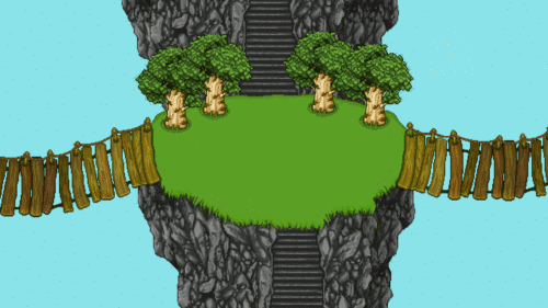
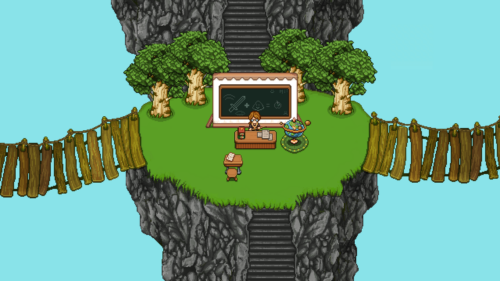
Next up, let’s return to Arcade Mode for a bit, adding some background stuff to that quiz challenge we showed a few weeks back! Let’s have a look:
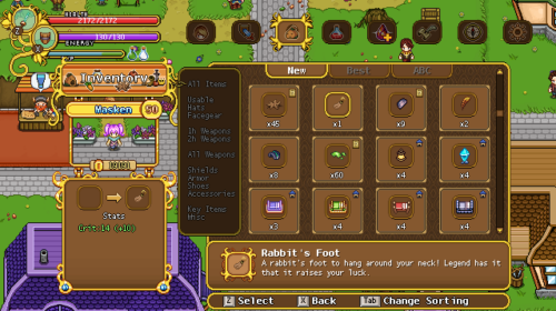
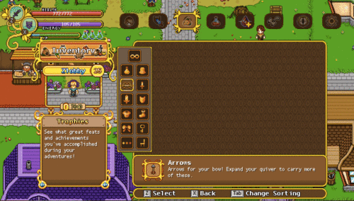
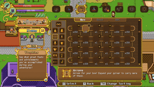
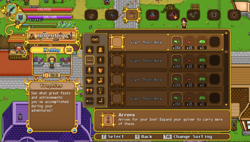
As for the final parts of the menu upgrades, we have the inventory and crafting menu. Let’s have a look at the inventory menu first:
Still not a 100% sure about this, as it feels a little bit cluttered! We’ll have to think further…
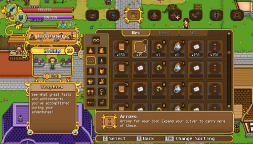
And so, let’s play around with some more basic background detail, more like it looks in the game currently but taking up less space and with some newer graphics! Let’s see what we can do:
This here is our current favourite, giving the interface an updated feel without feeling too messy! Plus we can squeeze in a lot more items than we can currently. What do you guys think?
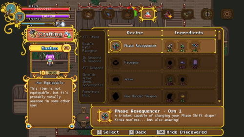
Next it’s time for the last piece of the ingame menu update: the crafting menu! Let’s have a look:
Almost done with the menu updates now! Really looking forward to when these are all added to the game :)
Meanwhile, Teddy is using his time to make a bunch more Arcade challenges! Let’s have a look at some of these:






I’ve actually hated the inventory screen for awhile now, but you guys made it super pretty! Good job! My only suggestion for the quiz show, however, is make sure the quizzes work for those who have only played Arcade mode.
If you only got the game for Arcade, you wouldn’t know any NPCs and such from the main game.