This week we’ve focused on completing the prototyping of the entire Toy Factory, as well as applying some polish to its first half. For posterity, we’ve saved all the different development stages of a challenge room, to show you what prototype iteration can look like!
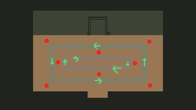
This was our first iteration. It’s pretty hard to see what’s going on since it’s all place holder graphics, but the idea was to have conveyor belts going in circles through the room (the fields with arrows), and the red dots were things you had to strike with your weapon when they appeared.
The challenge was designed so that you needed to use the speed boost from the conveyor belts to quickly move around the room in order to hit the different targets before they disappeared.
We implemented a prototype of the challenge, but quickly realized that it wasn’t up to par. The challenge was there, but it didn’t feel good. Sometimes, that last part is just lack of polish, but this time we felt it went beyond that. We decided to scrap it entirely.
Back at the drawing board, we decided to experiment with a mechanic that was intended for the Toy Factory boss, namely toy trains. This idea was, in short, to have trains go around a track to provide dynamic area denial while having the players face a second challenge, which originally was going to be fighting enemies.
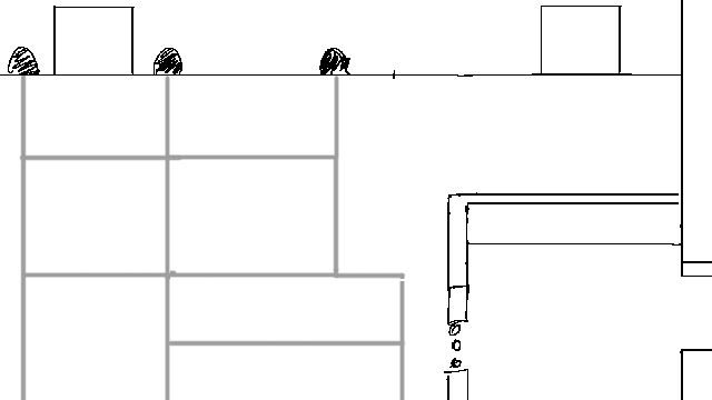
After brainstorming a bit, we decided against the enemies since it would be too similar to other encounters in the mini-dungeon, and instead came up with the idea of piling on a second type of area denial: falling bombs. For this, we moved things around a bit and came up with this layout:
The playfield was divided into nine squares (term used loosely here). Bombs would fall inside randomly chosen squares, between which trains would zoom by on the rails. The challenge was to move between the squares, while simultaneously dodging trains. Each train crossing had a track switch, which changed at regular intervals, causing the train patterns to constantly differ.
Using the map above, we implemented a prototype of the trains themselves, as well as their switching. This time, it felt interesting right off the bat, and we decided to go forward with this idea and continue iterating.
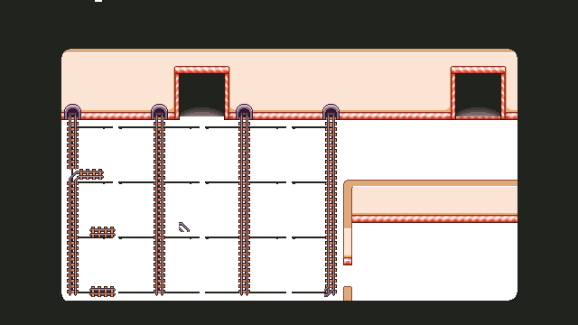
This is how the background looked after cleaning things up and measuring distances. At this point, we added the falling bombs to the prototype.
It felt pretty good, but oftentimes the trains would be too chaotic for player effort to actually be rewarded. You’d feel you had a good read on the situation, but then a switch changed and suddenly a train could still blindside you as you moved between the squares.
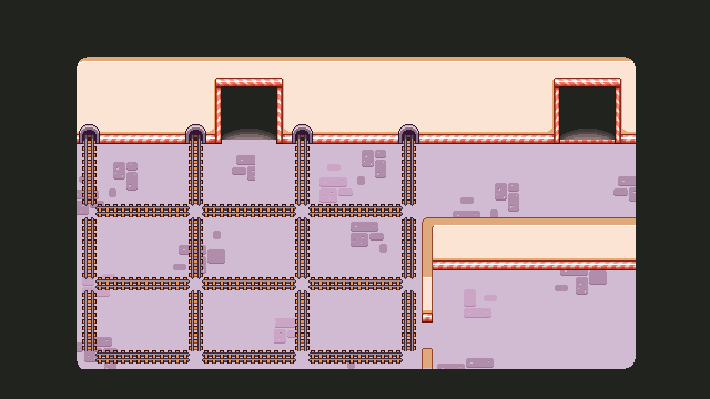
We decided that by making the pattern consistent, we could improve clarity and decrease frustration while still maintaining what made the challenge interesting.
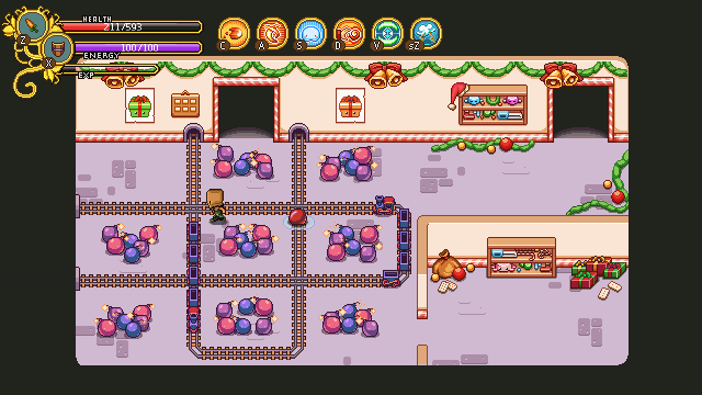
In the end, this was the prototype we went for. The image above links to an animated GIF, so be sure to click on it! Note that this is still the prototype; there’s a whole bunch of polish left, as you can see, but the core gameplay is there.
This little story is a good example of how gameplay can (and will) change as you go along, and that you should never expect your initial idea to be perfect as-is.
It also conveys the issue of hidden/surprise development time – one of the biggest reasons it’s so damn hard to estimate how long things will take on a macro level. This is why young companies (ourselves included) so often are very optimistic in the beginning regarding how long time a game will take to make.
You can look at some other game that took years to make and go “hey, I could make a game like that in six months” and you might be right, but then you never take into account all systems, sub-systems, prototypes, sprites, models, textures and lines of code that had to be made and thrown away in order for that final game to grow into existence.
Some closing food-for-thought: almost every game you’ve ever played has gone through this at almost every stage of development. Even amazing triple A games has looked terrible and been a clunky mess to play at some point!




Nice!