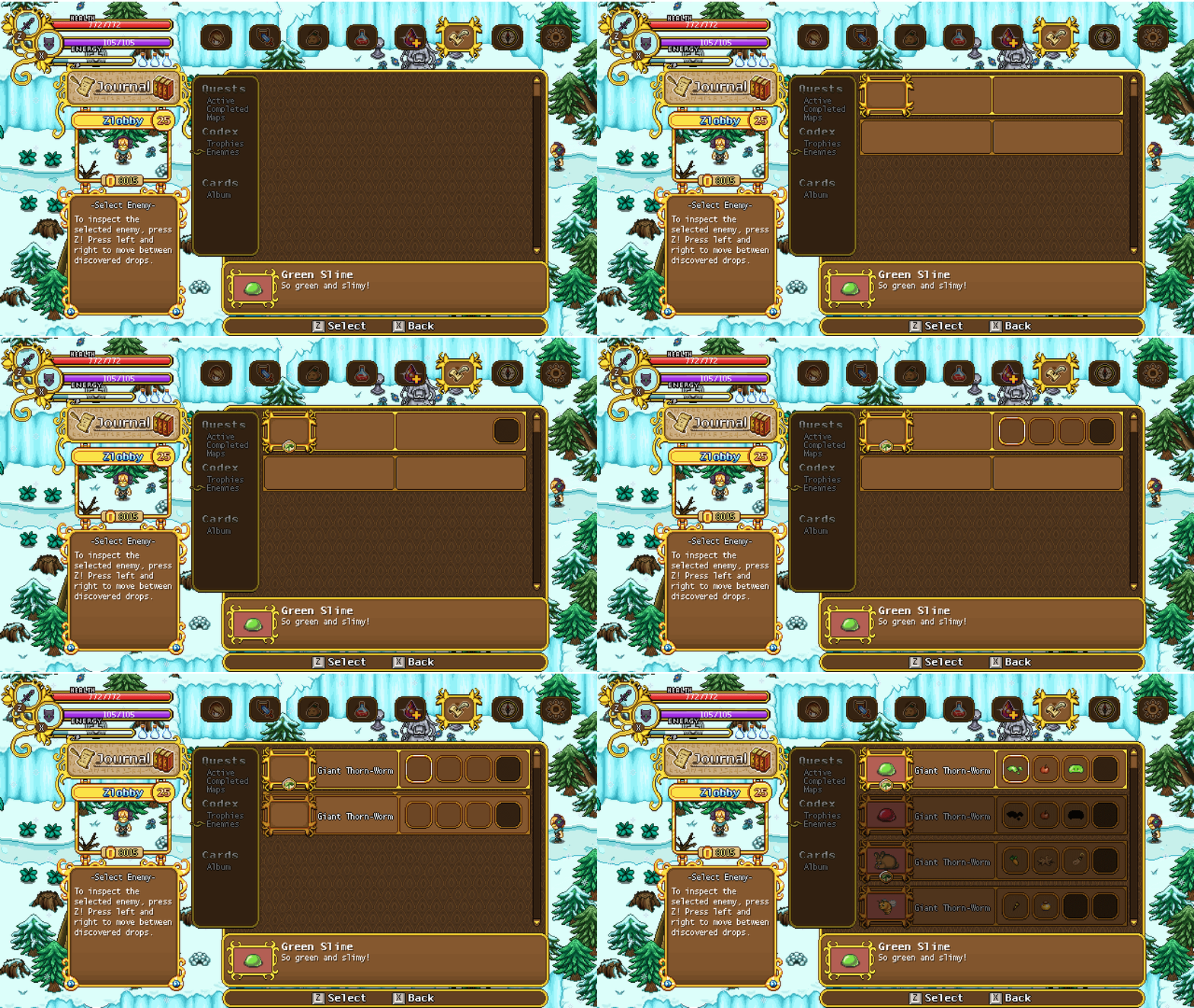
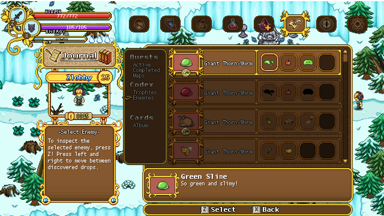
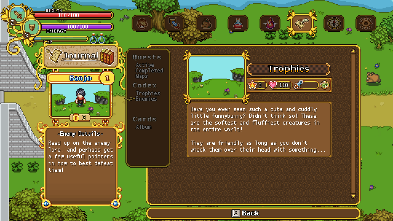
Moving on with the codex work, we’ve actually started second guessing that fancy new design, as it limits us in some ways. True, you could show more enemies on one page, but on the other hand there was no easy or obvious way to browse which items each enemy drops. As such, I’m making another iteration, this one based on the original, only with fancier graphics and cleaning it up a bit:
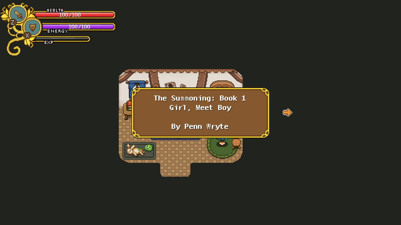
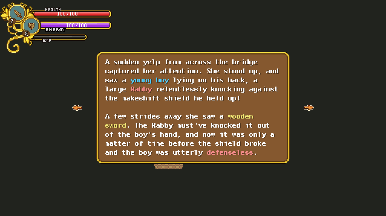
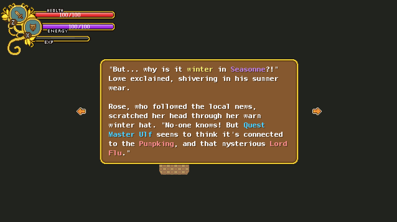
Work on a very different part on the game is progressing as well, namely that story written by Penn Wrythe!
The idea is that you’ll find parts of this story across the game, each one progressing the story slightly, until you meet Penn Wrythe herself and help her come up with the ending to her novel. The idea is that that Penn Wrythe will ask you what you value the most; power, love or fame (or some such), and depending on your answer the final part of the story will turn out in different ways.
There will be 5-8 parts of this story scattered across the game, so it’s quite the long tale.
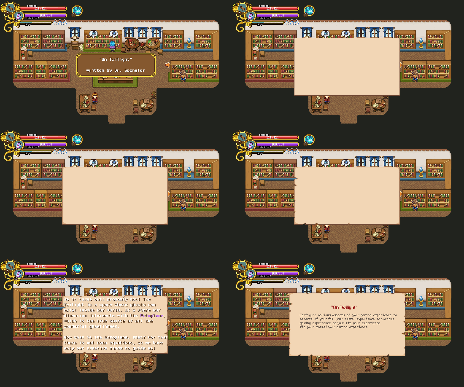
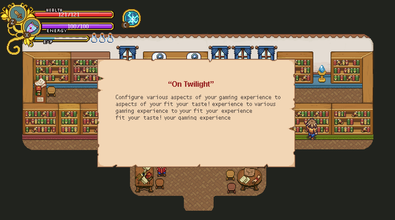
With the various books being added to the game, I thought it’s high time to make a better background than the typical classic brown one for such works. As you might remember, we designed a book interface ages ago, but due to limits in sizing and making it easier for us overall, we decided to scrap that some time back (for the time being, anyway). However, a more simple paper would still be feasible to add, so I threw something together:
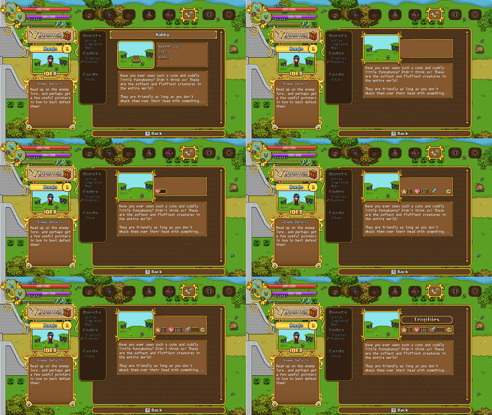
Next up, a quick redesign of the enemy info pages! Just some slight graphic updates and the removal of some unnecessary text in favour of icons!
And here’s a quick little reminder of what it currently looks like in the game, which will be replaced with the above version:
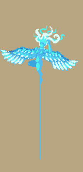
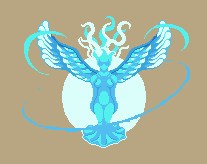
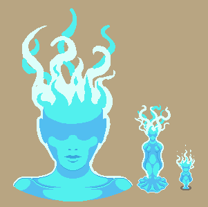
Meanwhile in Fred’s department, work on Grindea is in full swing! Take a look at these sketches:





Can we hoped for the big romance adventure 100th floor tower as the last dungeon ?