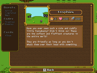
First up this week, editing that enemy info page a bit, allowing for larger numbers in each of the categories:
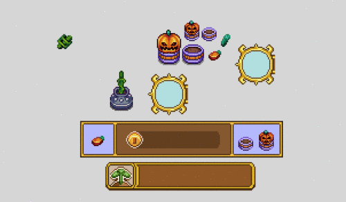
Another seed is on the way, through which you can grow a very strange plant indeed… Let’s take a look:
After some consideration of the previous version, we decided to swap it around:
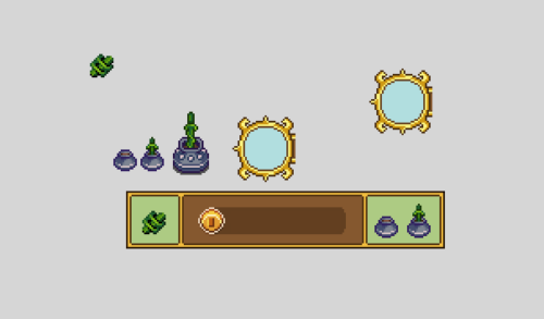
And now, for the seed:
And all of the usual interface bits needed for you to grow this thing:
And now, something that’s been a long time coming: new haircuts! Remember the locked ones? Well they won’t be locked much longer, as we intend to fill up the remaining haircut slots – or at least add a bunch more of them. Here’s the first batch:
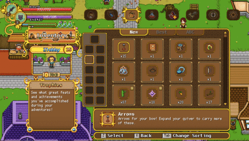
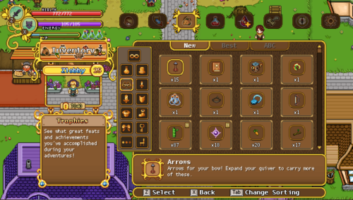
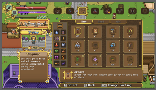
Remember how started improving the inventory menu a while back, preparing for the categories to be icons rather than text? Well, it’s finally time to start making those icons!
In this first test, I went for a monochrome look, but we’re not sure whether it’s the best way to go – perhaps it’s better to bring in a bit more colour to the menu, giving each icon a colour of its own. What do you guys think?
And here we have another option, the icons in colour! Which one do you prefer?
I personally feel a bit torn, since the monochrome one looks a bit less messy and more stylish, but it’s also nice to bring in more colour to the menu! It’s possible we’ll keep on iterating these options, or go for a mix of some sort, perhaps having the category you’re currently on show in colour. We’ll see!
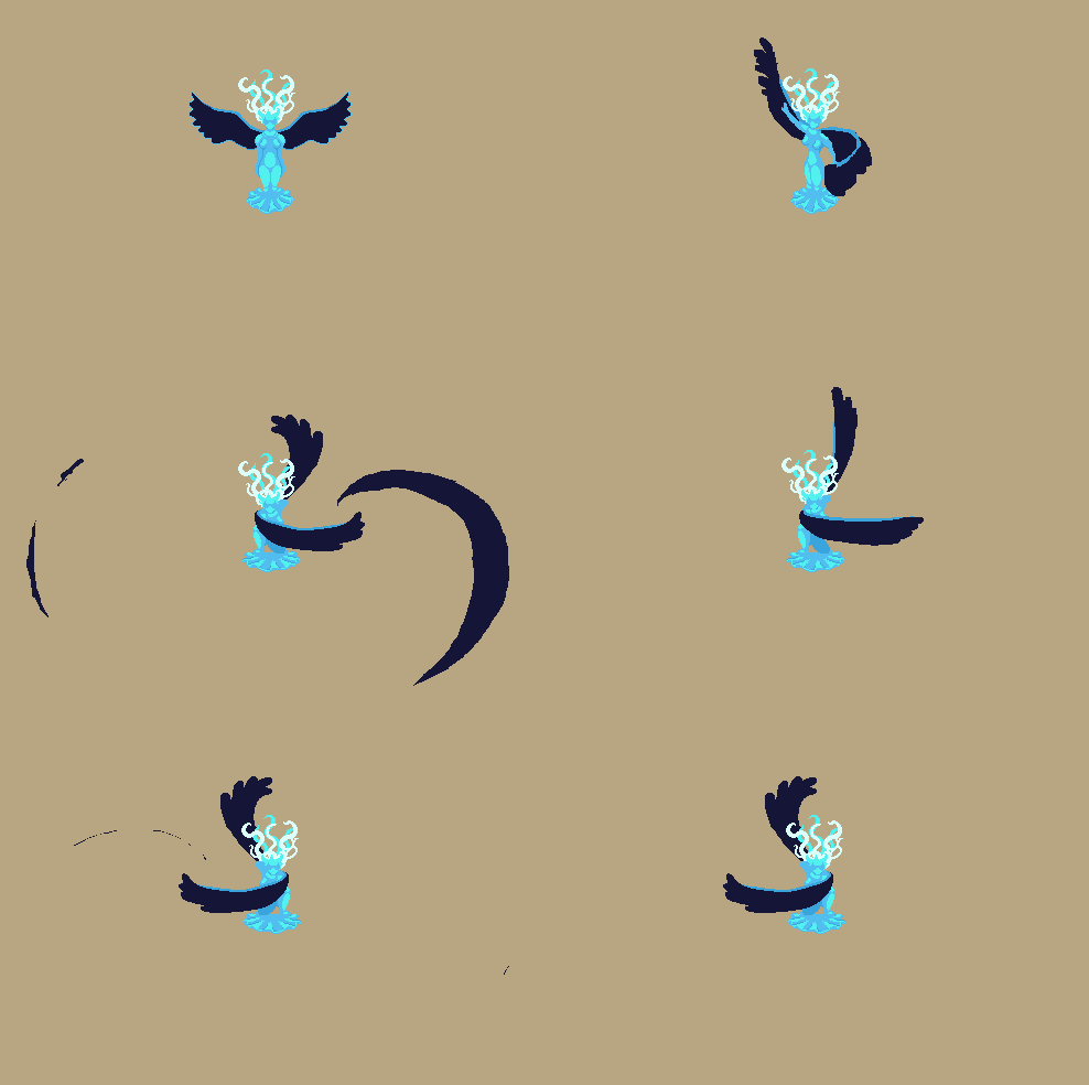
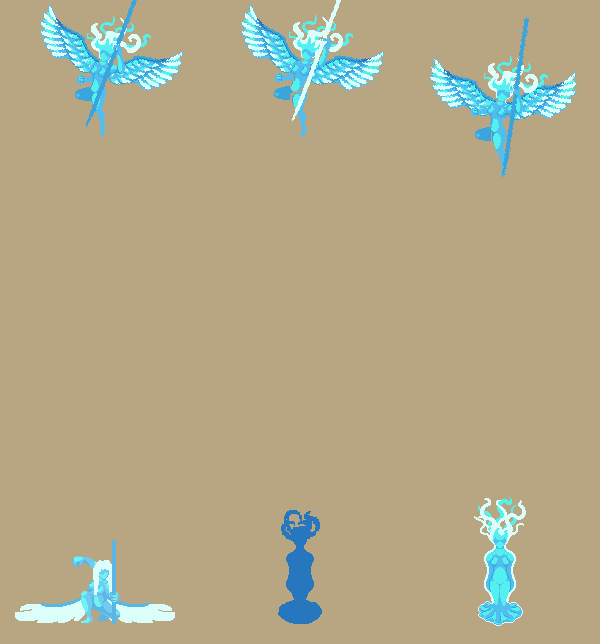
Meanwhile, Fred has been doing some more work on Grindea! Here’s some of his WIP sketches:
…And Teddy’s been adding my personal favourite feature in a long time! Lizards in your house!! How cute isn’t this?








Maybe you could do a bit of both styles? Something like having the icons all be monochrome, but the icon that is being hovered over or selected becomes full in color.
You would probably need to change the color of some of the icons though since some look pretty similar to the monochrome even in the colored version, like the 1-handed blade.
If I had to pick between one or the other definitively though, I prefer the monochrome version, since it contrasts with the rest of the inventory items a bit more, reducing visual noise.