This week, aside from still doing a bunch of bug testing, we’ve been focusing on getting the “elevator floors” for where you’ll battle the bosses just right, starting off with the Shadow Slime floor!
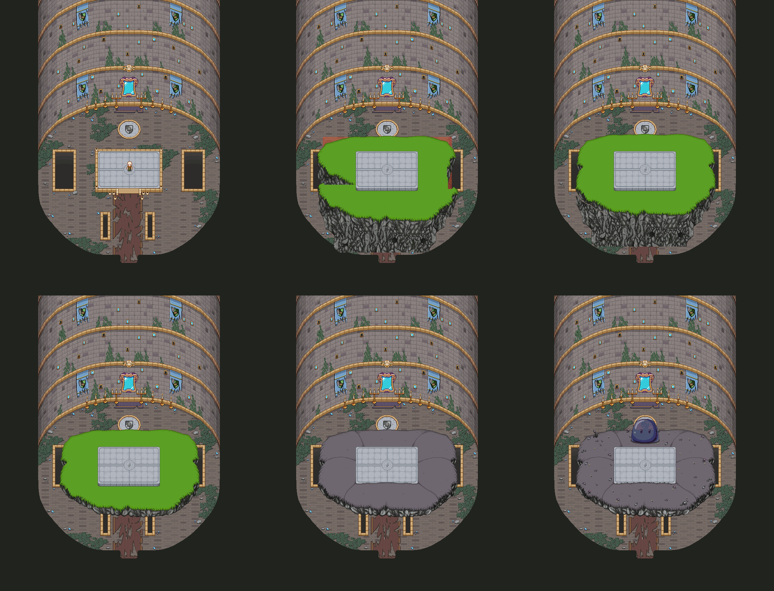
Our first test was with an organic floor, resembling whatever area you fought a similar boss, that would appear around the original elevator. Here’s the process for that:
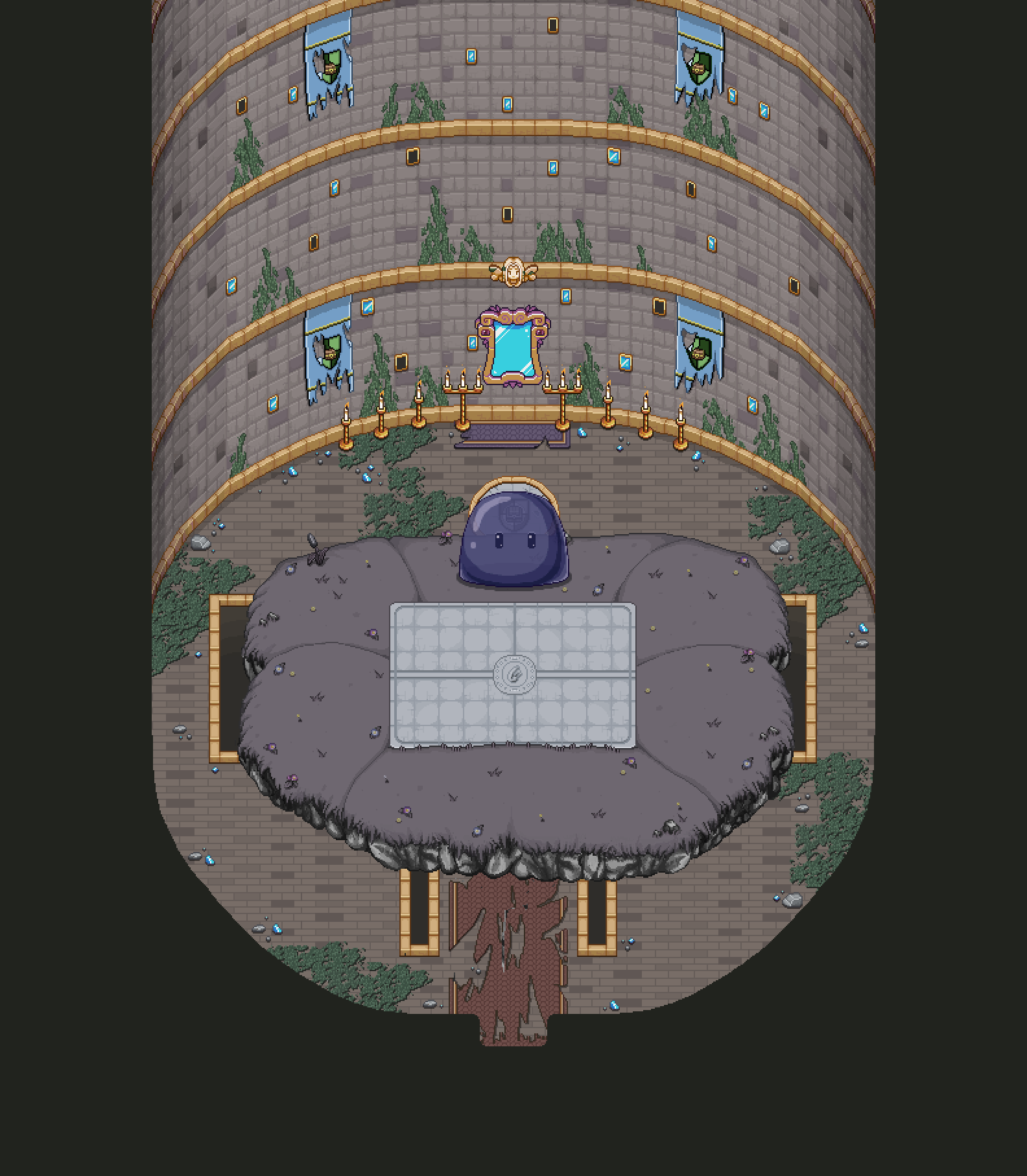
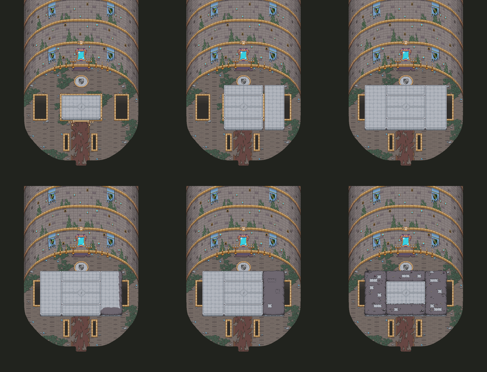
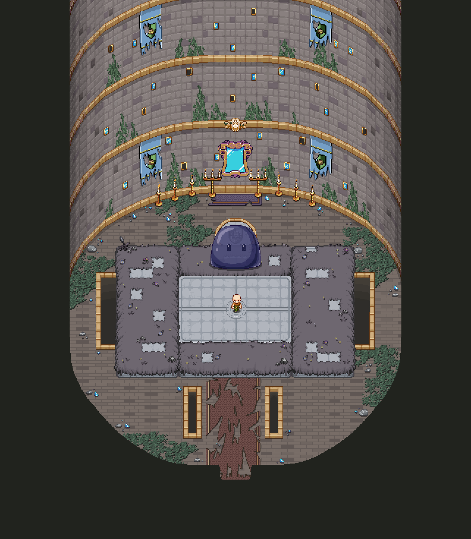
Our second idea was that the floor would remain in the style of the elevator, with more elevator pieces appearing and connecting to the original elevator. These would then, through the magic of the mirror guarding the tower, be “dressed” in the various decorations that would have been where you first battled this type of boss. As such, here’s the second idea:
For now our favourite is this second version, so we’re gonna go ahead and make the rest of the boss floors in this style, which will be my main focus (in the graphics department anyway) the next upcoming weeks.
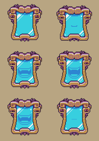
Speaking of the mirror artifact, Fred’s been working on some animations for him this week, and here’s one of them:
Now, the elevator will of course move upwards in some way, and Teddy has been experimenting with a variety of speeds and effects. Here’s a bunch of the various speeds:
And here we have the quick ones once more but with blur (and more blur):
Of course, the last thing we want is for anyone battling here to get dizzy from the moving background, so it’s quite a fine line here to make sure it looks cool while still being easy to read. Both the blur and the slower speed seems to be more easy on the eyes, but of course, one option is also for the elevator to stop during the fights. What do you guys think? Do you prefer a moving elevator or a static one? How fast is too fast? :)
Getting ever closer to the end! :D




I like the slower one with the blur the most. It strains my eyes the least.
If you do consider having the platform stop for each boss fight, could you consider it stopping at themed floors that mirror the boss?
I love the hustle!