This week I’ve continued to focus on the visual aspects of the production book! Even with the general style decided upon there’s still a ton of smaller details to take care of, such as picking fonts and proper colour schemes. While it might seem trivial, it’s in fact extremely important since it determines if the book is comfortably readable and whether it’s visually pleasing at all.
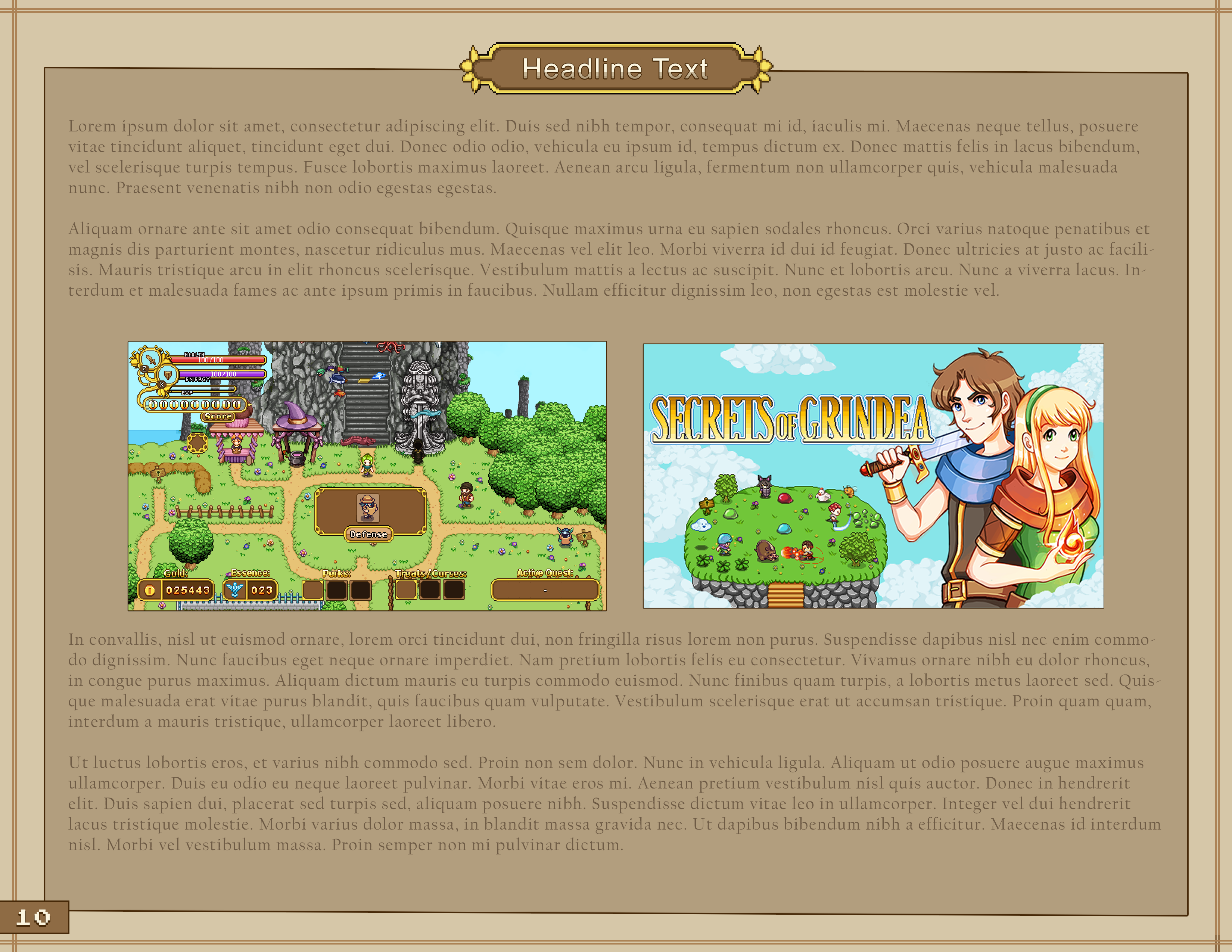
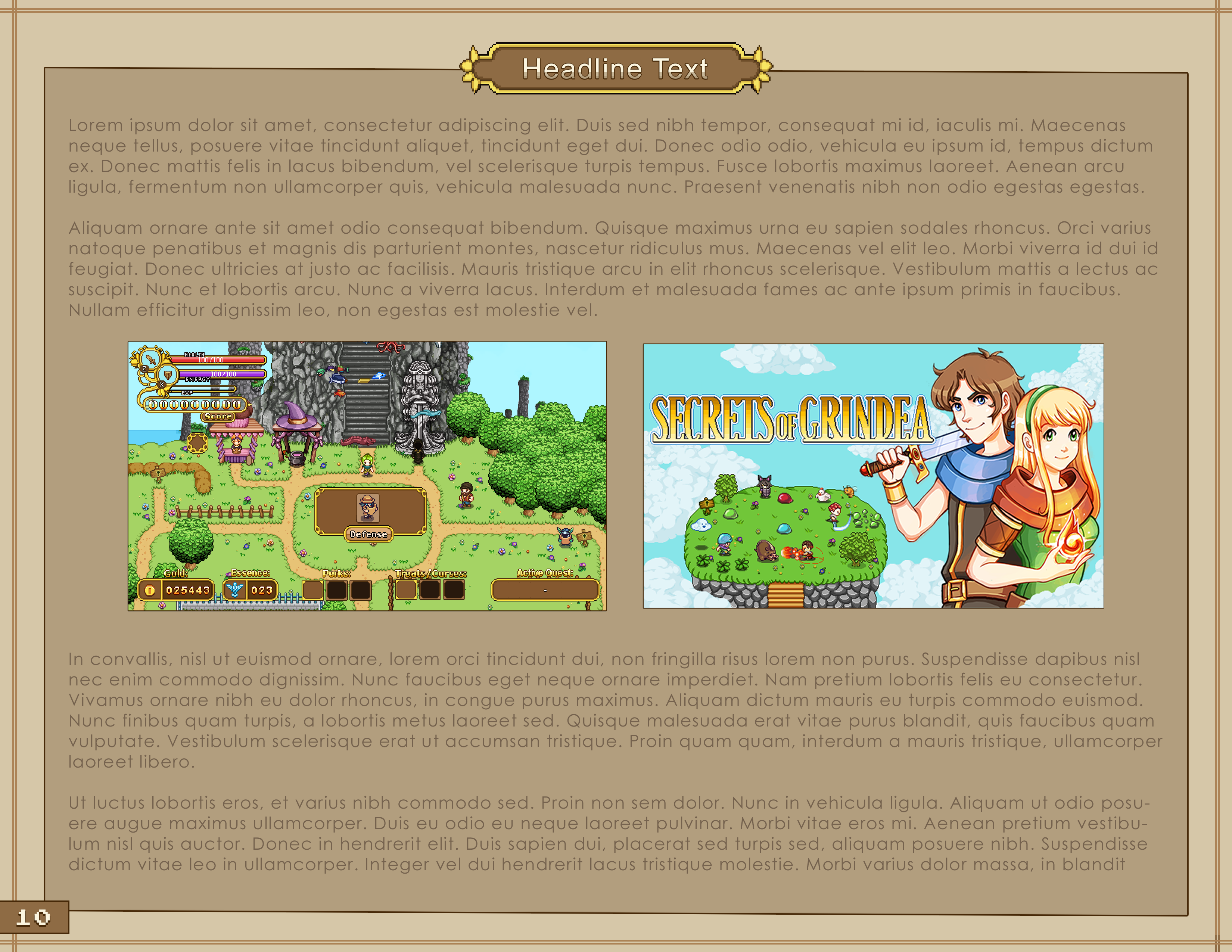
Below you can find a few mockups with some of the fonts we’ve gone through:
Our current favourite is the third. Which one do you prefer? :)
As I’ve been going through more art and game books I’ve also come to the realization that I need to cut more of the original text than I initially thought. I don’t want the production book to drag on with boring details, instead I want the focus to be on the process as a whole with as many pictures as possible and short and succint comments rather than whole chapters. Perhaps I will change my mind again, but for now it seems like an overall better approach for a project like this.
As a result I’m currently going over the text once more with the scissors, trying to polish it down as much as possible!
Fred, meanwhile, has continuined his work on the Frosty Fiend, which now has a proper spawn animation, death animation, roll and soon (!) an alternative attack animation:
Teddy has shifted focus from the boss battle to work on some cutscenes between the two major battles, as well as the cutscenes surrounding one of the endings. This week the both of them will likely team up to finish up those cutscenes, with Teddy requesting animations for the cutscenes whenever he feels he needs one.


The first one looks just right for a book, beautifully drawn letters!