Hello everyone! Before jumping into this week’s update, I’m happy to say that Teddy is doing fine and is back at work as of this week! :)
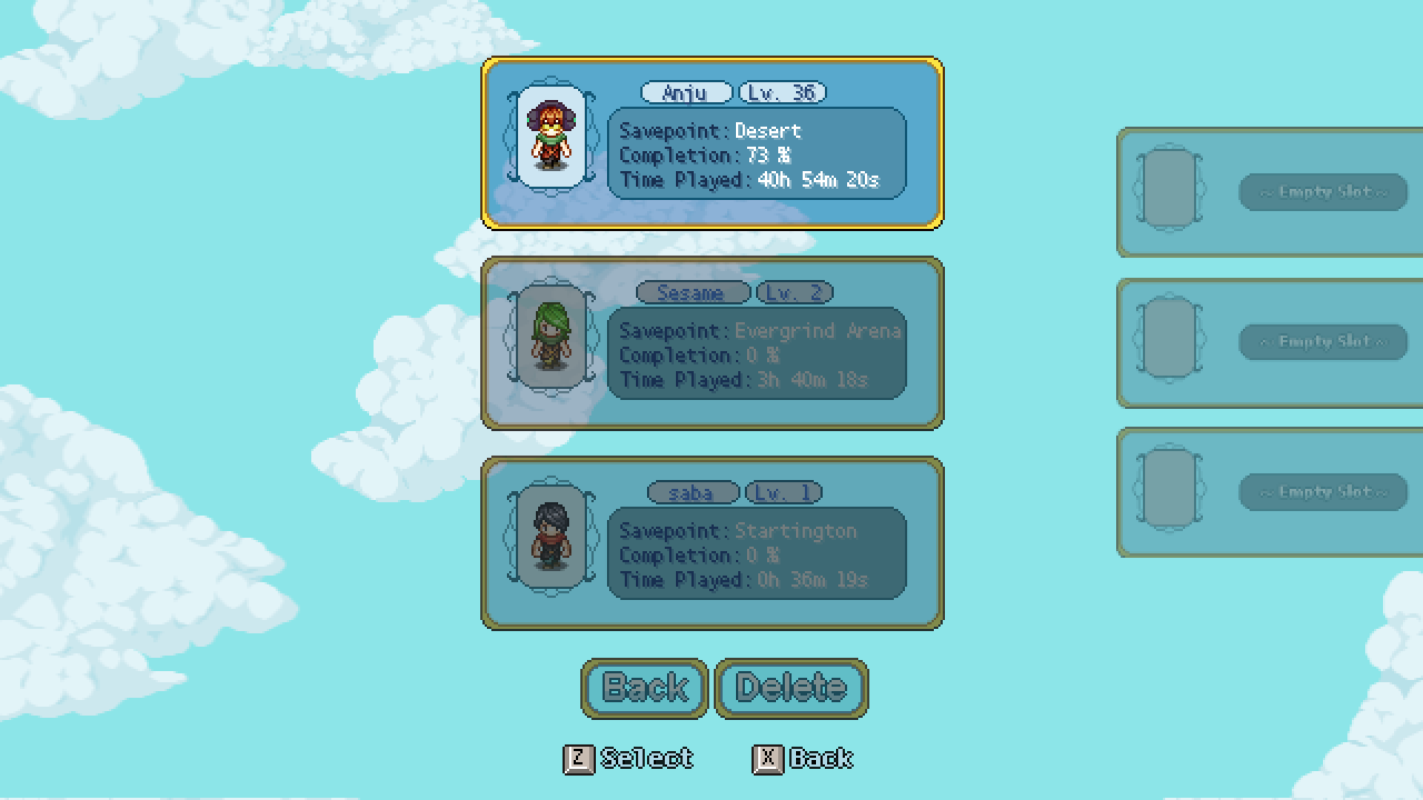
Now, it’s time to summarize another week and show more progress as we near the release of Secrets of Grindea. Let’s begin with a little menu revamp – remember the ‘character cards’ that greet you as you decide which of your characters you wanna play as? Here’s a reminder for those of you that haven’t been in-game for a while:
With the game nearing release we’re trying to clean up as many places as possible that cause issues for game translations. In several languages the font size needs to be quite a lot bigger than what the graphics were initially designed for, which has already lead to quite a few redesigns throughout the game. The character cards is yet another example of something that’s been incompatible with translations, and so we felt it’s high time we correct that.
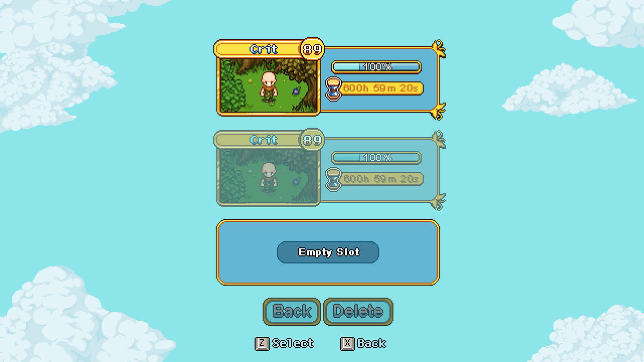
Without further ado, here’s the new version:
Not only is this new version compatible with the translation suite, it’s also – in our opinion – more visually pleasing, with more graphics and less text. The background indicates where your character has its current savepoint, rather than it being stated in text, and along with your completion percentage you get a little progression bar.
As some spawn points were missing background images, Vilya made a bunch for the missing ones as well:
Can you tell which one belongs to which area or part of the game?
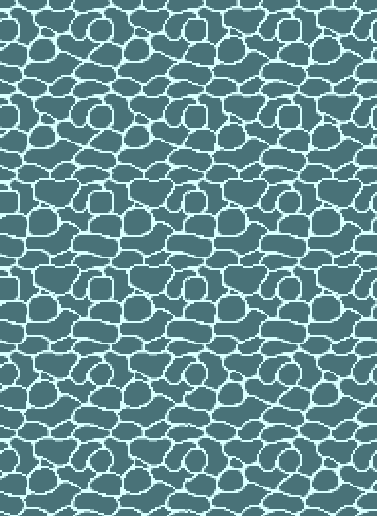
Meanwhile, Fred’s been cleaning up a bunch of effect animations and made some sweet water animations (which are tile-able!):
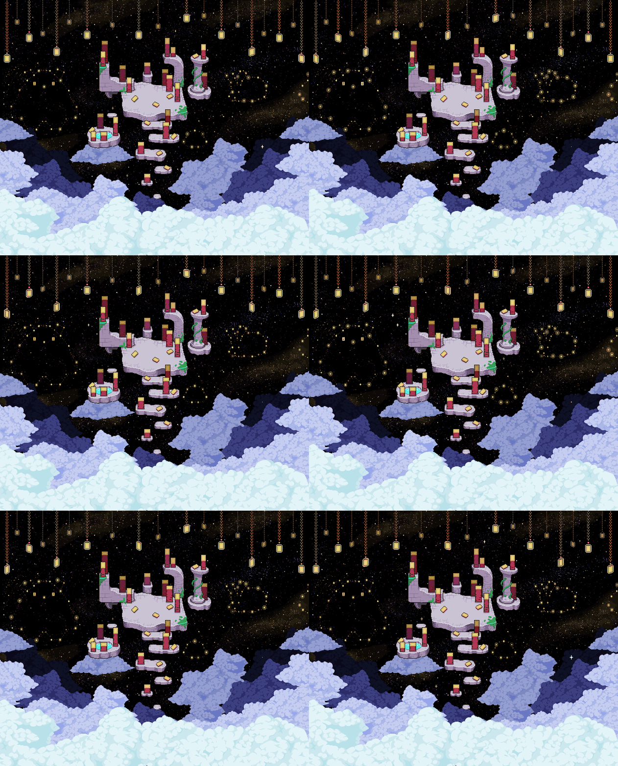
Finally, remember those starry card pieces from last week’s update? Have a look at what those look in their proper setting:








“With the game nearing release” :o
This sounds like an early 2024 release! Finally, i can climb that god-damn Tower!