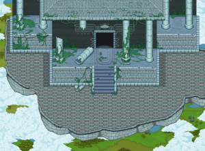
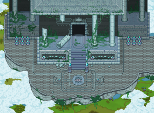
This week we have focused on adding those small details that tend to make an area feel more alive. Often it’s not the way you make the biggest or most important sprites that makes an area nice, it’s in how you decorate and add details. Here’s some examples of the improvements we made:
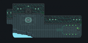
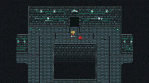
Here’s another example, where we did not only add decorations, but also changed the layout quite a bit:
In this room we planned to block the way up the stairs to a key until you solve a puzzle using the machine to the right. However, as we thought about it we realized it would probably be cooler if solving the puzzle itself was enough to unlock the door. Therefore we made the room smaller before redecorating it to look a bit more interesting.
Lastle, here’s an animated gif of what the walls will look like in the game:
We’re really excited about how the dungeon is coming together, and we hope you guys will like it as well.
As we’re writing this we’re also well on our way of refining a specific part of the dungeon where we plan on recording that video we talked about in the previous post. Hopefully we’ll be able to include it in one of the coming recaps!


Looks much better! Working with programmers, it’s hard to explain to them why all the little details are important, BUT THEY DO!!!