This week we’ve kept on working on getting things in order – fixing bugs, adjusting levels and implementing the new animations and interfaces.
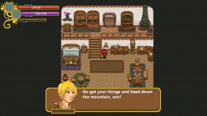
We’ve also been discussing the portraits (yes, again!). This time around we’re toying with the idea of keeping the high-res versions of the portraits in the game rather than making them more pixelated, which proved quite a challenge when it comes to keeping all of the details.
Nothing has been decided yet as all our options each have their own issues and advantages, but here’s a mockup of what it might look like with the high-res portraits in the game:
What do you guys think? Is it too distracting to have a high-res portrait among the rest of the pixel art, or do you prefer to see the characters in this form, which is more detailed compared to the old portraits?
In the animation department we’ve noticed that the Collectors’ Headquarters have been in grave need of some extra flare for a while and we figured it’s finally time to start correcting that! We really want to give the HQ a busy feel, so Fred have been bashing away at some minor flavor animations to liven up the place:

![]()
We’ve also got some news regarding the game outside of our workroom! It seems like we’ll be going to Gamex again this year, so if you’re near Stockholm/Kista at the end of October, be sure to visit us there!


While the high-res portrait in the screenshot looks really nice, it looks a little out of place next to the pixelated text.