Hello guys! Another week has gone by at the office, and we’re drawing ever closer to finishing Tai Ming’s third zone (slowly but steadily, as you know…) :)
While Teddy and Fred are busy prototyping the two remaining boss battles (one which actually has a working prototype that we’ve been testing already), I began working on the card appearances and some housing items. Housing will very likely be implemented once Tai Ming is done, so it’s time to get a bunch of items ready.
Anyway! First up, the Thorn-Worm card.
My notes on this card from our design meeting (feels like it happened 100 years ago now), was to have two worms kissing, creating a heart shape. I think we might have decided on this design before the Thorn-Worms were actually made, cause having two of them create a heart shape when they’re so short and fat is kind of heard. I decided to slim ’em down and paint a heart in the middle for clarity.
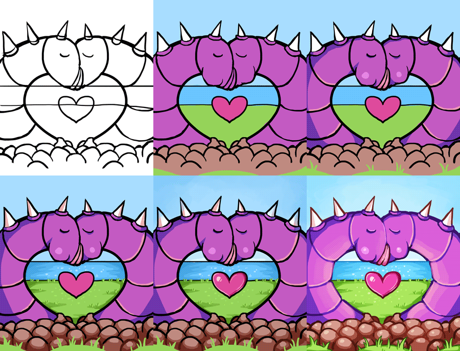
Maybe not the best design out there, but possibly the most gross?

Next, the Plantae Hostilis card!
My notes for this said: The enemy sprite surrounded by its spawn. Alright then, that’s kind of straight forward? So, it’s what I did. Lots of greens and flowers. I kind of get a very strong RO vibe from this enemy, and I’m not sure why, but I really like it. Kudos to Fred who designed it!
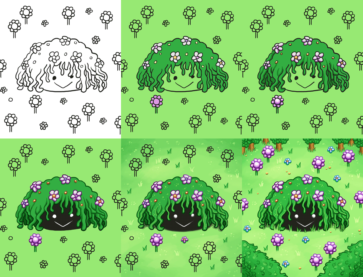
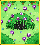
Finished card sprite below:
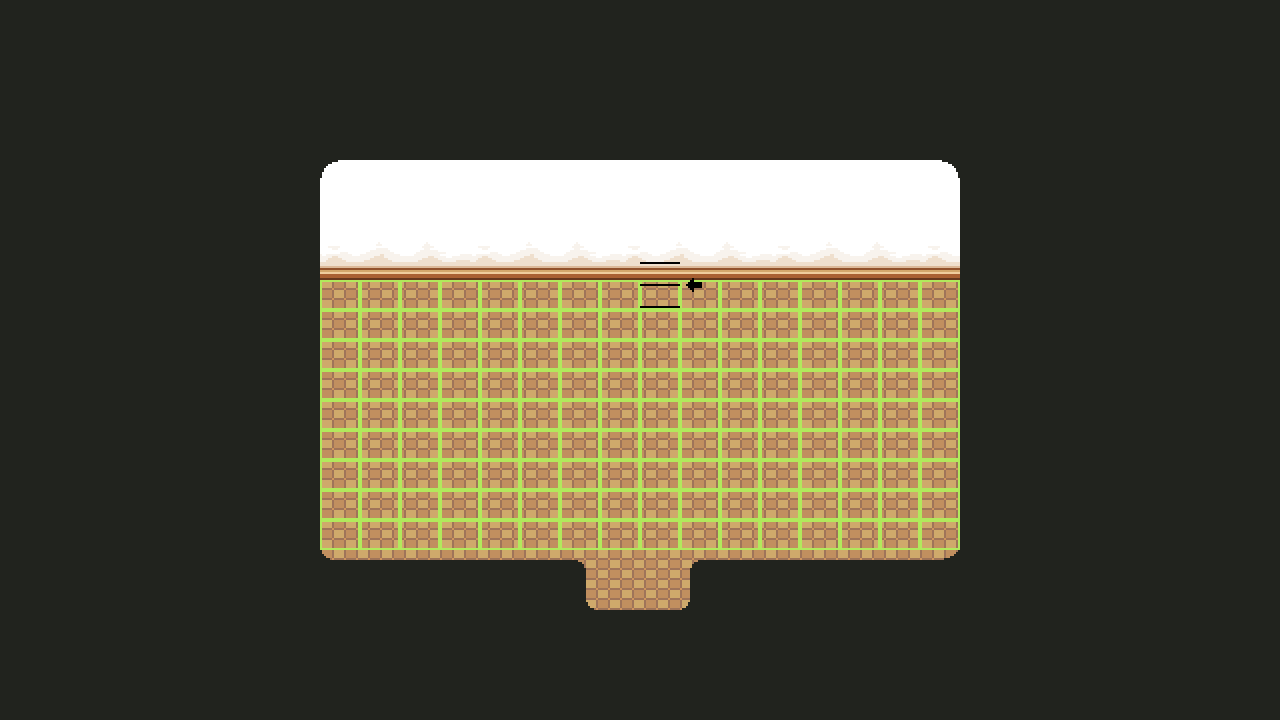
So, Housing! It’s a subject we touch upon every now and then, but as we get closer to finishing Tai Ming, we also get closer to implementing the dang system (finally)! A while ago, Teddy mentioned we changed the dimensions of the grid we use as a base for the housing system. It used to be much more square, and now it looks like this:
Basically this meant that every single item made before this change needed to be checked and edited or discarded/completely remade depending on how hard it’d be to fit it into the new grid. So I had a very fun (not really haha) day this week where I added all of those housing items to the Housing master document and manually changed and changed each and every one of them.
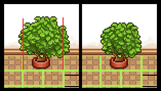
Some, like the plant above, had to change shape, but could still be used. The red lines indicate the end of its two designated slots, so everything going over those had to be cut.
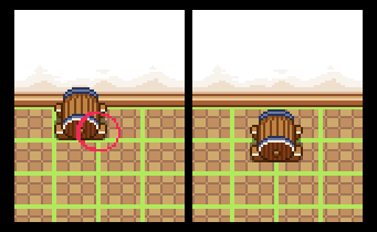
Others, like the wine barrel below, had to be discarded, and will be remade later. In this case the barrel would become too small if fit into one slow, and it’d be much too big if we edited it to fit it into two/four. So, I’ll redesign the thing later and make a design that works better with the grid size!
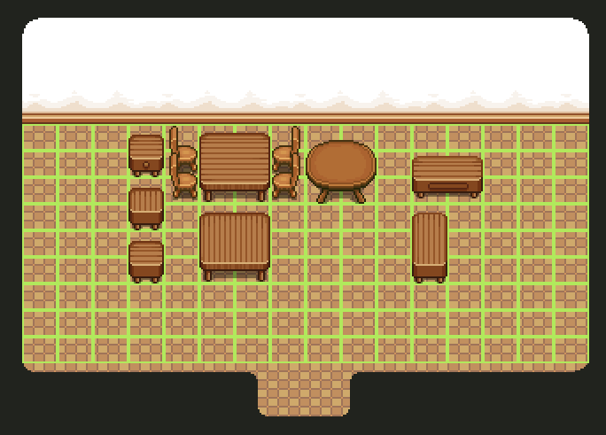
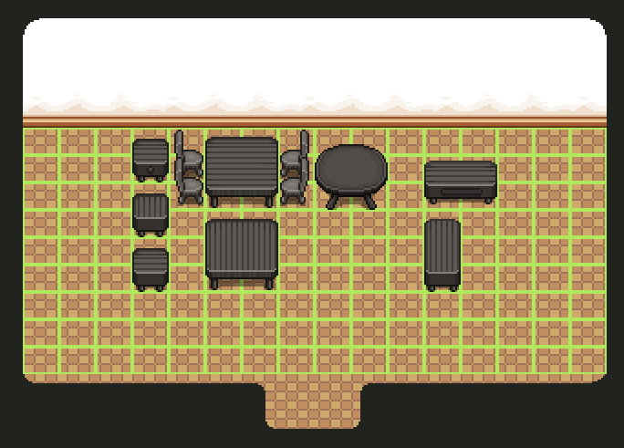
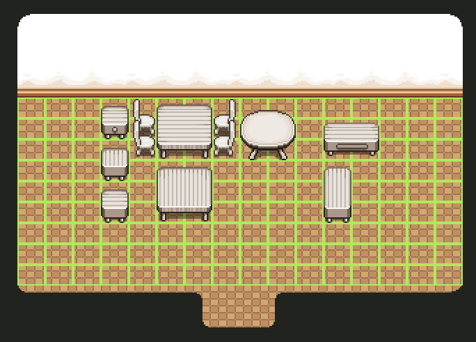
There were also some placeholder items Teddy made to test the system out. These were mostly surfaces (tables and the like) and made quickly by copy-pasting other tables in the game. After checking the other items, I went over those and touched ’em up until they resembled actual game sprites more, and made some color variations:
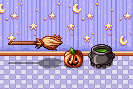
Now we’re finally able to start making batches of new housing items!! I actually went ahead and made a few silly Halloween items on a whim, just to celebrate that we can actually start pumping out housing items for reals:
As you can see in the video, the cauldron is actually a slightly edited version of Fred’s cauldron design for Candy (the witch in Pumpkin Woods). The others were (also as you can see) made from scratch.
A while ago we decided to have a batch of purchasable housing items unlock every time you enter or finish a new area, so it’s very possible these items will unlock once you enter (or complete) Pumpkin Woods. SO I’ll definitely make more items on the theme, and probably a set of basic stuff (like desks and chairs) in suitable colors to match the wallpaper/floor coloring. Also stuff for every other area you unlock… Gonna be a lot of housing items in the future! :)
ALSO, this week was AGDQ and during the event there was an Arcade Mode speedrun! Check it out here:




Wait for housing update,this part of update make me interested!)