Finally, after many twists and turns (and a ton of housing items), we’ve managed to make a somewhat playable test build of the housing system, which we’ve started testing within the team!
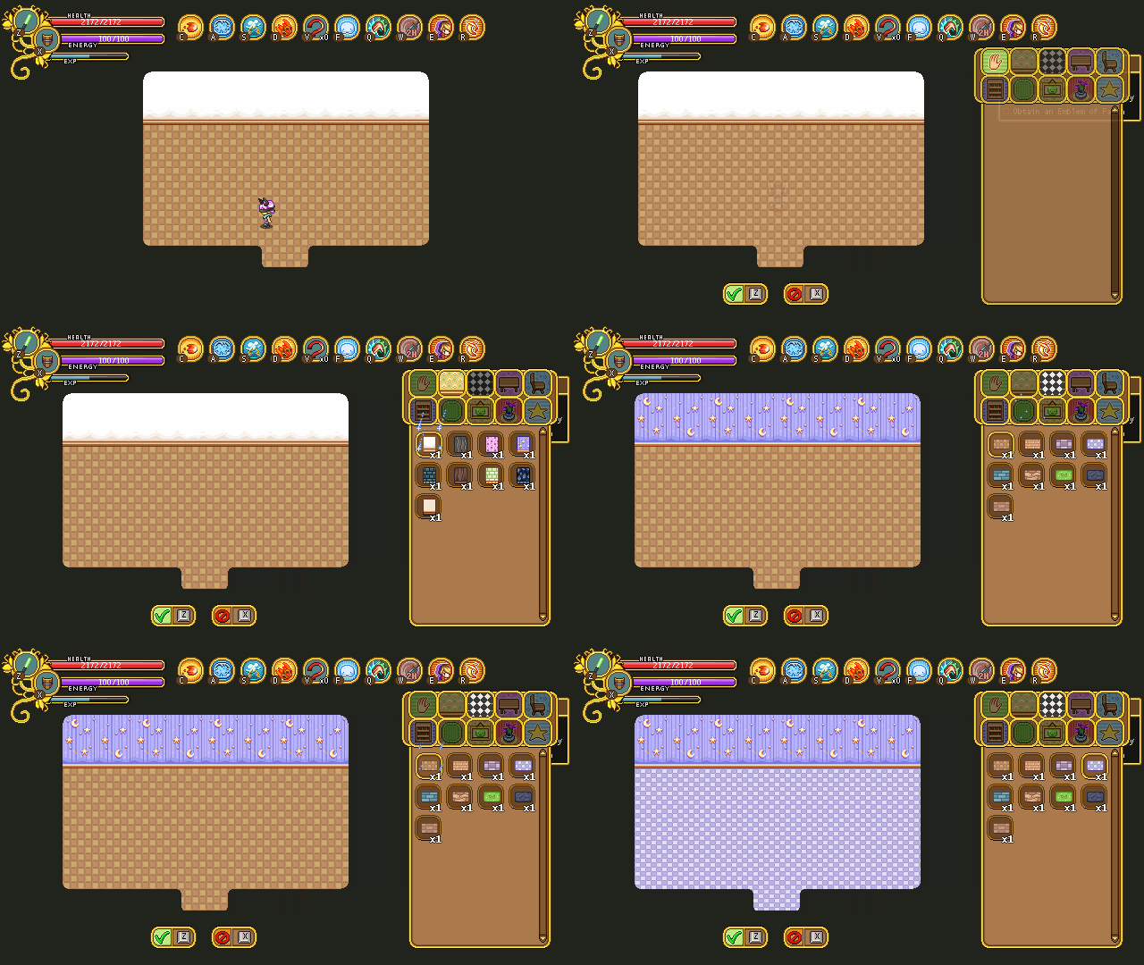
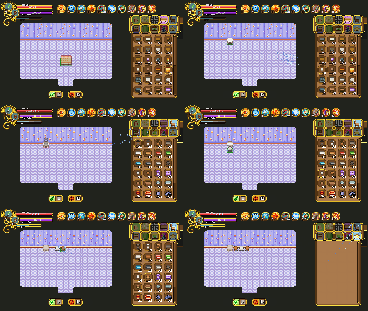
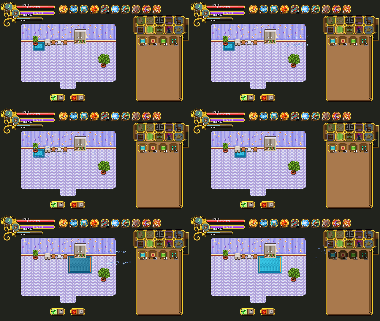
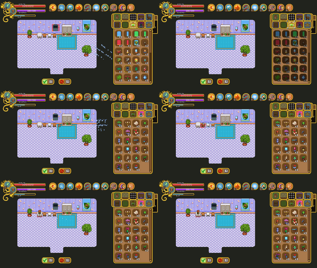
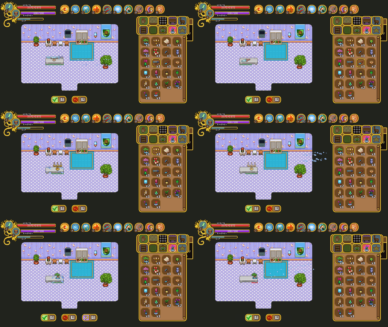
Without further ado, here’s a bunch of GIFs, featuring the most basic features (changing wallpaper/floor texture, adding basic furniture, creating carpets, changing the style of an item, and placing items on top of each other):
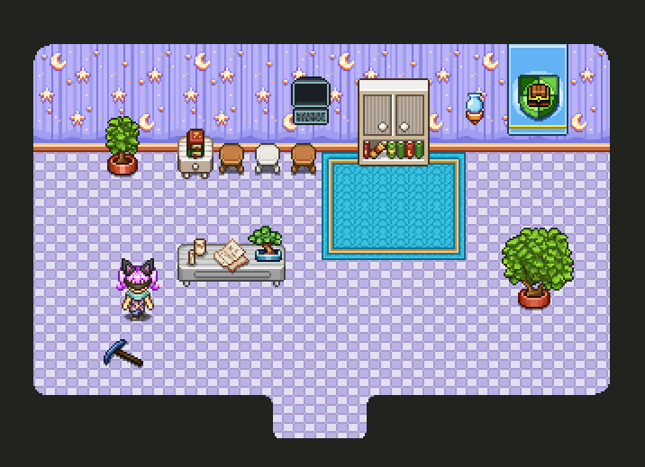
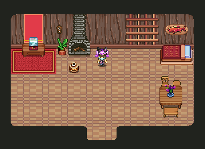
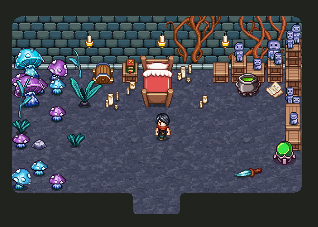
And here are some of our (not very creative) test houses:
Since this is the very first steps on creating a fully functional housing system, there were a ton of things we needed to discuss, and a bunch of changes we definitely have to make!
In order to plan all of that, we decided to have a looong meeting at our favorite fast food place (as usual). Immediately there were a bunch of things we decided had to change (or be added), and here’s some of them:
* More house layouts, and varying sizes. From the beginning we thought it’d be enough to use this one layout, but we quickly felt not only did it feel a bit big, it’s also a little boring to only be able to work with a single open space room. We also felt it was a little big. So, there will be an option to change between a set of house layouts, with a smaller room and multiple rooms available.
* A character who creates duplicates of unique housing items you already own. For obvious reasons! Unlike the items you buy in the store (where you can buy as many items as you like), there are unique items out there which you’ll only be able to find one of. In order to be able to place more of these in your house, you’ll be able to make duplicates of them – either at the regular store guy or through another NPC.
* We’ll look into making the area around your house a little bigger so there can be some kind of decorations surrounding it rather than it being placed in the middle of nowhere (well, in the middle of Evergrind) just like that.
* A furniture section should probably be added to your character’s inventory menu.
* The hand tool (which is used to move furniture around or delete it), is currently a long basic line/beam, and will be replaced with a pointing hand.
* The option to flip an item horizontally will be added to items where that feature makes sense, such as the pick-axe
* A mini-icon for furniture items that have more than one style. Styles are various skins of an object, and can be a color change or detail change in some way. For example, a bookcase might have different sets of shelves or stacks of items you can pick between.In order to make it more clear which items have more than one style, we’d like to add one of those tiny icons (like the 1H/2H/housing item icons in the main menu), only visible in the housing menu.
* When you place an item you have more than one copy of, you’re able to keep placing more of it until you run out of that particular item. Currently, what happens after you’ve placed your final item of that kind is that you’ll get automatically moved back to the menu again.
This, we quickly realized, felt a bit jarring, so next we’ll try adding a sound indicating you’ve run out of the item when you try to place another one, forcing you to cancel back into the menu rather than automatically getting there. This might seem counter productive, as it means you’ll have to press an extra button before being able to select your next piece of furniture, but we believe it’ll be less annoying then the jarring feeling of going from moving objects around to changing between new objects in the menu.
* Visual- and sound effects for placing and deleting objects in your house. An outline around the currently selected object. A better icon for the wallpaper section, which currently can be mistaken for a floor texture. Sound effect and visual feedback when you try to delete an item you currently can’t remove (for instance if it has other items on top of it).
* The currently not used star menu will be replaced with a settings menu, where you’ll be able to save your current house, change between different lightning settings and house layouts and other things we might think of.
———
…Aaand a bunch of other small things. As you can tell, when we add a new system things are far from perfect the first time around, and the only way of getting to that polished state is to change and add things until it feels nice :)
Once these things have been added we’ll try the system out again and reevaluate!
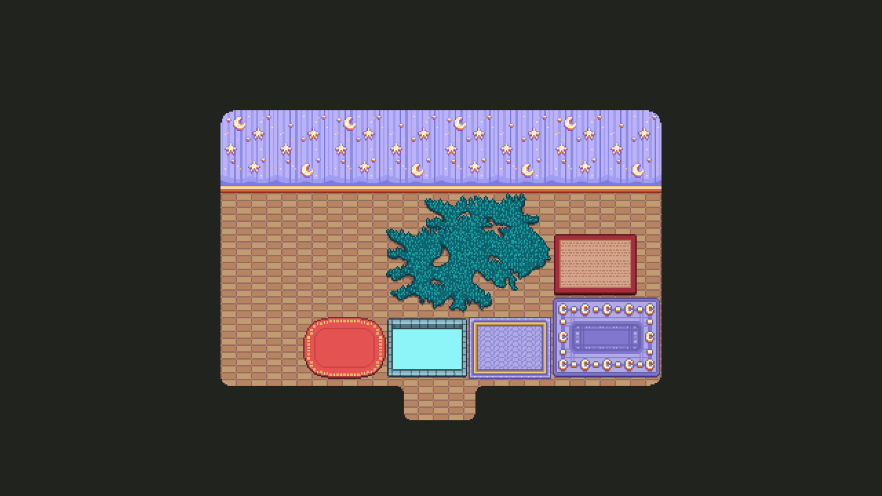
Speaking of housing, when we planned the housing batches and I made them, there was one thing we had completely forgotten about: carpets! Now that I’m done with each of the batches up to the point of the game where we’re currently at, we decided it was time to go back and add something to stick on the floor for most of the areas (we felt it wasn’t necessary to include in each and every one, and Temple of Seasons already have a bunch of floor decorations!)
In the Pumpkin Woods batch, there will be two carpets, one that has a static size with moons, and one that you can change the size of to fit your needs (second one from the right).
In the Flying Fortress batch, there won’t be a carpet, but a “big item” that you can put on the ground where you can see the sky below.
In Seasonne, there’s a red christmas-y carpet matching the tablecloths of the batch, which you’re also able to change the size of.
Mount Bloom will have a static sized moss carpet, and in Tai Ming, there’s the red and beige carpet that you’re used to seeing inside the houses, but with a slightly adjusted pattern so it’s possible to change the size of it:
And to end this week, something more simple and straight forward: new portraits!
You might wonder where we could possible need more people right now, but aside from pretty much everywhere (or at least everywhere in Evergrind City!), the answer lies in the desert town you’ll soon be heading towards.
I figured it’s better to start making portraits now and make a few every week, than to do everything else until I end up having to spend weeks doing nothing but portraits when it’s time to finally add them! Makes for more varied blog posts, anyway.
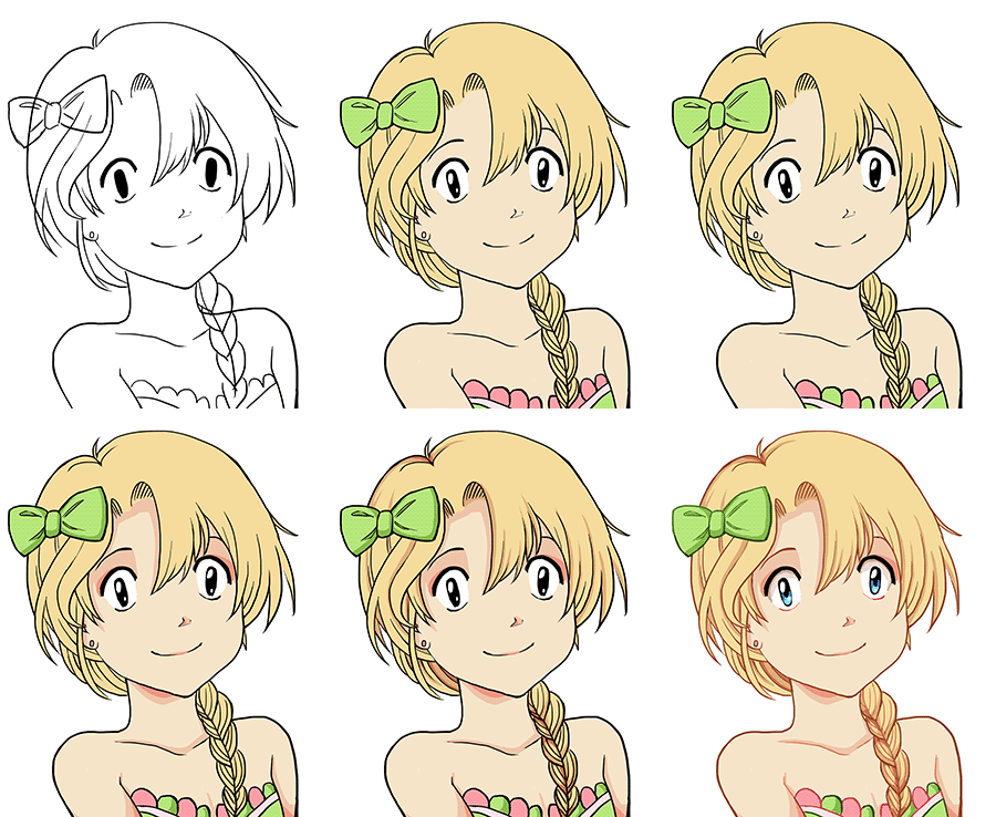
So, first up, here’s a tourist girl, enjoying the nice weather of the yet-unnamed harbor town:

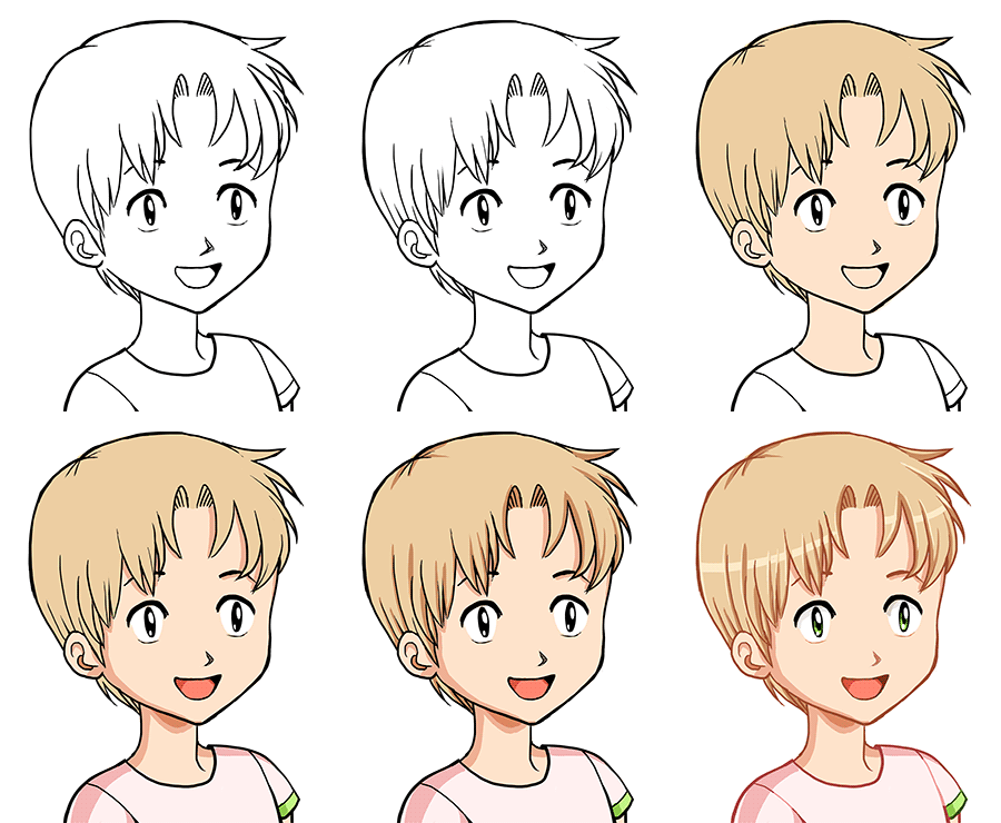
And her companion: a tourist boy!





Wow! That’s really clean! I love the house decoration UI, looks very fun to use! I like the way the carpet was handled, too!