Sometimes, it’s easy to forget that being a gamedev involves more than simply making games and managing the community surrounding it. Today (when this gets posted, a while ago) we had our “annual meeting”, which is a formal thing we need to do to review the year and how the company has fared through it.
This year we also formalized and signed contracts surrounding Secrets of Grindea and its IP, protecting it and us in the unlikely case we no longer get along. While we trust each other 100% it’s so much easier making these contracts while there are no issues, rather than try to solve any such issues as they arise in a not-so-likely future. In fact, we should have done this years ago, before we even started selling the game.
If you’re an aspiring gamedev, I very strongly advise you look into getting a contract outlining exactly what each of you will be doing for the company and what happens in the case where one or several of you want out. You might think there will never be any problems ahead, but you never know, and it’s better to be protected than to wish you had been. Also, money can easily change people, and I’ve seen countless horror stories out there where devs no longer get along once they start selling their game as opposed to it being a dream.
——–
Now, some time has passed since we started the poll regarding which of the Tai Ming Arcade floor designs you’d prefer – backtrack through time or random time jumps. At the moment of writing this, it seems you guys are as divided as we are, so for the time being we’re leaning slightly towards the backtracking idea.
This means each of the rooms have to be made available in both a past and a present version. And speaking of the floor visuals, how would we even go about designing an Arcade floor of an area that’s more of a town than any of the previous areas you’ve progressed through?
To sort this out, I had a long meeting with Teddy where we sketched and discussed the various ways we could handle this.
In conclusion, we’ve decided to make the floors in a very different way compared to the others. For the other floors, each room background is either very designed by me, with variations to give the user an impression of there being more rooms than there actually is (Flying Fortress, Mount Bloom etc), or they are fully generated by the engine that puts a bunch of trees in a circle on top of a basic background (Evergrind Fields, Seasonne, etc). For Tai Ming, we’re going to do a mix of the two.
We decided that each outdoor room of Tai Ming will consist of a plain grass background, upon which we’ll put various things that will serve to block the screen so that you can’t move further than the square where you’ll be fighting. These things will include various fences, mountain walls, streams of water and houses, either ones you will enter or closed ones that will only serve to block your way forward.
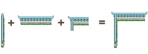
Each of these items will be generated into the game by the engine, but they will have to be handmade by me to fit into each situation. For instance, there needs to be a way for a horizontal and vertical fence/stream/mountain wall to connect, and they need to be able to work with each other – a fence must be able to connect to the mountain wall, for instance.
To make these floors coherent we’ll frame them with the mountain, meaning the the bottom, far right/left and topmost floors will have a corresponding mountain wall – it will be in the upper parts of the topmost floors, signifying that you cannot go further north than this. We believe this will give the floors a sense of you progressing through Tai Ming much like it works in Story Mode, you’re passing through a town that’s inside the mountain. Because there’s a lot of water in Tai Ming’s second zone and we thought it would make the rooms a more interesting look, there will be streams here and there that you can pass over (in some rooms) by bridges, that will also be made by me but generated into the game by the engine as it creates each floor.
So basically, instead of painting whole rooms, I will spend a lot of time making and piecing together many, many small parts, that need to work both on their own and be able to connect with others as they get generated by the game!
As for the indoor rooms, they will (for now) be single room living areas in a bunch of variations, but with entrances and exits in the same place: if you enter a house from the south you’ll exit it in the north, and if you enter a house from the right you’ll exit it to the left. Since we’ve already dealing with quite complex backgrounds we thought we’d keep the indoor houses simple. This way we don’t have to make a ton of variations of the house sprites (the outodoor ones) that would have to look different if the house is L-shaped or longer than one room. Now we can focus on giving each of the exits variations through color and design rather than the shape, which would also end up affecting the other pieces made for the outdoor areas.
Creating these floors properly will definitely be a challenge, and more on the technical side than what we normally do, but we believe this will make these floors look the best they can. Our other options would be to make a ton of pre-rendered rooms (a bunch with the mountain wall to the bottom, a bunch with the wall to the left, etc) or lose the coherency of where the mountain floors and walls connect, and we all agree that just wouldn’t be as nice.
In other words, expect a post or two full with tiny parts and ways of connecting them! ;)
———————-
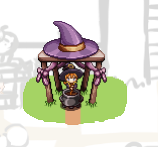
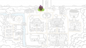
And now, for something else! Among these other things I’ve also started working on the proper Arcadia graphics now that the design is settled! Here’s a video featuring the first part, Candy’s Curses:
And here’s the whole map! I thought I’d post this after every new step, to show you the town slowly taking shape:
One I’ve made all the finished buildings, I’ll make the flat version with signposts where the buildings will be. The reason I’m starting with the finished buildings is so that each plot will be big enough: it’s a little hard to tell exactly how big a building will end up being before I’ve painted it and it’s surroundings, and I want to be able to adjust the paths and greenery to fit the built versions :)
————–
Back to housing! We’ve had multiple discussions regarding table cloths and how to apply them to various tables. Finally, we’ve come to a decision!
Basically, we had two options. Either we’d make a ton of basic table cloths that had to fit each of the tables, or we’d make unique styles for each table, with table cloths (and other decorations) specifically made for that object.
In the end, we decided to go with the second option, for multiple reasons. For one, the tables aren’t all exactly as big, which means it’ll be quite a challenge to make sure every table cloth fits each and every table. Second, it’s more fun for us to design table cloths to go with each table, rather than have to design around all tables with the limitation of size as mentioned. It also makes each table you buy a little more interesting, as it comes with its own unique styles.
And without further ado, here’s a bunch of the table cloths we’ve made so far:
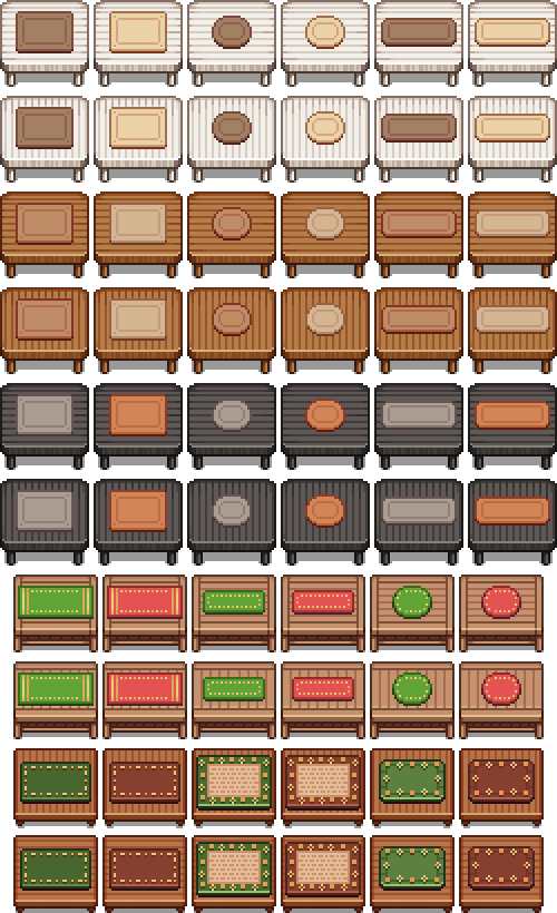
…With more to come!
And while we’re on the subject of housing, have another bunch of Fred’s animated housing items:
![]()

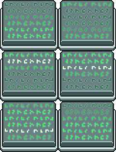




Woah! Those are some huge house items! They look great, though, I love how the computer screen is animated