After a couple more weeks of designing, implementing, polishing and remaking, we have finally patched the frontline beta to include the new set of Utility skills! With the addition of these skills, we expect the game change a lot for some players, if not all – we suspect a lot of you have longed for something to use spare silver points on, and many of the Utility skills offer new paths of gameplay. In short, we can’t wait to see how you guys use them, and what the feedback will be.
While we hope it will be possible to balance all of this properly (we’ve done our best so far, but we’re always ready for your feedback on what’s broken and what may be too lame), we are aware that depending on your feedback, we might have to rethink certain things. For instance, if every single one of you hate a specific skill! Because of this, it’s important to let us know what bothers you (and what you like!) so we know how to proceed. As always, feel free to share your opinions on this patch and the skills here or on the forums!
And as always, to see the full patch notes, go to this forum thread. Now go ahead and try them out!! :D
.. and in the meanwhile, let’s take a look at what our previous workweek looked like, with the Utility skills coming together:
First up, some skill Icons, starting with the Focus skill (the very first frame of each WIP-animation shows our current placeholder icon made by Teddy, and the last frame is my reinterpretation):
Focus is the meditate skill which allows you to channel EP by holding the skill button, and allows you to cast a skill for free after a set amount of time. Since it’s EP focused, we decided to use a purple background (as the EP meter is purple).
Next, the Barrier, which in our game kind of looks like a bubble engulfing the character, and so I wanted to focus on that in its skill icon:
For the blink skill, we had a bit of a hard time coming up with something that would resemble the skill at all, in such a limited amount of space. The color of this skill was later changed to orange/yellow to avoid healing associations:
Next, Death Mark, or as it’s called now: Reaper’s Blade, fittingly using a skull (I modified the one used in the animation where boss-Vilya yells out insults at her minions in the second battle), and added some decorations based off of a sword behind it. Red, as it’s an offensive skill that will help you deal a lot more damage:
For the Stasis icon, I focused on the stasis effect, which grays out an enemy and disables them from combat. In this case I took a Rabby sprite, turned it black & white and painted some background patterns around it. In the final version of this, the whole thing is black and white, however, I added more color to the background later to make sure it stands out from when the skill is unavailable (at which point all skills are grayed out):
Finally, for Challenge (or as it’s called now: Provoke) I brought out boss-Vilyas insults once more! As you yell at the enemy you’re targeting, your own character will begin cursing at them in a similar way, so I thought it’d be nice to use the same graphic indicators for the insults:
And here’s the lineup:
In the end, we decided to divide the buffs into three, so they’re now divided into one that boosts you damage and crit, one improved version of haste (increased cast and attack speed) and a defense and shield boosting buff. The icons of these can be seen below, along with their “buff timer” counterparts:
Our reasoning is that separating attack/castspeed from the damage buff allows for more varied builds, and each of the buffs can be stronger than they could be if they buffed more things. With that in mind, we’ll likely cap each of the Utility skills at three silver points as well, with each level making a bigger difference.
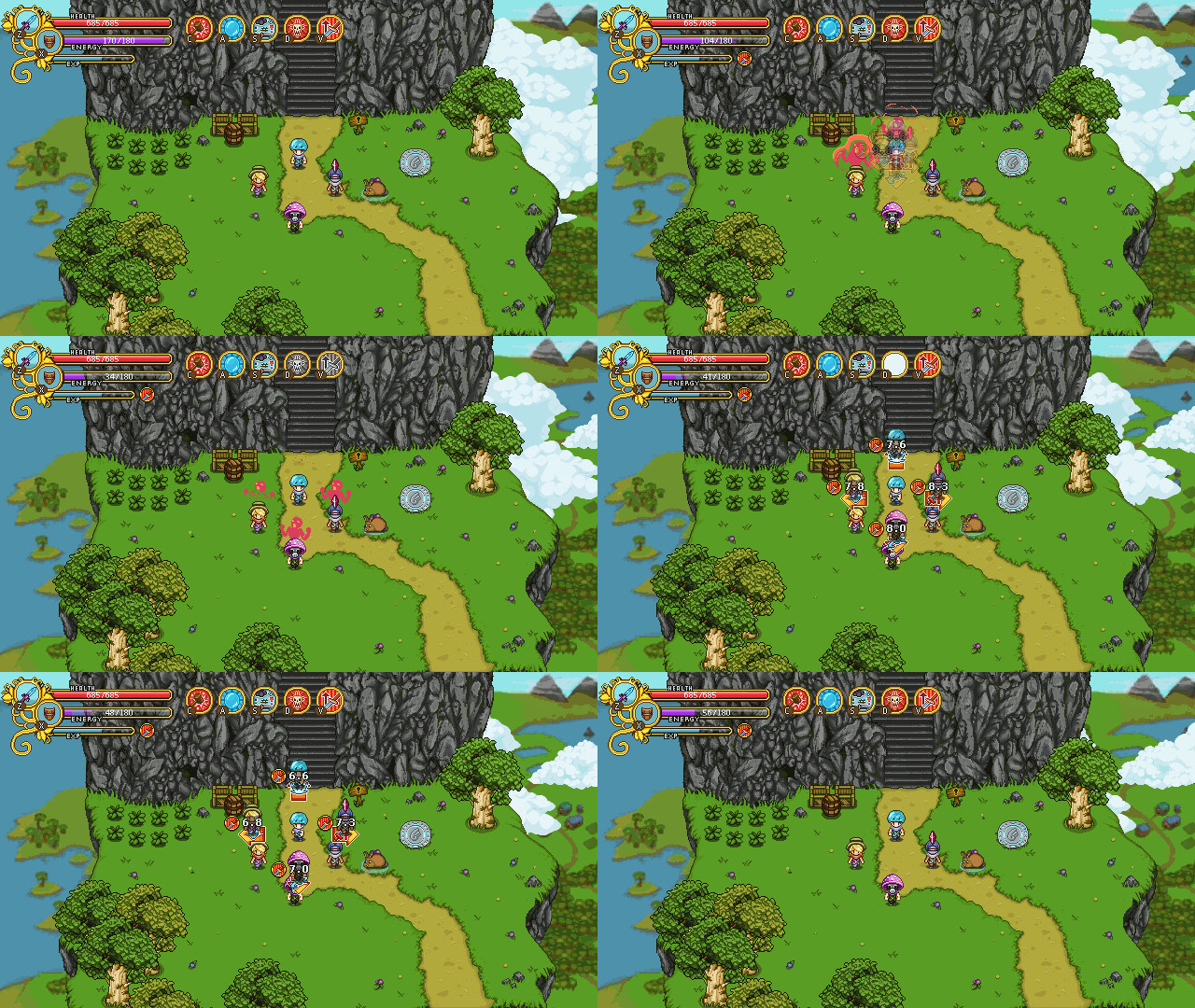
Now that the buffs are in place, it’s time to implement the targeting system for them. As mentioned in a previous post, you’ll be able to buff your friends in multiplayer one at a time, with a system similar to what we use for the Frosty Friend: you start channeling the spell, and as you do so several arrows will appear showing your friends. Press in the direction of the friend you want to buff and the buff will land on them. To buff another friend, simply cast the spell again and press in another direction. In order to buff yourself, you’ll need to press upwards after channeling the spell – but only in multiplayer. In single player the buff will automatically target yourself.
Our first idea was to show each character’s face along with the arrows, but as Teddy started implementing this targeting system, he came up with a different plan: showing the entire characters, including what they’re doing:
While this wasn’t exactly what we had in mind from the beginning, it kind of grew on us as we tried it out. At the very least it makes it easier to know which direction you need to press for which friend, as you can check what they’re doing right now and compare it to what’s going on in the arrows, while our previous idea would make things a little confusing if you had several friends with the same face and hairstyle.
One might argue that this version is a lot more messy, and I supposed they’d be right: however, seeing as you’ll not bring up this interface a lot after confirming which direction your friends are in (most likely you’ll just quick-cast your buffs as seen below once you get a hang of it, anyway), we don’t view this as a too great drawback.
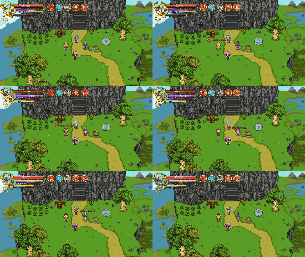
As can also be seen above, if you bring up the cast menu again after buffing everyone, you’ll see a timer counting down on top of each character. These timers show how much time is left before the buff runs out, which makes it easier saving up EP. Once the buffs run out an icon and text will appear above each character which indicating that this has happened (as seen below). This will only be visible to the one who cast the buff(s). You can always recast a buff before it runs out, so long as you have the EP to do so.
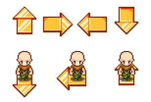
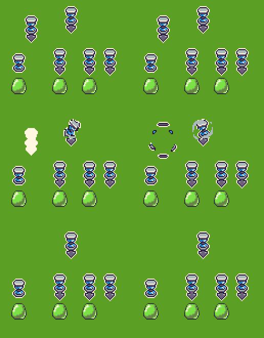
In the above GIFs, the arrows used are placeholder arrows (the Frosty Friend’s arrows, to be precise), with the character stuck randomly on top of them. Because we didn’t have any arrows that fit this purpose already, I made a bunch. The bottom image shows how we intend to place the characters on top of them, which is slightly different to how they’re standing on the Frosty Friend arrows as well:
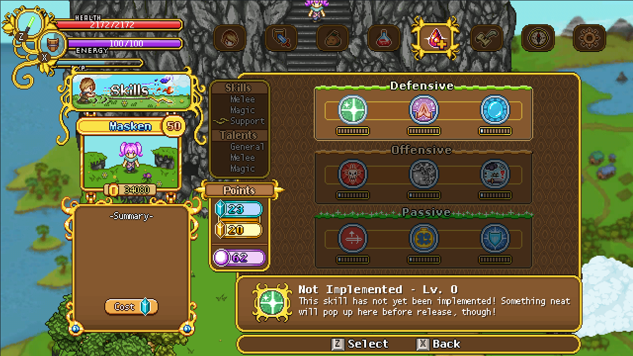
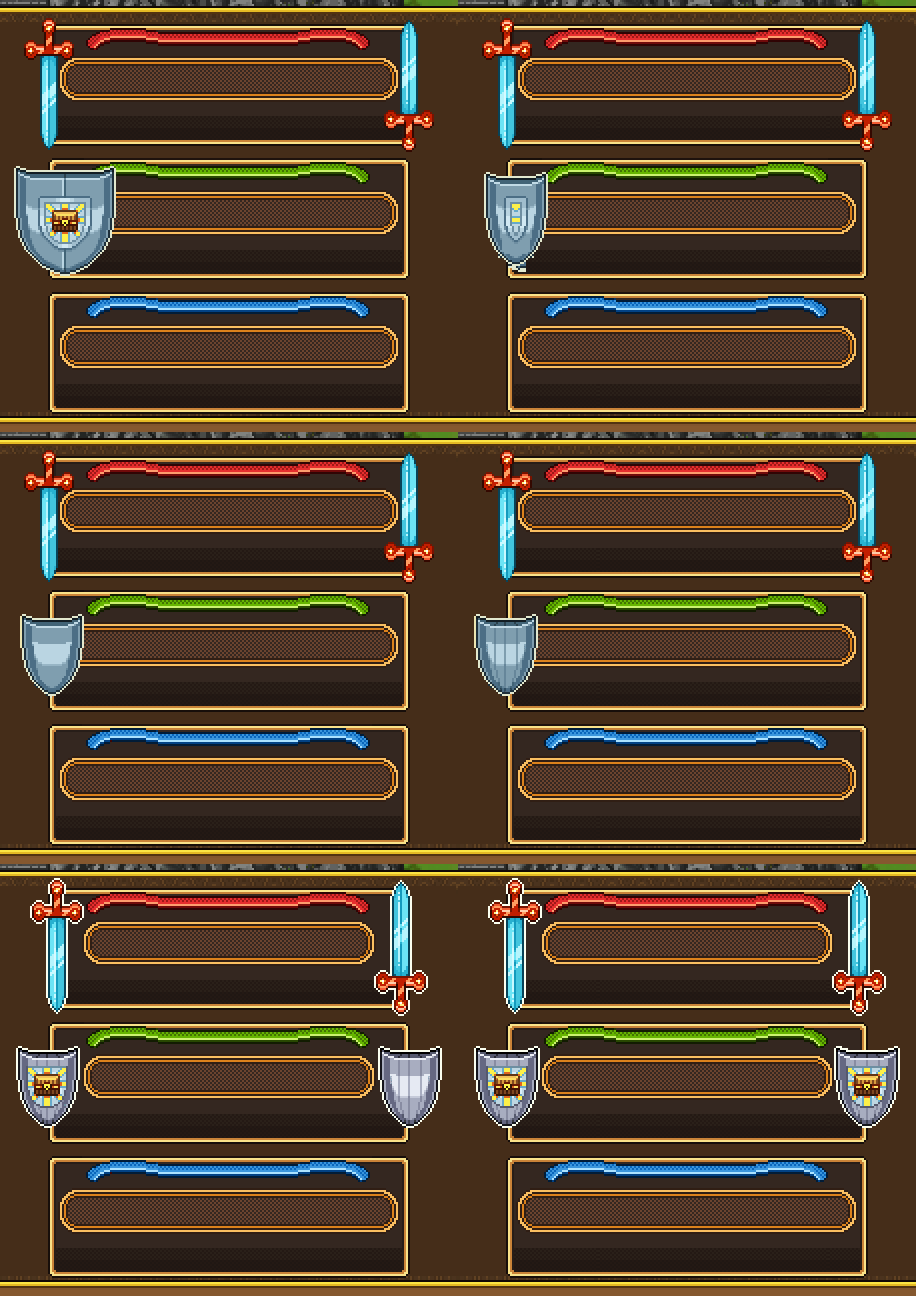
The next step on our quest to implement the Utility skills was making the proper menu backgrounds for it! The old one was rather outdated, and in fact much older than the rest of the skill menu:
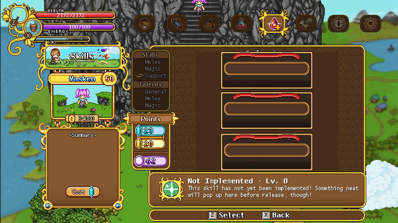
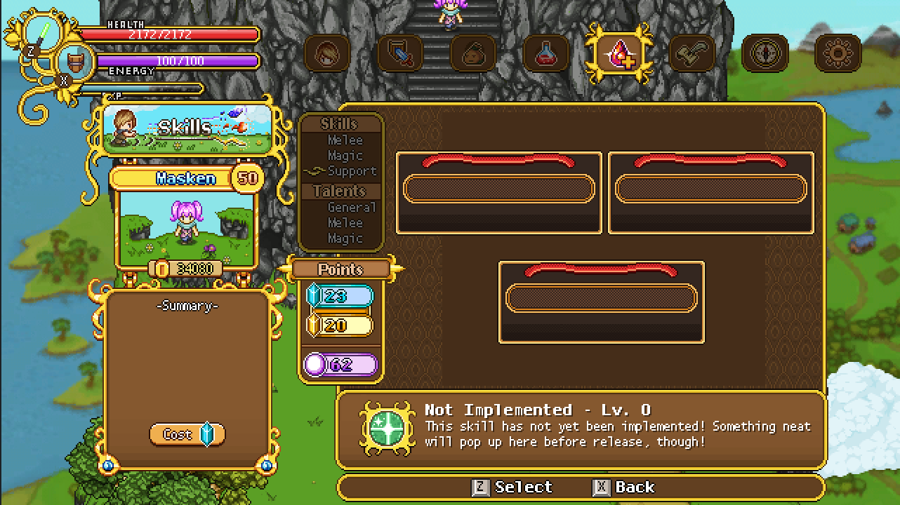
So the first thing we needed to decide was what kind of layout we want to use for these guys. Three in a row, or two next to each other with the buffs centered beneath them?
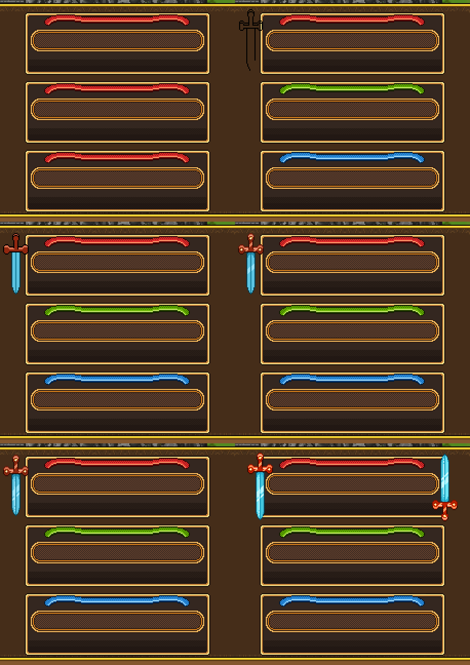
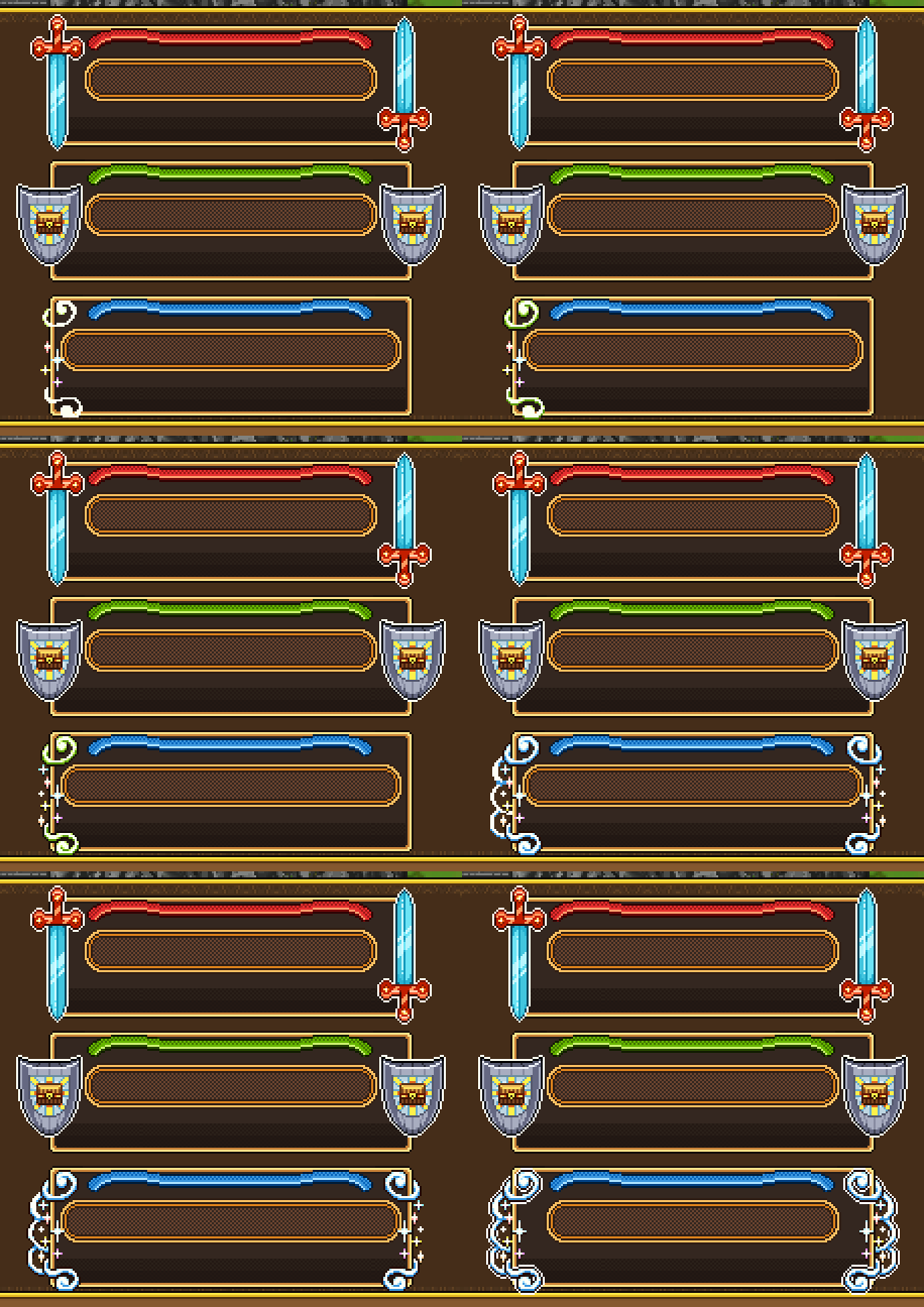
To avoid any confusion when jumping between the different levels, we decided to go three in a row, but make them slightly longer so they’d be more visually pleasing. Next, time for some decorations, beginning with a sword to don the offensive utility skill section:
For the defensive utility skills, I made an edited version of a shield that’s used in a different section of the menu (the talent area, to be precise):
Finally, for the buff section (which we haven’t given a proper name yet – might become something else entirely), some magic and glitter:
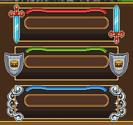
And in the end, here’s the new and improved utility skill section! At this point still missing the title texts and actual skill graphics, but that’s for Teddy to puzzle together with the engine:
In Fred’s department, the Utility skill stuff kept going on. First, the development of the blink:
From the beginning, what you see above is the effect we intended for the blink. However, because of how it looks when you’re not travelling in a straight line (for instance, if you blink diagonally), it became more of a hassle than we first anticipated. We could either rotate the effect in engine, which left us with a bunch of ugly artifacts, or we could have Fred make the effect in 8 directions – both options which weren’t too great.
So, we ditched the above design and decided to go for light globes spawning around the character instead instead:
In the newest iteration, the globes are a bit smaller than what is seen in the above GIF, but it sill gives a good idea of what it looks like.
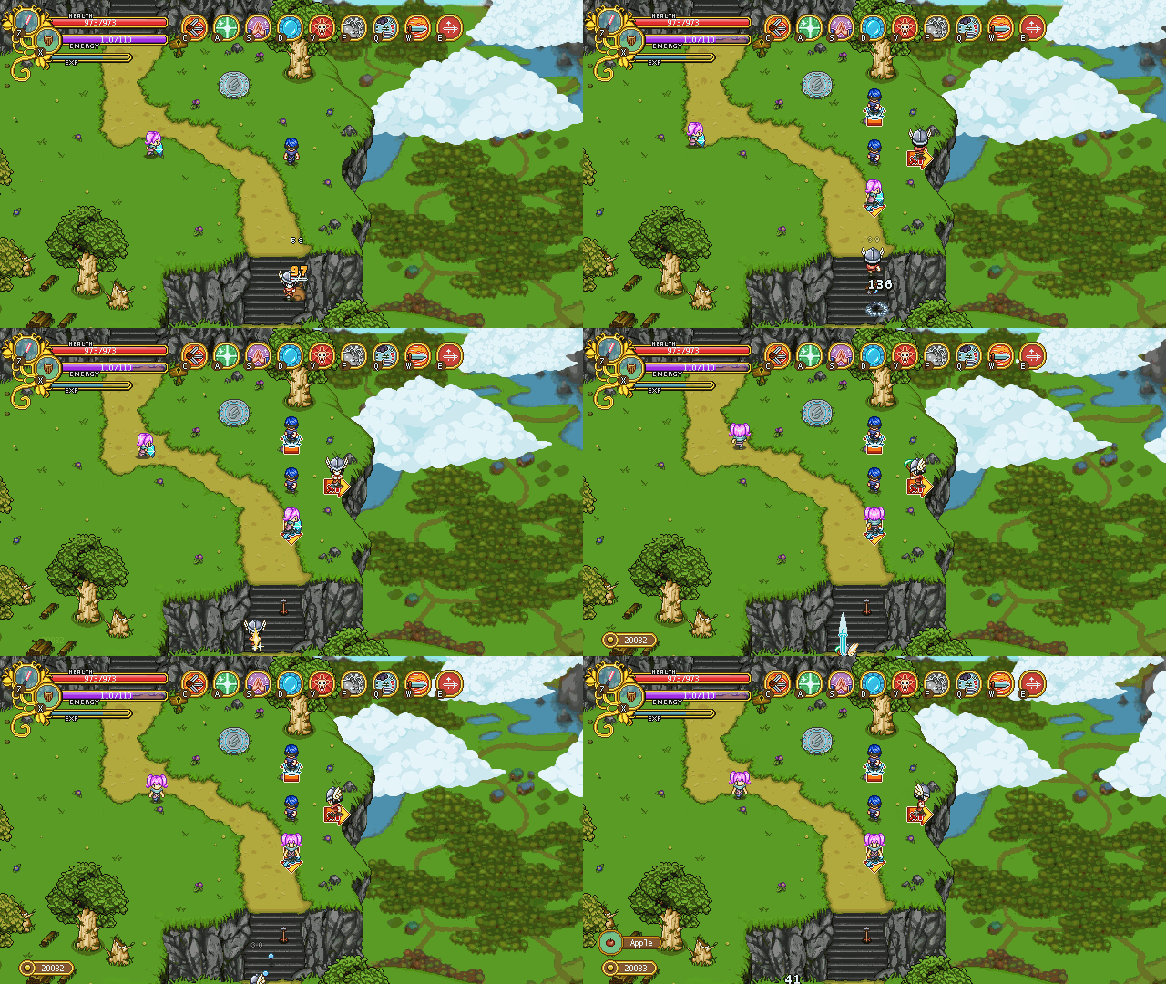
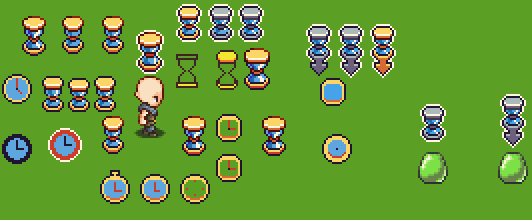
For the Stasis skill, we still needed one more thing: an indicator of some sort above the enemies as you target them, before you unleash the skill. Fred came up with a bunch of suggestions based on our initial discussion, where we though it should either be a clock or an hour glass, indicating time stopping for the enemy in question:
In the end, we decided to go for the hourglass, and as an added bonus, Fred made a quick animation as you unleash the spell on an enemy: having the hourglass either turn of shatter as the skill lands. While we liked both ideas, the shattering hourglass is the one we’ll use in the game for this skill:
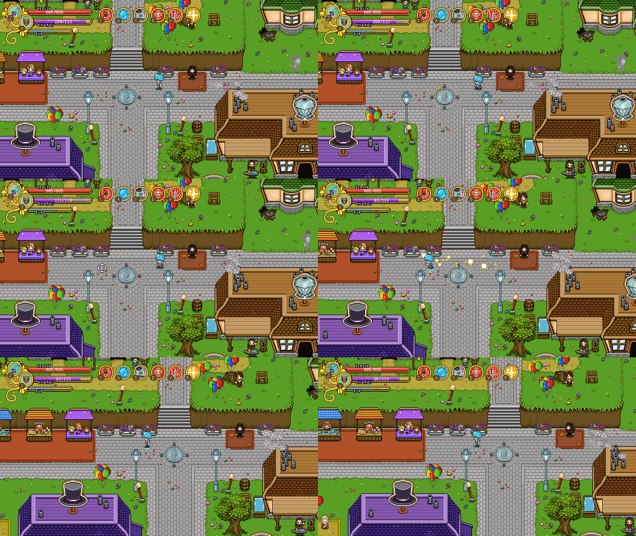
The Focus skill, which allows you to regenerate EP faster, got a new indicator appearing beneath the character:
The purple lines serve as a timer, of sorts. If you channel the spell until all four lines appear, you’ll be able to cast the next skill free of EP. We’ll also have a different channeling animation for this skill, possibly where the character is hovering above air – but at the time of writing this (which was before the patch) we’re still uncertain whether this will be available in the initial patch, or if it will be added in one of the many upcoming bug fixing patches once you start trying out (and breaking) these new skills!
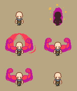
Finally, a little sneak preview of the work in progress of that damage buff we’ve been talking about:
We’re not 100% it’ll look like this once it’s done (could be a little too big for a skill that will be cast rather frequently), but it’s just a bit too funny not to show!
Now, I hope you enjoy the patch and come back to us with lots of feedback. Actually finishing all the skills seem like a big step closer on our journey to finishing the game as well, wohoo :)






This is coming out excellently. Can’t wait to see how I can use these skills in the runs. ;)