Good news everyone: the Bow and Talent patch is officially live (and has been since Thursday afternoon)! Go try those things out and let us know what you think. To summarize, the patch includes 21 new talents, sound effects for the utility skills and the revamped bow including a bunch of upgrades! As always, the full patch notes can be found over here~
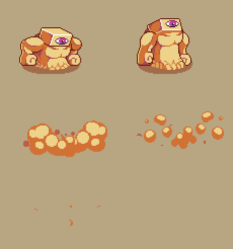
In Fred’s department, there has been three main things going on: making the bow upgrading NPC, continuing polishing the Solem animations and starting work on our next system upgrade, namely the potion rework. Once the rework is live your character will visually drink the potions, so that had to have a neat animation of its own. Here are some results from this week:
My main focus last week was also preparing stuff for the patch, starting with the final batch of talent icons! Final three General talents + the Melee talents:
Alchemist – Potions refill faster. Pretty self explanatory talent, and to make things even easier to understand visually I used the other potion talent icon as a base for this one.
Arrow Scavenger – Increases the number of arrows dropped by enemies. Featuring a bunch of arrows (or the ends of them anyway)!
Quickshot – Shoot arrows faster. For this icon I took one of the bow icons and put some effects behind it that I hope illustrates its increased speed!
Blood Thirst – Killing an enemy grants increased attack speed for a short duration. With a name like this I kind of wanted to make a blood thirsty animal or beast of some sort. Not super sold on the look, so might change it around in the future – we’ll see!
Combo Starter – After a normal attack, your melee skills have increased critchance for a short duration. Since we already have a ton of basic looking swords in the old talent icon, I went with a different kind of blade this time!
Knowledge is Power – MATK gives ATK. Using a book from another talent icon as a base, I changed its color around, making this icon’s color scheme a mix between magic colors and melee colors.
Riposte – Perfect guarding within x range of an enemy deals some damage to the enemy you guarded against. Bringing back the perfect guard icon to use it as a base once more, I changed the colors around to better work with the melee page.
Sudden Strike – After being out of combat for a short while, your next normal attack will have increased attackspeed. Here we have another regular-looking blade, but dropping from the sky this time!
Final lineup:
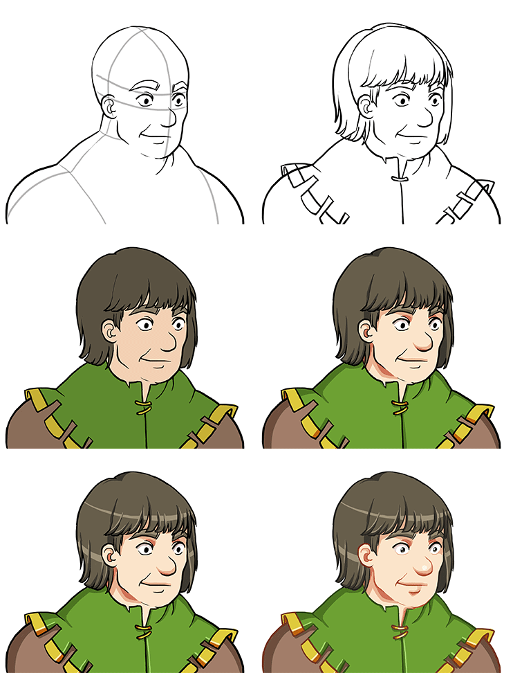
So in order for you to be able to upgrade your bow, we needed someone who can help you do that! While Robin, who first gives you the bow, might seem the obvious choice, we didn’t want him responsible for more than one mechanic – and as he’s currently in charge of the shooting mini-game, it seemed it’d be a better idea to make another character who can deal with bow upgrades.
Introducing Little J:
This guy will be carving bows outside Robin’s house. Once he has a new upgrade for your bow you’ll be able to purchase it for some gold!
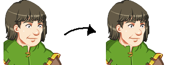
After some feedback from my fellow Pixel Ferrets, I made a small adjustment of the eyes:
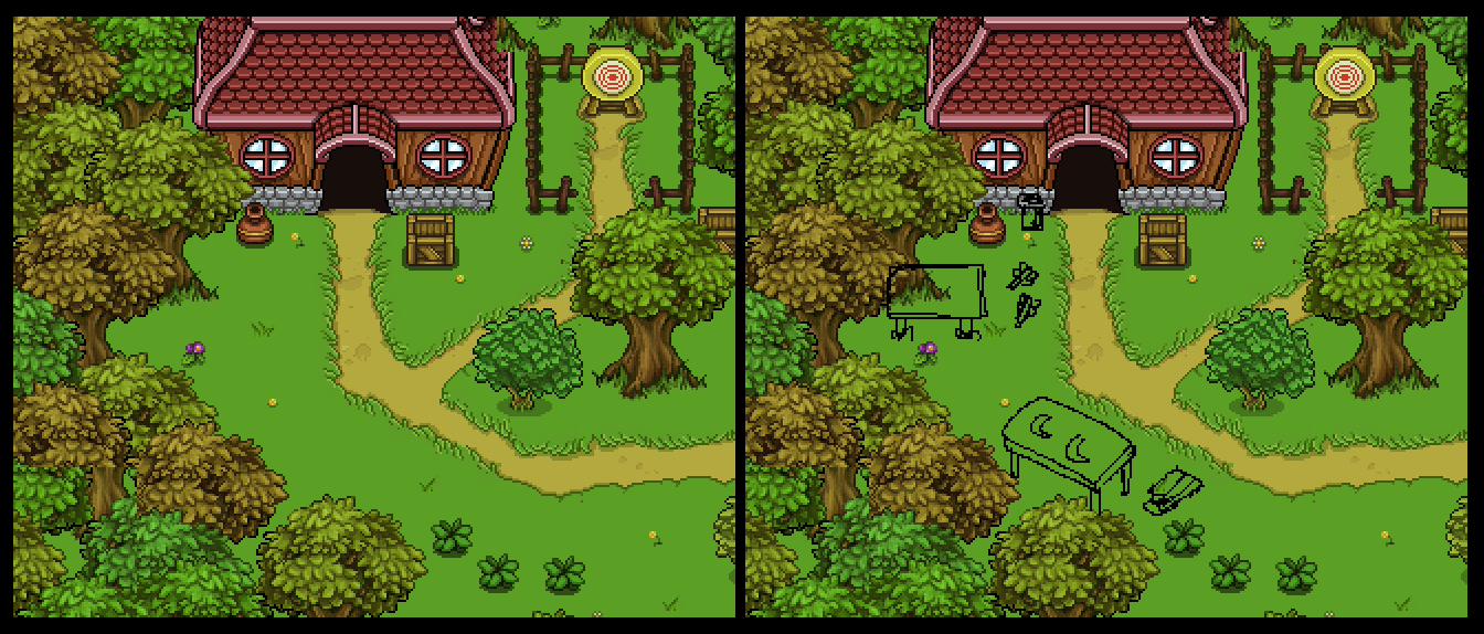
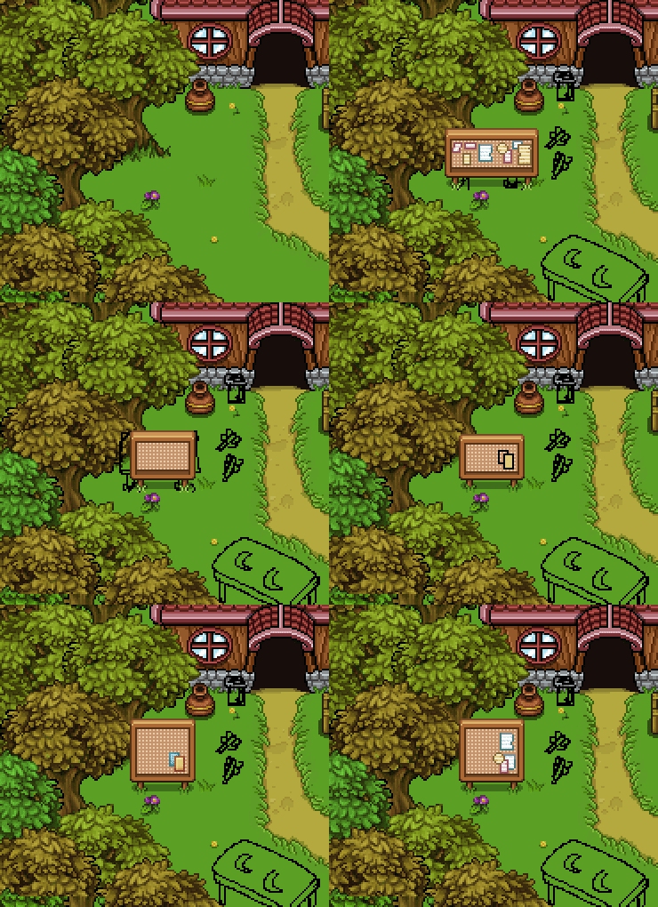
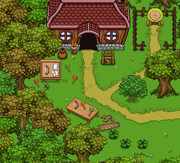
And next, it was time to actually make Little J feel at home next to Robin’s hut! In order to make it more obvious that there’s something for the player to gain by talking to this guy, we made a bunch of improvements to the surrounding area. Starting with some sketching:
First thing we’ll do is add a notice board of sorts, where the next bow upgrade available will be displayed. Here I’m using the notice board from the Arcadia rework as a base:
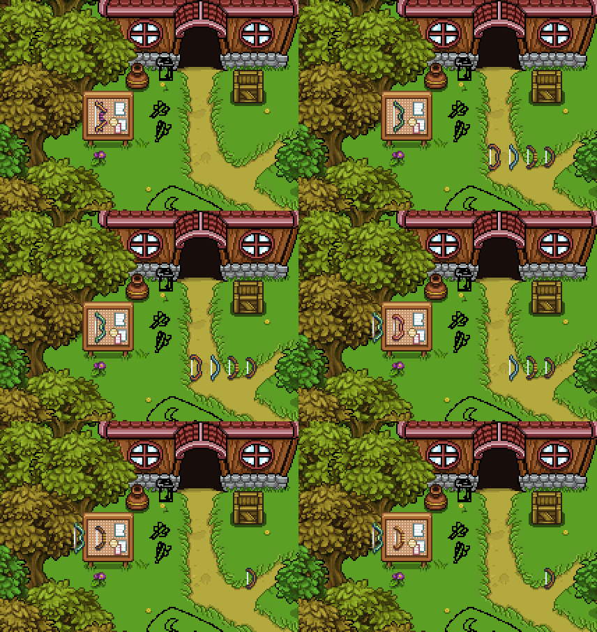
Now that the board is done, it’s time to bring in the bows and edit them all slightly so they merge better with the board. The very first bow won’t be on display since that will be the one you’ll have from the beginning (and the first upgrade will be available from the start):
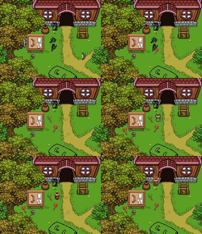
Next, some ground decorations: a bunch of arrows, and a quiver next to Robin’s door:
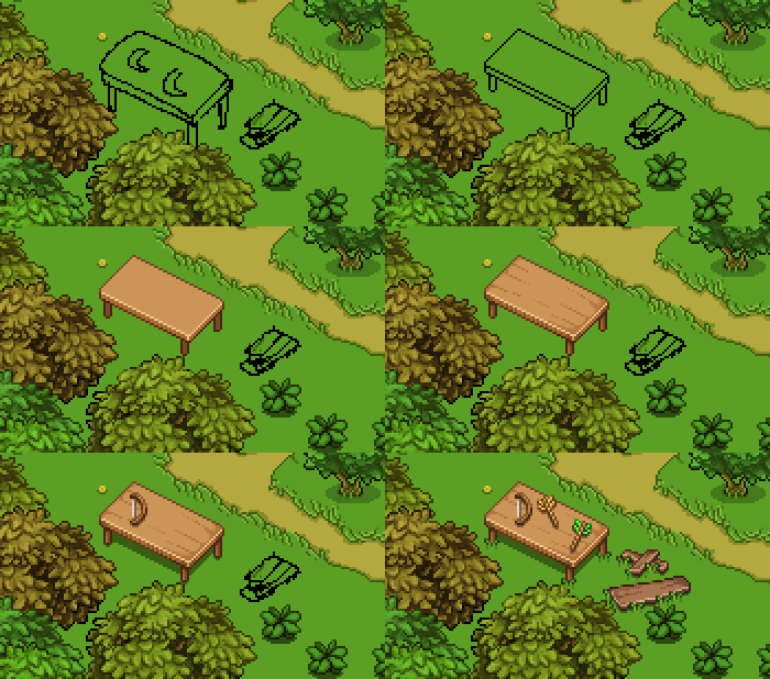
Finally, Little J’s working table, where an old bow and some arrows lie forgotten:
And here’s Robin’s place after the added stuff! You can kind of see a difference in quality of the props made now compared to the old ones. Maybe someday (when the game is done), we’ll go back and touch up old areas, improving the overall graphics. For now, we’ll try to steer clear of doing too unnecessary improvements, as we want to finish this game within our lifetime:
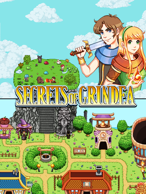
As some of you have noticed, we also (finally) made a cover image for Secrets of Grindea on Twitch. It’s been on my to-do list for a while, but has been pushed back due to other things being more important – but with this bow upgrade being mostly out of the way, I decided to throw something together before moving back to Arcadia stuff.
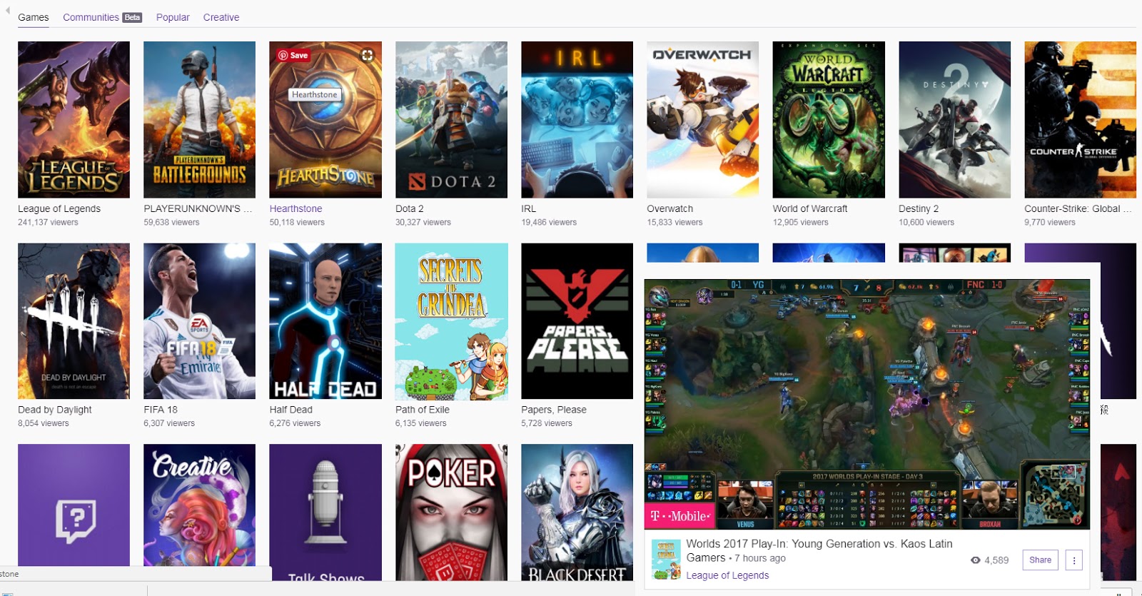
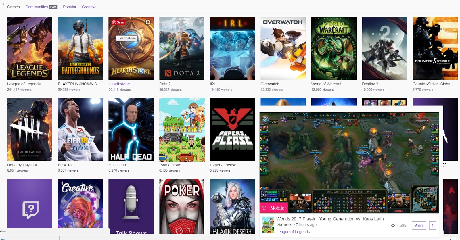
So to make the cover image, we wanted to use graphics already available to us, at least for now. Maybe in the future we’ll do something more epic. Using the capsule image from Steam and a screenshot of the Arcadia rework, we pieced some graphics together and made a couple of mockups which can be viewed below (pretending to be Path of Exile).
We resized our mockups on top of other games in order to get a feel for what the image would actually look like in the end – you’re supposed to provide them with a quite large jpeg file, though for the most part its resized by Twitch as seen below. We felt the best way of trial and erroring this was playing around in Photoshop rather than uploading 500 versions of the image and trying it our in real time:
In the end, we decided to go with the third one. The big version can be seen below! Note that the logo has been resized into a bigger version in a rather crude way, which means it’s a little blurry. This is because we didn’t want to completely remake it and take more time from doing actual game stuff at this point. Since the image is mostly viewed in a much smaller version where the blur won’t be visible anyway, we felt this was OK for now:
With the Talent and Bow updates drawing to a close, it’s time to look ahead and start planning for the rest of the Arcadia Rework. I’m almost done with the rework of the outdoors, but after that there’s still some important stuff left: the indoors.
To make sure we’re on the same page, we got together to discuss exactly what will be available in each of the buildings, coming up with the list below:
Inside the Dojo there will be enough space for a small battle area, where your challenges will take place. Beyond it, Master Ji from story mode will sit, and it’s him you’ll have to talk to in order to activate the challenges. Once you activate a challenge, your character will be teleported to the battle area you just passed through.
In multiplayer, you’ll only be able to do these challenges solo. To make sure everyone can use the Dojo at the same time, characters who are currently partaking in the challenge will disappear from the map, meaning – unfortunately – that you can’t spectate other users as they do their challenges. In this case we felt it would be better for players to be able to take on the challenges at the same time rather than having to wait for someone currently doing one to finish.
The interior of the Farm will be pretty straight forward: hay, buckets and sacks of wheat. And enough space for your favorite farmer, Oak to give you new quests!
The Aquarium will feature a huge aquarium on the topside wall, around which painted decorations featuring seaweed and fishes will be added. We’re currently discussing what kind of fishes will be available in the aquarium, whether all of the fishes will be or just one or two from each area. We’re kind of into the idea of having one fish per area (meaning less animation work for Fred), each which you’ll be able to catch and keep during a quest given by the Aquarium owner.
The Bank will be decorated office style. Desks, water coolers, the occasional plant. A vault where the gold is kept!
The Cinema will look pretty much like a cinema, with a receptionist selling tickets near the entrance. This will be where you select which replay you want to watch.
The Inn will look much like it does now, some sitting areas and a bar. The Arena reception will look much like it does in Story Mode as well.
The Clock Tower will have a rather small, round, room, with a window on the opposite wall where you’ll be able to tell what time of day it is. You’ll change time by hitting a small bell in the middle of the room, which will – through magic – cause time to speed up. The big bell on top on the clock tower will chime as the scenery changes outside the window through an animation made by Fred.
And that’s that! Looking forward to diving into all of that soon~ :3








You can see so much improvement in the pixel art, amazing work! The pixel art and animations are my favorite.