This week it’s time to move on to doing some interiors for the Tai Ming arcade floors! Since Tai Ming is a town, it would be kind of weird to not have any houses you can go into, so we decided to make a few variations!
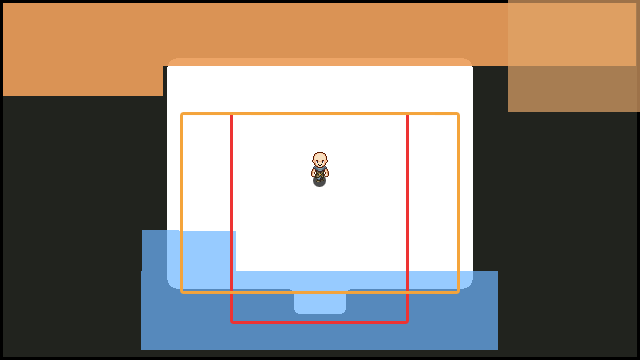
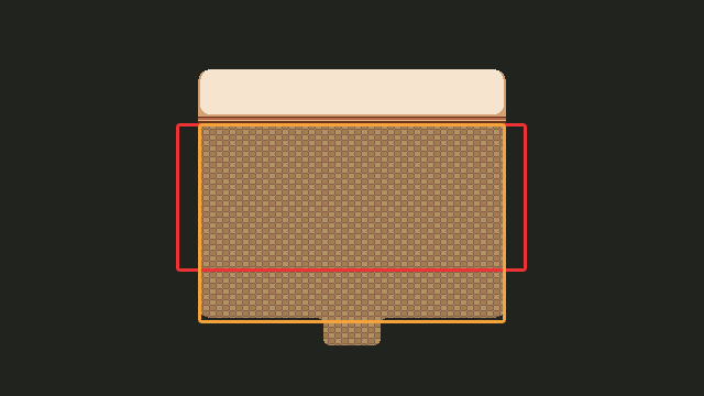
First up, deciding on the sizes (paying extra attention to the user interface limitations this time):
Starting off with the wider of the rooms, I add some basic walls and floors to create a shell we can use to decorate these interiors in various ways:
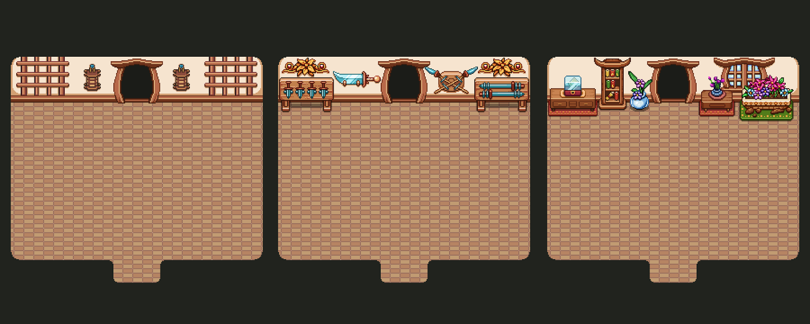
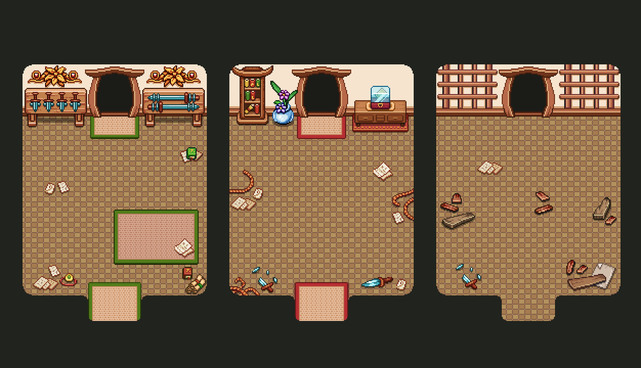
First up this entails wall decorations! For this shape, we have three variations of what the walls can look like:
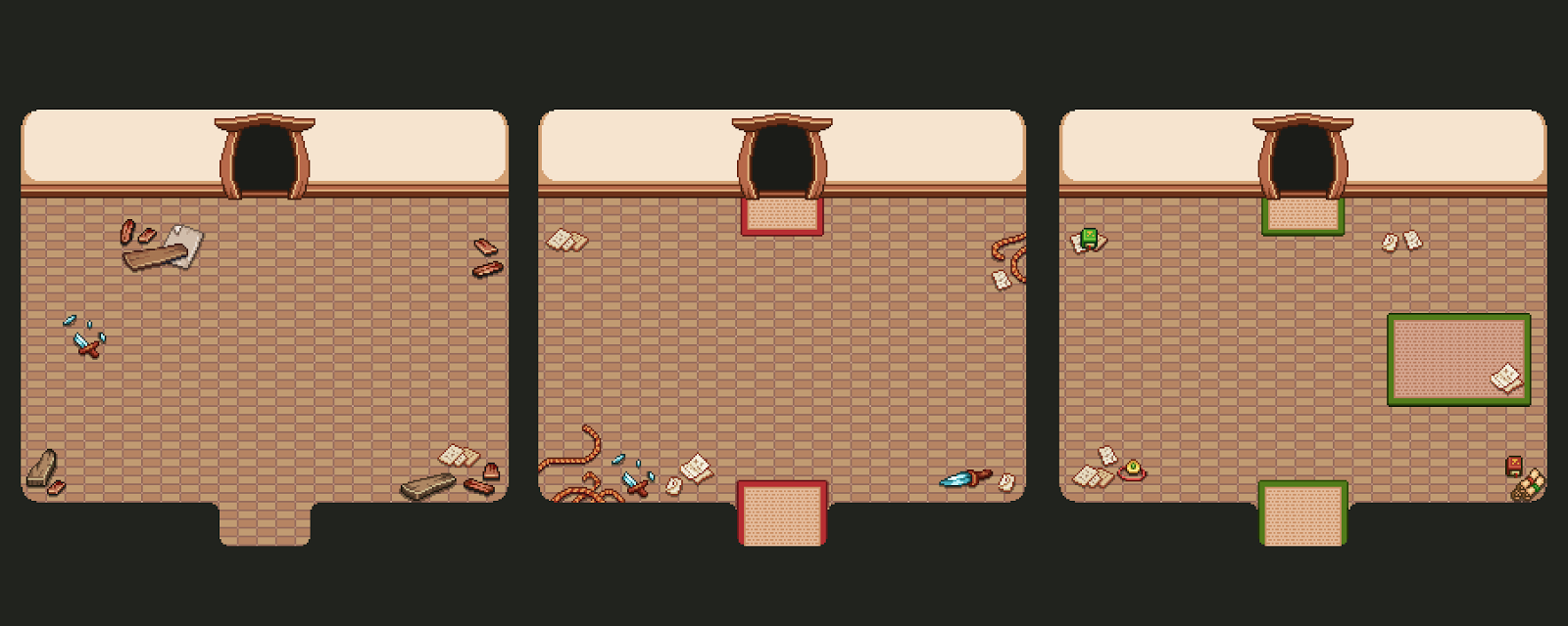
…and they in turn can be combined with three different floor layouts:
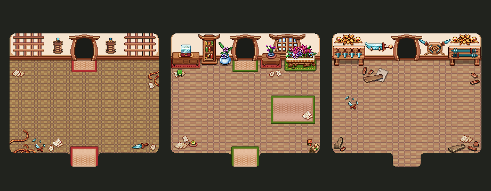
Using these six types of decorations, we can mix and mach and create quite different rooms, even though the shape is the same! As you can see, we also added another type of floor texture to mix things up even more:
And then, it’s just doing the same thing all over again, but with the smaller version of the room:
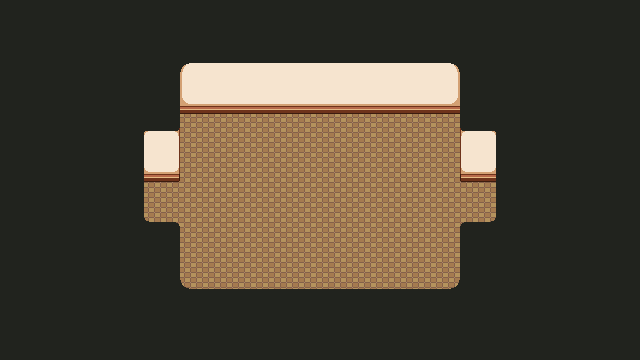
Now it’s time to make a bunch of rooms that go in the other direction (horizontally)! Starting off in the same way, deciding on size and adding the basics:
Then adding a bunch of wall and floor decorations:
And here are some mix and match examples of what these houses can look like:
While there isn’t a ton of variation, there also won’t be a lot of house interiors, and even if there were we think it’s probably not going to look too much the same (especially when you compare it to previous floors, which were all very basic and same-looking)!
As for the final part of interior creation for these floors, there’s of course turning everything into its present version, ruined and forgotten!
Some of you may remember a discussion we had about whether the player would pass through the same rooms, once in past and once in present, or whether enforced time warps between rooms would determine whether the next room is past or present (and as such only available in that state).
Back then we were more into the idea of reusing the same rooms and showcasing them in both past and present, but since then we’ve realized that having the rooms isolated in either a past or present state is more time efficient, and in the end, may be more straight forward for the player as well. In the earlier version it would mean there are two states of the map at the same time, with different room types in them (challenge rooms and the nurse, for instance, would only be available in one of the states and you’d have to travel back and forth if you wanted to return to them after changing time).
So, with that decision, it opened up the opportunity to make even more layouts for the present type rooms, allowing for even more variation!
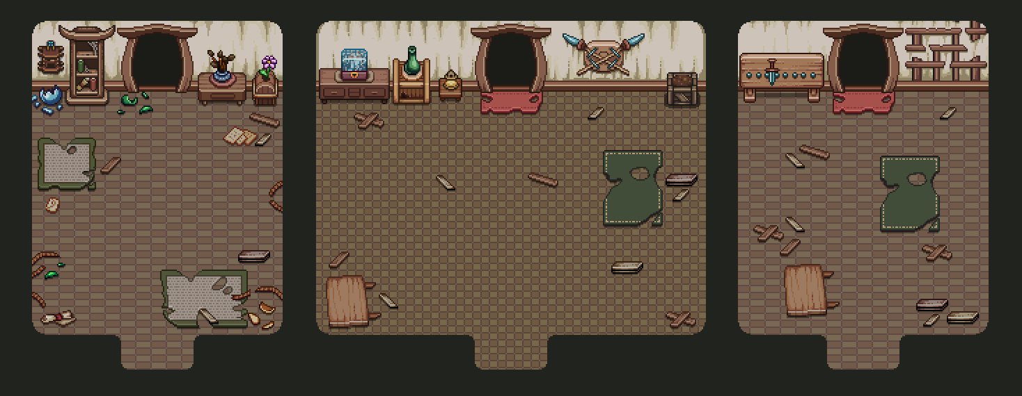
Here’s some of the wall and floor decorations:
And here’s a bunch of mix and matching, showing all types of rooms:
One step closer to finishing these arcade floors, wohoo! :)
And now, moving on to boss rooms! Each of our bosses are in rather special places, so instead of just sticking them into random rooms, we decided to edit and adjust the areas they are in to fit the Arcade version instead.
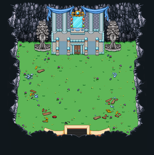
Starting with the Mimic, it’s pretty isolated in it’s own room, so technically we could just have had it appear inside a random interior. However, since we want to show off that the Mimic is coming (in more ways than simply having the skull map indicator for those who are looking), we decided to bring in the entrance to his lair from the game:
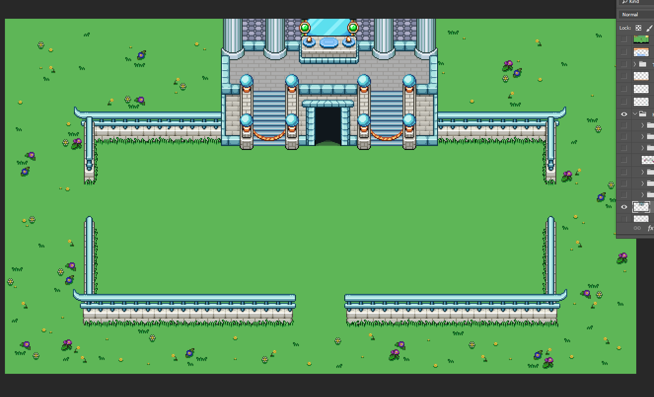
Of course, a few adjustments were needed. For one, we didn’t want to use the whole map, so we extracted the building part, removed the door, and added ropes to keep you from going up the stairs:
Trying it out in photoshop, it doesn’t look too shabby when you connect it to the stone fence:
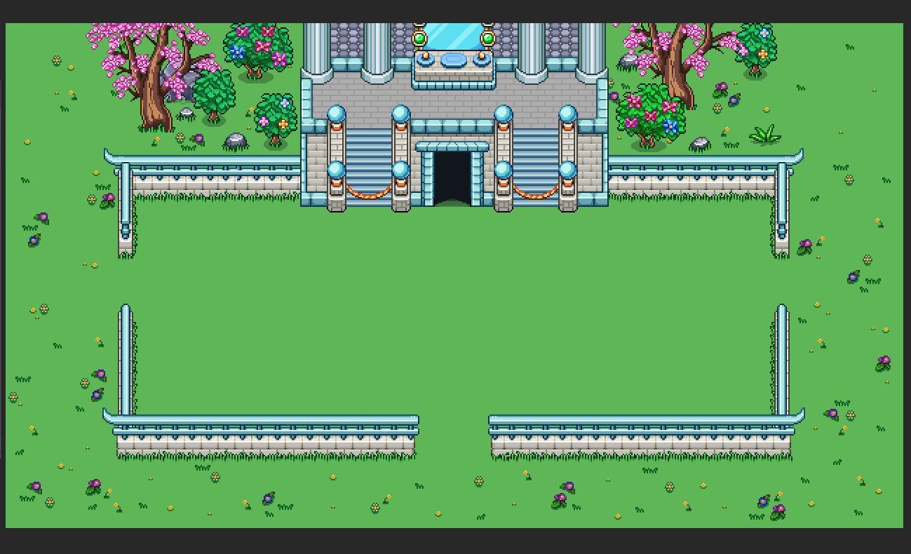
We also added some specific decorations for when this room appears, so that nothing will get cut off:
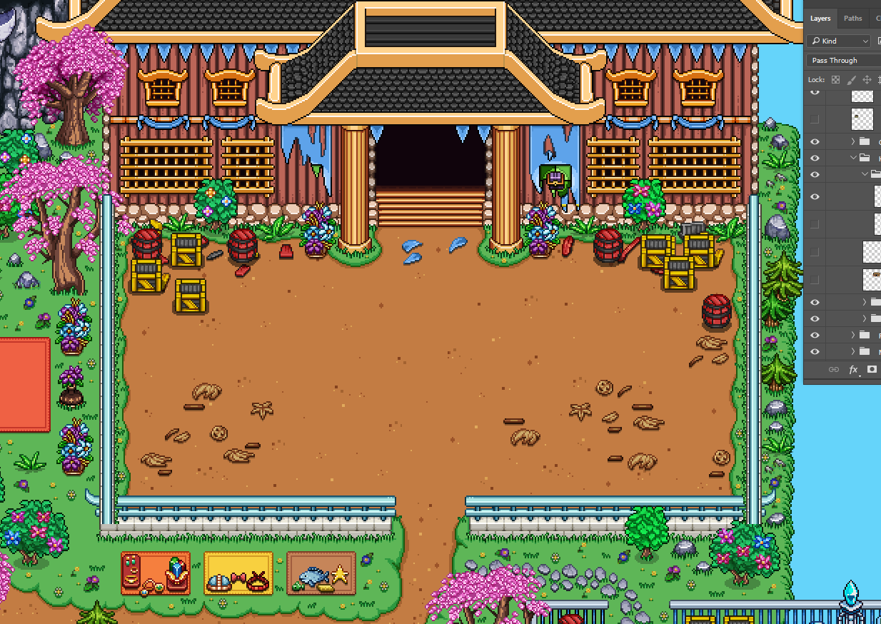
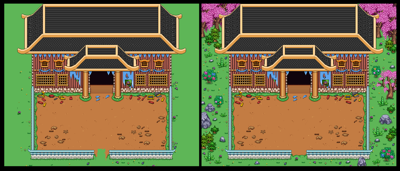
As for the Thorn Worm boss, its arena is pretty set in the middle of town:
…But we extracted the whole building and made it a map of its own, removing all the distracting surroundings and fixing things that got broken in the move. Here, too, we added a bunch of decorations surrounding the battlefield, and you’ll be able to exit to the next floor by going through the big door:
As for the third boss, the Priestess…
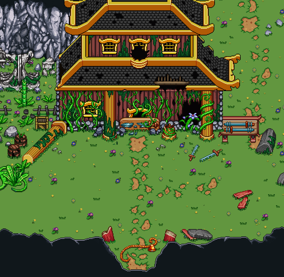
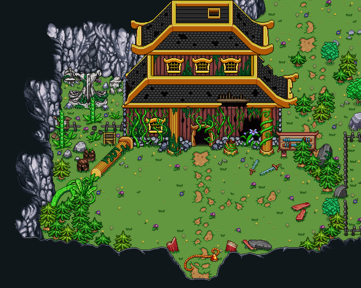
…we use pretty much the same method! Extract the whole area, remove things that are unnecessary to the fight and fix any things that need fixing. In this case there was no version of the building with an open door, and since we want the player to progress into the next floor through its interior, I had to repaint the area surrounding the door to make it open:
Now we just need to make a corridor that you will run through in either past or present state depending on which of the bosses you faced, in order to reach the next floor!
Meanwhile, there’s one more week of fishy updates, but this is the last one! With this post all the fishes have been animated and are ready to be added to the aquarium:
Now that those are out of the way, Fred can finally go back to creating NPCs for the desert, which is what we’ll be diving into as soon as we finish up our Arcade Mode business. There are still quite a backlog of portraits I’ve made over the months for random character that will live there, so he has his work cut out for him for a while!








Yaaaay, fishies! The manta ray looks like a pancake… pancake fish! Brown it, add butter and syrup, call it a pancake ray! :D
Thank you for all the work you do, both in writing and in game creation. Diving in, opportunity, allowing for variation… These words are all so consistently positive and upbeat with every post, and that makes me happy and excited to play the game. The conversational phrases you use (such as “pretty set,” “pretty much,” and so on) makes me feel like I’m listening to a well-rehearsed verbal presentation on the state of the game, instead of a formal and structured report or a half-apologetic bug fix. I may have read this post too late for Thanksgiving, but I guess it’ll work retroactively.