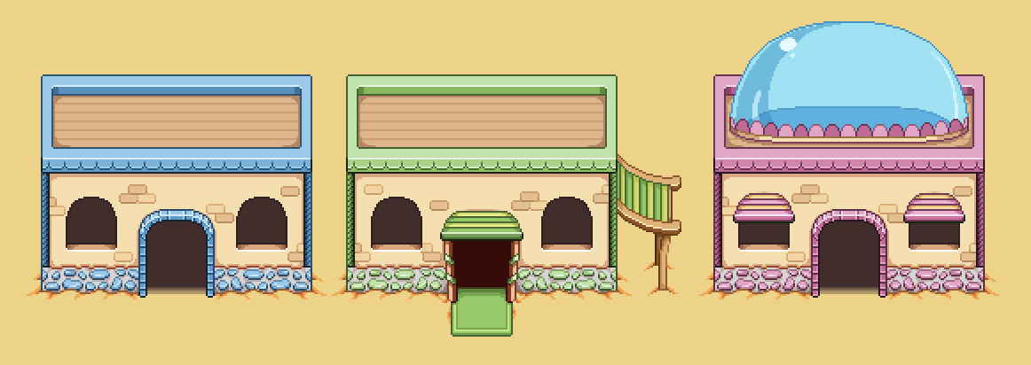
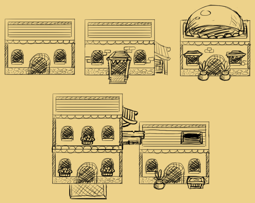
Another week, and work on the desert continues! Before I start sketching the town layout, I wanted to get a feeling of how the houses would look like, so I began to sketch a bunch of alternatives for random basic buildings. Like the house in one of the desert maps, these have a slightly different design compared to the rest of the houses in the game, much like the buildings in Tai Ming:
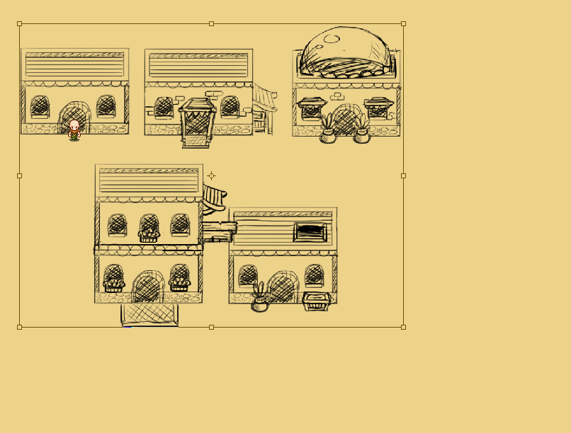
Once I was done with the sketches, I added a character sprite and quickly realized they were much bigger than they would be in game, so I resized them to fit better:
In order to truly grasp what they look like, I decided to make a few of them in the actual artstyle too. This will give a better feel for color and shape, and I’ll be able to use these houses in the game, or at least parts of them, depending on what the final town design ends up being.
Here’s the WIP:
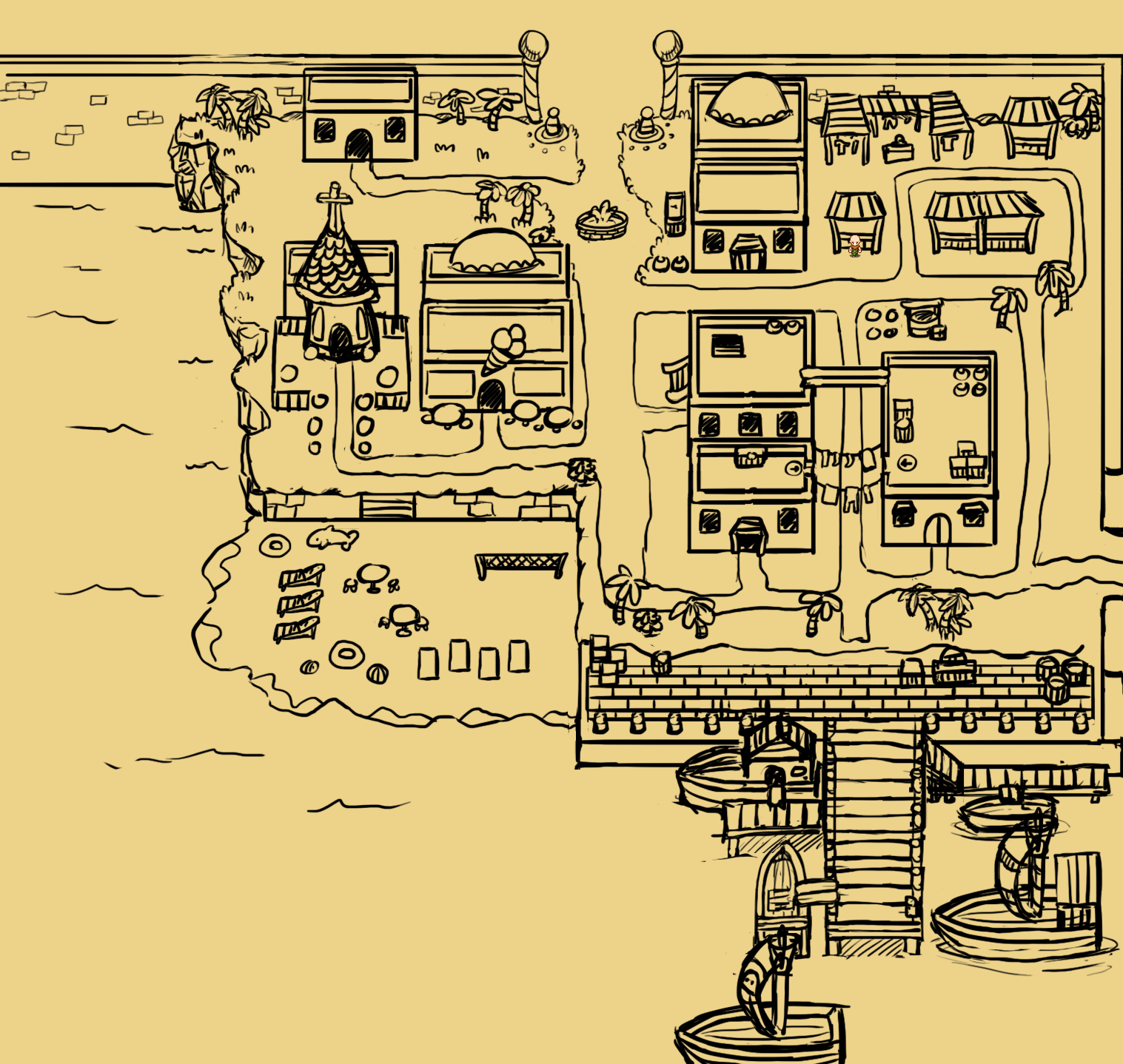
Alright, time to start looking at the desert town! …Neither the desert nor the desert town has been named yet, I guess we’ll have to fix that sooner or later… But anyway! As mentioned, we had already decided on a bunch of major things we wanted to include in the town, among those a church, an ice cream parlor, a marketplace, a beach and a harbor area with ships. With this in mind I began making a sketch of what I imagined the area to look like, with the list of features in mind:
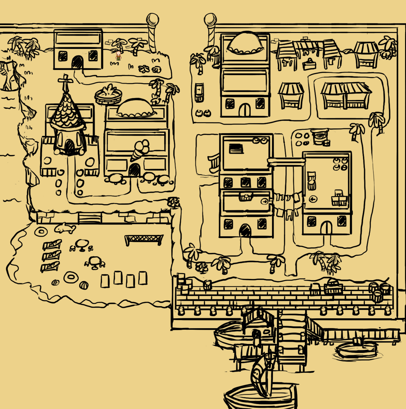
As always with these sketches, we added it as a flat background to the game and ran around in it, imagining it the way it’d look when everything is done. It led us to a bunch of changes:
* Adding more water to the bottom and left, making sure the camera doesn’t stop scrolling when you near the edge of the land. This makes it more pleasant to the eye and helps give a feeling that the sea is more vast.
* The bridge near the harbor area would be increased in size, both in regards to width as well as length. We plan on adding a bunch of NPCs to make it seem bustling enough. We also added more ships, to increase the sense of it being a lively port.
* We reduced to overall size of the entire thing (but just slightly), with the exception of the beach which we found to be of adequate size.
* We made the north entrance a bit more fancy looking, having space for a couple of guards rather than palm trees being the very first thing you run into. We also moved the fountain near the northern entrance to a more central position.
Here’s the upgraded version, and what we’ll use as a base for the city:
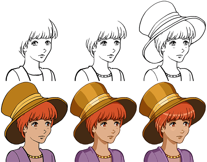
And as Fred keeps making NPCs, I get to make more portrait. This time it’s for the lady gardener, struggling to get the vegetables growing (maybe if she stopped pulling them up and let them grow it’d go better, but who am I to judge). Here’s the sprite, for those who forgot:

And here’ the WIP and final (for now) portrait:

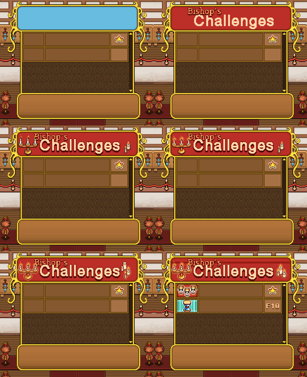
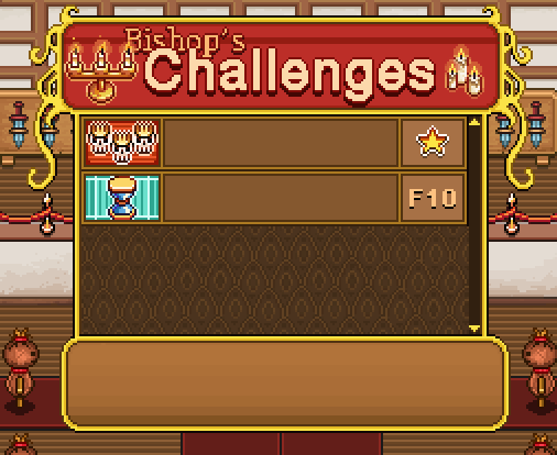
A quick break to fix some Arcadia things that popped up! To begin with, Bishop’s challenges of course needs a interface of its own:
The basic design is pretty much the same as Master Ji’s shield training, but instead of having either a star or nothing, this interface will show you what floor you reached on your best run during a challenge! Completing a whole run will give you a gold star, though to be honest we don’t expect a lot of people to manage that:
A slight adjustment has been made to the inventory title box in Arcadia as well… For as you can see, the original version includes bag:
…and since bag is not included in Arcade Mode, we simply replaced him with trunk instead:
The health pot also won’t be available from Remedi’s potions in Arcadia. It’s possible we’ll include an Arcade-only potion, but until we come up with one or in case we don’t, we made a special icon showing that the health pot is unavailable in this mode:
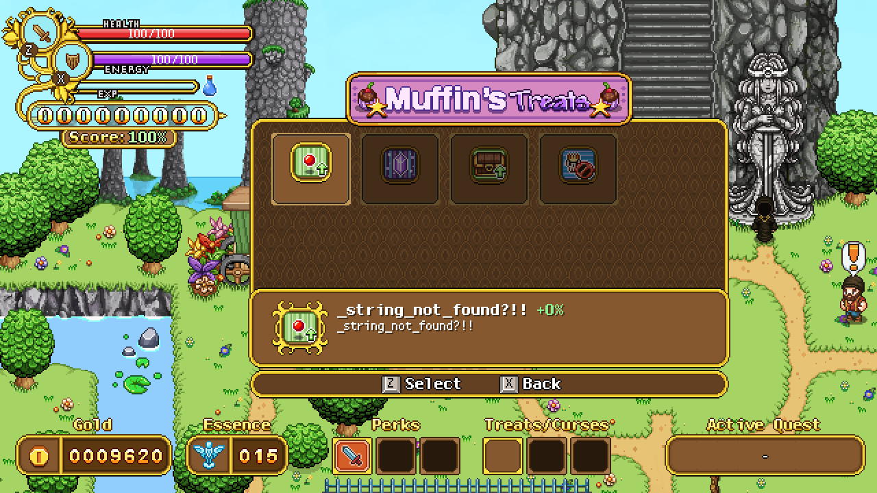
Teddy’s working on implementing each of the new buildings, and while working on Muffin’s Treats we realized we need to edit how the item frame(s) look:
As you can see the item frames are a bit too big for the treat icons, so I made a slightly edited version of the fancy one in the description box that will be used for these! As I took the opportunity to upgrade the overall look of it, we decided to update the regular item frames in the rest of the game to look more like it as well:
As for the selection frames, they will be using the treat/curse frames seen in the bottom UI instead, but at the time of the screenshot, they hadn’t been implemented just yet.
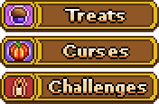
Next, we forgot that you of course need to browse to Treats, Curses and Challenges in a popup window (same as when you select buy or talk in shops), so they needed icons as well:
Finally, a minor edit: we decided to change name of Trunk of Tricks to Trunk of Tips:
This way it’ll feel slightly more different from Bag of Tricks :)
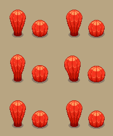
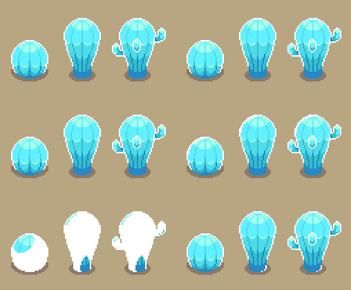
As for Fred, this time around he has animated the cacti I made a while ago! As mentioned, these won’t be destructible but will only wiggle a little when you hit ’em:
Some of them will be able to get frozen though, and those you’ll be able to destroy to make your way slightly quicker through the first desert area:
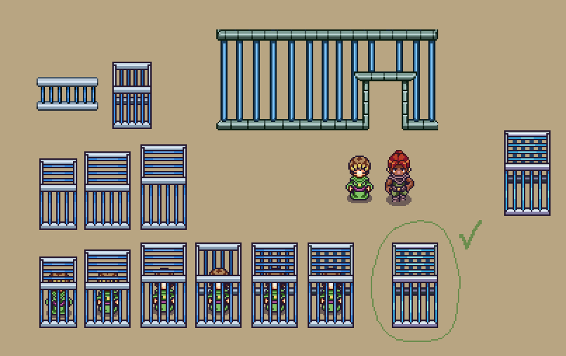
In Arcadia, a cage being built to house NPCs that you’ll be able to release during your runs after defeating a mini-boss!
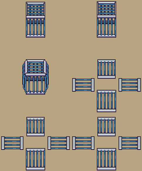
Of course, it also needs an animation for when you successfully save a captured NPC and let them go:







Looks great! So, it looks like the art part for Arcadia is almost over and now you mostly work on Desert, so I wonder how much work is left for Coding part and if we can have any ETA for Arcadia Rework? I realy want to play it a lot!