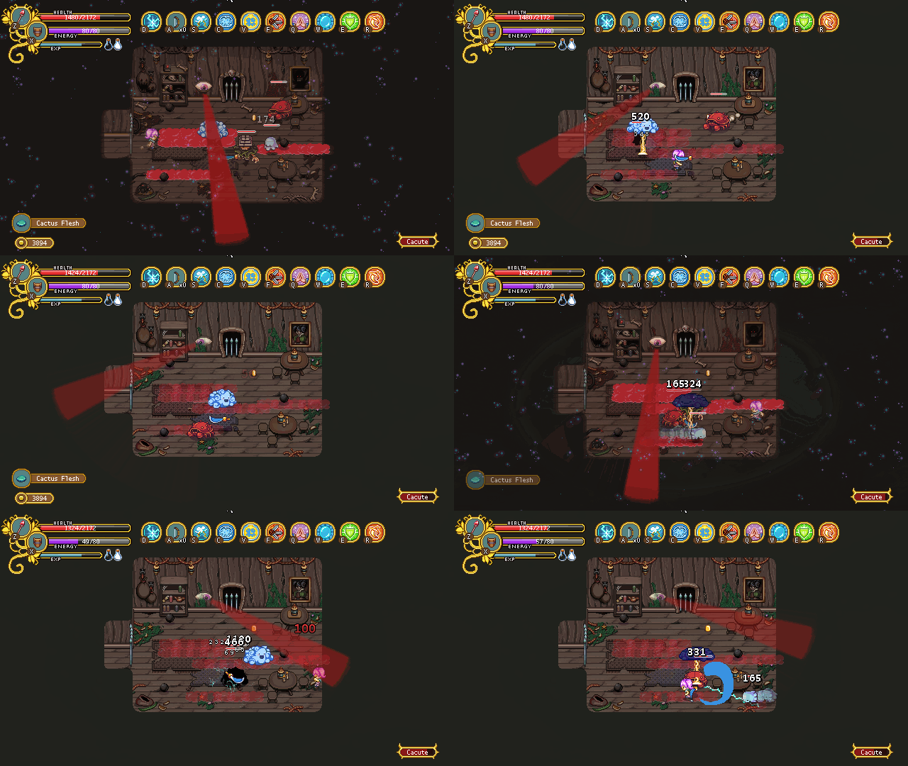
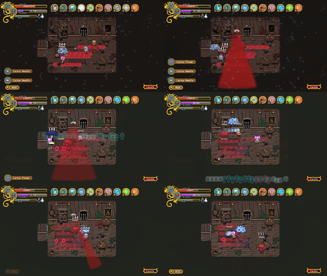
This week it’s time for some more trap prototyping! This time we’ve been working on those eyes we’re using in the ‘ghost bridge’ room, but here they serve as a ‘trap’ of sort in an ordinary fighting room.
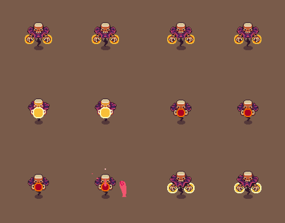
In our first iteration, we used the eye in the same way we use it in the ghost bridge room; basically moving back and forth in a set speed. If you’re in the regular world, the beam from its eye will be slightly transparent and won’t deal damage, while in the ghost world it’s darker and will damage you quite a bit if you get hit by it.
For the second iteration, we wanted the eye to feel more ‘alive’, so we’ve given it a couple patterns. Either it will slowly open its eye and cast a beam straight forward, or it’ll look to the sides as in the example above for a little bit before closing up again. These patterns are then randomized so you never know which one it will do next; you’ll have to keep track of it to know how to dodge it.
We do prefer the second version so far, as it makes the eye feel more like a living thing rather than something that just ‘blindly’ (ha) looks back and forth forever. It also keeps the players on their toes a bit since they need to keep track of what it will do next, rather than just dodge the eye beam over and over.
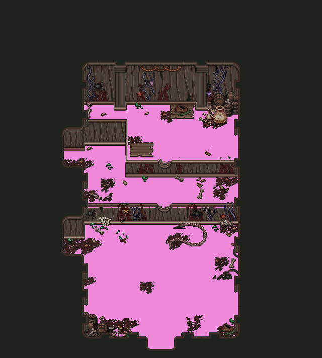
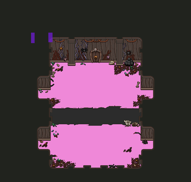
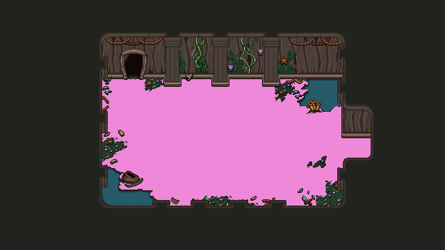
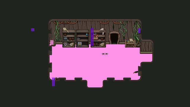
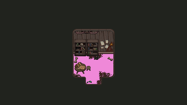
And now, time for something much less exciting but still very needed… Some background masking! This is a technique we use when we want certain effects and such to only be visible on the floor and nowhere else. Basically, each part of the floor is painted with a color (in this case a pretty pink), which will be used as a guide in the game for where the effect can appear.
Starting out by applying this to the first floor rooms, since we want to finish up the first floor and get it all sorted out before we move on to the other floors:
Next up, the captain’s portrait! To make sure I’m getting his features right, I’m going to trace the boss sprite for this one, using it as a base for the portrait:
And here’s the finished thing:
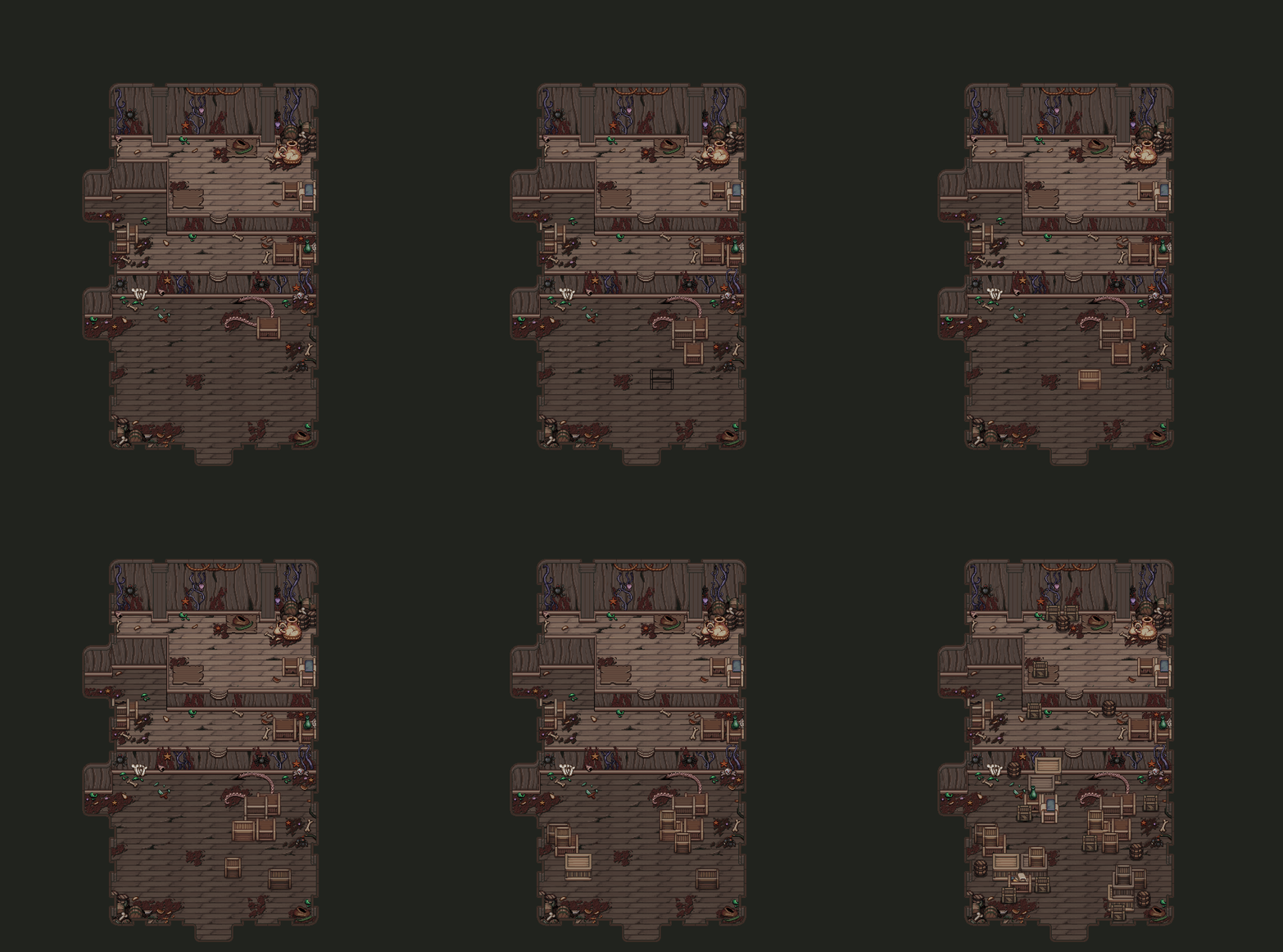
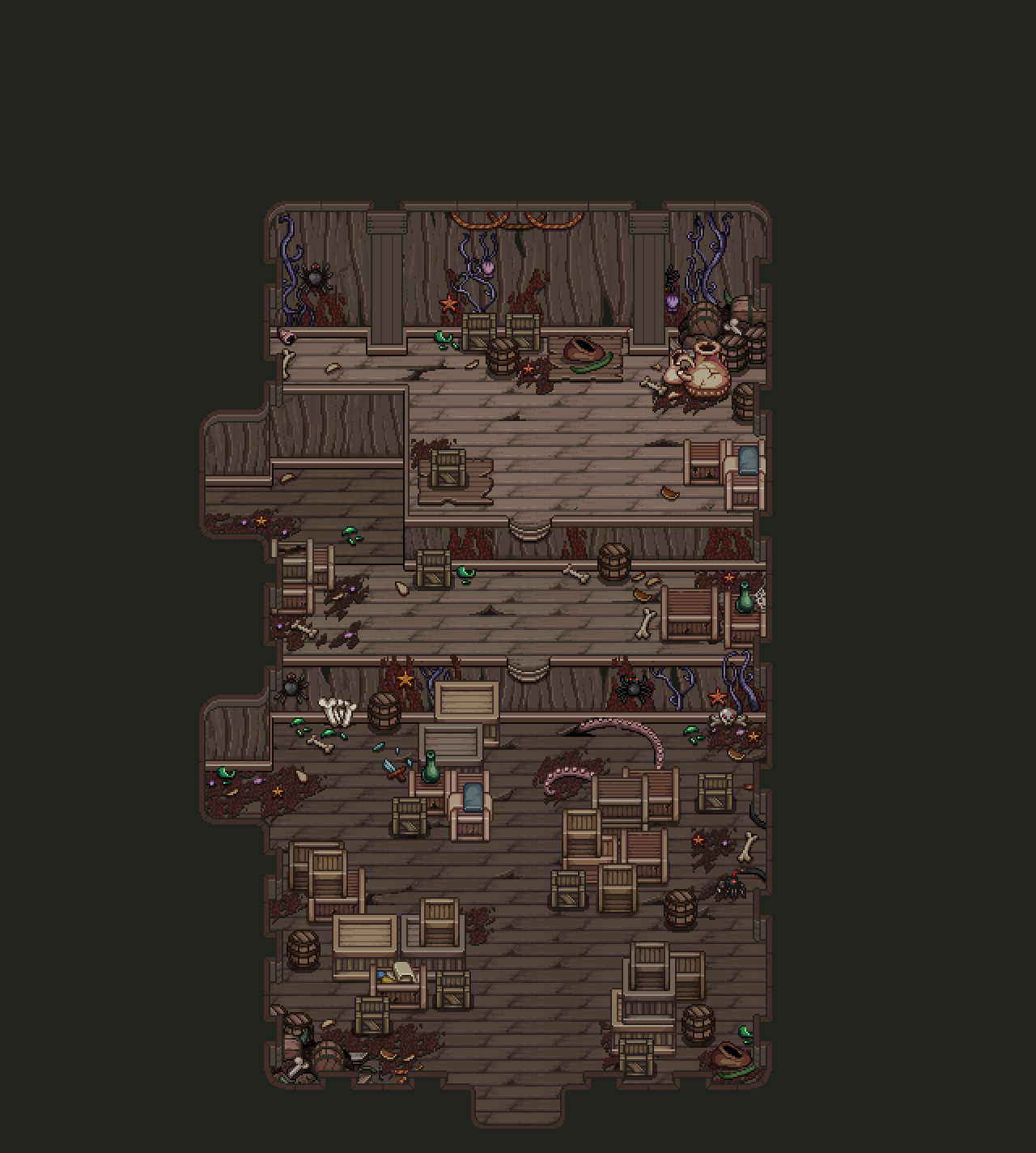
As I mentioned before, we’re currently working on finishing up the first floor. That means going over each room and adding the remaining details that have been missing. For the very first room, that entails adding a ton of boxes and crates to give the room a bit more ‘storage room’-y feeling:
Quite a few boxes! We thought of blocking the path leading straight to the door, but ended up keeping it open as we felt like forcing the player to take the long way around might feel a bit overdesigned.
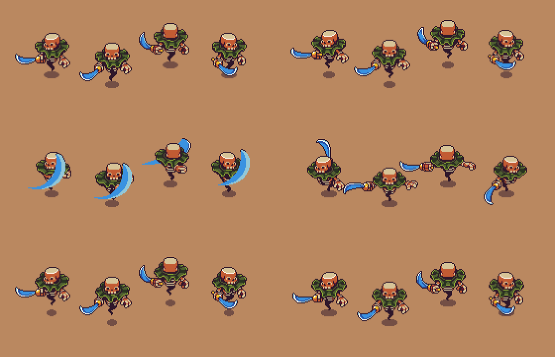
Meanwhile in the animation department, the enemies are finally being polished into their final forms, their animations cleaned up with further details added. Just look at this:


