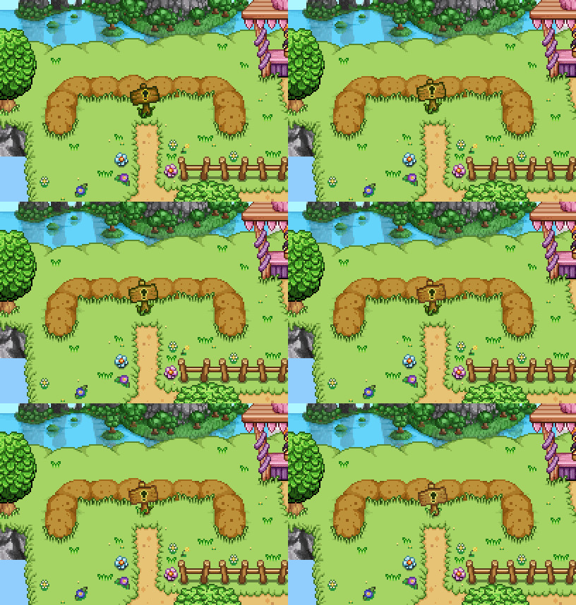
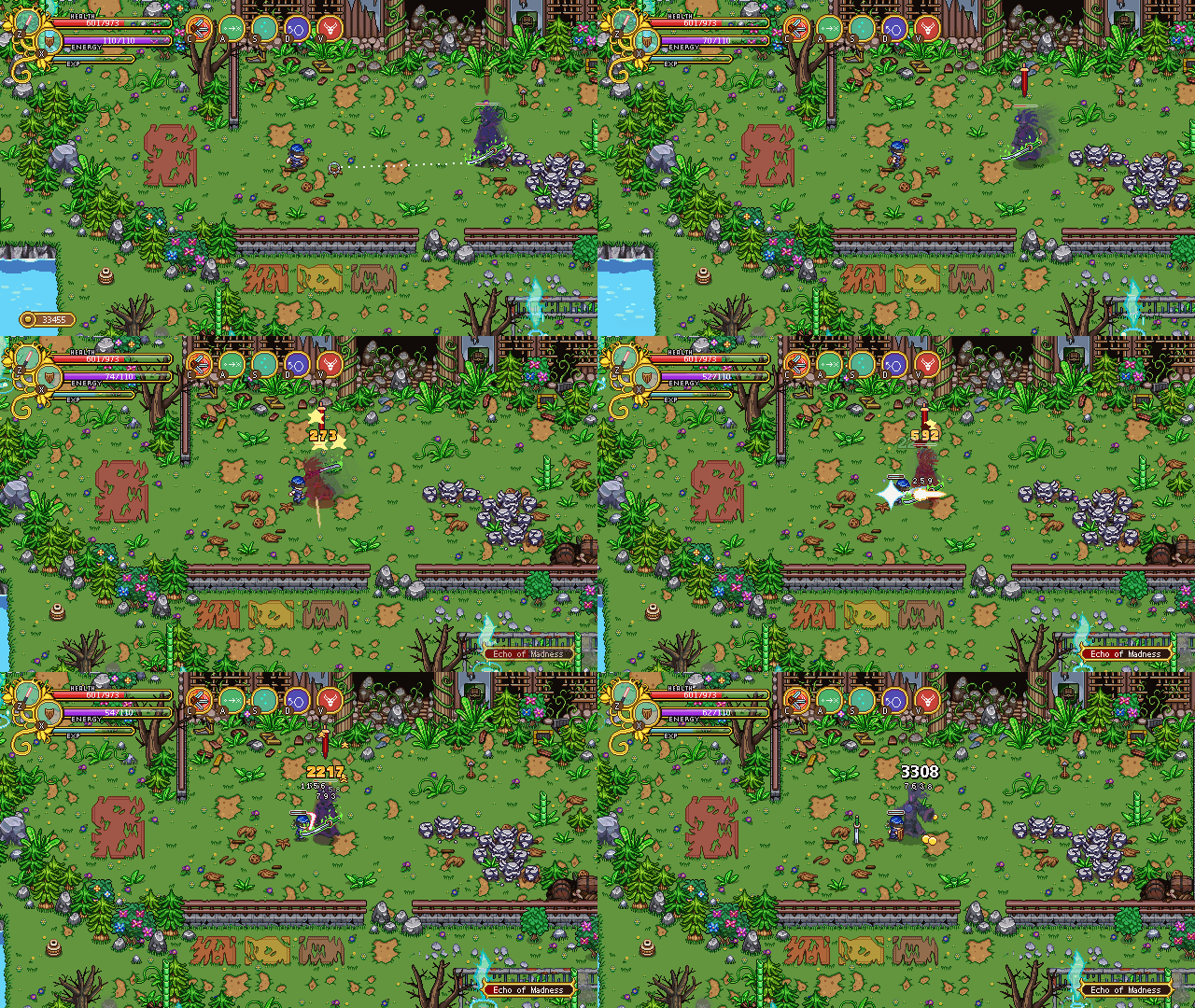
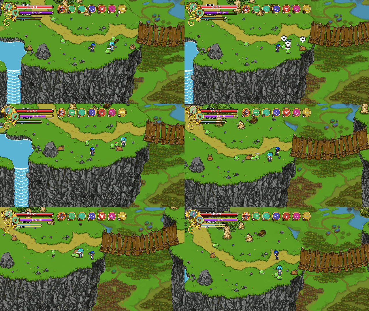
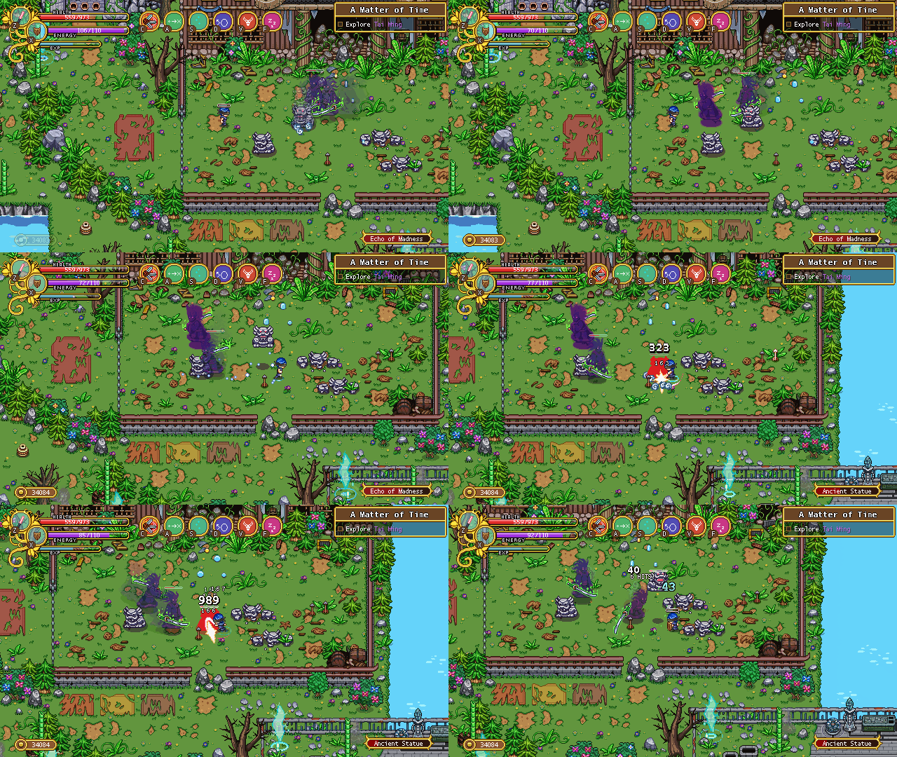
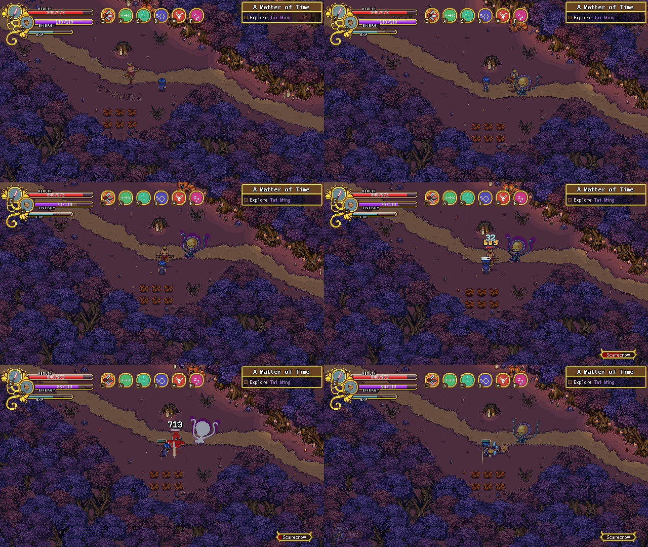
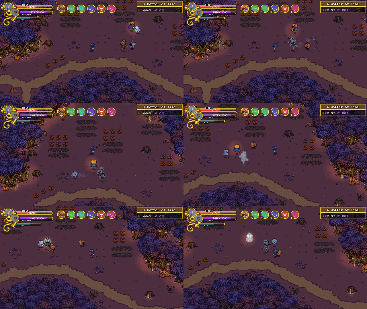
As mentioned before, our next main goal is to do a complete rebalancing of the skills in the game. This includes making bigger changes to some of our old darlings, such as Smash.

Smash has been kind of difficult to use since hitting the first enemy does not do a lot of damage: it’s smashing it onto others that’s the main source of epic damage. However, in some cases this isn’t exactly easy to do. In fact, most of the time it probably isn’t for most people, unless they’re in a very crowded area. If you’re facing few enemies, it might be hard to aim where the first one will go, making it near impossible to optimize the damage. Against bosses, the skill has been more or less useless.

So, how do we change this? I’d lie if I said we haven’t considered replacing the skill completely, and I suppose it might still happen. However, our first try will be to improve aiming and giving you something to use against bosses or in those cases where there simply isn’t enough enemies.

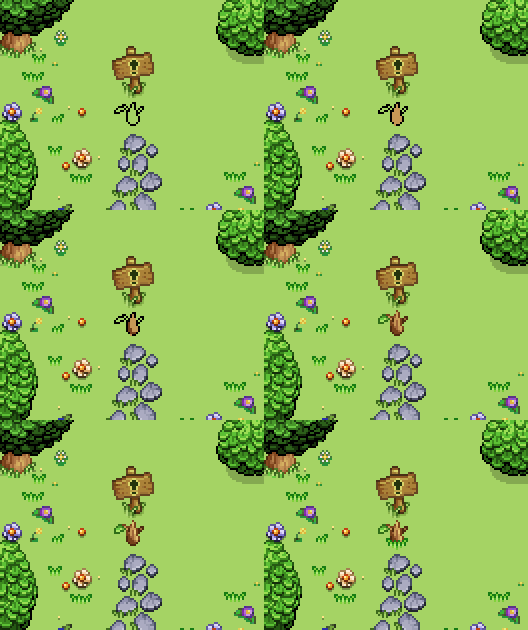
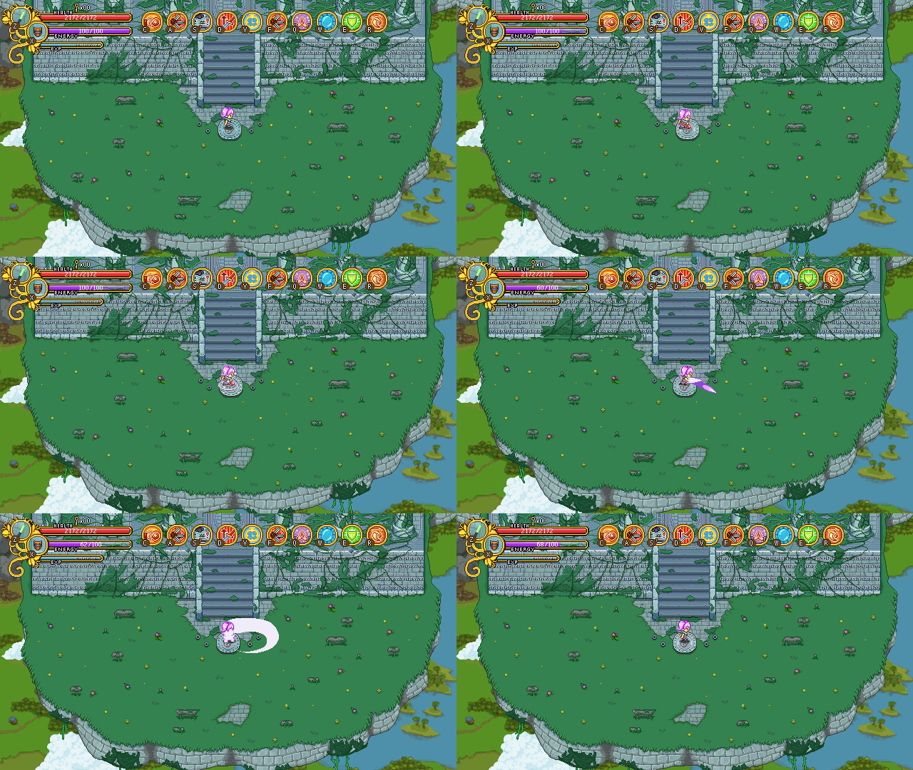
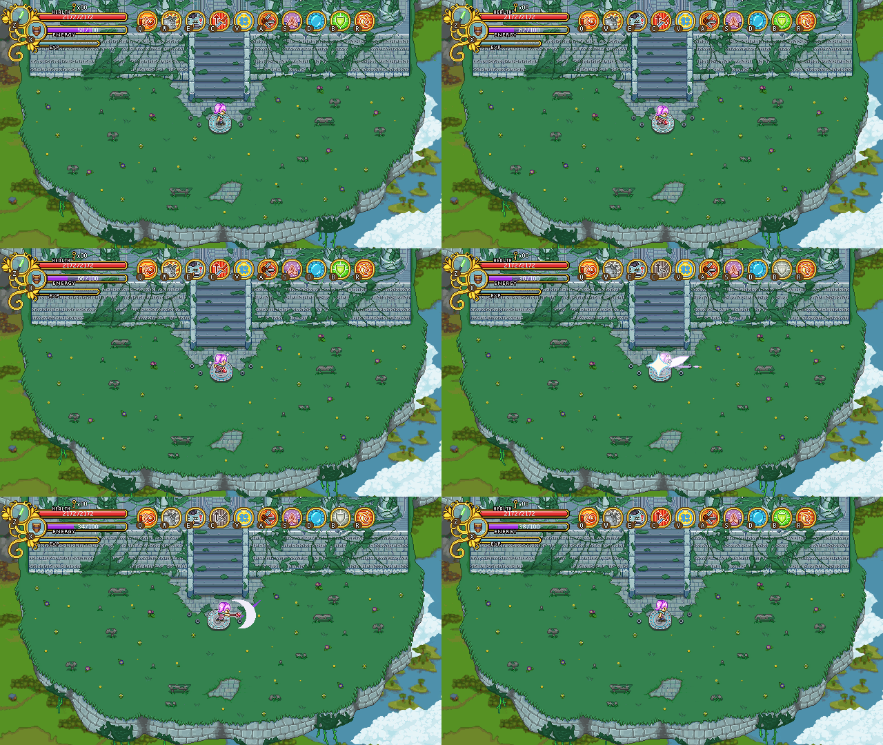
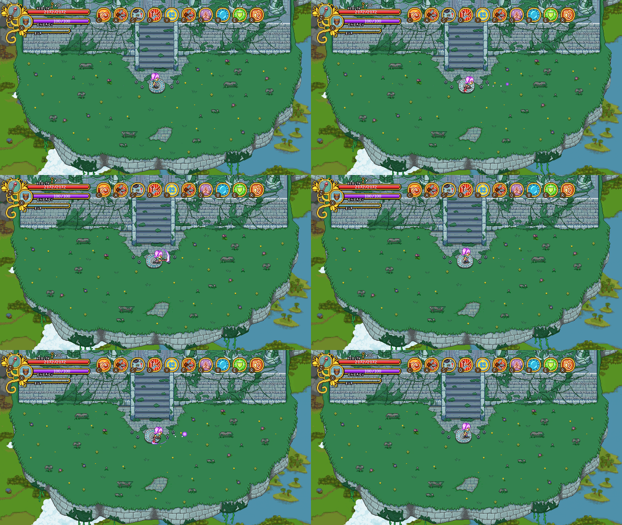
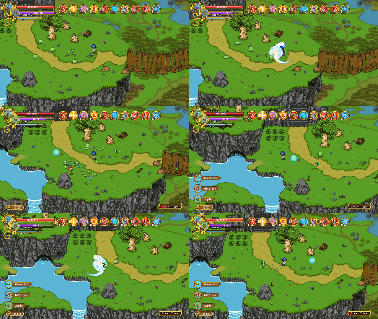
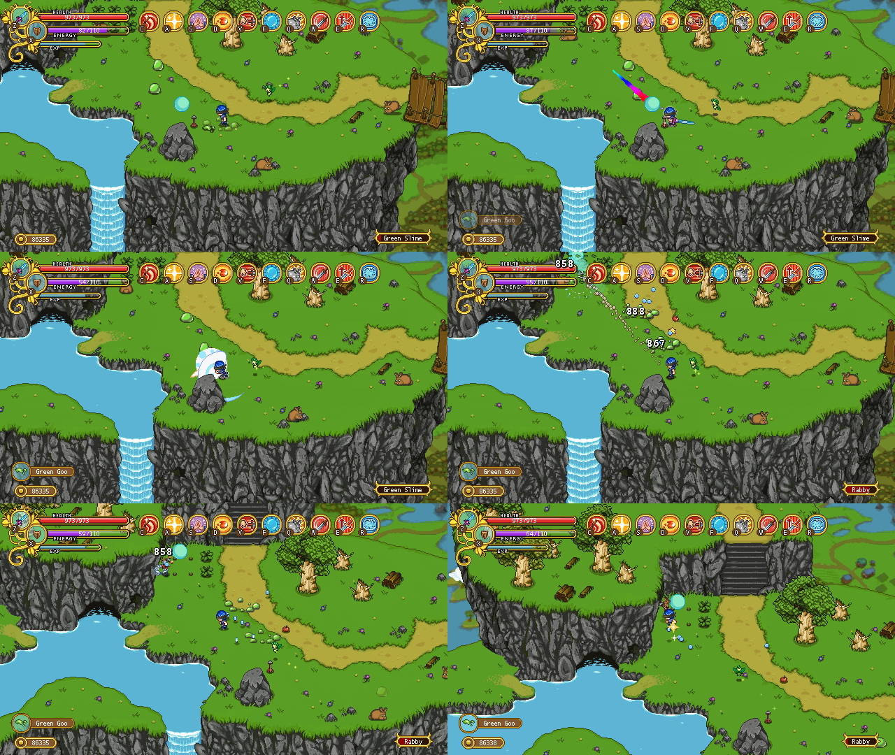
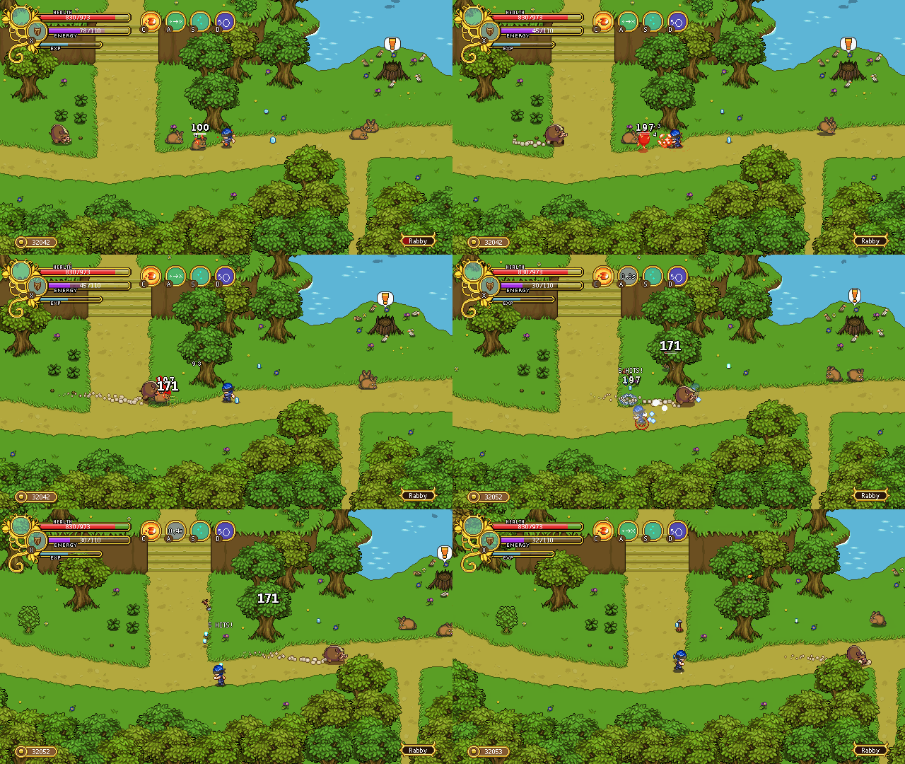
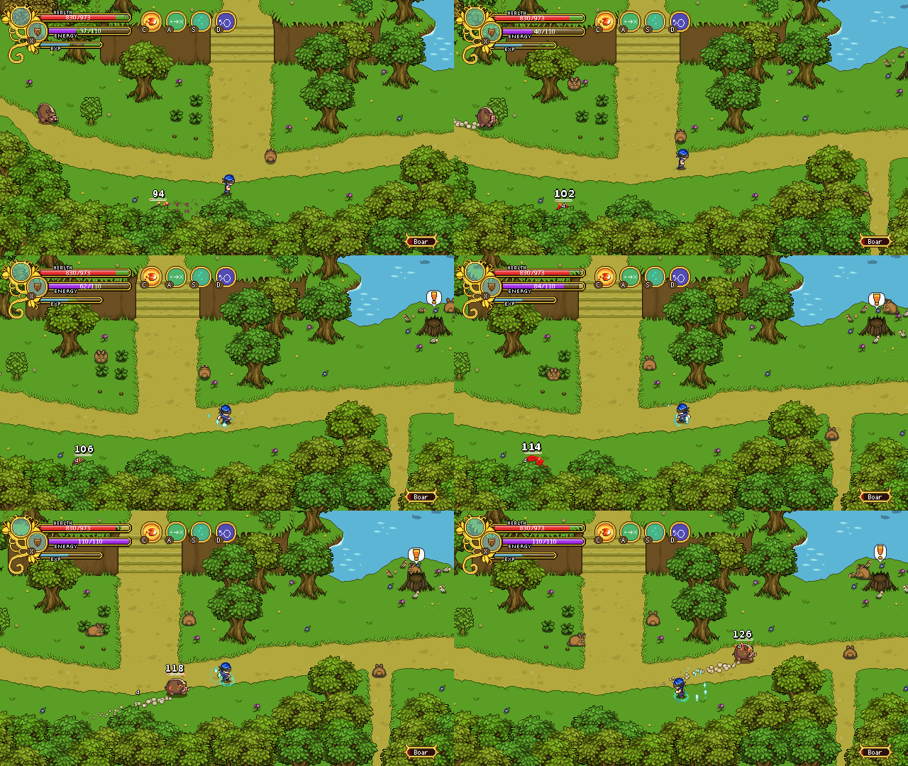
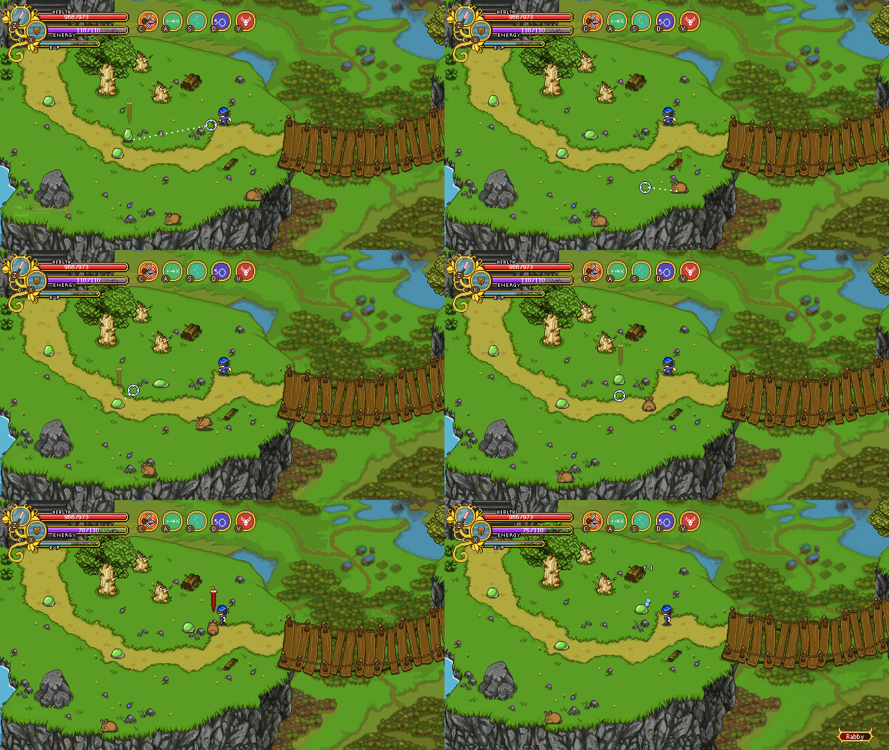
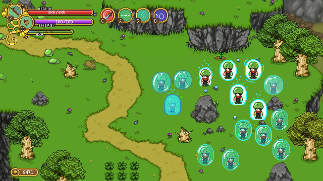
SO: the next time you charge your Smash skill (once the patch airs), a magical ball will appear in front of the player. You can hit this ball instead of an enemy, smashing it into approaching foes (or bosses) for maximum damage. To make aiming easier we’ve played around with a couple ideas as well:

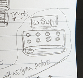
In the first one, a set of dots appear behind the ball, indicating where it’s going, including how it would bounce off walls and the like.

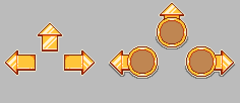
Below, there’s a second version, using a more cone-like shape. It’s important to remember that both of these indicators use placeholder graphics, and that in the end, regardless of which one we pick, it’ll look more fitting to the game.

As it is, we feel the second one has better potential of having a clean look, so it’s probably the one we’ll go for. Hopefully these additions to the skill will make it a little more fun and useful. Otherwise, it’s probably back to the drawing board for this skill!

So, now you’ve already seen some of our work on improving the skills, but as mentioned we have plans to improve or make tiny adjustments to almost every single skill in the game. This is all part of our rebalancing effort, which hopefully will end up with the game being a more fun and stable experience regardless of which sets of skills you pick. Here’s the complete rundown:

1-Handed Skills

Dodging Strike will get increased damage, and synergy with Reaper’s Blade (the new utility skill). A Gold Charge Dodging Strike will now automatically cast Reaper’s Blade on the target in front of you: level one by default, but if you put more points in the skill it will automatically use the level you have it at.

Piercing Dash will have its damage improved slightly.

Shadow Clone will be automatically nerfed as we lower the damage one 1-handed normal attacks, but it’s likely we’ll lower the base damage of this skill even further.

2-Handed Skills

Smash will be changed, as you’ve already seen. A ball will spawn when charging the skill, giving you something to hit enemies with for maximum damage.

For Titan’s Throw, we’ll add the option to get your sword back by channeling for a short while at bronze level. Right now, you have to pick the sword up manually until you get the gold charge, but we felt this has been limiting this skill a great deal. So instead, you’ll now be able to get your sword back from the beginning, though it won’t deal damage to enemies on its way back until gold charge.

Magic Skills

The Fireball will have increased speed, a graphic update (part of which has already been shown), and a more polished on-hit effect.

For the Meteor, we’ll increase the damage, and add more aoe.

You will no longer be able to damage enemies while moving, using the Flamethrower. If you start moving, the flames will die down until you stand still again.

Frosty Friend will have a cap of how many enemies can attack him. On the first level this will be a single enemy, but with each charge level he’ll be able to occupy one more enemy. This is to make sure he won’t be a complete meat shield, distracting all the enemies at all times. Instead, he won’t be able to die when shielding.

The Ice Spikes and Ice Nova will get a damage increase. As mentioned last week, you’ll also become able to chill and freeze all enemies (including bosses) with these skills.

Summon Plant‘s melee plants will have increased range, while the ranged plants will have less range.

Chain Lightning will get increased damage, possibly decreased range.

Static Touch will likely remain unchanged, but we are discussing whether to make a change so that you collect the cubes by battling, and by keeping on battling enemies they will get more and more charged. With this change you’d either be able to unleash the cubes upon a single enemy by using the skill again, or they’d be unleashed automatically when they’ve reached max charge level. Again, we haven’t decided whether to actually make this change yet, though.

There may be more changes than the ones listed above, but these are the ones we’ve discussed so far. As each skill gets its makeover we might have to adjust the others more.

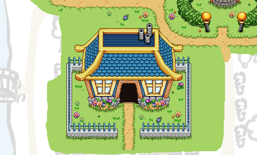
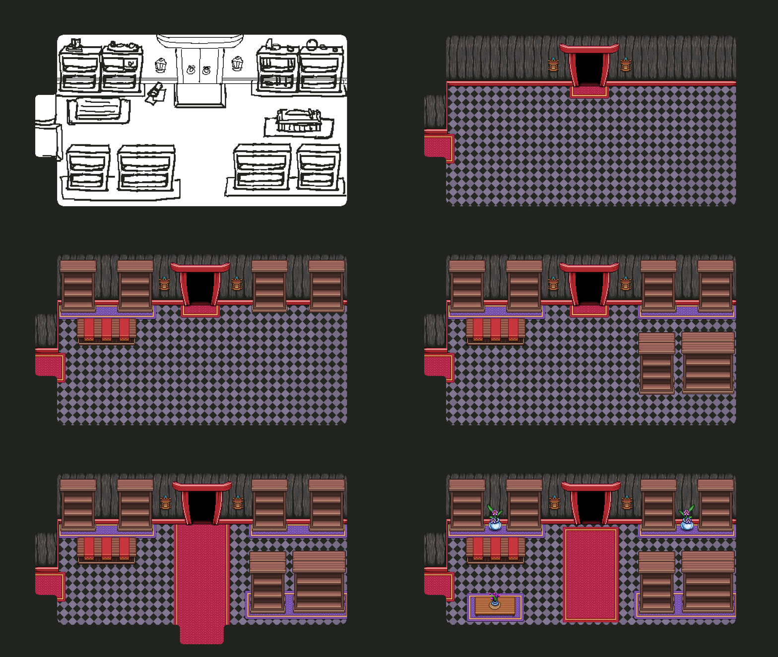
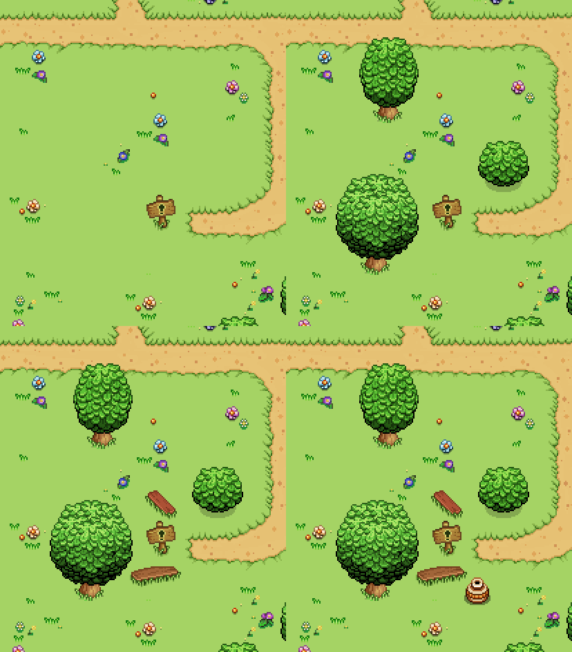
Meanwhile, in the Arcadia Rework we finally get to the part with the Player house! This is especially important since we want to use what we make here in Evergrind City (for Story Mode) as well! In this first part I’ll begin with the house itself, and make another, shorter video later featuring the immediate surroundings.


The colors I selected were based on the Collector color scheme, which is blue and yellow. Seeing as the technology behind the house is designed, developed and used by collectors, we though these were fitting colors. Next, it’s time to add some much-needed decorations around the area!


Short video, but it makes a lot of difference for the house. The fence surrounding the house is based on the fence around the gardens in Evergrind City, as we intend to move the place more or less as-is to Evergrind, with some minor adjustments.

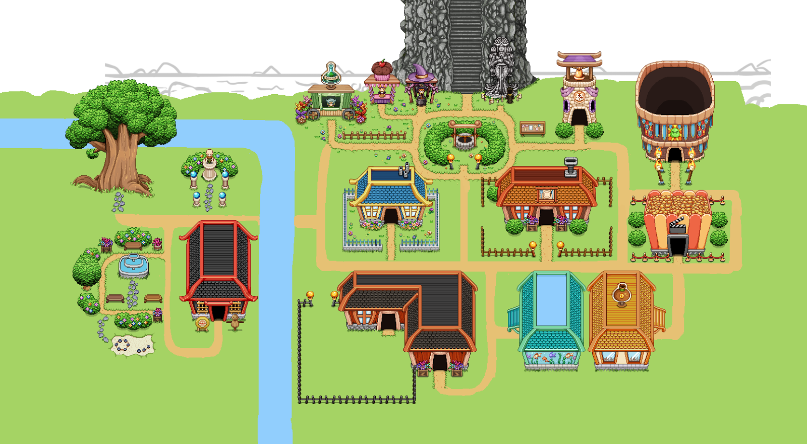
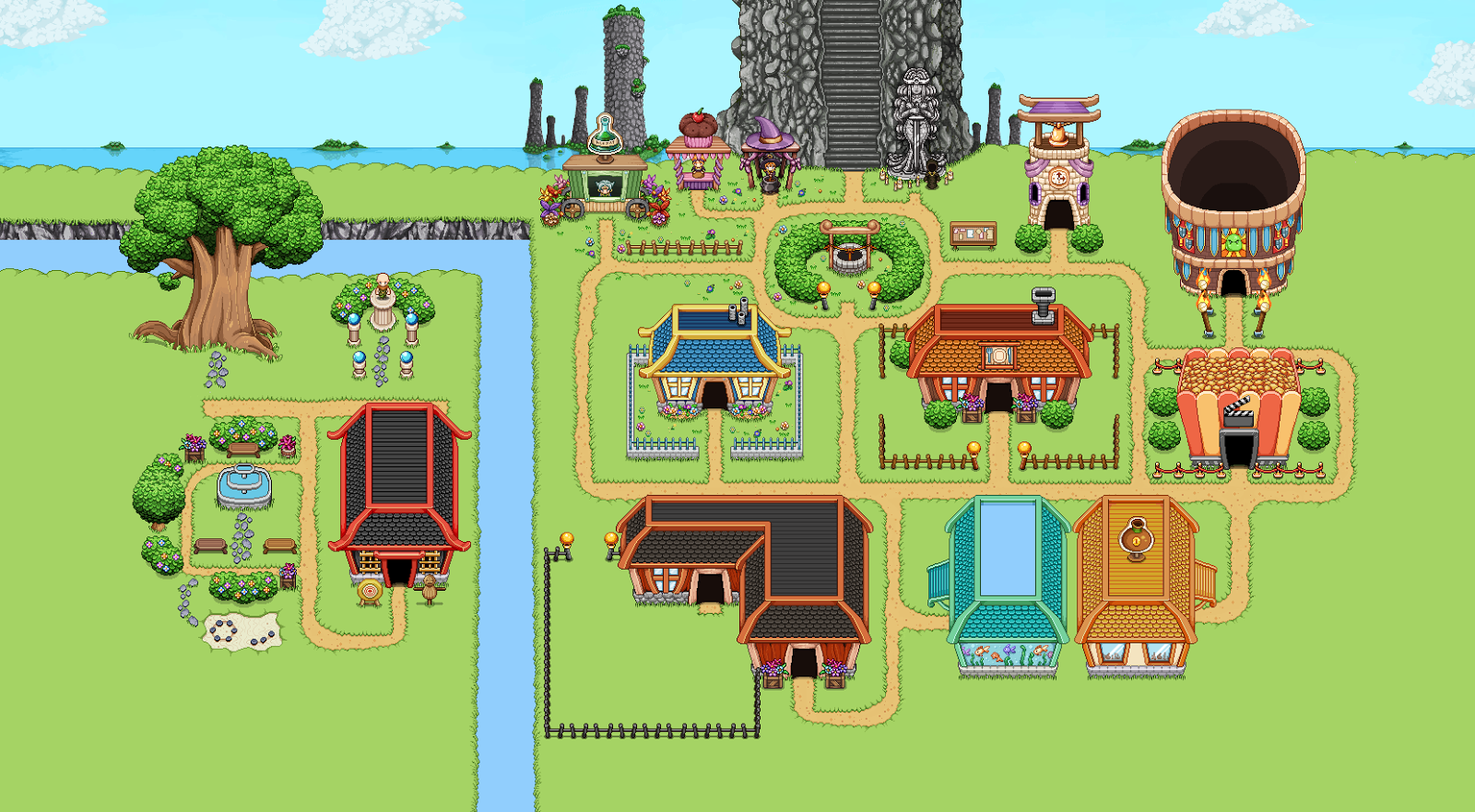
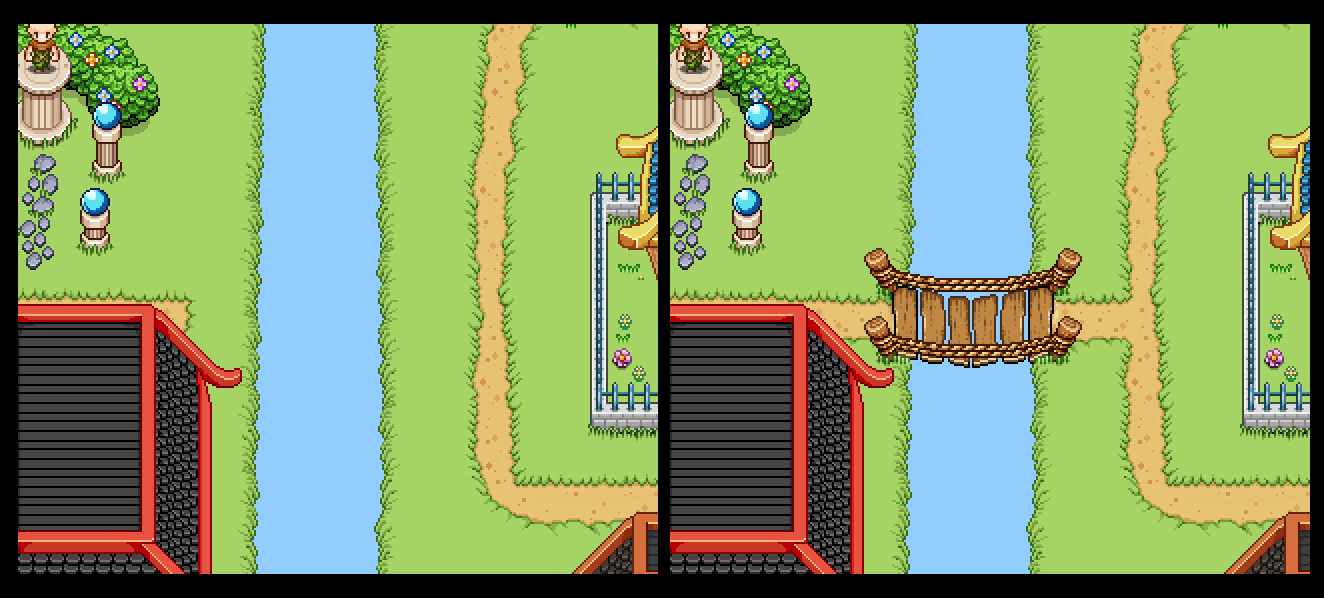
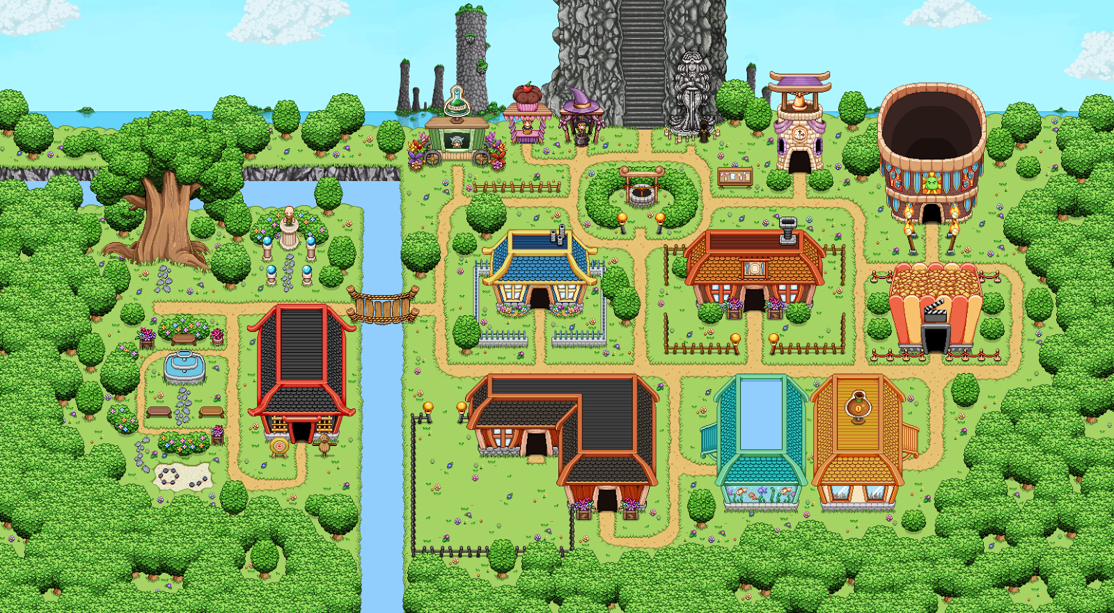
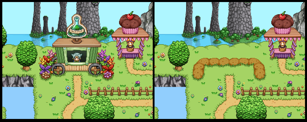
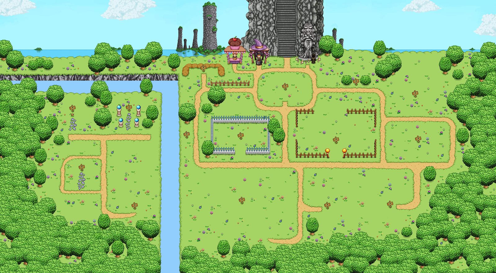
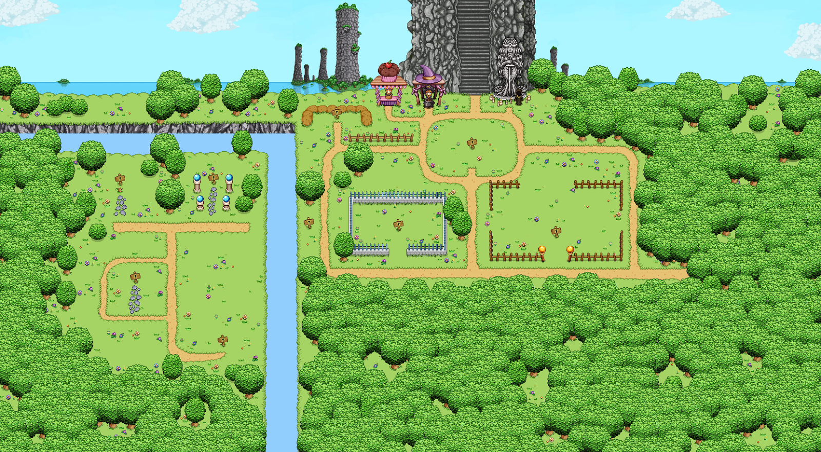
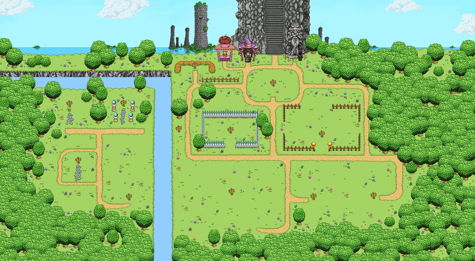
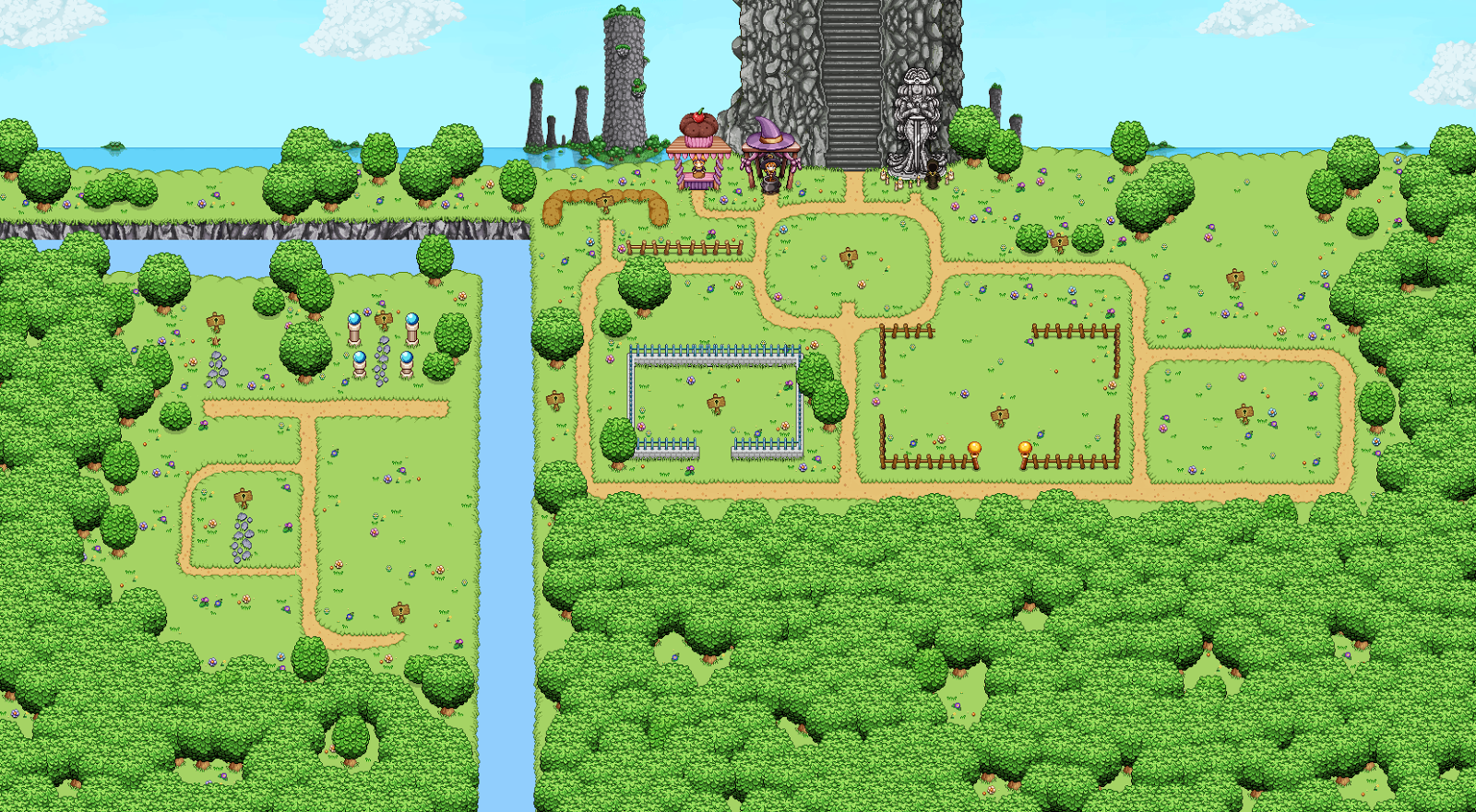
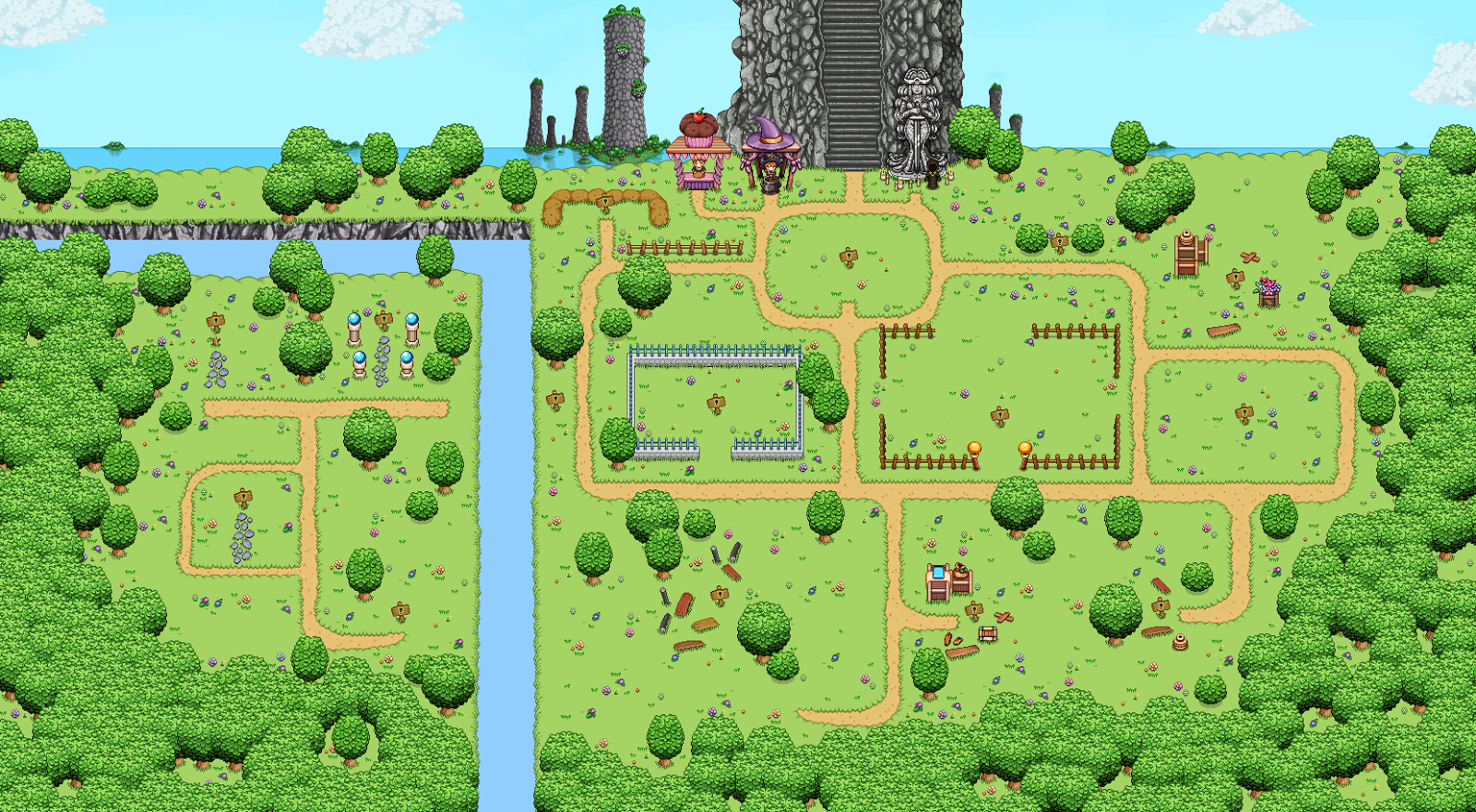
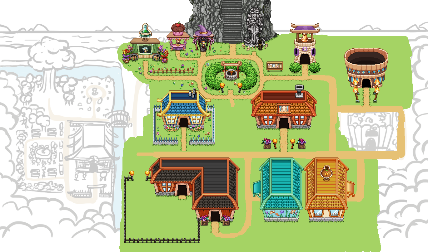
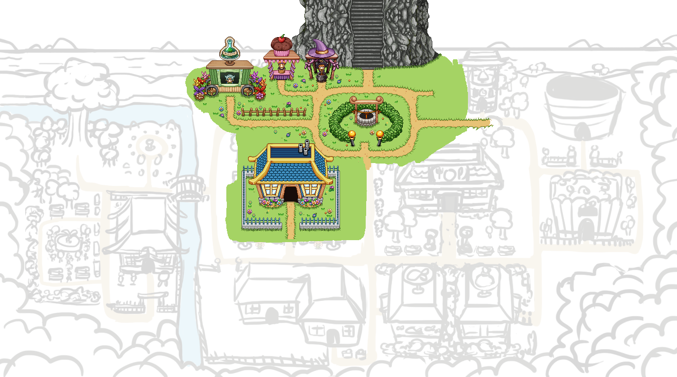
And here’s the full version of the town, with this added plot of land! Getting there, one step at a time:

Finally, in the desert, we need a few more Sailors – it is a port town after all. So here’s another sailor from the Merchant Isles, to help fix that problem:

It’s another Monday, and work on the Utility skills is in full progress!

As Teddy continues to prototype, I thought it would be fun to take a look at these very early stages of each of the skills! First up, we have the Defensive utility skills, three skills that are bound to change the game play slightly for at least some of you:

First among them, we have the blink (as seen above). As mentioned in the earlier rundown of the utility skills, it auto-targets some distance away as you tap the button, but you can also move the target around (if you have the time).

It’ll have a base cost of some energy, with a 20 more energy increase each time you spam it. If you stop using it for about 3 seconds currently, it will reset to the base cost. These costs will be lowered slightly for each silver point you spend on the skill, culminating in being able to use the first blink for free. The exact numbers are subject to change with further testing.

Next, the shield/barrier! It has an amount of HP, much like your physical shield, based on a percentage of your own HP, which increased per level spent on the skill. It can take damage up to his amount, but will always break after 4 hits regardless of how much damage they do to your shield. If your barrier gets crushed, you’ll take the remaining damage from the attack (the amount it failed to shield you from) as regular damage and you won’t be able to recast the shield for a little while.

Finally, the meditation/focus skill. It regenerates your EP faster the more you’ve leveled it, and if you channel it for two seconds the next skill you use will be cast free of EP cost. The circle underneath the character indicates when that happens!

As for the Offense skills, we first have Death Mark!

This skill has a new targeting system, which can be seen above. It basically aims at whatever enemy is the closest to your target, which you can move around the screen so long as you hold down the spell button.

Everything you see here is prototype graphics, so it will likely look a lot different in the end, but the general gist of it is that as you do damage to a target with Death Mark, a meter of some sort (in this case it will probably be a sword) will start to fill up. Once a set amount of time has passed, the mark will trigger and deal bonus damage based on how much you’ve already damaged the target. The more you’ve filled the meter, the more damage it will do when it triggers – so you better try to get as much damage as possible on your target before that happens, to maximize the bonus damage. If the damage Death Mark will do is enough to kill the target, it will automatically trigger and execute the enemy for you before the timer runs out.

Taunt/Challenge lacks all of the relevant graphics, but works much as described earlier: you challenge an enemy by shouting some insults at it, causing the both of you to deal more damage against each other. Upon leveling the skill, you’ll be able to target more enemies. Of course, in multiplayer, taunted enemies will prefer the taunting player when looking for things to attack, so your friends will be safe.

Sleep, or rather, Stasis is the skill we’ve come the furthest with graphics wise. The mechanics are fairly straight forward and as described previously: the targeted enemy gets put in a stasis from which it’s released either when a new enemy gets put under the effect, when you hit it, or simply when the timer (individual for each type of enemy) runs out.

Here’s the first prototype version, simply freezing the enemy in place:

In the second iteration, a flashing light was added to indicate when an enemy is about to come out of stasis:

Finally, some visual effects were added, and as it is, we’re already pretty satisfied with the way it looks right now – we might just add some small effect for when an enemy gets hit by the spell and otherwise keep it the way it is:

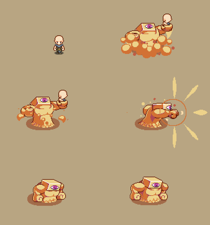
And, since the Utility skills will be implemented much sooner than the desert enemies, Fred has paused the creation of those beast and began work on the spell effects needed!

We felt Death Mark is the skill that’s perhaps the most reliant on the right graphics, and nearly impossible to really get a feel for without them: we want to be able to feel the urgency of trying to fill up that meter, and the satisfaction as it triggers and executes the enemy.

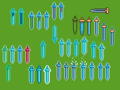
As such, Fred began sketching on multiple versions and ideas for what it could look like, with the guideline that we wanted it to be a sword:

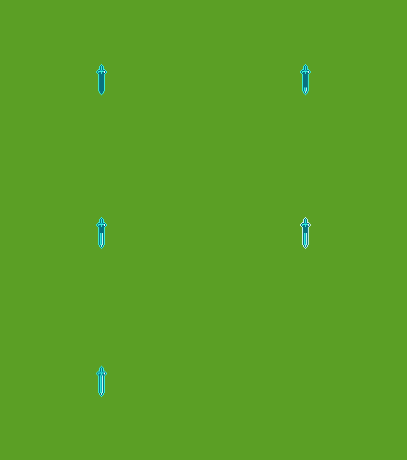
He also began making the actual animations, first showing how the meter fills up:

And then the indications for when time is about to run out (the flashing outline):

He’s also begun work on the shield/barrier skill from the defense section, which will be a bubble of sorts, surrounding the character. We’re still working on tweaking the transparency levels and overall feel, but we think we’re getting there:

The rest of this week we’ll be testing all the billion ways each spell can break the game (which they do, a lot), by playing through the entire thing using each spell on every enemy in every possible way. While we won’t be able to find all of the bugs or problems this way, hopefully it’ll make them more or less fully functional before we hand it over to you guys in the Frontline beta! Multiplayer will need a whole lot of testing of its own, both to make sure the effects are syncing up between users, and to bug test the friendly targeting (as some of the Utility skills will be used as buffs which can be cast on anyone in your party).

At some point I will be called upon to make the proper skill icons for each of these, though I’m not sure if that will happen this week or later when we’re 500% sure these are the skills we’ll actually end up using (that is, once we’re certain none of them feel too boring as we try them out properly on our bug testing runs). Until then my art focus will be mainly on continuing the Arcadia Rework, as it’s what’s next on our to-do once the skills have been finished (and the occasional desert town portrait). Slow but steady!

Fred, meanwhile will be focusing this week on creating more of the Utility skill animations and Teddy will be put on major polish and bug hunting duty. At the moment, we don’t have an ETA for when the skills will be available on Frontline: it’s all very dependent on how broken they end up being on these playthroughs.

We’ve already had lots of talks about small edits we’d like to see on each of the abilities, so they’re not even in their finished form as it is right now! No major changes in terms of mechanics, but lots of tiny timing-things and such. For example, whether Death Mark should trigger automatically once the meter is full, or if it should still wait for the timer to run out. In this case we decided to keep the timer fairly short, and have it wait for it to run out before it triggers, even if you’ve done enough damage to fill the whole thing. Our reasoning for this is to make sure you can’t spam it too often, in multiplayer, for instance – as you’d be able to fill the meter a lot faster with four people who might all also have the ability (though we’ll try to balance this as well). Our goal is to make it fairly hard filling up the meter before the timer runs out, so it’ll be a bit of a fun challenge to try and fill it as much as you can when battling.

Hope you guys are enjoying your summer!

With the third Tai Ming zone up and running, and the base of the dungeon essentially completed, it’s only natural to have a meeting to discuss the feedback we’ve gotten!

Before uploading the patch our inhouse testers had given us two point of views on the third zone: one said it was impossibly hard, the other said it’s too easy. The general consensus after uploading the patch seem to be it’s somewhere in between those two (yay), but we’ll keep monitoring your comments and make adjustments to the difficulty accordingly.

Aside from the usual bunch of bugs and a couple hotfixes, things seems to be sailing pretty smoothly and now all that remains is cleaning up the placeholders, await sound effects and polish things up for the stable release, which is our next goal!

So, for the next stable release, we’ll basically clean up Tai Ming to the best of our ability and launch the dungeon when it’s properly completed. We’ll also be adding a couple of things to the dungeon before patching as well, namely:

* A couple more NPCs in Tai Ming’s first zone
* A secret chest…somewhere I won’t say
* New shop items

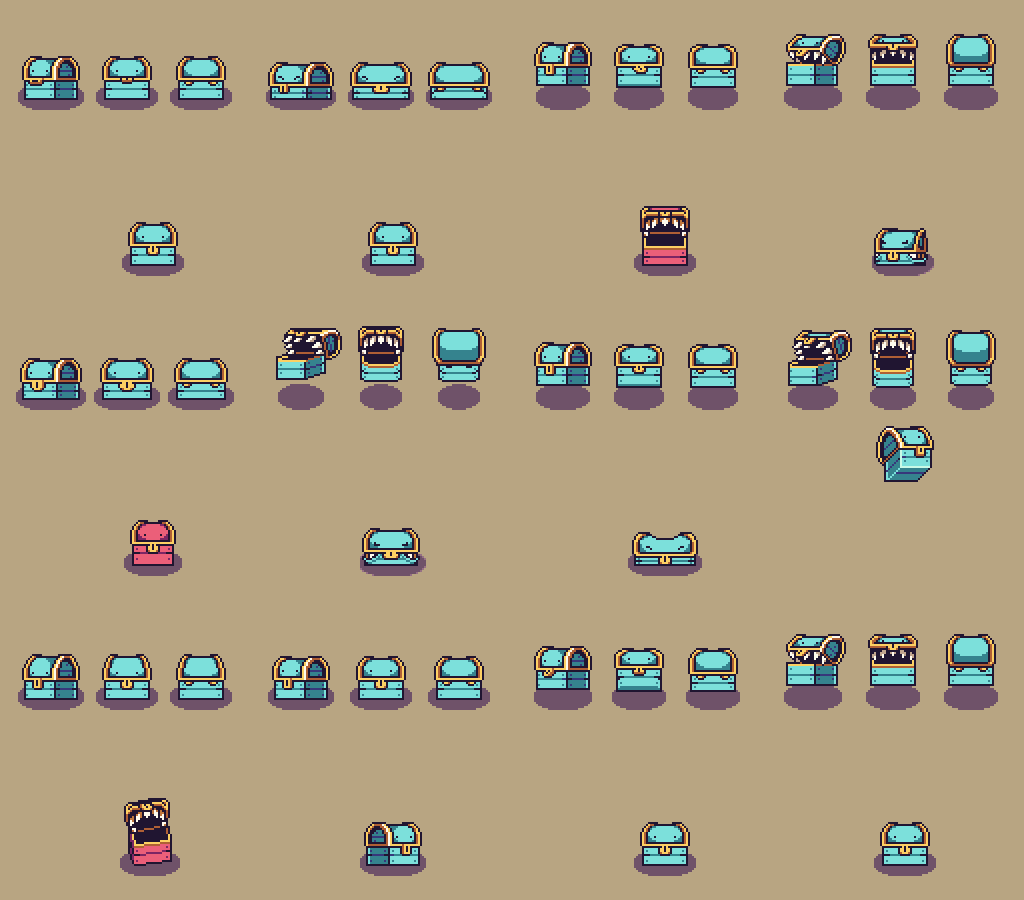
We’ll also make a slight change to the Mimic battle so that the Mimic spits out the sword if you solve the puzzle mid-fight. It felt a bit unsatisfying to push the block onto it only to be rewarded with nothing until the battle’s done, so that had to be fixed!

Now, as for what happens after Tai Ming… Previously we had an idea that we’d do a vote for what you people would like to see added, but after discussing our options today we realized there are so many things we feel need to be added ASAP, that we’ll probably end up doing all of those and only save the super optional stuff for later. More on that later!

Some other things we’ve discussed recently:

What year is it?
Some of you might have asked this question already, with all the time jumps in the dungeon! We’ve had multiple discussions about whether or not to include years, either when you zone or/and added somewhere in your journal.

The obvious argument for is that it would hopefully make it easier to know how much time has passed between certain events. However, there’s also the risk of annoying people who forgot what the previous year was, and now gets another year presented. This happens to me a lot in movies: in the beginning they show the setting and present us with which year it is, and I go “oh okay so we’re in the 1600’s”, and promply forget what the last two numbers where. Then, a while later, there’s a jump and they show another year, also 1600’s, but since I didn’t remember the whole year I have no idea how many years have passed in either direction (is it a flashback?), until I get it based on the context. In those cases the years did nothing but annoy me, since I had to rely on the context to grasp how much time has passed anyway.

It is our hope that we’ve provided the player with enough such context that there isn’t a need to know the exact year. We haven’t completely thrown out the idea though – if it becomes too confusing, we might add them later.

The Desert
After Tai Ming comes the desert, and as such we had another talked and decided that before we update the Stable beta, we’ll add the bare minimum of the first desert map – most likely only the background and something blocking your way from continuing (so no enemies or NPCs or anything like that).

The reason? Those “this area is not in the game yet” notifications. Once we add the first desert map we actually won’t have any of those anymore, and I’m pretty sure you guys are just as annoyed by them as we are! Nothing throws you out of a game as much as a blatant reminder that you’re only playing the beta.

Temple of Seasons Story?
And now for something completely different. Did you know that we, from the beginning, intended to have picture carvings here and there in the Temple of Seasons, telling the story about the player character’s mother Charlotte and how she came to save the fae that one time? Don’t worry, we won’t add that right now, but we did have enough time during this meeting to reiterate that we will add it at some point. Likely after the main story is done.

Spirit World Objects
Finally, we talked a bit about the spirit world and what kind of objects should appear when using the skill. We want certain things to be able to appear in order to create puzzles and challenges – such as a bridge that only exists in the spirit world, and so on. During this discussion we talked about what they should look like graphic wise.

Right now we’re thinking that we should go full on horror style – having the objects be made of bones or dark goo or other creepy things you’d associate with ghosts. We’re still balancing on an edge where we’re not sure if it’s gonna be too creepy or not (the game hasn’t been that scary until that point, even if we begin to see some darker things in Tai Ming), but hopefully it’ll not feel too off in the end.

If you guys have any suggestions for what you’d like to see graphic wise in the spirit world, let us know in the comments! :)

Since we’re currently busy airing out the bugs that have been reported, adding sound effects and basically polishing up the graphics, which isn’t much to show visually in this blog, here’s a sneak peek of the Mount Bloom Arcade Mode floors instead!

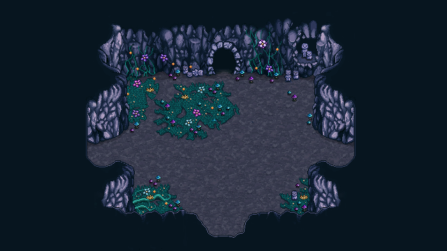
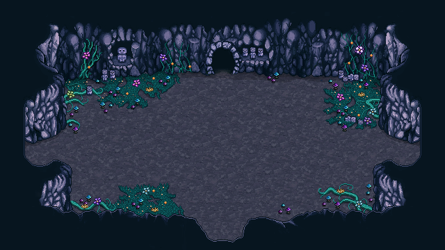
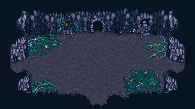
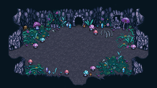
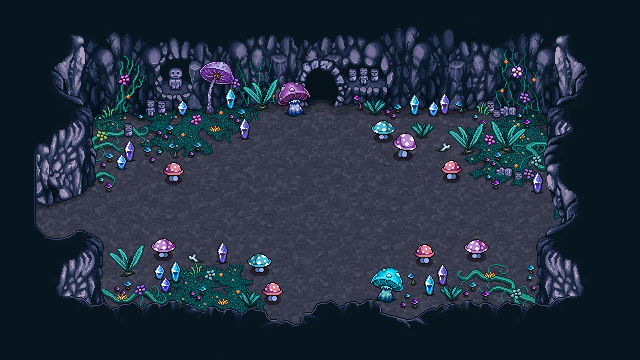
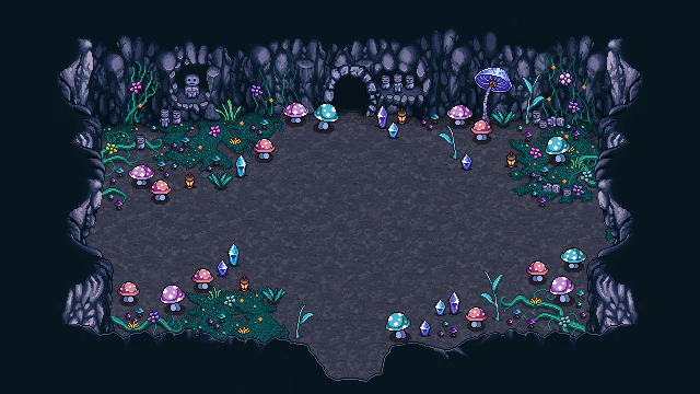
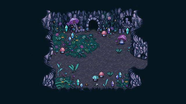
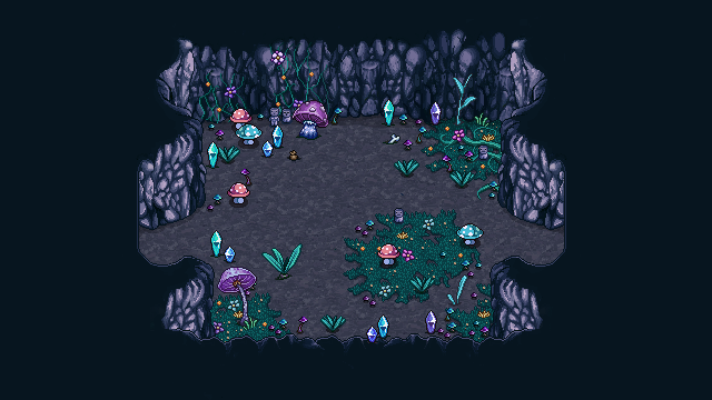
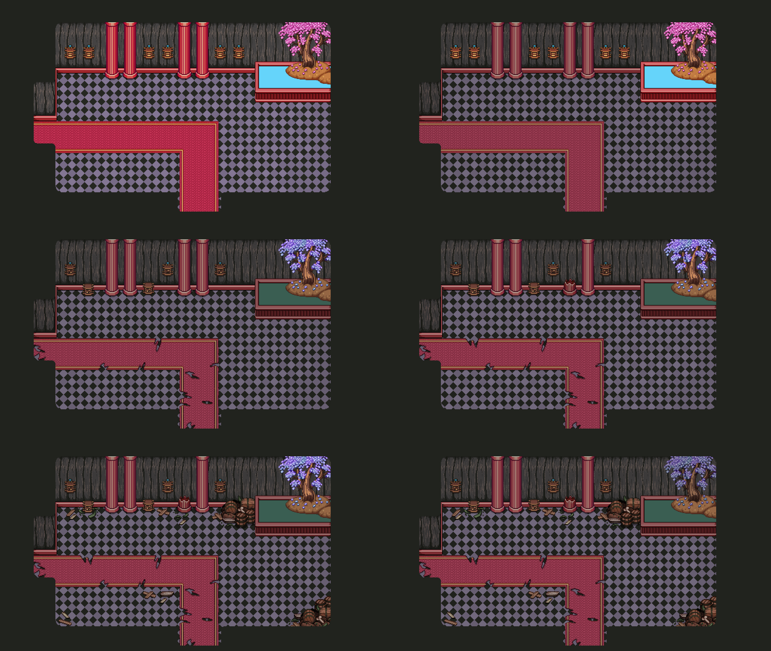
To make these floors, we’ll be using a bunch of basic room backgrounds as base, and create variations by decorating them in different way. When creating the bases I make a standard background, add some basic decorations that don’t need colliders (basically floor and wall stuff, such as moss and vines), as well as four exits – one in each direction:

01

The exits are on their own layer, and beneath is a solid wall, so you can simply apply the number of exits you need for the specific room. Some might only have one door, others might use all four.

02

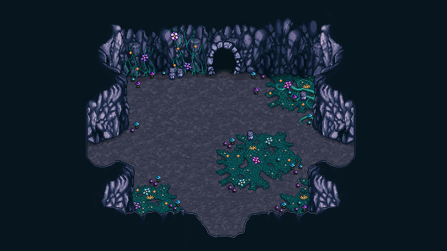
I then make a second and sometimes a third variation of the basic decorations, moving moss and wall decorations around so they aren’t all exactly the same:

03

04

Next step is adding props that have colliders, which are added using our editor. In order to increase the sense of variation we divide each backgrounds into four parts, and create a minimum of two variations in how the props are placed within each corner.

Once that is done, the game engine will be able to mix and match each corner for the background, creating 16 possible variations per background, if each corner has 2 different layouts:

05

06

07

08

09

The basic room shapes are the same, but thanks to different numbers of doors and decoration differences, they feel more different than they are. These are only the first two room types, next I’ll be making a bunch more to increase the sense of variation as you progress through this floor.

Hey guys! In order to keep things clear about where we’re heading, plus better keeping track of our design ideas, we’ve decided to have shorter meetings but keep them more often. So this week it was time to get together and discuss the future of Grindea once more! There are some pretty big design decisions going on here… Let’s dive into ’em:

Making magic weapons semi-ranged
So, magic weapons don’t give as much attack, and it kind of sucks that magic users face a clear disadvantage when they’ve run out of mana. So we decided that we want to add a tiny magic orb (or something like that) that shoots out from the magic weapons as you hit with them, making the range of your weapon slightly longer. Of course, this won’t be long range by any means, but it should make it possible to do some damage while running around waiting for that energy to recharge.

Easy Mode or no Easy Mode?
We had a quite long discussion about whether or not to implement Easy Mode. On the surface it seems like such an easy decision: why not add Easy Mode? Well, our worry is that by adding Easy Mode, a lot of people who would succeeded in Normal Mode after trying a little longer, would just give up on harder challenges and swap to Easy Mode. And, in doing so, they would probably end up thinking ‘man that’s annoying’ rather than ‘OMG I FINALLY MADE IT’ upon victory.

We’ve had a lot of forum threads or feedback that begins with someone claiming something is impossible, only for them to come back a while later saying ‘okay I totally get it now, this is amazing’. Would those people persist and end up feeling amazing after beating that difficult challenge if there was an Easy Mode? Or would they end up thinking Normal Mode is too hard and the game is poorly balanced since they felt forced into swapping to an easier setting?

In the beginning of our time in Early Access there were quite a few of threads with people claiming the overall game was too hard, but as time has progressed, those threads don’t seem to appear any longer and those who do have problems end up farming for levels and better items before giving the challenge a go again.

So, perhaps Easy Mode is not as needed as we first thought? Because of this we probably won’t implement Easy Mode anytime soon, anyway (but we’ll definitely reconsider if there’s renewed complains about the game’s difficulty).

Making Fishing more challenging
Fishing is… well, fishing, so it’s very straight forward and there’s only so many steps in difficulty. Unfortunately that also makes fishing kind of repetitive after a while, so we’re considering adding another mechanic after a couple of maps. The mechanic we’re thinking about is that the fish can move up or down as well, which means that at some point the fish will dive/swim upwards and you’ll have to press up or down accordingly within the time limit. Of course, this isn’t a high priority addition, so it probably won’t happen for a while. But in the long run it might help make fishing a little bit more interesting.

Potion Rework / Bottle Addition

Potions are great, but we don’t like how they work right now, where you can stack endless numbers and basically get a permanent increase in whichever stat so long as you have enough potions. To counter this, we’re strongly considering an introduction of Bottles which are a very limited commodity of which you’ll only be able to find 3 in total. These bottles can then be filled with the potion of your choice.

You’d get your first bottle from Remedi after clearing the Collector’s Trials, and after you’ve decided what to put in it and use it for the first time, it will slowly refill itself over time and as you do damage on regular enemies (yes, it’s a magic bottle). If you have more than one bottle, you can choose whether to fill the bottles with the same potion or use different potions. You can use two different potions at once, but you won’t be able to drink another potion of the same kind until the first one’s effect has run out.

With this change, it’d also be possible to reintroduce health potions, for all of you guys constantly asking about various healing features ;) Of course, we’ll likely balance them so it’s more efficient to use the other potions, but maybe it’d still help ease the minds of those who really want to be able to heal their character.

There are more cards this week, as well, as we finish up the Tai Ming card album! First up: the Ancient Statue card :)

01

For this card, my notes said the statue got some bird poop on it. It quickly became a fine line between painting the statue big enough for the poop to show up in the final image, while also not only being about the statue. In the end I think I went slightly too small with the statue, but whatever!

02

For this card I kept the colors soft and didn’t go too crazy with the highlights. Some variation and all that.. :)

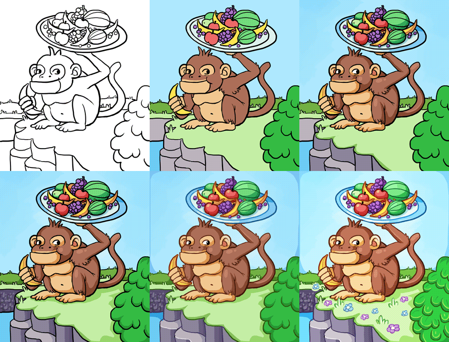
For the second card, let’s take a look at the Monkey Card! My notes for the monkey card said: the monkey holding a plate of fruits. Alright then:

01 (1)

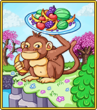
After painting the base and resizing, I added a couple cherry blossom trees (used the game sprites for this), to give the pic a bit more Tai Ming feeling:

02 (1)

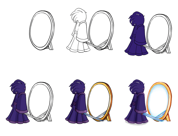
Now! Time for the final Tai Ming Card (unless I’ve forgotten something and lost the notes?!): Echo of Madness!!

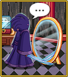
I used a slightly different approach when making this card, because I knew I wanted to use the backgrounds from the game for this one. So, I began by making the Echo and a mirror against a transparent background, keeping the center of the mirror transparent as well (my notes were: the Echo is standing in front of a mirror, but he has no mirror image):

01 (2)

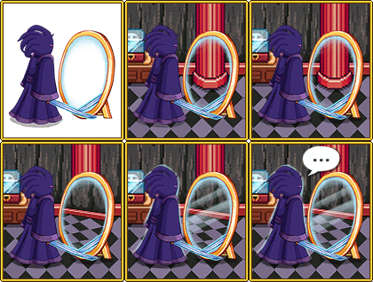
Next, I added the game background, and another part of it slightly tilted for the mirror, as well as a speech bubble. Cause why not:

02

…Aaand the finished card:

03

Alright! Before posting some fresh non-spoilery (well, kinda) animations made by Fred, let’s take a look at some more housing items!

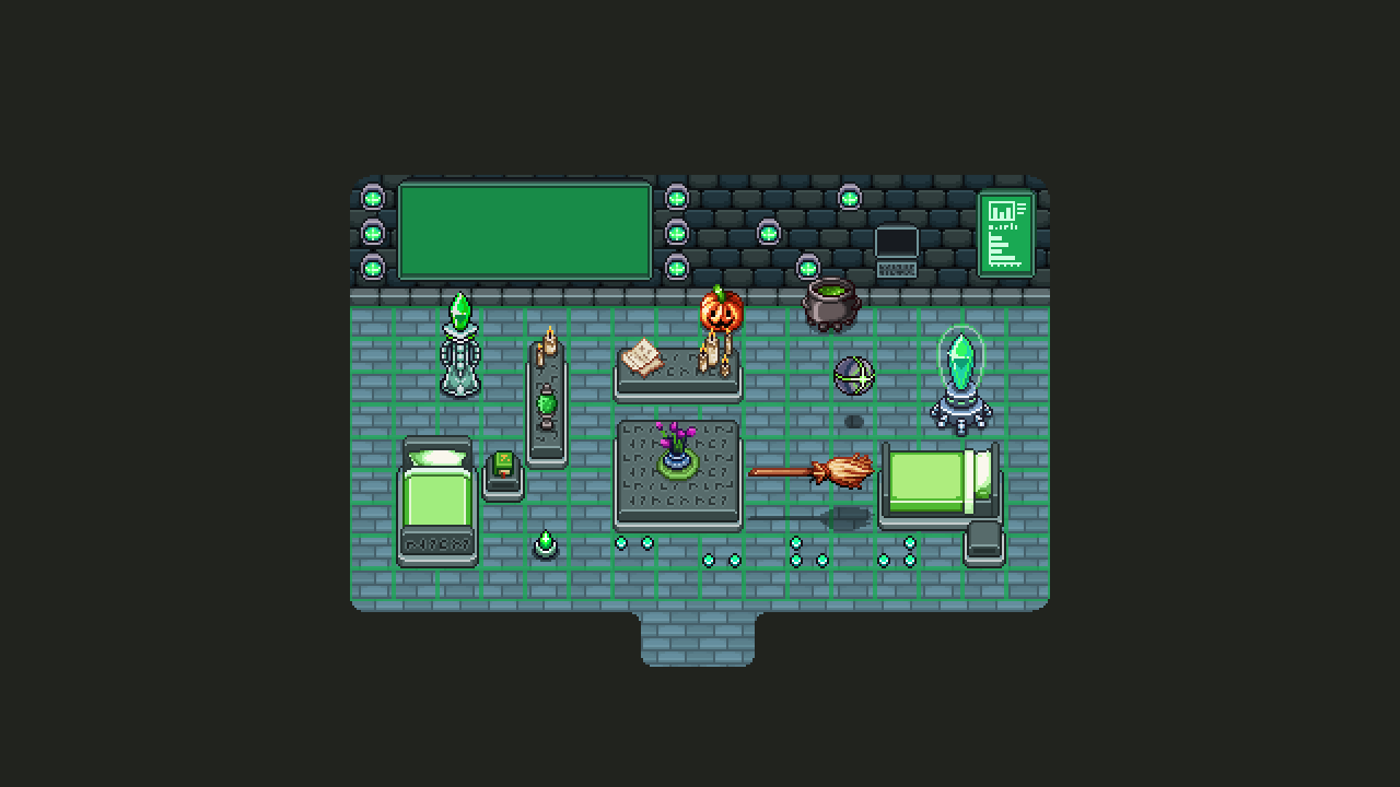
The theme for this batch is Flying Fortress, (tho I added some other stuff to give you an idea of what it can look like combined with items from other areas). Most of the items are based on sprites found throughout the game, only resized (or completely remade) to fit the grid.

bed

Housing Interior_001

It is my hopes that both the sentry and the broom will be animated to at least move up and down in the air, though it would be pretty cool if the sentry could move around the house on its own. I guess that’s up to Teddy, though, who would have to implement those features :)

And finally!!! A sneak peek of what the final Tai Ming boss will look like:

Mimicc

Hello guys! Another week has gone by at the office, and we’re drawing ever closer to finishing Tai Ming’s third zone (slowly but steadily, as you know…) :)

While Teddy and Fred are busy prototyping the two remaining boss battles (one which actually has a working prototype that we’ve been testing already), I began working on the card appearances and some housing items. Housing will very likely be implemented once Tai Ming is done, so it’s time to get a bunch of items ready.

Anyway! First up, the Thorn-Worm card.

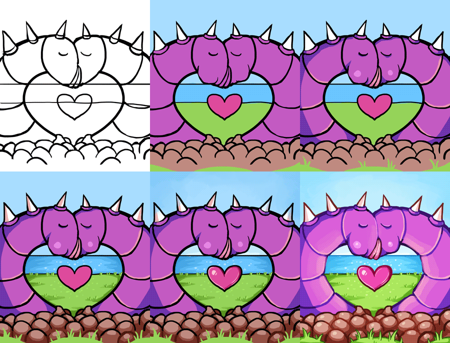
My notes on this card from our design meeting (feels like it happened 100 years ago now), was to have two worms kissing, creating a heart shape. I think we might have decided on this design before the Thorn-Worms were actually made, cause having two of them create a heart shape when they’re so short and fat is kind of heard. I decided to slim ’em down and paint a heart in the middle for clarity.

02

Maybe not the best design out there, but possibly the most gross?

03

Next, the Plantae Hostilis card!

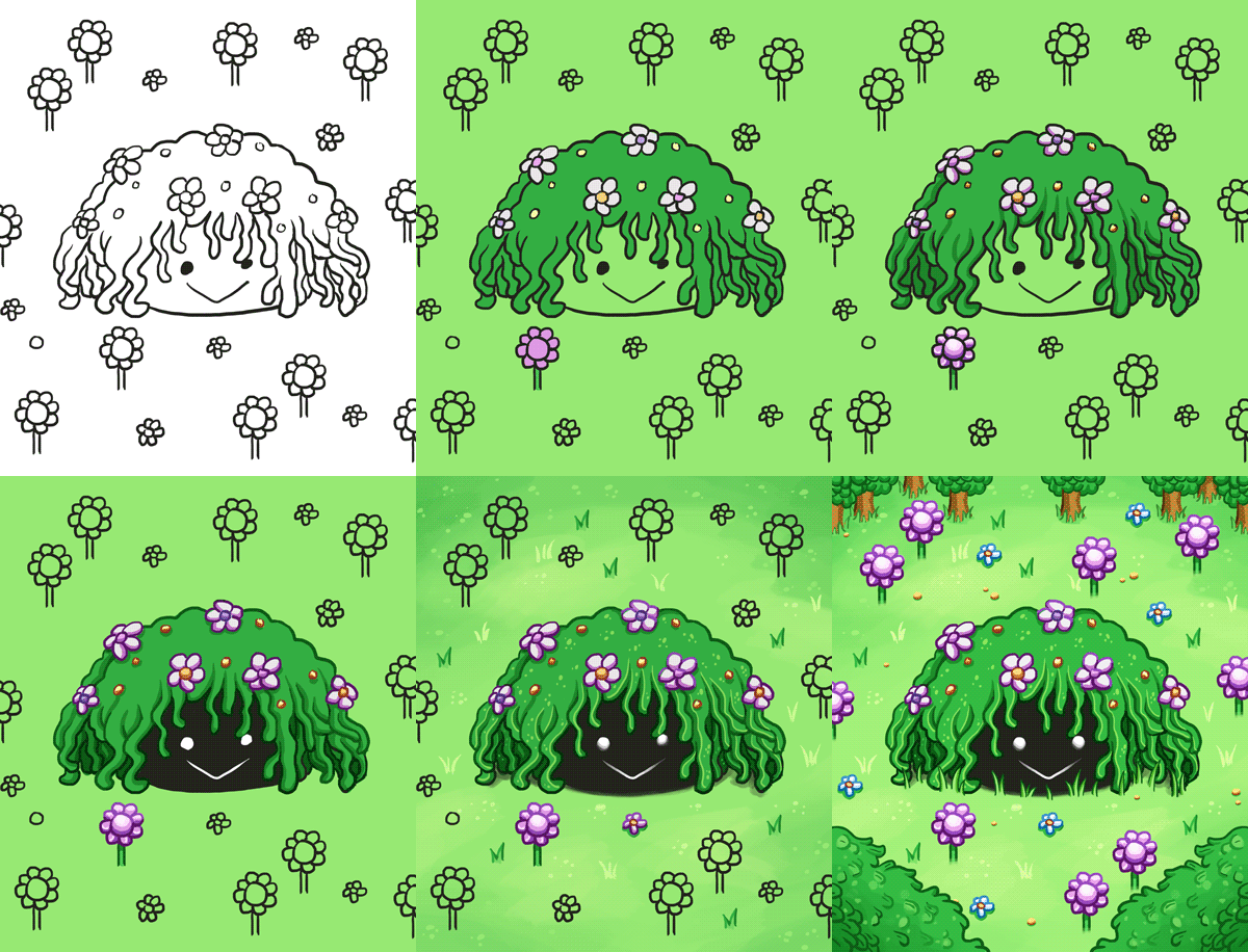
My notes for this said: The enemy sprite surrounded by its spawn. Alright then, that’s kind of straight forward? So, it’s what I did. Lots of greens and flowers. I kind of get a very strong RO vibe from this enemy, and I’m not sure why, but I really like it. Kudos to Fred who designed it!

wip

Finished card sprite below:

planate

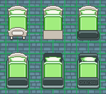
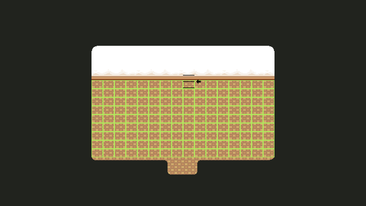
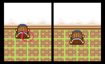
So, Housing! It’s a subject we touch upon every now and then, but as we get closer to finishing Tai Ming, we also get closer to implementing the dang system (finally)! A while ago, Teddy mentioned we changed the dimensions of the grid we use as a base for the housing system. It used to be much more square, and now it looks like this:

01

Basically this meant that every single item made before this change needed to be checked and edited or discarded/completely remade depending on how hard it’d be to fit it into the new grid. So I had a very fun (not really haha) day this week where I added all of those housing items to the Housing master document and manually changed and changed each and every one of them.

02

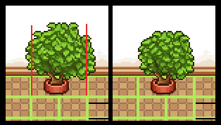
Some, like the plant above, had to change shape, but could still be used. The red lines indicate the end of its two designated slots, so everything going over those had to be cut.

Others, like the wine barrel below, had to be discarded, and will be remade later. In this case the barrel would become too small if fit into one slow, and it’d be much too big if we edited it to fit it into two/four. So, I’ll redesign the thing later and make a design that works better with the grid size!

03

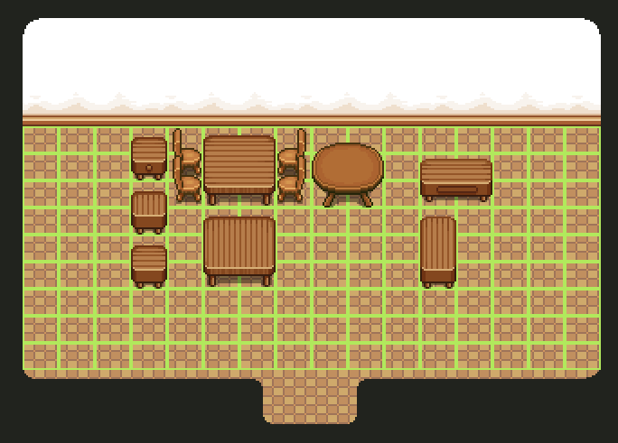
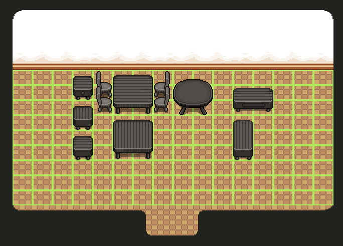
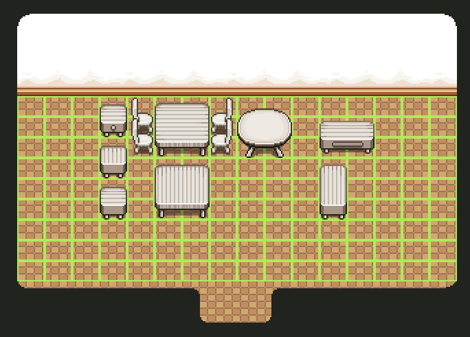
There were also some placeholder items Teddy made to test the system out. These were mostly surfaces (tables and the like) and made quickly by copy-pasting other tables in the game. After checking the other items, I went over those and touched ’em up until they resembled actual game sprites more, and made some color variations:

04

05

06

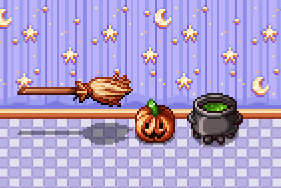
Now we’re finally able to start making batches of new housing items!! I actually went ahead and made a few silly Halloween items on a whim, just to celebrate that we can actually start pumping out housing items for reals:

As you can see in the video, the cauldron is actually a slightly edited version of Fred’s cauldron design for Candy (the witch in Pumpkin Woods). The others were (also as you can see) made from scratch.

housing

A while ago we decided to have a batch of purchasable housing items unlock every time you enter or finish a new area, so it’s very possible these items will unlock once you enter (or complete) Pumpkin Woods. SO I’ll definitely make more items on the theme, and probably a set of basic stuff (like desks and chairs) in suitable colors to match the wallpaper/floor coloring. Also stuff for every other area you unlock… Gonna be a lot of housing items in the future! :)

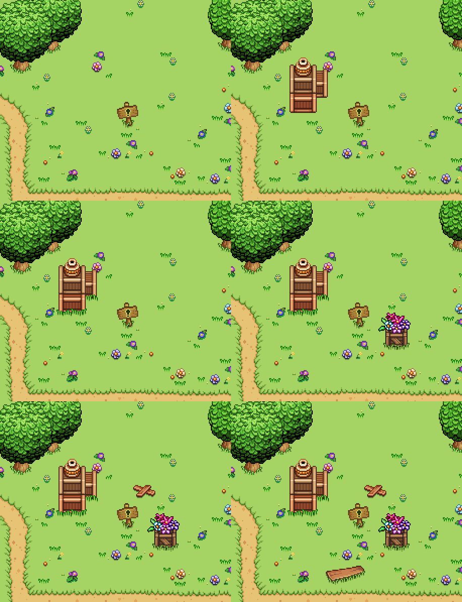
ALSO, this week was AGDQ and during the event there was an Arcade Mode speedrun! Check it out here:

Happy New Year (and we’re back)!! Have you had a nice holiday? We took about a week off to recharge our batteries, but as of last week we’ve all returned to the office to get back to work.

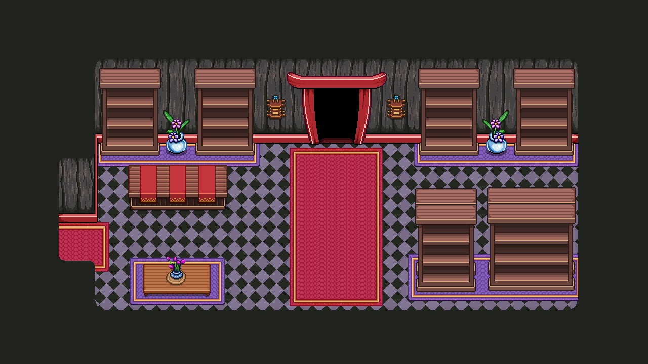
Remember before christmas, when I (Vilya) started working on the final room of Tai Ming’s third zone? Well, over Christmas I went ahead and finished it!

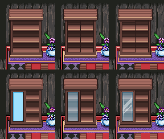
One big focus of this room is the shelf doors! Since the shelves will hold a bunch of different items, many of which aren’t books, I thought it would be cool to add doors and make them look a bit cooler. Plus, variations and all. So I made four different sets of doors: two types of glass doors (one long and one short) plus two types of wooden doors (one long and one short).

01

02

In the end the smaller wooden door didn’t get used, but who knows, maybe it’ll turn up in the future somewhere!

03-library_001

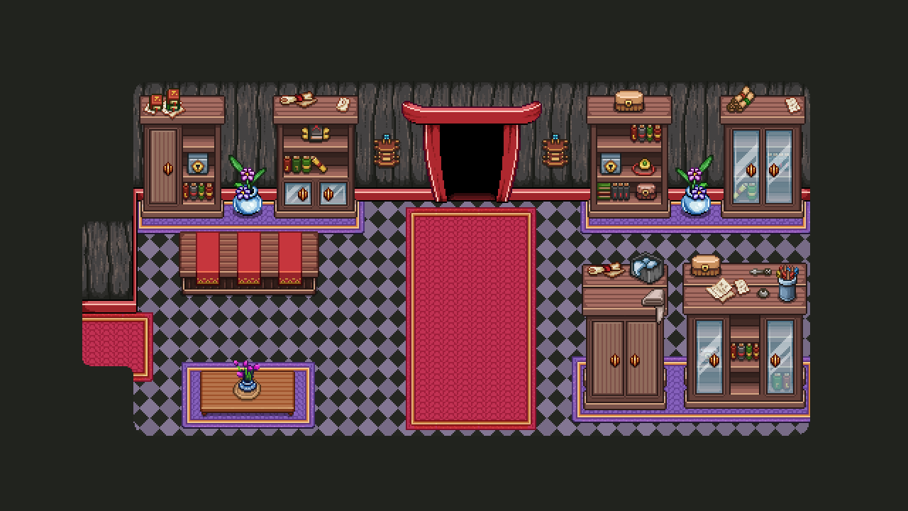
After creating the doors, I began adding a bunch of random props, some which have been used before in various places, as well as some edited stuff:

03-library_002

Next up, painting a bunch of unique props to spice things up a bit:

Some of these items are inspired by various items from other media. Can you figure out which ones and what they have been inspired by? :D

Finally, here’s the finished past version of this room! Whew:

library003

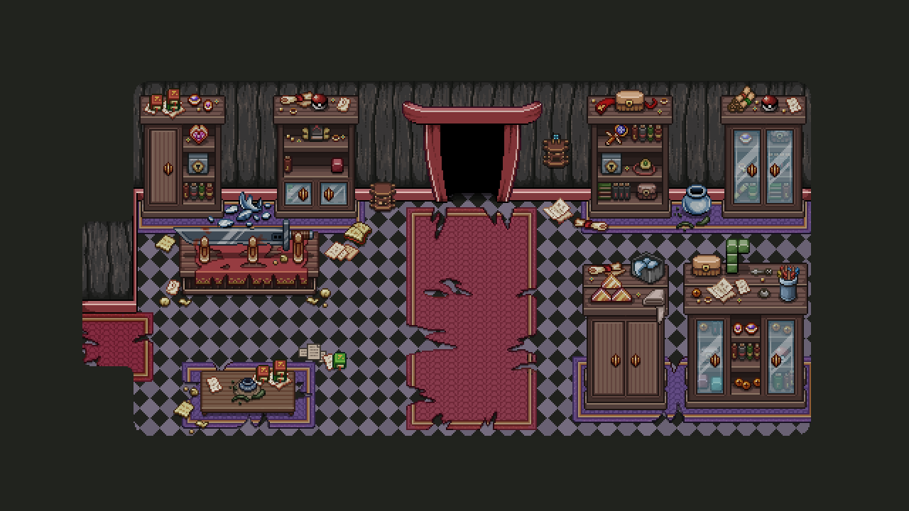
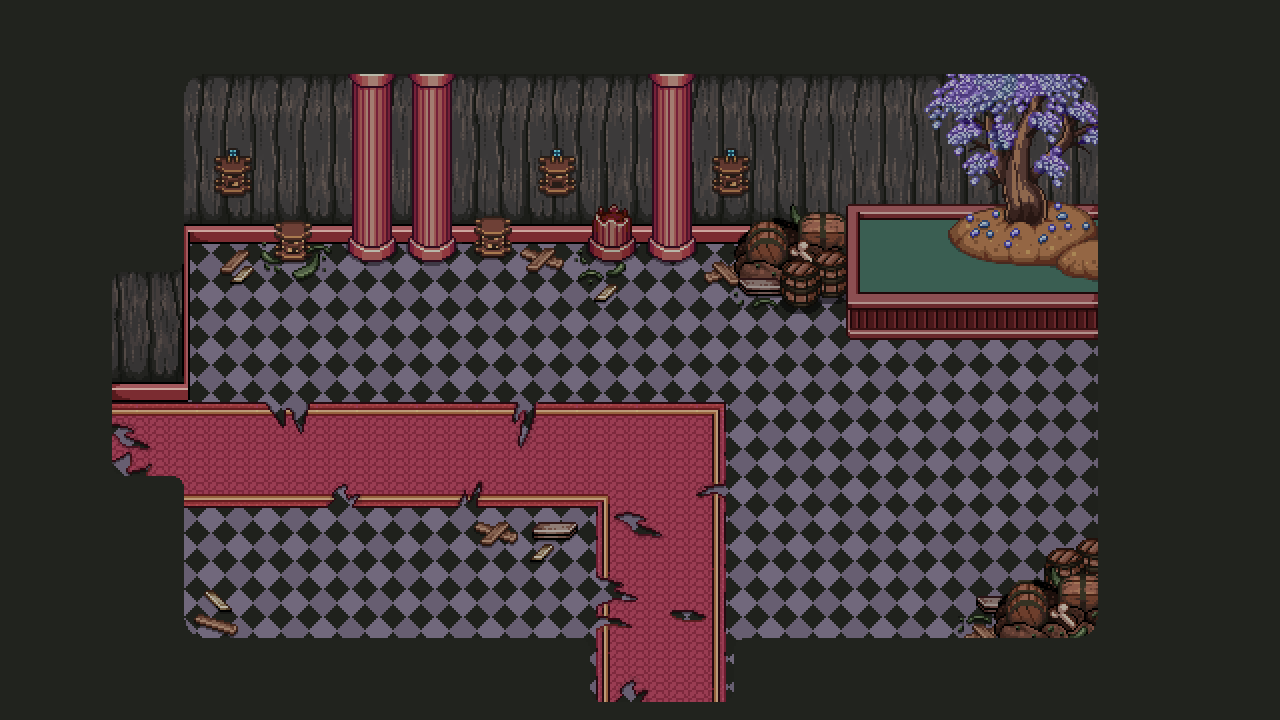
Now, all great things must come to an end (or so they say), and that includes fancy storage room! Forgotten by all, it has decayed and turned into a mess. Main part of turning this room from past to present state involved creating a ton of holes in the carpets. I also threw some random trash on the ground to make the room feel more messy:

presentwip

In the end, here’s the rather bleak main version of this room (you’ll actually only spot the past version through a flashback orb):

present

Now, before Christmas break we had some majord design talks which I may have mentioned in a previous thread. One thing we talked a lot about was Arcade Mode. And there’s some pretty huge changes coming…!

There’s no secret we want to add a bunch of new room types and challenges to Arcade Mode. We have a ton of ideas and it’s likely we’ll begin implementing some of them once we’re done with Tai Ming. However, there are more radical changes coming (though I’m not sure how soon)!

First up, the town will get a lot bigger with many new kinds of special buildings, and you’ll be able to choose which ones will appear first as opposed to the way things are now, where the town slowly updates depending on your total score. This will likely be handled by putting up a bunch of indicators for what will appear where on the map (like signs or character explaining what will appear if you if you ‘choose’ that one in particular).

We’re also reworking how you gain Essence! We’d like to reward everyone more evenly/steadily rather than giving almost no Essence to some and a TON of it to others, depending on how well you do on a run. So if you’re one of those who don’t typically get a lot of essence, you’ll likely get more, and if you tend to get more essence than you can handle, you’ll probably get less.

There MIGHT also be another currency, or rather a rework of an old one: gold! If we implement this, you’ll keep any gold you get on your run + a bonus at the end of each run depending on how things go or how far you get (kind of the way essence works now, but gold won’t be as important so we’re more OK with the pro’s getting more of it). The gold would then be used to unlock the hats and similar items previously exchanged for Essence by the Bishop (he will keep trading perks for essence, but his other shop functions will be moved to one or several other unlockable shops which use gold), as well as other new features.

So basically, Essence is used to unlock perks and town features where you can spend your gold (if the gold part gets implemented)! Whether gold gets added or not kind of depends on whether we feel there are enough cool things to spend your gold on, or if we’d prefer to keep most of it free of charge and use Essence for the rest.

——–

Typically this is where we’d have a bunch of Fred’s animations, but since he’s still working on some upcoming and very spoilerific cutscenes and fights… We’ll keep those to ourselves for a while yet. Hang in there! ;)

Hey guys, Vilya here! This week it’s time for us Swedes to celebrate christmas!

Teddy is already back at his hometown catching up with friends and family and Fred will leave later this week, so it’s time for a little break to recharge our batteries. Before that though, there’s one more weekly recap!

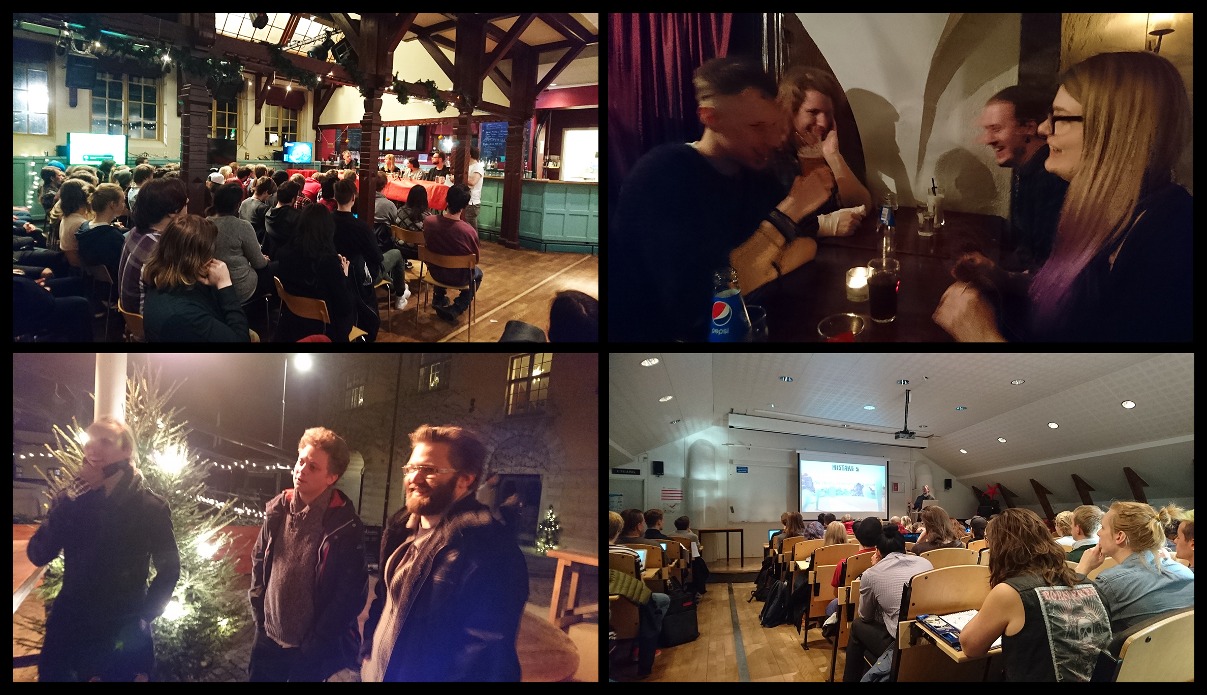
Since we live on the island where our gamedev education was held, every year there’s a couple of fun events for us alumni to attend. Last week was one of them: the Alumni Days!

The Alumni Days consist of 2-3 days where people who graduated come back to school to hold lectures on what it’s like out there ‘in the industry’, answer questions at a panel, plus attend some parties and dinner(s)!

alumnidays

This year was an absolute blast, and there were a lot of great lectures, all of which will eventually be uploaded on this YouTube channel (some are already there). Go check it out if you’re an aspiring dev – there’s already a ton of lectures from previous years too :)

This year’s edition went on from Thursday to Saturday, so there were three days of lectures and hanging out with other devs from our old class (among others)! While living on this isolated island can be quite trying sometimes (everything else is sooo far away), it’s great to be able to meet up with everyone like this and get inspired by other developers.

And now, the present version of the room from last week! Time to break some stuff :3

01gif

As with the previous battle room, I added a bunch of random stuff to the floor to make it look more interesting. The pure water has become a sickly green, and the tree has turned a more sinister shade (if there is such a thing as a sinister shade)… :)

02

Next, time to start working on the final room of the shrine in Tai Ming’s third zone! And it’s quite a large one…

03gif

So, this room is a kind of storage/library room where a lot of artifact and treasures will be housed. Because painting all these items will take a lot of time, I decided to split this post in 2-4 parts (depending on how much stuff I end up recording/creating GIFs of).

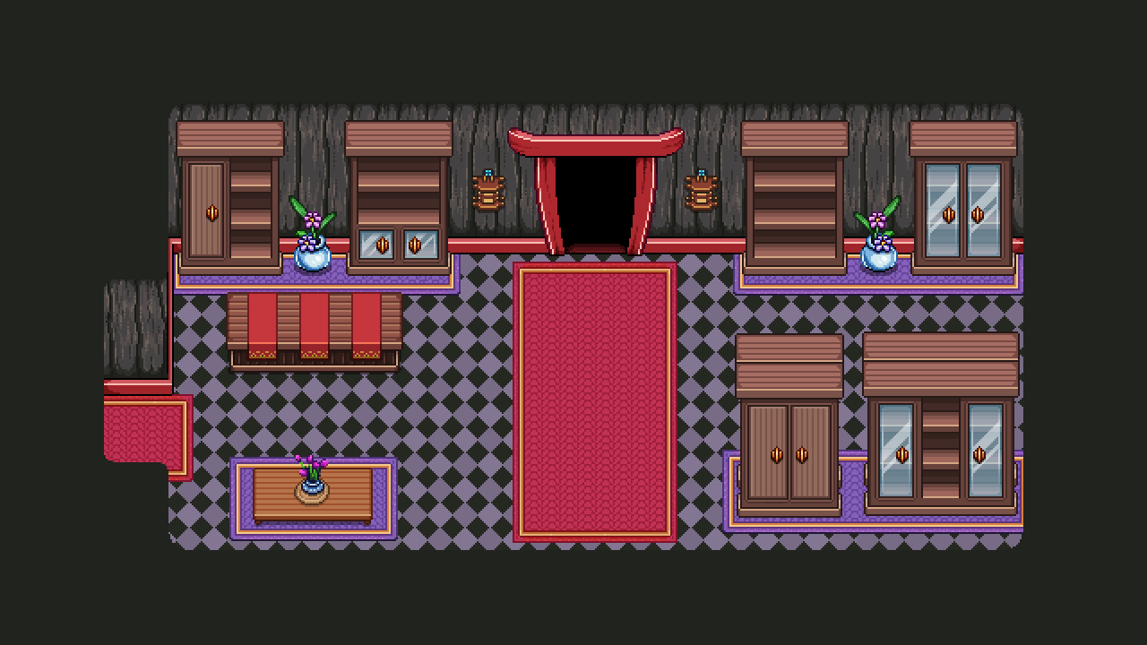
In this first part, it’s all about the basic stuff, creating the backbone of the room: floors, walls, bookcases/shelves that will contain the items. In the next 1-2 parts I’ll be making a bunch of GIFs of the items and shelf-doors, etc, being added! And of course, after that we need to make a present version of the room as well :)

After step 1, here’s what we got:

04

Some of you might remember Professor Pine, the guys behind the “diary entries” of Flying Fortress? Well, time to meet the guy!

05

Actually, you won’t exactly meet him… But you WILL watch him do some talking many years ago, through a flashback orb! What could he be doing in Tai Ming?

06

With my parts of Tai Ming almost being finished, it’s time to start looking ahead and think about what’s coming next. First up, we’re gonna update Arcade Mode, adding the Mt. Bloom and Tai Ming floors (and after that likely spend some time adding bonus things – Housing for example). Once I complete the final things for Tai Ming (the final room + cards) that means I’ll be focusing on Arcade Mode backgrounds and a TON of furniture, which will be a lot of fun!

After that, it’s finally time to start with the next area… I’ve already completed most of the art for the desert, which is supposed to come after Tai Ming, so for me that means I’ll begin playing around with the harbor town that comes after it. Then there’s only two temples/dungeons left! I can’t believe we’ve actually come this far, haha. Though it’s been 5 years already it feels like we began working on Grindea yesterday. Time flies when you have fun, and working on this game has definitely been a blast from the start!

Definitely looking forward to another year of fun gamedev, and I hope you’ll all stay with us through our journey! After all, without you guys there would be no game. So thank you for the support, and I hope you have a happy holiday/merry christmas/just a wonderful time :D

07

See you next year!!

This week we uploaded another patch to the frontline beta, featuring a bunch of smaller updates! The biggest changes, from the patch notes:

World Map Completion: Based on a suggestion on our forums, we’ve added completion tracking for the World Map! It tells you how many cards, drops, fishes, quests and secrets you have yet to find in any given area. This should help people figure out what it is they’re missing for that juicy 100 % completion! Note that the Achievements and Crafting completion is still tracked via their own menus.

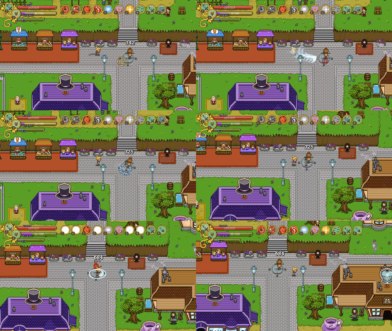
Damage Numbers: The new default setting for displaying damage numbers is “Composite”, which turns your damage into one big number per enemy instead of many small numbers. We did this change mainly because some builds dish out so many hits that the old damage numbers cluttered everything, and in multiplayer this happened pretty much regardless of builds. It also makes damage over time a bit more readable, as well as how much damage a flamethrower or blade flurry cast actually does in the end! For people unhappy with this change, there’s a “Classic” option that mimics the old style, as well as an even more streamlined option called “Minimalistic”, and of course… an option to turn off damage numbers completely!

HP Bars: Enemies now have HP bars above their heads by default. These appear after an enemy has taken damage, and fade away after a while if no new damage is taken! Also, low HP allies in multiplayer also have their HP displayed above their heads. Both of these types of HP bars can be disabled, or set to always appear if an enemy or player is below full HP.

There’s also the accessory shop, among other things (which we already began preparing in last week’s post), and a bunch of new characters!

Joining his sister in the store will be this young fellow! Yes, it’s a guy, you know the drill, Vilya can’t draw guys… though I think they do look a bit manlier now…maybe (ignoring the braids)??

01-wip

Anyway! Being the heir to their father’s business, he’s sick and tired of the boring stuff and would like nothing more than to become a collector. Perhaps there’s some way you can help him? We actually haven’t decided on any quests surrounding this family but it would be pretty cool :)

02-sprite

There’s also the father of the accessory store’s shop keeper and her brother! This is one famous merchant, visiting to check up on his daughter who has moved abroad to open up a shop of her own:

01-wip

As mentioned before, he’d like nothing more than for one of his children to take over his business, but with the daughter setting up a store of her own and his son’s lacking interest… Whatever will become of it?!

02-sprite

Now, remember the person entertaining a bunch of artifacts in the first part of Tai Ming?

01

Well, they’re back! Only this time in the second zone! Some of the artifacts have been replaced, and this Helmet appears instead!

02-wip

Not much is currently known about Helmet, but I’m quite sure Teddy has come up with some awesome dialogue for this guy (or girl). I mean, life has to be kind of cool as a helmet, right?

03-sprite

…Right?

Now, as always before a patch, there’s a bunch of smaller things to be edited or fixed!

First up, the accessory-siblings. We adjusted the skin tone of the brother slightly to make him fit in better with the rest of his family, and changed the hair color of the shop owner girl for the same reason:

accessorybrother

accessorysister

We also played around with the Accessory shop title, which previously was called “Accessory & Co” but is “Ruby’s Rubies”. Our current favorite (and the one who made it to the patch) is the middle one:

accessorytitle

Next up, we wanted the Accessory shop to stand out a bit more, so I was tasked with changing its colors! Below is the previous version as well as two color alternatives for the shop. We’ll probably go for the standard wall color, though in the future I might go back and edit the houses in Evergrind City in general.. Who knows what colors the walls will end up having then?

Before:

accext01

After, version 1 and version 2:

accext02

The ruins in the west needed their own title to appear as you enter the area as well as a name! We settled for Ancient Ruins for now, subject to change if we come up with something else… :)

ancientruins

Some of you noticed the chest closing in the present after you opened it and the water is low. Fear not, it has been solved – the chest will now remain open. Though where did the plants go? :o

chestinrubble

Then, since a flashback scene with Mana and the children (Zhamla and Tessen) has been added, so I got to make a bunch of new expressions for our favorite nanny! :)

mana

Finally……. Back to the third Tai Ming map and that old shrine!!

01

Aside from being a place to battle enemies in the present, this room will also hold another flashback orb, with the people of Tai Ming enlisting the help of the Flying Fortress crew to deal with a certain threat.

Since I don’t know exactly how much of the room will be shown in the flashback orb yet, I’m keeping the past version quite bare for now. I’ll probably add more decorations once I know where and how the cutscene will play out :)

02

Next week we’ll continue working on the third part of Tai Ming, and since the holidays are coming up and we’ll spend some time apart we’ve begun having more design meeting so everyone knows what’s coming next in the game! For those cases when we want to work but can’t get a hold of the others to ask questions, you know. Therefore, I expect the next two posts (or so) will contain more design talk and mentions of upcoming features…. But we’ll see :)

This week we continue to prepare things for a mini-patch adding the new features we talked about last week (new damage numbers etc)!

Remember the Accessory shop from the last recap? Well, someone has to run it! Time for another portrait~
01-wip

This girl comes from the Merchant Isles and has moved to Evergrind City to open her Accessory shop! Her father and brother will be visiting as well, checking out her new business, so they will be upcoming portraits later on :)

02-sprite

Last week I also mentioned adding some stuff to the world map. A big thanks to Own who came up with the great idea in this thread :)

So, for a long time now we’ve wanted to add some things to the world map in order to give more clarity for people wishing to 100% the game and as a general incentive to explore each area a bit more thoroughly (if you see how many secrets you have left you feel more inclined to find the rest, right?)

map01

So anyway! We have two sets of additions. First, a bunch of icons on the left side, indicating (in order) Enemy drops, Cards, Quests, Fishes and Secrets. Next to these icons will be a counter showing how many you’ve got vs how many there are (for example 06/10). These numbers are map specific and will change depending on which part of the map you’re hovering over.

The second part is the pet and map counter in the lower right corner of the map, indicating how many pets and maps you’ve found vs hos many there are. These are global and will show the same number regardless of which area you’ve currently selected.

We also plan on adding a percentage next to each area name, so in the case above, it would say “Evergrind City 48%” indicating I have achieved 48% completion of said area. As some things get added in patches or you unlock new quests as you progress through the story, it will be possible to get 100% on one area, only to have it revert back to say 70% as new content gets unlocked. When this happens you’ll get a notice letting you know your map has been updated, and there will be a “New” sign above each part of the map with new stuff to do/find :)

Now, with the world map expanding and new areas being added, it’s time to rebuild and add to the world map :D

First of all, it’s time to rebuild some of the puzzle pieces that make up the world map. These will be changed further as we go along and add the desert map & the maps past it. But first things first! This time, it’s the upper left corner that has been adjusted.

Before:

puzzlepiece01a

After:

puzzlepiece01b

Next, time to take a look at what happens beneath those puzzle pieces… Previously, we hadn’t added the ancient ruins above the western Evergrind fields, so there was no need to include it on the world map. Now that it’s been implemented, no more excuses!

We also expanded the size of the winter area a bit in the process, filling out some empty spaces and making sure the ruins don’t look too big compared to their size in the game.

Before:

mapadd01

After:

mapadd02

But what about Tai Ming, you ask? Of course, the old town needs some kind of indicator as well! We’ve solved that by adding a speech bubble indicating the city’s past or present state (depending on how far along the story you are) once you enter the town for the first time:

taiming

Finally, I made the stars which will indicate when you’ve achieved 100% completion of an area. I thought my 200+ hour character Masken who I use to bug test things would have a ton of these stars, but turns around I’m a terrible Collector – no stars for me :(

stars

How many will you get once this gets uploaded to the beta? :D

Finally, a brief return to the third Tai Ming zone! The exit/meeting room in it’s present state:

exit01

It’s always fun painting broken glass and vases, so I got to have some fun with this! Also had to split the table in two, so the flashback orb can be placed in the middle, showing everyone around the table!

exit02

Also, no enemies in this room so no problem having a bunch of props lying around :)

Hello guys!! This weekly recap will be a little different, to say the least! I (Vilya) had to go home to my hometown for a funeral last week, so I haven’t prepared anything to show on the blog. But rest easy, things have kept moving on in the Pixel Ferrets office anyway!

While Fred continues to prepare a ton of cutscene animations for the third zone, Teddy has set his sight on fixing and adding a bunch of things we’ve wanted to include in the game for quite a long time!

First up, and perhaps most importantly – new damage numbers! We’ve totally revamped the way these work. Take a look below for the old version:

damage_old

And now, the new version:

damage_new

So a bunch of things have happened here! First up, there will be tiny numbers showing how much damage you make with each hit, and a big number showing how much damage you’ve done in total within a limited amount of time! So long as you continuously damage an enemy this number will continue to increase. When you crit, the damage text flashes and there are pretty stars flying about! We also have plans to have the damage number increase in size the longer/bigger your combo is, and add some smaller stars to the crit-effect as well. But all in good time…

Another thing you might notice in the above GIF is – yes – Health bars above the enemies! Wohoo! I’m personally very happy about this update, as it makes hitting enemies much more satisfying when you can see their hp dwindle. True, you could do so before by checking the lower right corner, but it’s just not as effective (at least, I kept taking damage while doing that) or as satisfying. The health bar will appear once you hit an enemy and disappears after a while after you quit dealing damage to it.

And YES, this means health bars in Multiplayer will be a thing! You’ll be able to see the health bar of your friends when they go under a certain amount of HP, so now you’ll know who really deserved that health orb, and who was the petty thief!

Teddy also added The Western Ruins to the game, so there’s one more “Sorry this area ain’t implemented yet” notice gone. You can’t actually do anything here yet, except look at the scenery and battle a few slimes, but hey! At least it’s not an annoying invisible wall:

ruins

Also, we’ve finally added the Buy Back feature, which we’ve talked about for a loooong time. Shady Merchant is now officially your go-to guy for buying back anything you’ve sold in the game, and the Accessory Shop has moved into a building of its own:

shady

accessory

Ok, ok. One more thing. In order to make it clearer when a quest has been updated, we’re adding this new feature:

questupdate

This is still an early work in progress, but the idea is that whenever a quest gets updated in some way, you’ll get a notice saying ‘Update’ above your head, after which the corresponding quest window will flash in the upper right corner. If you’re currently tracking another quest, it’ll fade back to that one after some time, and if you don’t track any quest at all it’ll simply fade away. This is all to make it a bit easier knowing when you’ve done something that change the objectives of a quest, or if you’re tracking another quest and ‘accidentally’ make progress in another, so you know what’s going on.

We also plan on doing a ton of improvements on the in-game map before Fred is fully done with all the animations needed to implement the scenes in Tai Ming’s third zone! There will be a ton of helpful trackers there, showing you exactly how much you’ve got left to do before achieving 100% on each area. But that’s for another post!

Before saying bye-bye today, here’s one of the few non-spoiler animations Fred is able to show you guys. Behold, a bunch of praying priests:

praying

Stay tuned! :)