Vilya is unavailable, which means it’s time for one final(?) Fred guest appearance! Lesss go!

It’s become increasingly harder and harder for me to show content here on the blog since everything I’m working on now either falls in the camp of “Oh, this is way too spoiler-y” or “this is waaay too boring and uninteresting”. This is kind of sad since it makes for pretty bare-boned posts here, but overall it’s great because it means; the game is soon finished!

Anyway, been scraping the barrel and here’s some stuff from last week:


I can also report, after spending almost one week in our new office, that it kicks absolutley ass so far! It’s been slightly overwhelming getting used to being around other people again (fellow introverts rise up!), but I’m already starting to feel settled in, my production levels have been through the roof AND there’s unlimited free fruit! What’s not to love?

Tiny tour of my little spot:

And yeah, I dunno, I think Imma head back to the animation dungeon! Love you guys, Fred OUT!

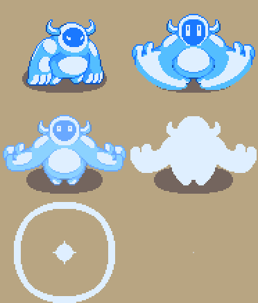
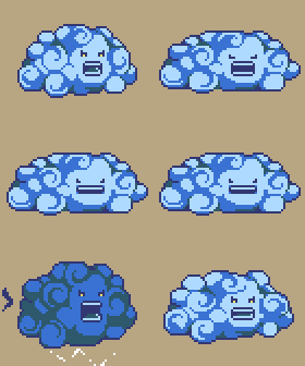
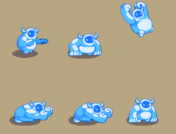
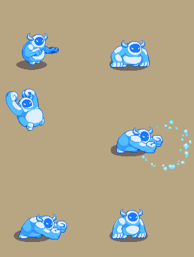
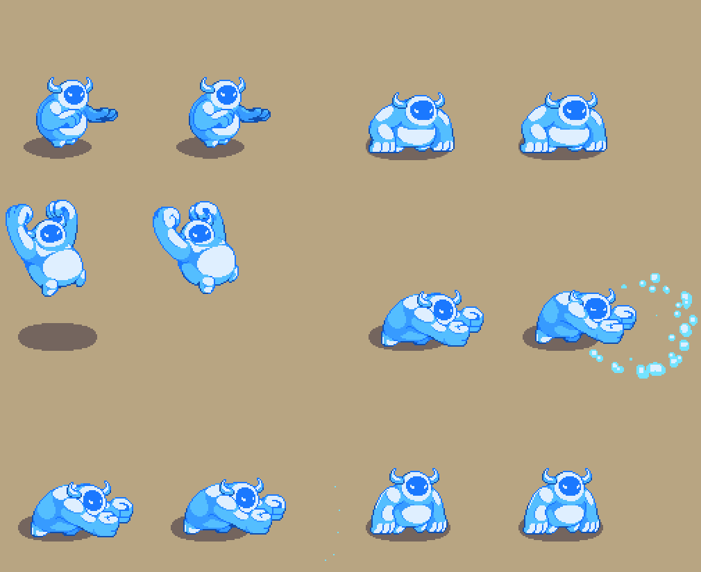
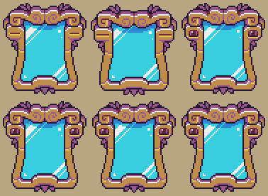
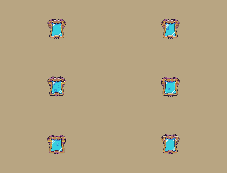
Eyooo! Fred here, once again standing in for the blogging duties! This time I feel even more unprepared than usual and since I’m not a natural writer in any shape or form, I’m just going to do sort of an animation dump of some random stuff I’ve been tinker with the last few weeks. Some are rendered versions of sketch animations that’ve been posted before, some are freshly made animations straight from the oven. Enjoy!

Frosty with some acrobatic moves! 


Frosty being sent into the shadow realm!


Cloudy doing cloud stuff!


A little lineup of Planty’s attack from first iteration to last!


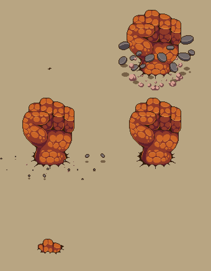
Finally, some tasty, tasty rock particles!


Vilya is still out of commission, Teddy switched out his food poisoning to being sick so I’m once again in charge. In true Fred fashion, I totally forgot to post yesterday as well, keeping up with traditions. Anyway, lesss go!

I think I’m going to do a bit of a deep dive into one of the animations I’ve been working on this weekend; the smash animation for Zhamla’s Frosty Friend. First of all, here is the very first iteration I did of it a few months ago when we began working on all of Zhamla’s summons:

The animation is a bit stiff and lacks impact, but in terms of trying out gameplay this gets the job done and then some. Even if this is intended as a “quick and dirty”-animation, I still spend a decent amount of time at this point to get the keyframes as correct and rendered as possible. I do this because it actually speeds up the rest of the process, I can use does finished frames as a base that I can animate around instead of going fully blind into it. Just diving into it CAN also be useful, it depends on what you’re animating really. For characters doing big movements like this, I almost always end up doing the keyframes first. If it is more of a subtle movement, like an idle, or a more abstract effect or something, I tend to like animating in the order the frames appear instead of jumping to the keyframes.

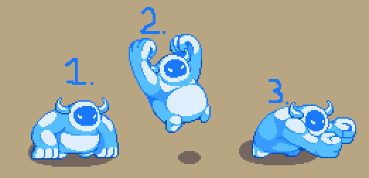
Oh, keyframes are the frames that contain the most exaggerated poses. So in this case, the keyframes (or poses) would be these three:

So, after this it’s pretty much just, slapping on more frames where I see fit to give it the level of smoothness and bouncyness I prefer. Here you can see I’ve added a bunch of extra frames and smears when his up in the air, preparing to smash!

This looks much better already, but the lack of impact when he lands again is very noticeable and the next thing I’ll fix!

Look at that jiggly little boiiii~ This might even be on the verge of over-animation, but I’m a jiggle addict, what can I do? None the less I really like what this added to the animation. Still feel like there’s some impact missing from the smash, and his “return to idle”-animation is almost none existent. Let’s get that fixed as well!

Ta-daa! Some smoke for that juicy impact and a smooth transition back to idle. In the game, he will recieve some added effects to make him even juicer, but even without them I really like how this turned out. Hopefully, it will feel good in the game as well!

Finishing up with a little side by side comparison of the first and last iteration:

Aaaand, yeah, I think I’m gonna wrap up here. Time to head back to the dungeon to finish up the final animations for the chilly boi! Baaaiiiiii, love you all~

So, Vilya is down with the flu. Teddy was supposed to step in and take care of the blogging duties this time, but in a sick twist of fate, HE ended up getting food poisoned and is out of commisson as well. Which means… Fred’s baaaaack b*tches!

Since I’m super unprepared for this I’m just gonna go with the flow and see what this turns into. SO! Last post we showed a bunch of animations I made for Zhamlas Echo of Madness-attack so this week I figured it would be fitting to show how they look in the game:

I think it looks and plays well, the only thing that needs a bit more polish is the “disappear after attacking”-part. I’ve done a very basic flash that we’re going to try to combine with the current effect, along with some color adjustments:
I think it’s going to look pretty sweet!

Other stuff I’ve been tinkering with, Zhamlas little Cloud buddy has gotten a few new animations to give his bigger attack a bit more build-up and visual feedback. Here’s a video Teddy put together showcasing it all in action:

Fun fact that I’m not sure has been mentioned on the blog: The cloud Zhamla is using is actually the original Gold Charge-version of the player’s cloud. We ended up discarding it because it was way too big and got in the way all the time. It also looks hella menacing, which we decided we didn’t like since the other two versions of the cloud looks so happy and dumb. It fits Zhamla perfectly tho so we figured, why not use it? Ending this random trivia note with a little family photo of the two:

Soo, yeah, I think I’m gonna wrap it up here. Missed talking to you guys, but hopefully, Vilya will be back in full force next week. Let’s all send a bunch of love to both Vilya and Teddy and hope for a speedy recovery. STAY AWAY FROM THE SHRAMP TEDDY!

Waddap, party people!

Fred back at it with more blogging, this time I’m reporting live from the vacation chair tho! We’re taking two weeks off to spend some much-needed time hanging out with family and friends while enjoying the last stretch of the Swedish summer. I’m gonna be doing a whole lot of chilling and doing absolutely nothing, and I can’t freaking wait you guys! After that, we’ll be ready for what might very well be the final push of the game before release. So, frickin, exciting!

This leads me to a more somber note. This will probably be the final post of my illustrious career as an intern devlog writer ._. After the vacation, I will hand the keys to the city back to Vilya, so I can go back to fully focus on pushing pixels and finishing up the final animations for the game. I know, I know, you’re all like “No Fred, write even more posts! We don’t care if it takes another 10 years until release” and I agree, but that’s just the animator’s life sadly. No, but seriously, writing the blog has been a trip! Shout-out to the SoG-discord server for showing me some extra love, it definitely helped fuel my confidence (maybe a bit too much?)

We’ll be back with more updates in a few weeks. Until then, take care, love you guyysss <3 Fred signing out!

Slabbe showing you how to vacation

*kicks in door*

I’M HERE, I’m here! Totally didn’t forget I was in charge of the blog still, I would never! Since I’m so not late and so on time, let’s just dive into the juicy stuff straight away!

Last week I showed you guys that little elevator animation-thingie I was working on. Since then, Teddy has been busy hammering all that together into an actual ingame prototype! Here’s iteration nr. 1:

As always, Teddy has done a stellar job transferring my chaotic Photoshop document into something playable. I like this version a lot, it feels more or less one-to-one to my version. I dooo think the little pause/stop the platforms do before they actually connect feels a bit off tho. It felt really nice when I was working on it in a vacuum inside Photoshop, but seeing it ingame we all felt it would look better if the platforms just connected to each other instantly.

This looks much better to me, just the flow and impact of everything feel much smoother and juicier. I’m actually kinda stoked over how well this turned out, I was very prepared for having to re-iterate the whole idea or at the very least add a bunch more effects and polish to it. But I dunno, I think it looks really good! Throwing in one more video just because I can:

So, a problem this added coolness of the elevator has created iiis, some other aspects of the elevator sequence now feels a bit tame in comparison. Especially Mirrar himself feel a bit static and stiff which is completely unacceptable!

This has been kinda my main task this week, trying to add some extra layers of CHA-PLOW to our little reflective friend. Starting out, I wanted to revisit his “wake up”-animation. This is the sequence that plays when Mirrar wakes up for the first time after the elevator activation. Here is the original animation:

Simple. Boring. Not enough “oh shiiii- it’s time for the final part of the game”-energy exerted. So, this is the amped-up version:

I like this one much more. The added length and build-up to the wake up add a ton of anticipation for me, and the effect adds some much needed flair. One thing I do like from the original is the little “I just woke up”-blinks he does after the wake up, definitely stealing those for the upgraded version.
You could for sure push this even further, adding even more effects, but I want to see it in the actual game before I do anything else.

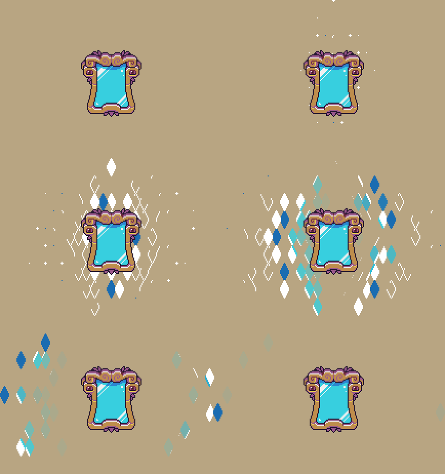
I’ve also tried to come up with some more abstract (yet mirror-y) effects that can be used to add even more oompf wherever we see fit:

I had a ton of fun tinkering with this, Photoshop on the other hand did not. Surprisingly, having 1000~ layers in a single document will make Photoshop have “performance issues”? Who knew!

Fred here again!

I was thinking… Since I’m still interning as Lead Blog Master, and have ultimate and all-mighty power over this thing, why not focus on what I do best? Let’s talk some animatiooooooonnn!

I figured I could try to do like a step-by-step of some animation-related stuff I’ve been experimenting with this week. Just share some general thoughts and maybe some tips and tricks. Makes it easier for me to write about, and hopefully, it’s a bit interesting for you guys as well ;D Anyway, lesss goo!

So, this week I wanted to add some more epic and juiciness to the platforms appearing in this sequence:

Even in this state it actually looks pretty good, but I’ve always felt there’s been potential for some extra level of pizzazz here. It is the lead-up to the conclusion of the entire game after all, I would rather it feel overboard than overwhelming. Hopefully, we’ll find a sweet middle ground, but we’ll see what happens!

What I start out with here is just adding some basic movement for the smaller platform piece. My main gripe with the original version is that the movement was a bit too smooth for me, so I try to counteract that here by adding different speeds to the animation and points where it comes to a complete standstill. This just helps a lot with adding impact and force.
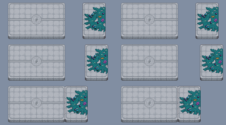
It moves! Looks kinda cool, but a bit too stale for my liking. Here’s a super useful magic trick I use all the time to help add impact and feedback: add a few frames of wobble at the moment of impact. The wobble here is super simple, just moving the platform a few pixels over the course of 4 frames. Super simple, but super effective!

Now I want to add a bit more anticipation to the whole animation, just to make sure players have the time to adjust their focus. This is super important when animating in general, if you don’t give your spectators a tiny heads-up something cool is about to happen, they could end up missing that sweet animation you’ve spent tons of hours on. In games, it gets extra tricky because there are so many situations where a player has to focus on multiple things on the screen at once. I battle with this a lot myself, even if I’m slowly getting better at it. ANYWAY, less talk, more animation!

Some added “oh lawd, he cometh”-wobbling and we’re good to go!

So now we’ve got the player’s attention, time to take advantage of that and add some more KA-PLAOW!
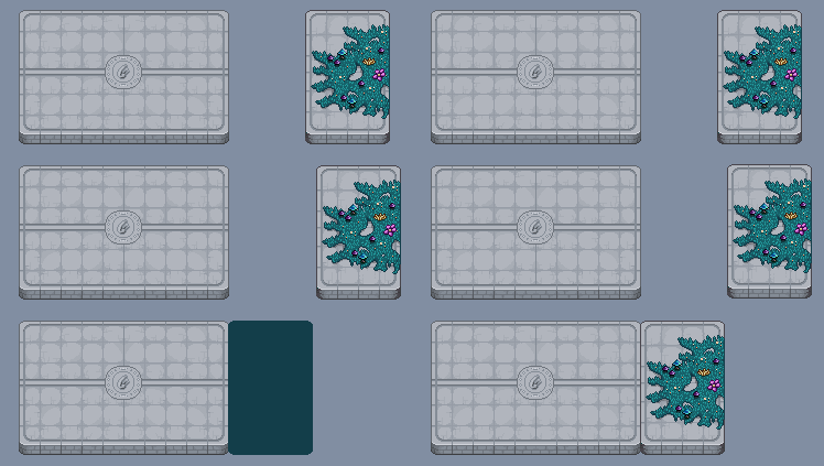
Much better. Not too over the top, but still way juicier than before. I added a small trailing effect here as well, which I’ve tried to keep intentionally simple. It’s basically just a square lagging behind the platform for 2 frames. Since there is a ton of different platform pieces both in size and visuals, I want to keep as much of the animation as modular as I can. If I can create effects that Teddy can easily recreate using code, that’s the dream!

So, while the trail looks kinda sweet already, we can do better. Time for my favorite; particlesss!
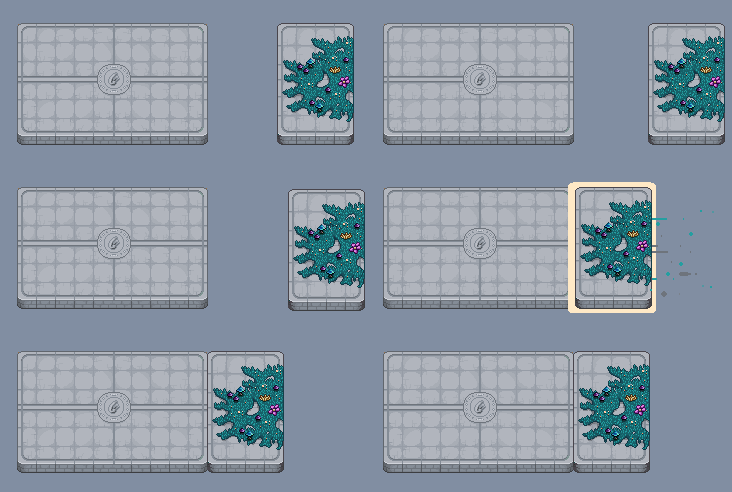
Here I’ve basically just added 3 different particles I made and copied and pasted them a bunch. I could probably have added more, but doing so in Photoshop get’s so tedious and time-consuming, especially when you want to try out different timings and stuff like that. Since the particles are also something that Teddy will control via code, it’s just easier to fine-adjust them at that stage.

We’re missing the most essential thing of all:

Smoke, the salt of an animator’s kitchen!

At this point, I dunno, I feel kinda happy! Like I’ve said, a lot of stuff here can be adjusted and fine-tuned in the code later but this looks solid as a base! As always it’s going to be exciting to see Teddy translate this “prototype” animation into the game, he usually does an amazing job so :) I will update you guys when we have more to show on that front.

As a little wrap-up, here is the entire sequence, with more than just the one platform:

I’ve messed around a bit with another added effect for the main platform which I don’t think I nailed fully, but I still think there’s something there to keep exploring. Added a touch of wobble to the big papa platform as well!

Anyway, thanks for reading this week’s issue of “Fred’s animation blog”! Will I be back next week? We’ll see. Until next time, love you all. Baaaiiiiiii! <3

Fred here! With Vilya being very busy with moving houses still, I’m filling in to keep the blog posts rolling. I was actually supposed to fill in for her last week as well buuut, I kinda forgot. Learning on the job 8)

Diving right into it; Teddy has done a ton of work for the final cutscene this week. For starters, adding and timing all of the music our lovely musician Riley has been sending us for the past month. It’s 9 tracks in total for the entire sequence of scenes and, you guys, it’s going to be epic! The music adds so much, it’s always such a cool experience hearing a scene with music for the first time. Especially in this case when it’s such a massive cutscene that we have been tinkering with for such a long time. If I can figure it out, I could add a track or two for you people to listen to. Might save that technical venture for next week tho ;D

Besides music, a lot of time has been spent adding multiplayer versions of the cutscenes. This means making every player have their own unique reactions, timings and positions during multiplayer. We don’t want every player to just feel like they’re a copy of the player hosting the server. It adds a lot of monotonous and tiresome work, rewatching and debugging cutscenes in different multiplayer setups. In the end, it’s worth it tho, even if it feels like a minor detail at first glance.

Worth it!

Besides all of this “hard to show on the blog”-stuff, we’re still swinging away at good ol’ Zhamla. One move from his original encounter in Tai-Ming that we all really like is his Dash Slash! It looks cool, has a lot of agility and speed to it and it just fits Zhamla’s combat style very well.

The only problem with it is that it’s not too challenging at this stage of the game. It’s not totally useless, but compared to the rest of his arsenal, it leaves you wanting more. So we tried to figure out a way to spice it up a bit while keeping the spirit of the original:

Since we tinkered with some Shadow Clone-stuff the other week, we stayed on the theme. The clones add a decent amount of difficulty while keeping the feeling of the original attack. He still has access to the “vanilla” version of the attack during the final battle, and will mix it up as he sees fit!

At this point, we’ve reached a stage with Zhamla where, in terms of his moveset and attacks, we are feeling pretty satisfied actually! He’s got a wide variety of moves, he’s fun and very challenging to play against (at least for me ;D) so I dunno… This could potentially be the final prototype of a move we show here on the blog! This does not mean the battle is finished tho, there are still a ton of adjustments needed and graphics and polish that are missing. Knowing us we’ll probably end up squeezing in one extra move or two as well, but still! Feels exciting that it’s starting to come together :)

We’ve mostly shown you Zhamla’s attacks separately, so I’m finishing this post off with a short video of him chaining some of his moves together. Can’t wait for you people to get destroyed by him the way I have during testing <3