First of all, thanks a lot for your comments on last week’s blog post! Most people seem to agree that Easy Mode isn’t needed, so that’s how we’ll keep it until it seems that opinion have changed :)

This week we’ve once more, in the spirit of having shorter design meetings but scheduling them more often, had another set of discussion regarding upcoming Grindea stuff! This time we’ve mainly focused on the next dungeon (!) and the bow.

The Fourth Dungeon
So, we’ve talked a lot about this back and forth over the years. We do know we want it to be ghost/undead themed, but it’s been hard to decide on a setting, and we’ve gone from wanting it to be a ghost ship, to a ghost ship + an island, to a shrine on an island, and back to just a single ghost ship. After today’s meeting I’m fairly certain the 4th dungeon will indeed be a ghost ship, where your goal is to move from the bottom of the ship to the deck where the final artifact awaits you.

So far, in our very basic design, there will be a big floor at the bottom, which will be used as the ship’s storage area and where you’ll move through a set of rooms solving various obstacles until you get the skill used in this dungeon: an item that allows you to see into the spirit world. Some of the enemies and other.. things.. on this ship can only be seen & interacted with when using this skill. That means there might be flying swords coming after you that you can do nothing about until you have the skill that allows you to see the actual enemies!

The following two floors will consist a main corridor, which you’re supposed to get through. Only there’s obstacles in the way forcing you into other doors in hopes of finding a way around the obstacles, finding enemies and challenges on the way.

The ghost ship will probably be around the size of Temple of Seasons (that’s what we aim for, at least), and the main focus of the dungeon will be to use the dungeon skill to solve various puzzles and obstacles.

The Bow
We also talked a bit about the bow, since it’s something we haven’t touched upon a lot since it was implemented a hundred years ago! We agreed that we want to add more upgrades for the bow in general -even bigger quivers, more damage, etc, but we’re also looking into adding a bunch of talents for it (we want to add a ton of talents for basically everything, haha).

We’re also thinking of adding a NPC somewhere that can modify your bow into a fire or ice bow (there might be more options as we come up with them). With the fire bow, your arrows have a chance to burn on enemies, and the ice bow has a chance to make them cold. I’m guessing this NPC would be found in the later stages of the game, perhaps in the upcoming desert town. Either that or modifying your bow will be expensive enough for most people to save up for it for a while. But nothing about that is set in stone yet – gotta finish Tai Ming first :)

Speaking of Tai Ming, we’re of course continuing to work on the final part. This week I began working the second to last map for Tai Ming: The Courtyard!

After this there’s actually only the final Boss Room (which will have a couple of variations, so it’s still a bit of work left before I’m ready to completely leave Tai Ming behind)… What a journey!

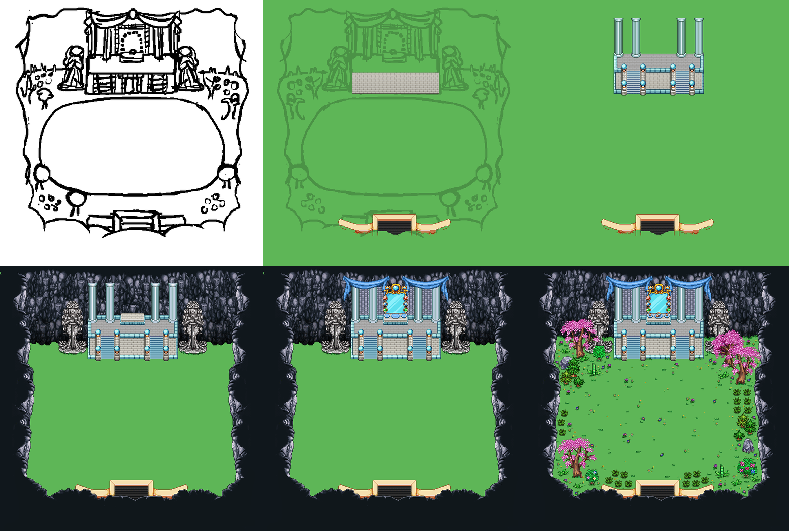
For this background, let’s start with the basic sketch:

01

The circle in the middle are my indications of where you need to be able to battle stuff, hence there shouldn’t be a lot of stuff in the way around there. Otherwise we have a huge altar of sorts, and some greenery…

Progress:

02

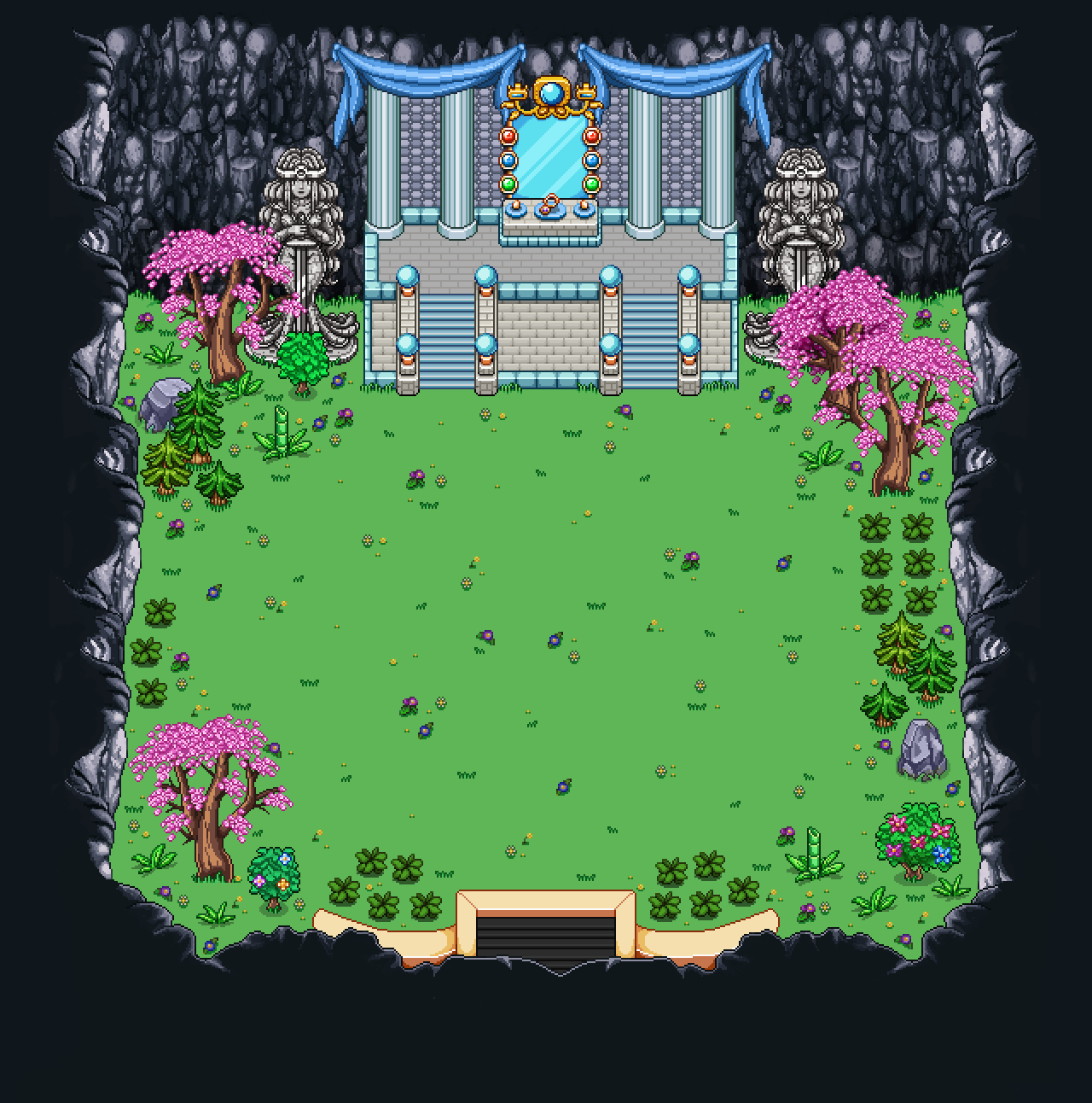
And the final image below! You may notice the door from my sketch (on the altar) is missing. Actually you probably didn’t notice since it wasn’t very clear it was a door…. BUT in any case, there will, indeed be a door there in the future (I hadn’t made it at the point of taking the screencap below…):

03

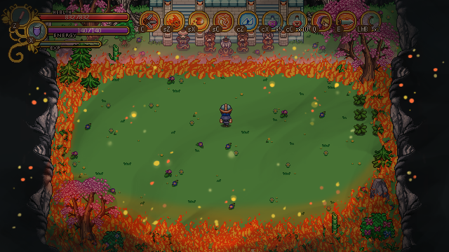
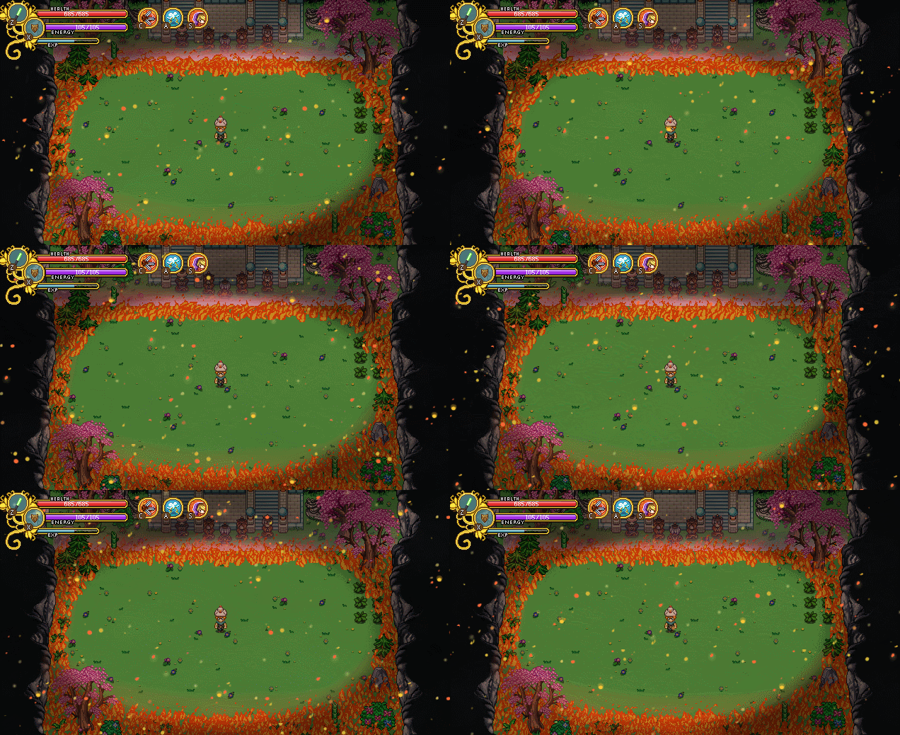
A somewhat related thing we’ve been working on recently is creating a suitable effect for an upcoming battle! In this recap, I thought it’d be fun to take a look at our iteration progress as we implement and improve upon an idea.

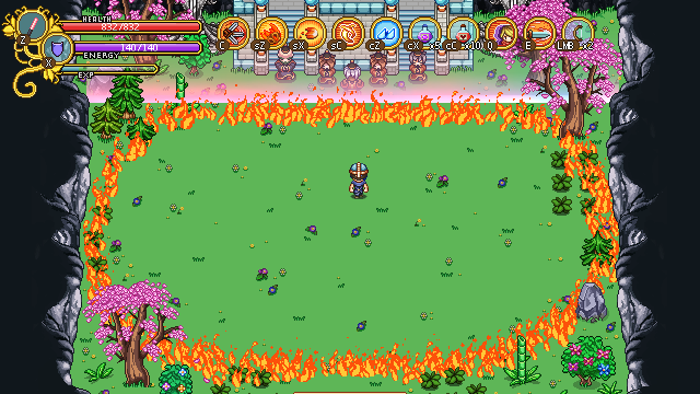
So, this battle takes place in that courtyard above, and in the beginning, we had a vague idea of the battle area being surrounded by a circle of flames. Once the background was ready, Teddy went ahead and made a quick prototype of what that circle could look like:

a

While it certainly gives some kind of effect, it also felt a bit underwhelming. While discussing our options, we thought about making the trees and bushes burn, using another color flame and using different sizes for the flame particles, among other things, but nothing really felt spot on.

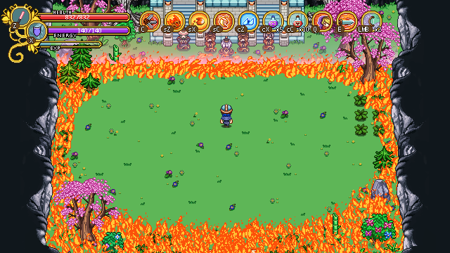
During our talk it also turned out some of us had imagined the flame circle differently. And so we went on to prototype another idea, where the fire would cover everything not inside the battle area.

Cue another screenshot:

b

Now this felt a bit more epic, but it still felt like it missed something. So I decided to take the above screenshot into Photoshop and started painting on top of it, creating a mockup of what I thought would be a cool effect for the battle:

c

After showing it to the others, Teddy used my mockup as a base and created a third prototype, this time featuring the illustrated effects:

d

After seeing this in action, we all pretty much agree this is a much better direction than the first basic flame circle. And we’re still gonna add/edit a bunch of stuff! For one, the graphics are all prototype here, the sparks in the air and the flame particles will be different in the final version. We’ll also the add the burning trees and greenery we talked about after seeing the first prototype, and I’ll edit the ground to look more burnt around the flames.

Now, we could have chosen to look at the fire circle in the first screenshot and say “this is OK, let’s keep it”. Instead, we kept pushing to make the scene better and more epic. Would it have saved us a lot of time to just stick with the original idea? Yes. Would the fight be as epic in the end? No.

And this is why it’s so hard for us to estimate how long things will take! Sometimes our first try is good enough, but often we have to spend a lot of time prototyping different options and change stuff before we get something we’re truly satisfied with. Is it worth it in the end? Well, I certainly believe it is and I hope you guys agree! :)

….And now for something different.

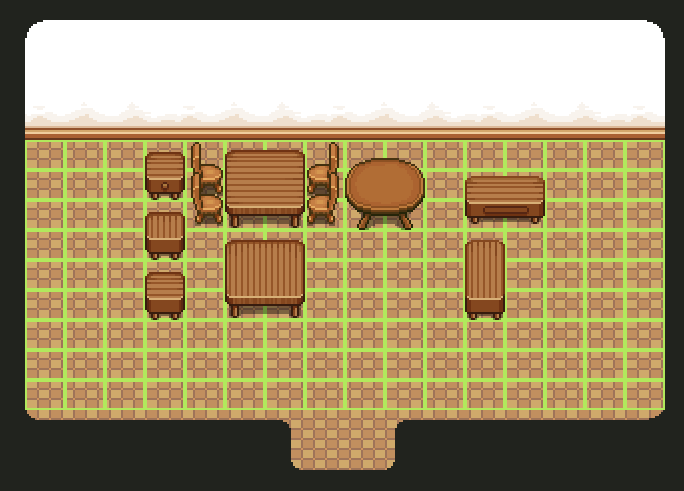
After some further discussing of the Housing and it’s ‘batch’ system (where you unlock a batch of x items in the furniture shop every time you enter a new area), we made a list of base items that should be included in each batch!

There will be a bunch of additional, random items as well, but we thought it would be good to have a common base for each batch. The items available in each batch will be:

1x Floortile
1x Wallpaper
1x Bed
1x Nightstand
2x Tables (one square and one rectangular)
2x Seats (one 1×1 tiled and one 1×2-1×3)
1x Window

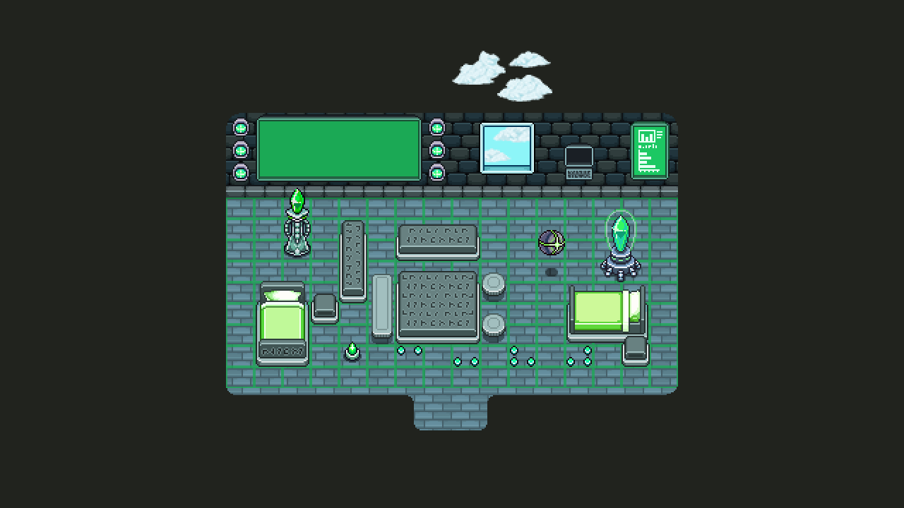
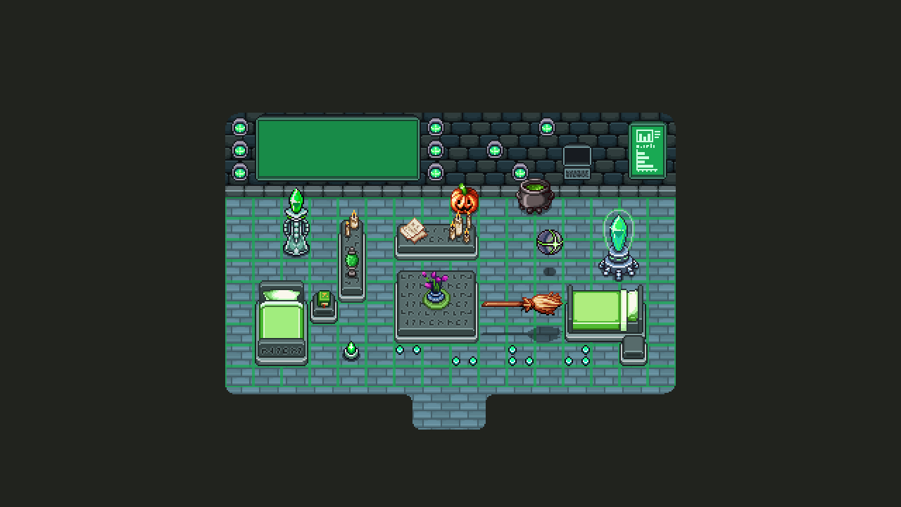
And so, I went ahead and added a bunch of basic items for the two batches I already started working on (more special items to come):

01

My dream for the Flying Fortress window above is that it’ll have tiny clouds floating by, but I haven’t confirmed 100% it’ll actually happen yet. If it ends up being too time consuming to implement we’ll come up with something else (or make a loopable animation of it perhaps).

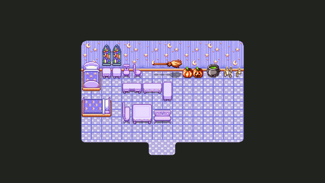
02

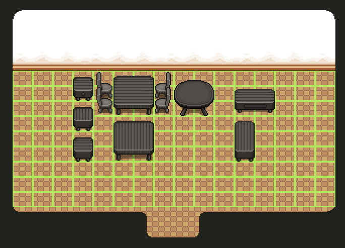
The above set will unlock when you enter Pumpkin Woods. Some of you might wish for a more extreme Halloween theme with scary ghosts and creepy stuff, but don’t worry! Those needs should be satisfied with another upcoming batch for.. another area… :3

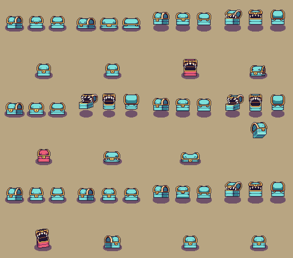
Finally, because tradition, have a sneak peek at what Fred’s working on right now – the second stage of the Mimic battle! Yes, it’s growing…
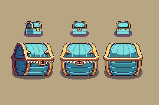
MimicStage2

Hey guys! In order to keep things clear about where we’re heading, plus better keeping track of our design ideas, we’ve decided to have shorter meetings but keep them more often. So this week it was time to get together and discuss the future of Grindea once more! There are some pretty big design decisions going on here… Let’s dive into ’em:

Making magic weapons semi-ranged
So, magic weapons don’t give as much attack, and it kind of sucks that magic users face a clear disadvantage when they’ve run out of mana. So we decided that we want to add a tiny magic orb (or something like that) that shoots out from the magic weapons as you hit with them, making the range of your weapon slightly longer. Of course, this won’t be long range by any means, but it should make it possible to do some damage while running around waiting for that energy to recharge.

Easy Mode or no Easy Mode?
We had a quite long discussion about whether or not to implement Easy Mode. On the surface it seems like such an easy decision: why not add Easy Mode? Well, our worry is that by adding Easy Mode, a lot of people who would succeeded in Normal Mode after trying a little longer, would just give up on harder challenges and swap to Easy Mode. And, in doing so, they would probably end up thinking ‘man that’s annoying’ rather than ‘OMG I FINALLY MADE IT’ upon victory.

We’ve had a lot of forum threads or feedback that begins with someone claiming something is impossible, only for them to come back a while later saying ‘okay I totally get it now, this is amazing’. Would those people persist and end up feeling amazing after beating that difficult challenge if there was an Easy Mode? Or would they end up thinking Normal Mode is too hard and the game is poorly balanced since they felt forced into swapping to an easier setting?

In the beginning of our time in Early Access there were quite a few of threads with people claiming the overall game was too hard, but as time has progressed, those threads don’t seem to appear any longer and those who do have problems end up farming for levels and better items before giving the challenge a go again.

So, perhaps Easy Mode is not as needed as we first thought? Because of this we probably won’t implement Easy Mode anytime soon, anyway (but we’ll definitely reconsider if there’s renewed complains about the game’s difficulty).

Making Fishing more challenging
Fishing is… well, fishing, so it’s very straight forward and there’s only so many steps in difficulty. Unfortunately that also makes fishing kind of repetitive after a while, so we’re considering adding another mechanic after a couple of maps. The mechanic we’re thinking about is that the fish can move up or down as well, which means that at some point the fish will dive/swim upwards and you’ll have to press up or down accordingly within the time limit. Of course, this isn’t a high priority addition, so it probably won’t happen for a while. But in the long run it might help make fishing a little bit more interesting.

Potion Rework / Bottle Addition

Potions are great, but we don’t like how they work right now, where you can stack endless numbers and basically get a permanent increase in whichever stat so long as you have enough potions. To counter this, we’re strongly considering an introduction of Bottles which are a very limited commodity of which you’ll only be able to find 3 in total. These bottles can then be filled with the potion of your choice.

You’d get your first bottle from Remedi after clearing the Collector’s Trials, and after you’ve decided what to put in it and use it for the first time, it will slowly refill itself over time and as you do damage on regular enemies (yes, it’s a magic bottle). If you have more than one bottle, you can choose whether to fill the bottles with the same potion or use different potions. You can use two different potions at once, but you won’t be able to drink another potion of the same kind until the first one’s effect has run out.

With this change, it’d also be possible to reintroduce health potions, for all of you guys constantly asking about various healing features ;) Of course, we’ll likely balance them so it’s more efficient to use the other potions, but maybe it’d still help ease the minds of those who really want to be able to heal their character.

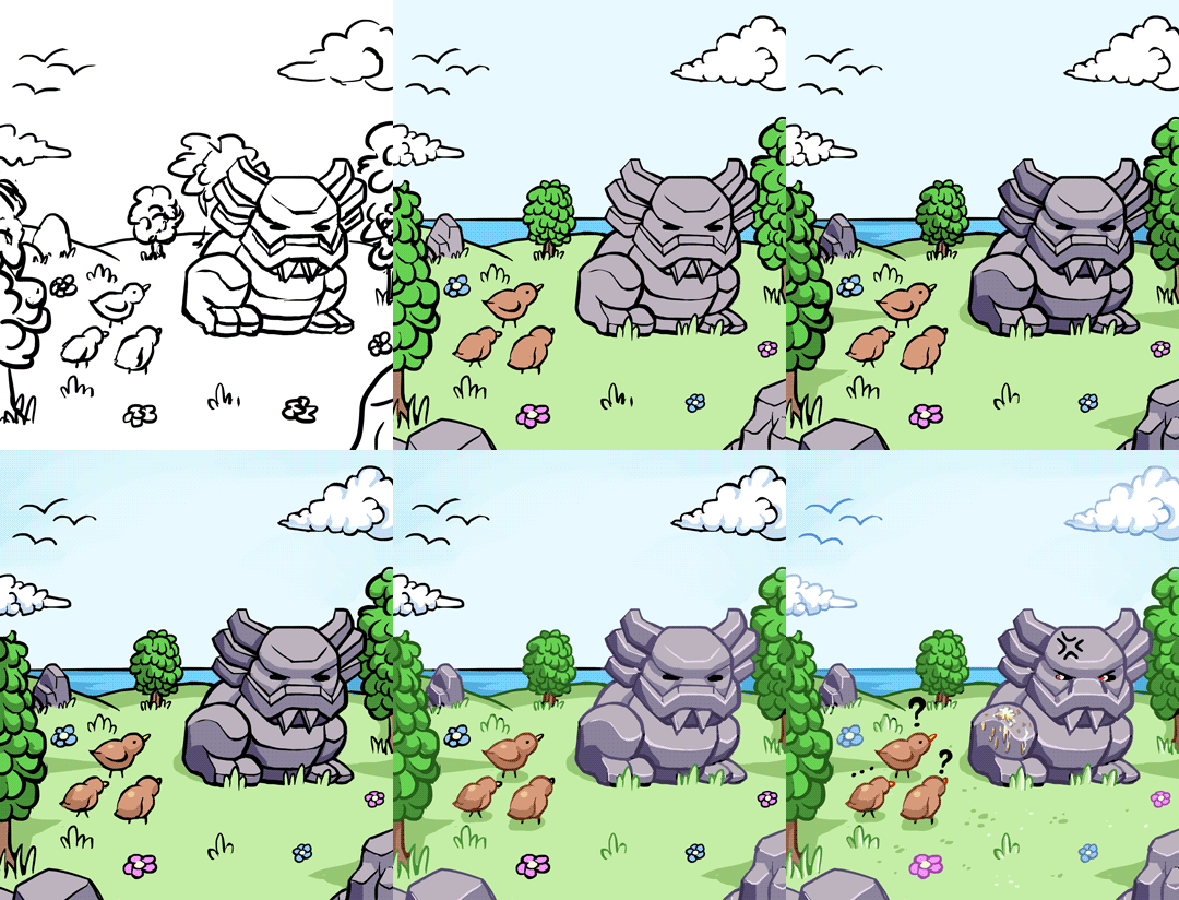
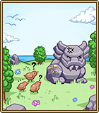
There are more cards this week, as well, as we finish up the Tai Ming card album! First up: the Ancient Statue card :)

01

For this card, my notes said the statue got some bird poop on it. It quickly became a fine line between painting the statue big enough for the poop to show up in the final image, while also not only being about the statue. In the end I think I went slightly too small with the statue, but whatever!

02

For this card I kept the colors soft and didn’t go too crazy with the highlights. Some variation and all that.. :)

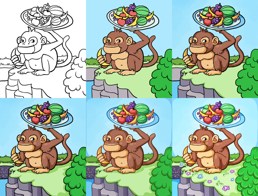
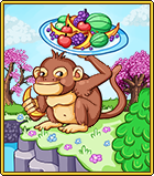
For the second card, let’s take a look at the Monkey Card! My notes for the monkey card said: the monkey holding a plate of fruits. Alright then:

01 (1)

After painting the base and resizing, I added a couple cherry blossom trees (used the game sprites for this), to give the pic a bit more Tai Ming feeling:

02 (1)

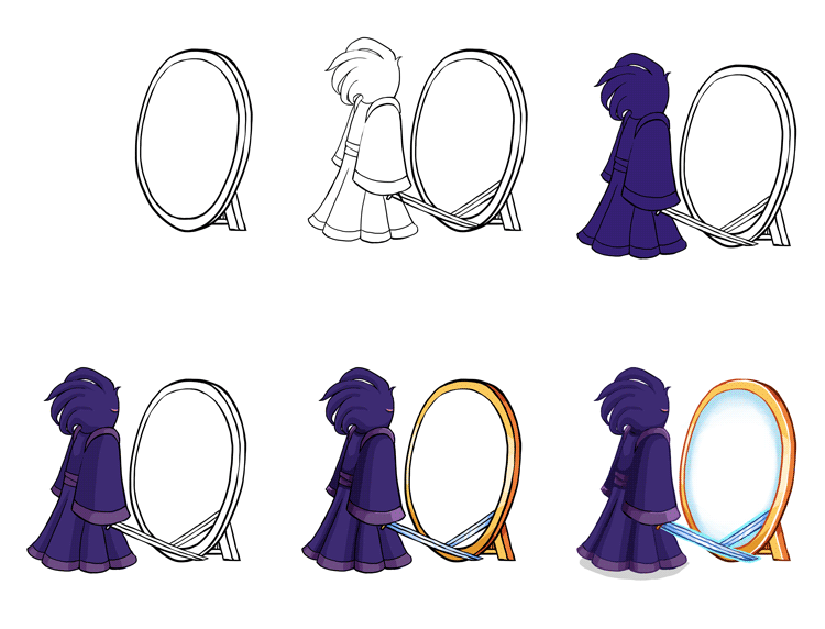
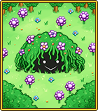
Now! Time for the final Tai Ming Card (unless I’ve forgotten something and lost the notes?!): Echo of Madness!!

I used a slightly different approach when making this card, because I knew I wanted to use the backgrounds from the game for this one. So, I began by making the Echo and a mirror against a transparent background, keeping the center of the mirror transparent as well (my notes were: the Echo is standing in front of a mirror, but he has no mirror image):

01 (2)

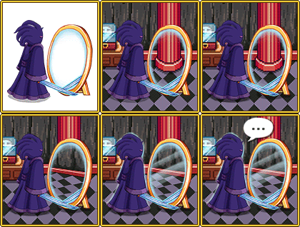
Next, I added the game background, and another part of it slightly tilted for the mirror, as well as a speech bubble. Cause why not:

02

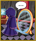
…Aaand the finished card:

03

Alright! Before posting some fresh non-spoilery (well, kinda) animations made by Fred, let’s take a look at some more housing items!

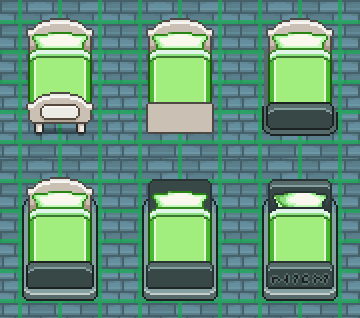
The theme for this batch is Flying Fortress, (tho I added some other stuff to give you an idea of what it can look like combined with items from other areas). Most of the items are based on sprites found throughout the game, only resized (or completely remade) to fit the grid.

bed

Housing Interior_001

It is my hopes that both the sentry and the broom will be animated to at least move up and down in the air, though it would be pretty cool if the sentry could move around the house on its own. I guess that’s up to Teddy, though, who would have to implement those features :)

And finally!!! A sneak peek of what the final Tai Ming boss will look like:

Mimicc

Hello guys! Another week has gone by at the office, and we’re drawing ever closer to finishing Tai Ming’s third zone (slowly but steadily, as you know…) :)

While Teddy and Fred are busy prototyping the two remaining boss battles (one which actually has a working prototype that we’ve been testing already), I began working on the card appearances and some housing items. Housing will very likely be implemented once Tai Ming is done, so it’s time to get a bunch of items ready.

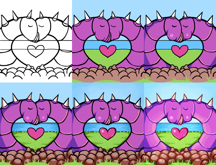
Anyway! First up, the Thorn-Worm card.

My notes on this card from our design meeting (feels like it happened 100 years ago now), was to have two worms kissing, creating a heart shape. I think we might have decided on this design before the Thorn-Worms were actually made, cause having two of them create a heart shape when they’re so short and fat is kind of heard. I decided to slim ’em down and paint a heart in the middle for clarity.

02

Maybe not the best design out there, but possibly the most gross?

03

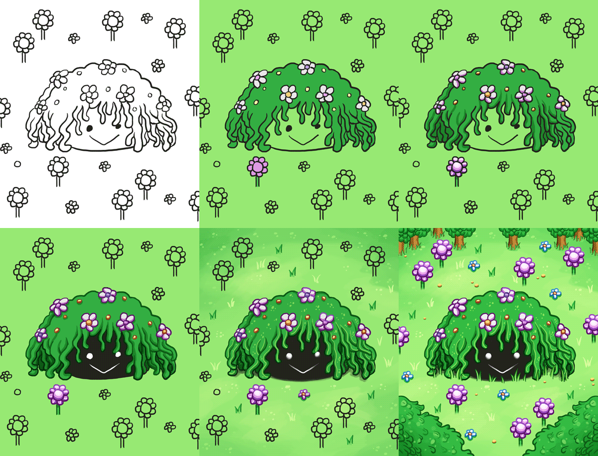
Next, the Plantae Hostilis card!

My notes for this said: The enemy sprite surrounded by its spawn. Alright then, that’s kind of straight forward? So, it’s what I did. Lots of greens and flowers. I kind of get a very strong RO vibe from this enemy, and I’m not sure why, but I really like it. Kudos to Fred who designed it!

wip

Finished card sprite below:

planate

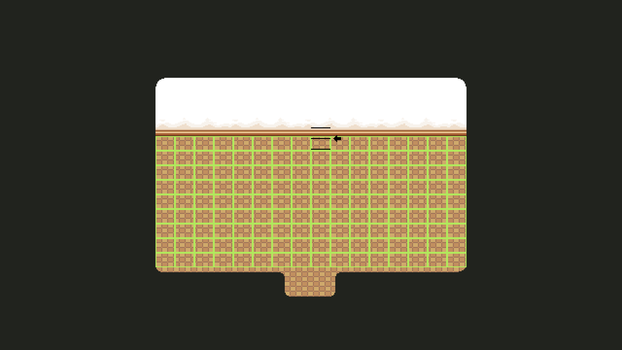
So, Housing! It’s a subject we touch upon every now and then, but as we get closer to finishing Tai Ming, we also get closer to implementing the dang system (finally)! A while ago, Teddy mentioned we changed the dimensions of the grid we use as a base for the housing system. It used to be much more square, and now it looks like this:

01

Basically this meant that every single item made before this change needed to be checked and edited or discarded/completely remade depending on how hard it’d be to fit it into the new grid. So I had a very fun (not really haha) day this week where I added all of those housing items to the Housing master document and manually changed and changed each and every one of them.

02

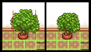
Some, like the plant above, had to change shape, but could still be used. The red lines indicate the end of its two designated slots, so everything going over those had to be cut.

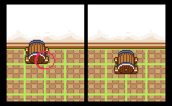
Others, like the wine barrel below, had to be discarded, and will be remade later. In this case the barrel would become too small if fit into one slow, and it’d be much too big if we edited it to fit it into two/four. So, I’ll redesign the thing later and make a design that works better with the grid size!

03

There were also some placeholder items Teddy made to test the system out. These were mostly surfaces (tables and the like) and made quickly by copy-pasting other tables in the game. After checking the other items, I went over those and touched ’em up until they resembled actual game sprites more, and made some color variations:

04

05

06

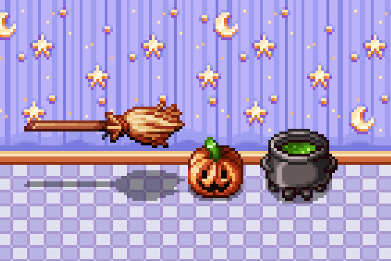
Now we’re finally able to start making batches of new housing items!! I actually went ahead and made a few silly Halloween items on a whim, just to celebrate that we can actually start pumping out housing items for reals:

As you can see in the video, the cauldron is actually a slightly edited version of Fred’s cauldron design for Candy (the witch in Pumpkin Woods). The others were (also as you can see) made from scratch.

housing

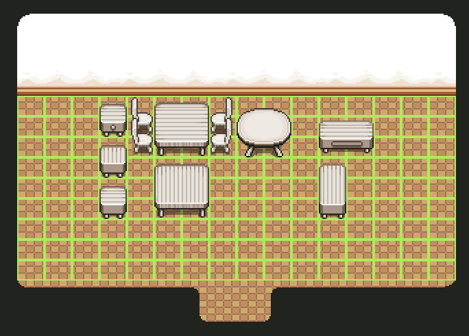
A while ago we decided to have a batch of purchasable housing items unlock every time you enter or finish a new area, so it’s very possible these items will unlock once you enter (or complete) Pumpkin Woods. SO I’ll definitely make more items on the theme, and probably a set of basic stuff (like desks and chairs) in suitable colors to match the wallpaper/floor coloring. Also stuff for every other area you unlock… Gonna be a lot of housing items in the future! :)

ALSO, this week was AGDQ and during the event there was an Arcade Mode speedrun! Check it out here:

Happy New Year (and we’re back)!! Have you had a nice holiday? We took about a week off to recharge our batteries, but as of last week we’ve all returned to the office to get back to work.

Remember before christmas, when I (Vilya) started working on the final room of Tai Ming’s third zone? Well, over Christmas I went ahead and finished it!

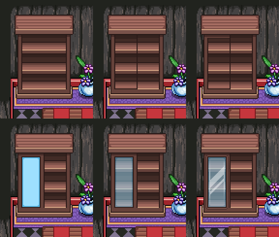
One big focus of this room is the shelf doors! Since the shelves will hold a bunch of different items, many of which aren’t books, I thought it would be cool to add doors and make them look a bit cooler. Plus, variations and all. So I made four different sets of doors: two types of glass doors (one long and one short) plus two types of wooden doors (one long and one short).

01

02

In the end the smaller wooden door didn’t get used, but who knows, maybe it’ll turn up in the future somewhere!

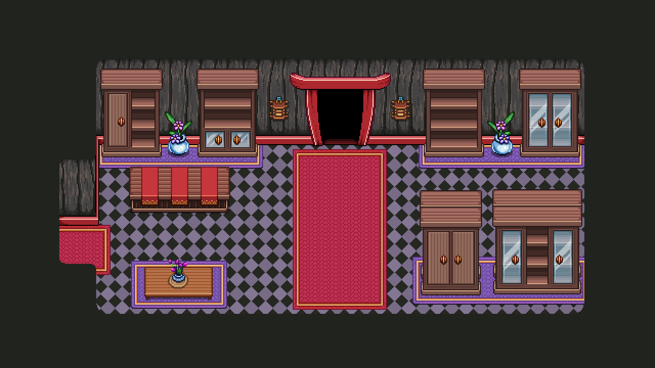
03-library_001

After creating the doors, I began adding a bunch of random props, some which have been used before in various places, as well as some edited stuff:

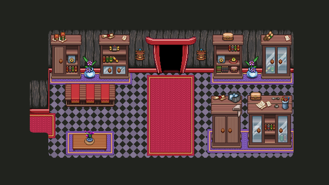
03-library_002

Next up, painting a bunch of unique props to spice things up a bit:

Some of these items are inspired by various items from other media. Can you figure out which ones and what they have been inspired by? :D

Finally, here’s the finished past version of this room! Whew:

library003

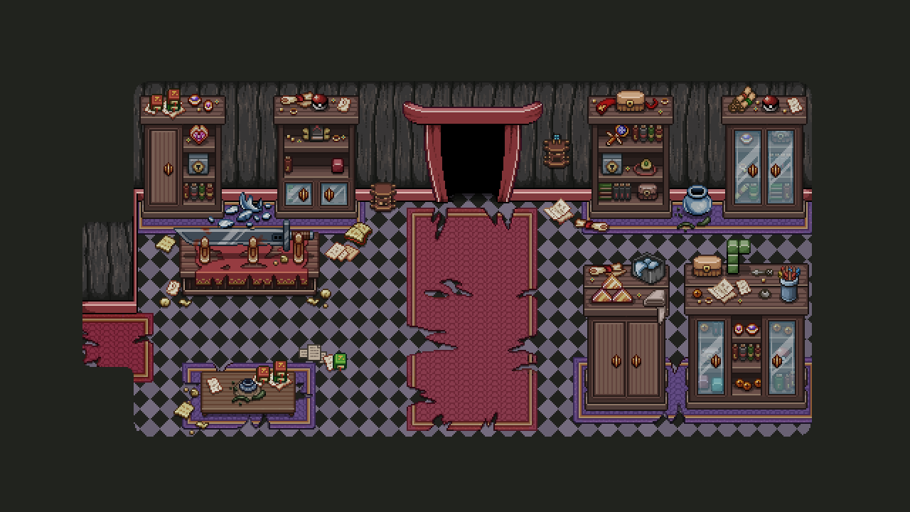
Now, all great things must come to an end (or so they say), and that includes fancy storage room! Forgotten by all, it has decayed and turned into a mess. Main part of turning this room from past to present state involved creating a ton of holes in the carpets. I also threw some random trash on the ground to make the room feel more messy:

presentwip

In the end, here’s the rather bleak main version of this room (you’ll actually only spot the past version through a flashback orb):

present

Now, before Christmas break we had some majord design talks which I may have mentioned in a previous thread. One thing we talked a lot about was Arcade Mode. And there’s some pretty huge changes coming…!

There’s no secret we want to add a bunch of new room types and challenges to Arcade Mode. We have a ton of ideas and it’s likely we’ll begin implementing some of them once we’re done with Tai Ming. However, there are more radical changes coming (though I’m not sure how soon)!

First up, the town will get a lot bigger with many new kinds of special buildings, and you’ll be able to choose which ones will appear first as opposed to the way things are now, where the town slowly updates depending on your total score. This will likely be handled by putting up a bunch of indicators for what will appear where on the map (like signs or character explaining what will appear if you if you ‘choose’ that one in particular).

We’re also reworking how you gain Essence! We’d like to reward everyone more evenly/steadily rather than giving almost no Essence to some and a TON of it to others, depending on how well you do on a run. So if you’re one of those who don’t typically get a lot of essence, you’ll likely get more, and if you tend to get more essence than you can handle, you’ll probably get less.

There MIGHT also be another currency, or rather a rework of an old one: gold! If we implement this, you’ll keep any gold you get on your run + a bonus at the end of each run depending on how things go or how far you get (kind of the way essence works now, but gold won’t be as important so we’re more OK with the pro’s getting more of it). The gold would then be used to unlock the hats and similar items previously exchanged for Essence by the Bishop (he will keep trading perks for essence, but his other shop functions will be moved to one or several other unlockable shops which use gold), as well as other new features.

So basically, Essence is used to unlock perks and town features where you can spend your gold (if the gold part gets implemented)! Whether gold gets added or not kind of depends on whether we feel there are enough cool things to spend your gold on, or if we’d prefer to keep most of it free of charge and use Essence for the rest.

——–

Typically this is where we’d have a bunch of Fred’s animations, but since he’s still working on some upcoming and very spoilerific cutscenes and fights… We’ll keep those to ourselves for a while yet. Hang in there! ;)