Hello guys and sorry for the late recap! Apparently, someone (me) forgot to hit ‘publish’ after finishing the post and nobody noticed until now… Ooops!

Oh well, ready for some new Housing info?

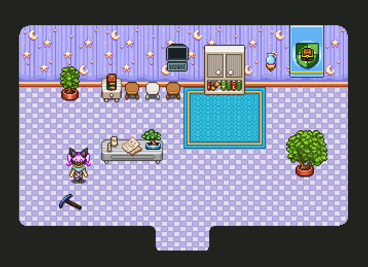
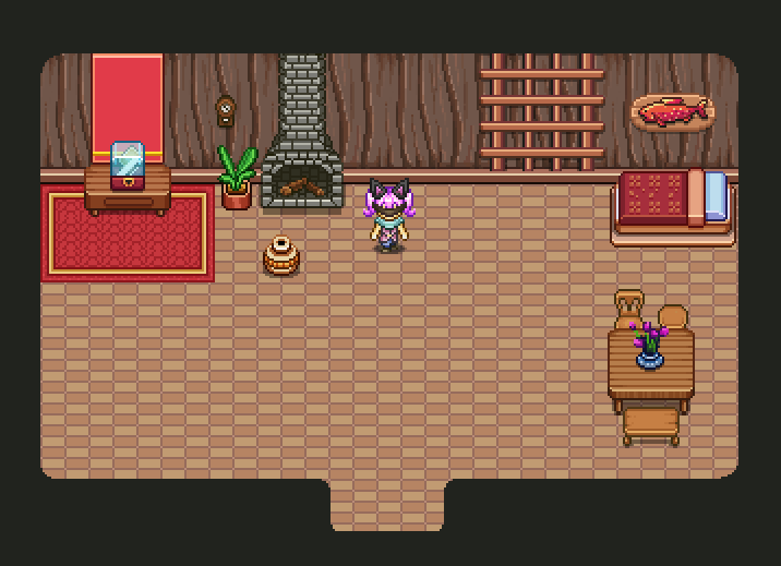
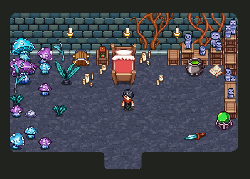
Our basic prototype is more or less done: the items that have been made so far have all been implemented, and most of the ones that will move in some way have their proper animations. Teddy is currently working on two things, the light settings (which are coming along rather nicely so far), and the rather complicated systems behind being able to add more rooms and change the layout of your house.

You see, previously we decided that you’d be able to select between a bunch of pre-designed layouts for your house, which could be unlocked at the proper salesman or through your housing menu (not fully decided). As our conversation went on, though, we started thinking it’d be really cool if you could design your house however you wanted, adding new rooms and change their sizes freely.

Before we fully commit to that can of worms, our current goal is to upload what we have to Frontline (any day now, possibly even tonight!) and let you guys try it out. We’re still a little torn between having pre-designed layouts or having you design the house more freely, as the latter definitely would add a ton more work and I’m sure most of you would like to see the game finished sooner rather than later.

So for now, we’ll upload what we have: a single layout, and the current housing items. The shop and house will be placeholder, with more finalized look for each of them coming later on, as we’ll use the Arcadia redesign versions as a base for the story mode versions after they’re finished.

With your feedback we hope to be able to gauge how much more work (and polish!) will be needed before the housing system can truly be complete, and as such will give us a better idea of which of our options to pick.

There’s also a third option here, where if people are satisfied with the basic version of the house, we might just stay off multiple layouts altogether as that would save a lot of time and would mean we could add the proper housing system much sooner. Anyway, your feedback will decide! Stay tuned for that :)

And now, time to make some walls for Tai Ming’s arcade mode!

“Walls?” you might ask. “Isn’t that quite straight forward?” Oh yes, my friend! Typically walls are the least of my worries when I make Arcade floors, as they’re just a very basic edge signifying the end of the battle area. In other floors, they’re a bunch of random generated trees, or a basic stone wall.

As mentioned in last week’s post, however, Tai Ming will be different. We’ll mix and match various ways to block off the battle area, ranging from streams of water, fences and even cave walls. And while creating each of those is a rather simple task in itself, they also need to be able to connect with each other and different types of walls – and they all need to work together!

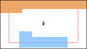
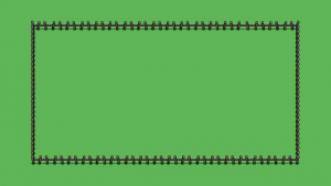
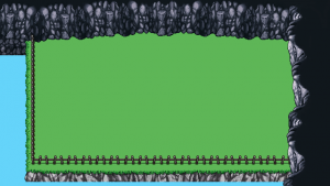
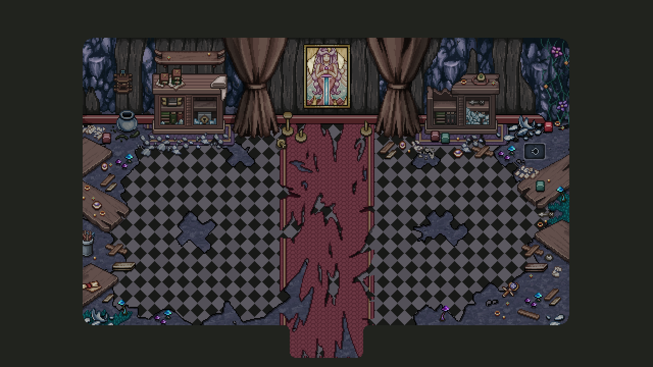
Above you can see the size of the battle area we decided to work with for these rooms. It’ll be slightly bigger or smaller depending on which walls are used in the room, but most will be of approximately the same size.

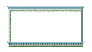
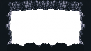
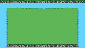
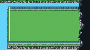
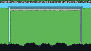
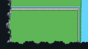
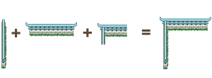
So, first of all, let’s take a look at what we have to work with. In order of appearance: wall, mountain, stream and fence:

In a coming post, we’ll also take a look at houses that will serve as walls, and maybe one or two variations of these that account for other town-like features. After all, we want to convey the feeling that this is town, in whatever ways we can while keeping the Arcade feel!

For now though, let’s look at how we can use these pieces together to create a variety of different room types:

…and so on! Of course, not all of the rooms will have streams or mountain walls, though I suspect many will and they do make for more interesting looking rooms so far (at least until we’ve added some houses)!

There’s still a way to go, but the basics are down and I think this will end up quite interesting once it’s all done.

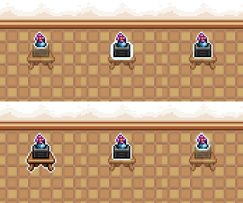
And now, some housing icons to indicate which tool you’re currently using! …Cause there are quite a few tools, actually. First up, the carpet tool:

This tool is used to edit the size of the carpets. You’ll be able to change the size of many of our carpets freely, and this icon will help indicate what you’re currently doing. The upper version is Fred’s basic version, but we’ll also make one featuring the carpet design beneath to see which one we like the best.

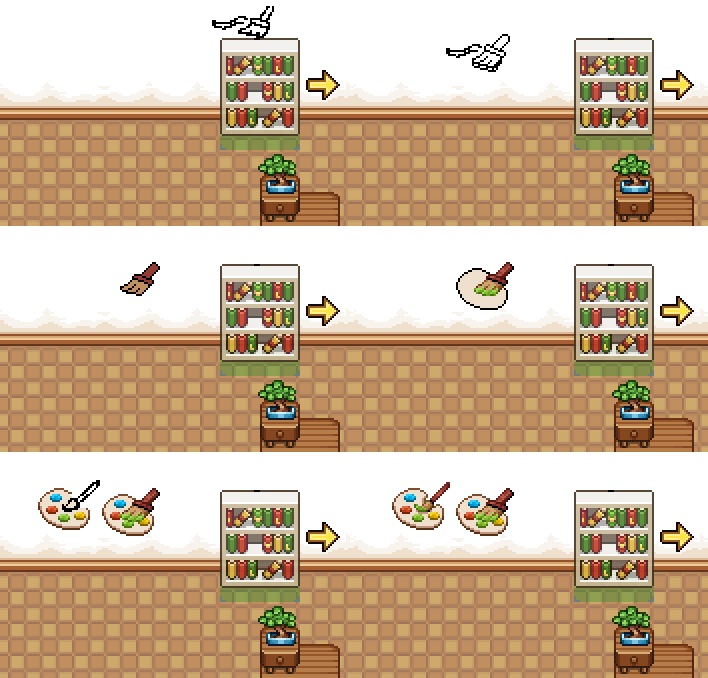
Next up, the move tool, which is rather straight forward:

Select a piece of furniture with the hand tool, and move it around to wherever you wanna put it. We’ll probably add some kind of animation to the arrows, as most of the tool indicators will be animated in some basic way (much like the carpet tool)

Next, the stack tool:

This “tool” appears when you try to select a square that has multiple objects stacked on it, and helps you select which parts of it you want to edit or move. Do you only want to select the top object, the topmost two or the whole stack?

Below’s a test animation I did to make the indicator easier to understand, and beneath it is Fred’s finished version:

Finally, the style tool, which allows you to change the basic appearance of an object. This is indicated by a painter’s brush and palette. The first version had a rather crude version of the brush, so it was quickly changed:

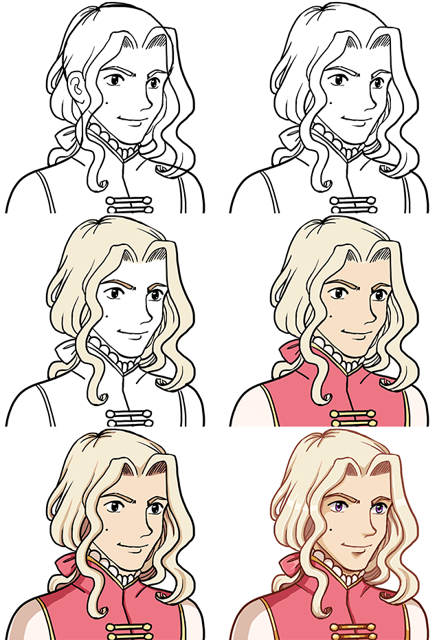
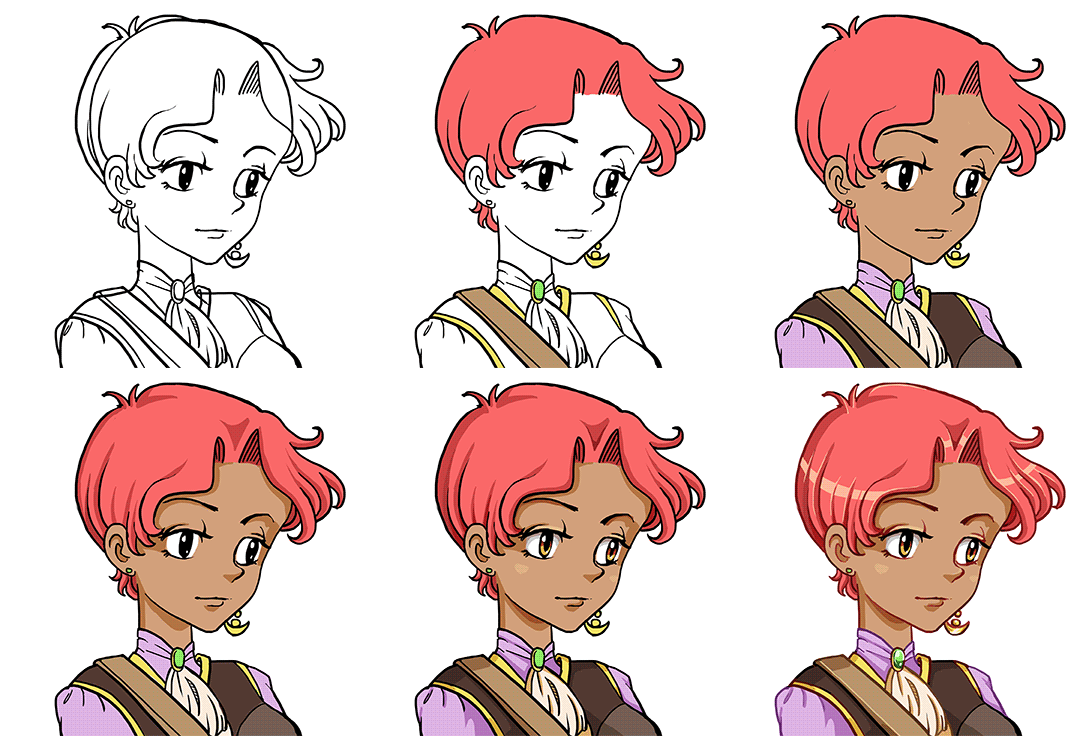
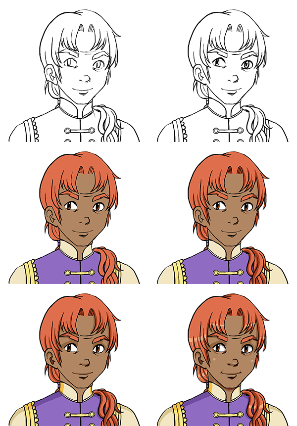
And now, another portrait!

Not much is known about this guy yet, I’m afraid! Other than the fact he’ll be staying in the desert, of course. I’ve been watching a couple of documentaries on Versailles in general and the era of Louis XIV in particular, which I guess shows through the design?

These portraits are a lot of fun to make, and I’m itching to remake the earlier ones to bring ’em all together style wise. That should probably wait, though :D

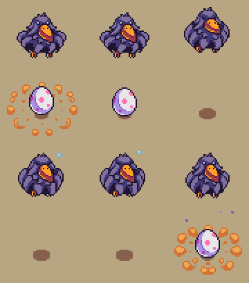
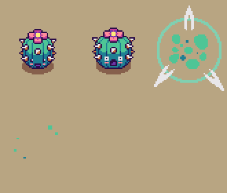
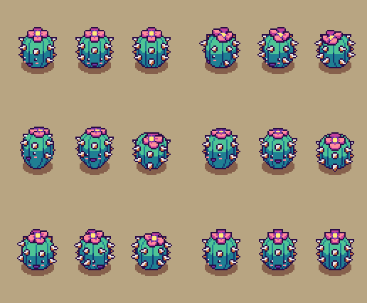
Finally, some animations! This week, Fred has been busy with the enemies, bringing the Cacute and Mrs. Bird to life~

First up, we have Mrs. Bird’s idle animations, and her laying one of those annoying eggs that will either spawn a new bird or slow you down if you decide to break it:

The annoying and OMG-SO-CUTE egg in question:

And next up, the Cacute! If you decide to be really evil, this is what it looks like when you kill it:

Though why you’d wanna do that when this is how cute it looks in its idle and movement animations, is beyond me:

Now that most of the Housing stuff has been animated, Fred will continue to work with the enemies to ensure that Teddy can just dive in and prototype them once he is done with his part of the housing. The less he has to wait on new animations, the more focused he can be when the prototyping phase starts!

For now though, both he and I will continue to be stuck for a while with housing and Arcadia stuff, as that’s our main missions before we can move on to the desert and rejoin Fred on that venture!

Sometimes, it’s easy to forget that being a gamedev involves more than simply making games and managing the community surrounding it. Today (when this gets posted, a while ago) we had our “annual meeting”, which is a formal thing we need to do to review the year and how the company has fared through it.

This year we also formalized and signed contracts surrounding Secrets of Grindea and its IP, protecting it and us in the unlikely case we no longer get along. While we trust each other 100% it’s so much easier making these contracts while there are no issues, rather than try to solve any such issues as they arise in a not-so-likely future. In fact, we should have done this years ago, before we even started selling the game.

If you’re an aspiring gamedev, I very strongly advise you look into getting a contract outlining exactly what each of you will be doing for the company and what happens in the case where one or several of you want out. You might think there will never be any problems ahead, but you never know, and it’s better to be protected than to wish you had been. Also, money can easily change people, and I’ve seen countless horror stories out there where devs no longer get along once they start selling their game as opposed to it being a dream.

——–

Now, some time has passed since we started the poll regarding which of the Tai Ming Arcade floor designs you’d prefer – backtrack through time or random time jumps. At the moment of writing this, it seems you guys are as divided as we are, so for the time being we’re leaning slightly towards the backtracking idea.

This means each of the rooms have to be made available in both a past and a present version. And speaking of the floor visuals, how would we even go about designing an Arcade floor of an area that’s more of a town than any of the previous areas you’ve progressed through?

To sort this out, I had a long meeting with Teddy where we sketched and discussed the various ways we could handle this.

In conclusion, we’ve decided to make the floors in a very different way compared to the others. For the other floors, each room background is either very designed by me, with variations to give the user an impression of there being more rooms than there actually is (Flying Fortress, Mount Bloom etc), or they are fully generated by the engine that puts a bunch of trees in a circle on top of a basic background (Evergrind Fields, Seasonne, etc). For Tai Ming, we’re going to do a mix of the two.

We decided that each outdoor room of Tai Ming will consist of a plain grass background, upon which we’ll put various things that will serve to block the screen so that you can’t move further than the square where you’ll be fighting. These things will include various fences, mountain walls, streams of water and houses, either ones you will enter or closed ones that will only serve to block your way forward.

Each of these items will be generated into the game by the engine, but they will have to be handmade by me to fit into each situation. For instance, there needs to be a way for a horizontal and vertical fence/stream/mountain wall to connect, and they need to be able to work with each other – a fence must be able to connect to the mountain wall, for instance.

To make these floors coherent we’ll frame them with the mountain, meaning the the bottom, far right/left and topmost floors will have a corresponding mountain wall – it will be in the upper parts of the topmost floors, signifying that you cannot go further north than this. We believe this will give the floors a sense of you progressing through Tai Ming much like it works in Story Mode, you’re passing through a town that’s inside the mountain. Because there’s a lot of water in Tai Ming’s second zone and we thought it would make the rooms a more interesting look, there will be streams here and there that you can pass over (in some rooms) by bridges, that will also be made by me but generated into the game by the engine as it creates each floor.

So basically, instead of painting whole rooms, I will spend a lot of time making and piecing together many, many small parts, that need to work both on their own and be able to connect with others as they get generated by the game!
As for the indoor rooms, they will (for now) be single room living areas in a bunch of variations, but with entrances and exits in the same place: if you enter a house from the south you’ll exit it in the north, and if you enter a house from the right you’ll exit it to the left. Since we’ve already dealing with quite complex backgrounds we thought we’d keep the indoor houses simple. This way we don’t have to make a ton of variations of the house sprites (the outodoor ones) that would have to look different if the house is L-shaped or longer than one room. Now we can focus on giving each of the exits variations through color and design rather than the shape, which would also end up affecting the other pieces made for the outdoor areas.

Creating these floors properly will definitely be a challenge, and more on the technical side than what we normally do, but we believe this will make these floors look the best they can. Our other options would be to make a ton of pre-rendered rooms (a bunch with the mountain wall to the bottom, a bunch with the wall to the left, etc) or lose the coherency of where the mountain floors and walls connect, and we all agree that just wouldn’t be as nice.

In other words, expect a post or two full with tiny parts and ways of connecting them! ;)

———————-

And now, for something else! Among these other things I’ve also started working on the proper Arcadia graphics now that the design is settled! Here’s a video featuring the first part, Candy’s Curses:

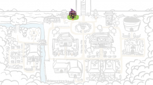
And here’s the whole map! I thought I’d post this after every new step, to show you the town slowly taking shape:

One I’ve made all the finished buildings, I’ll make the flat version with signposts where the buildings will be. The reason I’m starting with the finished buildings is so that each plot will be big enough: it’s a little hard to tell exactly how big a building will end up being before I’ve painted it and it’s surroundings, and I want to be able to adjust the paths and greenery to fit the built versions :)

————–

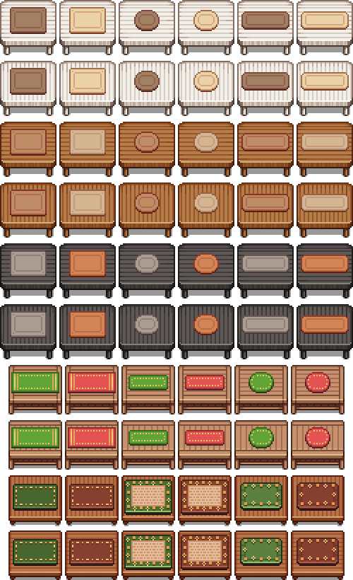
Back to housing! We’ve had multiple discussions regarding table cloths and how to apply them to various tables. Finally, we’ve come to a decision!

Basically, we had two options. Either we’d make a ton of basic table cloths that had to fit each of the tables, or we’d make unique styles for each table, with table cloths (and other decorations) specifically made for that object.

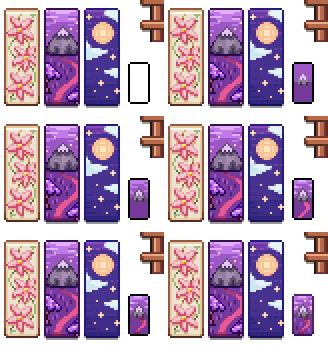
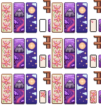
In the end, we decided to go with the second option, for multiple reasons. For one, the tables aren’t all exactly as big, which means it’ll be quite a challenge to make sure every table cloth fits each and every table. Second, it’s more fun for us to design table cloths to go with each table, rather than have to design around all tables with the limitation of size as mentioned. It also makes each table you buy a little more interesting, as it comes with its own unique styles.

And without further ado, here’s a bunch of the table cloths we’ve made so far:

…With more to come!

And while we’re on the subject of housing, have another bunch of Fred’s animated housing items:

This week was a little different, as it was very special week indeed! In fact, last week (Tuesday to be precise) Teddy turned 30! To celebrate this, we left our isolated island for the Swedish mainland to celebrate him with his family. We were gone from Thursday last week and only got back a short while ago, so this weekly recap will be a bit shorter than usual!

To make up for that, we’ll be taking a look at what Fred has been busy with recently! We haven’t posted a lot of his animations on the main blog for a while, so there’s a bunch of stuff that’s been going on behind the scenes.

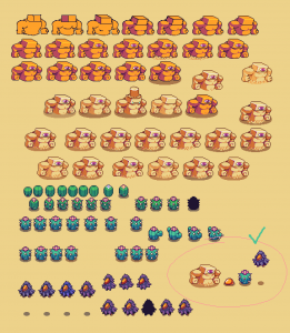
First of all, the desert enemy designs! We already talked about their gameplay design earlier, but since then Fred has been busy iterating their visual appearances:

This is typically what it looks like when we try to figure out what something should look like in the game. Make a bunch of variations and then pick whichever one is the best. In this case, we stuck with the ones in the red circle, bottom right. We’re all very excited to finally start working on the next area, although me and Teddy have a ton of housing and arcade mode stuff to finish first!

Speaking of housing, that’s another thing we’ve continued working on. Below you can see a basic test of a different light setting and a bunch of iterations for the visual appearance of the hand icon which allows you to select and edit furniture:

Our current favorite is the version that points straight down, with the selected square beneath it. We’ve also started working on our options regarding multiple room layouts and it’s coming along, though it’s gonna need a lot of testing since there’s a bunch of design problems occurring from having several rooms that need to be solved and reiterated.

Meanwhile, Fred has been making animations for a ton of the housing items that will move in various ways:

With many more to come! :)

And now, another of those desert town portraits! As I mentioned before, gotta start early and all, right?

Though the stories of the characters I design now aren’t fully established, the basic idea of this one is that she’s a merchant from Merchant Isles, come to trade in the harbor town.

In the future, I imagine I’ll make more merchants and sailors from there, as well as people from many other places. Our idea is that the desert town is a point of trade that attracts lots of people from all across the world, so there might even be one of two fae visiting, or perhaps a caveling? I guess we’ll see what the future holds for this town!

NOW; those of you not wanting to know what things will unlock where in the new version of Arcadia should probably steer clear of the rest of the post!

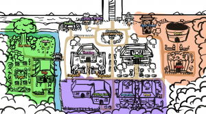
After confirming a bunch of things on another meeting, discussing which Arcadia houses should be approximately how far from the entrance/exit to your arcade runs, I went ahead and started designing the layout and basic looks of each of the houses you’ll be able to unlock in Arcadia!

For those of you who don’t want to know exactly what will get unlocked and where, I wouldn’t look too closely at this picture:

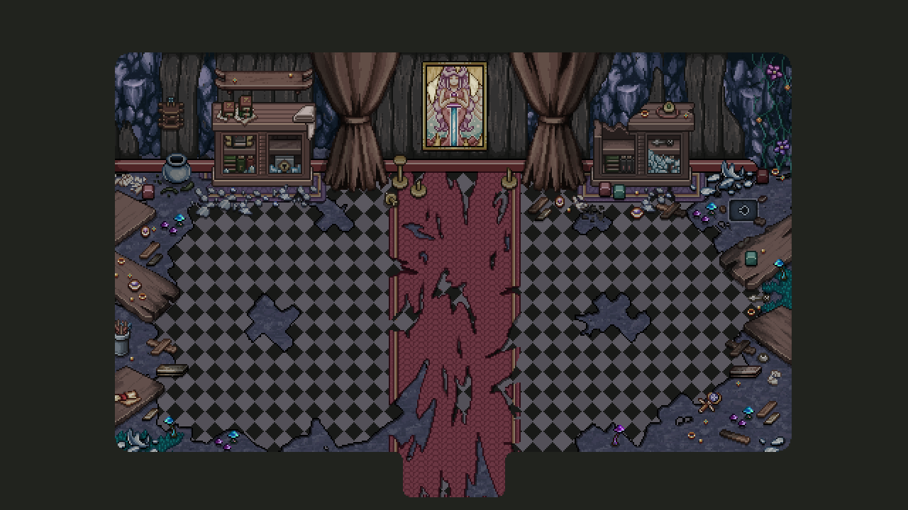
The color overlays show three different areas, each of which you will have to pay gold to unlock, while the white area will be available from start (though the Candy & Muffin stands will be the only ones built when you first start – the rest you’ll have to build with gold and time).

We ran around this background in-game with our characters and feel satisfied with the overall feel, though some sizes and distances will end up slightly different once the actual buildings and items have been made. For this area we’ll also be making new special trees and vegetation to further cement Arcadia as a place of its own, disconnected from the rest of Grindea (though connected in a mysterious way~).

I gotta say I’m really excited to start working on this and get the new improved Arcadia up and running, especially creating some of the more creative looking houses and make everything fit together :)

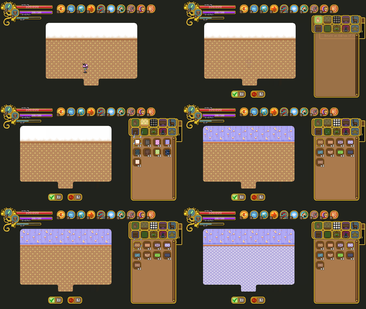
Finally, after many twists and turns (and a ton of housing items), we’ve managed to make a somewhat playable test build of the housing system, which we’ve started testing within the team!

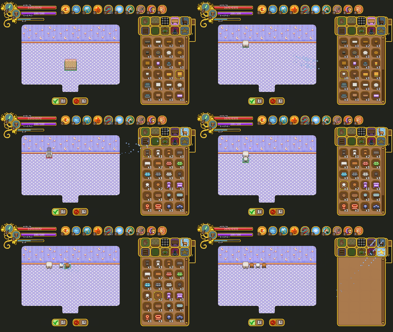
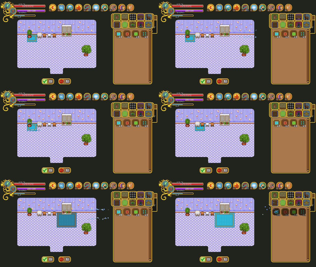
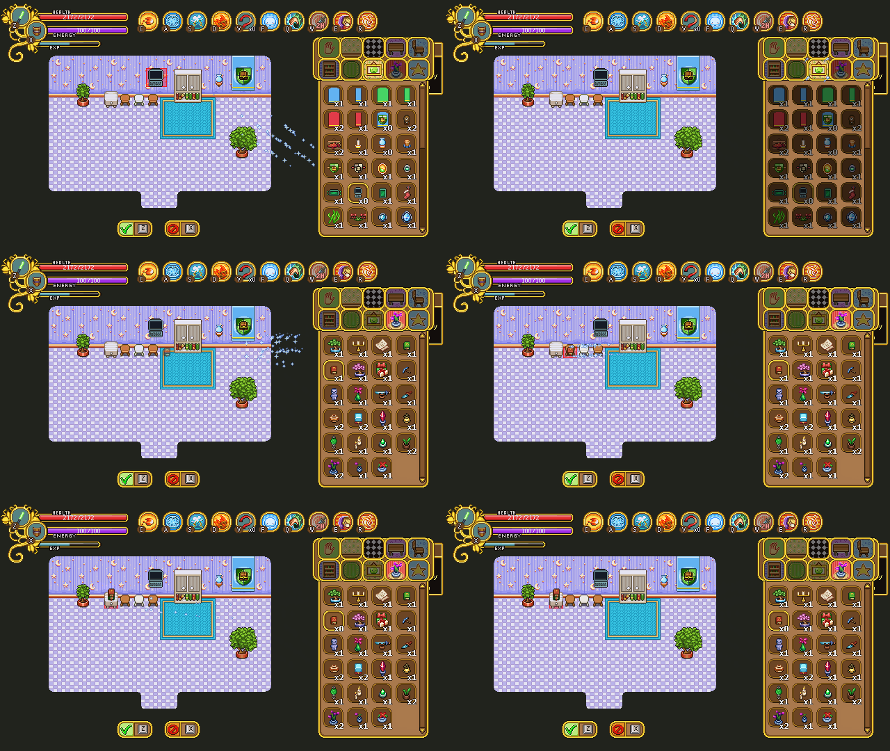
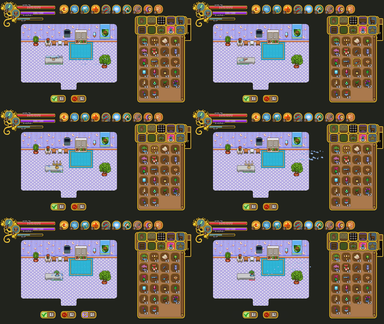
Without further ado, here’s a bunch of GIFs, featuring the most basic features (changing wallpaper/floor texture, adding basic furniture, creating carpets, changing the style of an item, and placing items on top of each other):

And here are some of our (not very creative) test houses:

Since this is the very first steps on creating a fully functional housing system, there were a ton of things we needed to discuss, and a bunch of changes we definitely have to make!

In order to plan all of that, we decided to have a looong meeting at our favorite fast food place (as usual). Immediately there were a bunch of things we decided had to change (or be added), and here’s some of them:

* More house layouts, and varying sizes. From the beginning we thought it’d be enough to use this one layout, but we quickly felt not only did it feel a bit big, it’s also a little boring to only be able to work with a single open space room. We also felt it was a little big. So, there will be an option to change between a set of house layouts, with a smaller room and multiple rooms available.

* A character who creates duplicates of unique housing items you already own. For obvious reasons! Unlike the items you buy in the store (where you can buy as many items as you like), there are unique items out there which you’ll only be able to find one of. In order to be able to place more of these in your house, you’ll be able to make duplicates of them – either at the regular store guy or through another NPC.

* We’ll look into making the area around your house a little bigger so there can be some kind of decorations surrounding it rather than it being placed in the middle of nowhere (well, in the middle of Evergrind) just like that.

* A furniture section should probably be added to your character’s inventory menu.

* The hand tool (which is used to move furniture around or delete it), is currently a long basic line/beam, and will be replaced with a pointing hand.

* The option to flip an item horizontally will be added to items where that feature makes sense, such as the pick-axe

* A mini-icon for furniture items that have more than one style. Styles are various skins of an object, and can be a color change or detail change in some way. For example, a bookcase might have different sets of shelves or stacks of items you can pick between.In order to make it more clear which items have more than one style, we’d like to add one of those tiny icons (like the 1H/2H/housing item icons in the main menu), only visible in the housing menu.

* When you place an item you have more than one copy of, you’re able to keep placing more of it until you run out of that particular item. Currently, what happens after you’ve placed your final item of that kind is that you’ll get automatically moved back to the menu again.

This, we quickly realized, felt a bit jarring, so next we’ll try adding a sound indicating you’ve run out of the item when you try to place another one, forcing you to cancel back into the menu rather than automatically getting there. This might seem counter productive, as it means you’ll have to press an extra button before being able to select your next piece of furniture, but we believe it’ll be less annoying then the jarring feeling of going from moving objects around to changing between new objects in the menu.

* Visual- and sound effects for placing and deleting objects in your house. An outline around the currently selected object. A better icon for the wallpaper section, which currently can be mistaken for a floor texture. Sound effect and visual feedback when you try to delete an item you currently can’t remove (for instance if it has other items on top of it).

* The currently not used star menu will be replaced with a settings menu, where you’ll be able to save your current house, change between different lightning settings and house layouts and other things we might think of.

———

…Aaand a bunch of other small things. As you can tell, when we add a new system things are far from perfect the first time around, and the only way of getting to that polished state is to change and add things until it feels nice :)

Once these things have been added we’ll try the system out again and reevaluate!

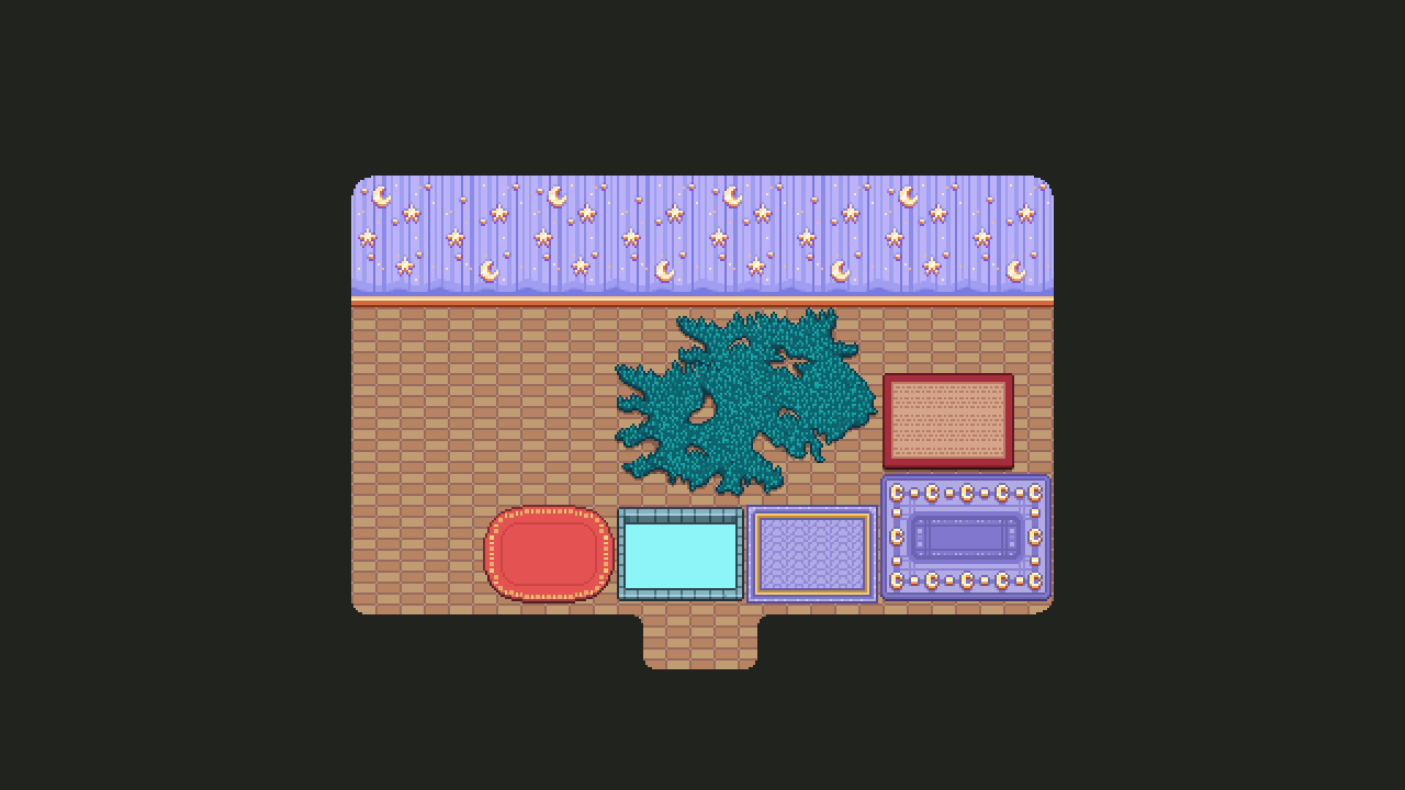
Speaking of housing, when we planned the housing batches and I made them, there was one thing we had completely forgotten about: carpets! Now that I’m done with each of the batches up to the point of the game where we’re currently at, we decided it was time to go back and add something to stick on the floor for most of the areas (we felt it wasn’t necessary to include in each and every one, and Temple of Seasons already have a bunch of floor decorations!)

In the Pumpkin Woods batch, there will be two carpets, one that has a static size with moons, and one that you can change the size of to fit your needs (second one from the right).

In the Flying Fortress batch, there won’t be a carpet, but a “big item” that you can put on the ground where you can see the sky below.

In Seasonne, there’s a red christmas-y carpet matching the tablecloths of the batch, which you’re also able to change the size of.

Mount Bloom will have a static sized moss carpet, and in Tai Ming, there’s the red and beige carpet that you’re used to seeing inside the houses, but with a slightly adjusted pattern so it’s possible to change the size of it:

And to end this week, something more simple and straight forward: new portraits!

You might wonder where we could possible need more people right now, but aside from pretty much everywhere (or at least everywhere in Evergrind City!), the answer lies in the desert town you’ll soon be heading towards.

I figured it’s better to start making portraits now and make a few every week, than to do everything else until I end up having to spend weeks doing nothing but portraits when it’s time to finally add them! Makes for more varied blog posts, anyway.

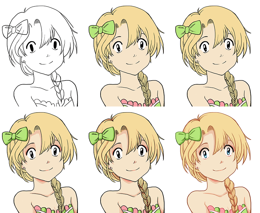
So, first up, here’s a tourist girl, enjoying the nice weather of the yet-unnamed harbor town:

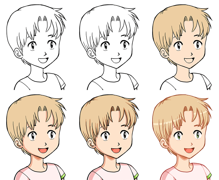
And her companion: a tourist boy!

Finally(!) we are happy to announce that Stable has received the long awaited update, introducing Tai Ming in its entirety to those of you who haven’t opted into the frontline updates! A quick rundown of what to expect in this patch can be found here.

Naturally, since we’ve spent most of our time last week preparing for the update, those of you who have played it might have already seen the following things. For some new housing items and a design question we’d like your input on, scroll to the bottom of this post!

First up though: when we talked about adding new items to the shops, we totally forgot about one pretty important store: the hat salesman! Because of this I went ahead and made a bunch of random hats for him:

We hadn’t really discussed exactly what hats would be available in this store, so it’s possible we’ll move things around and have some (or all?) of these somewhere else before the game is done. There are a bunch of hats available that haven’t been placed somewhere in the game yet, so if we feel any of them fit better we’ll just swap them out. In either case, there can never be too many hats, right?

Next up, the final Merchant Isles visitor to join the group in Tai Ming:

This guy has traveled far in hopes of selling things in Tai Ming, however since he won’t be let into the town itself (several years waiting time and all that), he’ll have to settle for something else…

As we draw close to releasing the stable version of Tai Ming, there’s – as usual – a bunch of tiny fixes needed as well.

First up: as you might remember, we talked about whether you’d be able to move a puzzle block to solve a puzzle in the middle of the Mimic battle. After our first discussion, we said it’d be possible to solve it mid-battle, but later on we changed our mind. For reference, here’s the final stage of the boss room, the way it looked before:

And here’s our solution: a bunch of wood that blocks the solution, so you can’t solve it while the battle is raging:

Instead, you’ll have to wait until after the battle, where some of the fire the Mimic spits out cause the wood on the map to burn:

Next, there were some sprites missing for the weapons in the area, which are now properly added, both in their proper animated form and as menu sprites:

Third, we decided to give that newly added Merchant Isles Merchant a couple expressions where he’s a bit bothered by the fact he is not allowed to sell his wares inside Tai Ming:

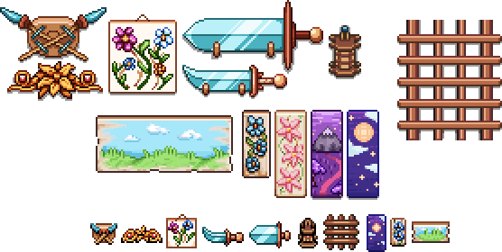
And finally, we decided that each of these Tai Ming housing paintings will be their own object, purchased separately, and so I made miniatures for them as well:

And now, time for a bigger batch of Tai Ming housing item miniatures!

These are the wall decor items, and there’s quite a few of them as you can see! I’m not sure if these will all be unlocked as part of the Tai Ming batch yet, or if we’ll move things around a bit to even it out between the batches. The three rectangular paintings to the lower right only have one display miniature for now, since I wasn’t sure if they were going to be objects of their own or various styles/skins of the same item:

And finally, something we’d like to ask our players regarding the Tai Ming floors of Arcade Mode!

The Tai Ming Arcade floors poses an interesting challenge that none of the other floors do. After all, Tai Ming is a town, and a town you can explore both in the past and present, so how do we properly convey that over a set of not-overly-decorated rooms where you battle a ton of monsters?

The first thing we decided was that there would have to be enemies in both past and present state rooms: we definitely want to include the time travel aspect in some way, and keeping the past rooms enemy-free (as they are in Story Mode) just isn’t an option.

As for the layout of the floors, we have two options.

Option #1 is to have the Tai Ming floors be about half as long as a regular Arcade Mode floor. That means there will be half the amount of rooms, and your goal is to find a specific room which contains a time rift that allows you to travel forward in time, passing through the rooms once more in another time!

For example, say you begin in past. You battle your way through a set of different rooms, all decorated in Tai Ming’s past style with cherry trees, statues and whatnot. Then you reach a big room, which is empty. This is the boss room, but you’re not yet able to battle the boss because you’re in the wrong time. You go back and find another room containing a time rift which you pass through. Now on your mini map the empty room gets the boss icon, and you start making your way back there.

Now that you’re in a different time, all of the rooms have transformed into Tai Ming’s present state instead, with the statues broken and cherry trees bare. In each room you pass, new enemies will spawn: you essentially battle your way from the portal room back to the boss room you found before. Once you reach the boss room again, you can finally battle the boss and get to the next floor.

There will of course be cases where you find the time rift before you reach the boss room, and in those cases the floor will be shorter than normal, since you don’t have to backtrack through as many rooms.

The upside to this version is that you’ll get to see each room you already went through in its past and present state, and that it makes these floors a bit more unique compared to the other floors of Arcade Mode. The downside is the backtracking, which might not feel as interesting as going through a unique set of rooms, and the fact that you have to find a specific room (the rift room) before you can progress through the floor as usual, which might feel annoying to some people.

Option #2 is a bit more straight forward. This idea is simply that certain rooms have a time rift you pass through as you go between one room and another, so some rooms will be past and some will be present. This means the floor will be the same length as and work in the same way as the other Arcade floors (when you find the boss room, it will always be in the correct timeline and you can battle the boss at once). What rooms will appear and whether they are past or present rooms will be randomly generated by the map rather than you going through a set of past rooms first, which then transform into present rooms.

Perhaps not as interesting mechanically, but might be more so visually (more unique rooms rather than two versions of the same, shorter floor).

———————–

Since we can’t really decide which one we prefer, we’d like to hear what you guys think. Would you prefer Option #1 or Option #2? This game is designed to be enjoyed by our players, so we’re very interested to hear which one of these you’d like to see!

In order to collect your votes, I have made a topic with a poll on our forums! Please cast your vote in THIS THREAD to let us know what you prefer. Thank you :D