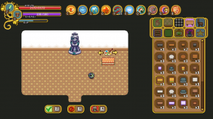
With Fred back in town we had a meeting, as mentioned last week, where we discussed two important things: the new housing patch feedback and something I know many have long awaited… the support skills!

When it comes to the housing build tools, there actually haven’t been much feedback to speak about, which we take as a good thing: hopefully that means they weren’t too confusing! There are still some things we’d like to polish, though – for instance, some kind of visual effect for the clear and delete functions (as the items/rooms disappear).

We also want you to be able to add more than one door to a room, and by doing so connecting it to others. To do this, we’ll add a ‘connect’ button in the menu, which allows you to add another doorway between two rooms that are next to each other but not yet connected.

What about the support skills, then? Well, we’ve come up with eight different skills, which will be introduced in more detail at a later date. For now, let’s talk about the changes compared to what the support trees look like now:

For one, the skill category will change name from “Support” to the more versatile “Utility”. Our reasoning is that with a name like support, many players who expect to play the classical support role will automatically hone in on the support tree without checking the other trees first. However, while these new utility skills will likely make playing a support-like character more fun (compared to the current skills), we want to make a point of the fact that you can pick and choose from any of the skill categories, and use the Utility ones as bonus abilities, rather than either ignoring the tree or focusing too much on it due to the support name.

Inside Utility category there will be three trees: Offensive (3 skills), Defensive (3 skills) and Buffs (2 skills). The old support skills will be completely removed.

Finally, the utility skills won’t use the charge system, and won’t use up gold points. The way we’ve designed them now, they will cap at 5 skill points and only use silver – but this might change as we begin to prototype them and play around with them within the game.

Since the support skills are mainly Teddy and Fred’s area, I’ve focused on other things this week!

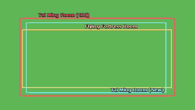
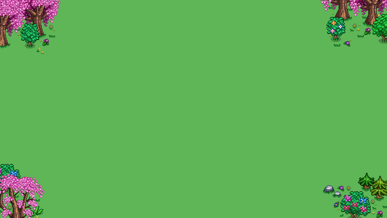
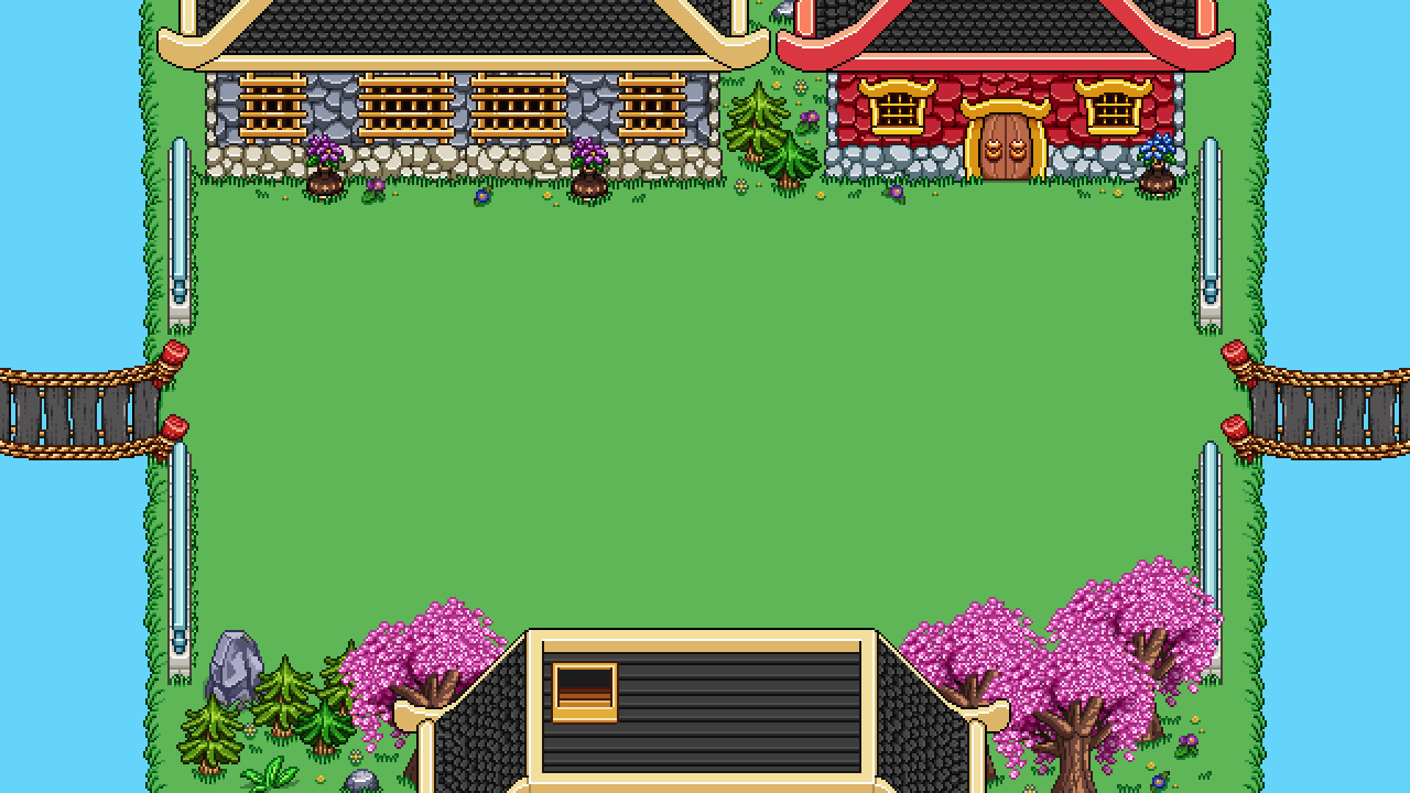
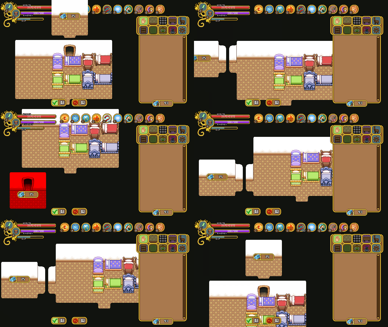
First up, I’m continuing work on Tai Ming’s arcade mode stuff, and it begins with changing the initial size of the rooms:

As you can see in the above image, our first version was pretty huge, larger than the biggest room in Flying Fortress (which I believe is the biggest room in all of Arcade Mode to this point). It still is very big, even after we changed the size a little, but less extreme.

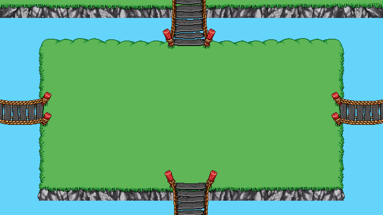
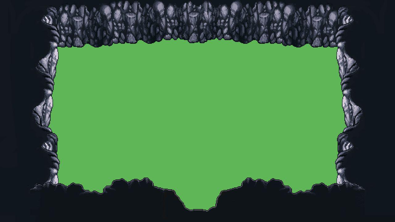
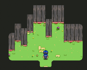
So anyway, first thing I had to do was change the size of each of the walls I made currently, and then I went on to add openings/exits for each of them, as seen below:

The mountain walls only need an exit (or rather, entrance), to the bottom, since you’ll only use it once as you come through a Mount Bloom exit!

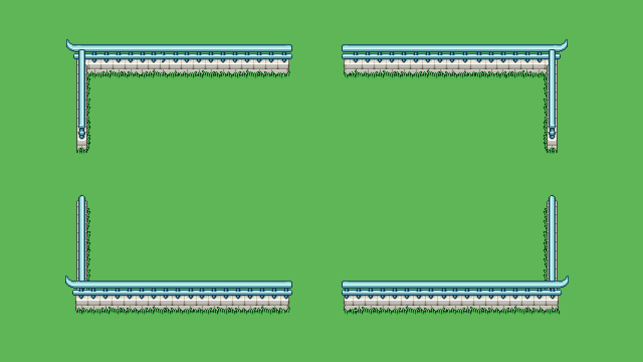
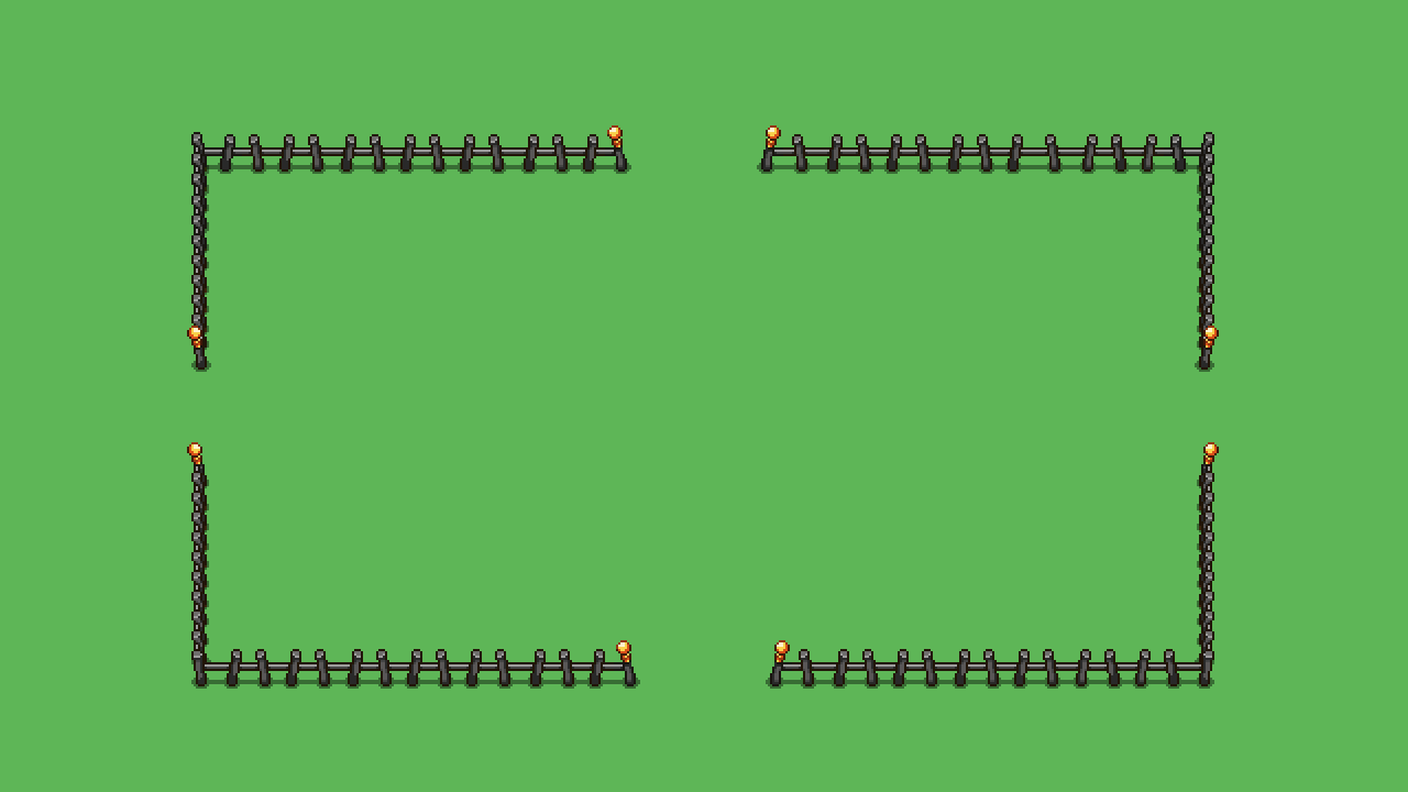
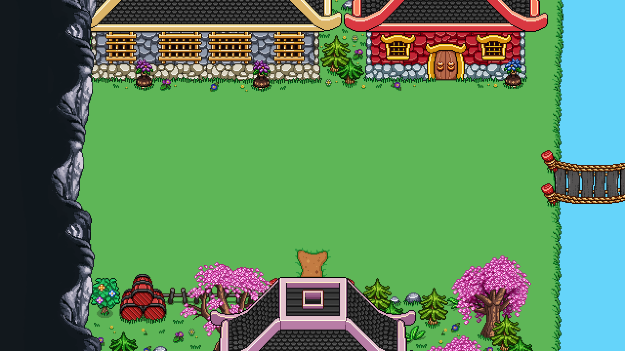
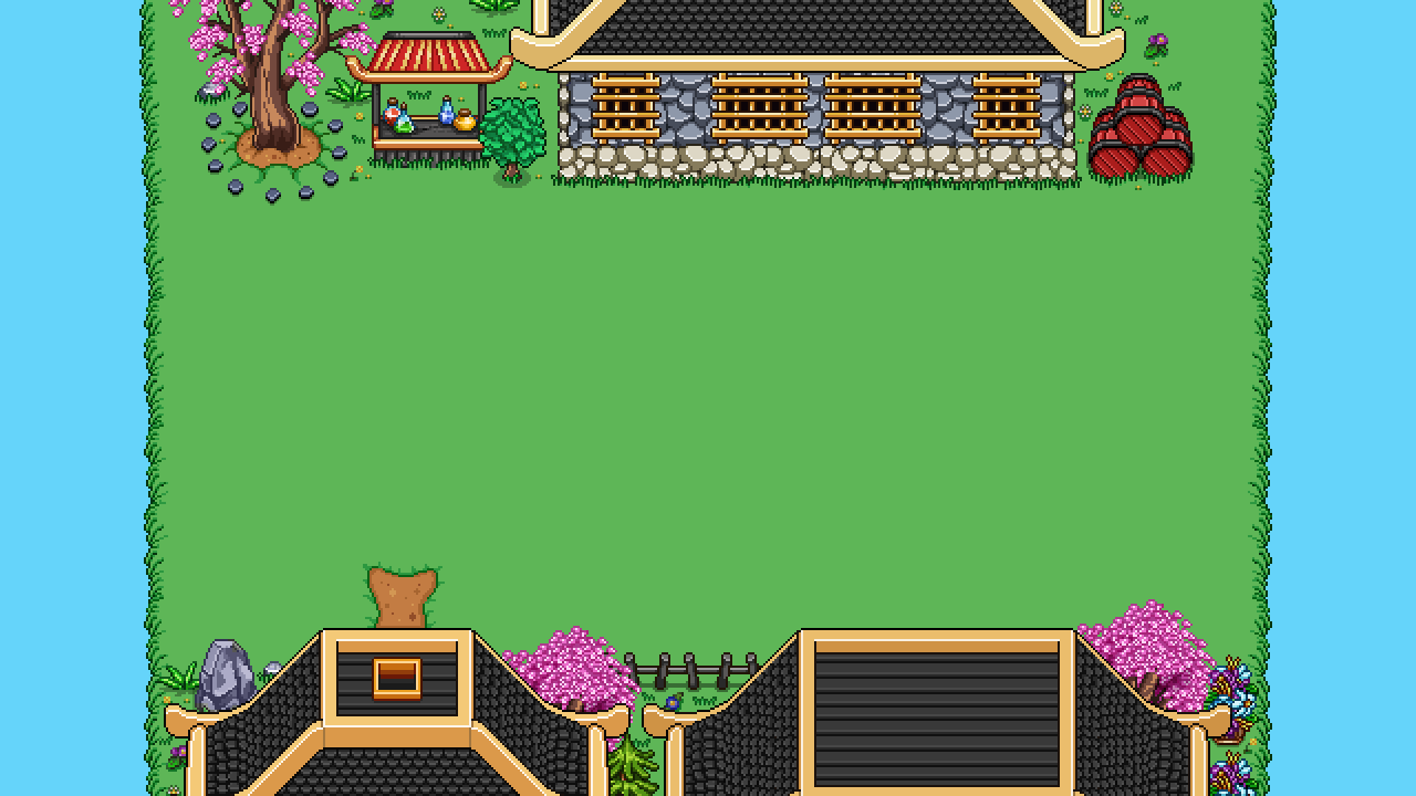
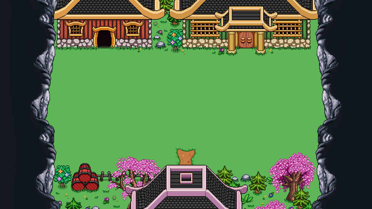
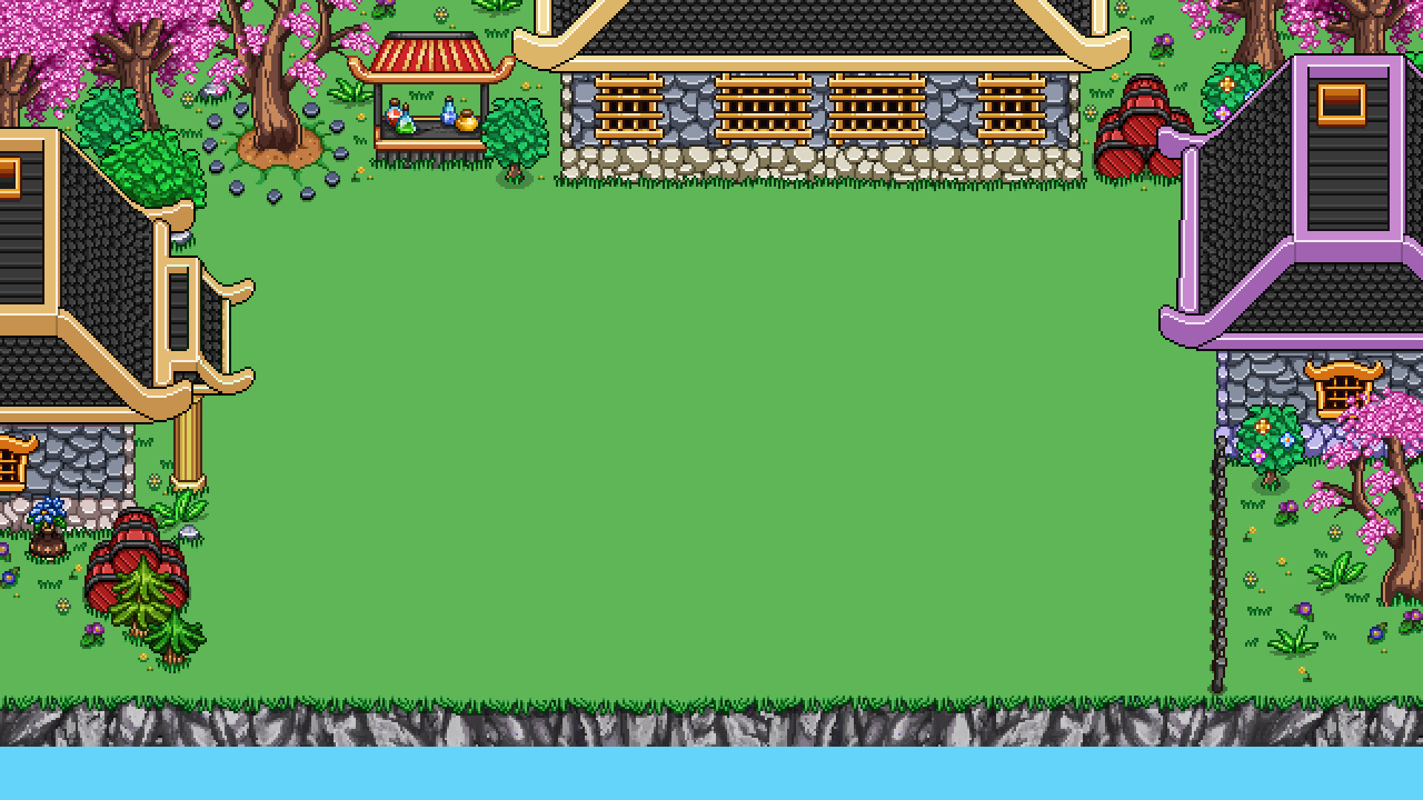
Then, I started working on another type of wall, featuring houses! Tai Ming is a town, after all… Here are a few of the ones I made in combination with some of the other walls:

When making these “house walls”, or more town like walls for the Tai Ming rooms, I wanted to make sure they could work both alone and next to water or other walls. In order to make this work, I made small versions of each, that are small ends just before the water edges, in case they are placed in a room with some kind of water. I then made four corners (seen above) than can be added to each of the walls to make them longer, for when there’s just greenery in the room, and no water.

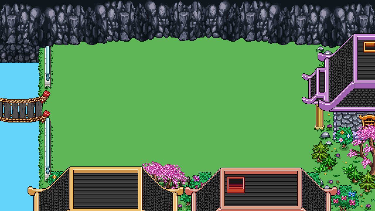
An example of this can be seen below. The vertical edges of the battle area used here are the smaller versions, with the corners added on top but not bottom sides, in order to make room for the water that flows there:

Here’s another example, with a single corner connecting the short vertical and short horizontal edges of the battle room. It also showcases how you can use both a water edge and the stone wall together:

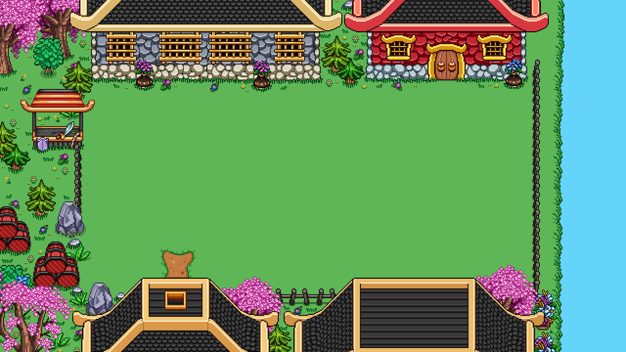
Third version, with corners on the left side! Also as you can see, there are a bunch of variations of the layouts, which means hopefully there shouldn’t be too many repeating walls:

And here we have one with only the short versions and no corners:

The actual battle area needs some grass decorations (that is likely to be random generated), but other than that I think we’re nearing something that feels a little more complete. Now we just need to feed these walls into the game engine and figure out in which ways to connect them to make the rooms look interesting and cool!

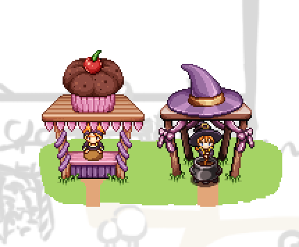
Now, it’s been a while since we made the first step in the progress of revamping Arcadia, but it’s finally time for another: Candy’s brother Muffin makes an appearance, ready to give you treats that will make your arcade runs easier!

The final form can be viewed below:

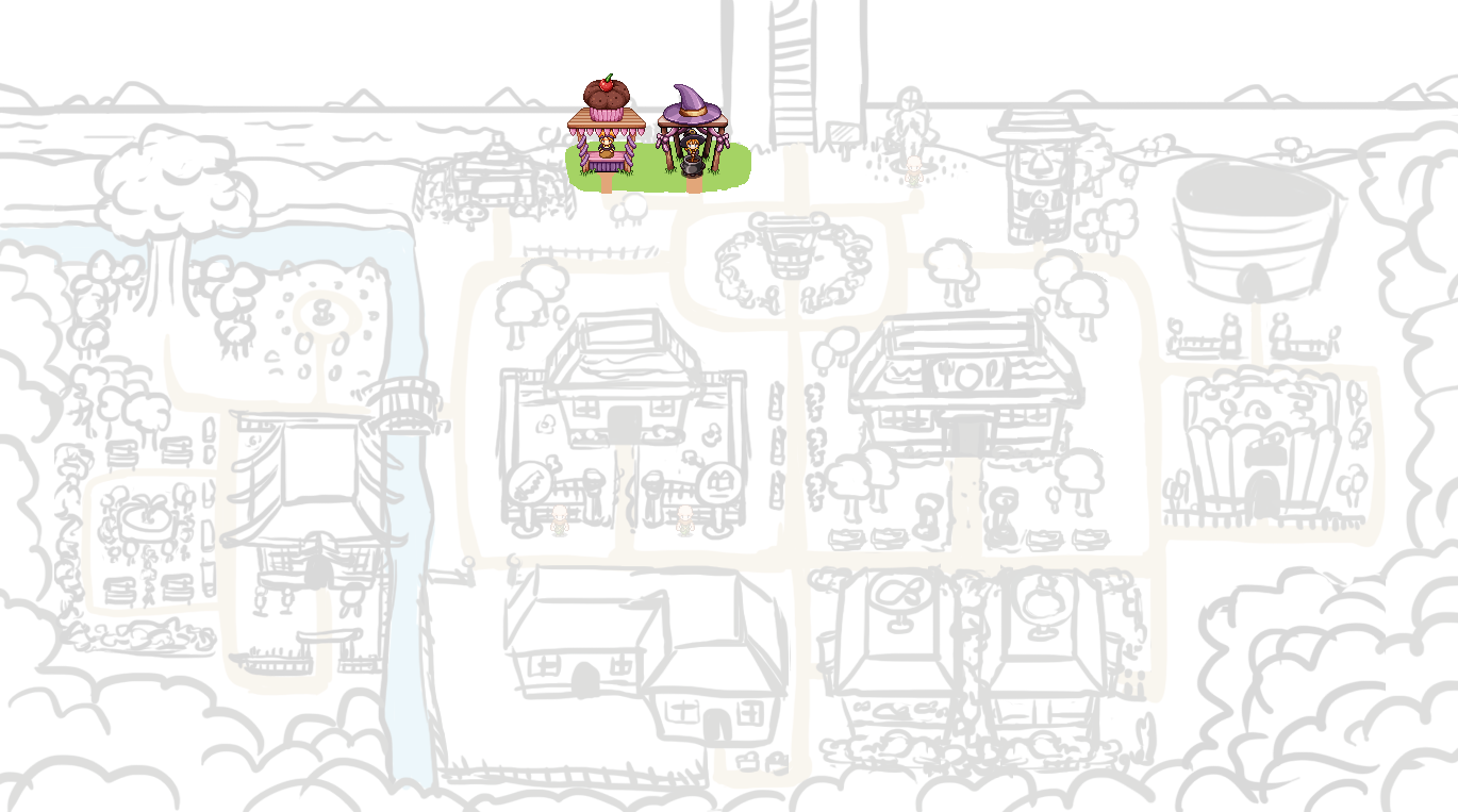
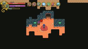
And below’s the map as of now! Quite a way to go yet, but we’re slowly getting there:

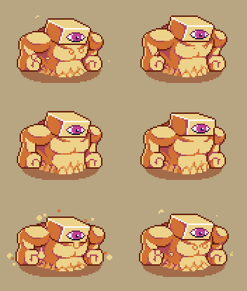
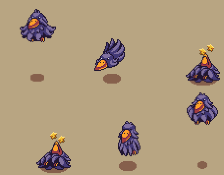
In Fred’s department, the desert enemies continue to take shape! This time around he has finished up the Mrs. Bird animations and moved on to the Solem~

See how another Mrs. Bird spawns out of the egg of another? We have a feeling this enemy will be quite annoying, hopefully in a good way! The Solem, meanwhile, will be a lone beast, few and far between due to their strength.

Since all paths will be open to the player (once the maps are actually in the game) we plan on sticking one of these guys near the entrance of the desert, deterring any stray new players on their way to Pumpkin Woods from going the wrong direction. One bout with this guy and hopefully they realize they took a wrong turn and continue down the right path! …or perhaps it’ll become a challenge to some, to see how soon they can best these high level beasts? Looking forward to seeing all the cheese strats! :)

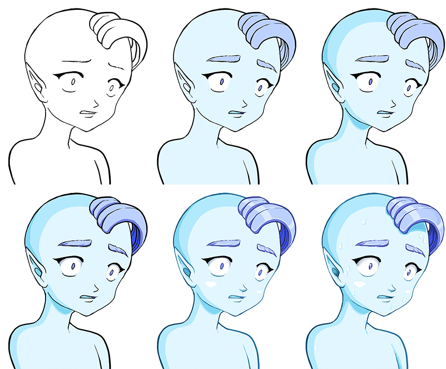
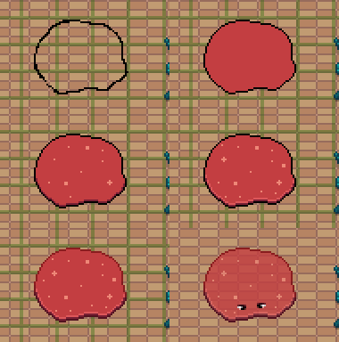
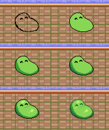
As a bonus, Fred has created a step-by-step for the initial creating of the Solem, from sketch to finished sprite:

Excited to battle yet? I know I am.. But first we have some support skills and Arcade Mode reworks to finish :D

Last week me and Teddy had full focus on getting the house building tools up and running, and I’m happy to say the patch is ready and has been uploaded!! Finally you’ll be able to be more creative with your house, adding new rooms and editing their shape or size in more detail.

The full patch notes can be seen here, and as always, we’d LOVE to hear your feedback on these new tools, anything that may be confusing with them, improvements to be made etc. Let us know! You can comment either here or in the thread above (or make a new suggestions post on the forums).

Last week, Fred was also gone on vacation, and since he returns tonight and the build tools are done (aside from some polishing and anything we learn from your feedback), our next move will be to get together and discuss the support skills! Yes, finally! We’ve put them off for so long, but with the game drawing ever closer to a finished state I guess it’s best we finally get to adding them before there’s no reason to use them anymore, right?!

We’d like to thank all of you for your input and suggestions in regards to them up to this point, and we’ll consider each of them as we move on to iron out in which direction we want to take these spells. Again, though, it’s unlikely there will be any kind of healing skills, but most of you are used to the thought of that by now! It’s a cool skill to have, but we’ve made the decision it won’t be available in Grindea (unless you’re a certain NPC) for a variety of reasons I don’t think we need to rehash once more.

What we DO end up implementing we’ll only know after tomorrow’s meeting, and will be disclosed in a future post!

Since I don’t get to do much for the support spells (it’s mainly Teddy implementing mechanics and Fred doing animations for them), I’ll return to focusing on the Arcadia rework and its new floors until the skills are properly decided and I can make icons for them (likely after some prototyping as been made). We’ll keep you updated!

FOR NOW THOUGH, let’s take a look at last week and the path to creating the tools you now have in your game:

In the first screenshot (above), we added a very simple way of being able to drag each wall tile down however far you need. At the point of this screen, it’s a very basic way of handling things: the darkness above each wall tile looks very square and unpolished, and the black outlines have actually been added manually in Photoshop as a visual test.

Since we don’t want the outlines to be completely black in the final game – it will look jarring next to some of the wallpapers – what we’ll do is have me make a 1 pixel wide line for each wallpaper, using a much darker version of its own color. This way we can also manually account for the lower part of the wallpaper being a different color. For the particular wallpaper above, this would mean the outline will be dark gray and dark red.

As a next step, we polished the darkness, and added a way to pull wall tiles upwards as well, as seen below:

If you’ve an eye for details, you’ll notice the corners aren’t as rounded as in the previous screen. The reason for this is that rooms with multiple extra corners (such as the one above) looked super weird with the smooth corners attached everywhere – it looked less like a house, and more like an organic shape. Even now, the edges might look a little bit too rounded, but I think this is a lot better, and I feel completely square corners would end up looking too flat.

Next step: attaching doors that connect your rooms. Each wallpaper will have its own door, and unfortunately as of now you won’t be able to mix and match between them.

When making the doors, we had two options regarding sizing: either making them 40 pixels wide, equaling 2 floor tiles – which honestly is rather small compared to most doors in the game – or going for 60 pixels / 3 floor tiles, which is rather huge compared to most doors in the game.

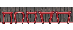
SO, I made a bunch of suggestions, the left ones being 40 pixels / 2 floor tiles and the bigger ones on the right equaling 3 floor tiles of width:

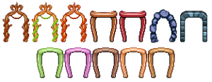
In the end, we decided to go for the smaller doors, as they don’t look quite as gigantic and it seems easier to fit in doors that are 2 tiles wide inside your house. It’s going to be a challenge keeping each door this tiny, but that’s what makes it fun too, right? Continuing on, I made one door for each wallpaper, both facing upwards and to the sides:

And now that those are out of the way, it’s time to return to something we haven’t touched in a rather long while… User interfaces! First, we need to get some stuff together so you can purchase the lumber that allows you to extend the size of your house and rooms!

And it all begins with a basic item sprite (you will be carrying the lumber in your inventory, after all), and a modified version for the shop menu:

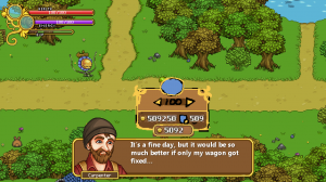
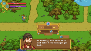
Next, we begin sketching what the lumber purchasing interface could look like. Since lumber is a very different item compared to furniture, we wanted to keep them separate. Therefore, rather than being part of the regular sales, lumber purchasing will have a special interface, loosely based on the Nurse in Arcade Mode:

The main things of importance in this interface is how much lumber you wish to purchase (and how much it costs), how much gold you have, and how much each lumber costs at this level. We decided that after you’ve purchased a number of lumber, the overall price per lumber will go up. This way it’ll take some extra work (or rather gold), to get those huge mansion type buildings!

Once we were satisfied with the sketch I went ahead and made the rendered version, also featuring how much lumber you currently own, which we realized might be interesting to see as well:

Next up, the build tools menu! Gotta access those tool some way, right?

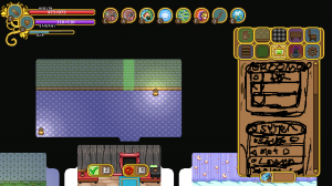
Every menu we design starts with a basic sketch, and in this case a messier one than usual! In the above screen, we were discussing various ways of making the tools available to the player, sketching as we went on. Our first idea was to merge the build tools with the hand tool, but we quickly changed it to be its own focused menu in the settings tab, where we could fit all of them – including the light settings, which would be slightly out of place otherwise.

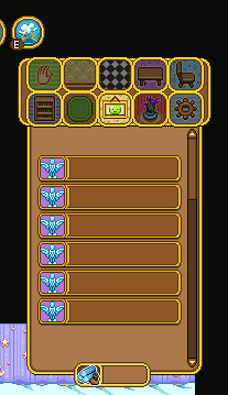
Similarly to the shop menus, this menu will use buttons that allow you to enter each tool. In the above screen, I added some of the already made shop menu buttons to see what it’d look like if we used them as a base for the new bunch. Since the size in length fits well with the background and it’s edited to fit all font types in height, we decided to stick with these and just swap out the icons to represent each tool.

Next I began editing the background to make the buttons stand out more, as well as making room for the menu title (which as of now will be”Room”). The icons on each side of the band (on which the title text will be) will move with the text, so no matter the length of the title they will be a pixel or two away. We made it this way to make sure it’ll look as good as possible in the translations:

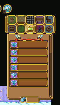
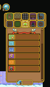
Then it’s all about making those icons, and doing our best to come up with images that fit with the tool and make them easier to understand. Can you guess what each tool means below?

The correct answer is, from top to bottom: Add New (room), Resize, Reshape, Light Settings, Clear and Delete!

Add room will create a ready room with a door that you’ll be able to place on the wall in the room you’re currently in. Resize will replace the current resize system and allows you to pull at any of the walls, making the room longer in that direction. In Reshape you can pull down (or up) walls to change the shape of the room, and Light Settings will replace the current light setting – after you press the button, it’ll allow you to change the percentage. Clear will clear all furniture from the room, and Delete will, naturally, delete it.

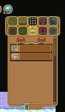
Since this will be the new settings menu, you might wonder what will happen to the Save and Load options. They will remain in their own box, beneath the above Room settings (you might have to scroll down to access them). These are designed much in the same way, and will work just like the Light Settings button: after you press their buttons you’ll be able to edit which slot you want to save/load into, just like before:

And now, some work in progress gifs showing the early stages of the build tools:

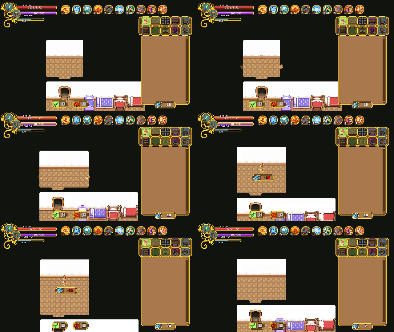
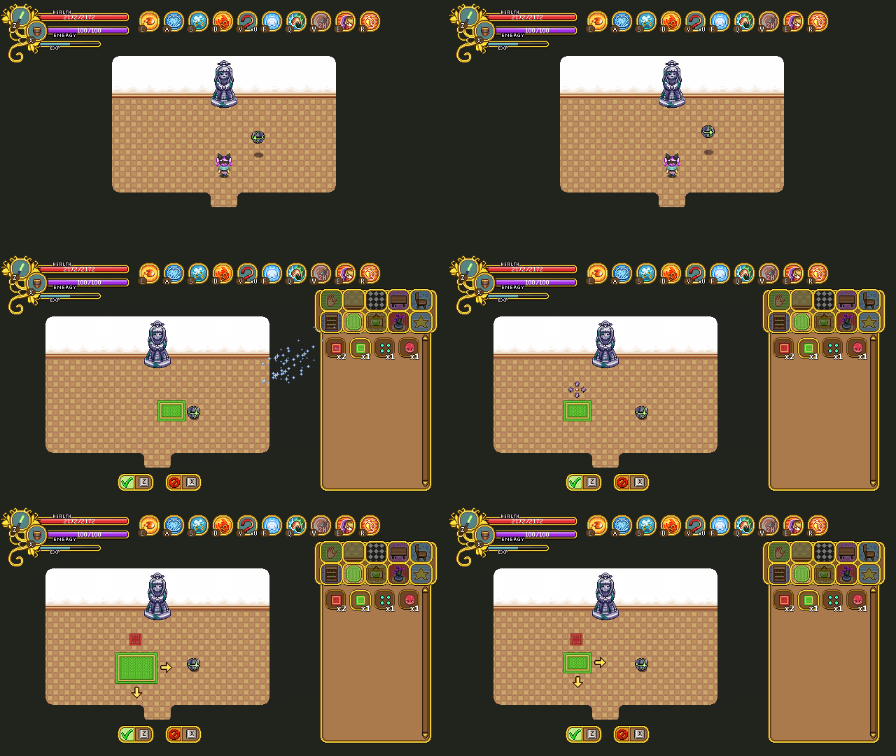
First up, the add new (room) tool, seen above! The cost of the room will be shown in the middle, and you use the arrow keys to decide where to place the entrance.

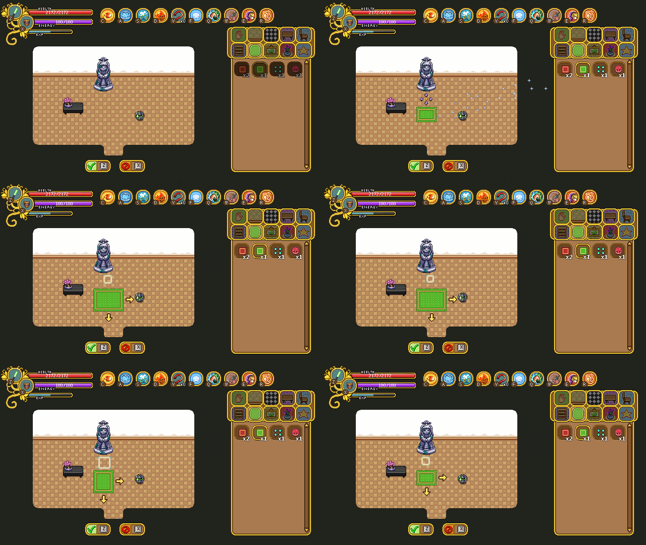
Below, you can see the prototype for the resize tool, where you use arrows to first select which wall you want to make bigger, and then keep pressing the arrow key in the direction you want it to increase. As you do this, the amount of lumber needed to complete the action is shown. Right now it displays with a minus sign, while the add new room does not, but in the end they’ll both use the same format.

You’ll be able to pull at the walls however long you wish even if you cannot afford it, but you won’t be able to confirm your edit unless you have enough lumber. The reason for this is so that you can try making the room the size you want it and see how much lumber you’d need to make it that big before you go purchase more at the Carpenter.

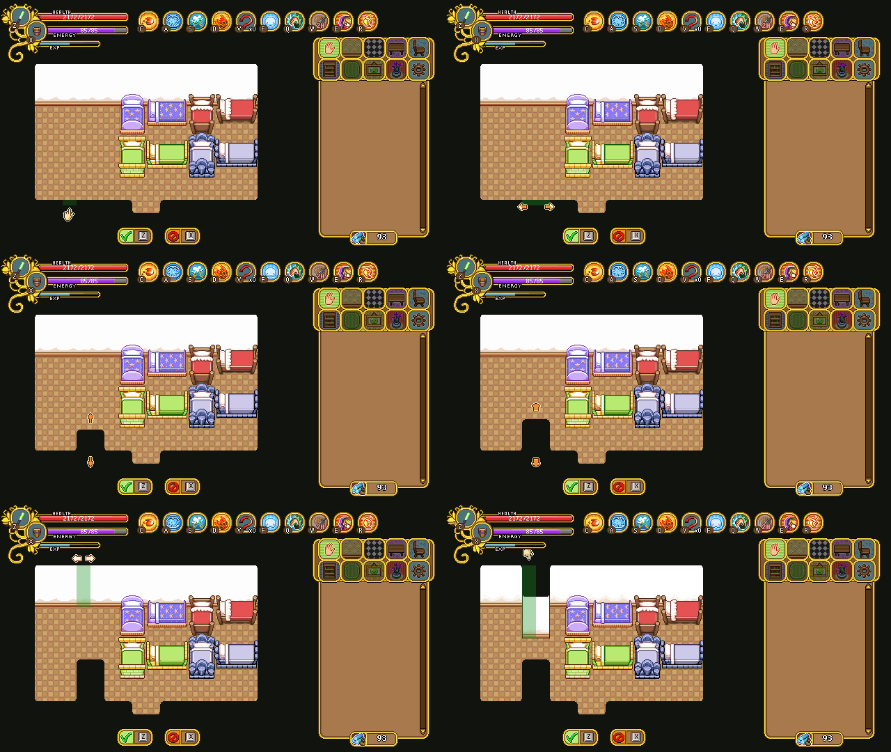
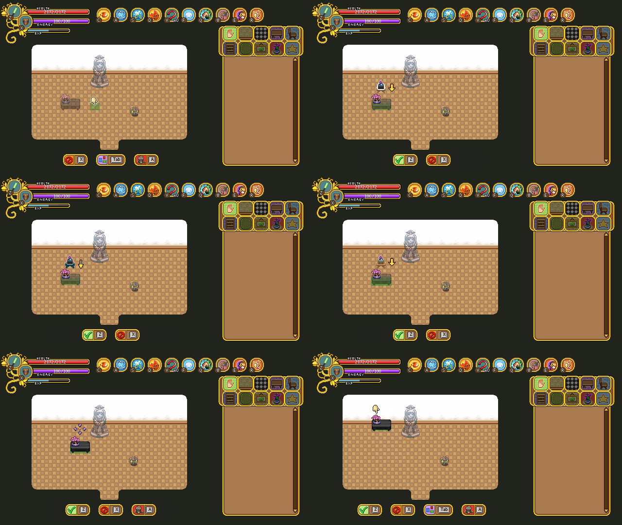
Finally, there’s the reshape tool, where you can edit the inside of the room. Pulling down (or up) these walls don’t cost anything, so you can redesign the shape of your room freely!

In case you missed it, the housing patch is now up and running, so if you haven’t tried that yet, go ahead and test it!

The initial feedback seems very positive, and I’m actually surprised to see how many of you seem to really enjoy building your houses! The interiors that have been posted all look great and so creative, I didn’t even know you could make such cool layouts with the things we made so far. Thank you for that all of you! We’re still going to introduce a ton of new pieces of furniture, of course, and we’ve already gotten a ton of cool ideas based on your suggestions! If you have any more ideas for housing and what to do with it, please go ahead and let us know by commenting or posting on our forums!

Now, we’ve decided that we do want to further improve the housing system – specifically the layout – and we’d rather do it now while it’s fresh in our minds rather than sometime in the future. Since we estimate the development time will be more or less the same between creating pre-designed layouts or having you guys make those layouts yourselves, we’ve also decided to go for the the later, allowing you more freedom in your house building endeavors.

This of course means a whole new set of design decision that needs to be ironed out before things can be implemented properly. For one, we need some kind of build tool where you can edit the walls, pull them down or up and change the size of each individual room. This will be a challenge in itself, but will have to wait until the system runs properly (Teddy has already started working on this).

Second, we had to discuss whether increasing your house size would be completely free or something you pay gold to do. The idea we came up with is that each tile/square in the house represents a number of “Lumber” (might change the name later). This means that as you expand your house you’ll use up lumber, but should you make it smaller again, you’ll regain them. You will be able to purchase the lumber at the carpenter store for gold, though we haven’t decided how expensive it will be yet.

As now, there will be a minimum number of tiles each room can be, but you’ll have a lot of options in terms of the shape, since you’ll be able to move each wall tile up or down. While this system will need a lot of fine tuning, I think it’ll be great in the end!

As for the general feedback we’ve received since the housing launch, two requests stood out above the rest: bookcases facing sideways and chairs facing upwards!

The reason we didn’t include sideways-facing bookcases was, honestly, because we thought it looked boring and we thought nobody would be interested in that anyway. After listening to your feedback, we know we were wrong, and agree that there’s definitely uses for them – and so they will be added in an upcoming patch!

Along with the bookcase update, there will also be chairs facing upwards, so you can put chairs in all directions. We always intended to include these, but for some reason, we kept forgetting to actually make them. Oops!

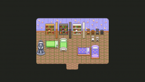
As per request, there will also be a style for the female statue without the moss, as pictured below:

As you can see, there’s also a bunch of beds in that picture, and you might wonder why. Well, we’ve had a discussion about the perspective in the game and whether some items look better in their correct form or not.

You see, the vertical beds that are currently in the game are wrong according to the perspective – they are much smaller than they should be, compared to the horizontal version – and Teddy suggested we should correct it since it was something that bothered him as he was flipping between the two.

When I took the above screen, I had started fixing the vertical beds, but something felt kind of off. I asked Teddy to upload the Pumpkin Woods bed so we could test it and compare it to the old, smaller version.

Turns out we ended up preferring the smaller one, even though it’s technically wrong. For some reason, the beds end up feeling huge when they’re in their correct size, and it actually felt a lot worse than flipping between the original ones. I will still fix two that felt a little too small, but the rest will be kept the same, and the “fixed” versions will go to the trashcan!

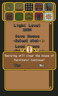
Another thing that will be added is the !-mark seen above. It will appear above important notices, and serves as a warning of sorts. Or just to make the boxes a little more interesting-looking, if you will!

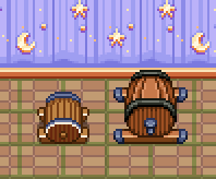
We also decided to do a bunch of fixes to items that didn’t properly fit within their tiles/squares, making placing them in a house rather awkward. First up, the beer keg, which has been changed to a bigger version. In the original, left version, it was simply too small and left a lot of space on each side. Making it even smaller (to fit a single square) wasn’t an option, so instead we decided to make it a lot bigger. It now takes up 4 squares, and while there’s still some space remaining, there’s not nearly as much of it:

Next up, some of the Temple of Seasons bushes, which used to take up about 1.5 squares, also making them very annoying to place within your house. For these, we decided to make them smaller instead:

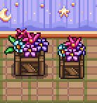
This flower crate also got a smaller version, which now fits a single square as well:

The Pumpkin Woods bench and chair, which weren’t pictured above:

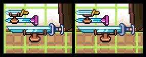
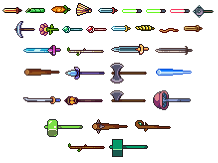
We’ve also started working on a new object, which is a weapon stand where you can place your 1- or 2-handed weapons to show off within your house. In the top left corners of the below picture, you can see two of our iterations for the 1h version. In the end, it’ll be something closer to the right one, as it shows off the weapon better and feels more balanced:

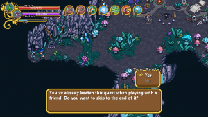
In semi-related news, another thing that will be included in the next patch is the long-awaited feature of being able to skip quests you previously finished in a multiplayer session! Before this patch airs, you’ve had to redo every single quest in single player, regardless of how far you got with your friends (unless you were the one hosting). Now, you’ll get a notification about having completed any given quest in a previous multiplayer run, and the option to skip to the end of it:

As for Fred, his focus has been more enemy animations, as well as laying the groundwork graphically for those weapon stands that will feature any weapon of your choosing as a housing item!

In order to make the weapon stands work, Fred selected a frame from one of the attack animations featuring each sword and edited it to fit the weapon stand sprite. He also had to add a hilt to each of the ones that needed one, since he never made on for the animations: the main character’s hand typically covers where it would have been.

And as for the enemy animations, things are moving forward with the desert enemies and in particular with the Mrs Bird enemy:

Finally, there’s another portrait for the upcoming desert town! A winter fae, to boot – Talk about getting out of ones element!

This poor guy has been dragged along to the desert by a summer fae friend. How cruel! He doesn’t particularly seem to enjoy the heat, does he?

This week was a very special week, since the annual GGC was hosted (and also the week where we launched housing on frontline – go check it out)!

GGC is short for Gotland Game Conference, which is basically a game expo where the students at the game design education showcase their game and a bunch of people from the industry is invited as judges to give feedback and select which ones did the best. It all culminates in an award ceremony with an after-party where we all get a chance to hang out together and share experiences with other game developers. So basically, it’s great!

For those of you wanting a glimpse of all the game presented at the conference, check out this video:

One of the showfloor favorites, and clear winner of many of the awards at the award ceremony was this little gem called Pump the Frog, made by a bunch of first year students:

Totally charming and so well polished. It was hard to imagine they only had 8 weeks from start to finish, incredibly impressive work! It’s also nominated for several SGA (Swedish Game Awards) categories, so its success might continue on to other venues as well!

If you want to know more about the conference or would like to see some cool pictures from the showfloor and presentations, head over to the conference website!

———–

Now as I mentioned, this week we also launched the housing system, which is now playable on frontline! So, when we weren’t at GGC judging games and hanging out with fellow game developers, this week was all about some last minute housing polish, finishing up the remaining details and the graphics needed for them!

First up, we realized there were some more forgotten things we needed to take care of!

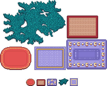
Some miniatures for the carpets from before, for example:

And then, a couple of items some of you have likely had in your inventory for quite some time! The red slime carpet and the green slime bad:

Hopefully that’s the last of our forgotten objects, and we can now focus on just adding new ones in the future :)

As for the housing system itself, the way you get the house, for now, is that once you’ve completed Flying Fortress, the scientist Kim will appear in Evergrind City next to your currently not-yet-built house, explaining one or two things about the science behind the houses in the game (and your own)!

She also wonders if you’d like to help test out some new systems, and upon agreeing to do so you’ll be able to purchase the house from the carpenter, who will build it for you. After this is done we plan to move Kim back to the lab in the HQ where she’ll continue doing other experiments (gotta keep busy, you know)!

As for the house, once it’s been finished (this happens once you change screens once), you’ll get a very short and basic explanation of how to use it upon entering the building.

We’ve continued working on the icons that illustrate what tool you’re currently using, and here they are in action:

First up, the style icon (seen above). After some thinking we’ve decided the arrows for each of the icons need to be remade, and it’s also missing a proper outline and an animation at this point.

Next, the carpet tool’s “carpet version”:

For this one we’re actually considering using the old version (seen below) after all, to make it stand out a bit more from the carpets you’re editing.

Finally, a GIF showcasing both the stack and the move tool:

The stack tool (as well as the carpet tool) don’t use the correct freeze frames in these GIFs which means the animation isn’t paced exactly right (it’s supposed to pause for longer on each stack), but it gives you an idea of what it’ll look like. The move tool is missing an animation in these GIFs as well, but it has since been added to the game. Finally, we added outlines to all the icons, which made them stand out a bit more against the background. This can also be viewed in the game.

We did have a discussion regarding whether or not to use a more simplistic style for each of these (like the old version of the carpet tool), but decided against it in the end. This way there will be a little more color, and hopefully each icon will stand out enough on their own once the outlines and proper animations have been added!

As for Fred, his main focus has been getting all those housing icon moving. Here are the finished icons he worked on:

We didn’t talk about the hand tool much in the previous post on housing, but the hand tool is a very basic tool accessible from the housing menu that allows you to move around your house and select any furniture piece you want (which in turn brings you into the other tools). The hand tool is also connected to your skin color in-game, and matches that of your character.

Here’s the new and improved move tool! We changed the arrows quite a bit, both in shape and color, plus it now moves and has an outline. It works a lot better than the old version, to say the least!

There’s also this new and improved version of the carpet tool icon (above), and the stack tool which you’ve already seen, below:

And here’s the style tool, a little bit interesting now that the brush is moving about:

Finally, Kim got a slight redesign to better resemble her portrait as well as an additional animation. In her regular one, she’s doing some chemistry stuff, mixing a liquid of some sort. While she’s outdoors telling you about the housing science, we thought we’d give her a different animation to better suit the theme (as well as one that doesn’t make sounds every few seconds):

We currently haven’t decided whether she’ll pick her chemistry set back up once she returns inside, or if she’ll continue using her newfound tablet instead!

Now, if you haven’t tried out the housing system yet, go ahead and let us know what you think! We’re eagerly awaiting your feedback :)