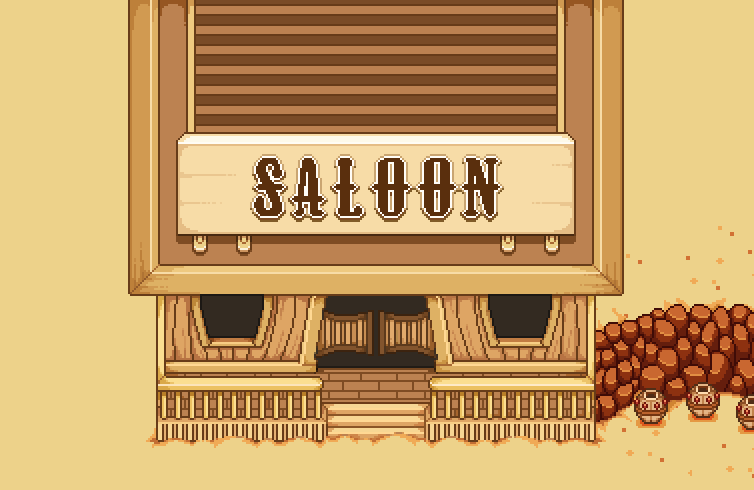
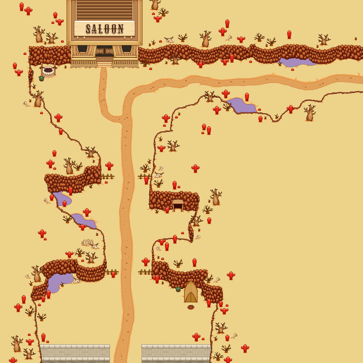
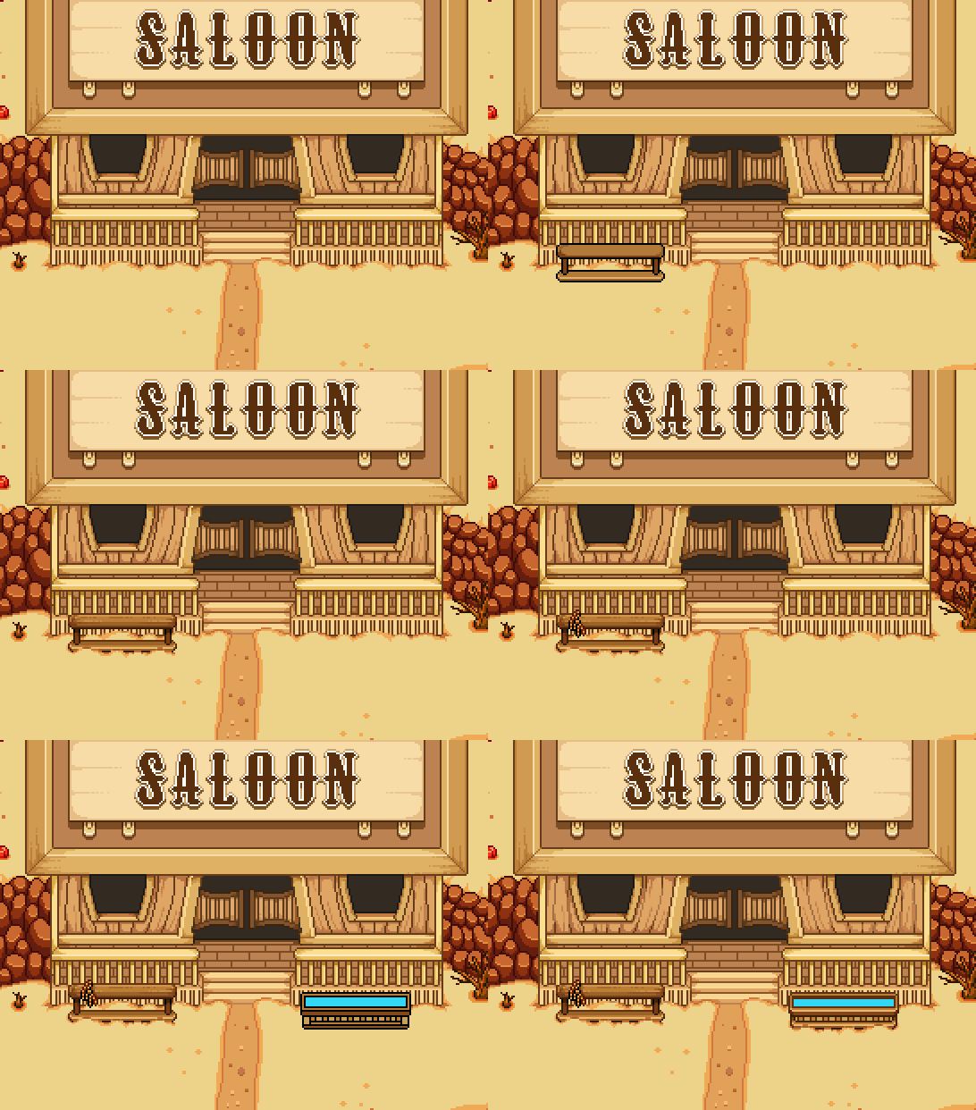
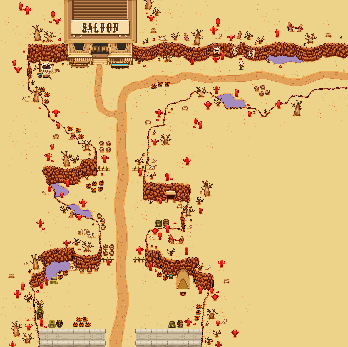
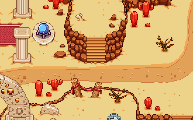
Time to start (continue) working on the desert for real! Since the sketch is all done, it’s time to start bringing the fourth desert area to life, and we’ll start with the Saloon:

There are still a few things to do with this place, but I feel it’s best to iterate things rather than make the whole thing in one go – the best ideas usually come when you have the basics down and let it rest for a day. Instead, I’ll continue working on the basic skeleton of the area: getting the walls and general decorations down, before continuing adding props on a more detailed level!

For now, here’s what the Saloon looks like right now:

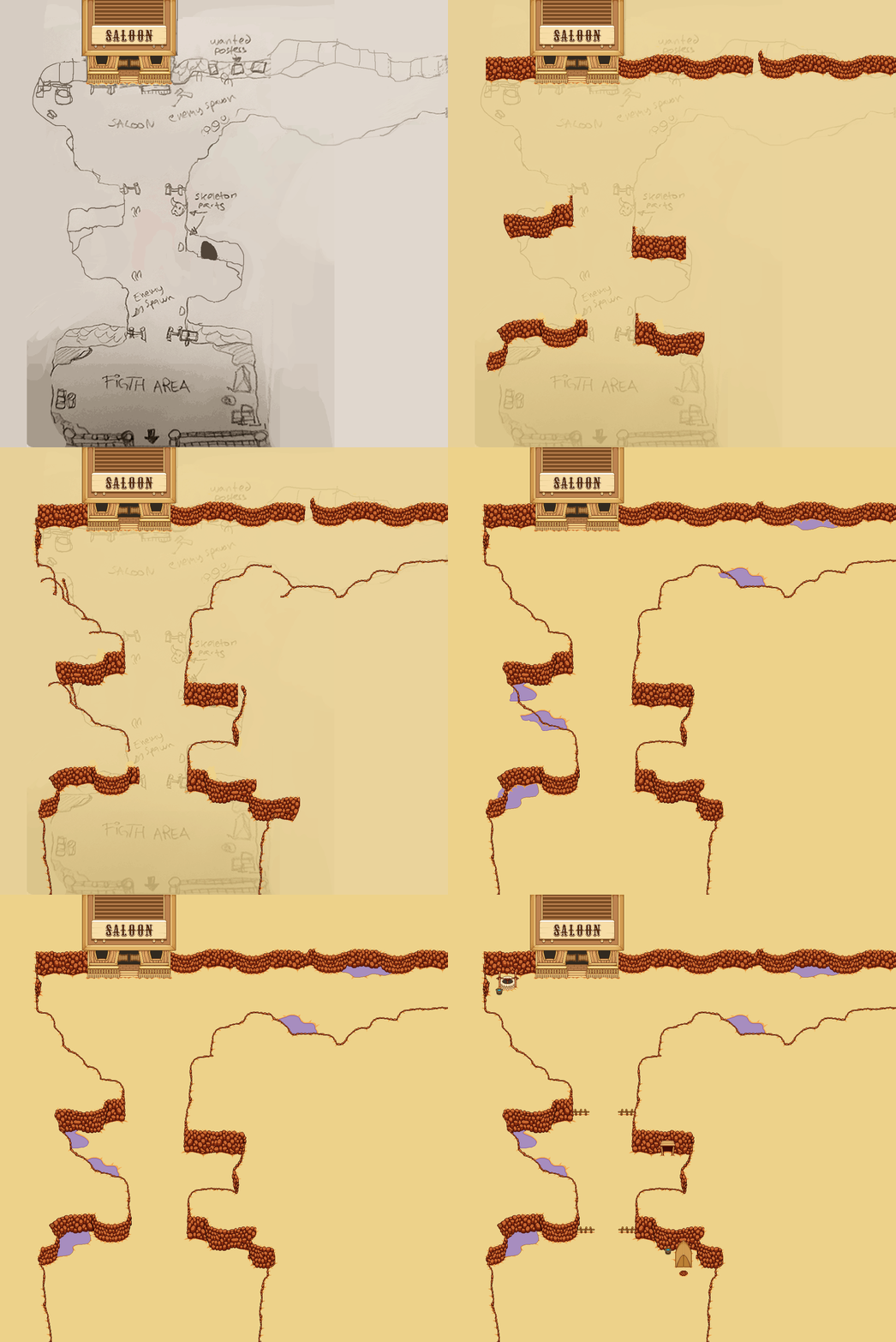
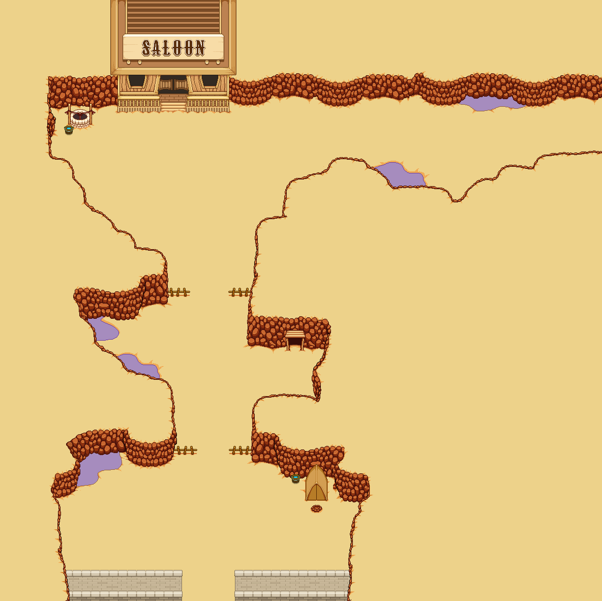
And now, time for the rest of the area! As mentioned, this is best done in several parts, starting with the basics:

The entrance to the harbor town will be in the lower parts of this area, which will be indicated by a wall of sorts, much like the wall around Evergrind City:

Next up, I’m adding a bunch of props using the editor, mainly cacti and bushes, and then, the path leading to the town and Saloon:

Then, some texture decorations of the sand and a bunch of pots:

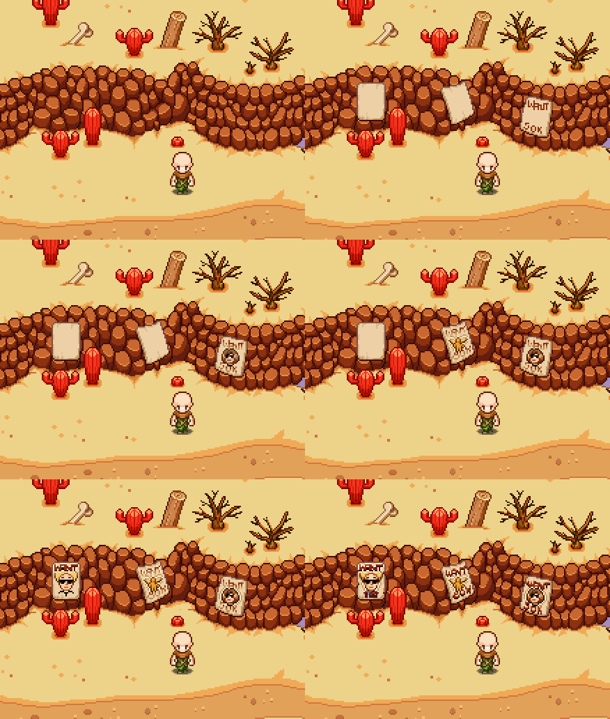
Now it’s time to get down to detail level, adding stuff to give this area a little bit personality. First up, a few wanted posters along the way to the Saloon:

The Saloon will be a hangout for a bunch of shady characters, which will be foreshadowed by the posters above. As for the Saloon itself, there are some details left that I want to get down:

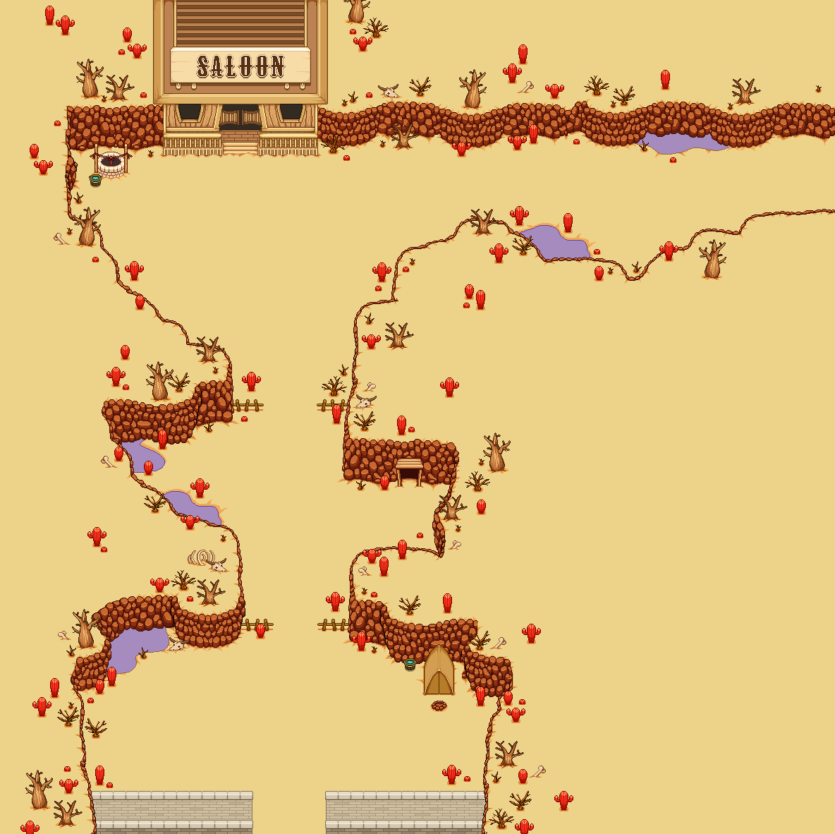
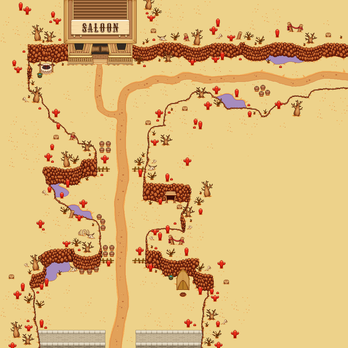
Finally, I’m adding some more stuff to the rest of the area using the editor: crates, barrels, jars, and a few bushes. In the end, here’s the area for now, more or less completed:

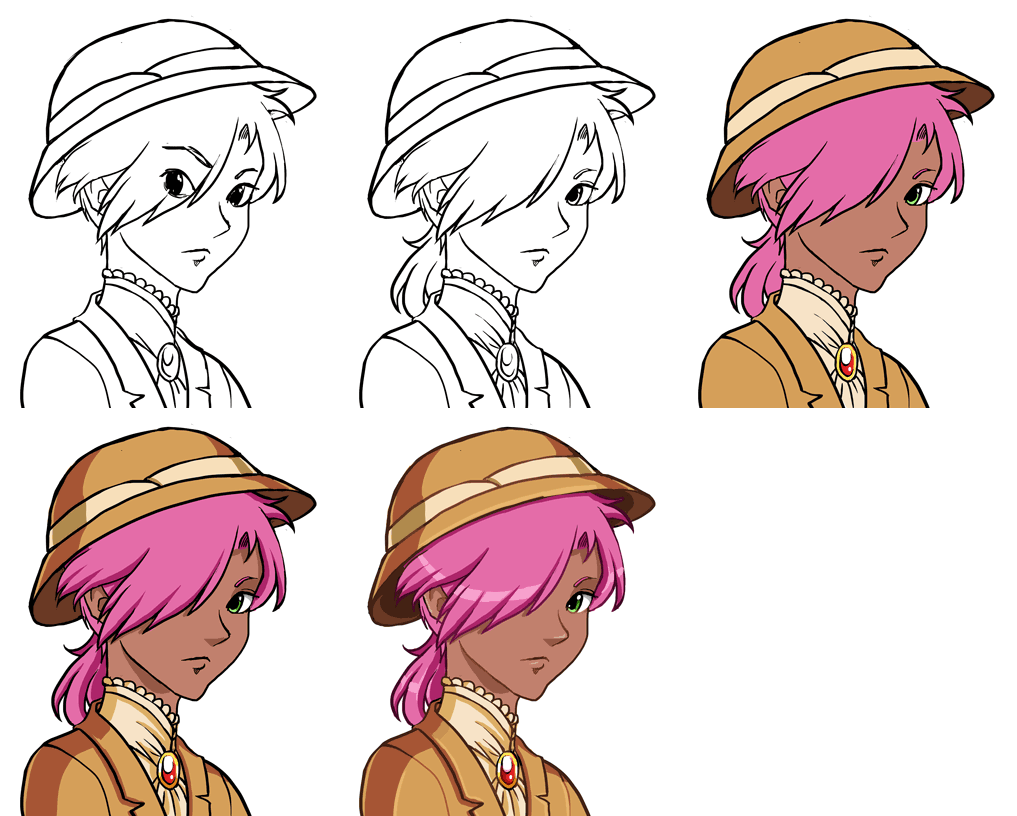
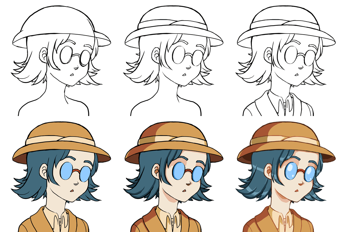
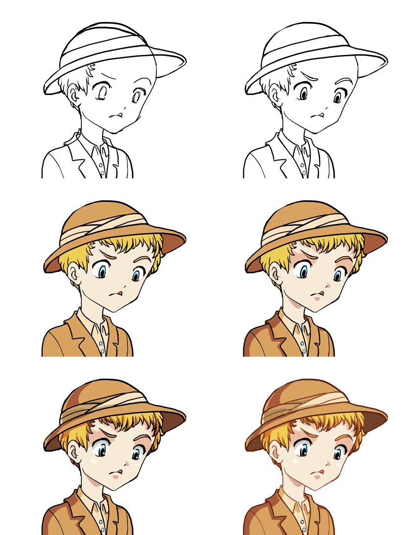
In the portrait area, we’re not done with the archaeologists just yet! Here’s the portrait of another one, the pink haired one shown a few weeks ago:

And the WIP:

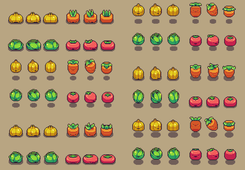
In Fred’s department, his vegetables are now fully animated, bouncing around ready to be implemented as actual enemies:

And the female gardener from last week gets a husband who’s inside the house stirring.. a pot of water? A bland soup? Who can tell!

What we do know though, is that her father is keeping an eye on him, making sure everything is done correctly:

New week, new interfaces! This time it’s the last couple of interfaces for Arcade Mode, featuring how to build new houses and a notification window for when new NPCs are added to town:

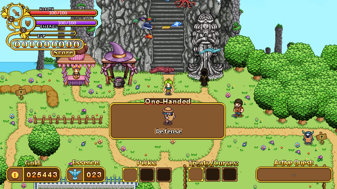
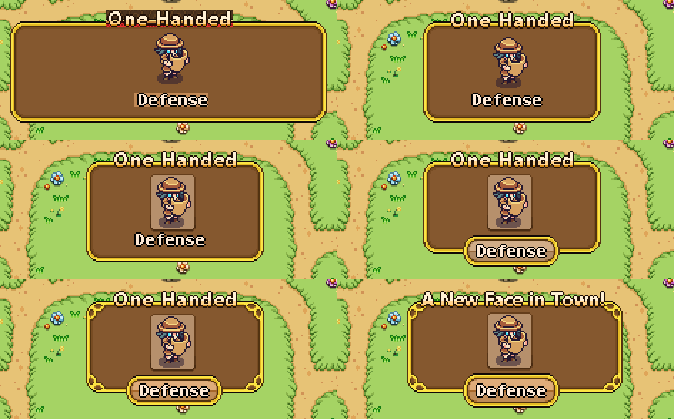
Above is the first quick sketch of the notification box mentioned. We wanted to notify players of when new characters appear in town so they know what/who to look for. Instead of One-Handed it will say “A New Face in Town”, and instead of Defense, it’ll say the character’s name. We used to placeholder text to get a feeling for how big the fonts are.

Here’s the progress of taking the box from the sketch version to the actual one we’ll use in the game:

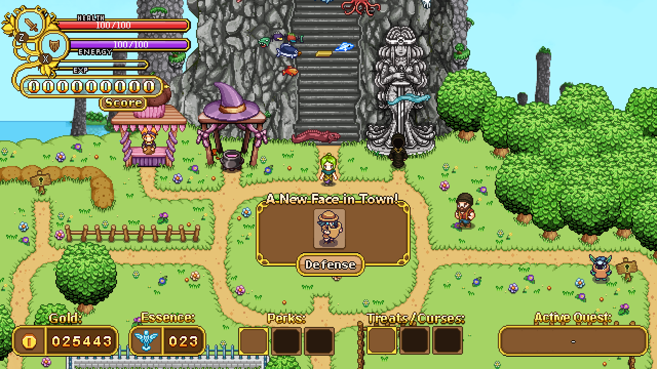
And the final window in its context:

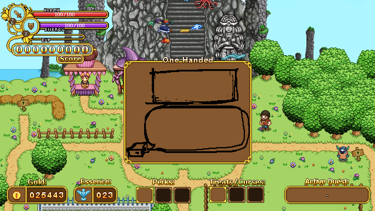
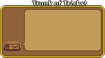
Next up, building houses. When you inspect a signpost you’ll be presented with a window where Trunk informs you of what will appear in that area and how much it’ll cost. Extremely(!) detailed sketch below:

Again, bringing it from sketch to final box:

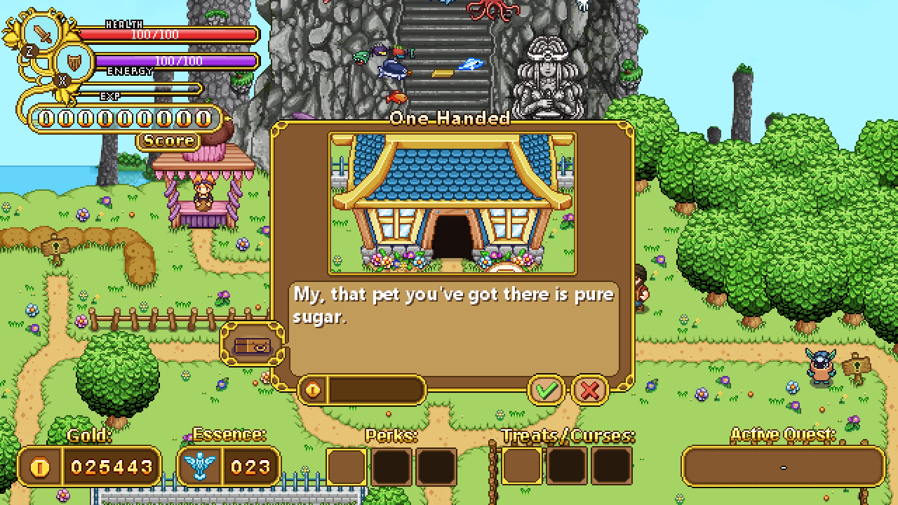
Once more we’ve used a placeholder text to get a feeling of how big text will appear inside the box. Instead of One-Handed it’ll say the name of the building, and instead of Candy’s line from Pumpkin Woods there will be a description of the house and what can be done there. The coin box to the bottom left of the window will tell you how much it costs to unlock this building, while the checkmark and x will confirm or cancel. The x will be selected by default to avoid accidentally building things you wouldn’t want.

Final version below:

Next up, a bunch of icons, featuring both curses and Bishop challenges:

This first batch are all Bishop challenges. The first one is the one where you race against time to complete each room in a specific time or get instakilled, the second represents the only elites challenge, the third is for the challenge where you’re blinded the whole time. The fourth is for the runs when you can’t level up, and the fifth and final icon is for the combined no leveling / only elites challenge:

Next up, the next bunch of curses:

The first one being where the floors turn to ice, the second where you’re surrounded by flames, the third being the curse which allows higher level enemies to spawn on lower level floors, the fourth is a curse that makes you take double damage.

The fifth is the curse which makes enemies leave something harmful behind when they die (poison clouds, acid, etc), and the last one is a slightly modified version of the bishop challenge above, for the curse which either blinds you temporarily at the start of each room, or has blinding mushrooms spread across the floor. If we go for the mushroom idea, we’ll likely change the icon, but for now this is the placeholder until we’ve tried the two modes out:

Now, in preparation to move from Arcadia to the desert, here’s some small Arcadia fixes to conclude my work there (for now):

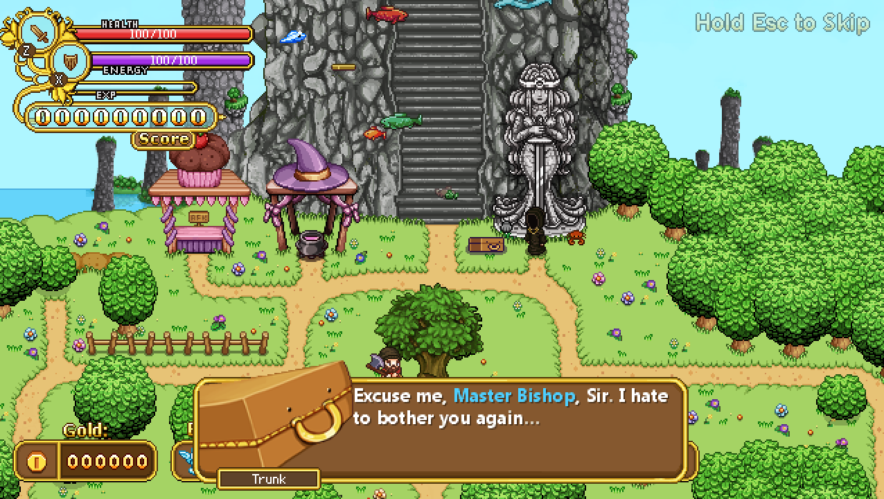
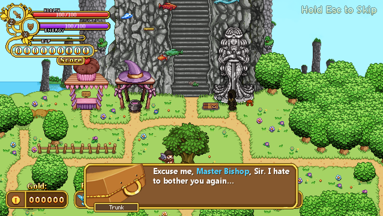
Above is a screen of Trunk talking to Bishop, during which we realized his portrait is a little too big and feels too close to the text. First mission: make it smaller!

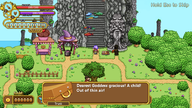
Second mission, giving him a proper expression for a special moment where he gets a little surprised to say the least:

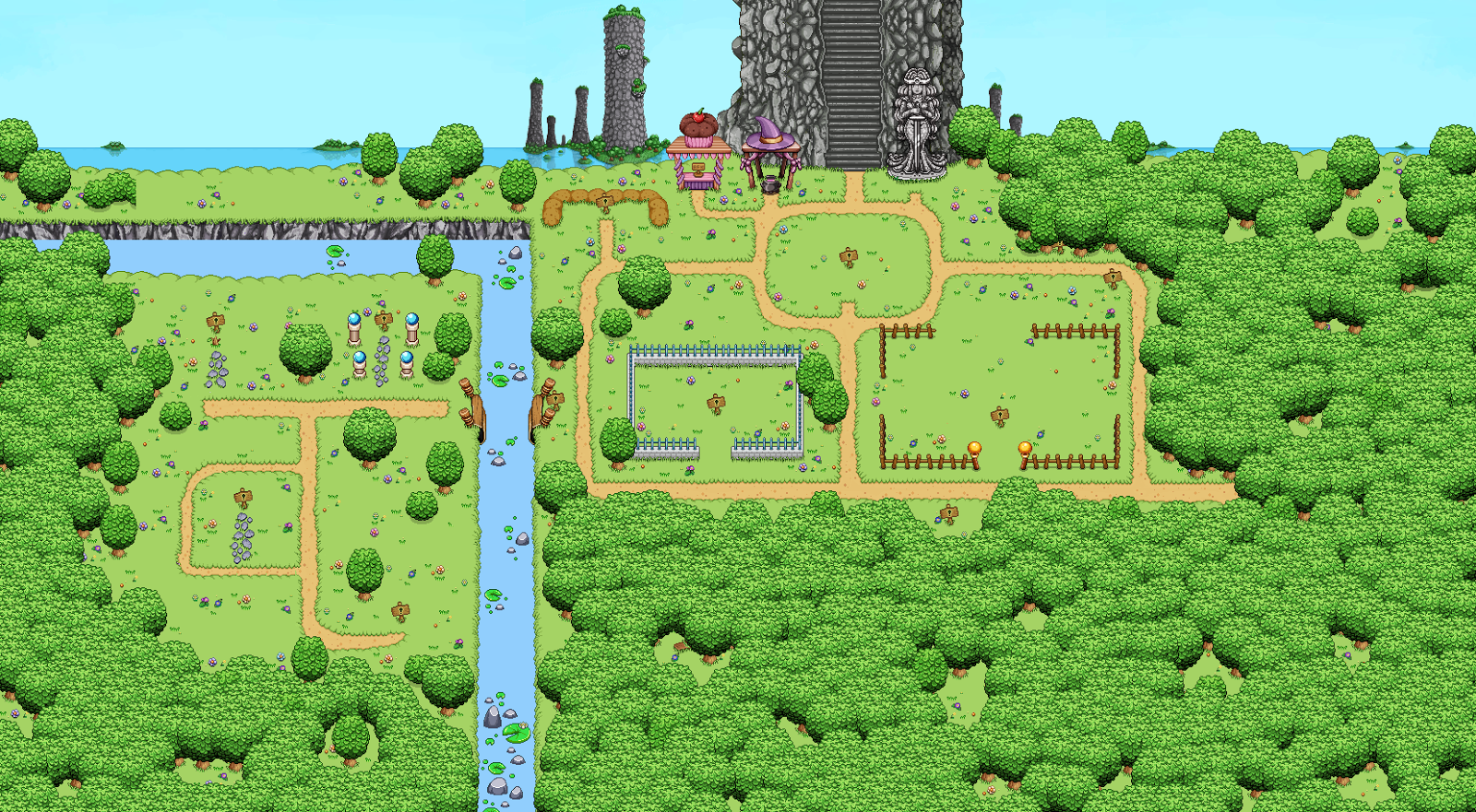
This is approximately what Arcadia will look like when you first arrive, but there’s a little something missing here:

What’s that? A ruined bridge, of course! We realized it’s kind of weird that some things have already been set up on the other side of the water without any indication of how people got over, and it looks a little more interesting to have it there:

Okay, so time to move to the desert. Here we have a pathway that’s supposed to be blocked, so you have to move around the area before unlocking a way to pass through here:

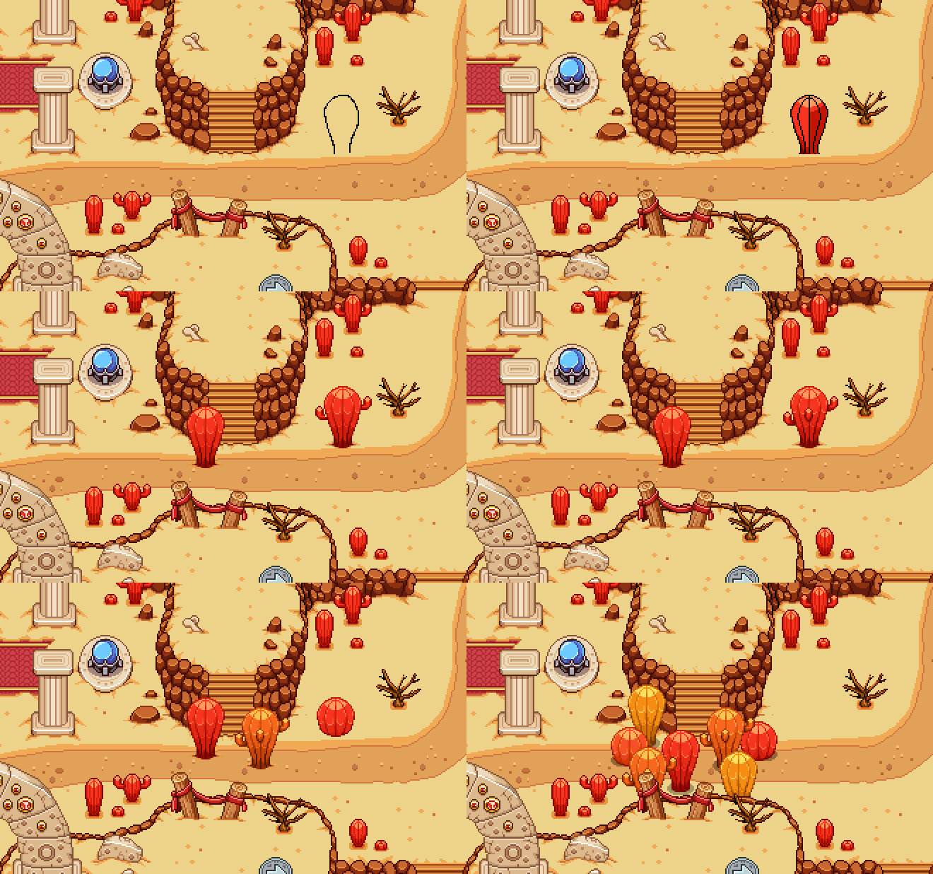
And what’s stopping you? More cacti! Bigger ones, this time. Time to make a bunch:

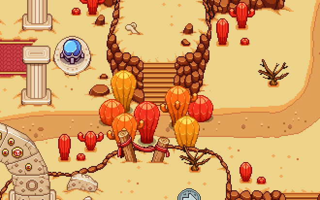
And here they are, in their rather huge glory! We’ll probably add a bunch of these here and there to keep you from being able to destroy everything (most other decorations – the smaller cacti – can be cut down by the player, while these cannot):

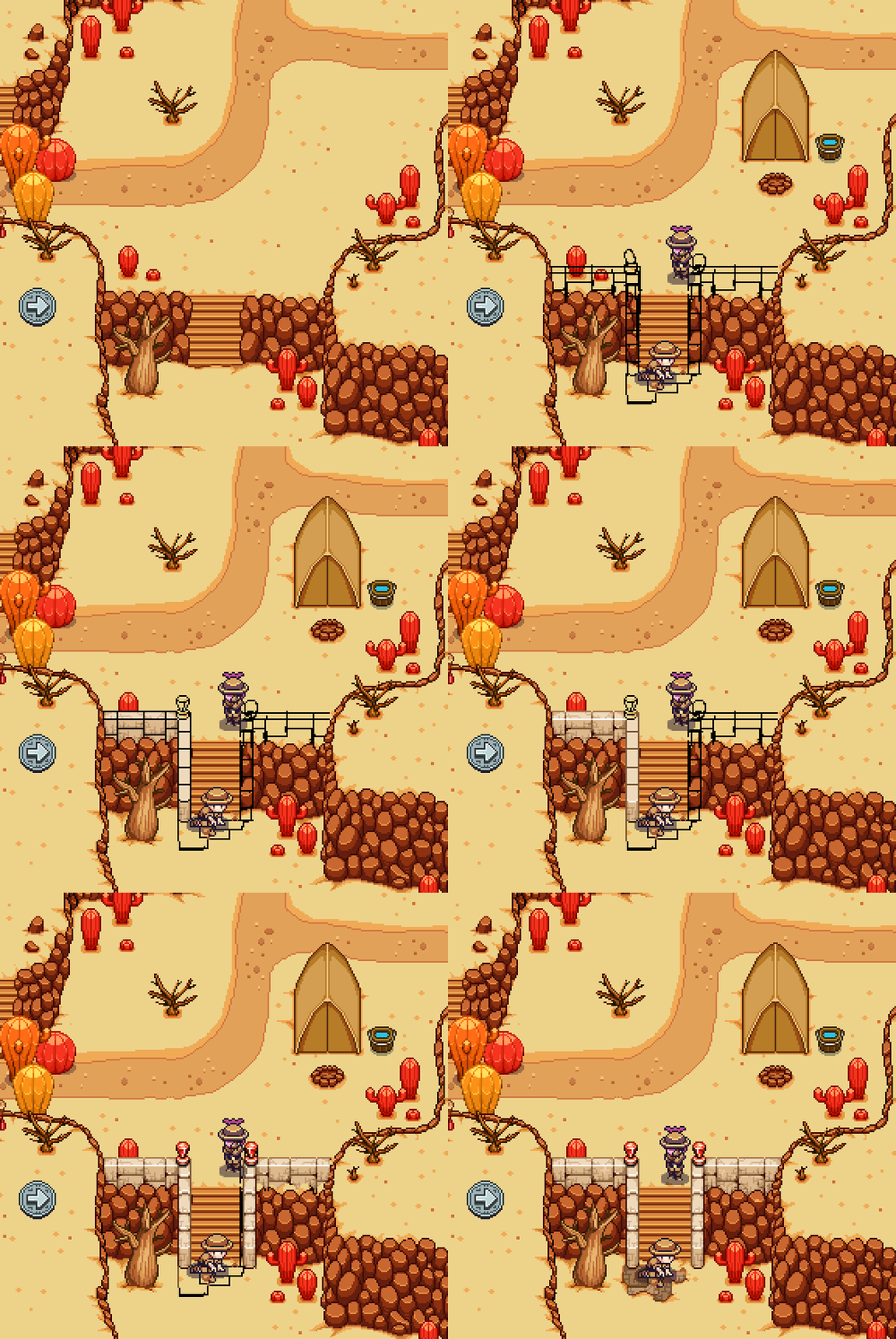
Next up, another place that will be blocked until you’re actually supposed to get here:

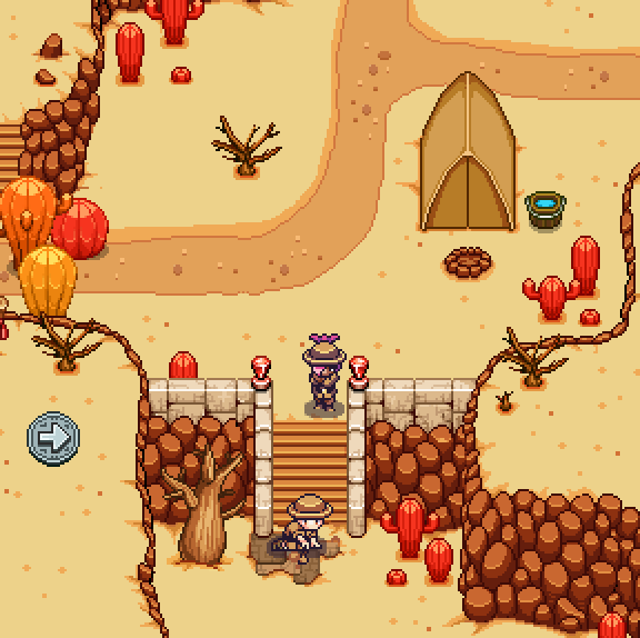
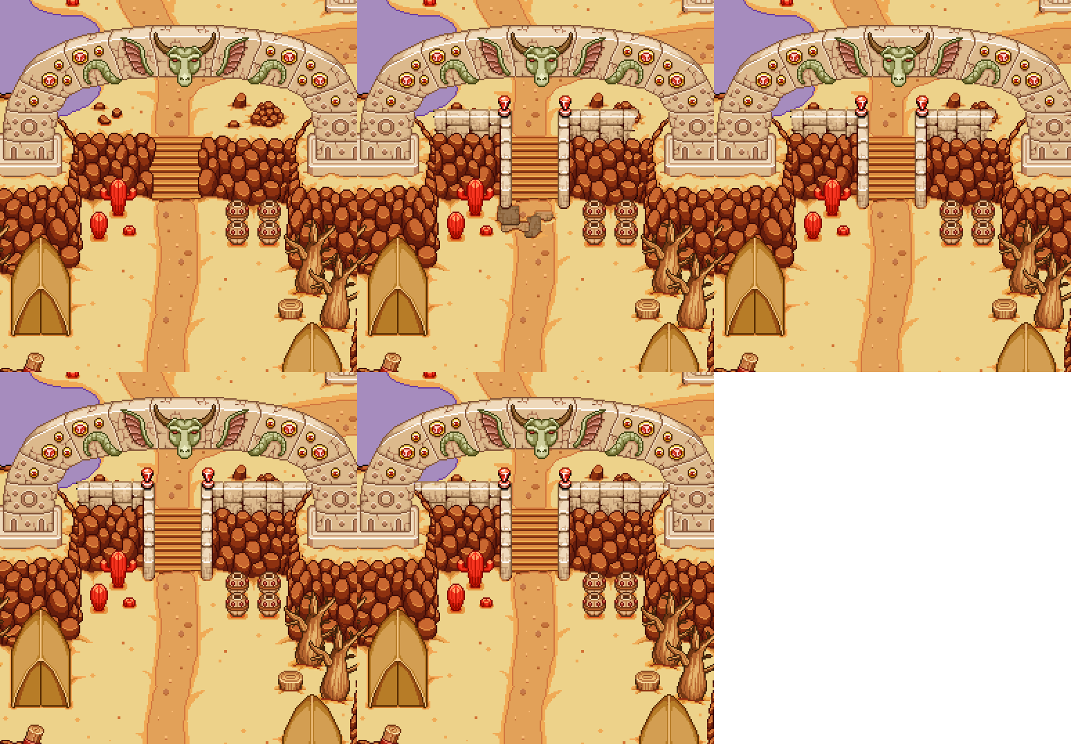
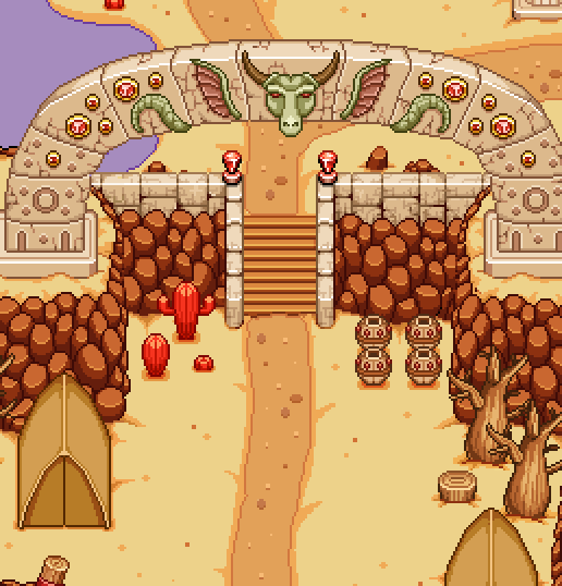
Here, we want the stairway to be blocked by a couple of archaeologists who have made interesting findings in the area. This serves both as an introduction to the fact that there will be archaeologists here, as well as a temporary way of blocking your progress until you’re ready for the desert storyline:


(Of course I couldn’t leave the stairs looking as empty as they did, or you wouldn’t really buy why the archaeologists are interested in it..)

And with the new, more epic looking staircase, this one looks rather boring in comparison:

Time to fix the problem:

Next up, another portrait! As Fred keeps making new NPCs needed for the upcoming quests, I make the portraits to match. This time it’s another archaeologist, consulting a map. Sprite below:

And here’s the WIP:

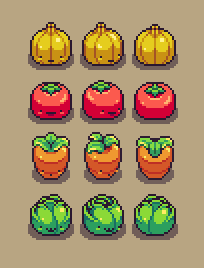
As for Fred, this week he has been working on finishing up the vegetable lineup from last week! Here they are, in all directions:

Needless to say, these fellow will of course be animated as well, bouncing around in a cute way:

And where’s there vegetables, there’s a garden, right? Here’s a gardener, pulling up some rather small and sad looking vegetables in comparison to the lively one above:

As usual there’s a lot of planning and designing going on in between our actual graphic/programming jobs, and with Arcadia there’s been a ton of it. Here’s a couple new things:

Intro Pacing: For new players, Arcadia can be a bit much to grasp in the beginning, and that will be even more true after the rework is complete. There’s a ton of empty plots ready to be purchased by you, new characters and quirks that are unlocked from the beginning or will appear as you play (such as Candy and Muffin who were scheduled to appear after you’ve reached a certain floor or when you’ve died x times respectively).

To pace things a little better, we’ve decided that the first time you spawn in Arcadia, there won’t be any signs near the empty plots describing what they’ll do. Instead, there will be a cutscene where your new partner in crime introduces himself (Trunk), and you’re off on your adventure. The ability to purchase things will only become available after your first death, at which point you’ll actually have some money for the first time: and to further invite people to aim for a plot purchase, a NPC will provide a quest with a gold reward.

A couple of deaths after that, Muffin will appear to help you out with treats, and after a while (or after you’ve reached a certain score and/or floor), he in turn will have a quest for you, which is to bring back Candy who has gotten lost somewhere. Finishing this quest will unlock Curses.

And so instead of everything hitting the player at once (or just randomly), we feel this step by step introduction will be easier to grasp for new Arcade Mode players and sets things up more nicely.

A new type of room: or perhaps, rather, another thing that can happen in event rooms! In some event rooms in the future, there might be a captures NPC tied to a pole or shut in a cage, which upon inspection will trigger a mini boss battle. Winning against this mini boss will unlock the captured NPC in your town, where they might just be another friendly face (with a reward?!) or provide new quests in the future.

More Curses:
* Each room’s edges are burning
* The floor is ice
* Defeated enemies leave aoe effects where they fell (such as blind, poison gas, acid, etc)
* Temporary blindness upon entering a new room/Blinding shrooms appear in rooms (haven’t decided on which of these variations yet)
* Enemies from the higher areas appear in lower floors
* Player takes double damage

Bishop’s Special Runs: Since some people (ourselves included) have expressed a wish to be able to replay certain extreme challenges, such as Bishop’s “no leveling, all elites” run, we’ve decided to add the option! At Bishop you’ll be able to select these special formats in a list once you completed the original quest(s) where these rules first applied. Next to each special condition you’ll see a mini hiscore list of how far you got (what floor you reached), encouraging you to aim higher next time.

For these special runs you won’t be able to use neither curses nor treats, and the highscore gain remains as if you played the game normally. It’s basically just for fun wacky ways of playing the game, and some of the special modes include:

* No leveling
* All enemies are elites
* Both the above at the same time
* 24/7 blind effect
* Clear the rooms in S-rank speed or insta-die

While some of these could be curses instead/as well, we decided to keep these crazier versions separate as the game isn’t designed to be played this way; you’re basically not really meant to be able to finish the game with one of these adjustments on, and as such we thought it’d be more interesting to give them their own highscore board where you can see how far you got, rather than an arbitrary score increase.

Exciting times!

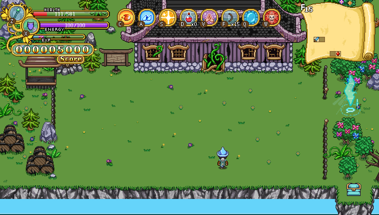
Now, time for a bunch of random stuff! Starting off with a sneak peek at one of the challenge rooms in Tai Ming, dodging the Mimic:
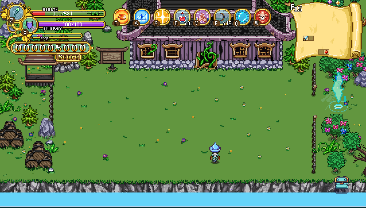
Of course, it’s probably best if he has a platform of his own….:
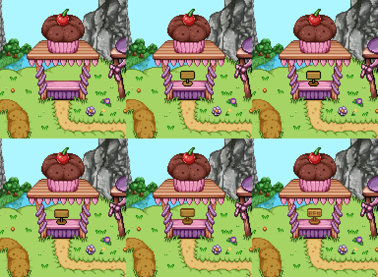
Next, in order to make it more clear what’s going on with Muffin who has his stand all built and ready but isn’t at home in the beginning of a new Arcade game, we added a small signpost (that will be animated), which will let you know where he’s gone if you inspect it:
Playing around with the background of Arcadia, we had two options, either keep it static or introduce parallax scrolling:
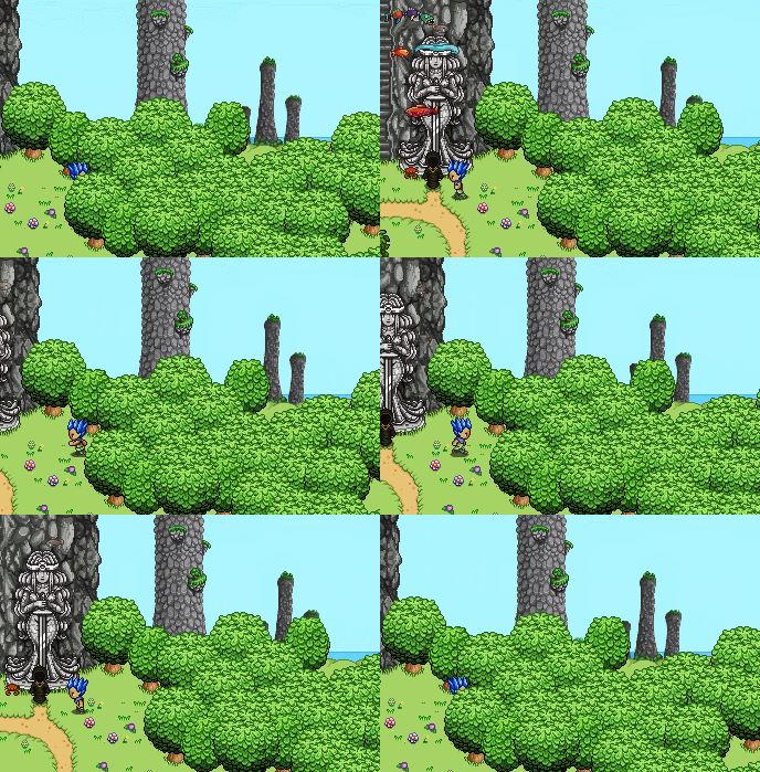
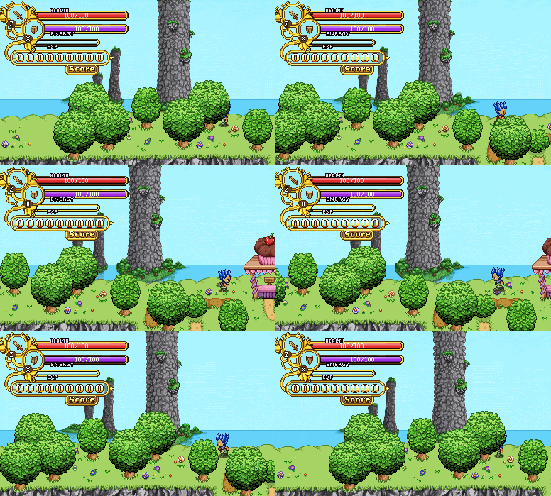
Since we all thought the second one looked better, we’re gonna make some adjustments to the background allowing us to properly use parallax scrolling for all the pillars (as well as add some more to increase the effect).

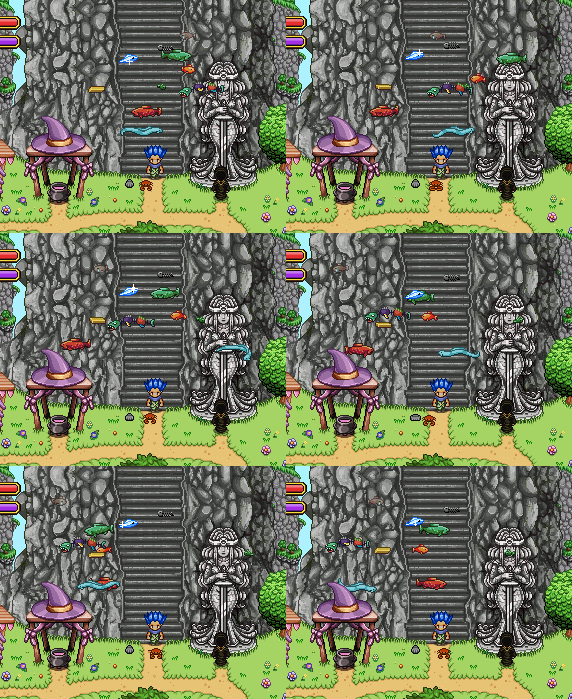
As you might notice at the edge of one of those gifs there are some strange flying fishes near the entrance… And as much as it’d be super cool to have the surrealism of flying fishes in Arcadia, we’ll probably remove these soon! They’re actually just temporary tests where Teddy is trying out their movement patterns:
As you might remember, you’re supposed to be able to change time in Arcadia, at least between day and night. Since no nighttime scenery is complete without a starlit sky, it’s time to make a secondary version of the background:

And this is how it looks as night falls in town:

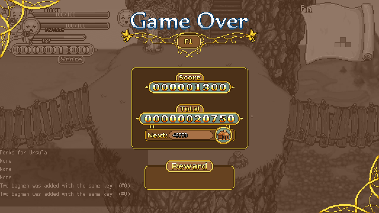
Finally, a slight adjustment to the Reward box in the game over screen (original version pictured below):
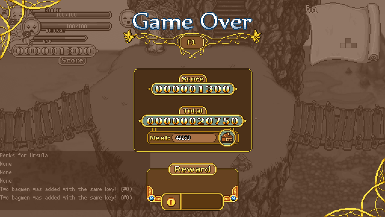
Since you’ll be awarded gold and actually get to keep the gold you’ve collected during your run, it might be a good idea to actually have a spot for the gold to appear in said reward box, which has been added in the version below:
Okay, one of the last interfaces I need to make belongs to Master Ji’s shield training dojo where he challenges you to perfect guard various enemies! Because we haven’t discussed this in detail though, we needed to have a talk and finalize some things.

The basic idea with Master Ji’s dojo is that you won’t be able to deal damage on enemies without having perfect guarded them first: after which they’ll die after just one hit. You yourself on the other hand will just need to take a single hit before losing the challenge!

The first time you talk to Master Ji he’ll give you a trial run where you have to perfect guard twice: once where you hit the enemy regularly after the guard, and once where you’ll use a skill (in order to quickly showcase how your attacks and skills become better by perfect guarding). Once you’ve done this you’ll be able to select a bunch of challenges through his interface.

Each area has their own challenge where you’ll be presented with either one or multiple of the same enemy one at a time until you’ve perfect guarded your way through all the enemies of that area. After that you have to perfect guard against each of the previous enemies at the same time. Complete this without taking damage and you’ll have cleared the challenge. Clear five challenges and you’ll get the first “belt” (a headband of a specific color), ten to get the next and so on (actual numbers might differ depending on how many challenges we have in the final version).

Aside from the basic floor challenges there will also be special challenges with interesting enemies, such as perfect guarding against each of Marino’s special attack combo attacks, or being stuck on a platform with Lantern Jacks shooting fire at you.

As for availability, the relevant challenges will be unlocked as you reach each area, so you’ll have to have gotten to the Evergrind floors in Arcade before you unlock perfect guard training against those enemies, for instance. However, you can clear the challenges in whatever order you want.

In order to make retrying challenges less annoying you’ll get the option to retry (yes/no) after you fail a challenge, where selecting no will simply bring you back to regular Arcadia and yes restarts the challenge.

And now, on to actually making the interface!

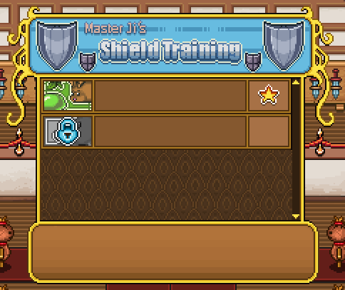
Since this place is all about training with your shield, we decided to simply call it “Master Ji’s Shield Training”, and use shields as decoration:
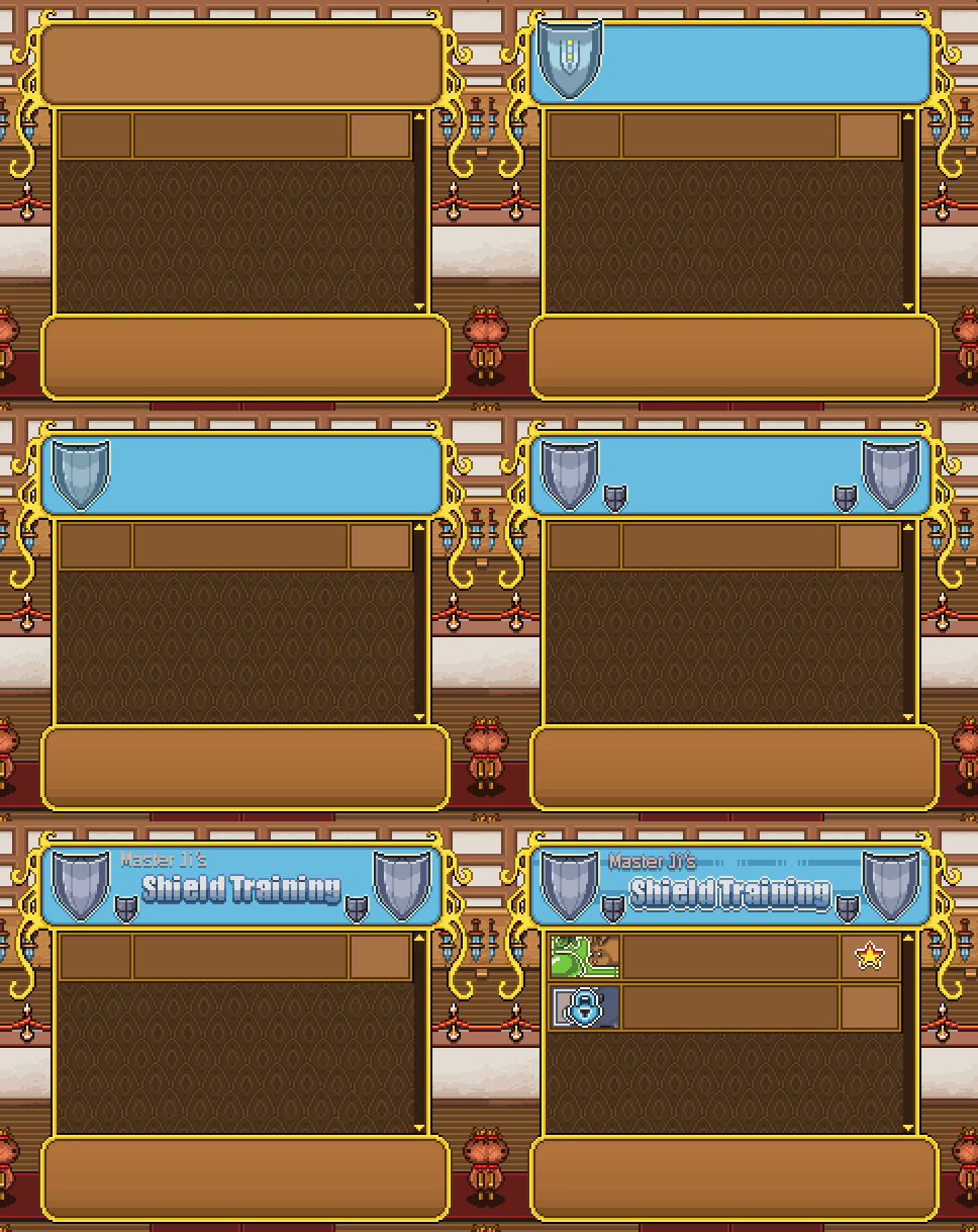
As mentioned before, if you have cleared a challenge, it will get a star on the right side, while if you haven’t unlocked it yet, its icon will remain black and white with a lock on top. In the info box you’ll get information on how to/when you’ll be able to unlock it:
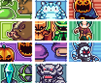
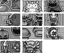
As such, not one but two sets of icons are needed for each challenge, one in color and one black and white:
In Fred’s department, this week has been focused on more desert stuff, the place where I will end up very soon as well!

First up, another, new archaeologist with animation:

Another important feature in the desert is the ability to destroy cacti! The cacti will be the main destructible item/container in the desert so naturally there needs to be a bunch of them, animated and all:

There will be a couple additional enemies as well, though these little guys will only appear in a side quest that we’re working on that will be added along with the desert. Seeing how cute they are though, we might wanna squeeze them in somewhere else in the game too, we’ll see!
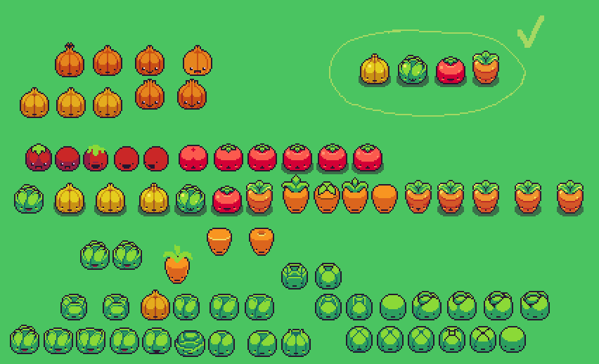
The ones in the top right are the final versions, the rest are various stages of sketches or other variations we decided not to go for. Hope you’re excited to see where you’ll end up meeting this crew!

With the new year coming, it’s time to plan new things. For us that means it’s time to start thinking about the harbor town, a place which has been planned for a long time but never sketched and never discussed in greater detail. So that’s what we’ve done now!

Basically, we’ve had a huge brainstorming session where we just talked about what we’d like to see in the harbor town, what would be cool and a little how things would look. Here’s our list:

The Harbor – Obviously a harbor town needs a harbor or it’s not much of a harbor town, right? So we’ve planned a long dock, next to which there are a bunch of ships. Some will look like regular ships, others might have special themes: a viking ship perhaps, seeing as we’re Swedes and all?

“Loading Area” – An area next to the dock with a lot of strange crates and sailor carrying stuff and loading stuff onto carts and such.

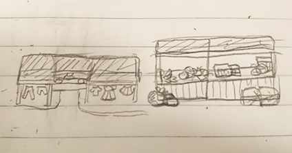
Market Place – A pretty big area with lots of market stands: some where you can buy the usual stuff and gear, some that carry exotic items or fruit for show, to give the area a bit of flavor.

The Beach – A small beach with touristy things such as sunbeds and blankets. Tourists walking around enjoying the sand, water and hot weather!
Ice Cream Parlor – Probably next to the beach? But who knows! Anyway, an ice cream parlor filled with tons of ice cream! Probably some tables outside where people can sit and enjoy their treat.

A Church – With Grindea’s statue inside and one of those creepy priests!

Houseboat(s) – One or a few, for a more interesting way of living.

Regular Houses – A few where NPCs live, one of which will be an author which you’ll help complete the final part of her best selling series! We’ll also add this author character earlier in the game, once the library is implemented. We’d like her to have a book signing there in the beginning of the game, up until the festival (or so), for added recognition once you get to the harbor town (where she’s forced to live away from all of her fans so she can finally complete the next book)!

Wells and Fountains – The town is in the desert so they better have water available for the heat!

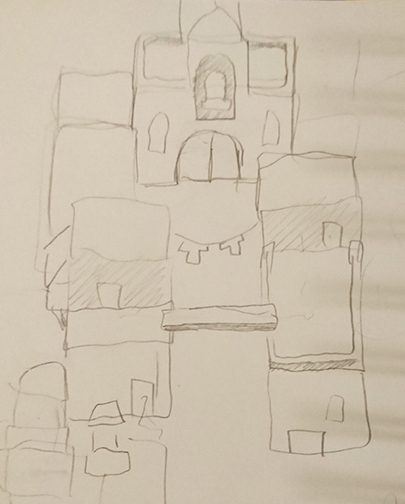
Now we (or well, I) just need to mix all of these things together and make a proper sketch of what the town could look like with all these ingredients included. First though, time for some icons and small interface fixes! All related to Arcadia, of course. First up, making a new version of Bag of Tricks, featuring Trunk instead of Bag:

And speaking of Bag, that guy’s actually the inventory icon… not very fitting for Arcade Mode where he doesn’t even exist. Time to replace him with Trunk:

Next, true icon galore as it’s time to make icons for the Treats & Curses we’ve come up with so far. In order of appearance: More Elites Curse, No Heal Curse, No Elites Treat, More Healing Treat, More Treasure Rooms Treat, and Time Crystal Treat (they will probably get better names later):

Finally, not exactly an icon, but cleaning up the background a little! Since it’ll move around as you run across the map (parallax wohoo), I needed to clean up holes of stuff I thought would be permanently hidden behind buildings (oops):

We’ve also been sketching and talking about the details surrounding two big upcoming things: the final desert map, and the interface at the Cinema in Arcadia!

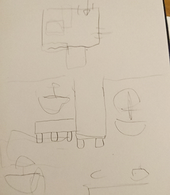
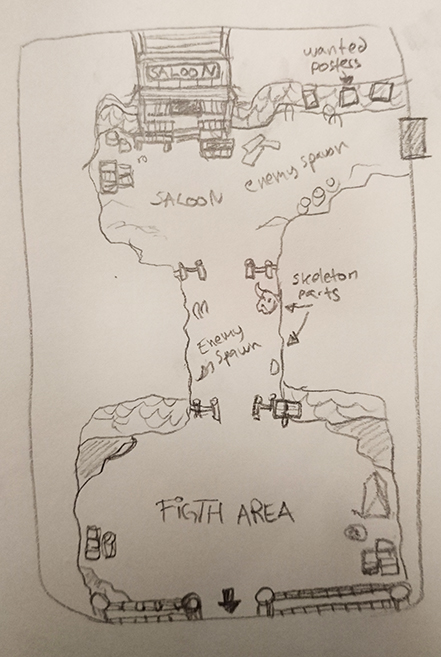
Starting with the desert map, this is the sketch we showed a little while ago:

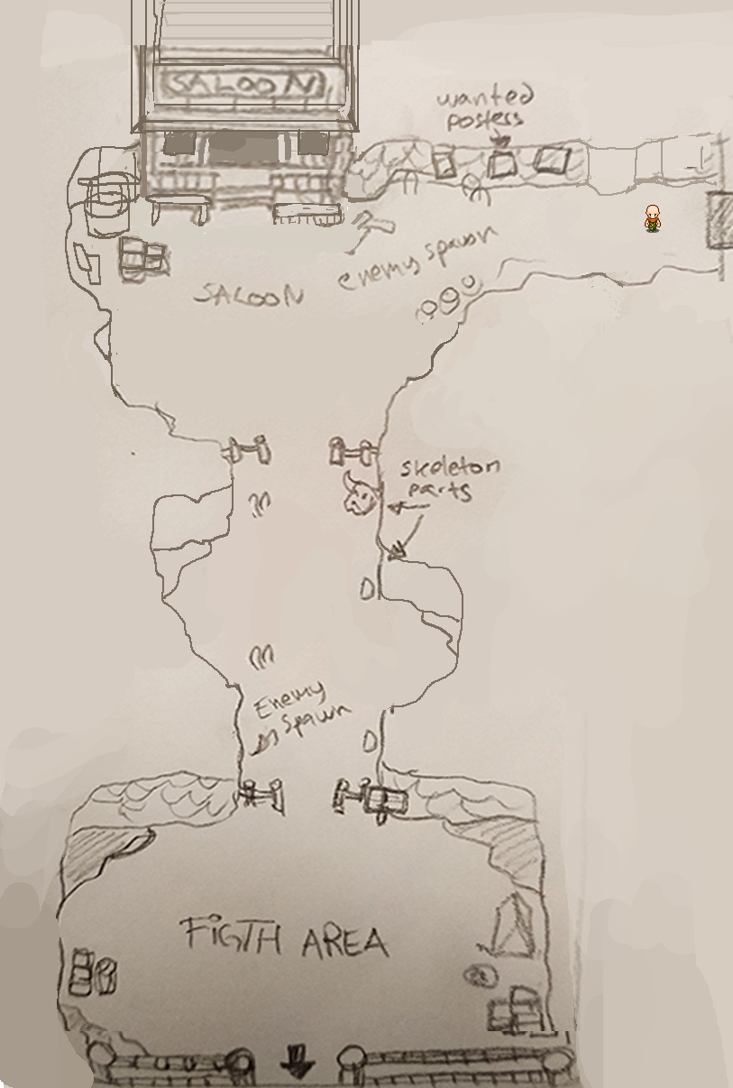
When I made this sketch I paid no heed to character sizes or what the distances between each section of the map would be in the game, as it was a sketch made on paper after all. Now that we need to translate the sketch into something we can actually use, we need to fix that.

In the above version of the sketch I’ve brought the whole thing into Photoshop and copy pasted a player character into each section, using it to determine distances and how big each thing is. The result is that certain parts of the sketch have been enlarged to better fit the character(s) that will run through the area. For instance, the part above the misspelled fight area has been a bit enlarged on both sides, and there’s a longer corridor coming towards the Saloon from the top right.

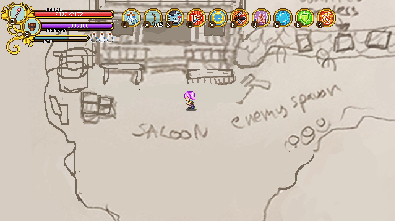
Once this was done, we brought the map into the game to run through it and try it out for ourselves (it’s a much different thing actually playing through the map compared to looking at a static character in the midst of it):

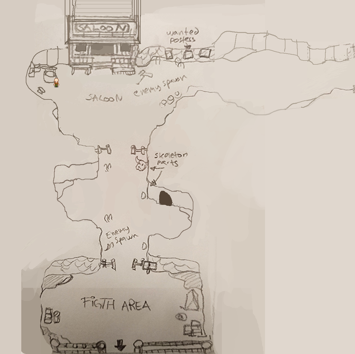
Again, we felt some areas were too small, so we made the corridor before the Saloon even larger and added a small space where you can more easily battle enemies there. The area before the (still misspelled) fight area was made larger as well, with the option to add a cave (can’t have too many caves and potential extra maps). Finally we actually made the Fight area slightly smaller to give the user interface in the top of the screen more room without it having to completely cut off the walls.

As mentioned, we also talked about the Cinema, how it would work, and how best to make an interface for it. We decided that when you open the cinema interface you’ll be presented with six options: Personal Best, Most Recent, Favorites, Friends, Public and Sharing.

In the “Personal Best” section, you’ll be presented with a list of your top best runs, automatically saved for your rewatching pleasure! Same thing with “Most Recent”, but with your most recent runs rather than the best. In “Favorites” any runs you’ve saved as a favorite will be available, both your own and those of your friends or strangers: which brings us to “Friends”, where your friends top runs will be available: each friend having one entry each. In Public, you’ll see the runs with the highest scores, and in Sharing you decide whether you want your runs to be shown only to yourself, you and your friends, or if you want them to be public to anyone (i.e if you end up on the high score).

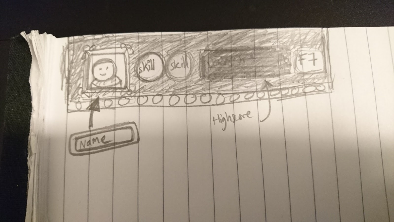
Here’s a very early sketch showing what the selection of a replay could look like, featuring your character’s face (+ parts of the poncho and hat), the top two skills you used, what score you got and which floor you reached:

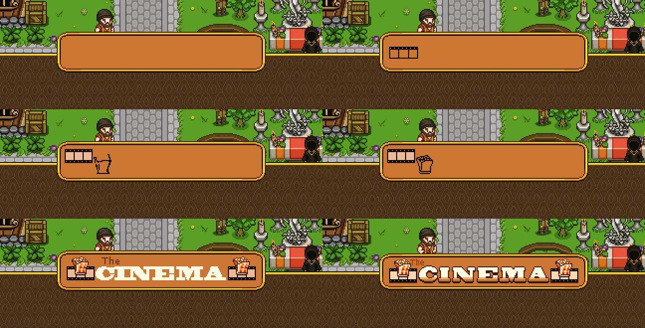
Continuing on with the cinema interface, though, the first thing we need to design is the header:

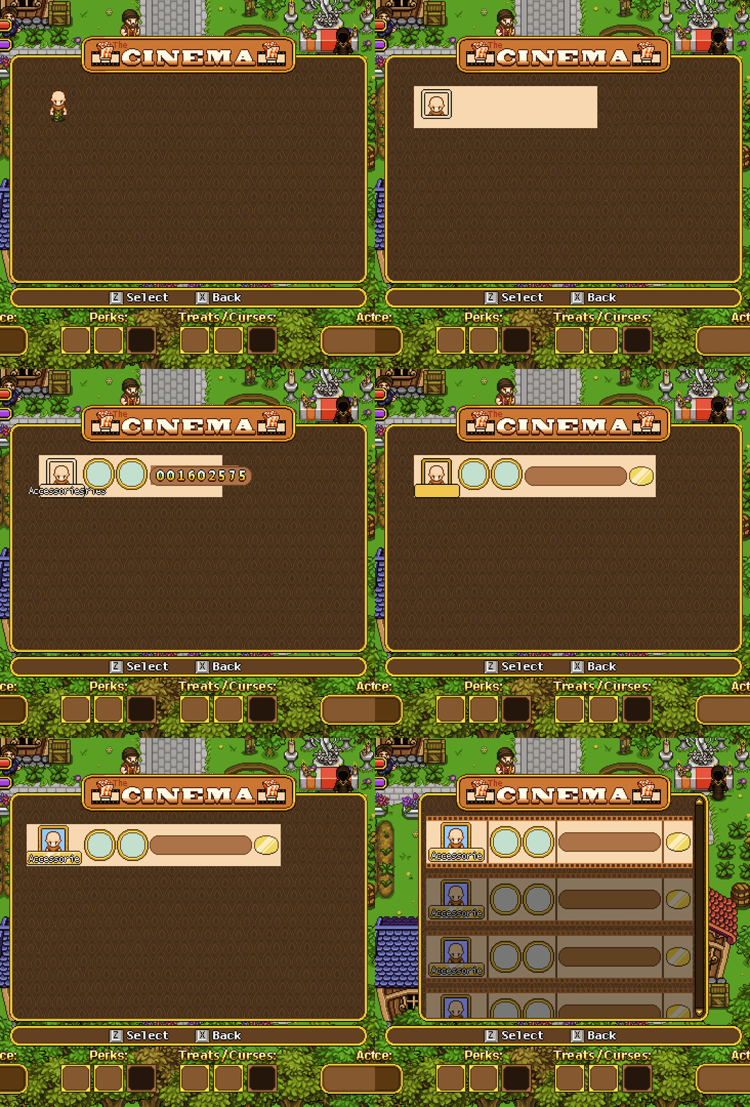
I went with a bag of popcorn and film strip to decorate the sides as this felt like two iconic references to the movies! Keeping with that spirit, I designed the movie info boxes to resemble film strips as well (as seen on the sketch earlier):

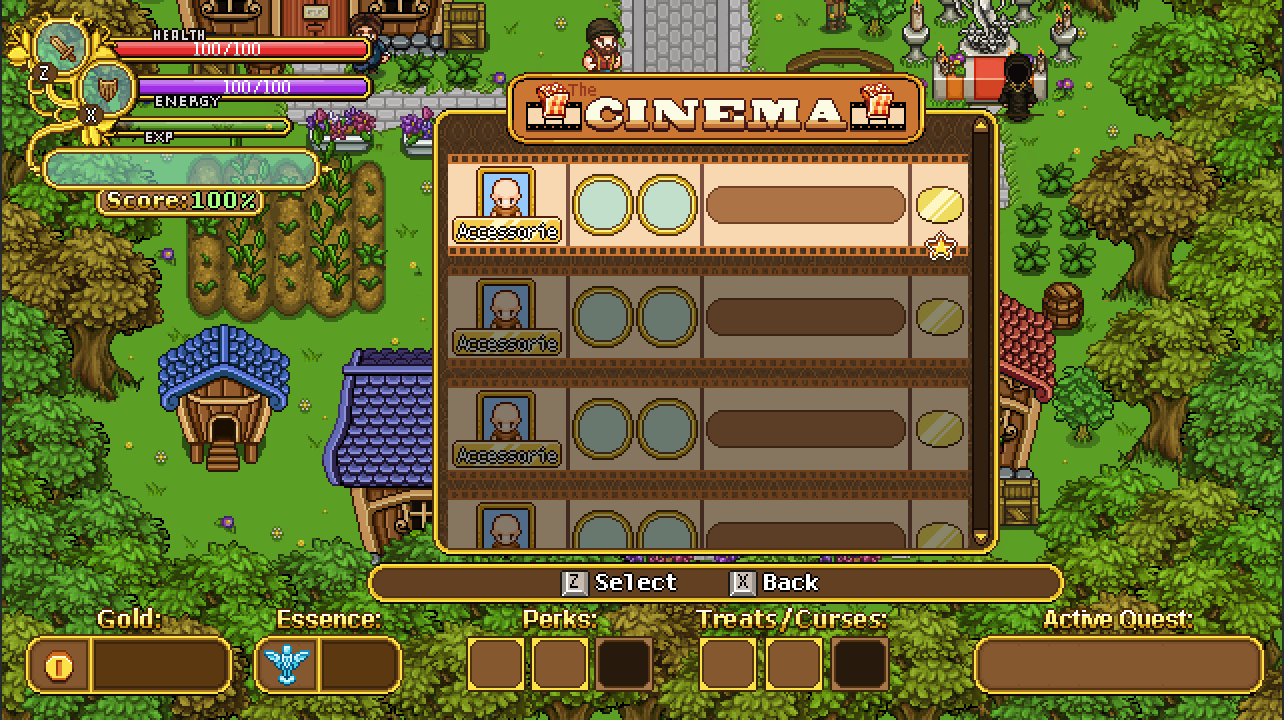
Also as mentioned earlier the info shown will be part of your character, it’s name (or the first 10 letters of it), the two highest leveled skills, the score (in the brown box), and the floor reached (golden shape at the end). In the final version below, I added a star to indicate someone having added that particular strip to favorites:

Speaking of which, this interface needs quite a few new buttons as well, in order to select everything! Without further ado:

From top to bottom: Play Clip, Most Recent, Favorite(s), Friends, Public, and Settings. The last one will lead to this rather simple popup menu, where you can select who can view your replays by moving left or right (the options being only you, only friends, or public):

Finally, let’s take a look at another portrait. This guy is designed after one of the archaeologists Fred made a while ago:

Like most NPCs made recently, you will run into this guy in the desert, where he’ll be busy excavating some new findings (and in doing so, unfortunately blocking your way for a while)!

Next week we’ll discuss and continue designing the final interfaces for the Arcadia Rework: the one for Master Ji’s shield challenges, and the UI that shows information about each building you can build. After that there’s mostly some smaller detail stuff for me to do before I believe I’m done with all Arcadia Rework things! Exciting times.

We’re back! Hope you guys have had a great holiday, a merry christmas and a happy new year! Now it’s 2018, and as we continue working on and implementing Arcadia rework, it’s only natural that our weekly meeting has a lot to do with establishing the smaller details of how everything will work!

Early Gold Quests
In order to quickly get your first building(s) up and running, we’ll add a couple early quests with gold rewards to speed things up and get your into the whole building thing as soon as possible! Some will probably be reused from old Arcadia, while a couple will be brand new.

Balancing Gold Rewards for Slow Builds
How much gold you get per run/room will be balanced is a tough one, because we don’t solely want it to depend on how quickly you clear rooms (even if they will play into it too, of course). Using only speed as an indicator would mean that certain builds, such as anything involving Insect Swarm for instance, would get a lot less gold vs the builds with faster clear times. To counter this, we’ll award extra gold depending on how long your active time on a run is, meaning if you play for a long while with a slower build, you’ll still get the proper gold reward that quicker builds get.

Build Time for Unlocked Buildings

Remember how I mentioned a build time that would count either IRL time or Arcade run time (or a mix of the two where time passes faster if you play Arcade Mode)? After some discussions, our current stance is that we’ll probably skip build times altogether.

This was a kind of difficult decision because we wanted to give players another incentive to play more Arcade Mode (play the game to unlock your building/unlock it faster)! However, you’ve already played Arcade Mode to gain the gold used to unlock the building, so it felt a little unfair that now you have to play the game more before it actually spawns, even though you already paid for it. Instead, we’ll probably use a fade to black effect with some building sounds before you return in front of your fully built property.

We’re still not 100% sure about this, and each of us actually have our own preferred version with the fade to black being the compromise. What would you guys prefer? Would build time be a nice or annoying thing?

A couple of Treats & Curses
We’ve only just begun planning for these, but here are the ones we’ve come up with so far:

Curse – Increased Elite spawn rate
Curse – No/Reduced healing (or both as two separate curses)

Treat – No Elites spawn at all
Treat – More HP from HP orbs
Treat – You start your run with a Time Crystal that rewinds time to when you first entered the floor if you should die. Meaning you get a chance to play through the floor again and fix your mistakes!
Treat – Increased chance of getting treasure rooms

Keep sharing your best ideas and we’ll see where we end up with all of these!

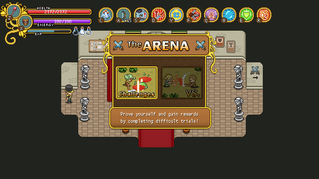
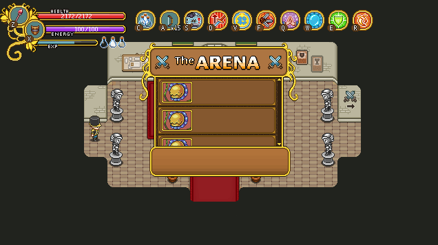
And now, time for more interface design, this time featuring the Arena! As a reminder, here’s what it looks like in Story Mode:

There are two categories, Challenges and VS. Challenges won’t be available in Arcade Mode, but there will be something else:

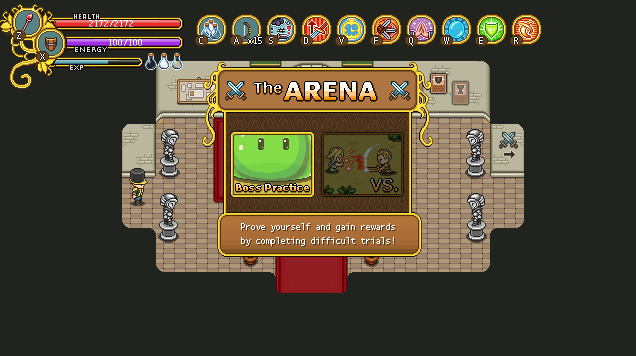
Boss practice! For those of you who have troubles with bosses, we know it’s really difficult and annoying to get chances of practicing against them as you have to survive a whole lot of regular enemies first. To give players a chance to polish their skill against these more difficult bad guys (as well as a way of learning their patterns), the Arcadia Arena will let you pick and choose among the bosses you’ve reached so far (no skipping ahead). When designing this interface, I presented two options: one featuring three bosses per page (with a scrollbar), and their name next to them:

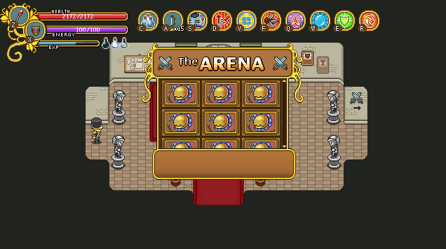
..and another, featuring just the boss images, with their title and description shown only in the text box instead:

It’s likely we’ll go for this second version as it has room for a lot more enemies and the text box won’t be used much anyway!

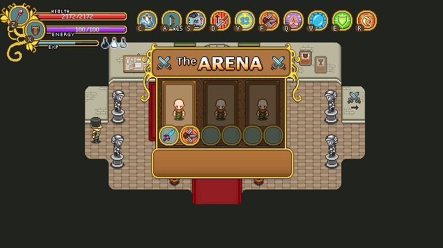
Once you’ve selected the boss you want to practice against, you’ll be presented with three character slots, featuring the last three characters who reached that specific boss, with their equipped weapon and main skill of choice shown beneath them:

This is so that you’ll have approximately the right level and equipment for the boss fight (as your current Arcadia character is level 0 with no gear what so ever)! It gives an accurate representation of the fight, as it reflects how you got there last time, and allows you to try out the fight with possibly different builds (if you change playstyle between runs).

Once you’ve selected which of your old characters you want to rebattle the boss as, you’ll be transported directly to the boss room for another go at the battle! Currently, none of these will cost gold or any other value, so you can practice as much as you like :)

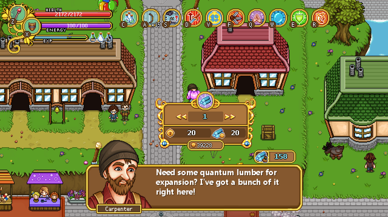
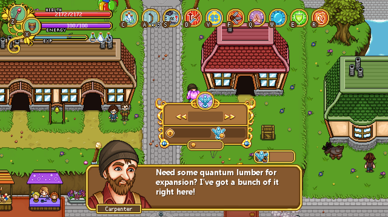
The next interface up on the design table belongs to the Bank and involves trading essence for gold, and gold for essence! For this interface we’ll use the Quantum Lumber interface from Housing as a base:

The main difference between the Lumber interface and the Bank’s interface is that instead of Lumber we’ll deal with Essence (obviously), and that you’ll be able to either buy Essence by handing in gold, or sell Essence and get gold back for it.

From the beginning we thought we’d deal with both in the same interface (calling it exchange instead), where you’d scroll right to get more Essence and less gold, and scroll left to get more Gold but less Essence (with a symbol for the respective currency on either side). However, we felt it’s probably easier to understand if we just call it Buy/Sell Essence and keep them separated.

Here’s our first try at a modified version of the Lumber interface:

Here, the Lumbers have each been replaced by an Essence statue. The top box will contain a number indicating how many Essence you want to buy (or sell), the number next to the big coin will let you know how much that will cost you (or how much you’ll get back for selling your precious Essence), and the number next to the Essence-with-a-coin indicates the current exchange rate (which don’t change the way things are designed now, but we thought it might be interesting to know).

The small gold coin is next to your current gold total, and the Essence-with-a-bag shows how many Essence you currently own. Pretty much like it is in the Lumber interface, in other words!

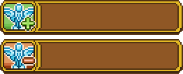
To make it more clear whether you’re in buy or sell mode, we made two variations of the above interface, one with a plus next to the top Essence icon (indicating this is the buy interface), and one with a minus (indicating this is the sell interface). There’s also a corresponding plus and minus next to the coin, to show whether you’ll gain or lose gold on the affair:

Finally, the shop menu (where you select Buy/Sell or Talk) needed two new buttons for this, so here they are as well:

Remember Trunk, the sidekick who will fill the role of (a more cheerful and optimistic) Bag in Arcade Mode? In order to communicate with you properly, he of course needs to have his own portrait:

The final version, slightly cut off to fit the text box:

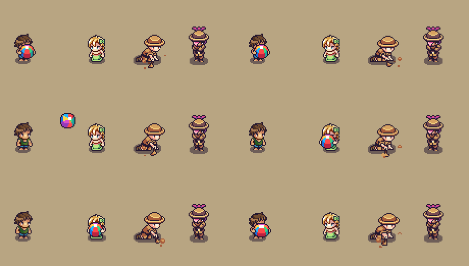
Finally, there’s a bunch of NPCs made by Fred! Some of these have portraits that have been showed before, but the two on the right are brand new archaeologists that will be inspecting the old ruins and skeletons found in the desert!