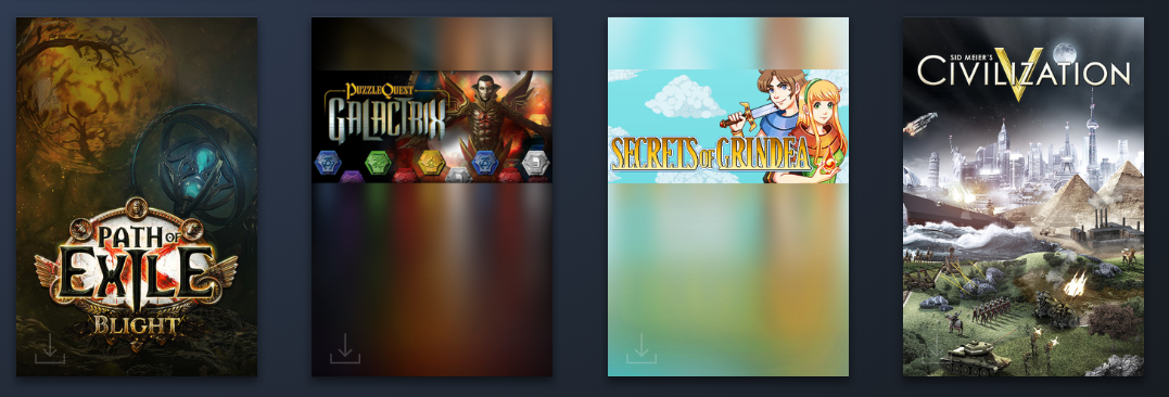
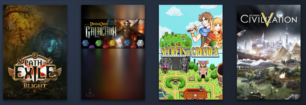
For those of you who have opted into Steam’s client beta, you’ll have noticed that there’s a new library style in the works, which calls for new and improved graphics to showcase each game. For starters, here’s what the header of each game looks like now, and more specifically what the default was and how we changed it around adding our own graphics:
Unfortunately for us, being a pixel game and all, the automatic resizing won’t do us many favours, but it could be worse!
You library has a more clean view featuring cover art as well, like so:
How do you guys find this new library update? Do you like it or not? I think the best bit is how more visually satisfying it is to browse your library, seeing all of the juicy cover art all lined up! And of course, it’ll only get better as more and more games add these new graphics :)
Next it’s time for a bunch of smaller graphic assets needed here and there throughout the game! Starting off with a super cute very scary chest:
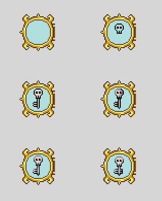
And a skeleton key, because which ghost ship would be complete without them:
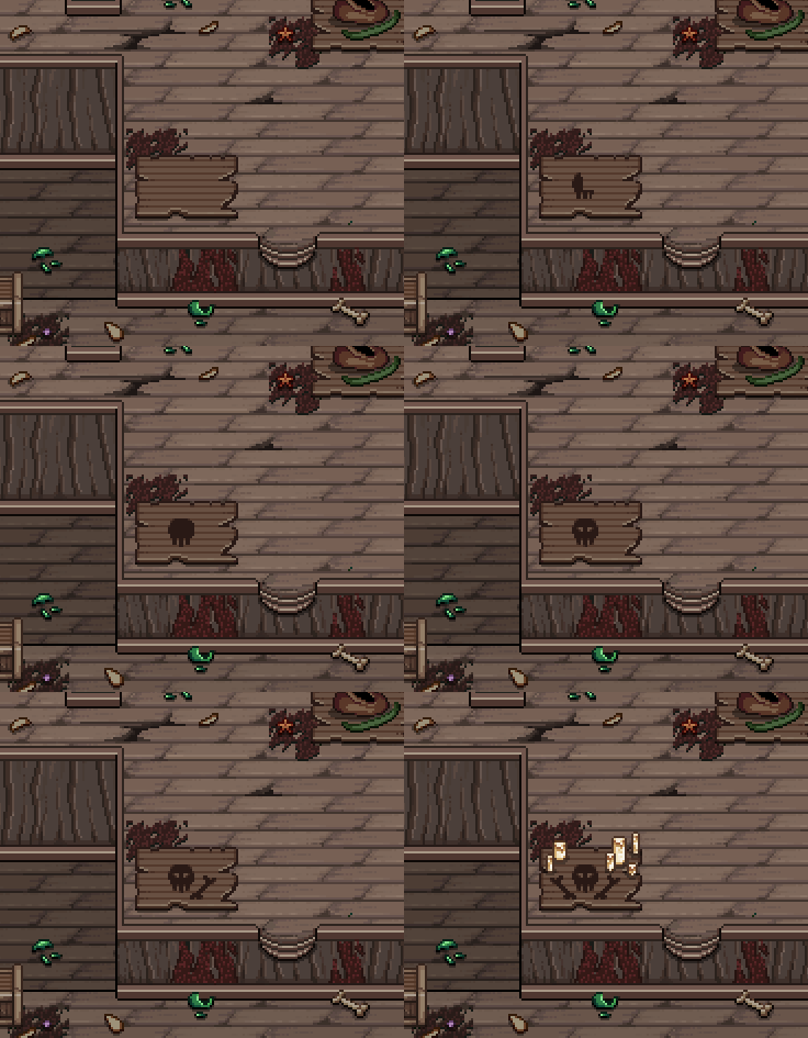
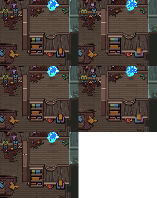
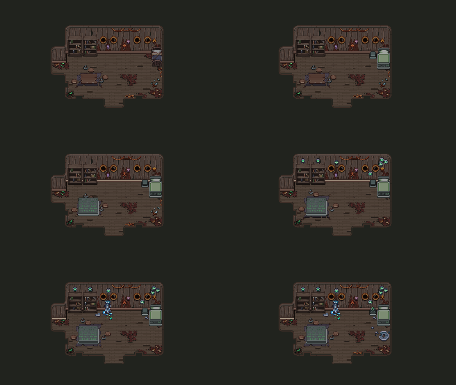
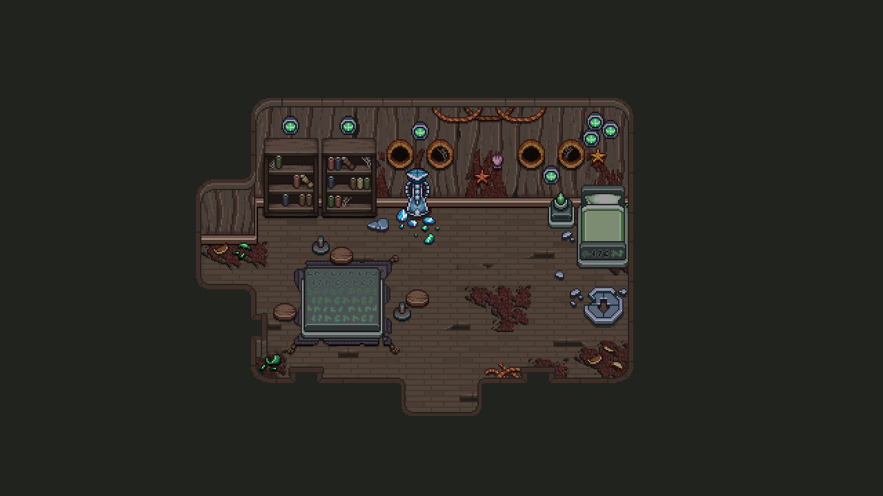
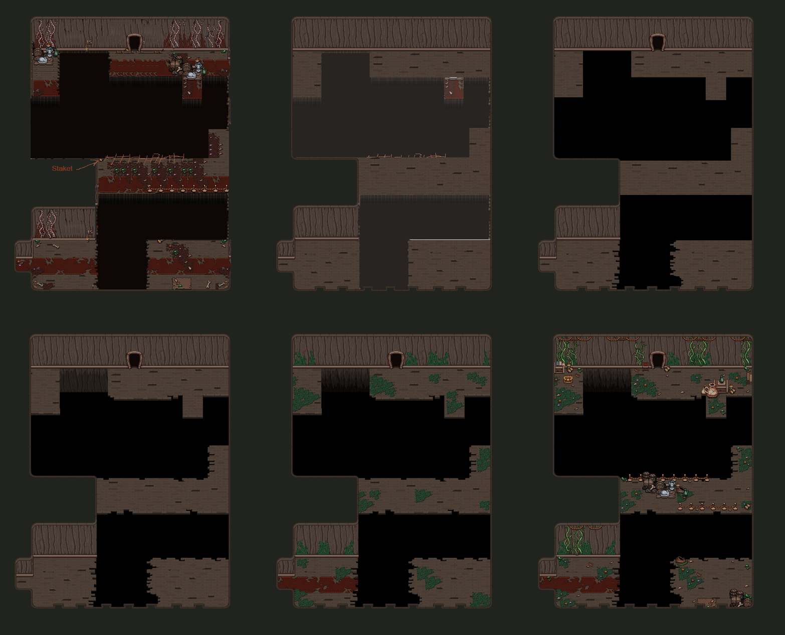
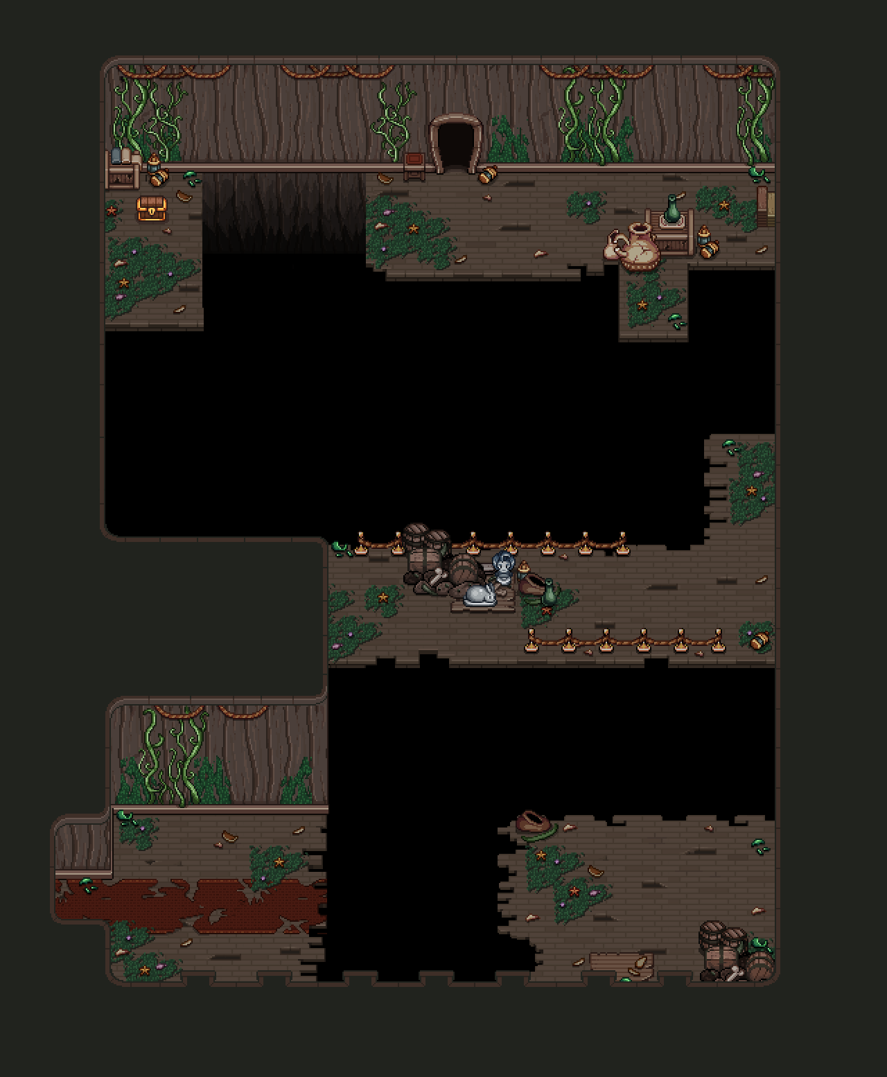
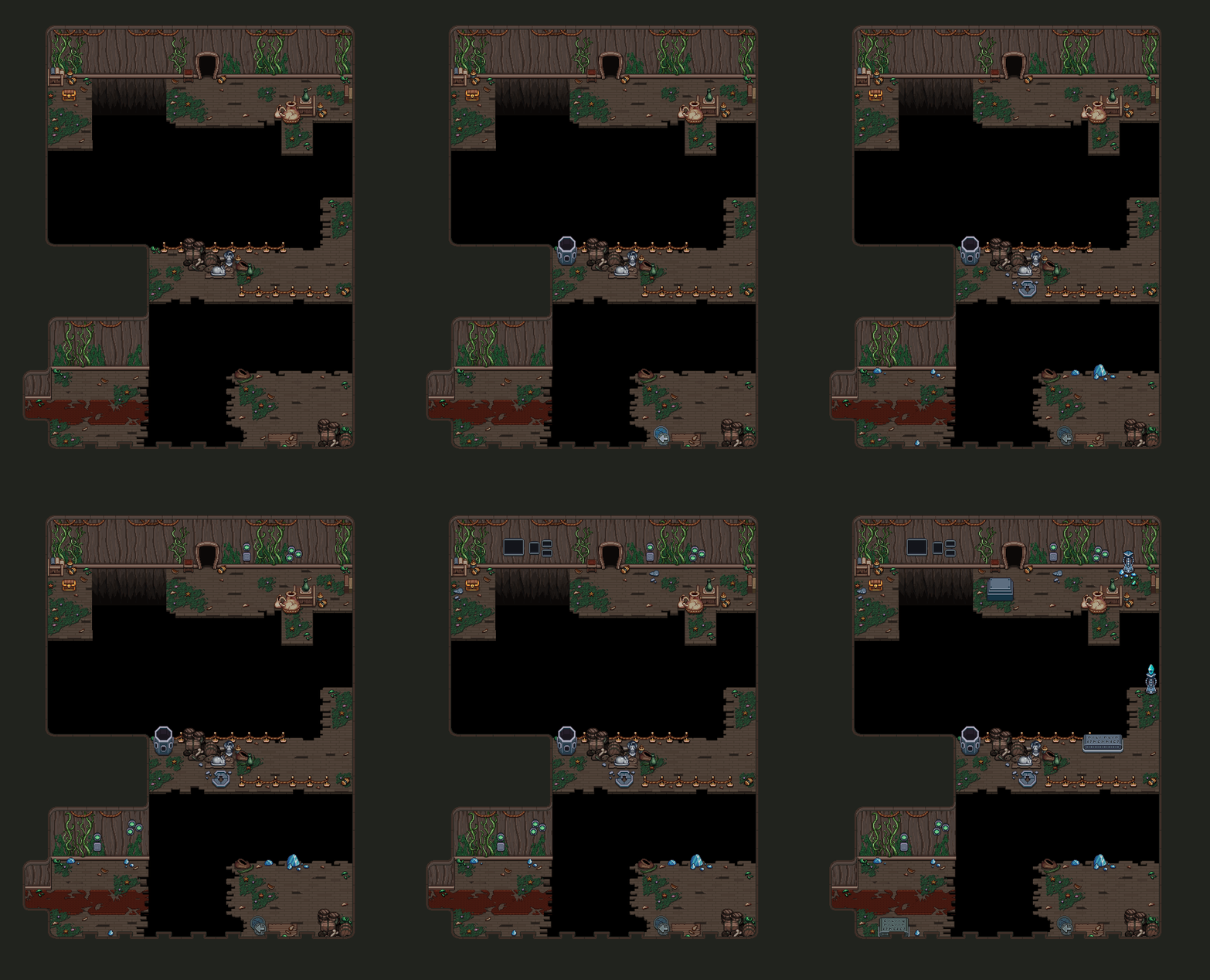
For this room, we added some spooky decorations on a wooden board to give the players a hint there might be something there if you swap over to the ghost world:
We also weren’t quite happy with how fresh and clean these shelves looked, so we wore them down a bit:
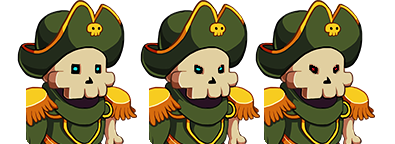
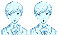
Finally, a couple expressions for the captain, to give the cutscenes a bit more oomph:
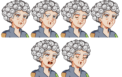
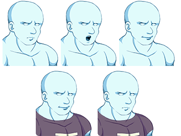
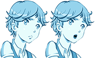
Speaking of expressions, here are some more, featuring the rest of the main story cast in the Ghost Ship:
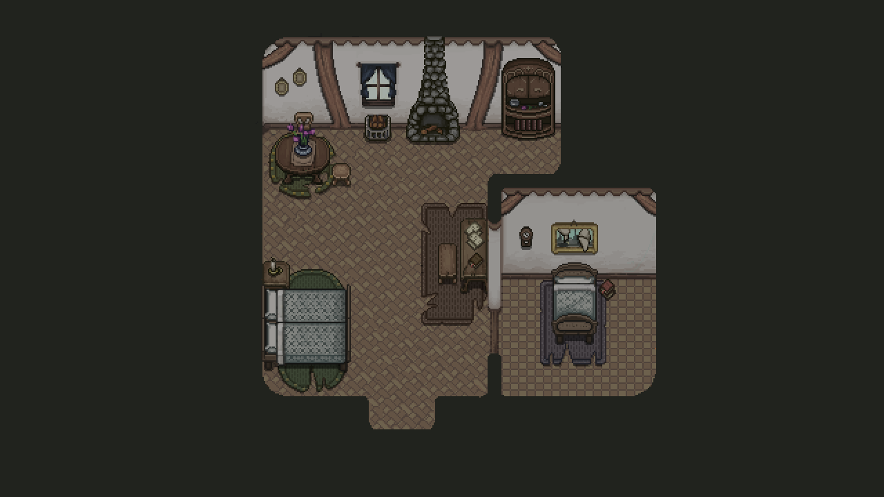
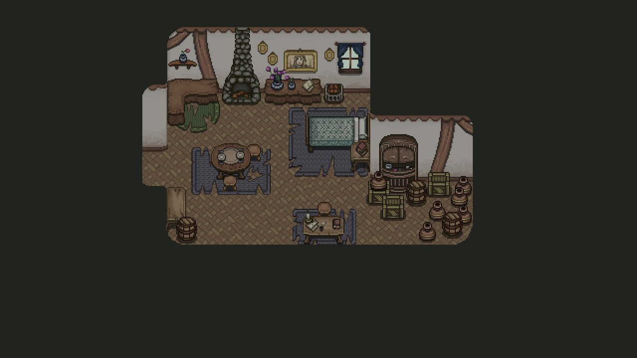
And since we decided to put Pine in one of the cabins, we thought we’d put in a bunch of Flying Fortress decorations in there as well:
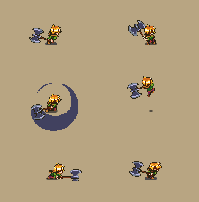
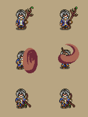
Finally, let’s take a look at some animations for the final boss of the dungeon… Our dear friend Luke!
First up a bunch of sketches for what he could look like in this boss version:
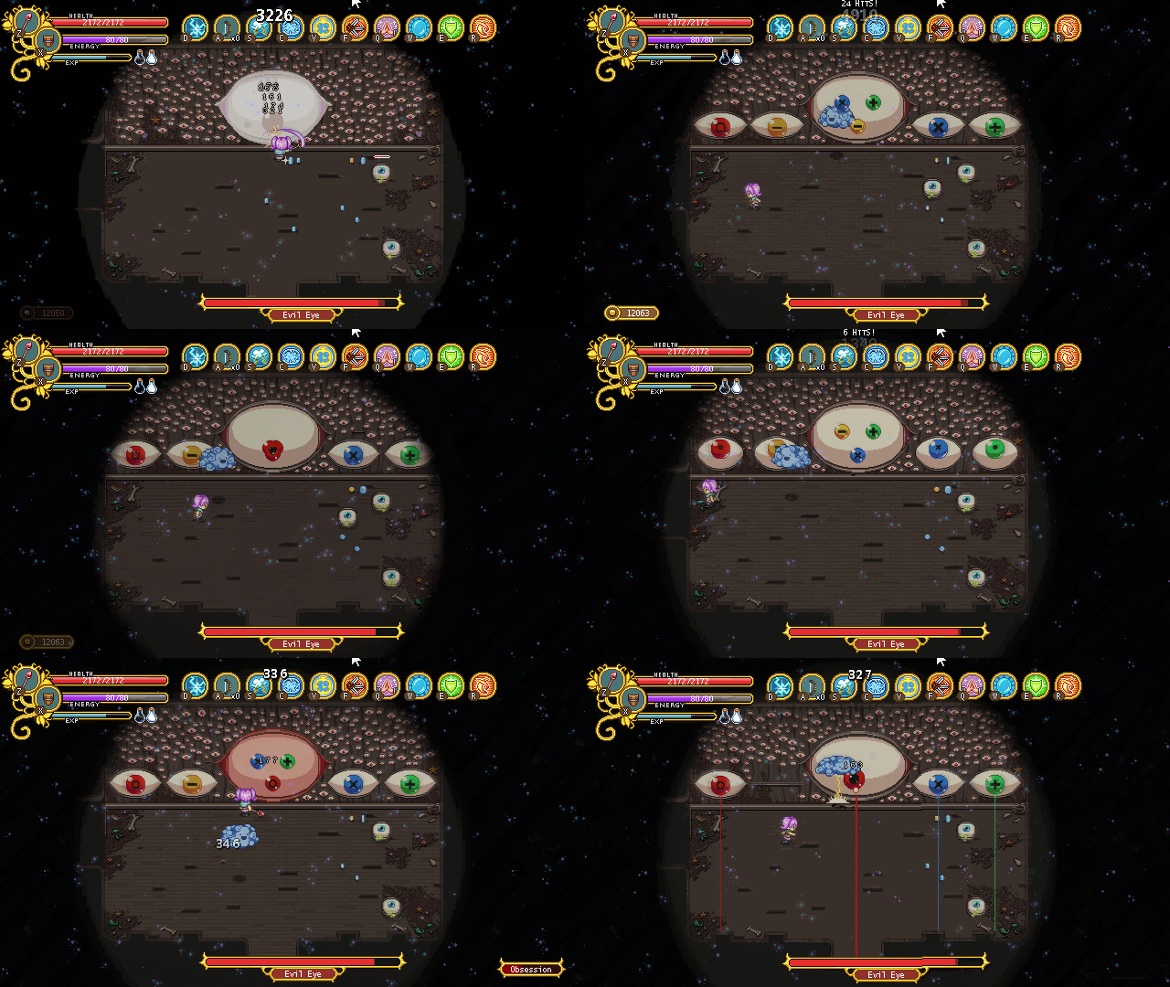
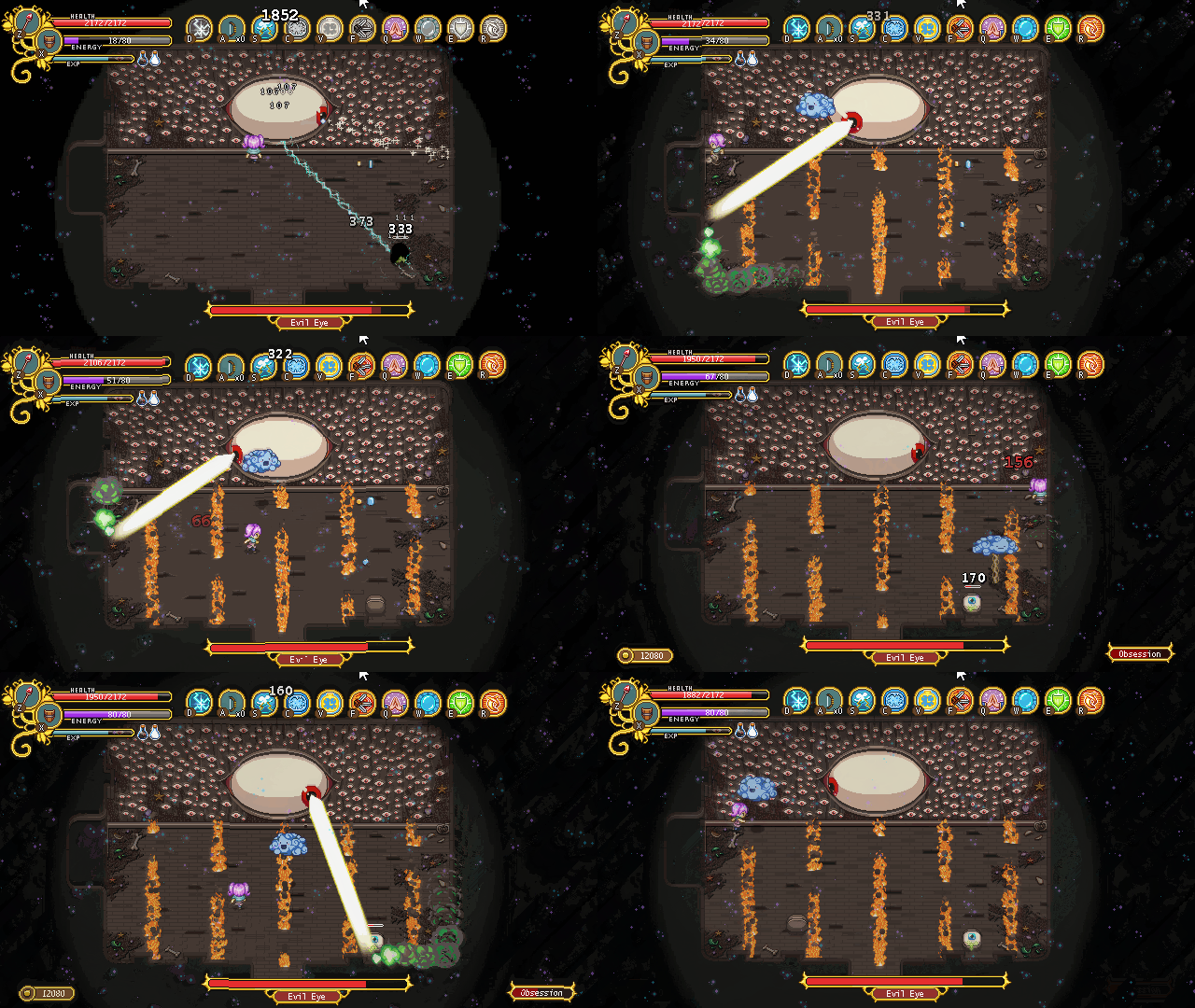
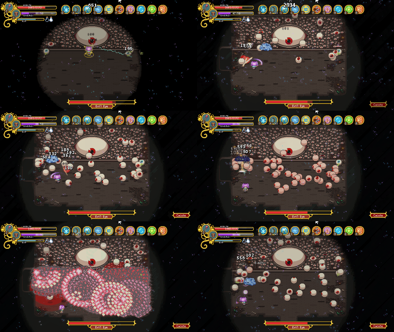
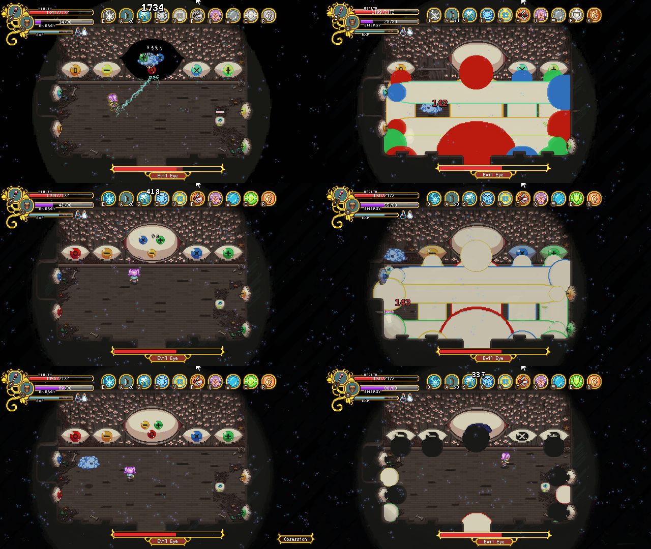
And the first batch of animations made for him combo’d together:


