Next up, some more Evergrind Improvement plans! Another batch of these things, mainly wanting to upgrade the overall graphics for each of these areas but also add some stuff and spice things up:

Meanwhile, these two buildings will be fully replaced by their Arcadia versions, which were made much later on and feature much better art:

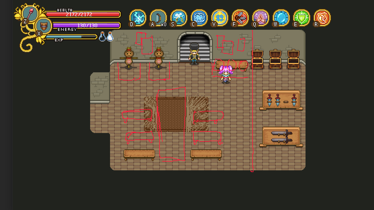
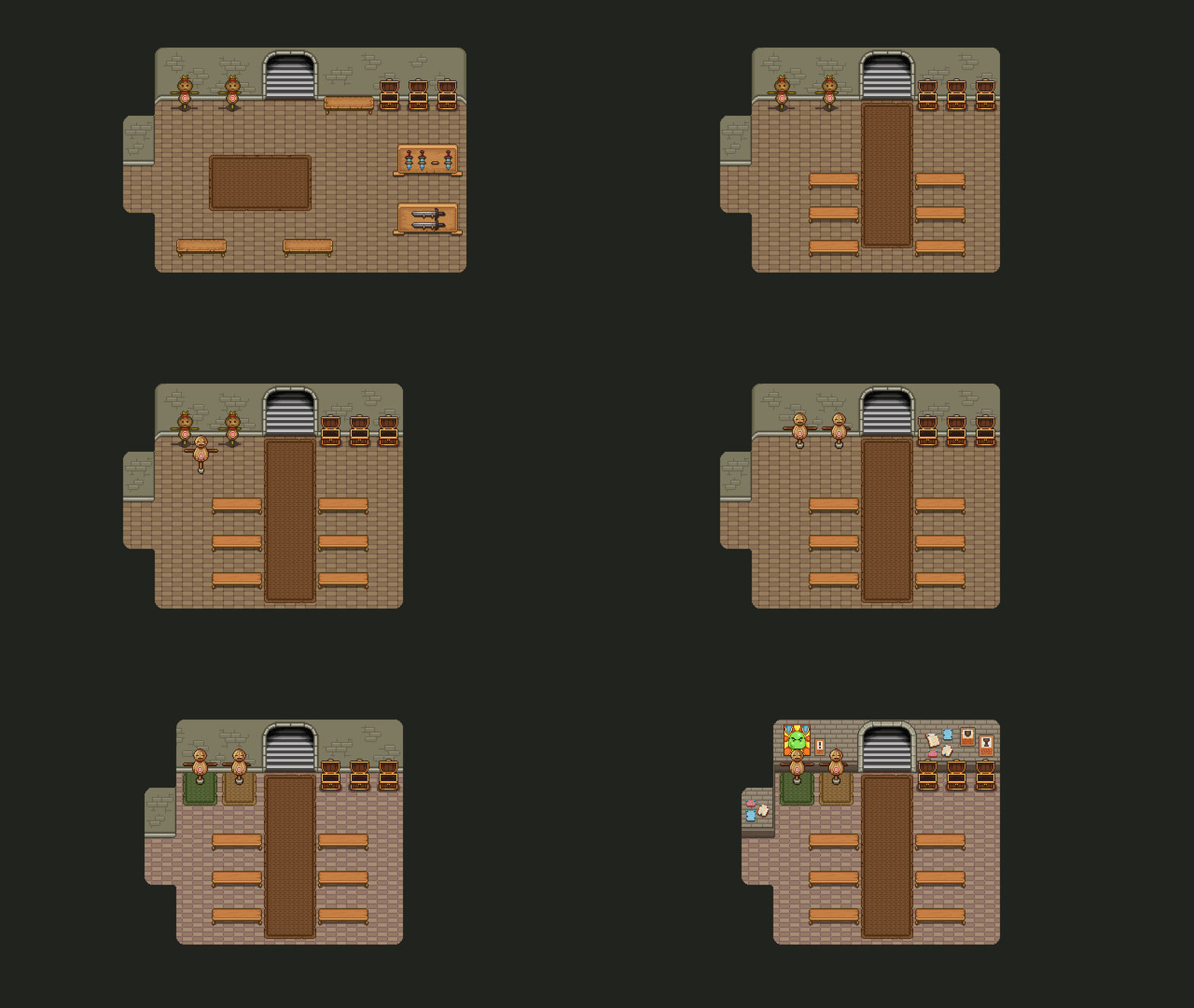
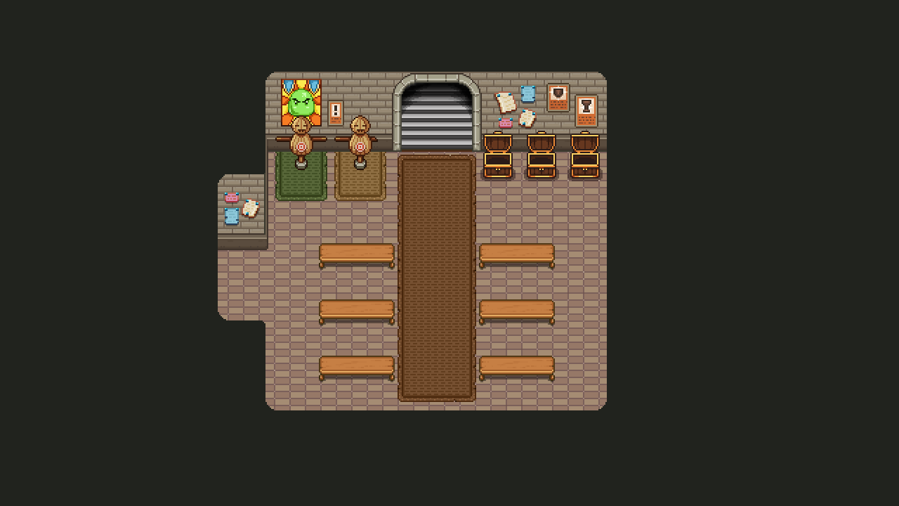
So, first up in this new batch of improvements we have the waiting room in the arena! To start with, this room felt a bit too big and empty, so we’re making it smaller and more compact, adding more benches for people to sit at and some things added to the walls for their reading pleasure as they eagerly await the next match. Other than that, the graphics have been touched up overall, so the room feels as fresh as the newer parts of the game:

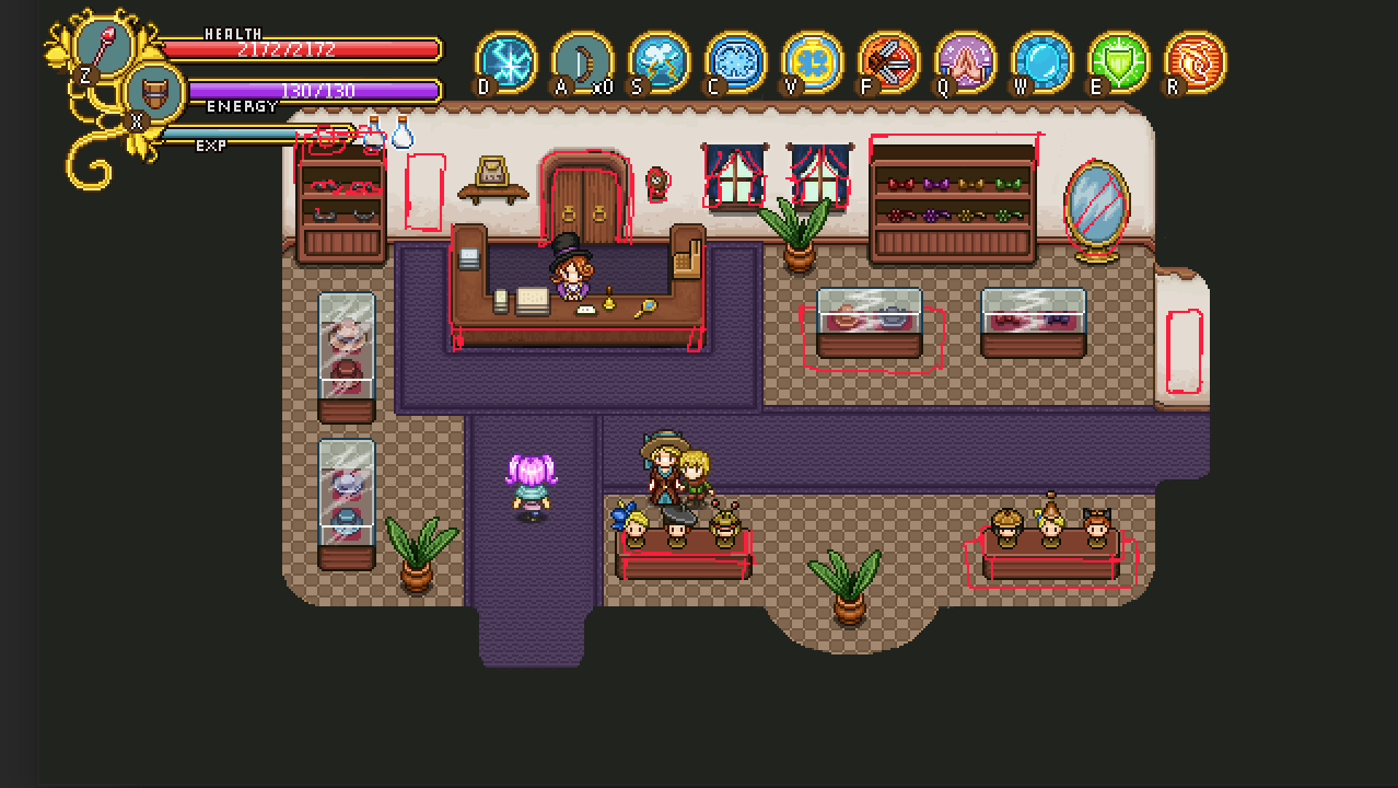
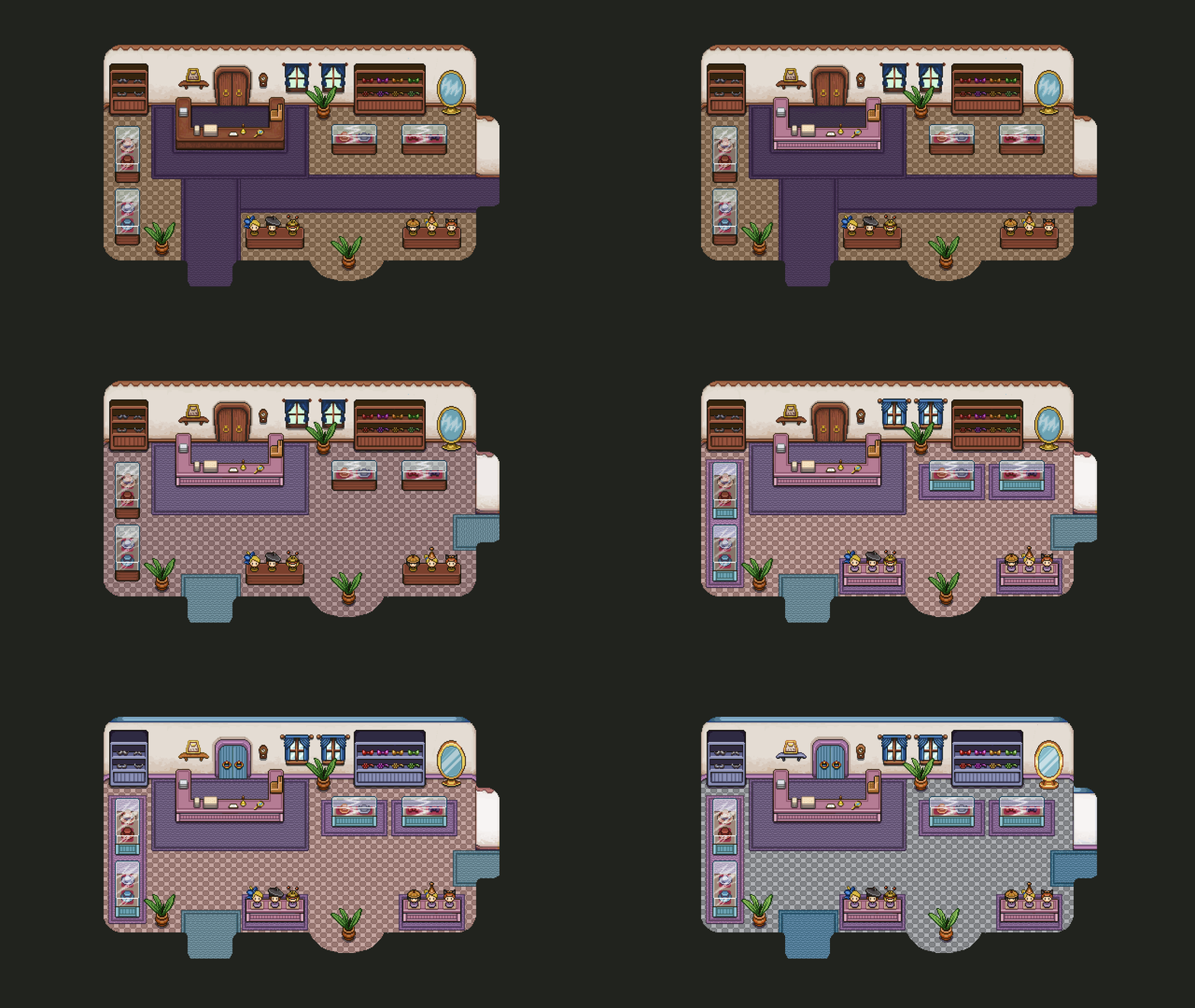
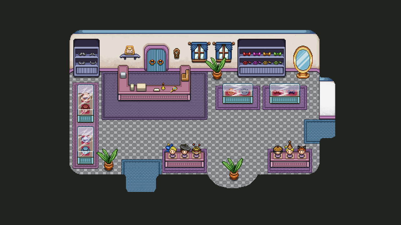
Next, the hat shop! This place needs a bit more color, some updated graphics and just some more details. I might go back and change some of the colours of this house further on so it’s colour scheme isn’t as close to the cafes, but we’ll see!

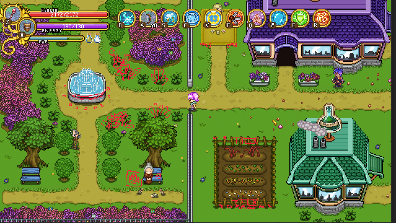
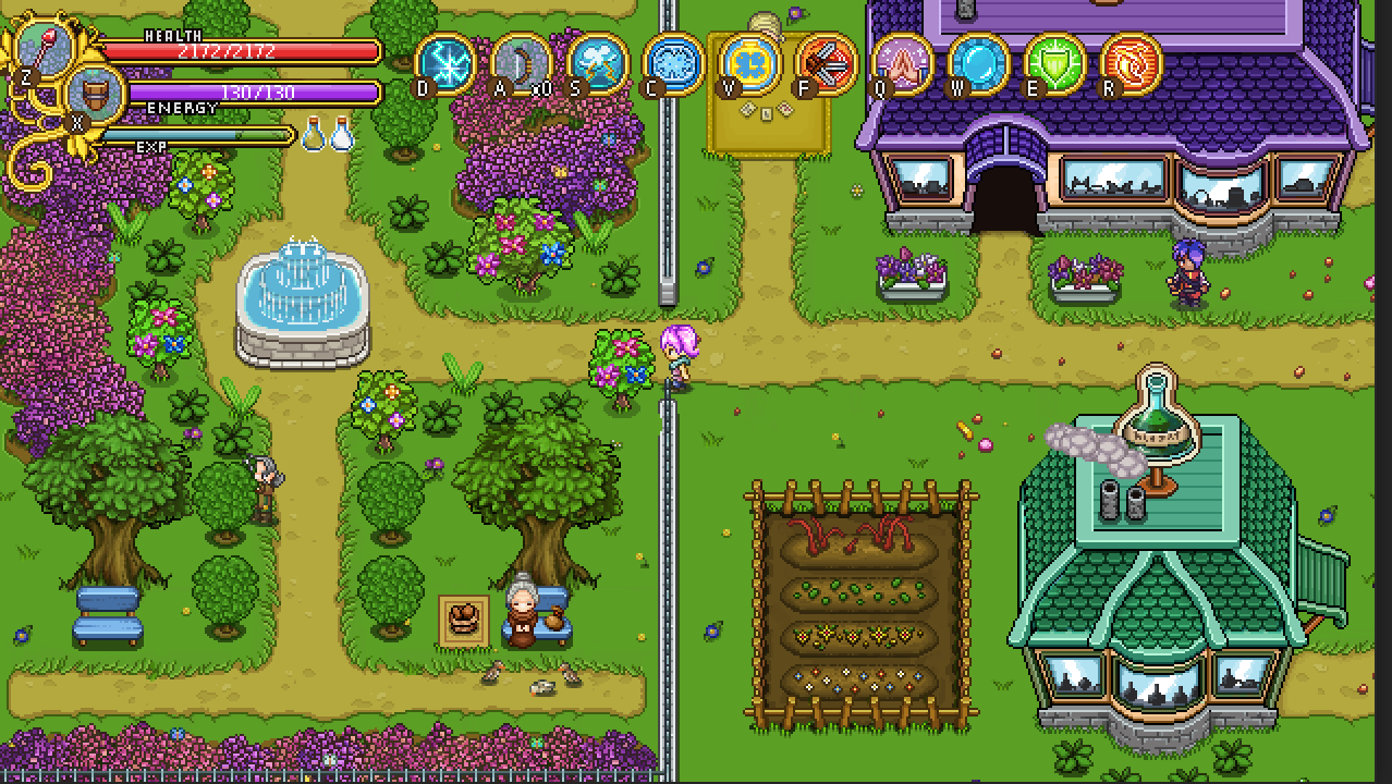
And now, the garden and its surrounding area! Here I wanted to add some more flowers, update the fountain graphics and the fence behind the alchemist’s house, as well as some details. The benches have also been updated as well to fit the more clean style of the later parts of the game:

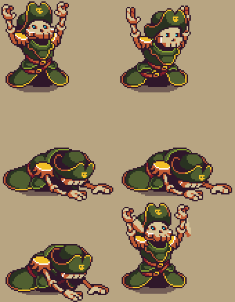
Fred, meanwhile, has been working on some new animations for Captain Bones, where he seems awfully… Distraught? Whatever could be happening to him?

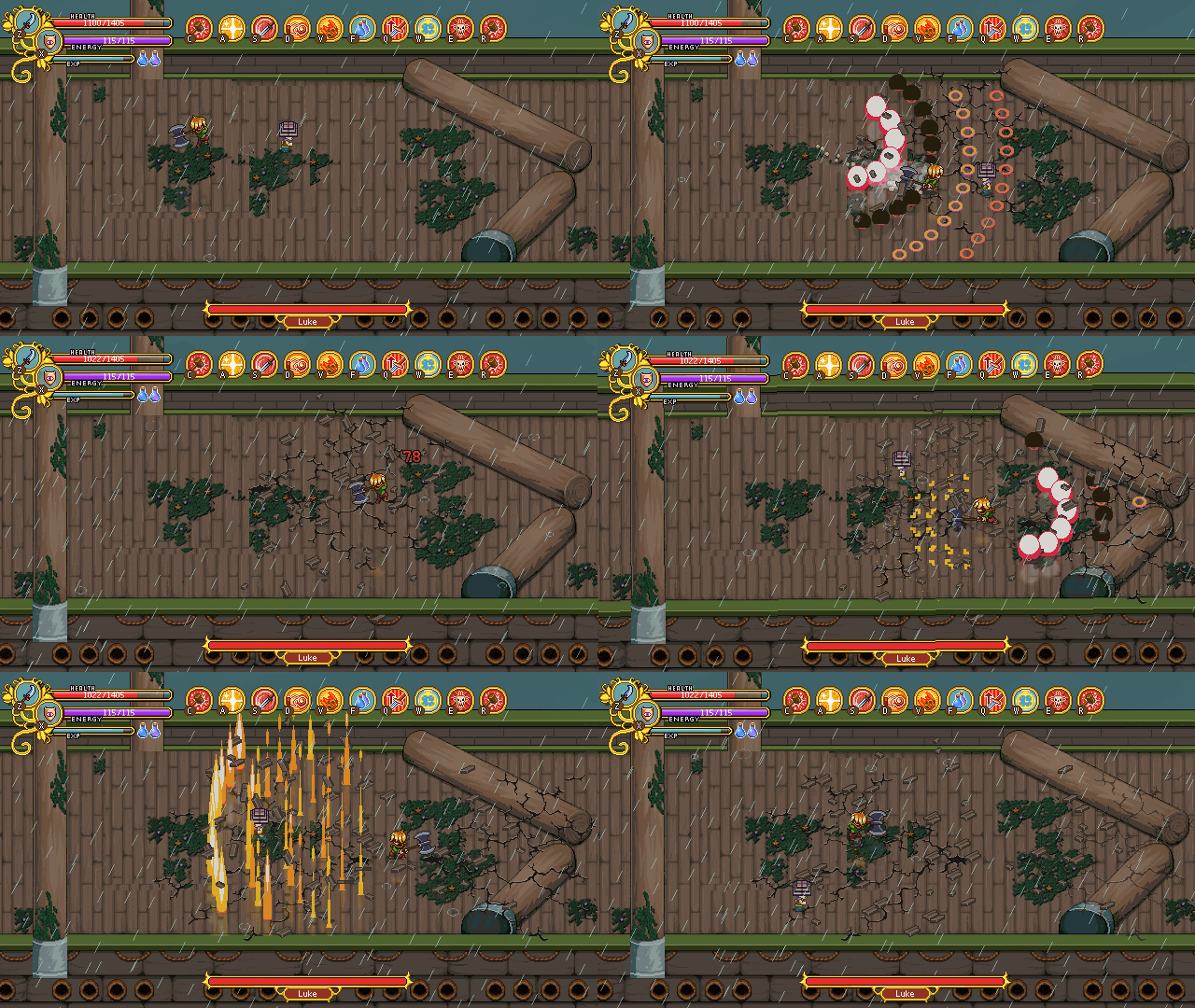
We also started making a test for the weather effect we’d like for the battle with Luke, adding some rain to give the battle a more epic feel (plus we haven’t really had any weather effects before, so about time!):

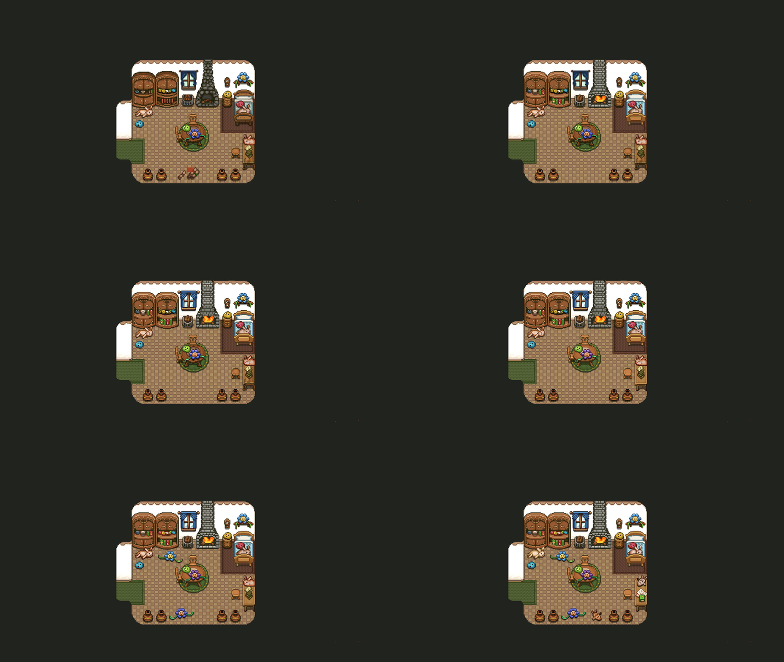
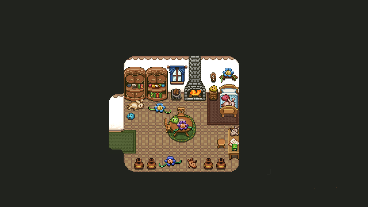
Next up, the plushie collector’s house! I’m adding a couple more plushies, but the rest I think we’ll add as they get added into the game: so whatever plushies you give her will appear in the house after you’ve handed them over. In other words, I’ll return to this house later on, once all of the plushies have been made :)

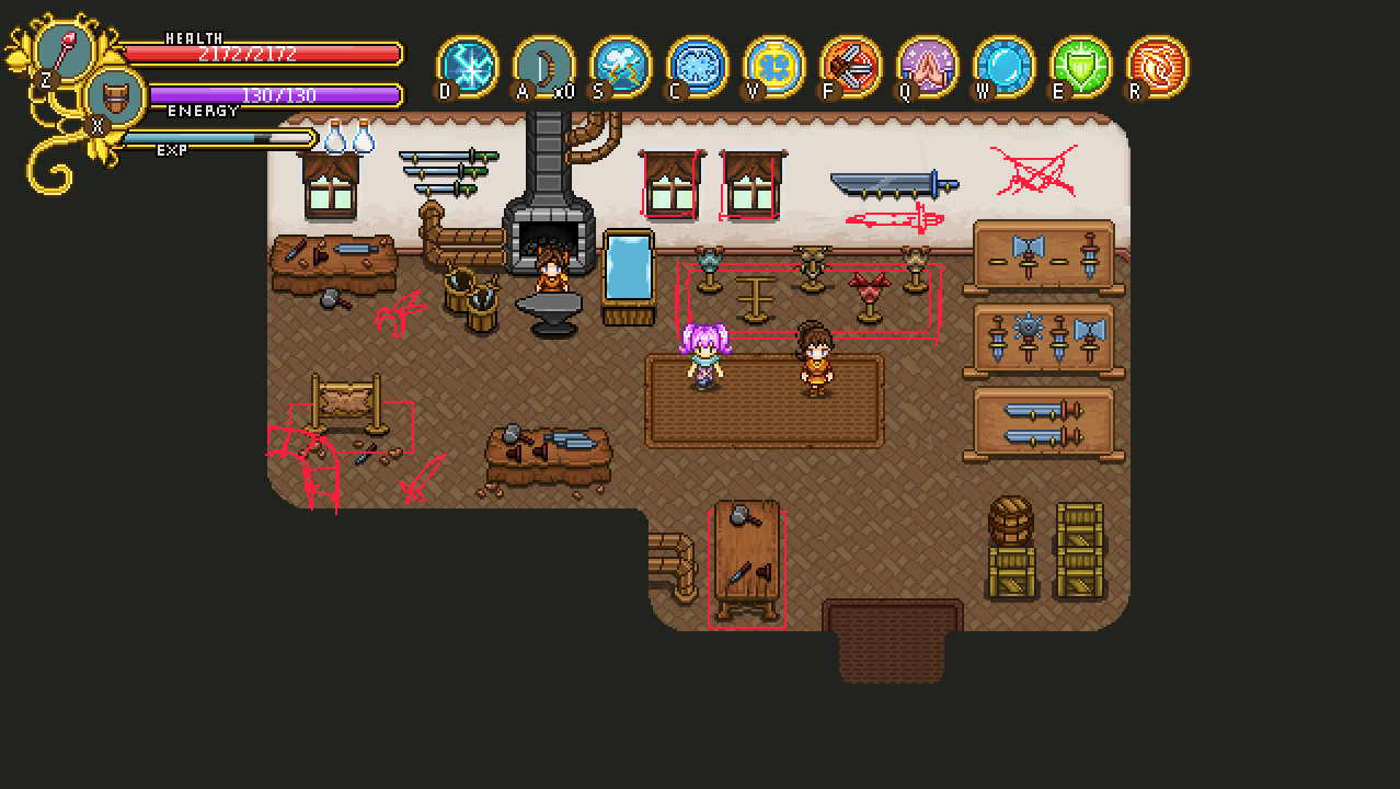
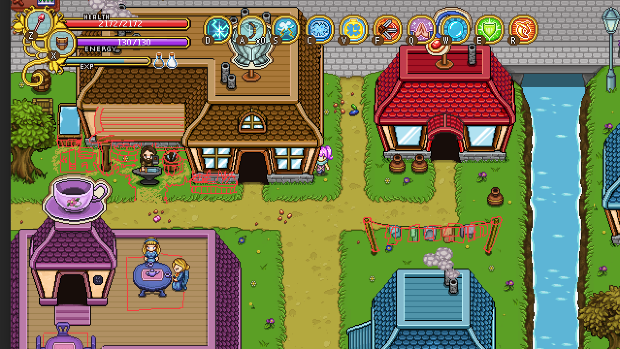
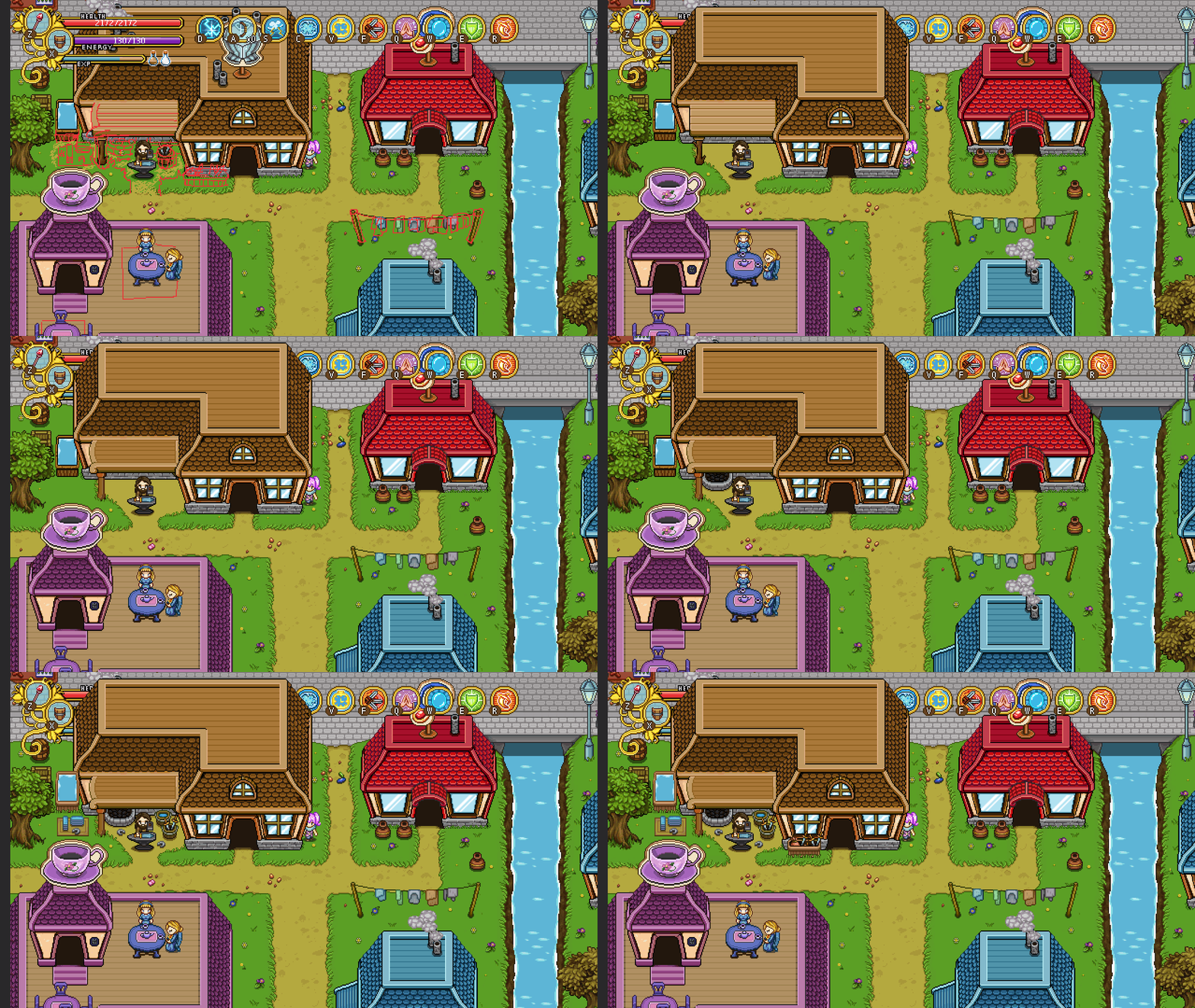
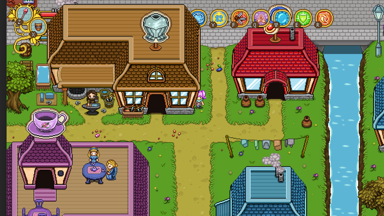
And now, the area surrounding the smithy! This time I’ll be focusing on the space around the smithy building, saving the laundry and adding some decorations to the café upper floor later on:

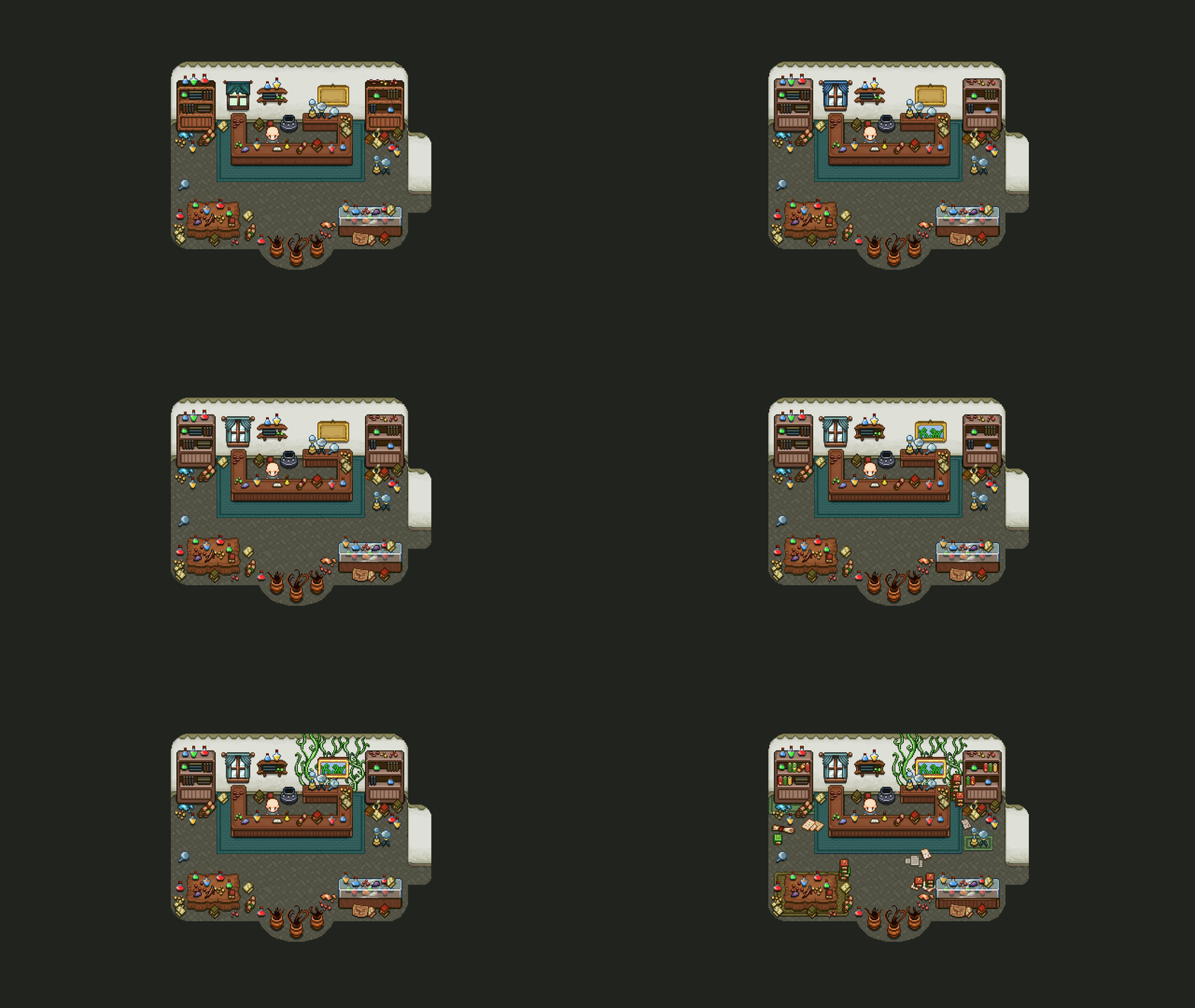
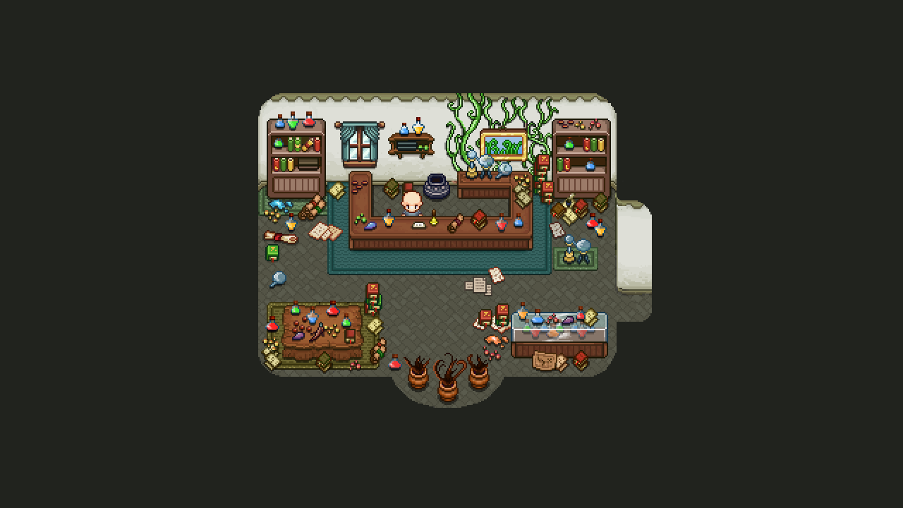
Time for the alchemist’s shop to get a bit of an upgrade as well! I decided to keep the worn out look of some of the props here, to make the house feel a bit old and worn out. Also added a bunch of more things to make the place seem a bit more cluttered, and some bonus carpets and vines for a touch of color:

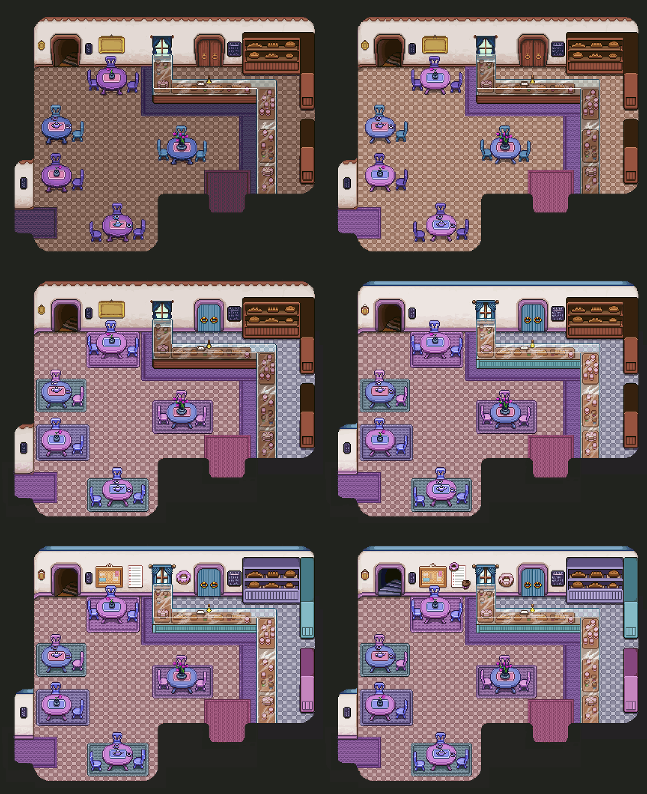
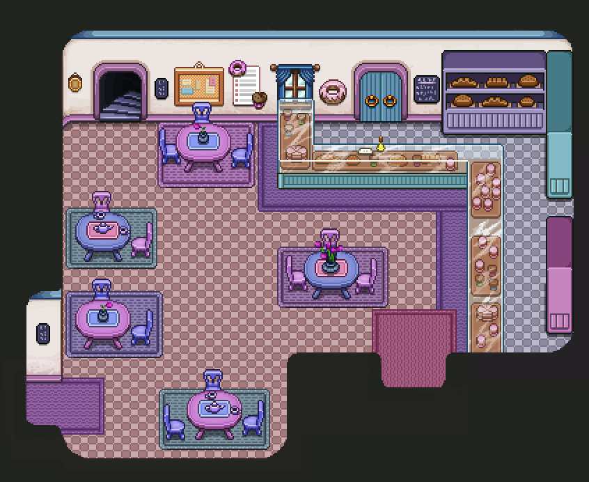
The café looks rather drab and boring as well, so it’s time to spice it up a bit! More colors, better rendered props, a touch of mint (the color), and some new things on the walls:

Didn’t take too long, it’s already time to look back on the ghost ship a little bit! Some minor changes and addition have been added here and there, starting with making the globe resemble the world map a slight bit more:

As well as settling for a zone name, which we decided would be The Lost Ship:

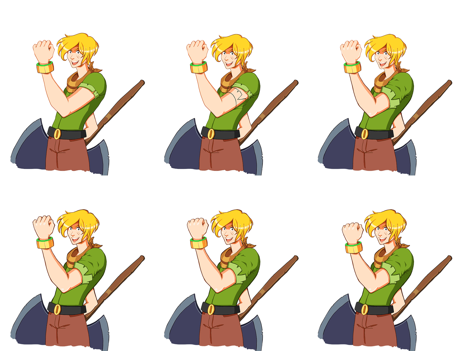
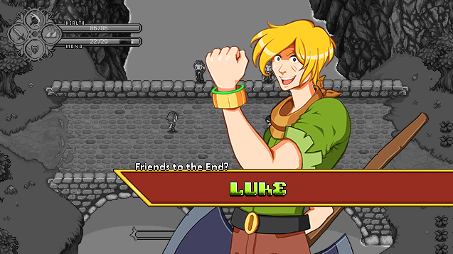
Also been working on a few upgrades to the Luke portrait, featuring a shirt that now more closely resemble his sprite, some anatomy fixes and a bit thicker outline here and there!

Time to plan out some more of the improvements needed for the Evergrind part of the game! Of course, the houses that use the old version of the Startington furniture needs to get the upgraded versions of that:
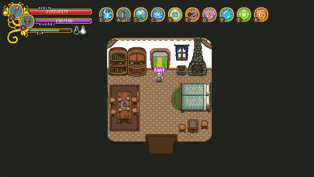
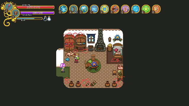
The area around the Smithy looks rather dull and the laundry hanging to dry could definitely be drawn better:

The entire café looks pretty outdated, so gonna have to do some revamping there as well:
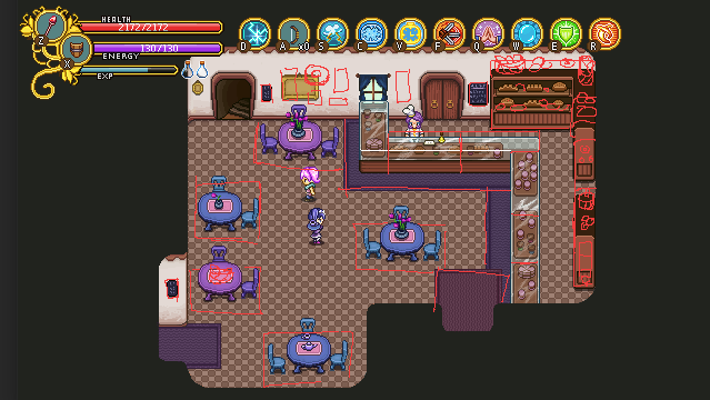
And same for the alchemist’s house, where I’d like to add even more clutter, some wild plants and other things to liven things up a bit and make it seem less drab and abandoned, and more like the colorful abode of a crazy alchemist:
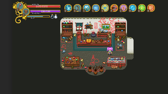
So starting off with the first improvement batch, time to upgrade this little house, the first you see as you enter Evergrind City:
We’ve also had another meeting discussing the final dungeon! We have a bunch of ideas for specific challenges and rooms now. Some of the new ideas are as follows:

* A phase shift puzzle where you have to catch x number of items in a certain amount of time. Sort of inspired by the torch puzzle we’ll have in the ghost ship where you need to light a certain number of torches in a short amount of time; here you need to get a hold of x pieces of a key (or something like that) in order to unlock the next room.

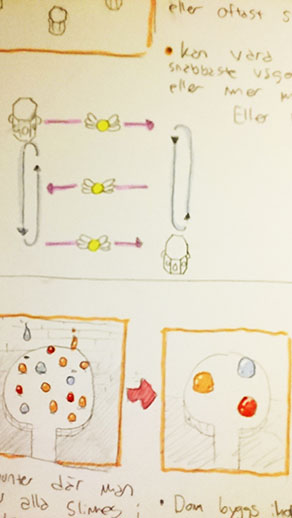
* A slime encounter where you get to battle every type of slime in the game! When you’ve killed them all, the goo they left behind will merge together into 4 bigger slimes, which will provide more of a challenge. After defeating these slimes, they will merge together into a rainbow giga slime, which will be a much more difficult version of the giga slime fight!
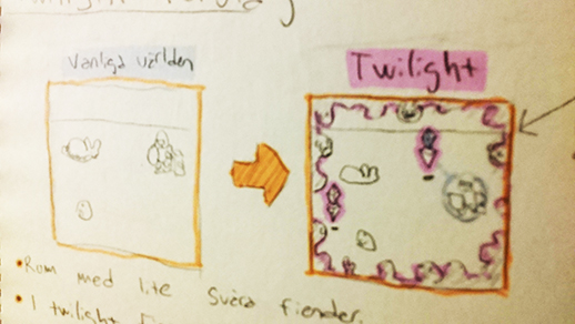
* A room surrounded by a ghostly essence that comes to life when you enter the ghost world (which you must in order to kill a number of ghost guardians) – for ever second you’re in the ghost world, the ghostly essence will grow bigger and bigger and will hinder your movement and will end up damaging you

* An encounter with enemies from across the game and a master wizard that will turn them all into elites

* A room where you’ll be trapped within 4 guardians that are connected with their laser beams; their movements will determine the size and shape of the space where you can move. Meanwhile you have to dodge a bullet hell, possibly summoned by phaseman!
* A challenge room with either Gifts of Presents (or both), which will eat a key and it’s your goal to find and defeat the one who ate it.

* An overgrown room in which you’ll battle every plant enemy in the game, ending with a short guest appearance from the power flower

… and more! Needless to say, we’re getting more excited about this final dungeon by the minute. Hope you are too! :)

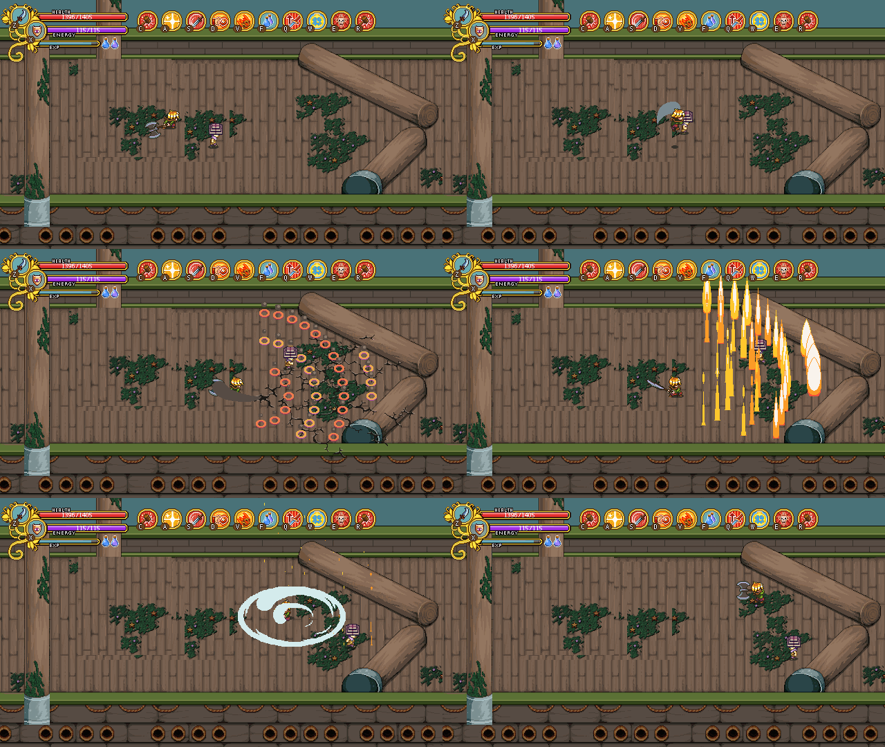
Now it’s time for another look at Luke’s boss battle! It’s coming together quickly now, with a bunch of his attacks being mixed and match to create an interesting pattern for the first stages of his fight that will be unique every time:
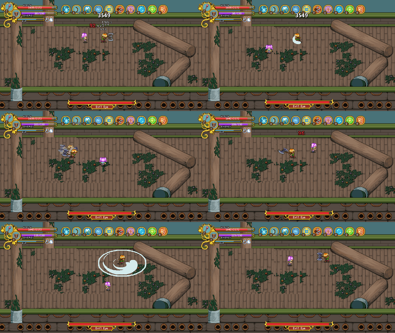
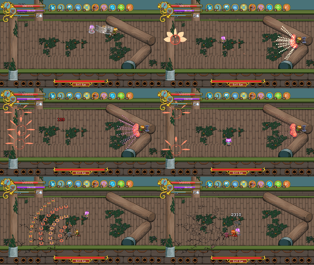
Some of the effect graphics have been improved since the last time as well, and I feel like it already looks pretty good (with the exception of the placeholder background, hehe – I’ll get to that eventually)!

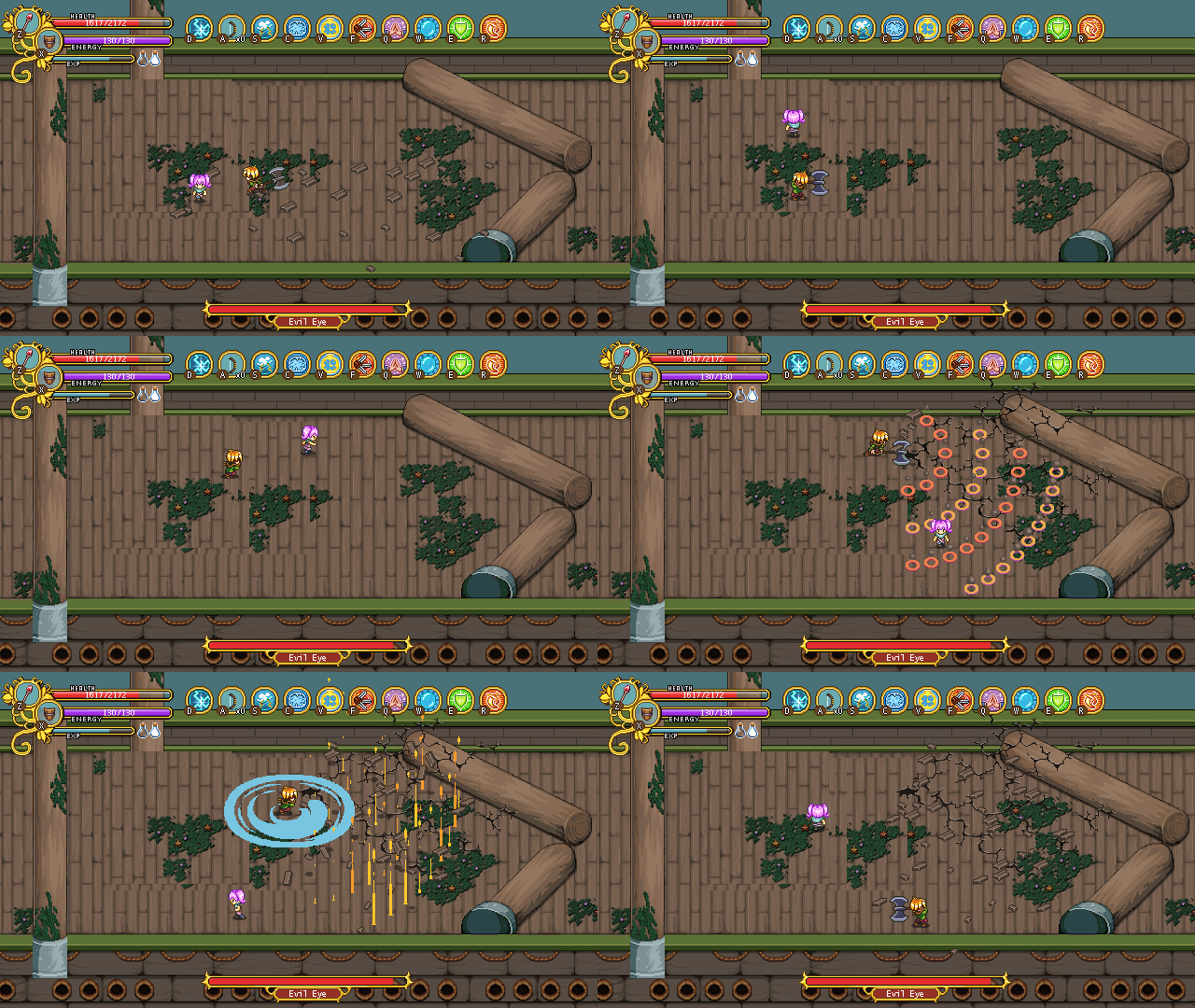
 

What we want now is to amp up the second part of the fight. We already know he will enter berserk mode at a certain point, but aside from that we want to mix it up a bit so it’s not just the same (random) mix and match combo patterns for the entirety of the fight. We have a couple of ideas for ‘bigger’ attacks that we’ll try out in the near future though, so we’ll see how that ends up!

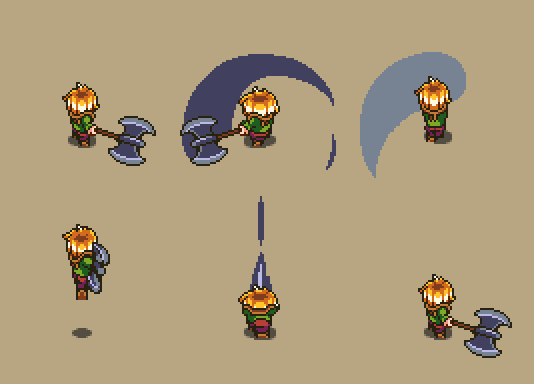
And here we have a closer look at a bunch of those fancy Luke animations:
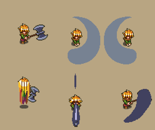
Exciting times!

So, new week and new Monday, which brings with it another meeting! This time around we’ve talked a lot about the near future, basically where we’re heading from here and what’s the most important on our to-do lists.

For Teddy and Fred, this mainly means the Luke battle and the cutscenes directly after and a final one leading up to where Frontline will end this time.

For me, there’s a lot more improvements to the earlier stages of the game, particularly around Evergrind City and the like.

And for all of us, it’s still the quest for the perfect final dungeon. We’ve already had a bunch of meetings discussion a variety of ideas, but seeing as we want a lot of floors, there’s still some work to be done and more floor ideas to shape – and eventually, actual floors to design. This week our homework is the sit down for 20 minutes to an hour here and there and create those ideas, so that next week we have even more of them to discuss. This will continue on while we finish up the rest of the ship until we have enough ideas, and eventually, proper designs, that we can make a whitebox sketch version of the final dungeon which we can run through and try out without the mechanics being implemented yet.

The main thing we want to avoid is one of the pitfalls that made work on the Ghost Ship such a struggle; in every other previous case where we designed an area or a dungeon, we had a clear design in mind before we actually started making the proper graphics. With the Ghost Ship, we did a whole ton of just winging it and designing as we went on, and it’s fair to say that designing a dungeon like that didn’t work out as well for us as the other way at all. So – no more of that, and more pre-design like we did before! With some luck, we won’t struggle as much this time, and it won’t be as long before an update hits ever again (touch wood) :)

Now, while I’m quite done with Ghost Ship stuff for now, there’s one ghost I have a feeling we’ll get to see at some point so I thought I might as well ghostify her portrait now while I’m kind of in the zone with the ghost stuff!

Who? Tannie of course!

Of course, I have no proof we’ll actually ever use this portrait, I suppose it depends on where we decide to take certain quests or side quests, but we’ve been talking so much about it that the chance seems pretty darn high she will appear in some shape, at some time…

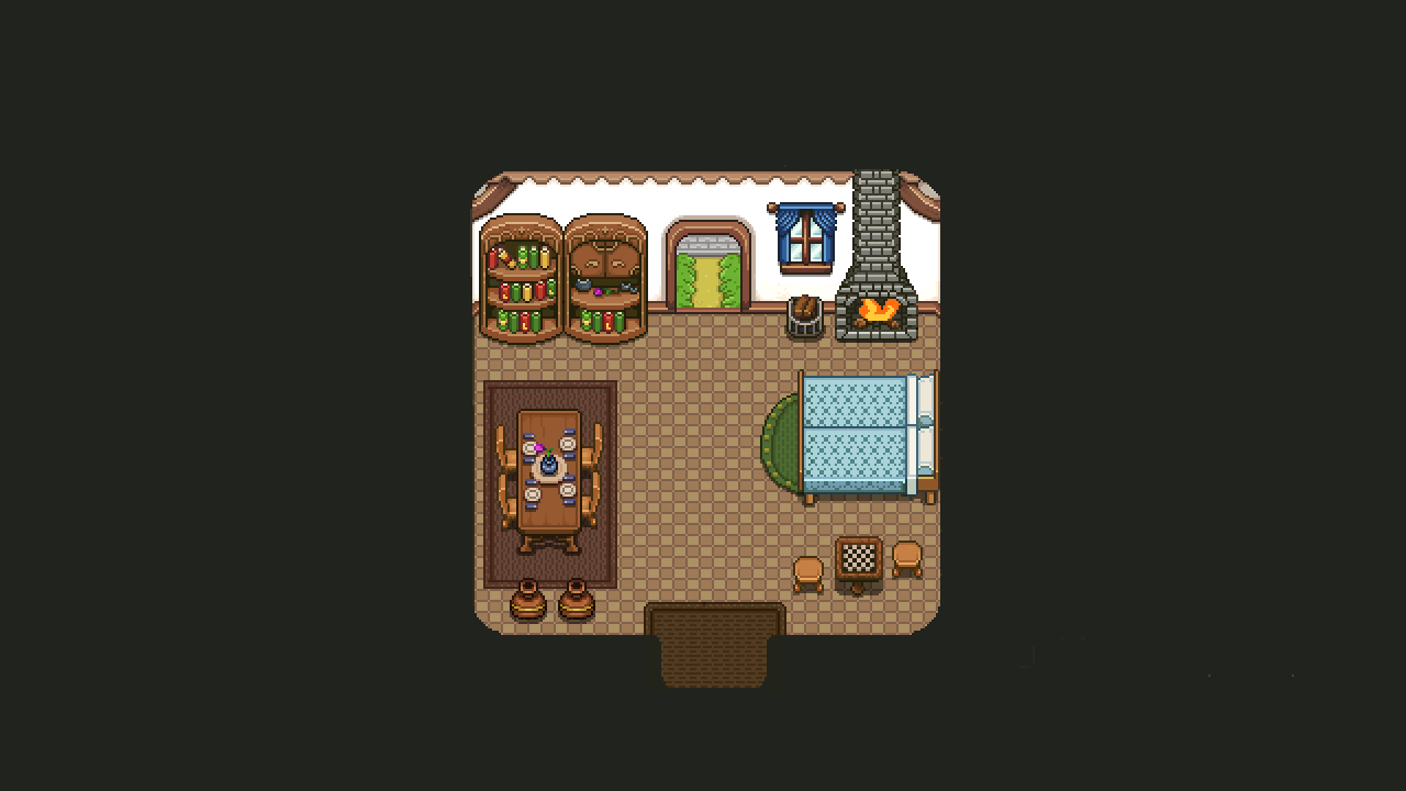
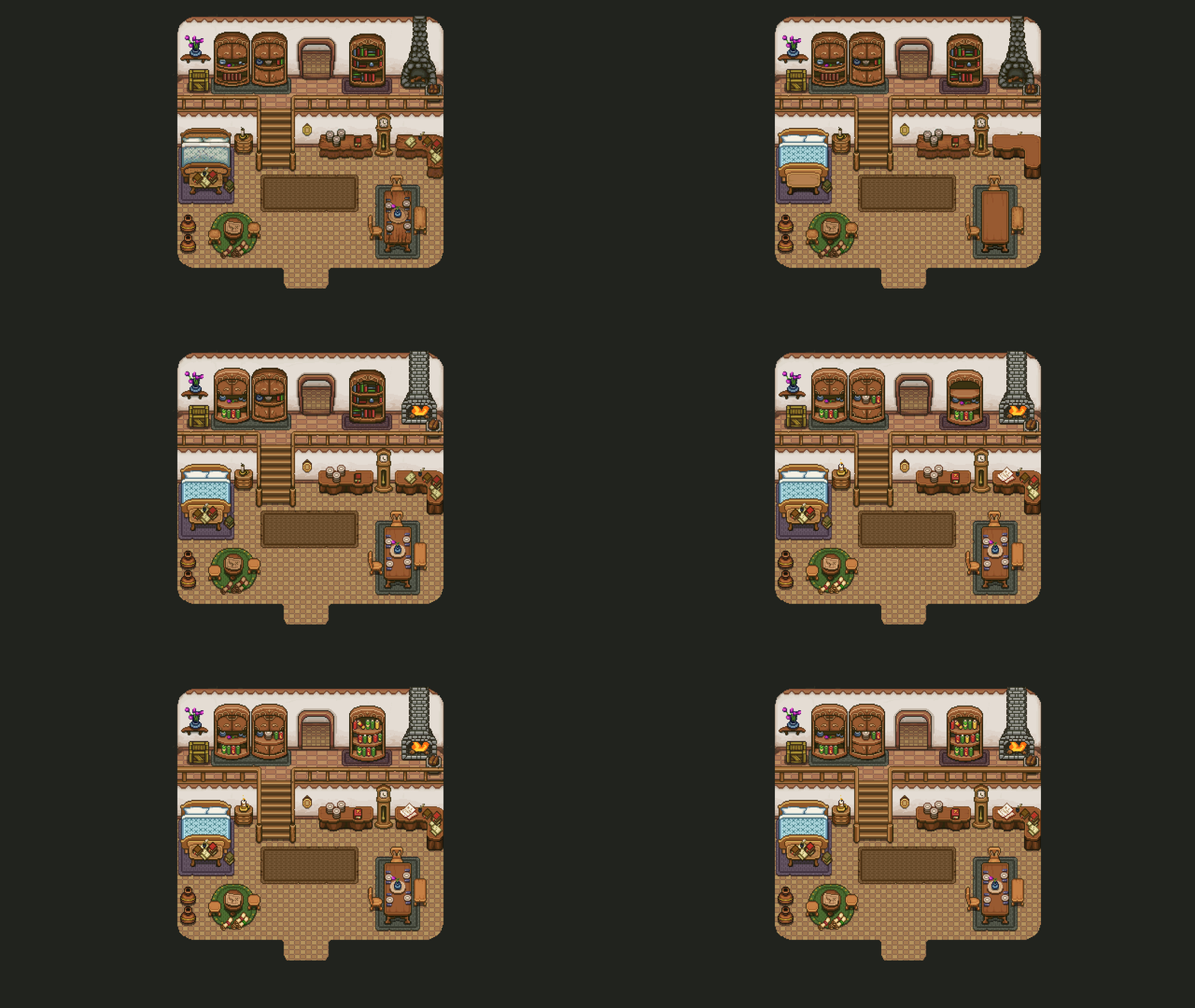
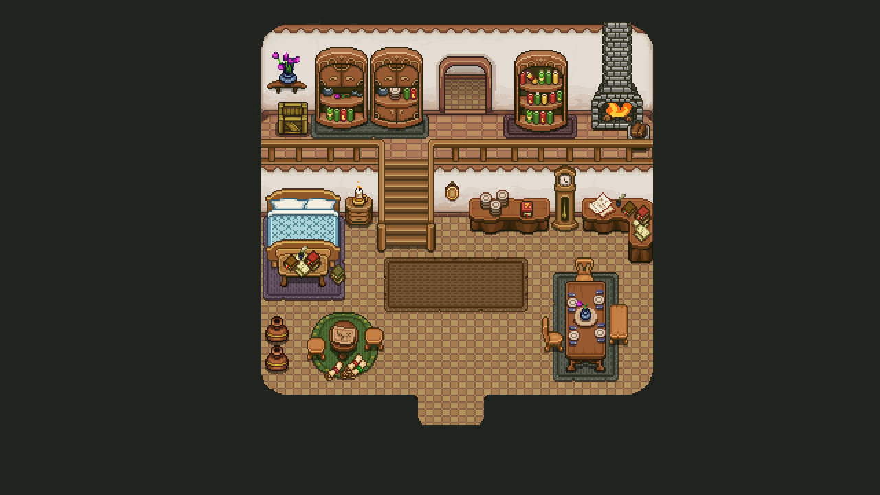
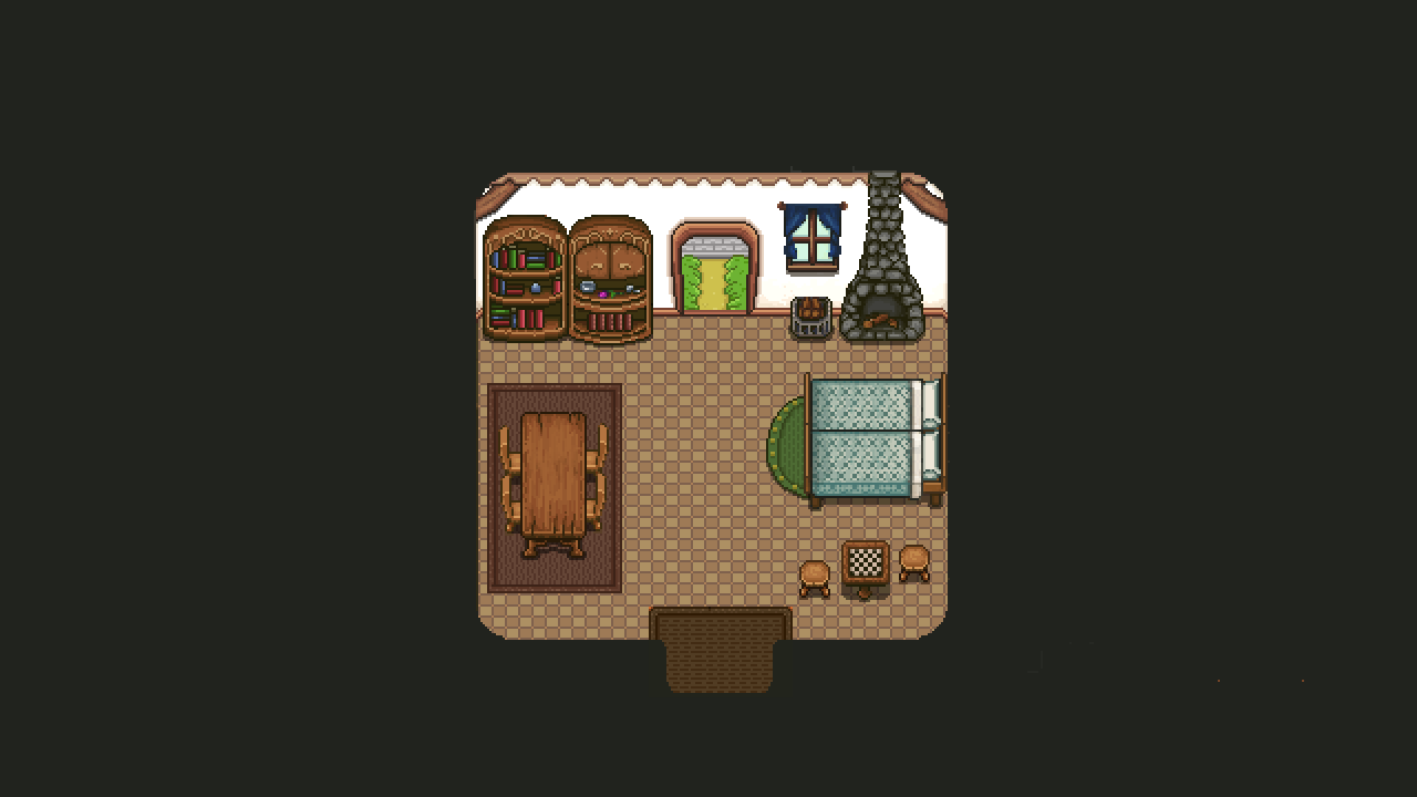
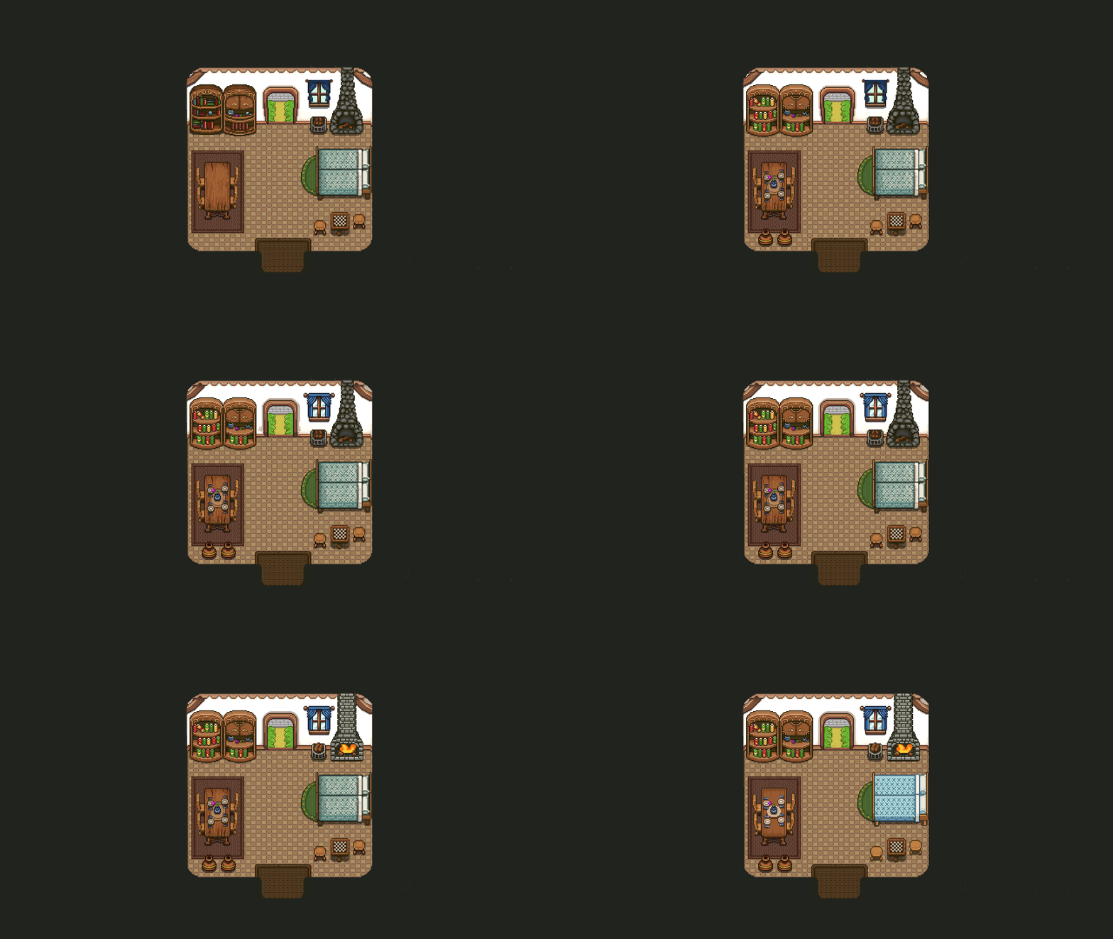
Now, with all of the other Startington houses having new and fresh graphics, it’s beyond time that the player’s own house get a bit of an upgrade as well! Without further ado:

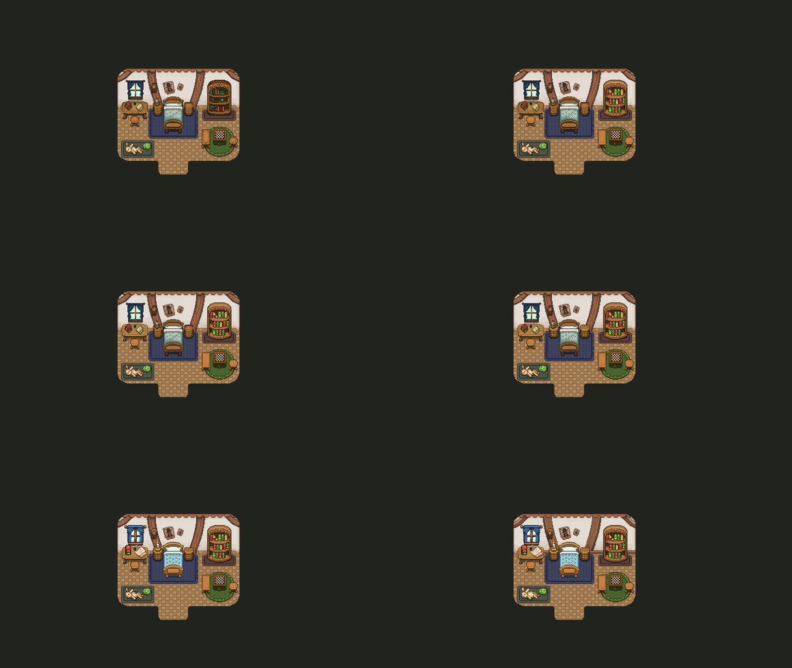
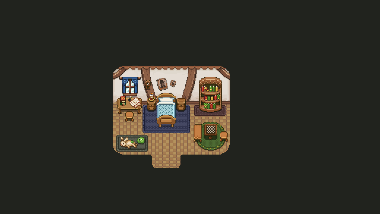
Next up, another part of the player’s house in Startington we can’t forget about; your own room! Like the rest of Startington, it’s about time it gets the appropriate visual upgrade:

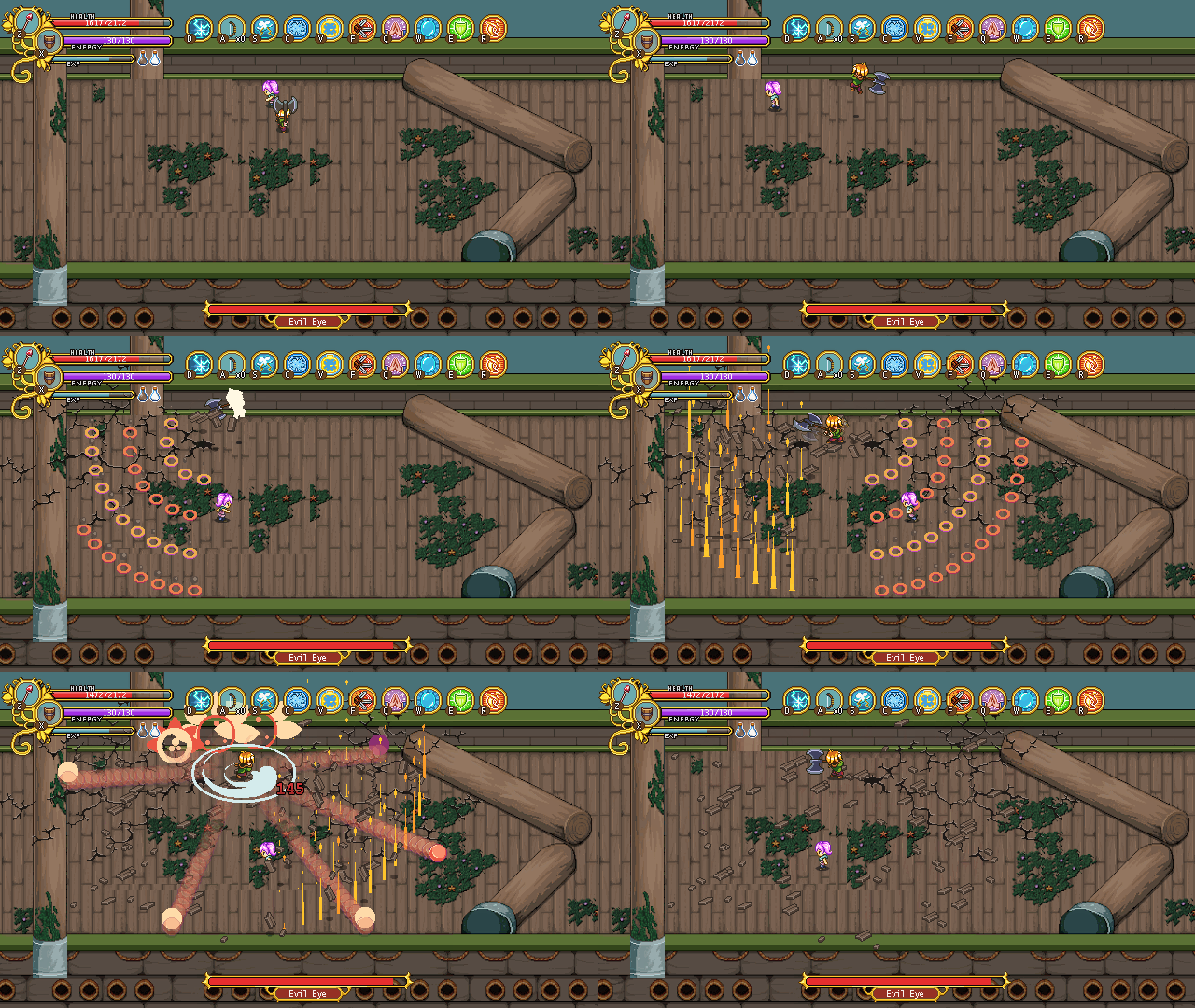
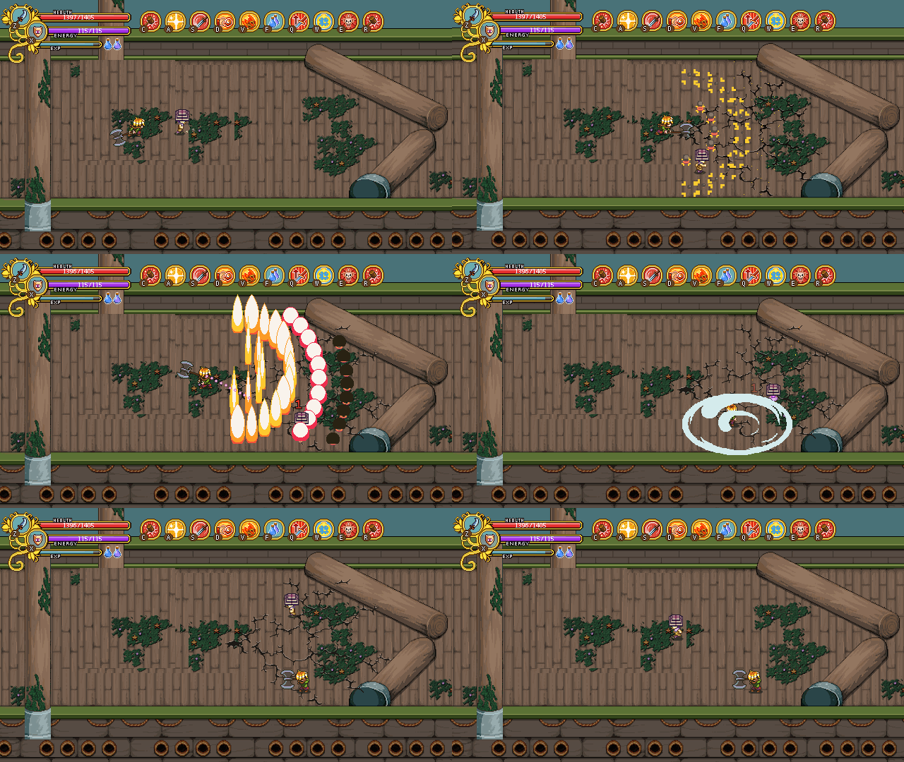
In Luke’s boss fight, we’re working on the level of destruction that will take place as he slams into the ship with his unparalleled strength! We’re currently choosing between three options – one where the cracks disappear quickly:

One where they remain a little while:

And one where they could potentially remain forever:

Right now we’re leaning towards the middle option. What do you guys think? :)