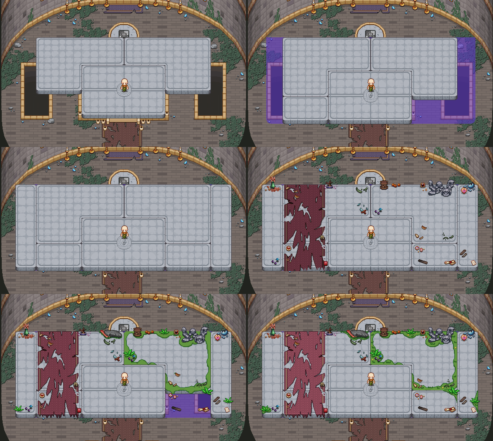
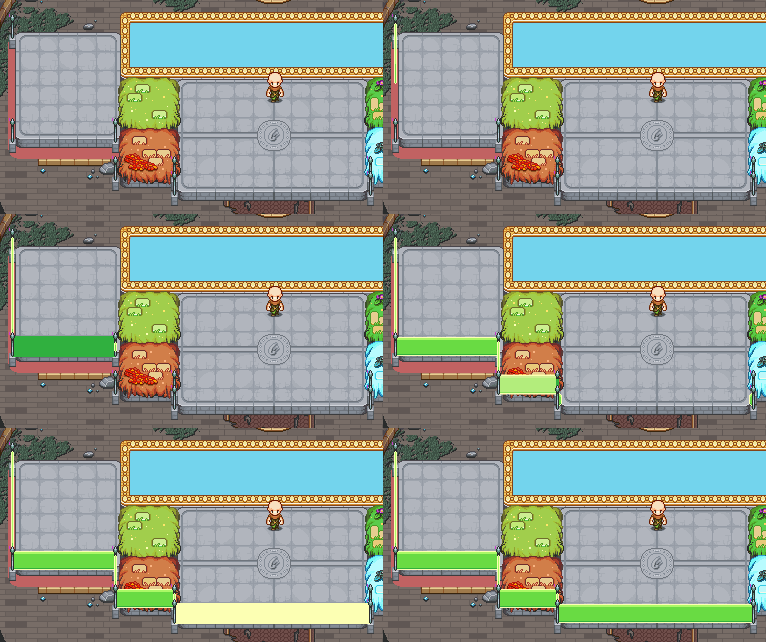
Another week and more stuff keeps happening in the tower! Last week, we took a look at the boss summonings, which looked something like this:

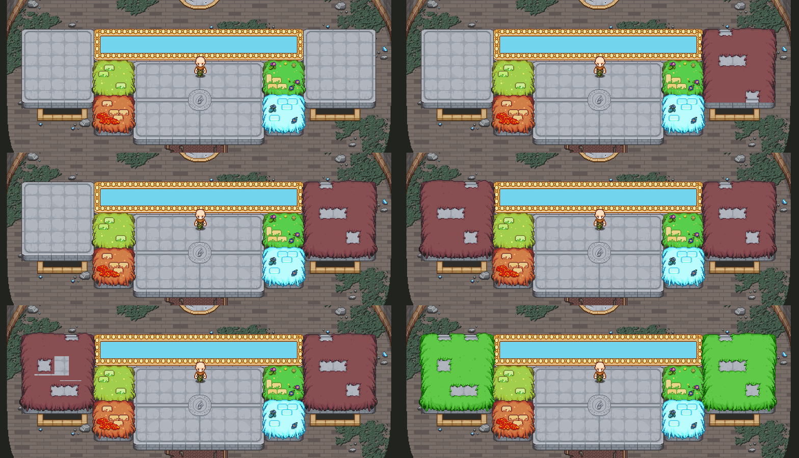
However, after some discussions we decided to change the timings around a bit and add the elevator parts after the Mirror’s lines as opposed to before it, making it a bit more of a surprise which boss will appear next – so here’s the updated version:

To start with, we weren’t in agreement of which one was better, but in the end I think all of us have been convinced to go with this second version. Which one do you guys prefer?

Next up, we’ve been working on a bit of a mix sequence, where you’ll basically have to survive a barrage of attacks from various bosses throughout the game, making sure even more of them show up in this final part of the game. Let’s have a look at some of what we have so far:

Of course, the graphics are will a work in progress, the proper elevators, particularly for the Black Ferrets, will be added soon.

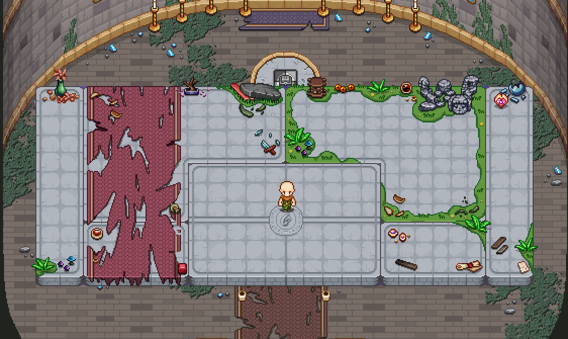
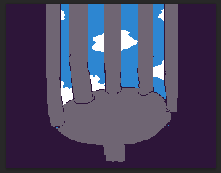
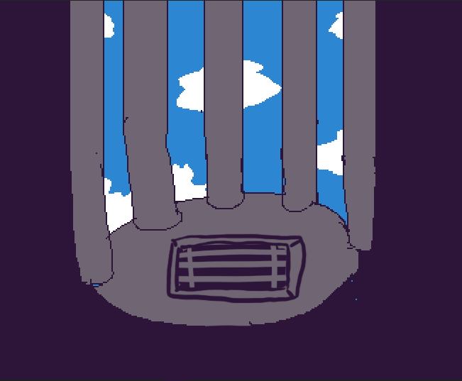
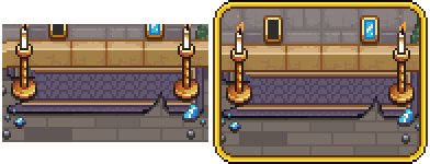
Speaking of new graphics though, there’s still a couple backgrounds left to make, so let’s have a look for the one that will feature in the Mimic battle:

Brings back old memories of Tai Ming, hopefully!

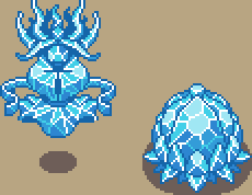
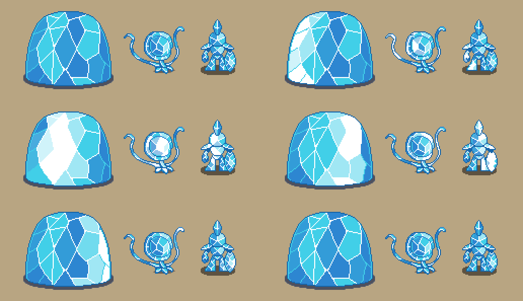
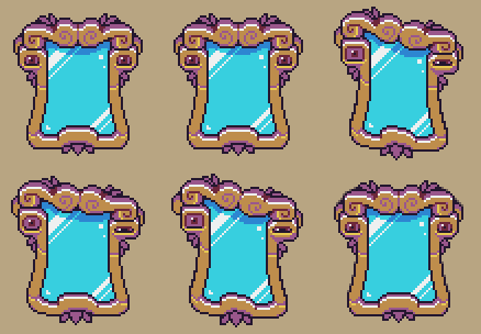
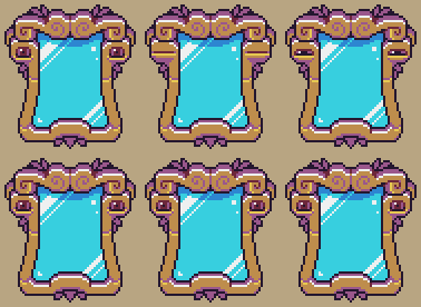
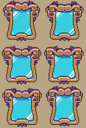
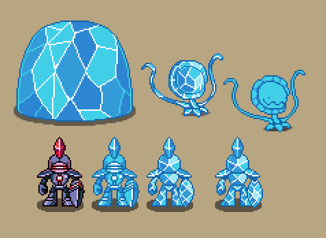
Fred’s busy making the proper glass-like graphics for each of the bosses and characters, so here’s a little sneak peek of two more:

And meanwhile, Teddy’s been busy with some programming that’s not exactly related to the game per se. As we may have mentioned ages ago, the game will not only release on Steam but will feature on GOG as well – so as we’re drawing ever close to completion, it’s time to start looking into implementing their stuff, making highscores and the like work on their platform as well. So, not much game progress – but still progress towards the release!

This week I thought we’d take a look at a bunch of the cutscenes we’ve been working on! Cutscenes are probably one of the most time consuming things for us to make, as it takes a lot of coordination between especially the programming and animation side of things, and there’s tons of small things that need to fit together to make them work.

In the final dungeon, there will be some minor cutscenes between each of the bosses, and here’s some of our WIPs this far!

We’ll start with taking a look at the intro of the boss himself, the mirror:

After that it’s time to summon the first boss, a shadow version of Giga Slime! Here we can take a proper look at the finished summoning animation as well:
Much the same happens for the next boss summoning, although here we’re thinking we want the grass to change rather than the elevators being replaced, so some changes might be in order:

Another fitting rhyme before your fight against two Phasemen:

Followed by a bit more epic appearance of the GUN-D4M!
In other exciting news, the sound effects have started to get added, courtesy of our lovely sound designer Fark! Here’s a little sneak peek of what things will sound like very soon:

And of course, a couple updates from Fred’s department. Here we have some shiny mirror versions of a bunch of enemies, and another animation featuring Zhamla:

Next week, it’s time for some new backgrounds and more final dungeon stuff! Stay tuned :)

We’re not only focusing on the bosses, even if it might seem like that from the last couple week’s updates! Today, let’s have a look at some of the other things we’ve been working on :)

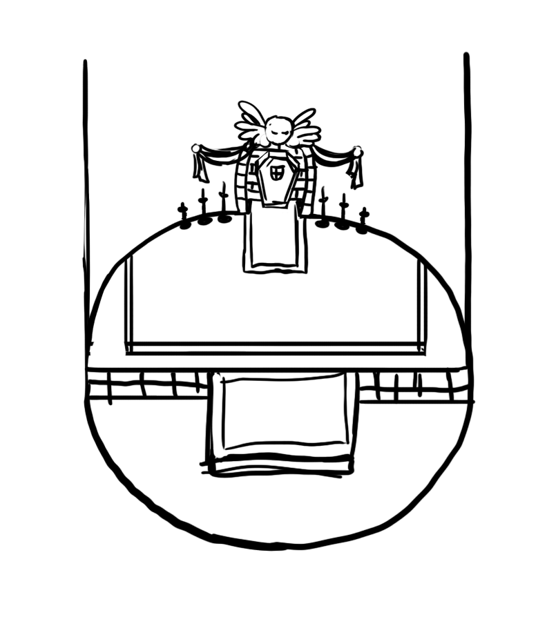
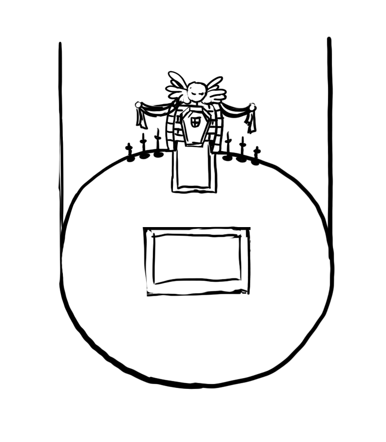
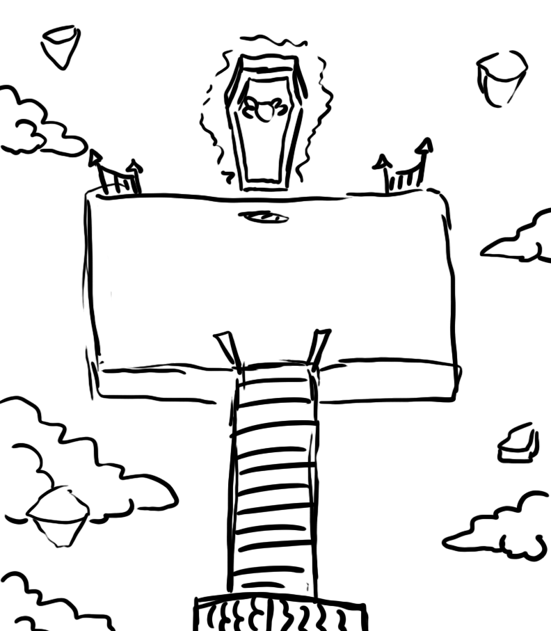
First up, we’ve been thinking about and sketching the final rooms, where you’ll face your final battle(s) of this game. Originally, we wanted the elevator to end up in the actual boss room, so I made a couple of sketches suggesting that (very basic, as these early designs often are):

Then we changed our mind, as an outdoor area would not only be infinitely cooler, but would also allow us to streamline some things in an upcoming cutscene. Hence, I changed the designs around and made on for the top floor and one for the outdoors where the actual battles will take place:

…and then we changed our minds again, thinking staying in the tower might not be so bad after all, but adding big windows to give a glimpse of the outdoors:

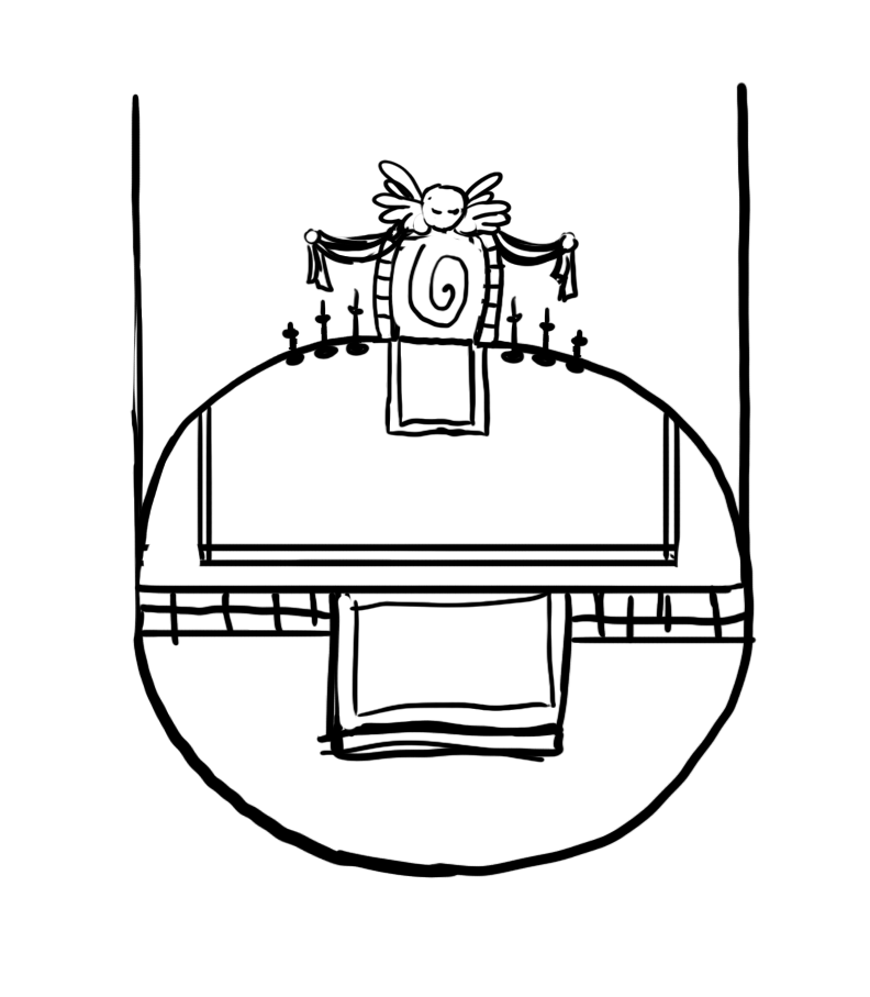
When this sketch was made, we still thought about having another room proir to the battle room, but then after making some changes to the cutscene idea, we thought the elevator going all the way up and the leaving might be a cooler idea, giving us a sketch looking like this:

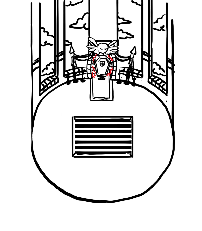
Finally, merging this new idea with the orignal sketch gave us something like this:

We’re still having a ton of discussions surrounding this, so these ideas may still change ten times over. Good thing we have a lot of other things to focus on in the meanwhile! Another thing we recently added are backgrounds for the journal and character background when you’re in the tower:

We’ve also been working on the Mirror, giving him another portrait and some flavour animations:

A lot of details has been made into making things look pretty in glass, for the mirror theme of the dungeon:

And Marino has been getting another animation too!

How peculiar… Whatever could he have to do with the final dungeon? ;)

A lot of work as been put into new cutscenes as well, a job which often demands a lot of time. Here’s a little sneak peek:

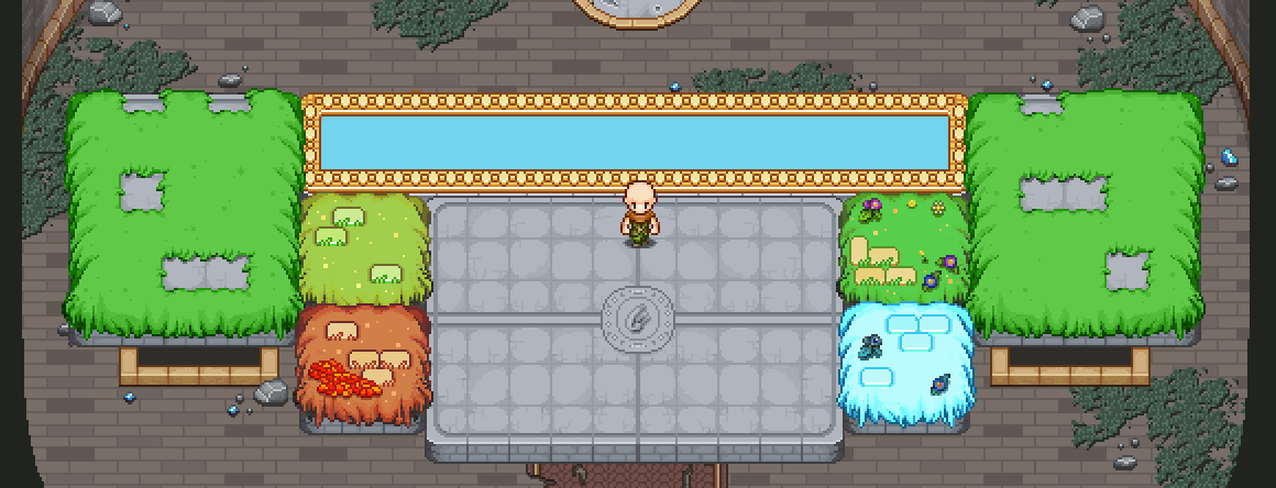
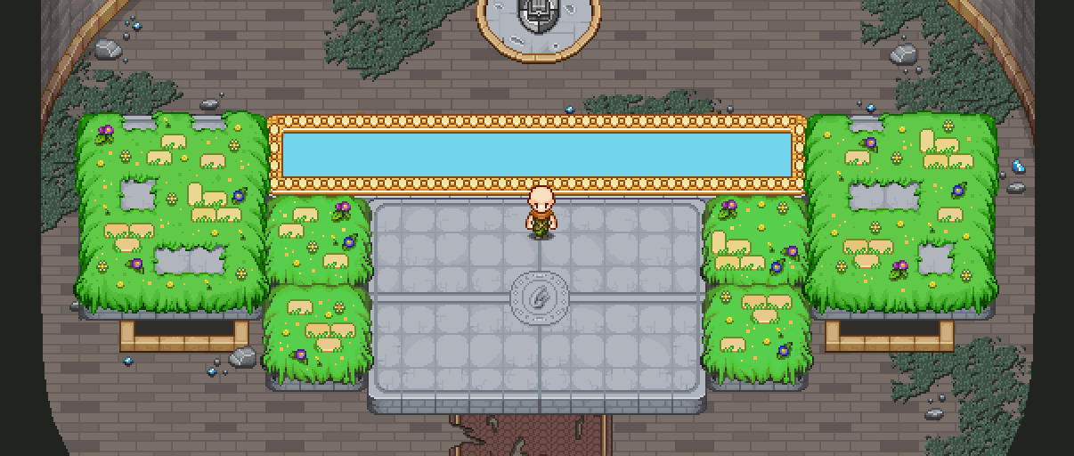
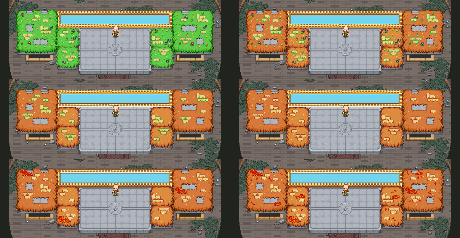
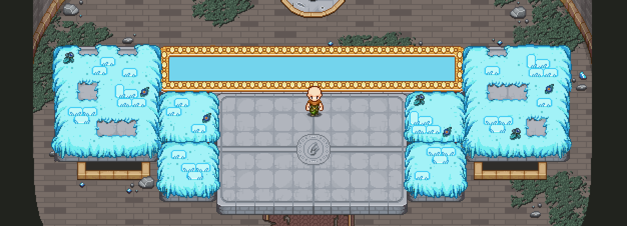
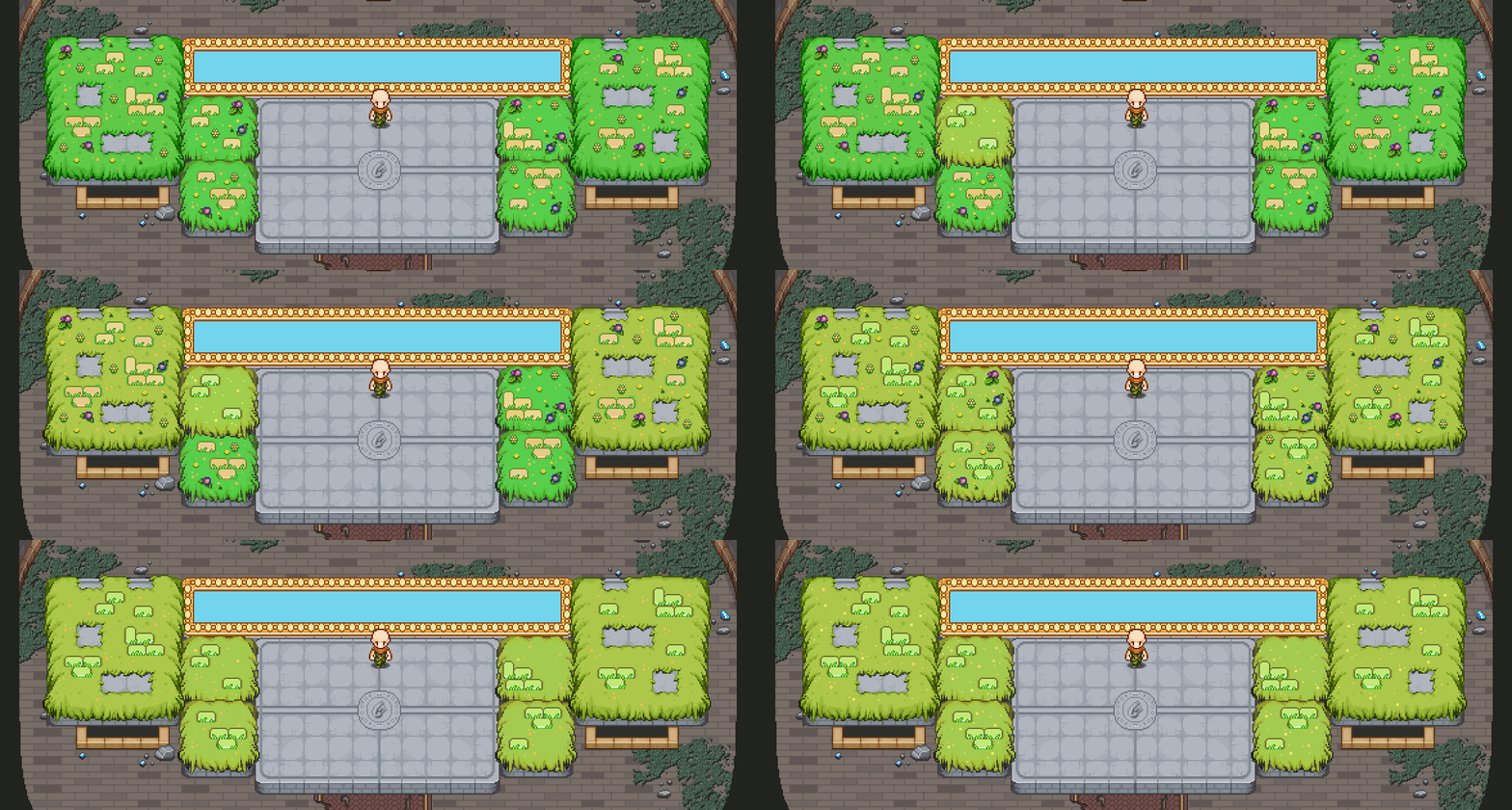
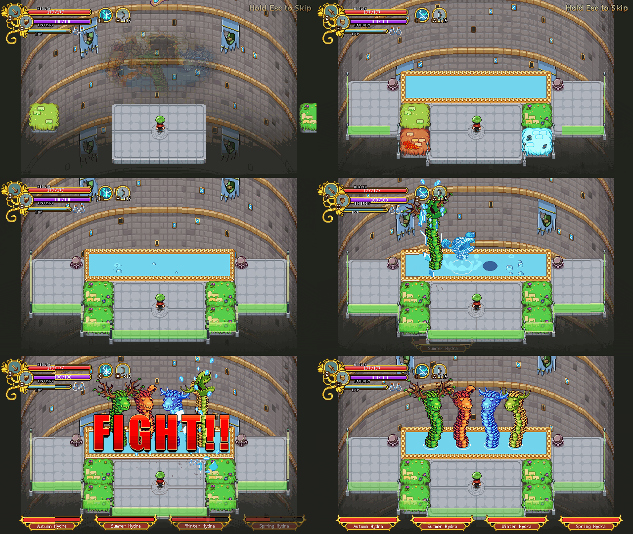
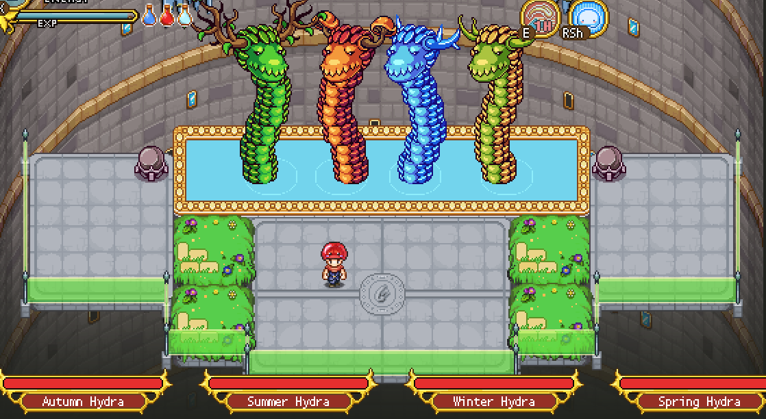
This week we’ll take a closer look at the next boss in the boss rush, the Season Hydra! As you may remember, I made a part of the background for it a while ago, but today it’s time to take a look at what the elevator will look like with each of the different seasons. First though, we decided to add grass to the remaining two platforms as well, so let’s have a peek at that first:

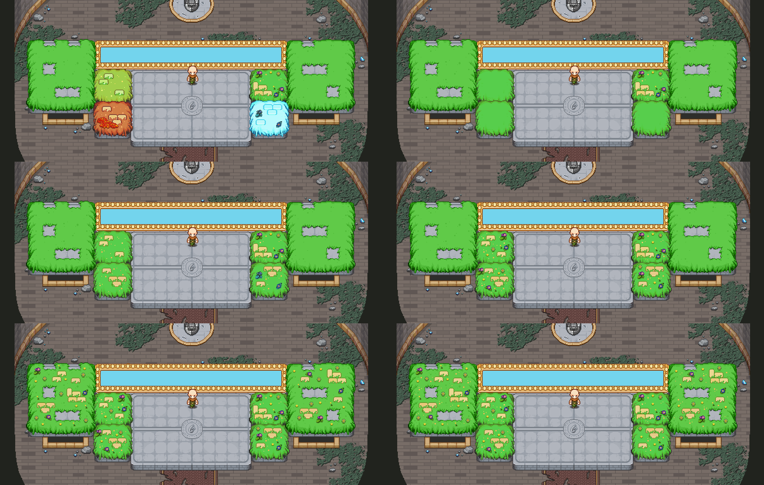
With that in order, let’s continue transforming this background into each of the four seasons! Starting with Summer:

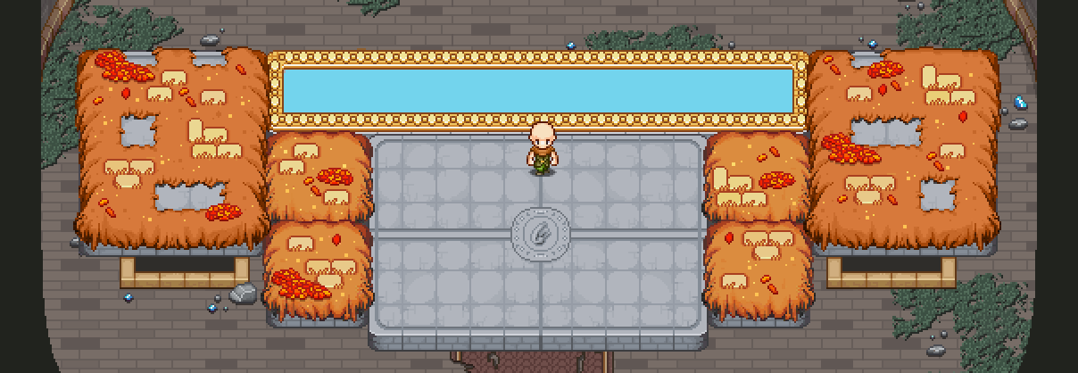
Next, Autumn:

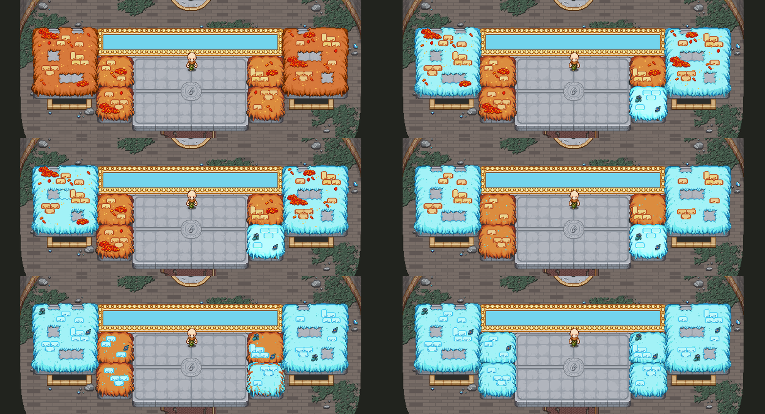
In the cold days of winter:

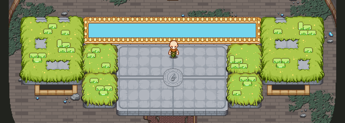
And finally, pleasant spring:

Of course, the Hydras will need some kind of wall for them to bang their heads into, otherwise how are you gonna be able to best them?! At first, we considered using the spears you’ve seen from across the game:

A basic WIP, of course, but we thought we might come up with something slightly cooler. Enter the force field:

A little bit more hitech perhaps, but also a lot visually cooler. Especially with Fred’s startup animation of it! Let’s have a look:

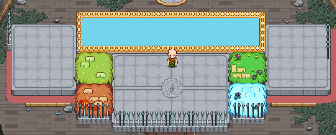
And before we go, have a GIF of what the spawn sequence looks like right now (without the proper summer background added yet):

With the Hydra fight well under way, this dungeon is coming together more and more :) We hope you’ll enjoy it!

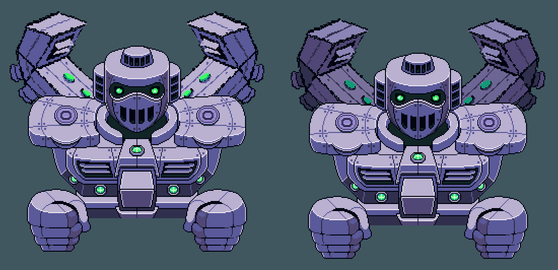
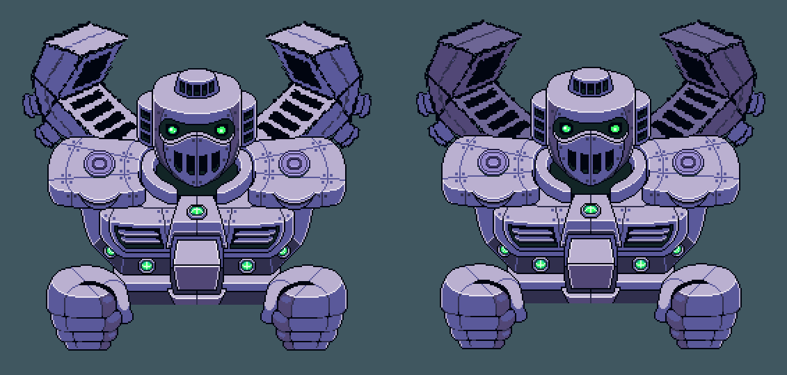
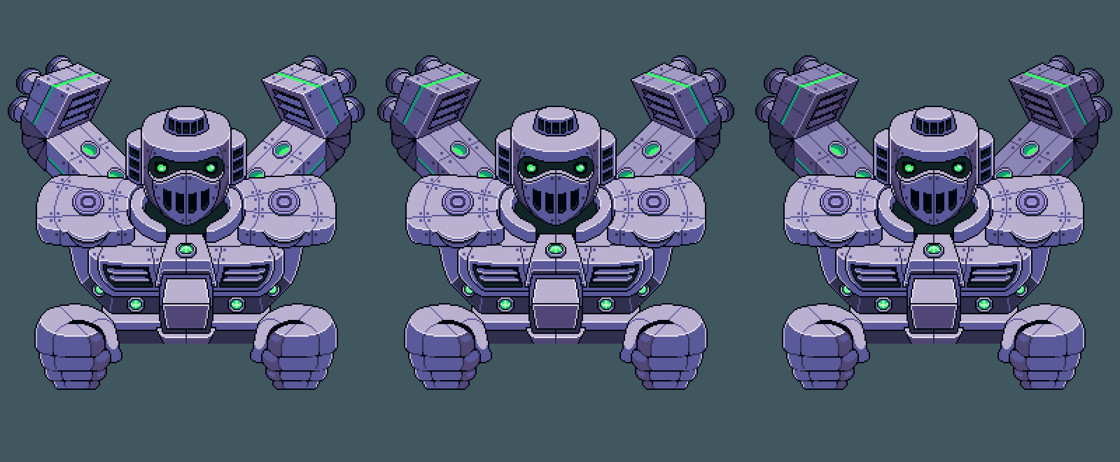
Another week, and this one’s main focus will be all about GUN-D4M, or rather the upgraded more epic version you’ll face in the dungeon! First up, a slight redesign was in order, to properly differentiate him from the previous version! For this, we made a couple sketches to determine which one we liked the best:

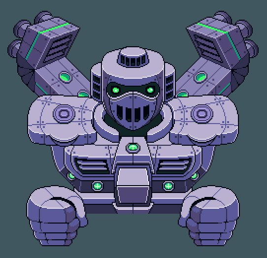
We felt like the one with the lights were the cooler version, so we ended up going with that:

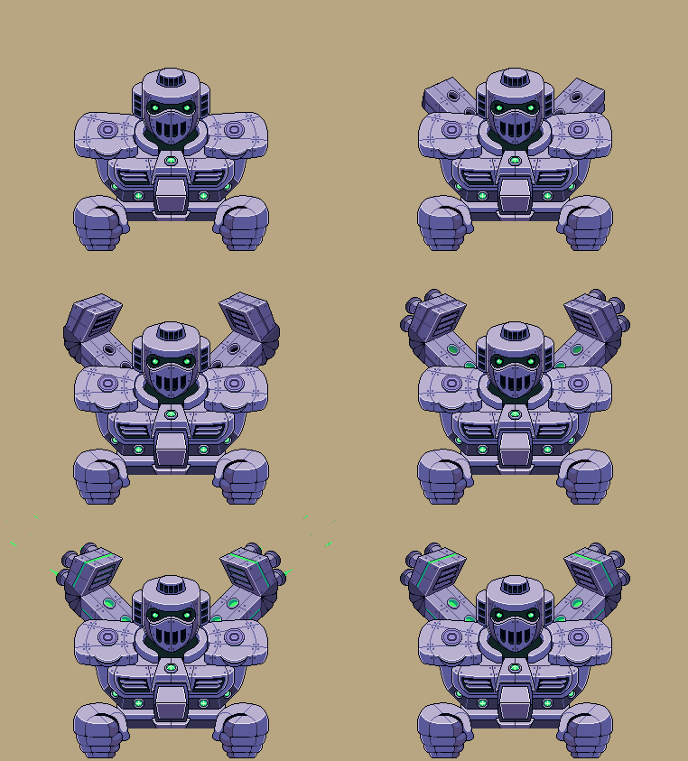
Some colour variations to get it all just right:

And after that, time to start animating that badass! Let’s have a look at one of his animations:

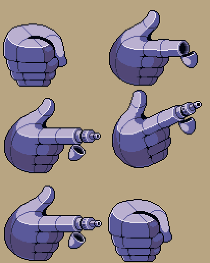
His fingers will feature a new weapon as well… Ooof!

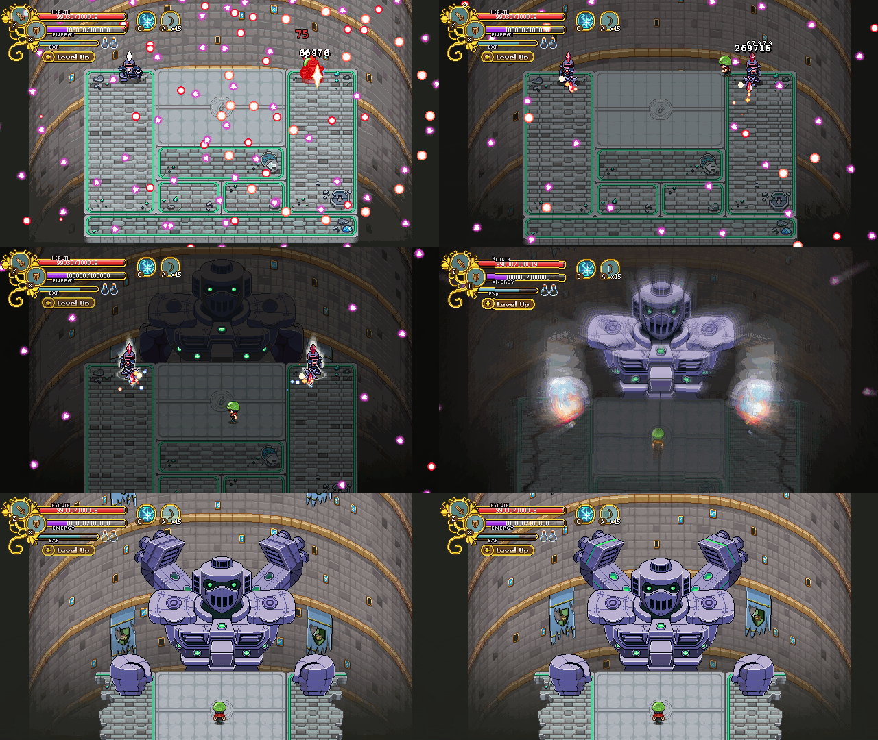
And here’s a bunch of videos from our prototyping of this part of the battle, starting with the two Phasemen, going into the GUN-D4M portion of the game, and then finally a bit of how the boss fight itself will play out:


What do you think so far? We’re all very excited for where this is heading anyway, hope you are too :D