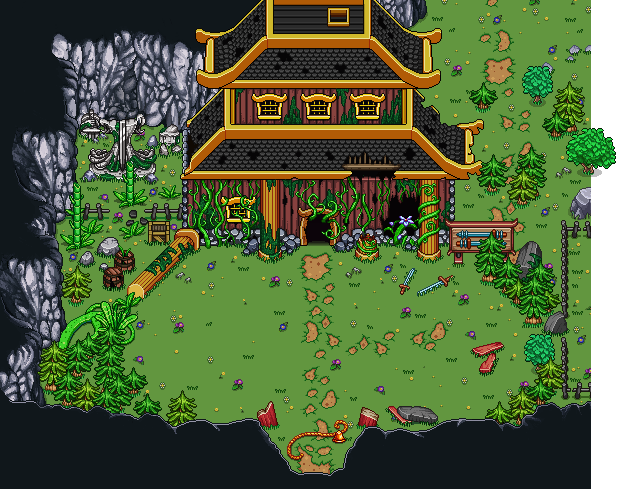
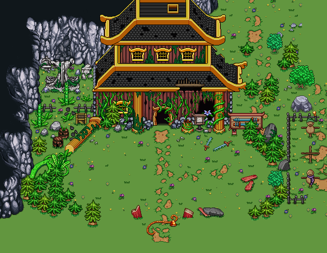
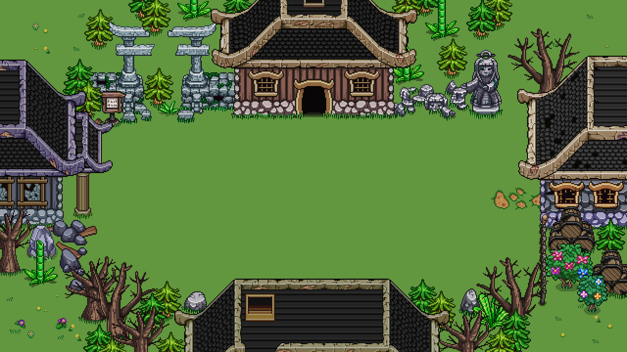
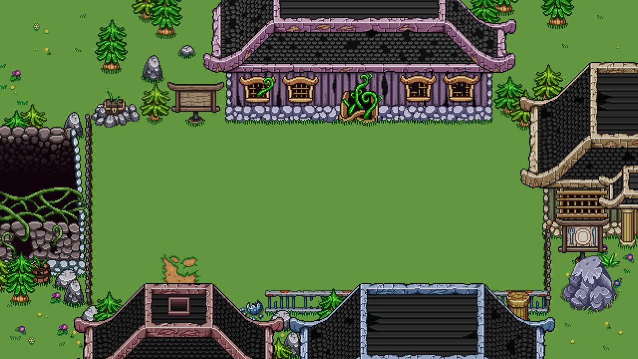
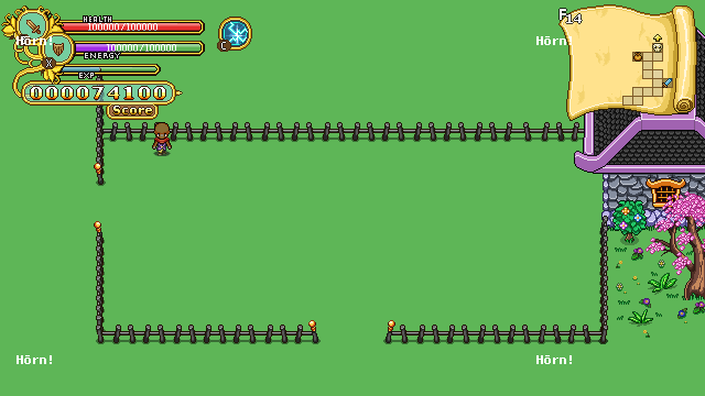
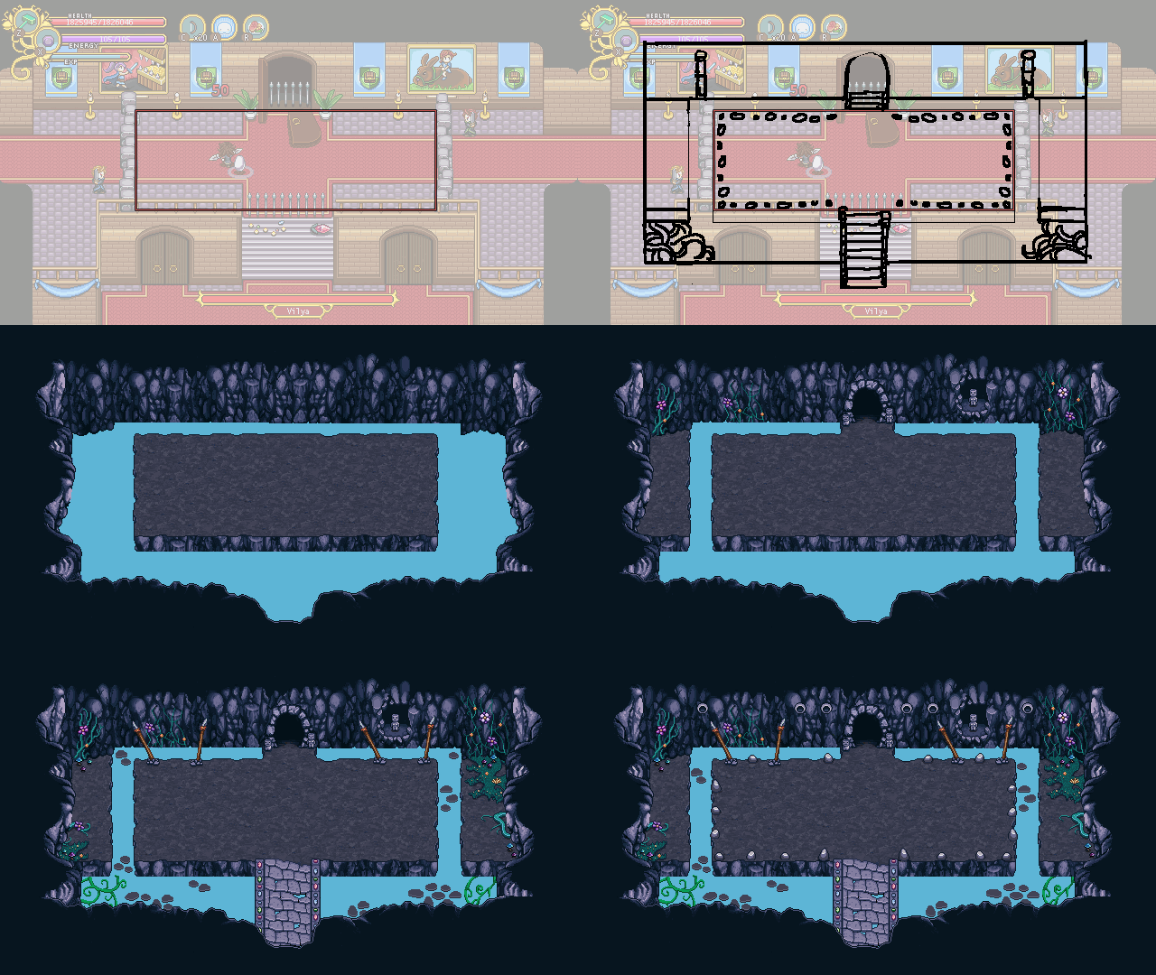
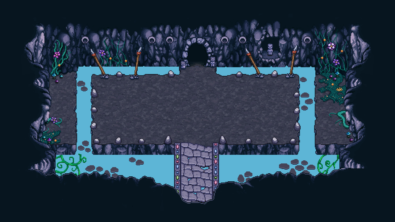
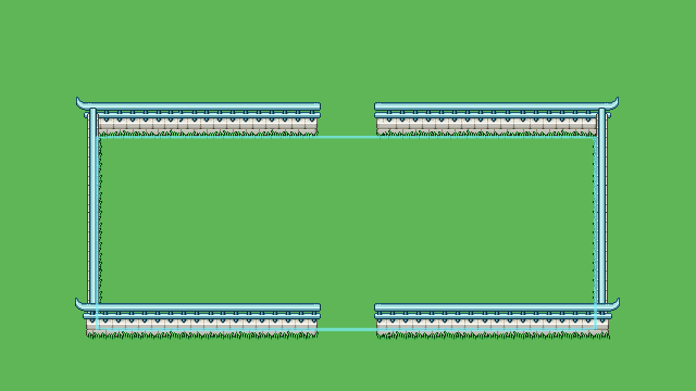
We’re back! Hope you guys have had a great holiday, a merry christmas and a happy new year! Now it’s 2018, and as we continue working on and implementing Arcadia rework, it’s only natural that our weekly meeting has a lot to do with establishing the smaller details of how everything will work!

Early Gold Quests
In order to quickly get your first building(s) up and running, we’ll add a couple early quests with gold rewards to speed things up and get your into the whole building thing as soon as possible! Some will probably be reused from old Arcadia, while a couple will be brand new.

Balancing Gold Rewards for Slow Builds
How much gold you get per run/room will be balanced is a tough one, because we don’t solely want it to depend on how quickly you clear rooms (even if they will play into it too, of course). Using only speed as an indicator would mean that certain builds, such as anything involving Insect Swarm for instance, would get a lot less gold vs the builds with faster clear times. To counter this, we’ll award extra gold depending on how long your active time on a run is, meaning if you play for a long while with a slower build, you’ll still get the proper gold reward that quicker builds get.

Build Time for Unlocked Buildings

Remember how I mentioned a build time that would count either IRL time or Arcade run time (or a mix of the two where time passes faster if you play Arcade Mode)? After some discussions, our current stance is that we’ll probably skip build times altogether.

This was a kind of difficult decision because we wanted to give players another incentive to play more Arcade Mode (play the game to unlock your building/unlock it faster)! However, you’ve already played Arcade Mode to gain the gold used to unlock the building, so it felt a little unfair that now you have to play the game more before it actually spawns, even though you already paid for it. Instead, we’ll probably use a fade to black effect with some building sounds before you return in front of your fully built property.

We’re still not 100% sure about this, and each of us actually have our own preferred version with the fade to black being the compromise. What would you guys prefer? Would build time be a nice or annoying thing?

A couple of Treats & Curses
We’ve only just begun planning for these, but here are the ones we’ve come up with so far:

Curse – Increased Elite spawn rate
Curse – No/Reduced healing (or both as two separate curses)

Treat – No Elites spawn at all
Treat – More HP from HP orbs
Treat – You start your run with a Time Crystal that rewinds time to when you first entered the floor if you should die. Meaning you get a chance to play through the floor again and fix your mistakes!
Treat – Increased chance of getting treasure rooms

Keep sharing your best ideas and we’ll see where we end up with all of these!

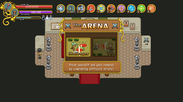
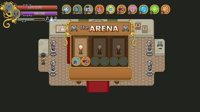
And now, time for more interface design, this time featuring the Arena! As a reminder, here’s what it looks like in Story Mode:

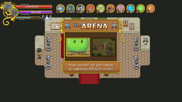
There are two categories, Challenges and VS. Challenges won’t be available in Arcade Mode, but there will be something else:

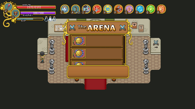
Boss practice! For those of you who have troubles with bosses, we know it’s really difficult and annoying to get chances of practicing against them as you have to survive a whole lot of regular enemies first. To give players a chance to polish their skill against these more difficult bad guys (as well as a way of learning their patterns), the Arcadia Arena will let you pick and choose among the bosses you’ve reached so far (no skipping ahead). When designing this interface, I presented two options: one featuring three bosses per page (with a scrollbar), and their name next to them:

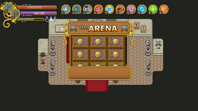
..and another, featuring just the boss images, with their title and description shown only in the text box instead:

It’s likely we’ll go for this second version as it has room for a lot more enemies and the text box won’t be used much anyway!

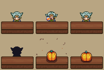
Once you’ve selected the boss you want to practice against, you’ll be presented with three character slots, featuring the last three characters who reached that specific boss, with their equipped weapon and main skill of choice shown beneath them:

This is so that you’ll have approximately the right level and equipment for the boss fight (as your current Arcadia character is level 0 with no gear what so ever)! It gives an accurate representation of the fight, as it reflects how you got there last time, and allows you to try out the fight with possibly different builds (if you change playstyle between runs).

Once you’ve selected which of your old characters you want to rebattle the boss as, you’ll be transported directly to the boss room for another go at the battle! Currently, none of these will cost gold or any other value, so you can practice as much as you like :)

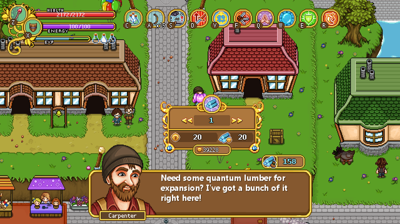
The next interface up on the design table belongs to the Bank and involves trading essence for gold, and gold for essence! For this interface we’ll use the Quantum Lumber interface from Housing as a base:

The main difference between the Lumber interface and the Bank’s interface is that instead of Lumber we’ll deal with Essence (obviously), and that you’ll be able to either buy Essence by handing in gold, or sell Essence and get gold back for it.

From the beginning we thought we’d deal with both in the same interface (calling it exchange instead), where you’d scroll right to get more Essence and less gold, and scroll left to get more Gold but less Essence (with a symbol for the respective currency on either side). However, we felt it’s probably easier to understand if we just call it Buy/Sell Essence and keep them separated.

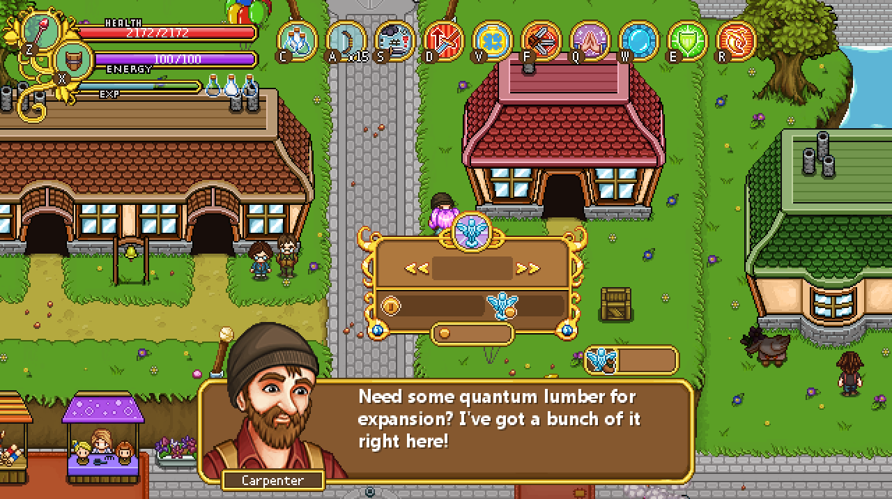
Here’s our first try at a modified version of the Lumber interface:

Here, the Lumbers have each been replaced by an Essence statue. The top box will contain a number indicating how many Essence you want to buy (or sell), the number next to the big coin will let you know how much that will cost you (or how much you’ll get back for selling your precious Essence), and the number next to the Essence-with-a-coin indicates the current exchange rate (which don’t change the way things are designed now, but we thought it might be interesting to know).

The small gold coin is next to your current gold total, and the Essence-with-a-bag shows how many Essence you currently own. Pretty much like it is in the Lumber interface, in other words!

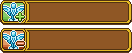
To make it more clear whether you’re in buy or sell mode, we made two variations of the above interface, one with a plus next to the top Essence icon (indicating this is the buy interface), and one with a minus (indicating this is the sell interface). There’s also a corresponding plus and minus next to the coin, to show whether you’ll gain or lose gold on the affair:

Finally, the shop menu (where you select Buy/Sell or Talk) needed two new buttons for this, so here they are as well:

Remember Trunk, the sidekick who will fill the role of (a more cheerful and optimistic) Bag in Arcade Mode? In order to communicate with you properly, he of course needs to have his own portrait:

The final version, slightly cut off to fit the text box:

Finally, there’s a bunch of NPCs made by Fred! Some of these have portraits that have been showed before, but the two on the right are brand new archaeologists that will be inspecting the old ruins and skeletons found in the desert!

Alright, back to business (ALSO SORRY THIS POST IS SO LATE! Scheduling got messed up again (I will set an alarm to check that it actually works, I promise)! As mentioned before, we’re at the point where we need to design a lot of interface stuff and decide how things will work together and unlock in terms of the new Arcadia rework features.

These include new interface indicator for gold, treats and curses when you’re running around inside Arcadia itself. Here we decided to combine Treats and Curses. Previously we said you could pick either Treats or Curses, and have three of each, but since then we have changed our minds: now, you’ll be able to pick and choose between Treats and Curses, but you can only pick 3 in total. It’s good to keep in mind that 3 isn’t a 100% fixed number at this point, we’ll have to try things out and see what feels good. The final number could be anywhere between 2-5 (is my guess, anyway).

We haven’t actually decided on which specific Treats or Curses to include yet, so if you have any cool ideas, feel free to share them with us! As a reminder, Treats are features that will make an Arcade run easier, but lowers your score, while Curses make your runs harder and increases your score!

Selecting Treats/Curses at their respective NPC will need a menu of its own too, as will the Cinema’s replay feature (where you’ll be able to view past runs), the Bank exchange service (where you can convert Essence to Gold and the other way around), and Master Ji’s challenge selection (where you pick which of his shield-focused challenges you want to try). We also need to come up with the challenges the latter will have.

The Arena will mainly use the interface from Story Mode, but we will also need a menu where you can select your last three characters that reached any boss in the game and have a go at the boss again. Here, we’ve decided to keep the Multiplayer mini-games, while the single player ones will be replaced by the boss-rebattle feature. Our reasoning here is that it might be fun to be able to challenge your friends to mini-games in the Arena without having to start Story Mode (since we have the arena anyway, you know), while the single player portion of the Arena doesn’t make as much sense to keep and works better in Story Mode alone.

There’s also another matter we need to discuss, and finalize: whether the build time of unlocked buildings will count IRL time, the time you play Arcade runs, or both. Last time we talked about this we could not decide, so now’s possibly your last chance: what would you prefer? To wait a short while regardless of what you do, to have to play arcade runs for the buildings to finish, or to be able to shorten the waiting time by playing arcade mode?

Let us know what you think!

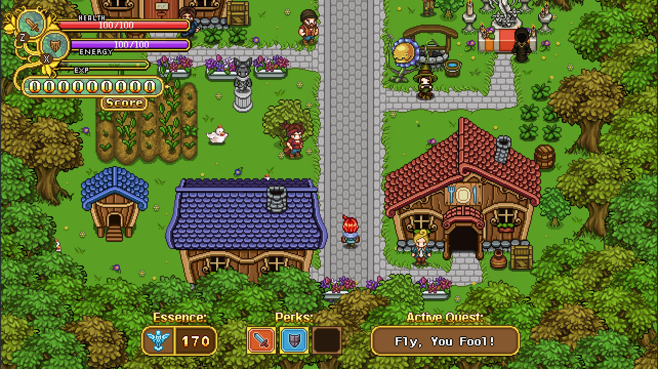
So, time to get those new interfaces going! First up, the main interface as you run around Arcadia. Here’s the old version of the interface:

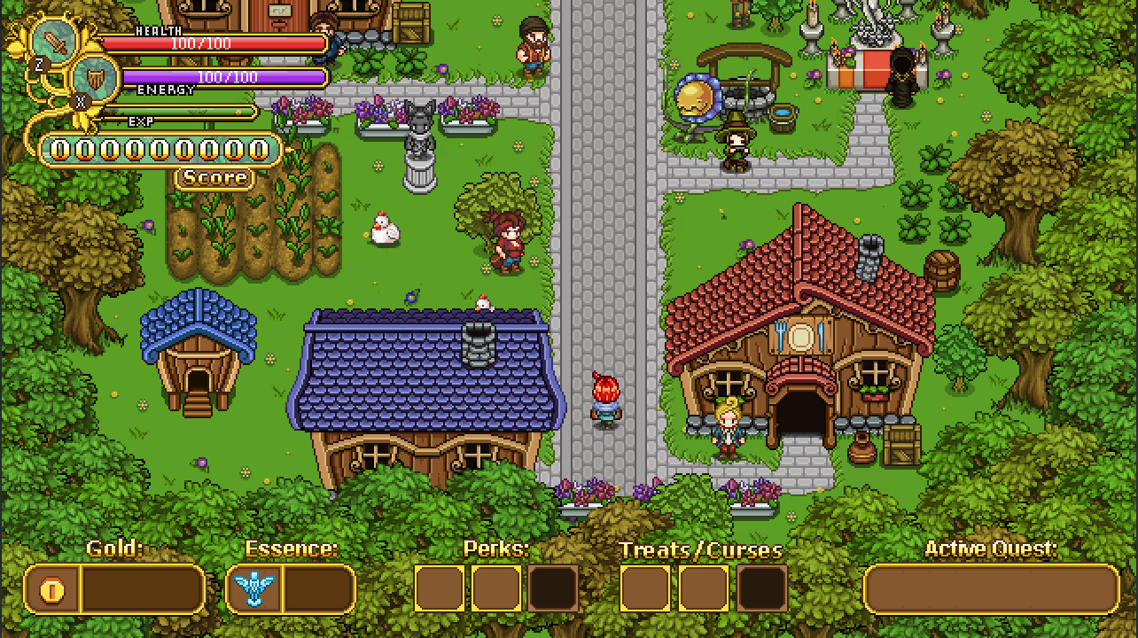
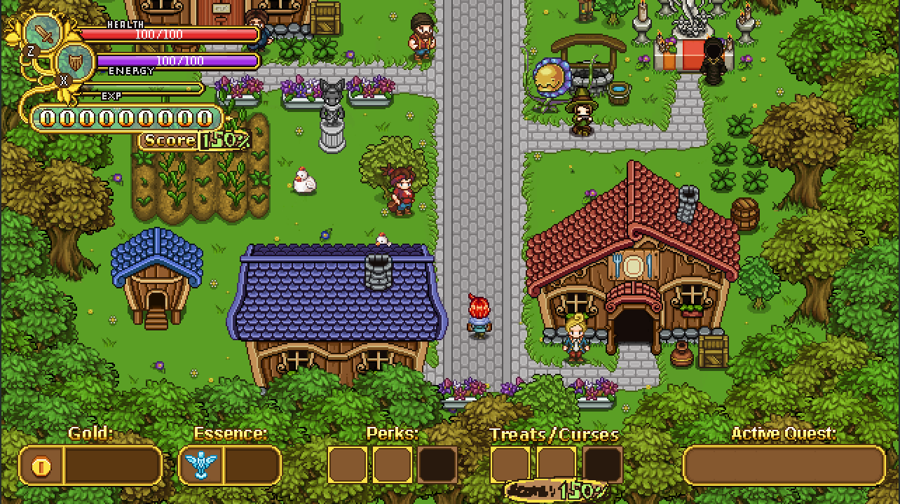
And here’s a basic suggestion with a new gold indicator and slots for Treats/Curses:

Now, the treats and curses will affect your score multiplier by a certain percentage each: either they’ll increase your score or they’ll reduce your score. More score equals more rewards (and a higher place on the high score list!), so we felt it was important to include this in the interface somehow. Here’s a quick sketch featuring the score multiplier increase both next to the score and next to the treats/curses:

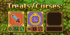
While we liked the idea of having the percentage show next to the score counter (that way it can show all through your run as well), we weren’t sold on having an exact copy of it next to the treats/curses. Instead, we thought maybe we should separate them and show how much each of your curses or treats actually subtract or add to your score:

As of now, we still haven’t decided whether we want to include the above version or just keep the cleaned up score multiplier next to your score (as seen below). Do you think you’d prefer to see how much each score adds/subtracts, or is that unnecessary information that only clutters up the interface?

Next up, we’ll continue the interface business by taking a look at the interface of one of the more important new features: Treats and Curses!

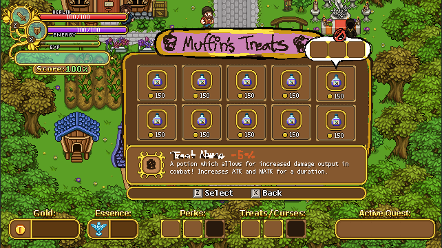
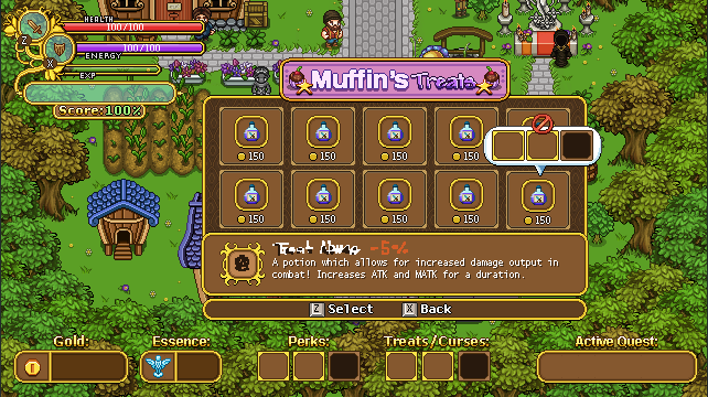
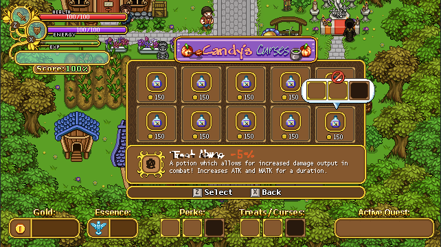
For this interface the important part is having enough room for a bunch of treats/curses, with a text box featuring a description of each treat/curse, a title bar (so you know which interface you’re in), as well as some way of letting the player know when treats/curses don’t work together – for example if you have on treat that disables all elite enemies along with a curse that makes them more likely to spawn.

In the above sketch I used the potion interface as a base. There will be a few key differences though: for one, it won’t cost you money to change curses/treats, at least not the way it’s currently designed. If you’re currently hovering over a curse/treat that won’t work with the ones you have selected currently, a speech bubble popup will appear with a stop sign, showing you which ones are incompatible. Next to the curse/treat title in the text box will be how much score will be added or subtracted to your score, in percent.

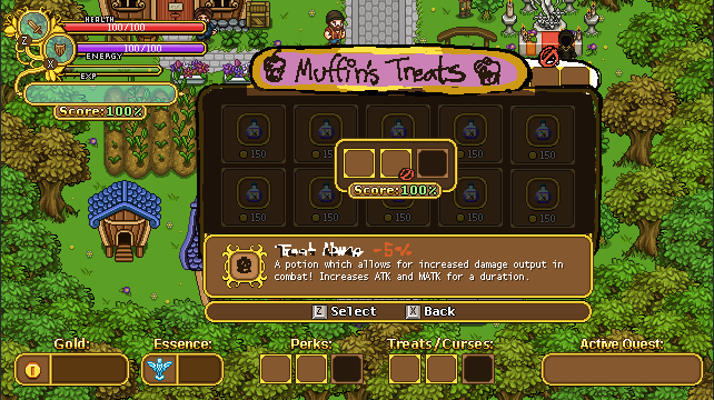
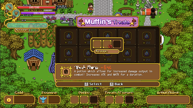
Once you select a curse, a new interface will pop up where you can select which slot you want to add the curse/treat to:

In this interface there will also be a total score counter showing how much your total score will be with your selected curses/treats. In the sketch above there’s another stop sign next to the incompatible curse/treat, however this will likely not be added to the game: instead, if you try to select a curse or treat when you have others selected that wouldn’t work with it, there will be a prompt asking if you’d like to remove the ones that are incompatible with the one you’re trying to select. If you answer yes, the above interface will pop up with the incompatible curses/treats removed: if you answer no, you’ll remain in the curse/treat selection screen.

Now, time to freshen up the graphics a bit:

Here I’ve added some proper graphics to nearly everything: Muffin’s Treats has a title sprite, the pop-up speech bubble indicating which curses/treats are incompatible has been added, and the background is properly made as well. The text I haven’t touched though, as it will be added properly with the game engine.

Next, same thing but with Candy’s title sprite:

And finally, the screen where you select which slot to add your selected curse/treat to! Again, the stop sign will probably not be used the way we ended up designing things, but we hadn’t finalized that by the time I finished making the graphics:

Next, a quick portrait, with and without hat:

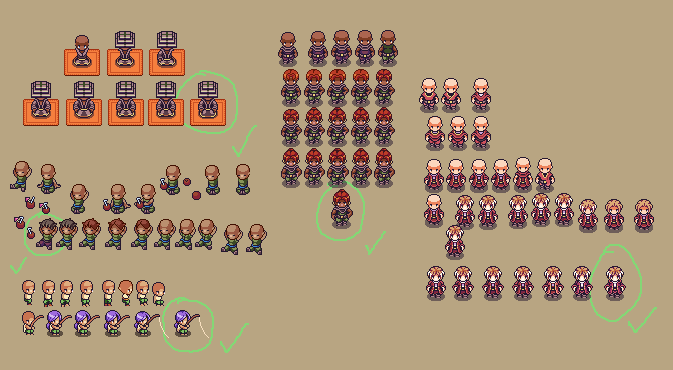
And Fred’s section of this post features a return to the desert and more of its inhabitants! Here’s a whole bunch of the iterations for four of the characters you’ll meet in the harbor town, with the final versions inside each green circle:

…And an animation for that poor winter fae, who has been lured into the desert by his friend! Poor thing is suffering from the less than ideal weather for a winter loving creature!

With only a few days left before Christmas, we’ll take a small break and will return on January 1st! No weekly recap next week, in other words, but we’ll make sure to post a happy holiday post to cheer you all on over the holidays :) In the meanwhile you can sneak a peek of what will be shown in the recap of Jan 1st over on my own workblog! Until then~

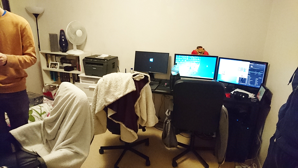
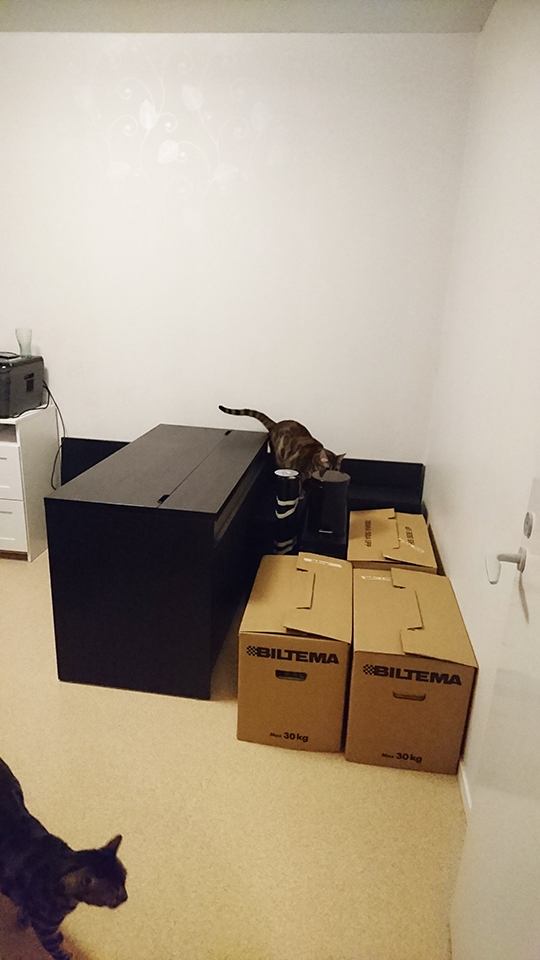
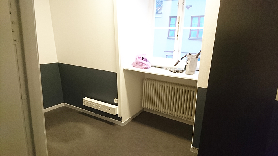
We’re in our new office!! Last Wednesday we finally made the move, but we had already started preparing the day before. Here’s the old office in our apartment’s guest room, as it used to be, and fully packed:

The saddest thing we’ll be leaving behind is the cats! It’s been so nice to be able to spend all day long with our lovely two cats, who will have to wait alone at home for us to return from the office every day now ;_;

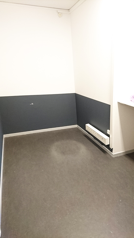
Yesterday, the moving company knocked on our door at 8 am, ready to move our stuff. The whole thing took about an hour, plus another 30 minutes of putting everything together at the new office, here pictured empty:

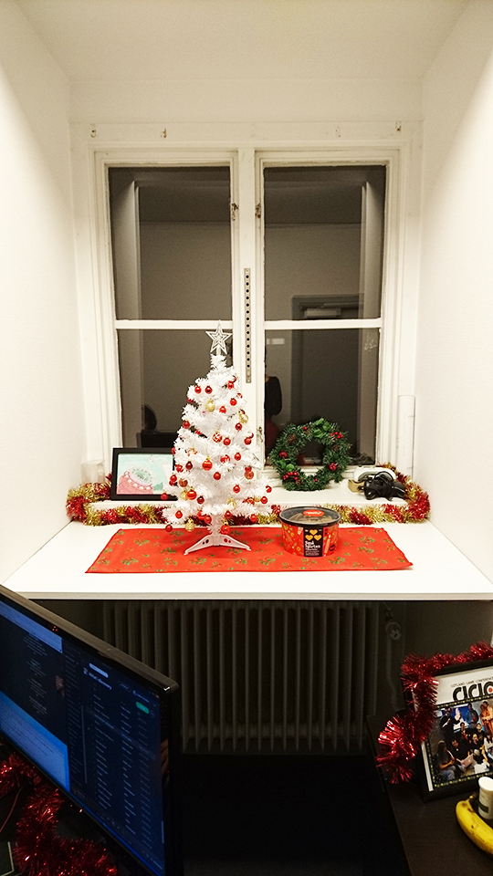
After we were done, we went to have lunch and went by a couple stores to buy a few things to make our office more cozy: a few plants (fake, so they won’t die if we have to leave the office for a few days), a clothes hanger where we can put our coats, and a few decorations for the window (including a cute little christmas tree):

The whole place feels very cozy now, and we’re very happy with the space. At first we thought it might be a little on the small side, but we’re really satisfied with the amount of room we have and how comfy we could make it.

The only sad part, as mentioned, is leaving behind the cats – but the walks and ability to separate work and free time should be worth it! Already work feels much more focused and distraction-free, so that’s great :)

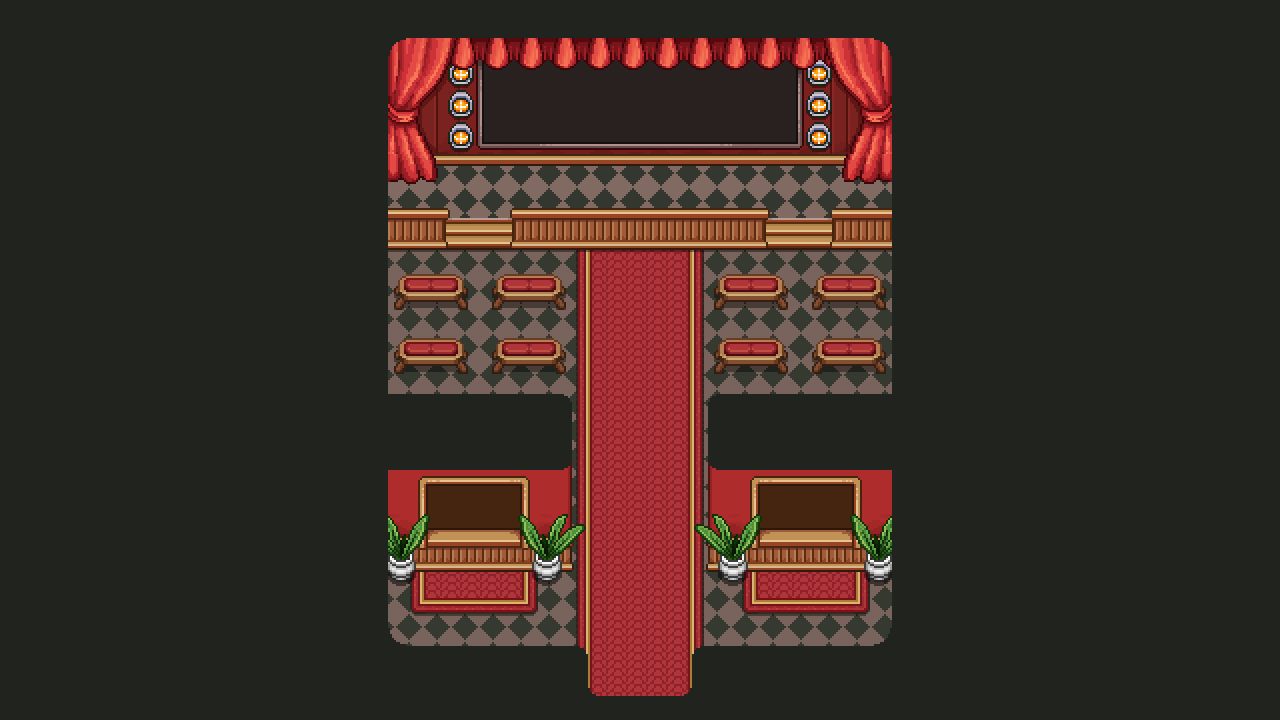
Now, let’s jump straight into continuing the interior spree of the Arcadia Rework! It’s time to take a look at the Cinema, another of those brand new buildings that don’t exist in Story Mode. Here, you’ll be able to watch replays of your previous Arcade runs, and even share them with your friends.

While most of this will take place in one of the ticket booths near the entrance, we couldn’t resist adding a bit of a cinema feel with a big screen and some seats for flavour. Perhaps some NPCs will be here, watching a short movie on screen? Maybe some of them will even offer a quest of two!

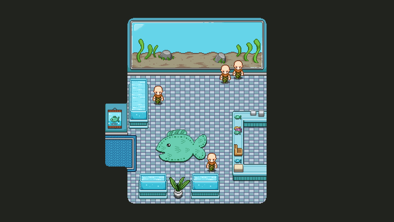
The second to last interior before all the interior designs of the new and improved Arcadia are completed, belongs to the Aquarium! This place will feature a set of fishes that you captured during your run, as well as the typical souvenirs:

In the sketch, I included a set of fish shaped balloons, but I think we’ll let Fred make those from start to finish since they will need to be animated to really have that proper balloon feel! For now, here’s what the Aquarium looks like, sans the proper fishes and mentioned balloons:

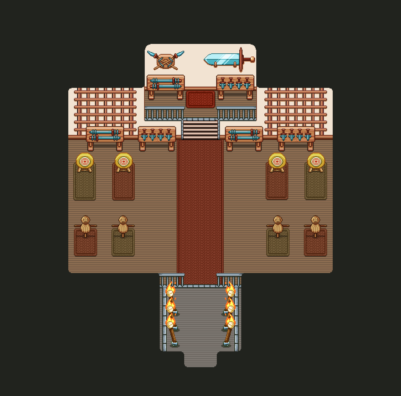
And now, the final part of the Arcadia rework (interior wise, anyway): the Dojo interior! This is another building that exists in Story Mode, and may have its old version replaced by this new Arcade version. It’s designed to have a big enough fighting area for you to prove yourself in a set of challenges, as well as a shield block training session we may include in the earlier parts of story mode: we’ll see!

Without further ado, the WIP video:

And the finished version! I thought it’d be cool to save some space at the bottom where Master Ji’s apprenticed can stand and watch/cheer for you as you do your challenges! In the section above, the master himself will spectate your progress:

As for Fred’s department…. It’s time to introduce a new character of quite some importance: the Trunk!

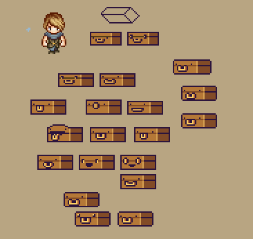
This little guys will be the equivalent of Bag, but for Arcade Mode. We didn’t have a character like this in Arcade Mode previously, but the more we thought about it, the more we felt it was lacking somehow. It kind of felt strange to have bag say random things when he isn’t even a character in this part of the game, and as we start to get to the point where we need to design how to unlock the new features, we felt a sidekick that can help you understand how to do that felt more interesting than random info boxes.

Aside from being your sidekick in the Arcade Mode portion of the game, bag and trunk have very little in common, though! This little fellow is cheerful and happy, excited to be a part of your adventures. (Well, maybe Bag is too, but he doesn’t show it half as well as this one!)

Stay tuned for more information about this new character and how you’ll interact in Arcade Mode!

Whew, after close to one week in bed sniffing away with the flu, I’m actually feeling alive again and more than ready to get back to work! Unfortunately I cursed Teddy with the flu as well, so he’s been down and out for a while too… Fred seems to have remained immune this time around!

Because 2/3rds of the company has been unable to do much work the past week, there aren’t much in terms of news! We are drawing ever closer to being able to move into our new office space though, so that’s super exciting and we’re all looking forward to it (and have already begun planning how we’ll move everything and changes we need to make to make it all work for us).

As I mentioned last week, the office is actually already available to us (since Dec 1st), but we’re waiting to move in until the 6th (this Wednesday) when we’ll get helped by a moving company. Since we don’t have too much stuff to move but the items we do have are quite cumbersome to transport in the tiny car that’s available to us – in fact we don’t think the larger of the two desks will fit in it even if we unscrew the whole thing- we decided for our peace of mind it’s probably better to hire a couple guys to move it for us. Less risk of us dropping and breaking stuff, and having to solve how to transport a much too large table.. Carry it to the office by foot, a healthy 50 minute walk…? Hmm.

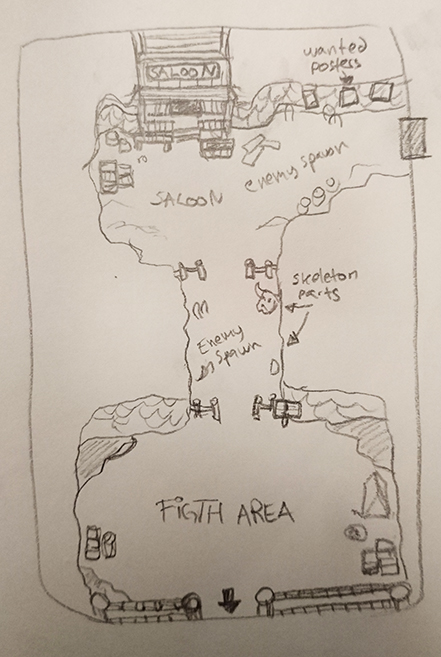
Now, I’ll be getting back to work properly today, and have already started off by sketching what the final desert map will look like (ignore my amazing misspelling of fight…):

The are three important areas in this map. First, the entrance to the city, indicated by the arrow pointing downwards. Second, the battle area in front of it, where you’ll battle a mini-boss and possibly some random enemy spawns. Third, the Saloon in the top part of the map, home of the shady people of the country. I want to make wanted posters in the surrounding area, featuring the gangsters you’ll meet in there. Maybe you’ll even run into a set of suspicious ferrets again…

The rest of this week will, however, be focused on finishing up the new Arcade Floors (some minor things remaining), and after that I’ll do the last interiors for the Arcadia town rework – just a few left! Once those are done we’ll start designing the new interfaces needed to get all the new systems up and running, and then test, test, test before we’re finally ready to release it all to the public! We’re very excited about the rework and though it’s a little while left before it’s 100% ready we hope you are too :D

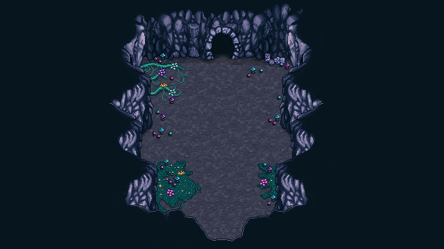
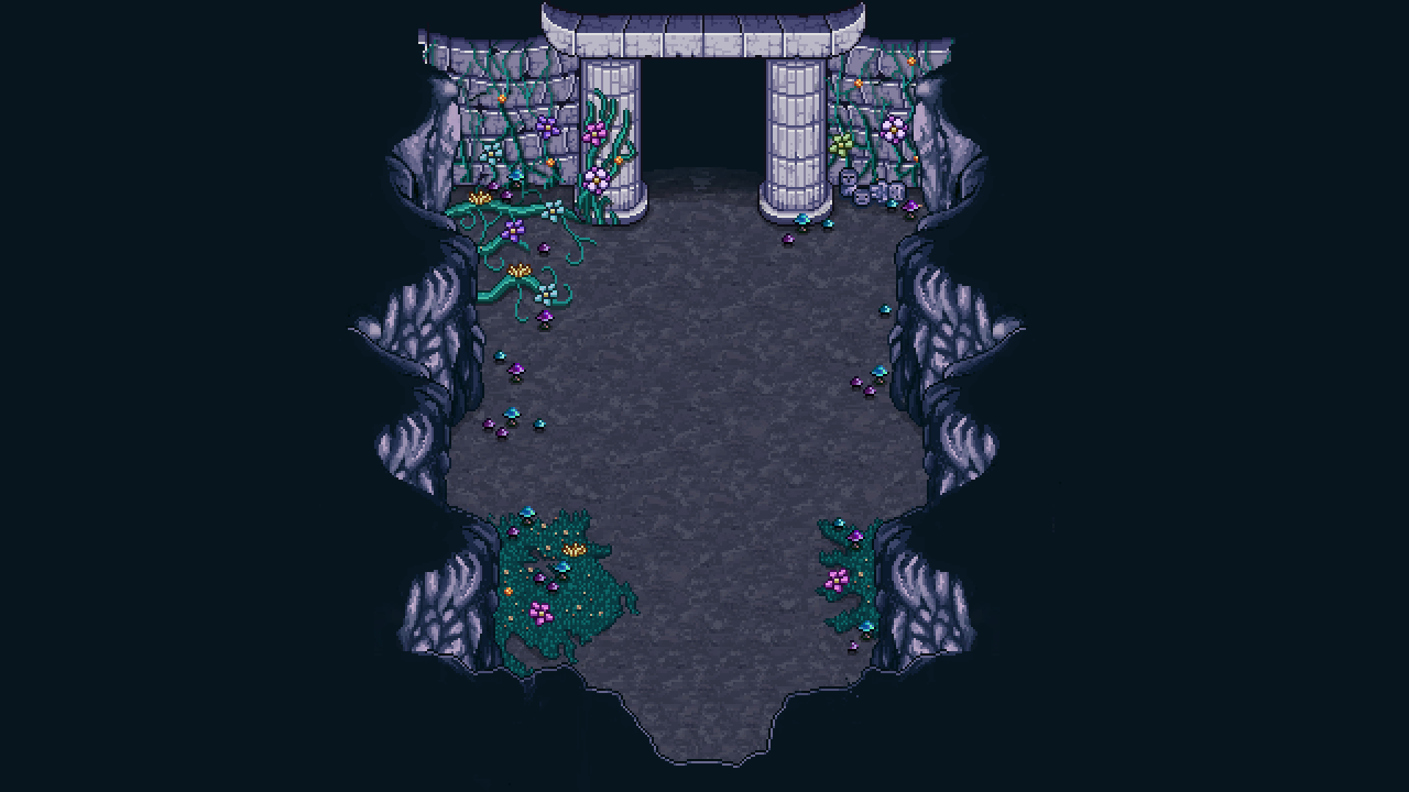
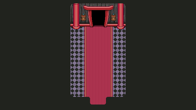
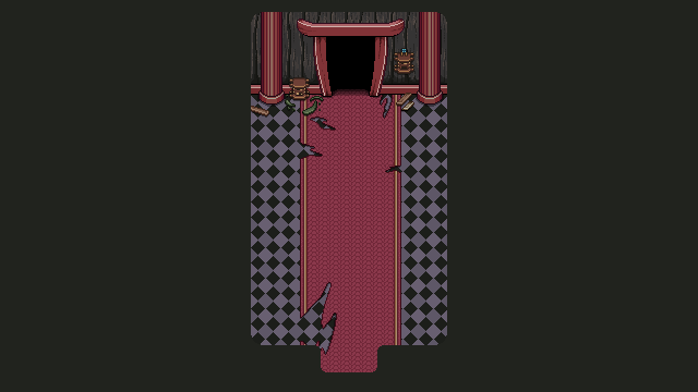
So, time to finish up those Arcade floors! There’s a couple of pretty important maps missing from both the Tai Ming and the Mount Bloom floors that need to be added before they are truly complete: the score counting screens!

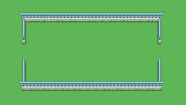
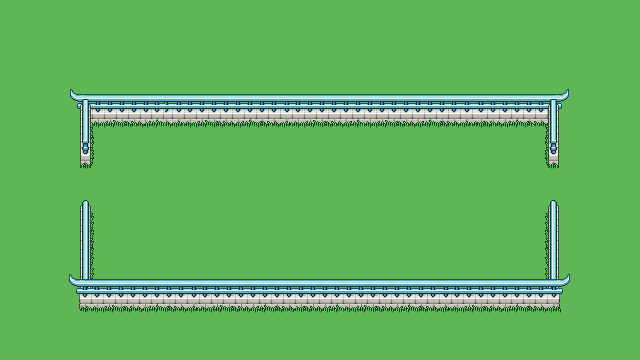
Whenever you finish a floor in Arcade Mode, you’ll run through a corridor of some sort while the game shows you your current score and how well you did in each room of the floor. These corridors are either connecting two floors of the same area, or serve to connect one type of floor with the next. The first corridor shown above is the corridor that will bridge the two Mount Bloom floors, while the second leads the way into the Tai Ming floors.

Below you have two types of the same corridor, one for past and one for present. Which one you’ll pass through depends on what boss you fought against. Meanwhile, when you transfer from Tai Ming to the desert maps, you’ll simply walk through a door from the Mimic room.

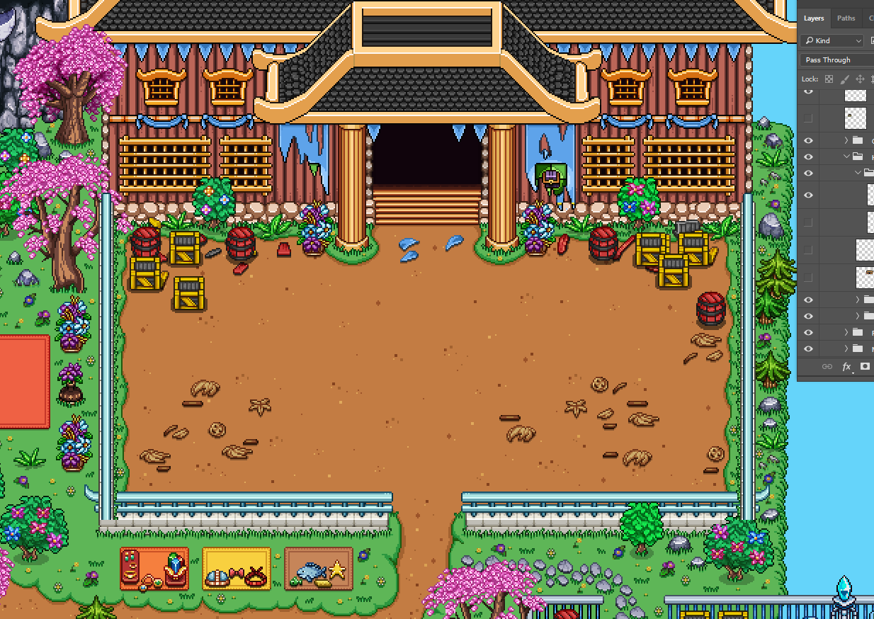
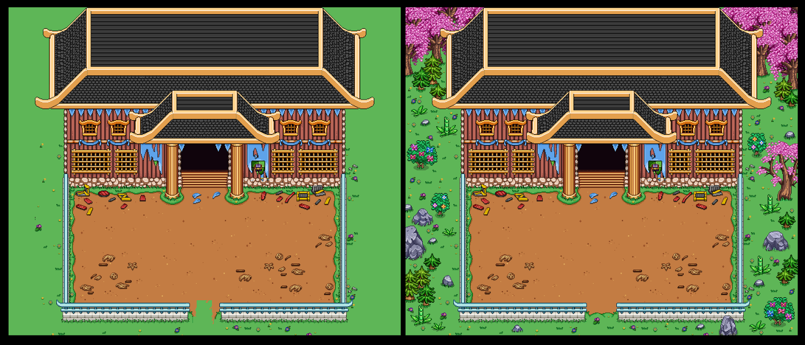
In order to have a proper exit from the above corridors, I had to extract and polish up the entrance/exit to the courtyard used in story mode and make a version of it in both timelines as well:

Finally, some minor changes to one of the boss rooms (the Arcade Mode version, that is):

Instead of having to limit ourselves to having this boss appear after going through a mountain wall, we decided to remove the lower mountain part and adjust how things were placed slightly, so we can put a regular fence there instead (and as such be able to place the boss map anywhere on the map rather than along a mountain). In order to do this we also had to repaint the lower parts of the vertical mountain wall, as can be seen in the second picture.

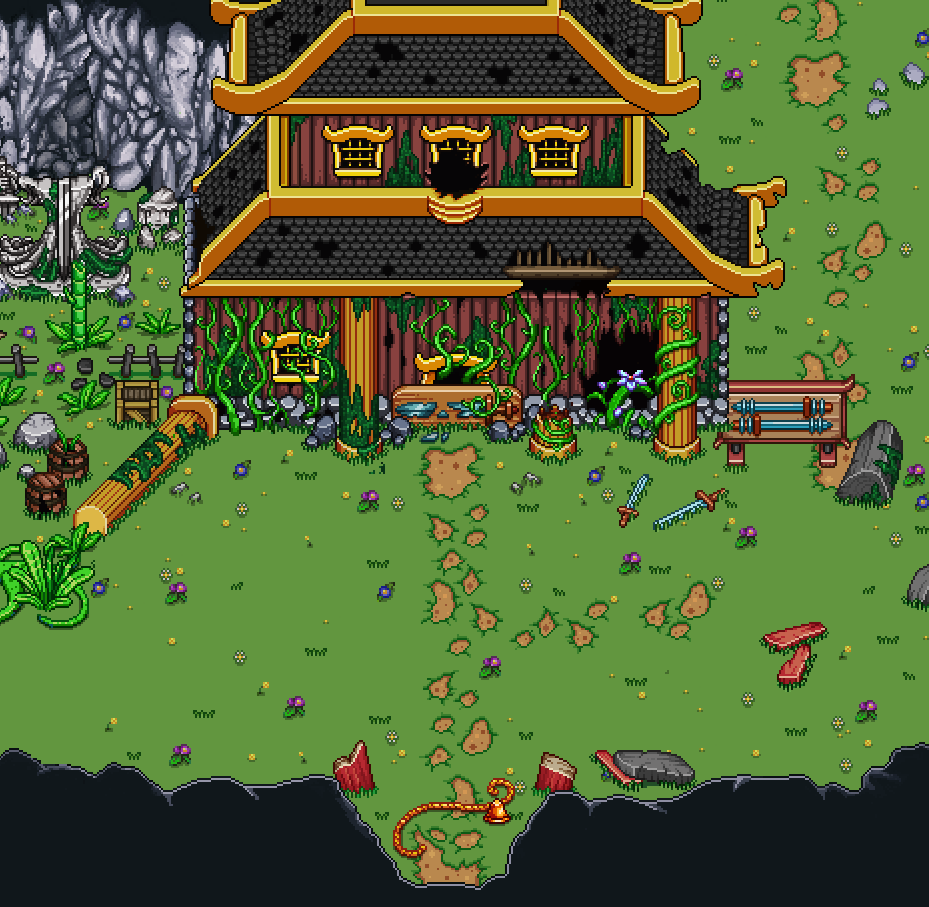
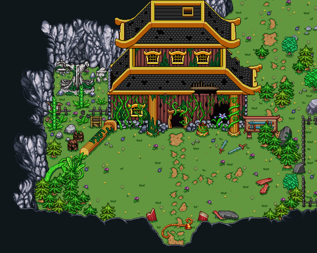
Now there’s just one more thing to do before these floors are fully complete (unless I’m forgetting something)!! And you guessed it, it’s turning all those polished and clean Past props into their present, ruined versions!!

Actually, since we decided each room will only be available in one of the timelines, I decided to not do exact replicas of some things, such as the buildings. With these I felt it’d be more interesting to bring in more designs to create more variations.

Here’s a few of the buildings that might appear on your run:

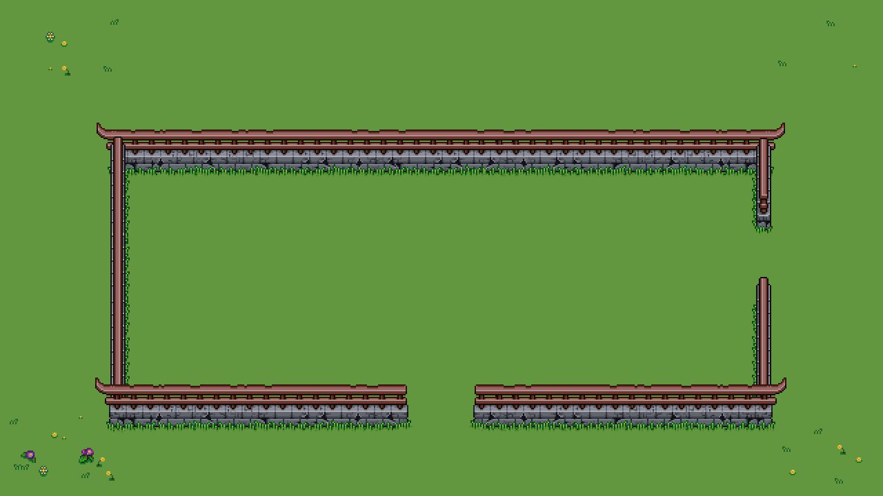
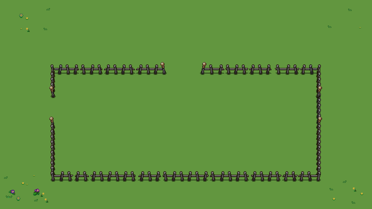
The fences were more straight forward, just make a ruined, old-looking version of each part:

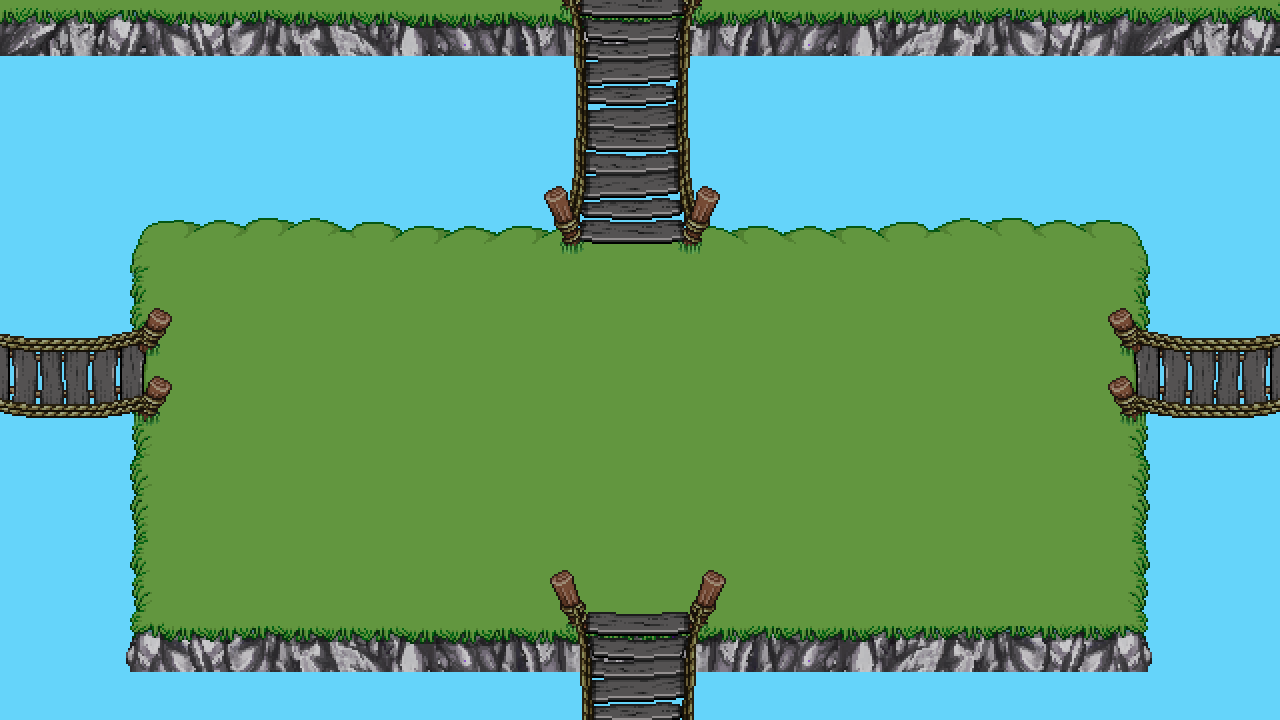
And finally, the new (very old looking!) bridges to connect islands or help you cross over streams:

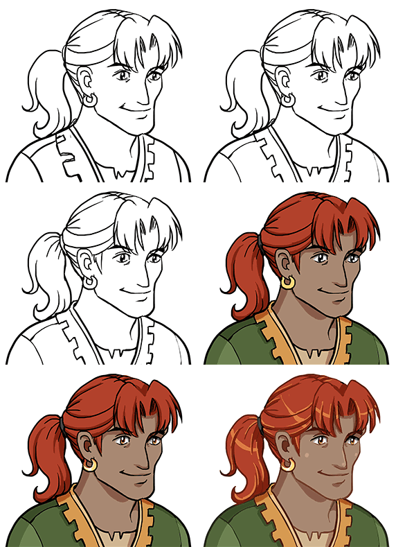
Okay, now that the new bunch of floors are properly completed, let’s celebrate by taking a quick break from Arcade Mode and make another portrait featuring yet another sailor (can’t have too many of those in a harbor town, right?):

And the finished portrait:

Meanwhile, Fred has moved on from fishes and started making a ton of NPCs for the desert! Here are some of the ones you’ll meet during your adventure:
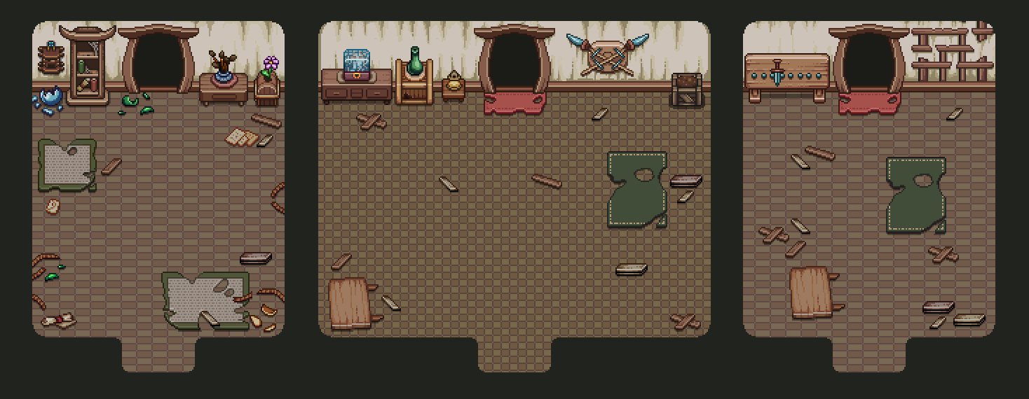
This week it’s time to move on to doing some interiors for the Tai Ming arcade floors! Since Tai Ming is a town, it would be kind of weird to not have any houses you can go into, so we decided to make a few variations!

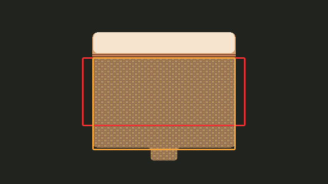
First up, deciding on the sizes (paying extra attention to the user interface limitations this time):

Starting off with the wider of the rooms, I add some basic walls and floors to create a shell we can use to decorate these interiors in various ways:

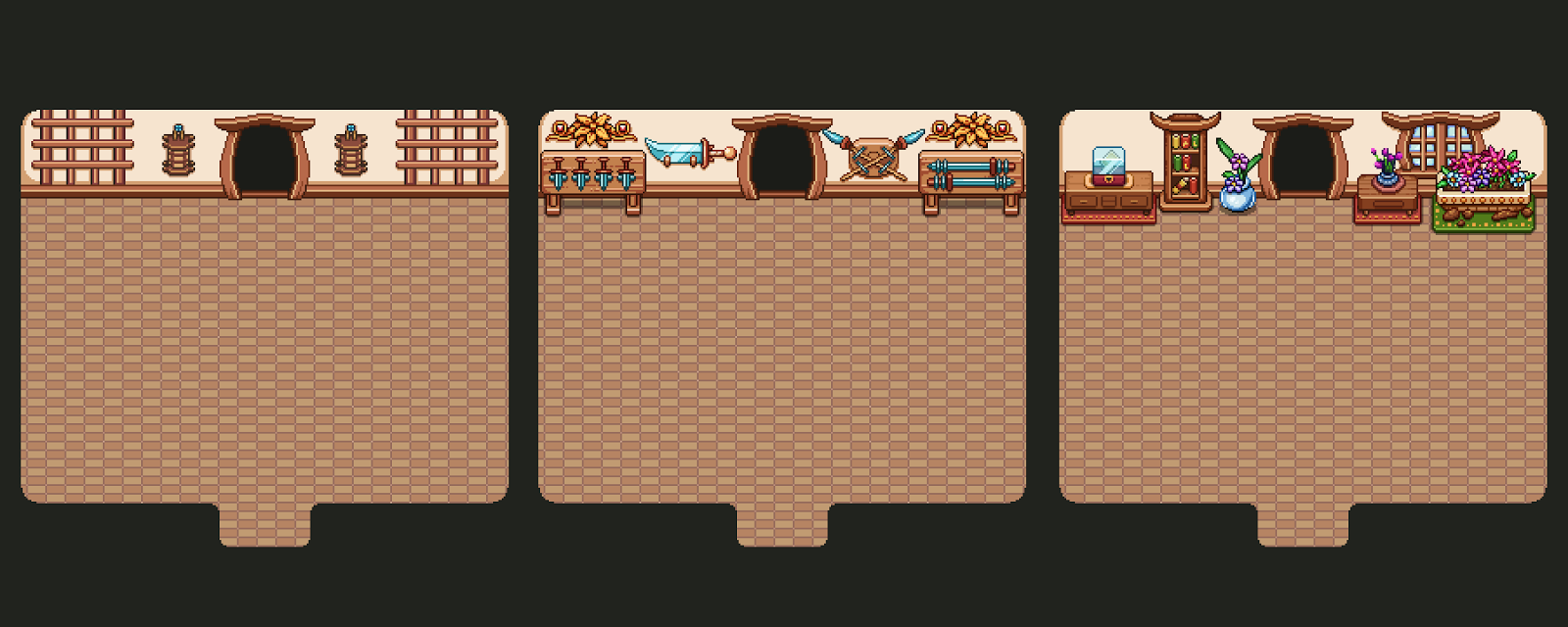
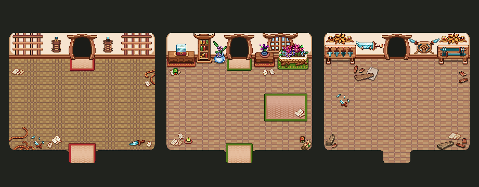
First up this entails wall decorations! For this shape, we have three variations of what the walls can look like:

…and they in turn can be combined with three different floor layouts:

Using these six types of decorations, we can mix and mach and create quite different rooms, even though the shape is the same! As you can see, we also added another type of floor texture to mix things up even more:

And then, it’s just doing the same thing all over again, but with the smaller version of the room:

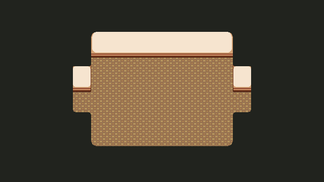
Now it’s time to make a bunch of rooms that go in the other direction (horizontally)! Starting off in the same way, deciding on size and adding the basics:

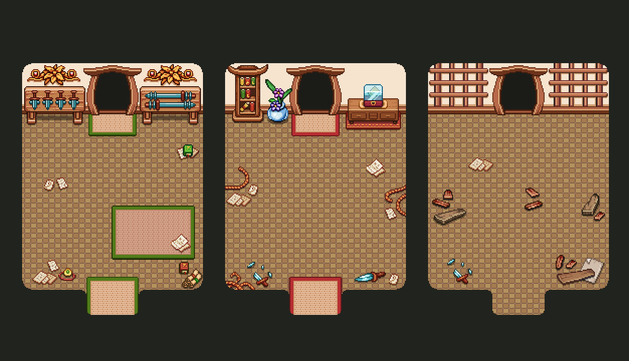
Then adding a bunch of wall and floor decorations:

And here are some mix and match examples of what these houses can look like:

While there isn’t a ton of variation, there also won’t be a lot of house interiors, and even if there were we think it’s probably not going to look too much the same (especially when you compare it to previous floors, which were all very basic and same-looking)!

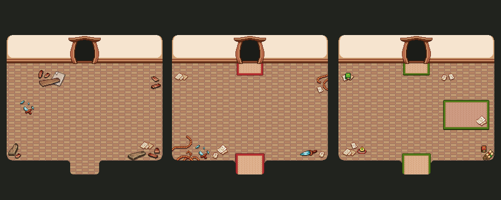
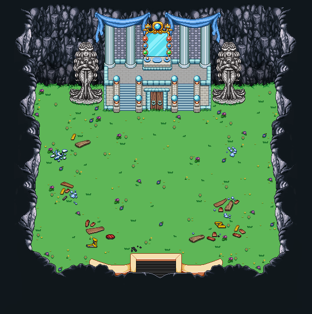
As for the final part of interior creation for these floors, there’s of course turning everything into its present version, ruined and forgotten!

Some of you may remember a discussion we had about whether the player would pass through the same rooms, once in past and once in present, or whether enforced time warps between rooms would determine whether the next room is past or present (and as such only available in that state).

Back then we were more into the idea of reusing the same rooms and showcasing them in both past and present, but since then we’ve realized that having the rooms isolated in either a past or present state is more time efficient, and in the end, may be more straight forward for the player as well. In the earlier version it would mean there are two states of the map at the same time, with different room types in them (challenge rooms and the nurse, for instance, would only be available in one of the states and you’d have to travel back and forth if you wanted to return to them after changing time).

So, with that decision, it opened up the opportunity to make even more layouts for the present type rooms, allowing for even more variation!

Here’s some of the wall and floor decorations:

And here’s a bunch of mix and matching, showing all types of rooms:

One step closer to finishing these arcade floors, wohoo! :)

And now, moving on to boss rooms! Each of our bosses are in rather special places, so instead of just sticking them into random rooms, we decided to edit and adjust the areas they are in to fit the Arcade version instead.

Starting with the Mimic, it’s pretty isolated in it’s own room, so technically we could just have had it appear inside a random interior. However, since we want to show off that the Mimic is coming (in more ways than simply having the skull map indicator for those who are looking), we decided to bring in the entrance to his lair from the game:

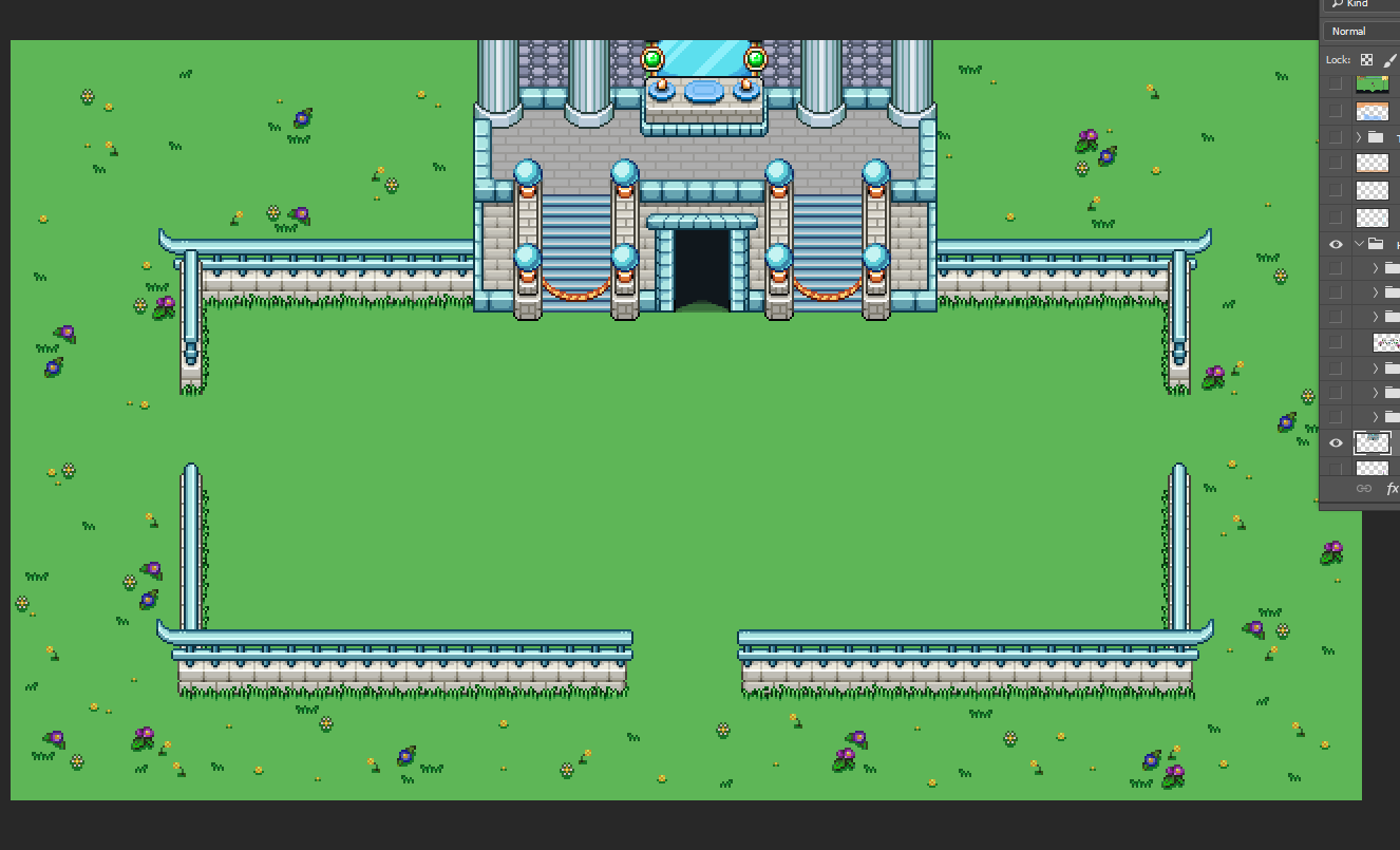
Of course, a few adjustments were needed. For one, we didn’t want to use the whole map, so we extracted the building part, removed the door, and added ropes to keep you from going up the stairs:

Trying it out in photoshop, it doesn’t look too shabby when you connect it to the stone fence:

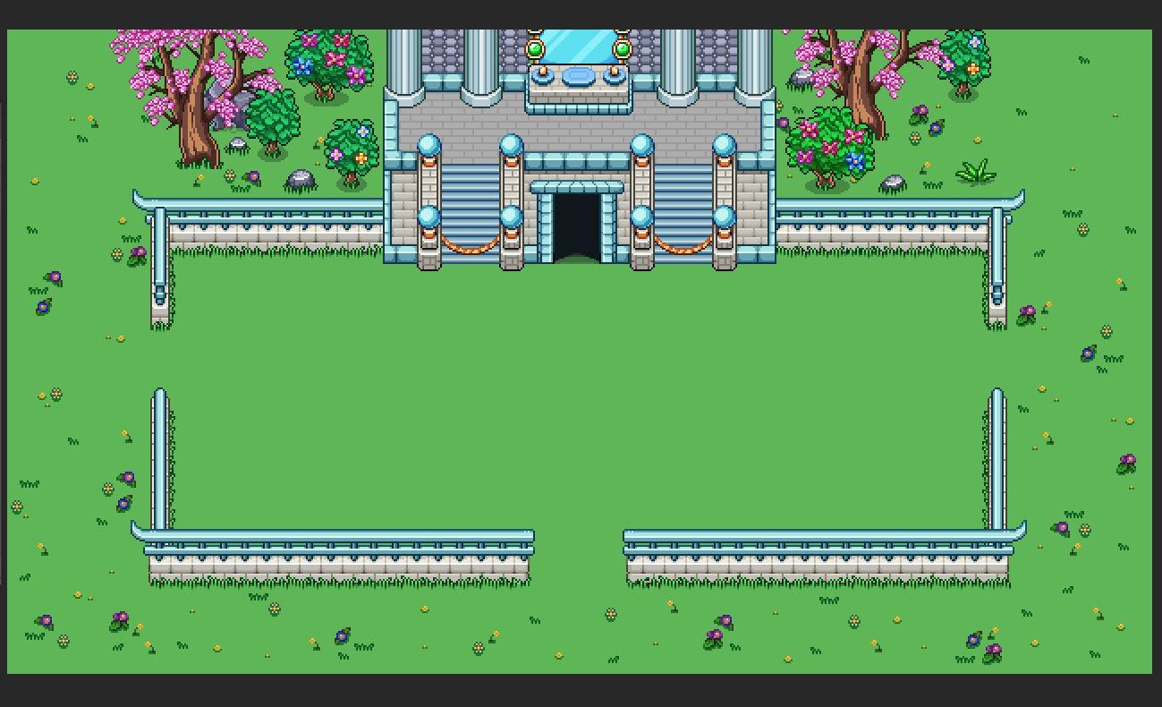
We also added some specific decorations for when this room appears, so that nothing will get cut off:

As for the Thorn Worm boss, its arena is pretty set in the middle of town:

…But we extracted the whole building and made it a map of its own, removing all the distracting surroundings and fixing things that got broken in the move. Here, too, we added a bunch of decorations surrounding the battlefield, and you’ll be able to exit to the next floor by going through the big door:

As for the third boss, the Priestess…

…we use pretty much the same method! Extract the whole area, remove things that are unnecessary to the fight and fix any things that need fixing. In this case there was no version of the building with an open door, and since we want the player to progress into the next floor through its interior, I had to repaint the area surrounding the door to make it open:

Now we just need to make a corridor that you will run through in either past or present state depending on which of the bosses you faced, in order to reach the next floor!

Meanwhile, there’s one more week of fishy updates, but this is the last one! With this post all the fishes have been animated and are ready to be added to the aquarium:

Now that those are out of the way, Fred can finally go back to creating NPCs for the desert, which is what we’ll be diving into as soon as we finish up our Arcade Mode business. There are still quite a backlog of portraits I’ve made over the months for random character that will live there, so he has his work cut out for him for a while!

So a really long time ago by now, we started working on the Tai Ming floors. Or rather, I made a bunch of graphics for them and awaited a chance for Teddy to add them to the game for testing. Now, a hundred years later when we finally finished a ton of other important stuff, it’s time to dive back into the actual Arcade floors again, and it begins with fixing a bunch of errors.

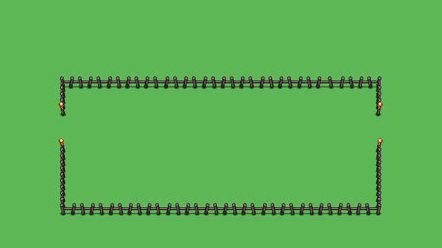
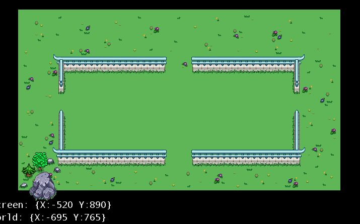
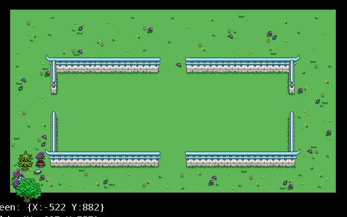
To start off, the first thing we noticed when adding things to the engine was that I had somehow failed making the openings in the two types of fences the same width, which creates a bunch of zoning problems….

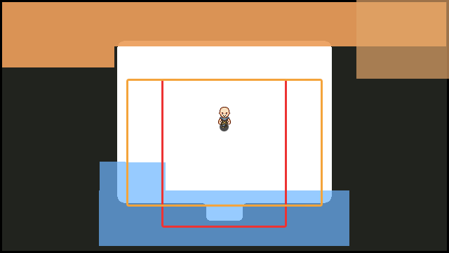
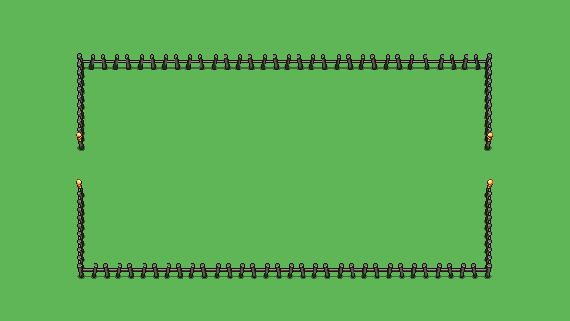
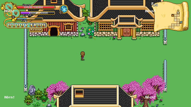
….and secondly, all of us had completely forgotten how much space the interface takes in in Arcade Mode compared to Story Mode. If you take a look at the screen below, you can see a lot of the fighting area is covered by the map and score board:

Not exactly ideal… SO, two kind of major things for me to fix: one, make sure the fence openings are equally wide, and make the fight areas smaller so they won’t get covered by interface (we certainly don’t want anyone losing precious score because an enemy was hiding behind the map):

The above changes may not look like much but it makes all the difference in the engine! As you may notice, the exits are no longer in the middle of the fence, but further towards the top. This is to save Teddy a ton of work, as he had already implemented the zoning for each of this exits, and would have to manually change them after the fence resize. As such, we decided keep them slightly higher and save the work. It may not look 100% ideal but I think in the heat of battle nobody will really think much of it.

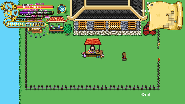
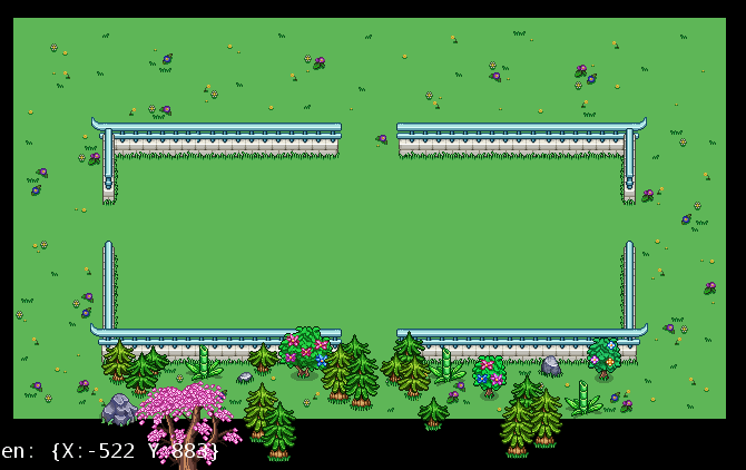
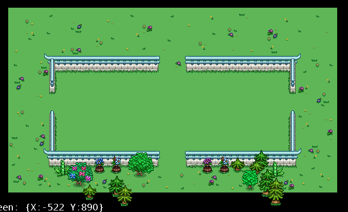
Now, here are a few more screens showing what things look like in the engine so far (using my still not fixed graphics at this point):

As you can see, there’s a lot of stuff missing still, but the core is getting there (it’s basically playable, just not polished graphically at all). Next up I’ll be making a bunch of decorations for the area around the “room”s: grass decorations, randomized trees and rocks, etc. Once everything is added I think this will actually look quite nice!

But before moving on to more Tai Ming floor stuff, I wanted to finish a rather important boss room for Mount Bloom’s arcade floors: the one where you’ll battle the Black Ferrets (the awesomest trio in the game, am I right?!)

As you may know, this battle initially takes place inside the HQ, but will now be in Mount Bloom, as it’s where you’ll be at Arcadia wise. As such, we extracted the vital points of the map (the actual size of the fight area, so Teddy does not have to make new boundaries for it):

…And the proceed to make a new version of the area, set in Mount Bloom instead!

It’s kind of amazing how much smaller the fight area looks when it’s surrounded by water rather than more of the HQ, but it’s the exact same size! Teddy and Freddy will each be on the opposite end, hurling their blades at the unsuspecting player(s), just like in story mode:

Okay, back to the Tai Ming floor decoration stuff! First up, adding a ton of floor decorations around the battle area (inside the battle area it’ll be randomized, so it won’t look so similar each time):

Now, we need to make sure the flowers won’t get cut off when we add water or mountain walls, as seen below (fixed by moving the flowers slightly away from the border):

In order to make the edges of the water look more decorated, we put a bunch of the flowers directly on its sprite:

And now, the most important stuff: making a bunch of variations for trees, rocks and other decorations that will appear around the fences when there is no water or mountain to cover ’em up. I’ve made 6 variation of each side: three for when there’s an exit in that directions, and three for when it’s closed (as seen in the two examples below):

When a horizontal fence connects with a vertical one, there also needs to be a number of corner decorations, so I made three of those for each corner as well, two of which can be seen below:

Mixing and matching these decorations along with water, mountain walls and the buildings I made earlier will surely make this area look a whole lot different each time you play it! I think as far as Arcade floors go, these will probably look the most epic in that way, as each time you get there will truly be a new experience graphics wise.

Now I just need to make a bunch of interiors (you’ll battle through buildings as well), and turn everything into its past version for when it’s time for the time warp!

As for Fred’s work this week:

Even more fishies! When all this is said and done we’ll be able to make a fishing game… Wouldn’t that be exciting?! (Maybe not…)

So while these fishes take a lot of time to complete, we hope that once they’re all available in the aquarium it’ll be worth all the effort! Plus, who knows what else we can come up with now that we have a ton of animated fishes.
If you have any ideas, feel free to share your crazy fish dreams!

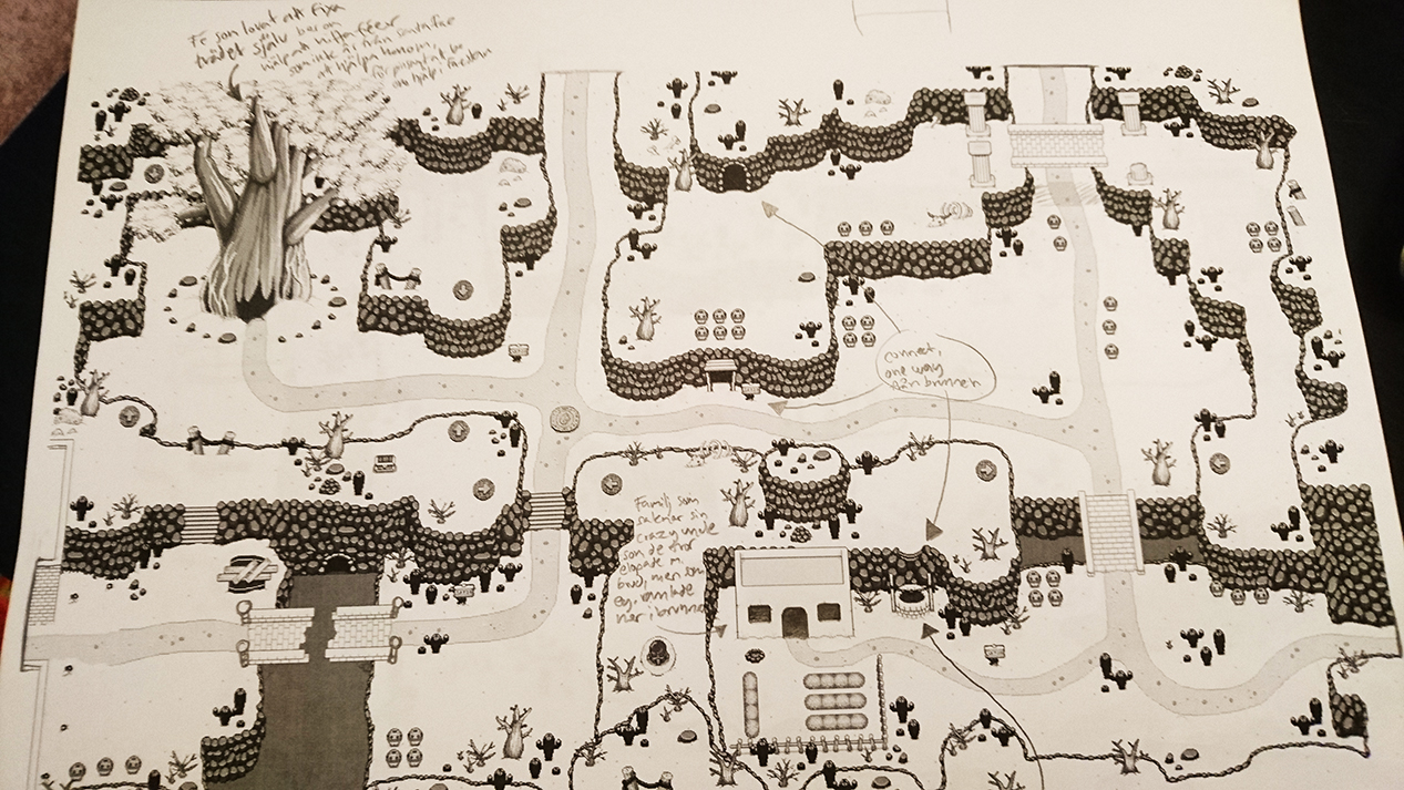
This week we mainly continue our work on the Arcadia remake, but we also took some time to bring a bunch of printouts of the desert area to our favorite fast food place for a little chat! Our goal was to discuss more in detail exactly what’s going to happen as you journey through the desert towards the harbour town, and what side quests we aim to include as we add this to the game.

We took a ton of notes on each of the maps, filling them with sentences about what will happen, what things will look like, what caves will connect and what will be in them, etc. After we were done, the desert had gone from a pretty basic set of maps to one of the most well thought out areas so far, at least in my opinion!
We aim to include three bigger side quests when we add it to frontline/stable (not including quests we might come put with for the harbour town), but like most areas, we have more ideas for other quests to include at a later date when it’s time for an overall polish of the entire game. While it won’t have a big side area like the Tai Ming’s phase shift section, the main quest here will bring back a lot of old friends to the plot, and have you travel outside the desert as well.

With all this new information, there’s a ton of new maps (cave interiors, specifically) for me to do, and a few new enemy and mini-boss animations for Fred to deal with as well! It’s all gonna be a lot of fun, and we hope you’ll be as excited to finally explore this area as we are making it.

However, before we start focusing for real on the desert, there’s still something left to do: the Arcadia rework (as mentioned), including the Tai Ming and Mount Bloom floors which currently aren’t in the game. So while we’ve made sure to plan ahead for this, it’ll be a little while before we actually continue working on the desert stuff.

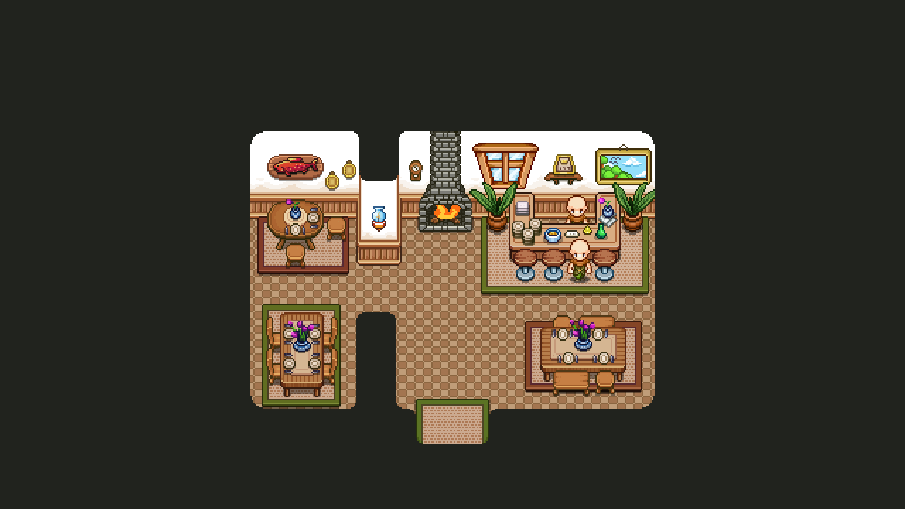
And the next Arcade Mode interior…. is the Inn! Or the tavern! Whatever you wish to call it. True, it does not have beds, but who’s to say there isn’t a hidden door somewhere that leads upstairs?

In either case, this is sort of an upgraded version of the old Tavern in Arcadia. Doesn’t look exactly the same, but I went for the same sort of feel and the overall layout. When everything is implemented this place will probably have more visitors than it currently does, more inhabitants looking to hand out quests!

Here’s the WIP video, using a lot of old housing items for this one:

And the finished version:

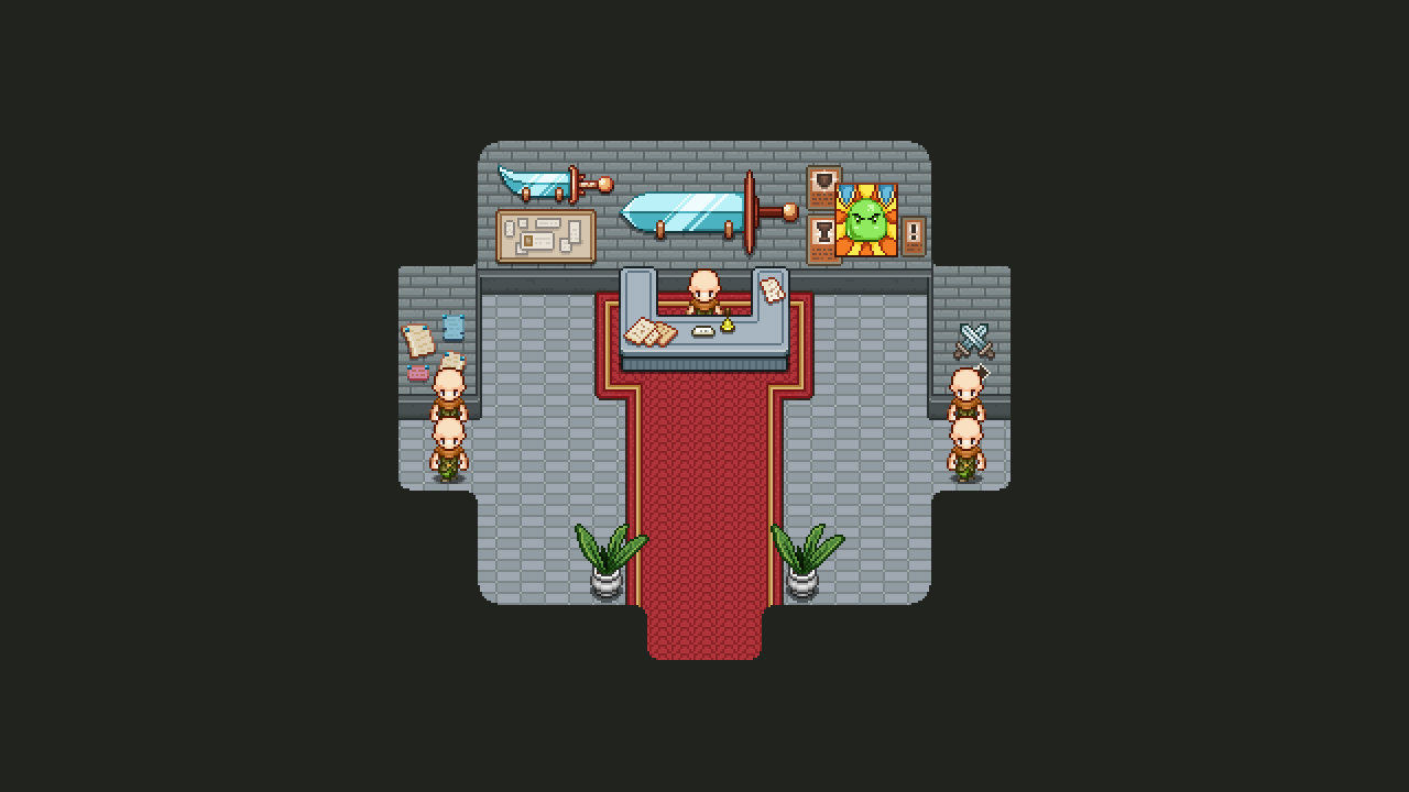
Next up, the arena!! Another interior that gets and upgrade, where we aren’t completely decided on whether this new upgraded version will replace the old one in Story Mode.

Like with the farm, I kind of went for the same layout and overall design, though in the original version there are statues of fighters which I opted out of in this version: I just didn’t feel it worked very well with this rather smaller and more compact version of the layout.

Instead, my hope is to have a few spectators chat in the reception area, maybe swooning at the champions (you guys) who are about to enter the fray!

Here’s the WIP video:

And the finished version:

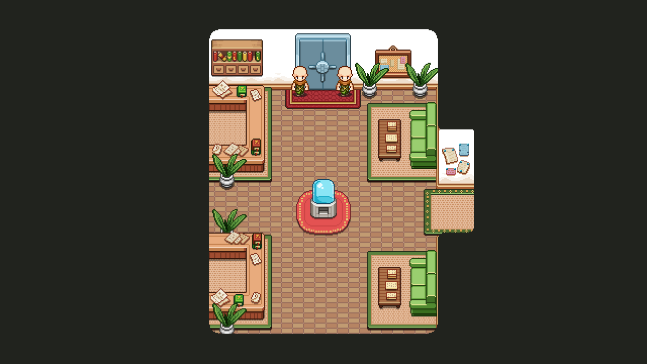
And now, a completely new building, not previously available in any form: the Bank! How exciting! …Maybe.

So for this place we wanted the look of a waiting room, with a kind of office-y feel to it. People requesting loans and whatnot will be waiting for their turn, while the player can just waltz up to one of the desks and request an exchange of gold to essence (or the other way around)!

Aside from the desk where the bank workers will be, there’s a (heavily guarded!) vault, and a water cooler, cause waiting times for non-players can be quite extreme…

The WIP video:

Finished version:

And finally, a bunch of new fishes for the Aquarium, to end this week!

After some discussion we’ve decided to make all of the fishes available in the Aquarium, which means each of them needs to be animated. While Fred has made a bunch already, there’s still a ton left to do…

..and as such, here’s the second fish batch, ready to be put into an aquarium near you:

And so, the potion patch is up! This patch includes the complete potion rework, a ton of new pots, a rework of Remedi and his first quest plus a brand new quest involving Remedi and his nephew (which will be available if you’ve finished his first quest and have started your journey in Mount Bloom).

As always, especially with new systems, we’re eager to hear your input on these changes to the potion system. There are a bunch of potions to test, and we’re interested to hear how you feel about the effects: are they powerful enough compared to the recharge time? Is it satisfying to recharge potions in battle? Are you more inclined to use potions now, or did you prefer the old system?

A lot of you have waited a long time for some kind of healing spell or health pot, and health potions are now available!! So let us know how you feel about that as well.

The full patch notes are available here, so be sure to check them out if you’re interested in the specifics! And do let us know how you feel about this new system (and the new quests), either on our forums or here in a comment. We look forward to hearing all of your feedback!

Now, let’s turn back time and take a look at what we’ve been up to last week:

So as we we’re drawing ever closer to finishing up the whole potion business, it’s time to pump out a bunch of new portraits to fit in with Remedi’s new questline which will grant you the empty bottles you need to use this new mechanic!

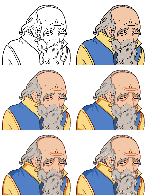
First up is his old man version, which will be the original form in which you meet him, rather than the kid-self you’re probably used to right now:

He won’t stay this way for long though, as that pesky accident with a stray potion has him transformed back to his ‘regular’ form. Unfortunately, with our tweaks to this storyline it seems he won’t stay very long in that shape either… ;)

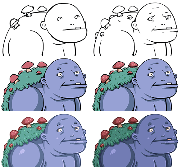
Now, what in the world is this?! A portrait of a cave troll? What is it doing here? What part will it have in our story? For now, all I’ll say is that it’s related to the potion quests, and will appear in this patch!

Unfortunately I had to cut all of its back or it wouldn’t fit the text box without covering the letters! Oh well… :D

Finally, some finishing touches before I’m done with my parts for this patch! First up, the Speed and Loot potions mentioned before:

…which of course also were in need of proper interface icons:

I also made small versions of each of the icons, to serve as buff icons / timers for the potions that work over time (and whatever else we might need them for)!

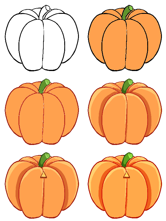
Then, there’s another portrait for poor Remedi, who will go through quite a number of shapes in his quest to return to his original form. Here’s the pumpkin version:

Aaand a bunch of expressions for his Nephew, as well as an icon for refilling potions in Remedi’s workshop:

Like me and Teddy, Fred too has been busy doing potion stuff this week as well!

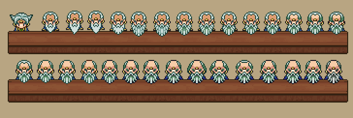
As Remedi got a new, older self, his first mission was to make the old man version of the sprite, to go with the new portrait. As usual, when deciding on a look for a new sprite, he made a whole bunch of iterations until we selected our favorite:

Which one do you like best?

Next, we need Remedi’s nephew to do some pretty advanced stuff in the upcoming new quest, so he needed a few new animations as well:

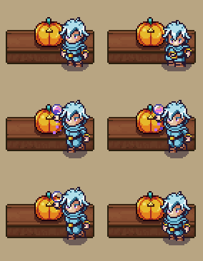
And finally, a ton of potion effects for when you drink those pots, signalling to the player what effect is about to happen:

Another week has passed, during which Fred has been busy finishing up the Solem…

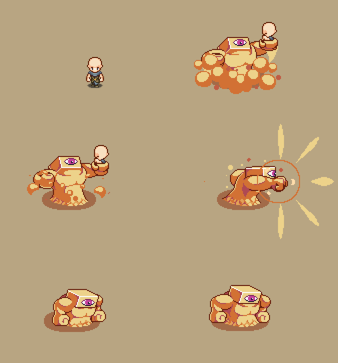
.., and starting work on his part of the whole potion business! This includes a sprite and animation for a new character who will stand outside the potion shop with a signpost. This way we hope people will easily come across him and learn how to get a bottle on their way to the Pumpkin Woods and Flying Fortress:

Next up will be more potion stuff, as we’ve decided to change some things around with Remedi’s quest, and add another one where you’ll get the second bottle. A sneak peek of what’s going to happen:

Excited? We sure are! In fact, most of this week has been about potions in their various forms as we’ve prototyped, tested, made changes, and tested some more! In the beginning of the week we had a meeting where Teddy showed us his basic prototype of the system and wanted to discuss it with us.

To refresh your memory, the potion rework is about giving you three bottles that you can fill with one potion each. After you drink a potion, the bottle will refill slowly as you battle enemies. This was the basic prototype added by Teddy, but unfortunately he did not feel it was very fun, and after trying it out as well, me and Fred agreed – to an extent.

In fact, for a while we talked about scrapping the potion rework altogether!

However, after playing around with the system (Teddy also included settings which allowed us the change the speed of which a potion recharges, their duration, as well how big of an effect they have), we found that we’d been looking at it the wrong way, making it too difficult to recharge the potions.

Basically, in our first iteration, you got quite a large effect but refilling the bottles (done only by battling enemies) took forever, and felt more like a chore. So instead, we decided to reduce the effect quite significantly, but have the recharge process be much faster. We also decided to add a passive refill that slowly refills the bottles for you even when you’re not in battle. This way it doesn’t feel like you’re losing out on refill time when you move from one group of enemies to the next.

We’ve also decided on what potions we want to have, which so far is a lineup of nine:

* Health Potion – refills a tiny portion of your health
* EP Potion – restores your EP
* DMG Potion – Increases the damage you do for a short duration
* Crit Potion – Increases crit chance for a short duration
* Gold Potion – Increases gold droprate for a short duration
* Arrow Potion – Increases the number of arrow that drops
* Loot Potion – Increases drop rate of items
* Speed Potion – Increases your cast and attack speed

And finally, the most important one:

* Chicken Potion – Turns the player into a chicken!

Yes, we’re serious about that one. Might not be very useful (or will it?), but fun at the very least!
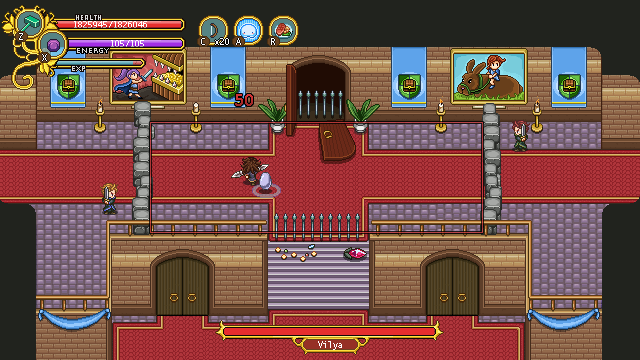
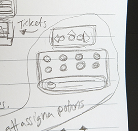
Okay, time for the next step in our potion-centric week! Starting with the basic UI where you assign which potions you want to carry with you on your journey. To my help with this I had a little sketch we made over at our meeting where we discussed these things:
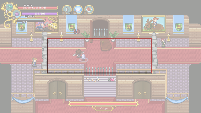
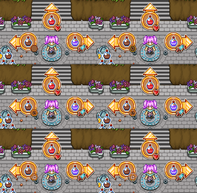
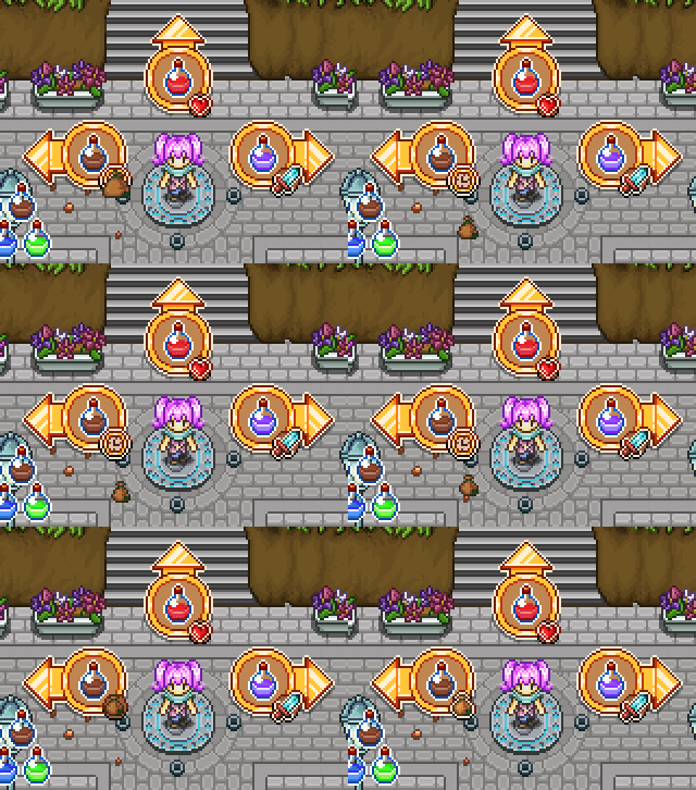
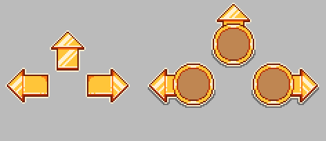
Using the buff- and Frosty Friend interface arrows as a base, I made a version that will feature the potions. These arrows will not only appear in the Assign Potion interface, but will also appear around the character in the same way as when you command Frosty Friend or buff a friend with your utility skills:

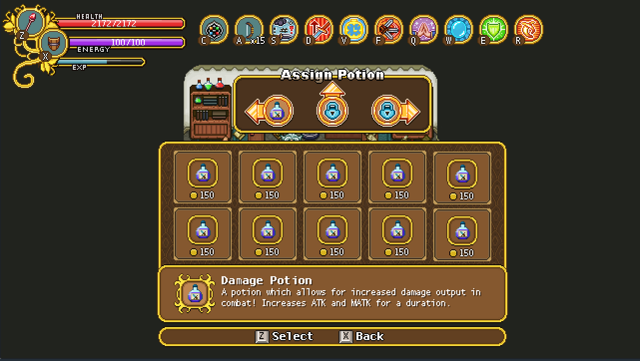
After selecting which of your potion slots you want to change, you’re brought down to a shop-like list where all the potions will be displayed. Right now there are prices beneath the potions, but in the version we’re aiming for, swapping potions will be free of charge and can be done anytime (all of the potions will be unlocked from the beginning).

Also the menu may not look exactly like this when it’s done, but it’s close to what we’re aiming for:

Next up, the portrait of that new character! So the guy outside the potion shop is the nephew of Remedi the Alchemist. As mentined, he will appear in Evergrind City carrying a signpost directing you to his uncle’s shop. He’s also the one to notify you about Remedi giving out a free bottle to adventurers! What a nice kid, huh?

Next, time to get some more interface done. This time we’ll take a look at what the player will see more often, i.e. the interface that will appear as you drink your potions. Using the arrows from before, here’s what they will look like in action:

And now, it’s time for an indicator showing how long you have left before your potion(s) have been refilled:

These bottles will appear filled when ready to use, or will refill in real time as you battle enemies or just wait around. In the finished version we’ll try making the top row of pixels a little darker to make it more clear how much recharge time is left:

Now, as for the potions, I will remake all of them in a fresh new style, using our talent icon as base, but making it smaller so it better fits inside the UI arrows:

Each potion will have their own color, and as they appear in the arrow another icon will indicate their effect, making it easier to distinguish between the different potions even when they are of similar color:

The Speed and Loot potions aren’t pictured here because as I was making these, we hadn’t decided they would be included yet! They will appear in next week’s post instead, so stay tuned for that~

Good news everyone: the Bow and Talent patch is officially live (and has been since Thursday afternoon)! Go try those things out and let us know what you think. To summarize, the patch includes 21 new talents, sound effects for the utility skills and the revamped bow including a bunch of upgrades! As always, the full patch notes can be found over here~

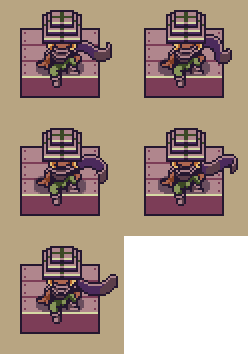
In Fred’s department, there has been three main things going on: making the bow upgrading NPC, continuing polishing the Solem animations and starting work on our next system upgrade, namely the potion rework. Once the rework is live your character will visually drink the potions, so that had to have a neat animation of its own. Here are some results from this week:

My main focus last week was also preparing stuff for the patch, starting with the final batch of talent icons! Final three General talents + the Melee talents:

Alchemist – Potions refill faster. Pretty self explanatory talent, and to make things even easier to understand visually I used the other potion talent icon as a base for this one.

Arrow Scavenger – Increases the number of arrows dropped by enemies. Featuring a bunch of arrows (or the ends of them anyway)!

Quickshot – Shoot arrows faster. For this icon I took one of the bow icons and put some effects behind it that I hope illustrates its increased speed!

Blood Thirst – Killing an enemy grants increased attack speed for a short duration. With a name like this I kind of wanted to make a blood thirsty animal or beast of some sort. Not super sold on the look, so might change it around in the future – we’ll see!

Combo Starter – After a normal attack, your melee skills have increased critchance for a short duration. Since we already have a ton of basic looking swords in the old talent icon, I went with a different kind of blade this time!

Knowledge is Power – MATK gives ATK. Using a book from another talent icon as a base, I changed its color around, making this icon’s color scheme a mix between magic colors and melee colors.

Riposte – Perfect guarding within x range of an enemy deals some damage to the enemy you guarded against. Bringing back the perfect guard icon to use it as a base once more, I changed the colors around to better work with the melee page.

Sudden Strike – After being out of combat for a short while, your next normal attack will have increased attackspeed. Here we have another regular-looking blade, but dropping from the sky this time!

Final lineup:

So in order for you to be able to upgrade your bow, we needed someone who can help you do that! While Robin, who first gives you the bow, might seem the obvious choice, we didn’t want him responsible for more than one mechanic – and as he’s currently in charge of the shooting mini-game, it seemed it’d be a better idea to make another character who can deal with bow upgrades.

Introducing Little J:

This guy will be carving bows outside Robin’s house. Once he has a new upgrade for your bow you’ll be able to purchase it for some gold!

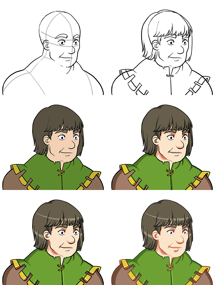
After some feedback from my fellow Pixel Ferrets, I made a small adjustment of the eyes:

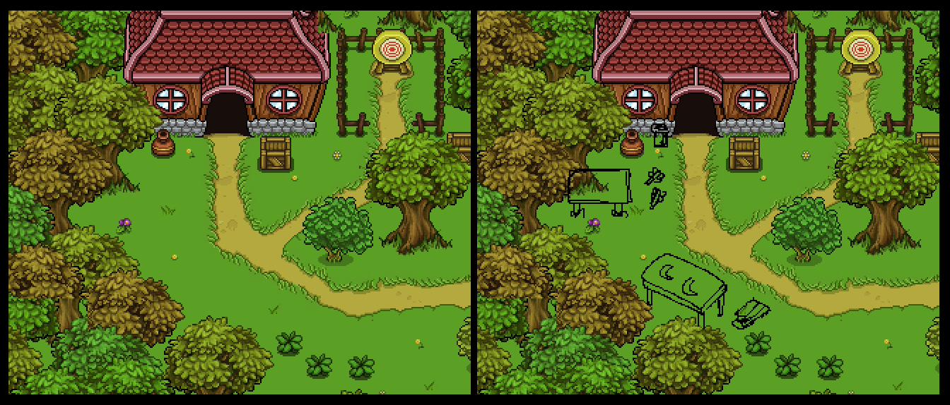
And next, it was time to actually make Little J feel at home next to Robin’s hut! In order to make it more obvious that there’s something for the player to gain by talking to this guy, we made a bunch of improvements to the surrounding area. Starting with some sketching:

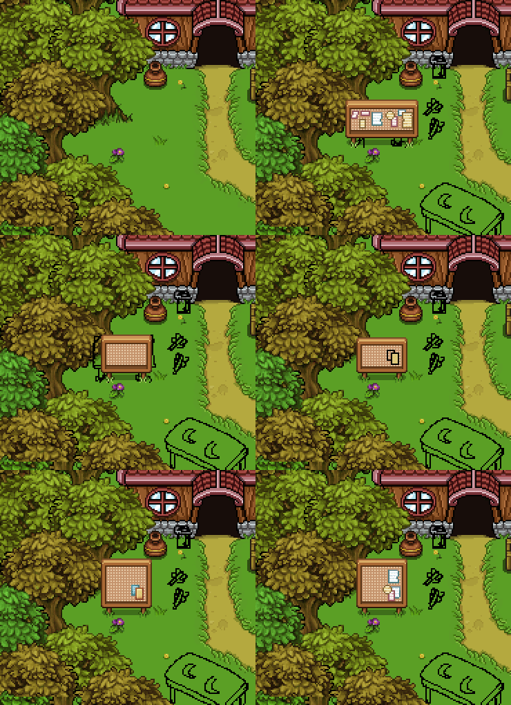
First thing we’ll do is add a notice board of sorts, where the next bow upgrade available will be displayed. Here I’m using the notice board from the Arcadia rework as a base:

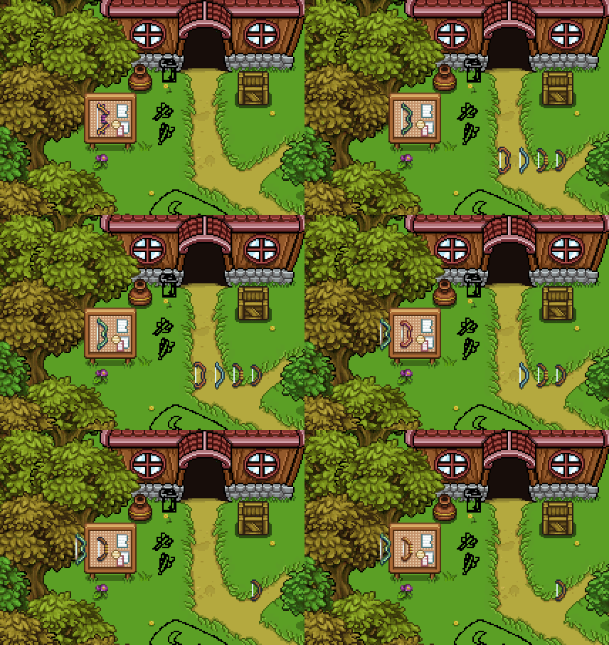
Now that the board is done, it’s time to bring in the bows and edit them all slightly so they merge better with the board. The very first bow won’t be on display since that will be the one you’ll have from the beginning (and the first upgrade will be available from the start):

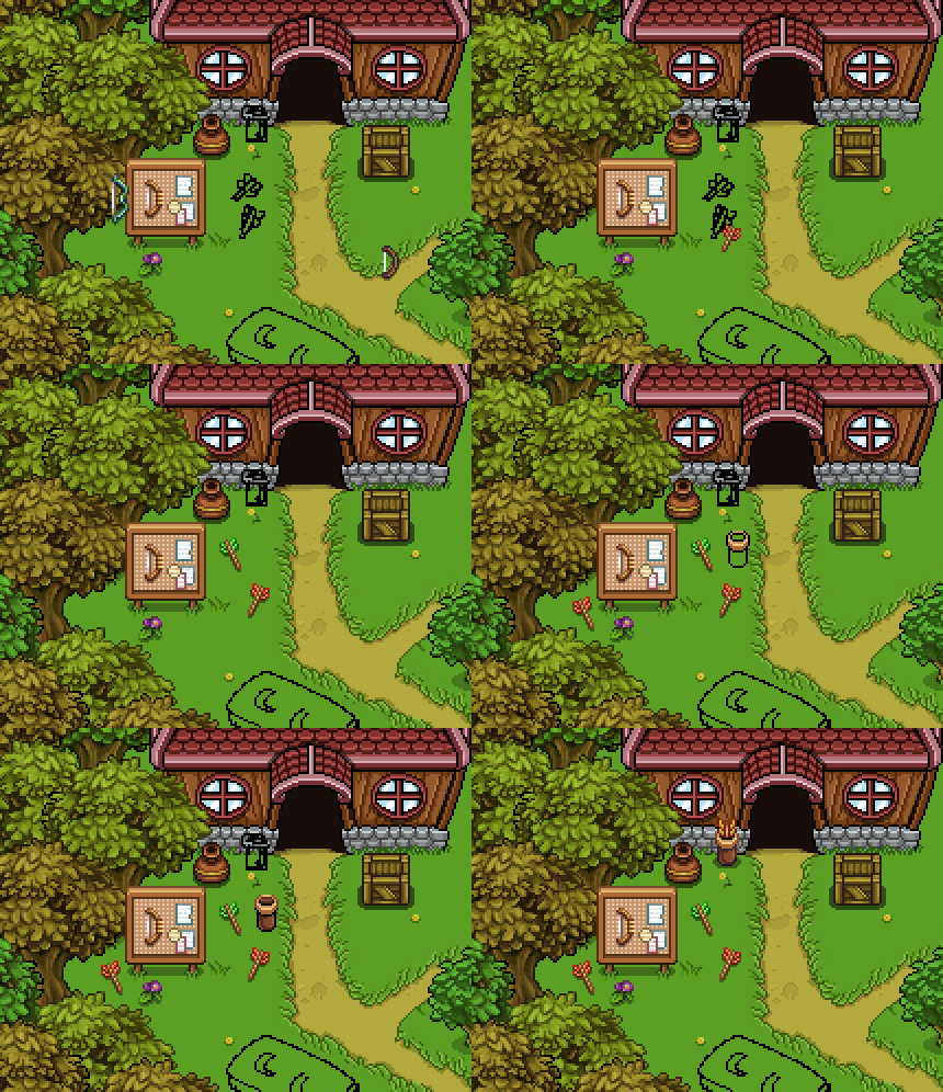
Next, some ground decorations: a bunch of arrows, and a quiver next to Robin’s door:

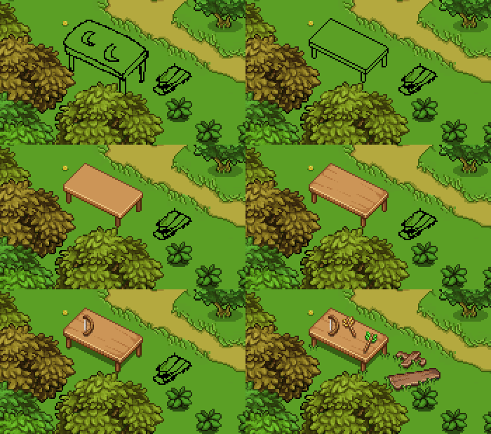
Finally, Little J’s working table, where an old bow and some arrows lie forgotten:

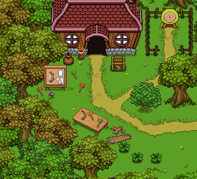
And here’s Robin’s place after the added stuff! You can kind of see a difference in quality of the props made now compared to the old ones. Maybe someday (when the game is done), we’ll go back and touch up old areas, improving the overall graphics. For now, we’ll try to steer clear of doing too unnecessary improvements, as we want to finish this game within our lifetime:

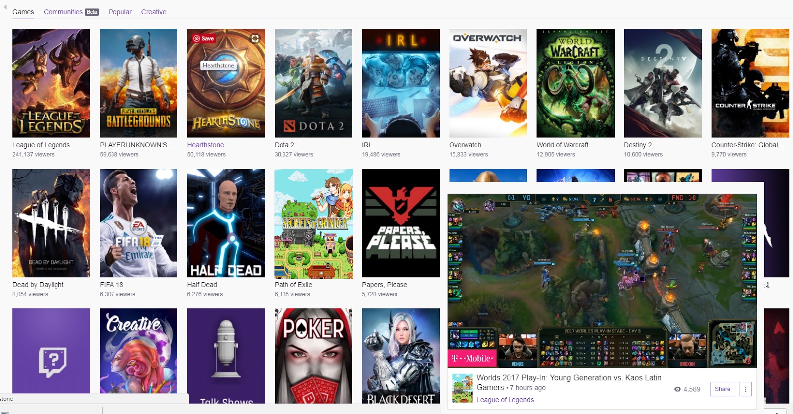
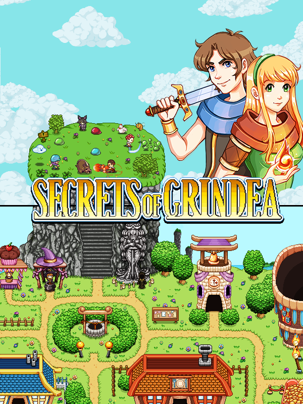
As some of you have noticed, we also (finally) made a cover image for Secrets of Grindea on Twitch. It’s been on my to-do list for a while, but has been pushed back due to other things being more important – but with this bow upgrade being mostly out of the way, I decided to throw something together before moving back to Arcadia stuff.

So to make the cover image, we wanted to use graphics already available to us, at least for now. Maybe in the future we’ll do something more epic. Using the capsule image from Steam and a screenshot of the Arcadia rework, we pieced some graphics together and made a couple of mockups which can be viewed below (pretending to be Path of Exile).

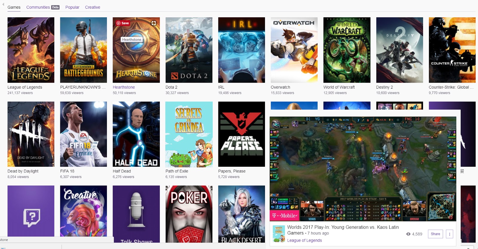
We resized our mockups on top of other games in order to get a feel for what the image would actually look like in the end – you’re supposed to provide them with a quite large jpeg file, though for the most part its resized by Twitch as seen below. We felt the best way of trial and erroring this was playing around in Photoshop rather than uploading 500 versions of the image and trying it our in real time:

In the end, we decided to go with the third one. The big version can be seen below! Note that the logo has been resized into a bigger version in a rather crude way, which means it’s a little blurry. This is because we didn’t want to completely remake it and take more time from doing actual game stuff at this point. Since the image is mostly viewed in a much smaller version where the blur won’t be visible anyway, we felt this was OK for now:

With the Talent and Bow updates drawing to a close, it’s time to look ahead and start planning for the rest of the Arcadia Rework. I’m almost done with the rework of the outdoors, but after that there’s still some important stuff left: the indoors.

To make sure we’re on the same page, we got together to discuss exactly what will be available in each of the buildings, coming up with the list below:

Inside the Dojo there will be enough space for a small battle area, where your challenges will take place. Beyond it, Master Ji from story mode will sit, and it’s him you’ll have to talk to in order to activate the challenges. Once you activate a challenge, your character will be teleported to the battle area you just passed through.

In multiplayer, you’ll only be able to do these challenges solo. To make sure everyone can use the Dojo at the same time, characters who are currently partaking in the challenge will disappear from the map, meaning – unfortunately – that you can’t spectate other users as they do their challenges. In this case we felt it would be better for players to be able to take on the challenges at the same time rather than having to wait for someone currently doing one to finish.

The interior of the Farm will be pretty straight forward: hay, buckets and sacks of wheat. And enough space for your favorite farmer, Oak to give you new quests!

The Aquarium will feature a huge aquarium on the topside wall, around which painted decorations featuring seaweed and fishes will be added. We’re currently discussing what kind of fishes will be available in the aquarium, whether all of the fishes will be or just one or two from each area. We’re kind of into the idea of having one fish per area (meaning less animation work for Fred), each which you’ll be able to catch and keep during a quest given by the Aquarium owner.

The Bank will be decorated office style. Desks, water coolers, the occasional plant. A vault where the gold is kept!

The Cinema will look pretty much like a cinema, with a receptionist selling tickets near the entrance. This will be where you select which replay you want to watch.

The Inn will look much like it does now, some sitting areas and a bar. The Arena reception will look much like it does in Story Mode as well.

The Clock Tower will have a rather small, round, room, with a window on the opposite wall where you’ll be able to tell what time of day it is. You’ll change time by hitting a small bell in the middle of the room, which will – through magic – cause time to speed up. The big bell on top on the clock tower will chime as the scenery changes outside the window through an animation made by Fred.

And that’s that! Looking forward to diving into all of that soon~ :3