Once again, thanks for all the feedback surrounding the desert patch! Now it’s a new week with new adventures, and for now we’ll focus more on upcoming stuff!

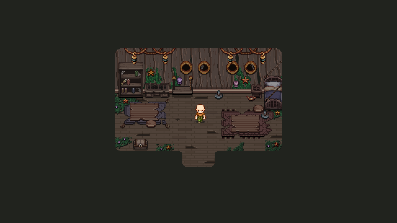
So while the actual room-by-room design of the upper floors of the ghost ship haven’t been decided, we know what types of rooms we want, and one such room is the cabin. Or cabins, really. We’d like the player to battle their way through a set of cabins on the second or third floor, so naturally we need to make a bunch of items that can be seen in these cabins. As such, I made a random design of what one such room could look like, and made a bunch of random props to put in it.

I know I mentioned we’d continue on adding things for the desert’s stable release, but I’ll have plenty of time to do that while throwing in a ghost ship background or two… :)

Let’s take a look:


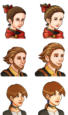
Next, another portrait from past times: this time featuring young dad!!

At this time in his life, he recently got accepted as a Collector after passing the trials, along with Charlotte (your mom) and Ivy, who went on to become the grandmaster of the Collectors.

And now, what I believe to be the last in a series of the younger version portraits: Ivy, from a time before she became the leader for the Collectors!

Who is this mysterious person, and what was her relationship with Dad and Charlotte like in the past? All questions that may soon be answered through those memory orbs…

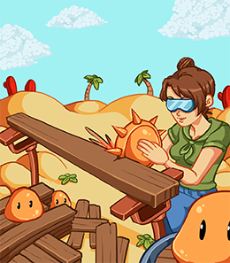
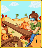
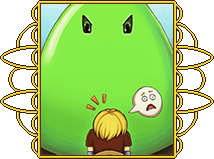
Next up, another card… There are still a few left, after all! This is the Orange Slime card, featuring an orange slime used as a saw by the desert’s own carpenter, Mallet:


Meanwhile, after having made a ton of NPCs for the desert, it’s finally time for Fred to start working on the Ghost Ship enemies!!

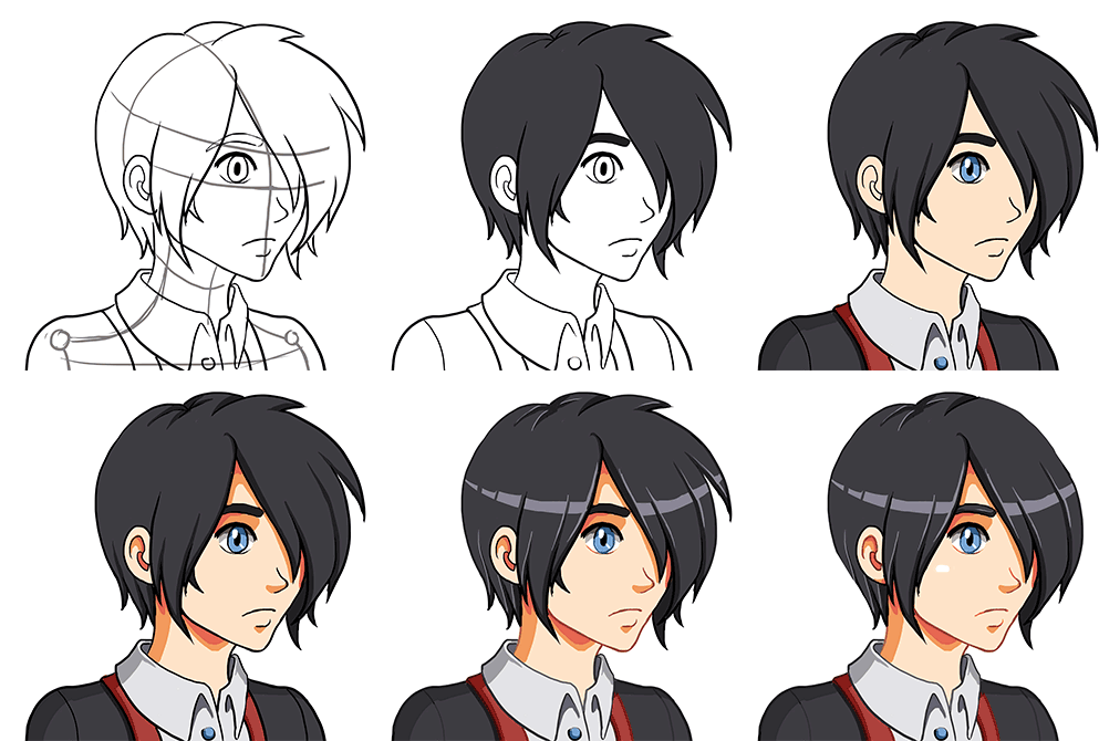
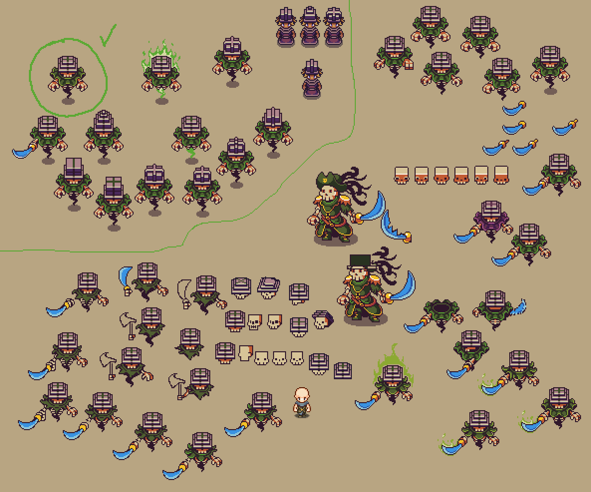
The first enemy he’s making is a skeleton ghost, which will come in two versions: one that wields a sword, and one that uses magic to buff and debuff the surrounding players and enemies! As usual, he’s made a lot of sketches featuring different versions of the enemy below (starting with the sword-wielding one), with the one in the green circle representing the one he’s decided to work with for the first couple of animations.

The magic user version will likely have a different color scarf and a slightly changed hat:

Exciting times! Can’t wait to start prototyping and testing these guys out, it’s gonna be so nice to move on to a different area after so many months working on the desert! As always, it’s great to be an indie dev cause as soon as you get tired of one thing, everything changes and you need to start working on something else!

Hey guys! In order to keep things clear about where we’re heading, plus better keeping track of our design ideas, we’ve decided to have shorter meetings but keep them more often. So this week it was time to get together and discuss the future of Grindea once more! There are some pretty big design decisions going on here… Let’s dive into ’em:

Making magic weapons semi-ranged
So, magic weapons don’t give as much attack, and it kind of sucks that magic users face a clear disadvantage when they’ve run out of mana. So we decided that we want to add a tiny magic orb (or something like that) that shoots out from the magic weapons as you hit with them, making the range of your weapon slightly longer. Of course, this won’t be long range by any means, but it should make it possible to do some damage while running around waiting for that energy to recharge.

Easy Mode or no Easy Mode?
We had a quite long discussion about whether or not to implement Easy Mode. On the surface it seems like such an easy decision: why not add Easy Mode? Well, our worry is that by adding Easy Mode, a lot of people who would succeeded in Normal Mode after trying a little longer, would just give up on harder challenges and swap to Easy Mode. And, in doing so, they would probably end up thinking ‘man that’s annoying’ rather than ‘OMG I FINALLY MADE IT’ upon victory.

We’ve had a lot of forum threads or feedback that begins with someone claiming something is impossible, only for them to come back a while later saying ‘okay I totally get it now, this is amazing’. Would those people persist and end up feeling amazing after beating that difficult challenge if there was an Easy Mode? Or would they end up thinking Normal Mode is too hard and the game is poorly balanced since they felt forced into swapping to an easier setting?

In the beginning of our time in Early Access there were quite a few of threads with people claiming the overall game was too hard, but as time has progressed, those threads don’t seem to appear any longer and those who do have problems end up farming for levels and better items before giving the challenge a go again.

So, perhaps Easy Mode is not as needed as we first thought? Because of this we probably won’t implement Easy Mode anytime soon, anyway (but we’ll definitely reconsider if there’s renewed complains about the game’s difficulty).

Making Fishing more challenging
Fishing is… well, fishing, so it’s very straight forward and there’s only so many steps in difficulty. Unfortunately that also makes fishing kind of repetitive after a while, so we’re considering adding another mechanic after a couple of maps. The mechanic we’re thinking about is that the fish can move up or down as well, which means that at some point the fish will dive/swim upwards and you’ll have to press up or down accordingly within the time limit. Of course, this isn’t a high priority addition, so it probably won’t happen for a while. But in the long run it might help make fishing a little bit more interesting.

Potion Rework / Bottle Addition

Potions are great, but we don’t like how they work right now, where you can stack endless numbers and basically get a permanent increase in whichever stat so long as you have enough potions. To counter this, we’re strongly considering an introduction of Bottles which are a very limited commodity of which you’ll only be able to find 3 in total. These bottles can then be filled with the potion of your choice.

You’d get your first bottle from Remedi after clearing the Collector’s Trials, and after you’ve decided what to put in it and use it for the first time, it will slowly refill itself over time and as you do damage on regular enemies (yes, it’s a magic bottle). If you have more than one bottle, you can choose whether to fill the bottles with the same potion or use different potions. You can use two different potions at once, but you won’t be able to drink another potion of the same kind until the first one’s effect has run out.

With this change, it’d also be possible to reintroduce health potions, for all of you guys constantly asking about various healing features ;) Of course, we’ll likely balance them so it’s more efficient to use the other potions, but maybe it’d still help ease the minds of those who really want to be able to heal their character.

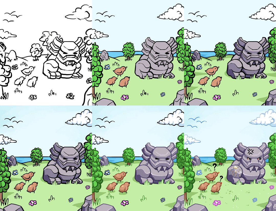
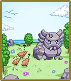
There are more cards this week, as well, as we finish up the Tai Ming card album! First up: the Ancient Statue card :)
01

For this card, my notes said the statue got some bird poop on it. It quickly became a fine line between painting the statue big enough for the poop to show up in the final image, while also not only being about the statue. In the end I think I went slightly too small with the statue, but whatever!
02

For this card I kept the colors soft and didn’t go too crazy with the highlights. Some variation and all that.. :)

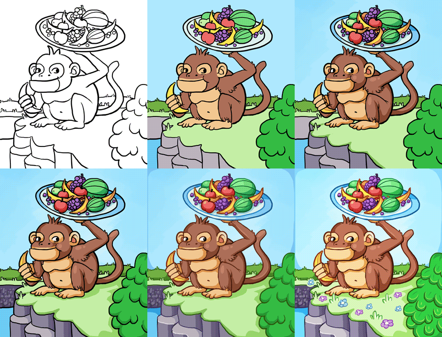
For the second card, let’s take a look at the Monkey Card! My notes for the monkey card said: the monkey holding a plate of fruits. Alright then:
01 (1)

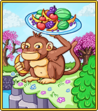
After painting the base and resizing, I added a couple cherry blossom trees (used the game sprites for this), to give the pic a bit more Tai Ming feeling:
02 (1)

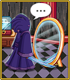
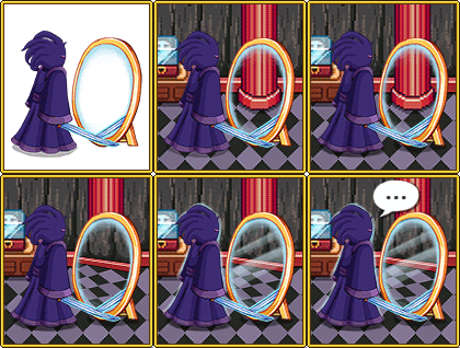
Now! Time for the final Tai Ming Card (unless I’ve forgotten something and lost the notes?!): Echo of Madness!!

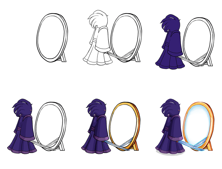
I used a slightly different approach when making this card, because I knew I wanted to use the backgrounds from the game for this one. So, I began by making the Echo and a mirror against a transparent background, keeping the center of the mirror transparent as well (my notes were: the Echo is standing in front of a mirror, but he has no mirror image):
01 (2)

Next, I added the game background, and another part of it slightly tilted for the mirror, as well as a speech bubble. Cause why not:
02

…Aaand the finished card:

03

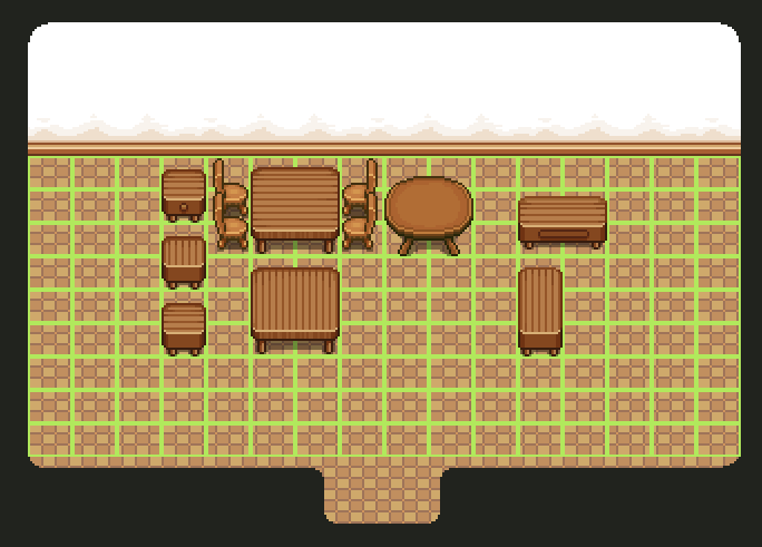
Alright! Before posting some fresh non-spoilery (well, kinda) animations made by Fred, let’s take a look at some more housing items!

The theme for this batch is Flying Fortress, (tho I added some other stuff to give you an idea of what it can look like combined with items from other areas). Most of the items are based on sprites found throughout the game, only resized (or completely remade) to fit the grid.

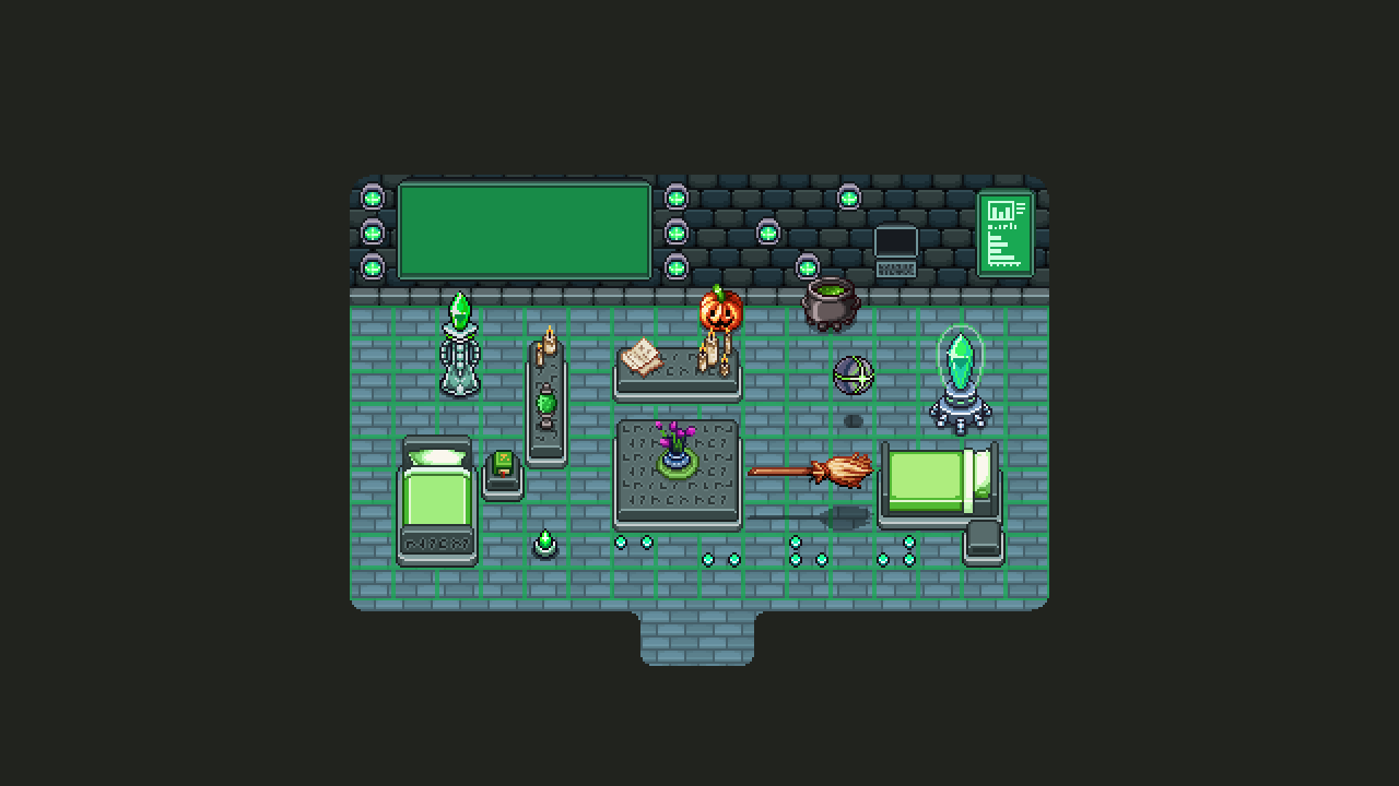
bed

Housing Interior_001

It is my hopes that both the sentry and the broom will be animated to at least move up and down in the air, though it would be pretty cool if the sentry could move around the house on its own. I guess that’s up to Teddy, though, who would have to implement those features :)

And finally!!! A sneak peek of what the final Tai Ming boss will look like:
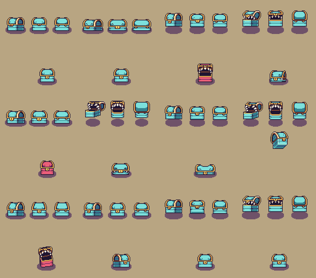
Mimicc

Hello guys! Another week has gone by at the office, and we’re drawing ever closer to finishing Tai Ming’s third zone (slowly but steadily, as you know…) :)

While Teddy and Fred are busy prototyping the two remaining boss battles (one which actually has a working prototype that we’ve been testing already), I began working on the card appearances and some housing items. Housing will very likely be implemented once Tai Ming is done, so it’s time to get a bunch of items ready.

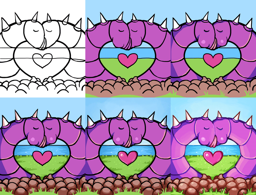
Anyway! First up, the Thorn-Worm card.

My notes on this card from our design meeting (feels like it happened 100 years ago now), was to have two worms kissing, creating a heart shape. I think we might have decided on this design before the Thorn-Worms were actually made, cause having two of them create a heart shape when they’re so short and fat is kind of heard. I decided to slim ’em down and paint a heart in the middle for clarity.

02

Maybe not the best design out there, but possibly the most gross?

03

Next, the Plantae Hostilis card!

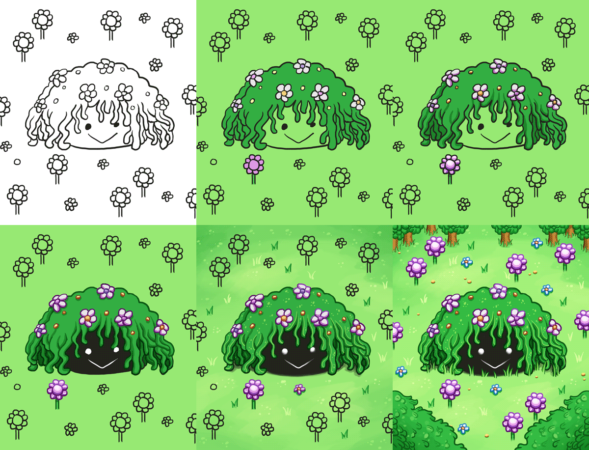
My notes for this said: The enemy sprite surrounded by its spawn. Alright then, that’s kind of straight forward? So, it’s what I did. Lots of greens and flowers. I kind of get a very strong RO vibe from this enemy, and I’m not sure why, but I really like it. Kudos to Fred who designed it!

wip

Finished card sprite below:

planate

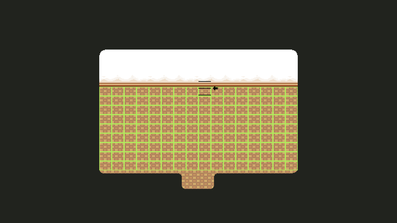
So, Housing! It’s a subject we touch upon every now and then, but as we get closer to finishing Tai Ming, we also get closer to implementing the dang system (finally)! A while ago, Teddy mentioned we changed the dimensions of the grid we use as a base for the housing system. It used to be much more square, and now it looks like this:

01

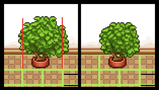
Basically this meant that every single item made before this change needed to be checked and edited or discarded/completely remade depending on how hard it’d be to fit it into the new grid. So I had a very fun (not really haha) day this week where I added all of those housing items to the Housing master document and manually changed and changed each and every one of them.

02

Some, like the plant above, had to change shape, but could still be used. The red lines indicate the end of its two designated slots, so everything going over those had to be cut.

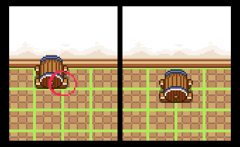
Others, like the wine barrel below, had to be discarded, and will be remade later. In this case the barrel would become too small if fit into one slow, and it’d be much too big if we edited it to fit it into two/four. So, I’ll redesign the thing later and make a design that works better with the grid size!

03

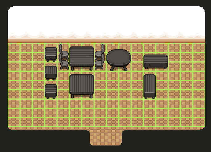
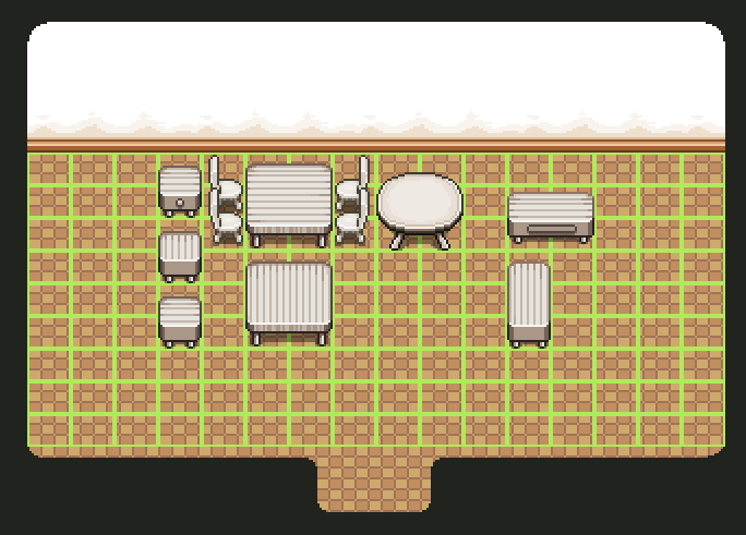
There were also some placeholder items Teddy made to test the system out. These were mostly surfaces (tables and the like) and made quickly by copy-pasting other tables in the game. After checking the other items, I went over those and touched ’em up until they resembled actual game sprites more, and made some color variations:

04

05

06

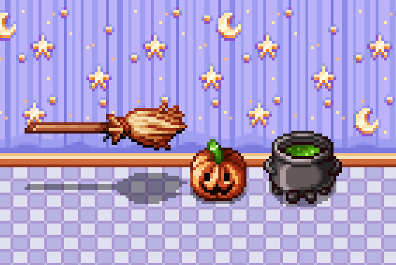
Now we’re finally able to start making batches of new housing items!! I actually went ahead and made a few silly Halloween items on a whim, just to celebrate that we can actually start pumping out housing items for reals:

As you can see in the video, the cauldron is actually a slightly edited version of Fred’s cauldron design for Candy (the witch in Pumpkin Woods). The others were (also as you can see) made from scratch.

housing

A while ago we decided to have a batch of purchasable housing items unlock every time you enter or finish a new area, so it’s very possible these items will unlock once you enter (or complete) Pumpkin Woods. SO I’ll definitely make more items on the theme, and probably a set of basic stuff (like desks and chairs) in suitable colors to match the wallpaper/floor coloring. Also stuff for every other area you unlock… Gonna be a lot of housing items in the future! :)

ALSO, this week was AGDQ and during the event there was an Arcade Mode speedrun! Check it out here:
We’re drawing closer to the second patch of the Temple of Seasons testing. So close, in fact, we’re going to unleash it tomorrow, together with some fixes for bugs you guys hunted down in the past couple of weeks!

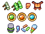
The patch will feature more progression (everything except the boss), drops for all the enemies, ability to get the actual cards, and also the proper music for the temple. Below are some of the drops you’ll going to find (the hats not included):
Drops

After this patch has been uploaded, we’ll turn all our attention towards finishing up the boss of the temple! Fred has already done a good chunk of animation work on him, and we think he’ll turn out great, but we’ll keep him out of this blog so that not everything is revealed!

Vilya, being done for now with everything she can do on the temple, has worked on things both from before and after Seasonne and the Temple of Seasons! For example, she made this Crystal Bug card (an enemy from Mt. Bloom), and also some slight style changes on a few characters in the very beginning of the game:

Card

Portraits

This week Fred has been focusing on making the Fae Village come alive in form of tons of flavor animations for the tiny inhabitants. Below are a couple of the happy villagers doing their everyday Fae-chores!

FaeBroom

FaeWindow

FaeTree

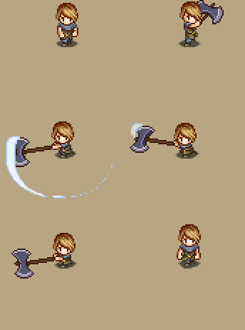
Introducing some new weapons in the game has been long due, so we felt it was time to supply the players with some new slime obliteration tools. Below is a mighty twohanded axe, with much more to come!


Attack1Down Vilya, on the other hand, has continued working with the cards:


frostling_scoundrel

yeti

She has also been making background and new GUI elements for the new rogue-like game mode, which is progressing nicely. We’re planning on having every major area featured in the mode, and right now we’re working on the floors representing Pillar Mountains, which is the first area of the story mode:

Roguelike - Pillar MountainsClick to view in full size!

Every monster needs its card, and minibosses or bosses are no exception! Here are the cards for Phaseman and Giga Slime:

As you can see, they have slightly more extravagant frames than regular cards, and we plan to make their effects a bit more awesome than most normal cards (although not ridiculously overpowered like the RO boss cards). Now you’re all probably thinking “but wait, what if I defeat the boss and don’t get a card? :(”

In order to let the completionists be completionists, we’re adding a Memory Room to the Collector’s HQ!

As you start out, the Memory Room is just a long corridor of empty pedestals, but for every miniboss or boss you defeat, a miniature trophy of it will appear on one of these pedestals. If you ever want to fight that battle again, either for the heck of it or because you want to get the card, you can activate the trophy and relive the battle!

Hopefully, by the time the game is done, there will be a ton of those pedestals to fill!

The past week has mainly been focused on spending time with our families, eating good food and catching up with friends who are home over the holidays. While production have had to take a backseat for a brief moment, we have recharged our batteries and are ready for a new year of hard development. Hopefully, Santa Slime will be bringing a full release of Secrets of Grindea next year instead of lousy beta keys!

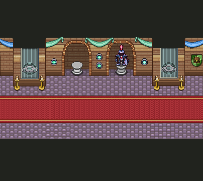
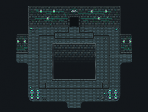
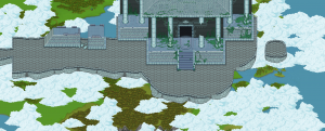
With that said, we’ve made some progress even though the holidays have been lurking around everywhere! The temple has steadily been getting a more finished renovation both inside and outside.

Vilya have also managed to squeeze out some card art for the Guardian enemy we showed a few weeks back. Bling-bling at its finest!


All in all, we would like to thank everybody for the support and feedback we have recivied through out this year. We read everything you guys say and take a lot of it to heart, be it good or bad things. If 2013 brings half of the love you’ve showed us during 2012, we will be more than happy. See you on the other side, happy new year!

Gamex was a total blast! Watching people play was great as always (and a sober reminder that not everyone is as good at video games as our beta testers), and we were even lucky enough to meet some fans (and gain some new ones)! Thanks to everyone who showed up :)

This past week, we’ve been a bit all over the place, fixing some details we noticed people having trouble with at Gamex, sketching up some of the final charge skills, and so forth. The coming couple of weeks, we’re going to focus on getting everything done on the two new areas so we can finally patch that in and let our beta testers sink their teeth in it!

One of the major things we’ve worked on is updating the gamepad support to how the game has evolved. The game actually started out with proper gamepad support, but after some major changes to the gameplay it fell behind and needed an overhaul to catch up.

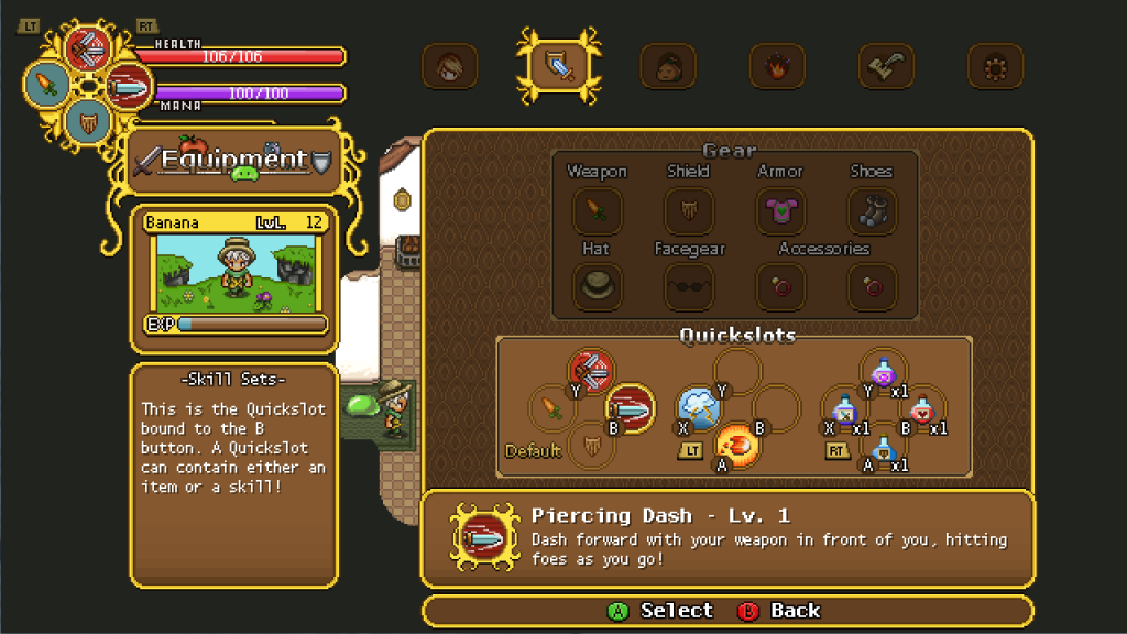
When playing with a keyboard, you assign hotkeys for your spells and use those. There are not quite as many buttons on a gamepad as there is on a keyboard though, so we needed a different solution than just mapping the skills to one button each. Instead, we use the left and right triggers to switch between skill sets. This way, the four buttons (A, B, X and Y on an Xbox-controller) effectively become twelve!

The screen above depicts the equipment screen when using a gamepad. Instead of two rows, the quickslots are now separated into three groups: no trigger, left trigger and right trigger. In the example, we’ve separated the potions to use its own group, accessed with the right trigger.

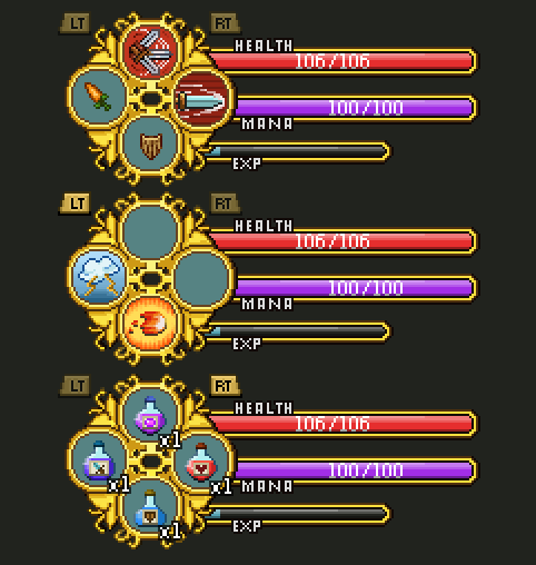
When holding down a trigger in game, the HUD changes accordingly. Below is a depiction on how it changes, based on the setup we had in the screenshot above. The order is Default (no trigger), Left Trigger, and Right Trigger.

The game will automatically detect what input method you’re currently using, and switch the GUI and help texts to match it. You can swap between gamepad and keyboard as you please!

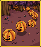
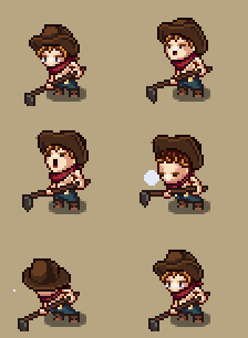
To round things off, here’s a sneeze animation for the cowboy from last week (working bare chested has its drawbacks) as well as a few cards dropped from enemies in the Pumpkin Woods! From left to right: Jumpkin, Ghosty and Lantern Jack!

Since we started posting updates (almost a year ago now, wow!) we have received a lot of suggestions and requests, which is awesome! Today we’re gonna address two of the things that has been brought up quite a bit.

First, we’ve often gotten requests to include a long-ranged weapon: most often a bow. And so, this week we have finally started experimenting with bringing the bow back into the game!

For various reasons we cut it out for a long while, but now we’re almost ready to have it reintroduced. This time cooler and better than ever! However, it has limited ammo and won’t include any skills of its own: instead you can upgrade it once in a while throughout the game. Currently you may equip and use the bow in the same way you do skills, through quickslots!

Fred has also been working on improving the graphics and the overall feel of wielding it, and we’re quite impressed. Take a look at this:

The second thing we’d like to address is casting spells or skills.

As some of you may know, we have a cast system in which you hold down a button until you’re ready to release the spell; the longer you charge, the better attack. However, you haven’t been able to move while casting, which is something that has caused a bit of complaints both from beta testers and people watching our videos.

After some consideration we did realize that it is a little limiting: it often forces you to wait for enemies to get in position, or you have to instantly burn off a low level spell to get away from damage..

So to solve this: you can now walk around while casting! Yay!

We hope you guys like these improvements as per your requests, and as a bonus, have these cards that Vilya has been working on! Until next time~

One of the more popular requests in the beta has been more difficult content. The Arena Challenges stopped most players in their tracks (for a while), but the main adventure is tuned to be what we can best be described as “pretty challenging for the average gamer”. In other words, not very challenging for the hardcore crowd!

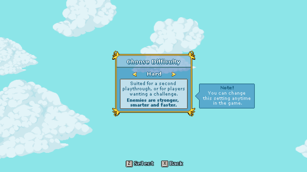
To cater to players on the masochistic side of the spectrum, we’ve added hard mode.

Since the enemies already scale quite extensively in multiplayer, we had a pretty good foundation to build on when adding this feature. In hard mode, nearly everything has been tuned at least slightly to make enemies more of a menace.

Apart from the basic/boring buff of slightly more HP (30 % for normal enemies), they also hit harder, move faster and have less glaring weaknesses. On normal, mastering perfect guard was an optional thing. On hard, enemies will make short work of your shield without it. Here’s a couple of examples to illustrate how the game changes quite a bit:

Exhibit A: Halloweeds have always been a terror on the battlefield, but at least you used to run faster than they could dig. Now if you turn your back on them, they will chase you down (and kill you). They also have half as long delay between attacks.

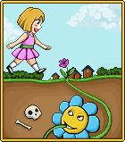
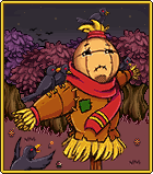
Exhibit B: Giga Slime (both versions) jumps quicker, the slow effect when stepping in his slime trails is twice as strong, the slow slime doesn’t disappear, he can use his hammer more frequently and its startup has been heavily reduced.

For now, personal satisfaction is the only reason to play on hard. It’s for the players that tend to get bored unless they must remain focused at all times to escape death.

Vilya has been busy creating the illustrations for all our enemy cards! Here’s previews of the Bloomo Card and the Scarecrow Card:

Fred has set up his computer for streaming, and last Friday he took it out for a spin!

Here’s a VOD of his legendary first stream, and below is the result from when he was sketching enemies for the Flying Temple:

Fred will announce on Twitter and Facebook when any future streams go live, so keep an eye out for the continuation of his streaming/DJ career!