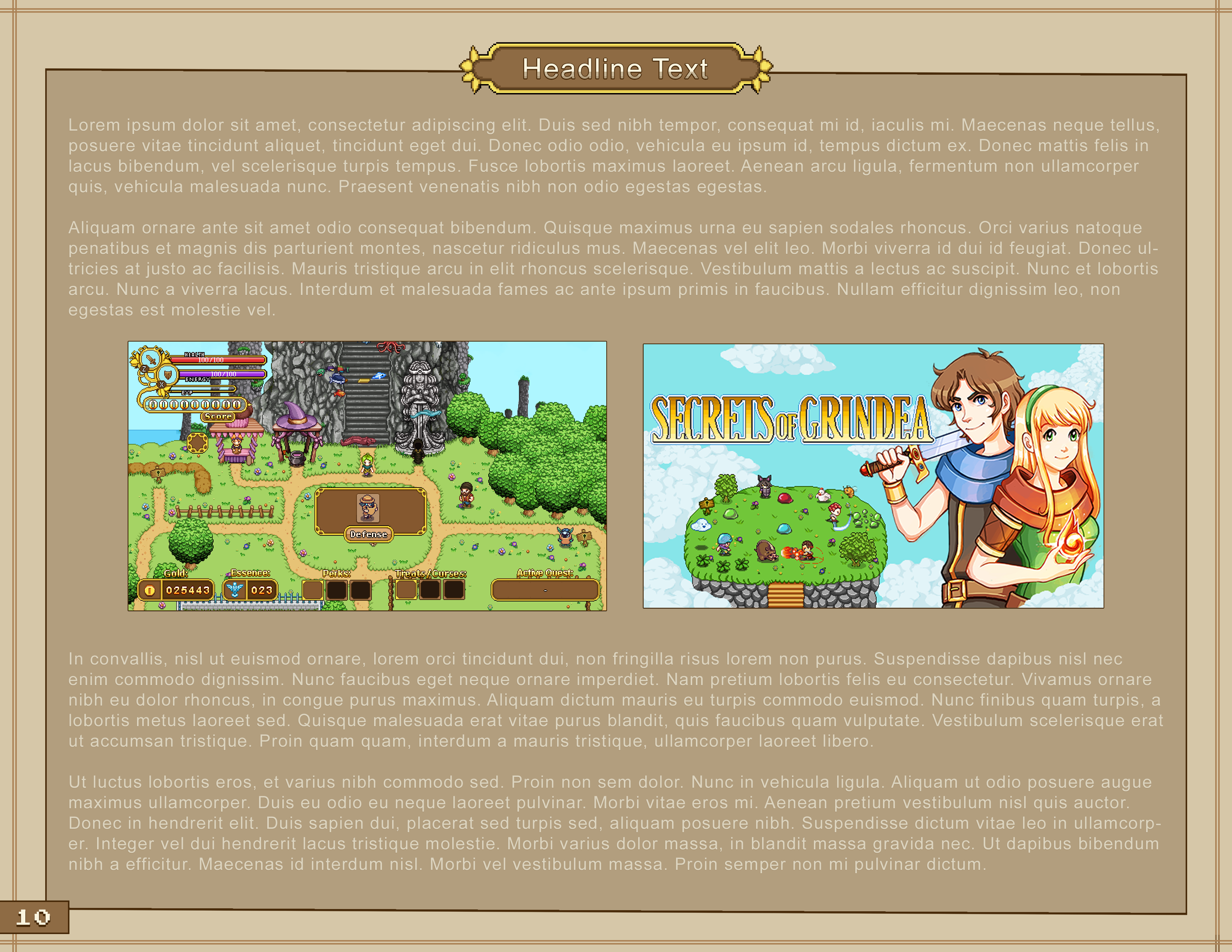
Time for another weekly update on the grind on the final boss battle and the related cutscenes.

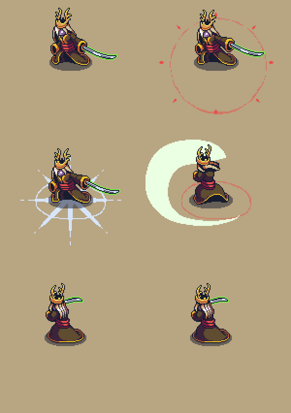
This week Fred has been making transitions between different Zhamla animations! Since we want the battle to feel quick and keep you on your toes, it’s important that Zhamla is able to change what he’s doing mid-animation as a response to what the player does. Normally, for any other mob, that just means we cut off the current animation and starting the next, but since Zhamla is one of the biggest sprites in the game that just ends up looking choppy in this case, unfortunately – and with this being the final battle, we definitely don’t want it to look choppy or weird in any way.

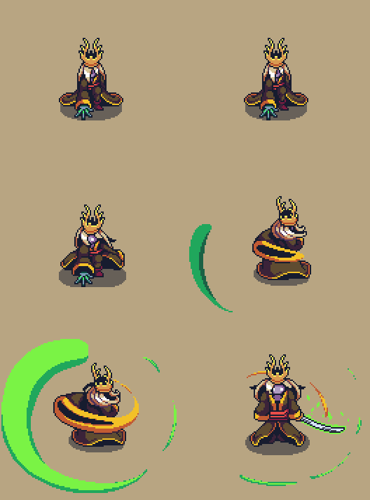
Here’s an example of what one such transition looked like before Fred added the bonus-animation:

And here’s what it looks like with his in-between animation added:

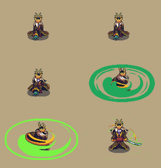
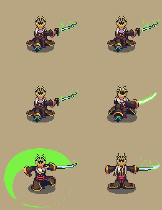
Another thing we’ve been working on is editing some of the attack effects to make sure it looks as good as possible. One such example is the spin, which originally looked like this:

Unfortunately we kind of realized it wasn’t nowhere as cool as any of the other spin-animations in the game, so we decided to remake it, using Luke’s spin as an inspiration:

We’ve also received one of the batches with sound effects needed for this final battle, but there’s still a bunch of things we need sounds for so we’re sending those requests over to our awesome sound effect master faRk as we speak.

Finally, we’re continuing to play through the game, adding those final bugs and wonky things to our list of things to fix before 1.0. While we’re finding a ton of stuff, most of them we’re OK with keeping in the game since they aren’t really all that bad, and the rest should be small and easy enough to fix. Onwards!

Another week gone and more boss work finished! This week we’ve been focusing on finishing up the summoning phase during Zhamla’s boss battle, which should (fingers crossed) be done now!

Fun fact, originally we didn’t plan on including Zhamla’s summons at all, but as usual we decided to spice things up by adding some extras to the battle. Also as usual, we’re really happy we did because it’s turned out pretty awesome and, in our opinion, made the battle a lot better.

For now, have a look at some of the recent animations for this phase:

Other than that, we’ve continued playing through the game, catching bugs and discussing what aspects we still want to improve upon. After all, once we hit 1.0 we want it to be the absolute best it can possibly be, a stance we’ve had since we began working on this game some ages past. We’re trying not to polish too much, though – don’t worry! But if there are quick and easy fixes that up the quality of the game significantly we’d be stupid not to consider them.

Okay, time to get back to that final playthrough! See you again soon :D

This week, Vilya is back in action and has continued working on some new backgrounds as well as playing through the game to catch things we’ve forgotten to add. So far she’s written a list of over 50 things, and she’s still only just finished the Temple of Seasons! Not to worry though – most of these things are super small things that will only take a couple of minutes to fix, or optional things we may or may not add. Some may even be added post-release! And some we probably won’t fix at all due to them not being as important as we first thought.

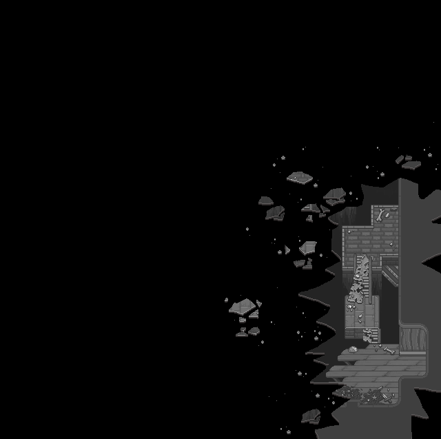
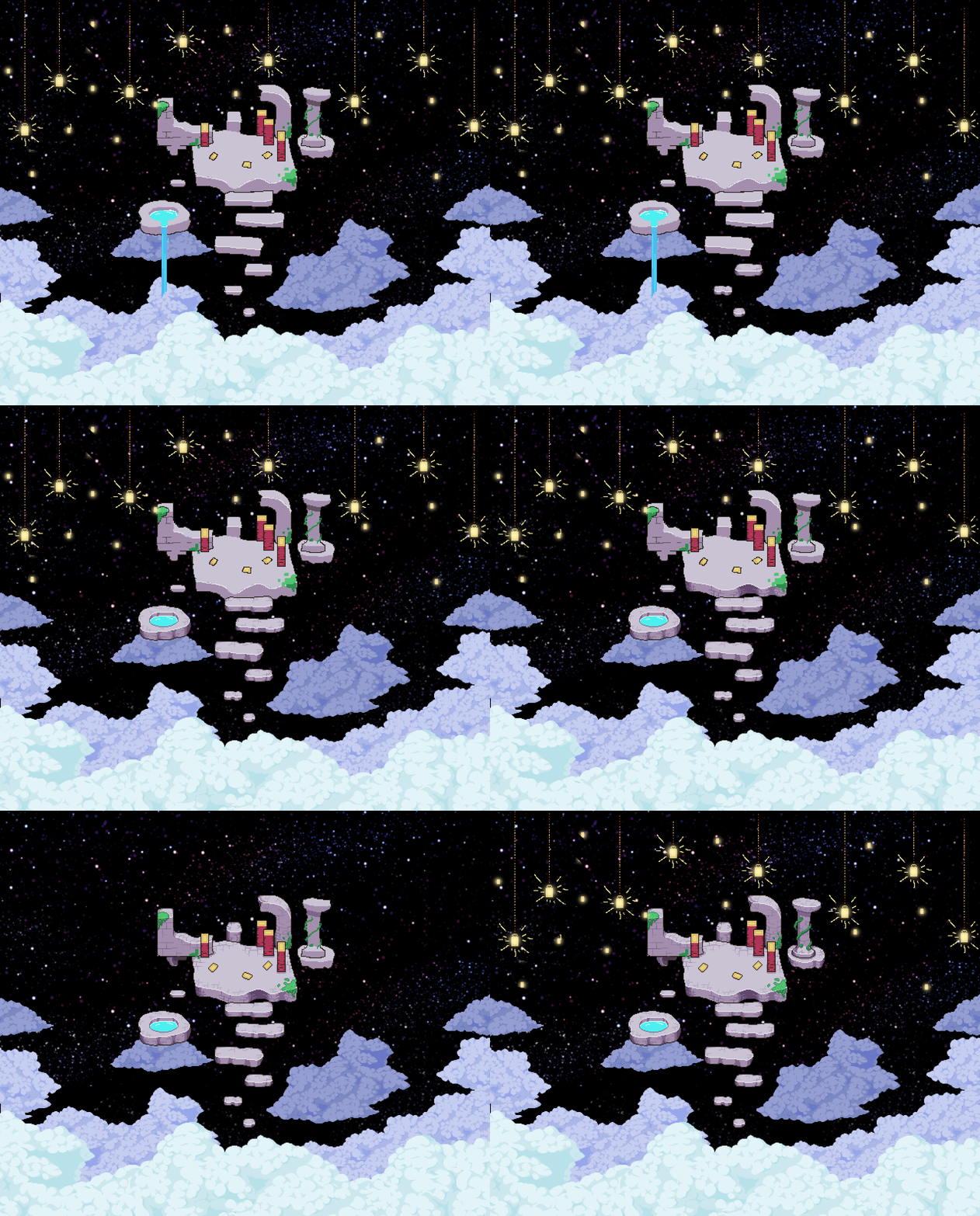
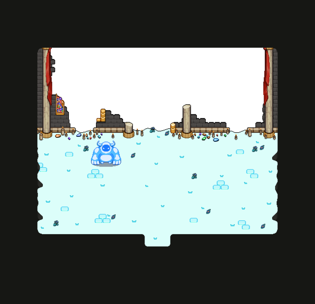
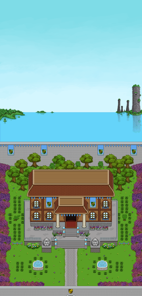
As for the backgrounds, here’s another iteration of one of the puzzle backgrounds:

I think we’re getting to a point where we’re all pretty satisfied with the way it looks now. What do you guys think?

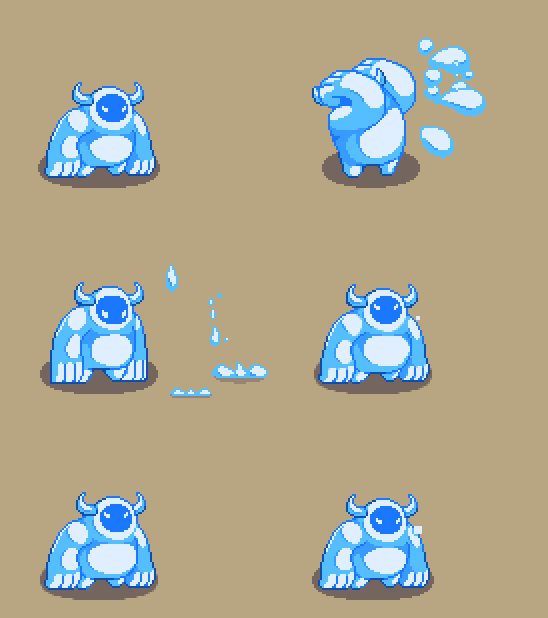
As for Fred, he’s continued working on the summons! Remember the Frosty Fiend smash animation from last week? It’s now officially in the game and looks like this:

He’s also been working on a charge animation, and some projectiles for the Plant summon:

Teddy’s been sick for a while yet, but he’s finally getting better and ready to get back into action this week. Stay tuned for more updates next week!

Another week, another recap! This week, Teddy has finished up the final cutscene of Arcade Mode, adding the new background Vilya made a couple weeks back. He’s also made a bunch of adjustments in the way final boss Zhamla’s plant launches its attacks, and started working on GOG support. Some years ago we decided we’ll be available on GOG as well, and with the release drawing ever closer with every week, it’s time to get that support up and running. Of course, that whole process involves some extra bits of programming such as porting the leaderboards and making sure multiplayer connections work properly.

Vilya has been busy playing through the game and making reports on bugs and other smaller things we need to fix, as well as making some further improvements to two of the puzzle backgrounds in the final dungeon:

We’re still not entirely happy with the second one, so another iteration is sure to follow soon.

As for Fred, he’s finished up the animations for Zhamla’s plant and cloud, and put in a lot of work on a special attack Zhamla makes, that’s a bit similar to how the echoes of madness work in Tai Ming. Here’s a little sneak peek of that:

Now, onwards to another week! :D


In the last post I mentioned recording a bunch of videos showcasing some of the stuff we’ve done so far with the final battle. Without further ado:


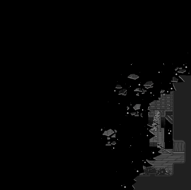
First above, the sequence where Zhamla breaks the room to reveal the sky outside! In this prototype, we still use the red sky, but in the final version we might change it around so a night sky with stars will be revealed instead.

Next up, a little updated sequence with Zhamla’s summons! Here you can see the swap between the red sky and the night sky, as it happens when Frosty Fiend appears:


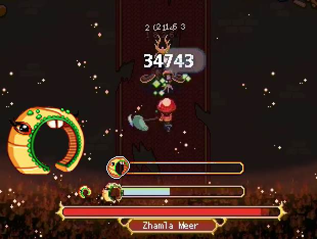
We’ve also made an updated heal for the sequence where you need to damage Braazlet. We’re still missing the proper HP-bar graphics (which I made last week) in the prototype below, but it should be added soon:


Finally, an assortment of new attacks and patterns:

   
Keep in mind that all of these are still in the prototyping phase and will get polished quite a bit more :)

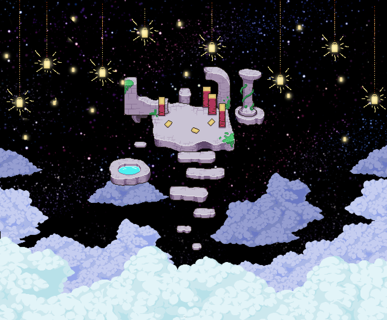
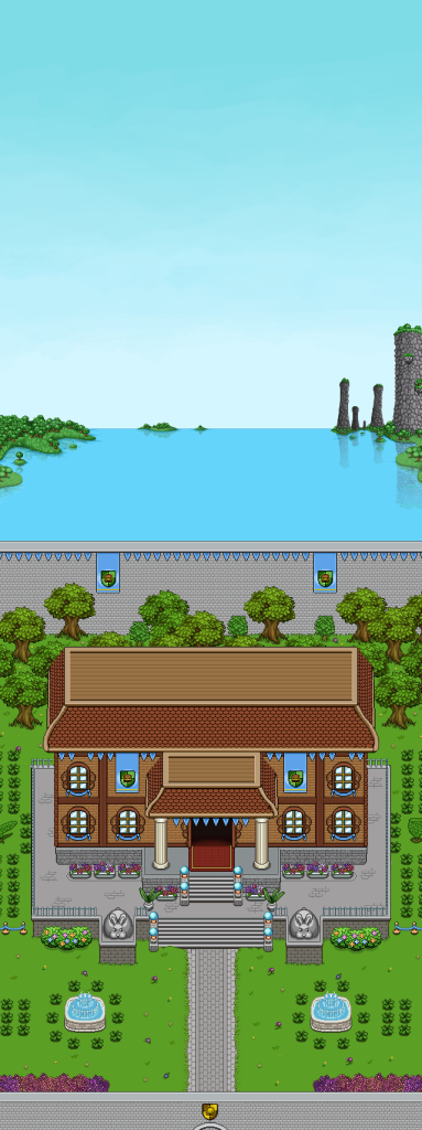
One of the very final scenes in the game will take place above the blue skies, in space, where Grindea herself has one of her dwellings. We thought a lot about how to do the transition between blue sky and starlit night, and after having tried out a bunch of gradient options, we decided to simply go for an easier (and prettier) solution: clouds!
Once you get high enough, there will be a thick blanket of clouds, and as you emerge above them, there will be different colour clouds and a starlit sky behind them.

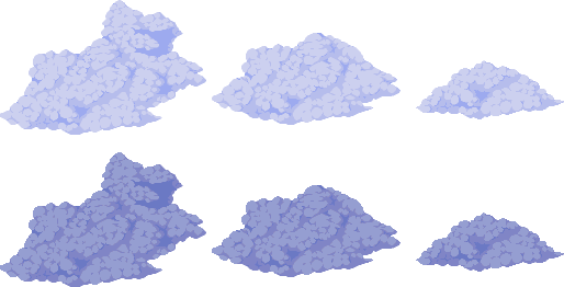
Here’s an early sketch, the the corresponding new clouds needed:

And now it’s time to render the background:

After painting a ton of floating stones, it’s now done! Well, at least my part of the work – time for Fred to animate some cards/stars :)

Hey guys! Sorry for this extremely late post, I’ve been in the midst of moving and with things still being pretty chaotic around here, I simply forgot to schedule the draft – oops!
Right now our full focus is on the very final boss battle, against Zhamla. While the prototype for the battle is nearing completion, we still feel like something is lacking. Nothing big, just a lil something extra. Our current focus is playing around with tweaking and/or adding bunch of new attacks, patterns and phases to see what feels good and what doesn’t. Overall though, I think it looks absolutely amazing, and can’t wait to show you guys!

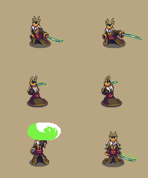
We’ll try to record a bunch of videos over the weekend so you can see some of the juicy stuff in action, but for now, here’s a bunch of Fred’s animations:

As for me, I’ve made a new kind of HP-bar as part of the boss battle against Zhamla! This bar is for Braazlet, who you’ll have to defeat before you’re able to do any real damage to Zhamla himself. In the videos we’ve shown before, we’re using placeholder graphics, so it was definitely time for me to add some proper graphics!

I

I’ve also made a proper background for the Frosty Fiend portion of Zhamla’s boss battle! As with Braazlet’s HP-bar, we previously used placeholder graphics for this, but now it has its very own proper background:

First up this week, let’s take a look at the healing phase of Zhamla’s boss battle!

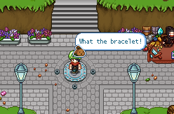
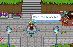
Here, you need to defeat the bracelet first, so it can’t keep on healing Zhamla indefinitely. Bag and Braazlet will also have some lines mid-battle in speech bubble form, and in order to make this look its best I made some new graphics to go with the bubbles. I also took the opportunity to update the speech bubbles used by other artefacts earlier in the game (= Shiidu and Trunk).

Here’s the result, with a sample bubble and a prototype video showcasing them:


The summoning of Zhamla’s version of Frosty Friend (Frosty.. Foe? Fiend?) is also coming together more and more. Here’s a prototype of the summoning of this summon:


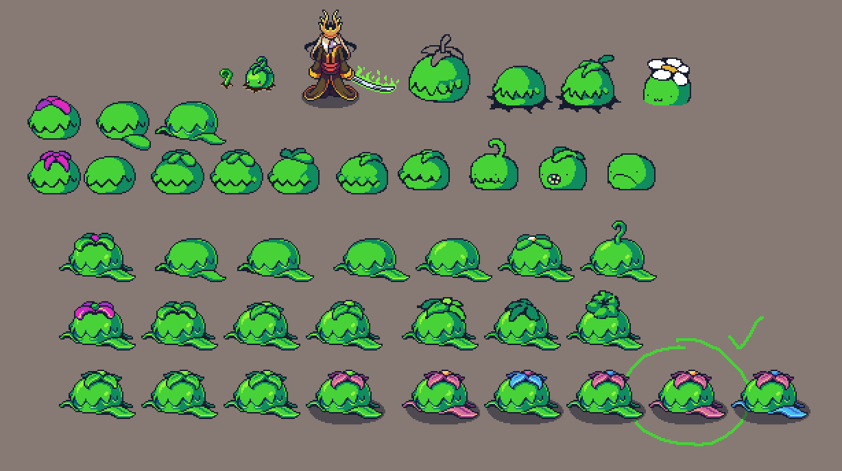
Fred has also been working on various sketches of another of Zhamla’s summons, a bigger and scarier version of Summon Plant! Let’s take a look at that:


Which one is your favourite? Ours is in the green circle with the checkbox!

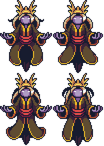
This week I’ve been working on some new art for Secrets of Grindea once more!

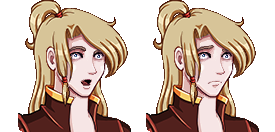
First up, two new expressions for Zhamla:

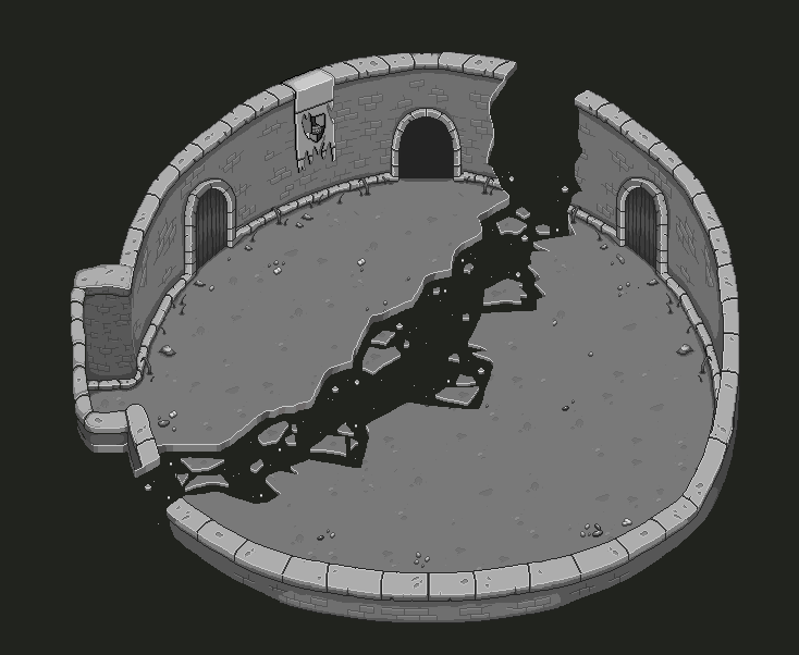
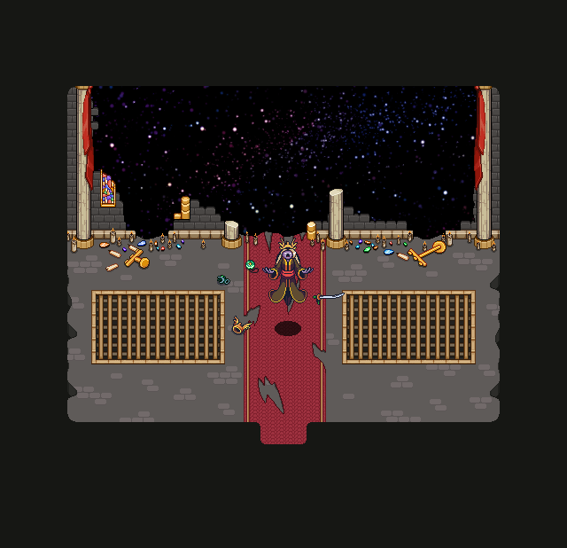
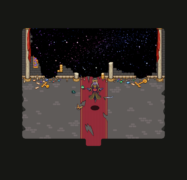
I also edited to floor, removing the golden bars to make the battle area look more clean – before and after below:

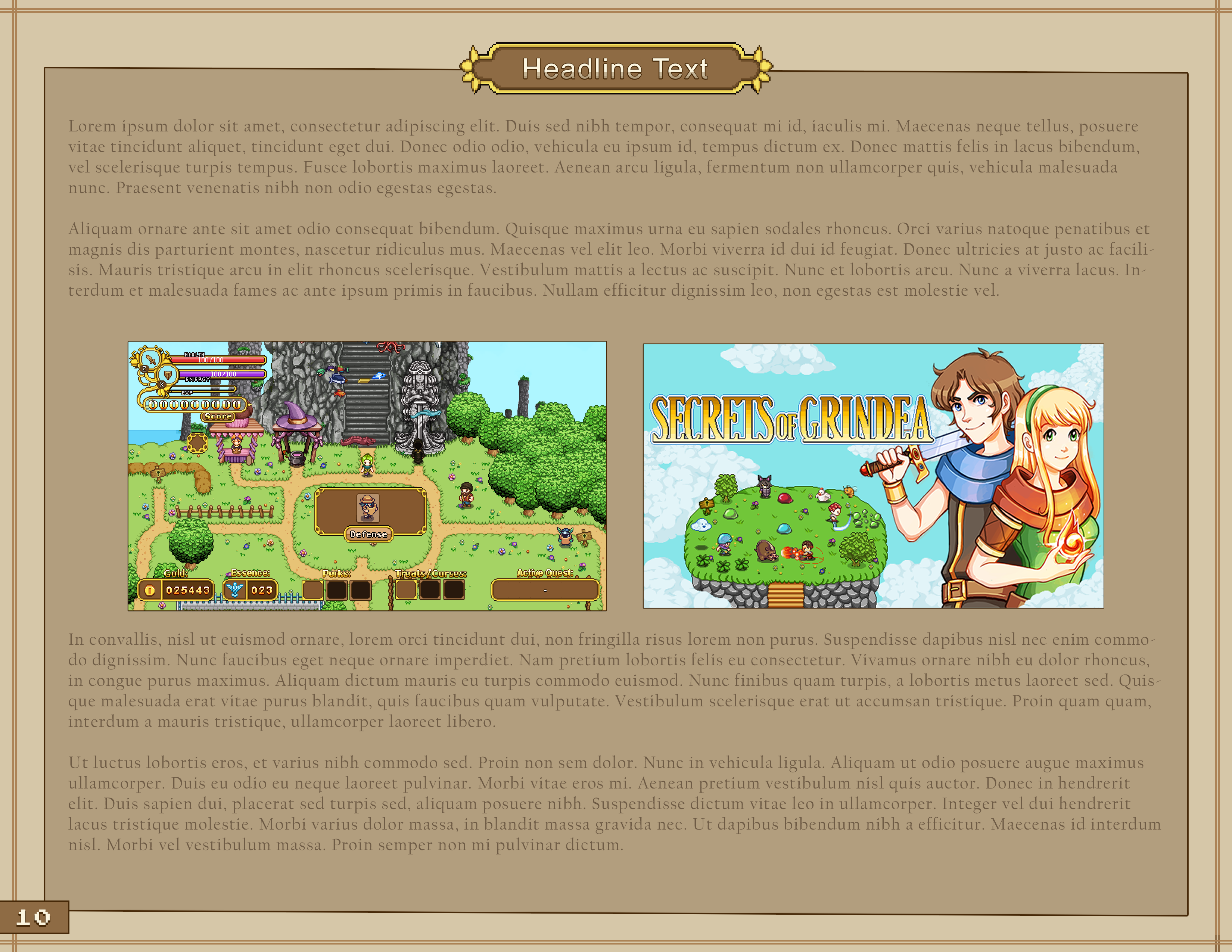
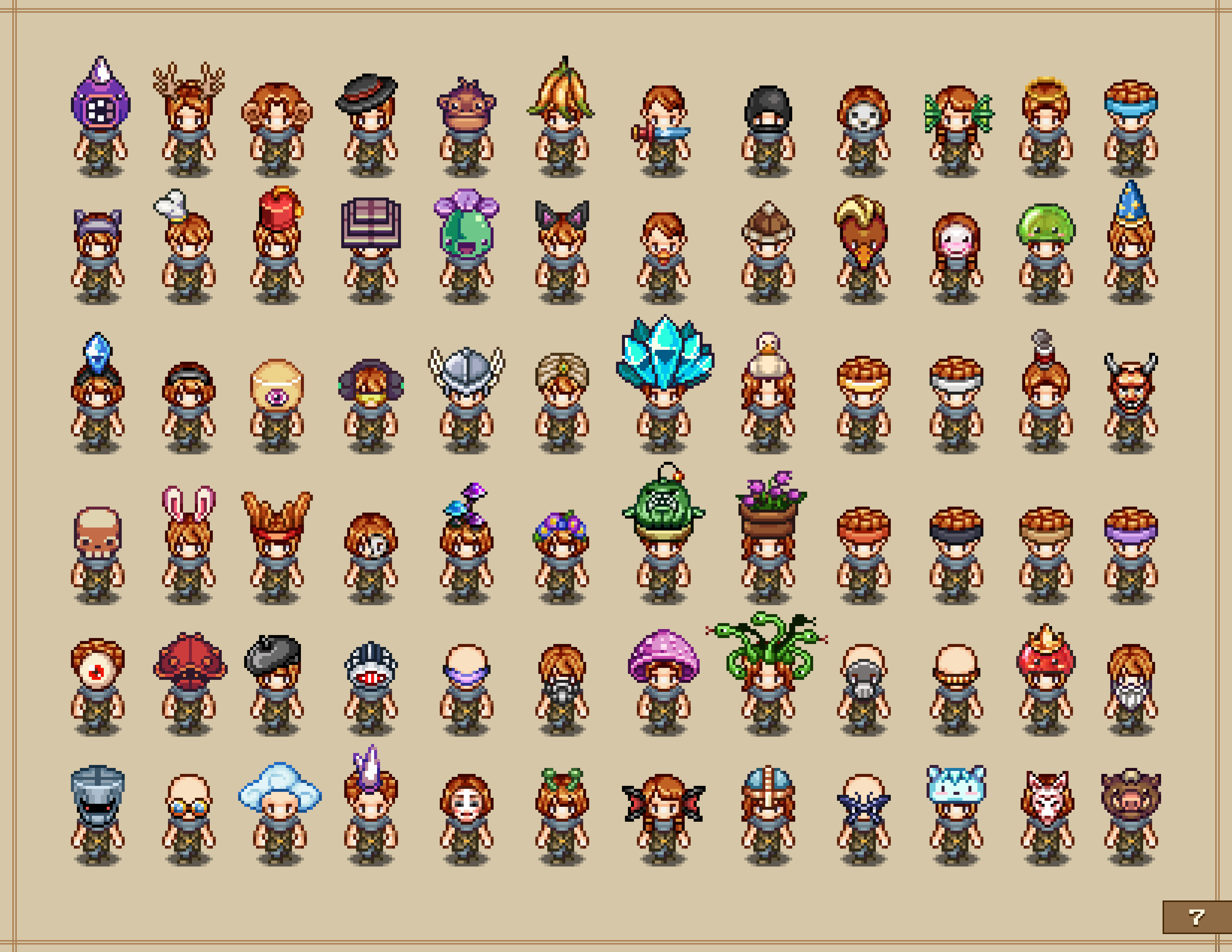
This week I’ve continued to focus on the visual aspects of the production book! Even with the general style decided upon there’s still a ton of smaller details to take care of, such as picking fonts and proper colour schemes. While it might seem trivial, it’s in fact extremely important since it determines if the book is comfortably readable and whether it’s visually pleasing at all.

Below you can find a few mockups with some of the fonts we’ve gone through:

Our current favourite is the third. Which one do you prefer? :)

As I’ve been going through more art and game books I’ve also come to the realization that I need to cut more of the original text than I initially thought. I don’t want the production book to drag on with boring details, instead I want the focus to be on the process as a whole with as many pictures as possible and short and succint comments rather than whole chapters. Perhaps I will change my mind again, but for now it seems like an overall better approach for a project like this.

As a result I’m currently going over the text once more with the scissors, trying to polish it down as much as possible!

Fred, meanwhile, has continuined his work on the Frosty Fiend, which now has a proper spawn animation, death animation, roll and soon (!) an alternative attack animation:

Teddy has shifted focus from the boss battle to work on some cutscenes between the two major battles, as well as the cutscenes surrounding one of the endings. This week the both of them will likely team up to finish up those cutscenes, with Teddy requesting animations for the cutscenes whenever he feels he needs one.

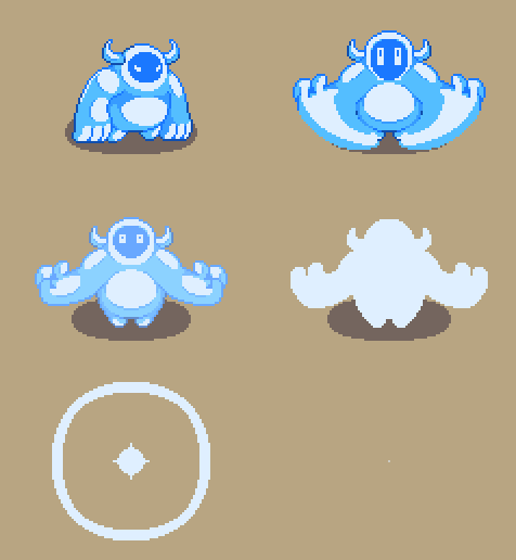
A new week, and more Frosty Fiend progress! He has, as of today, one regular attack (he will get another one, but one is enough for now to just test how it feels in-game), then Fred made a “hulk smash” for a potential special attack. It was a bit tricky as the pose was a bit difficult to get right but after much fiddling and reference checking, it worked.

Fred has also made a cannonball dive for him (he was first going to have a regular dive but he soon realized the cannonball felt more appropriate). He thought he would be extra smart here and just use the hulk smash pose straight away and just adjust the arms, but realized quite quickly that he needed to redraw everything for it to look nice. It went smoothly though! Nothing is 100% finished-rendered at this stage, but it’s taken far enough that one can test it in-game and get a fair idea of how it will feel.

Teddy has also continued with Frosty Fiend. He has tinkered together a (nearly finished) test for a snowball attack where the Fiend throws straight ahead instead of lobbing (which is what he has done so far). This way he has equivalents for both the snowball attacks we have previously used back in Seasonne through the snowball-throwing Scroundrel!

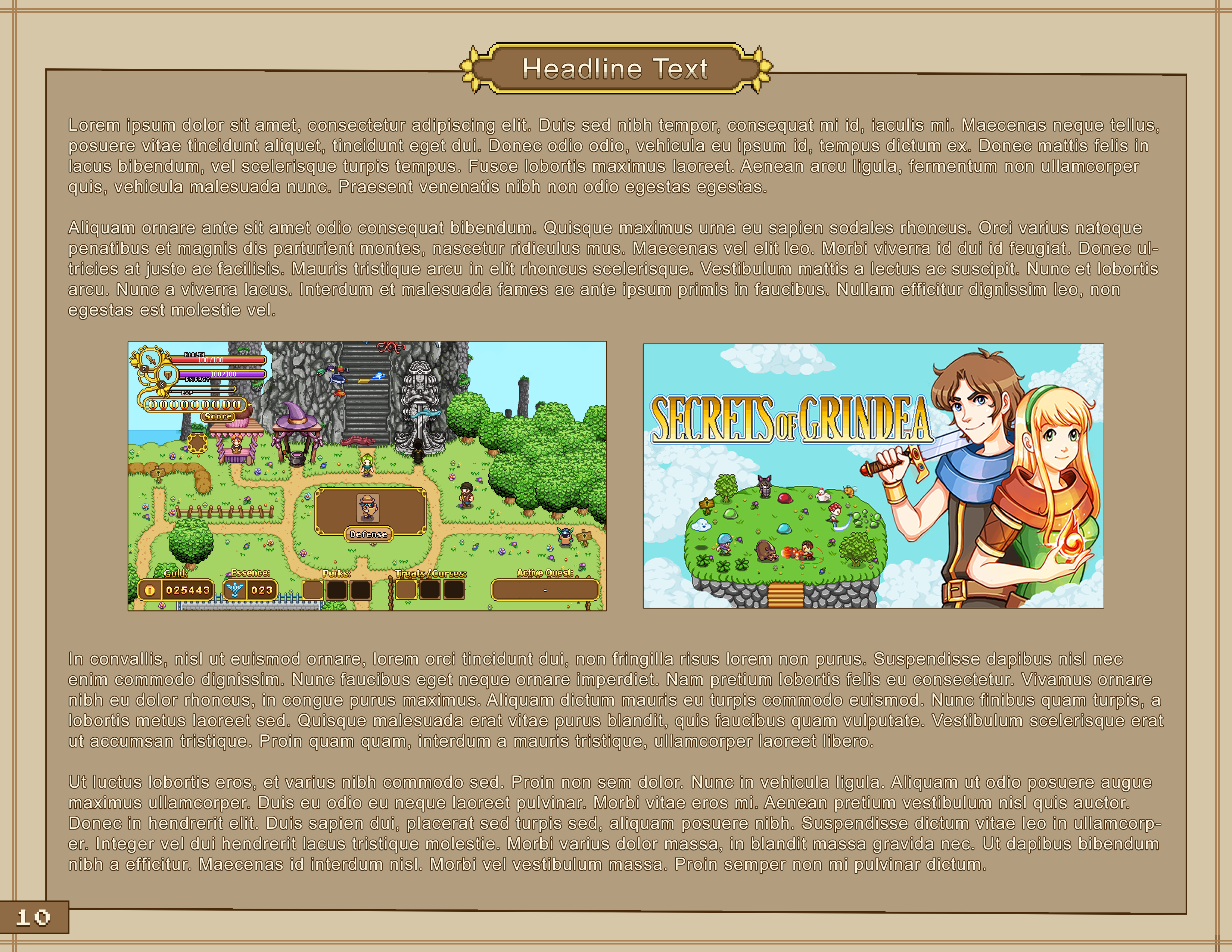
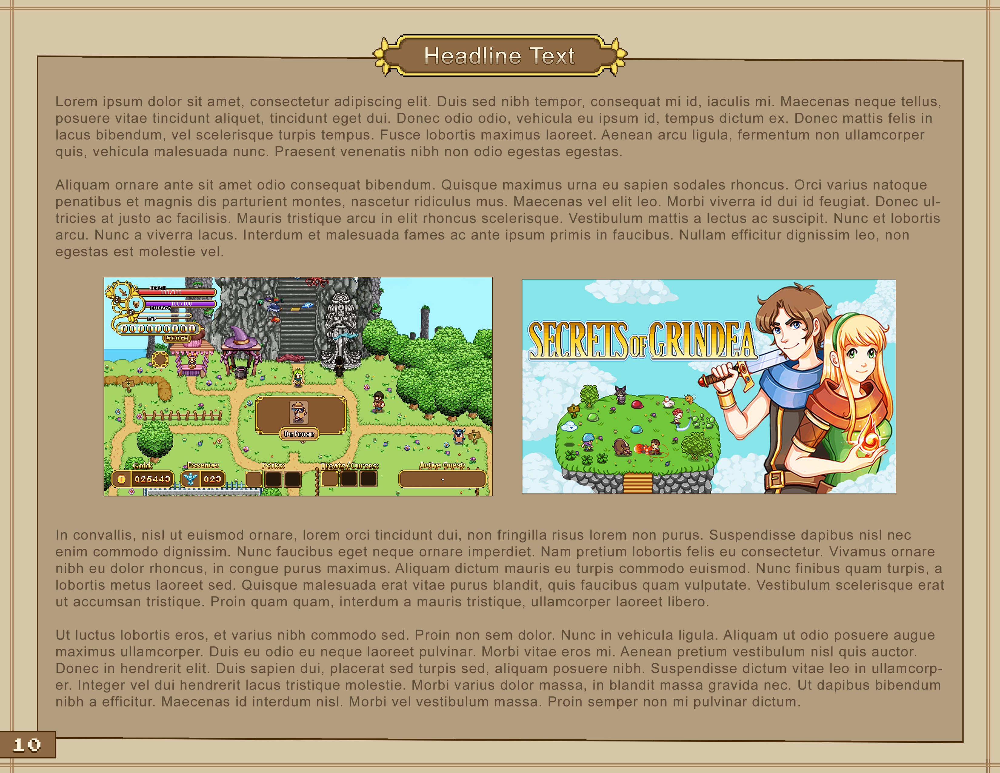
As for me, I have gone through more art/game books to get ideas and inspiration for the layout of the production book and made a ton of different design mockups before settling on something like these:

We are still evaluating what type of text design will be the best in terms of balance between readability and aesthetics, so it will probably change a bit before we are completely done:

Which version do you prefer so far?