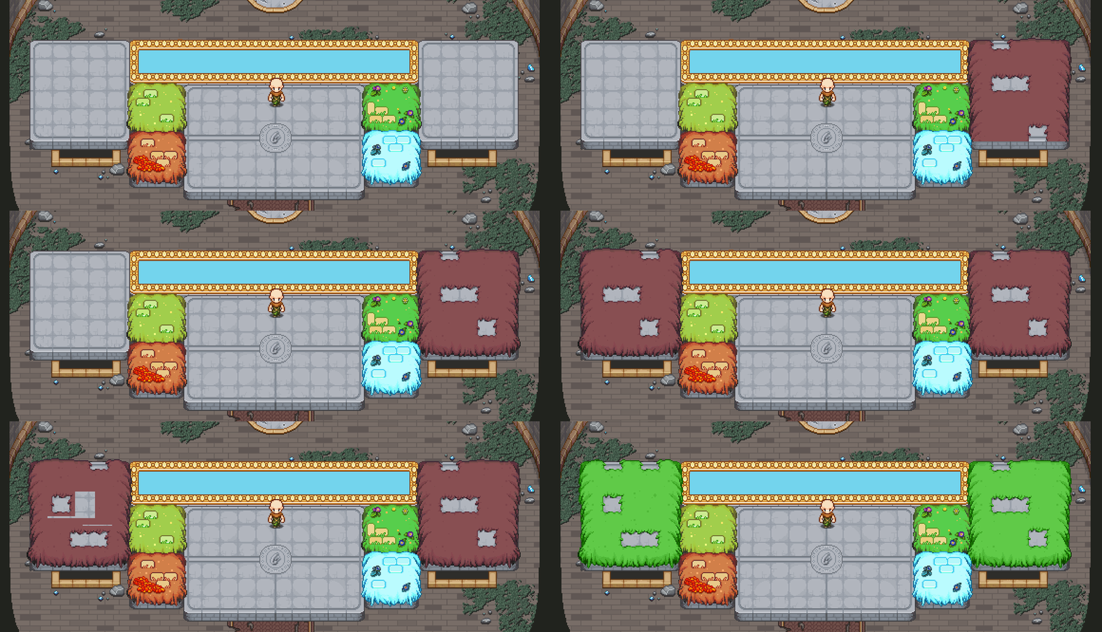
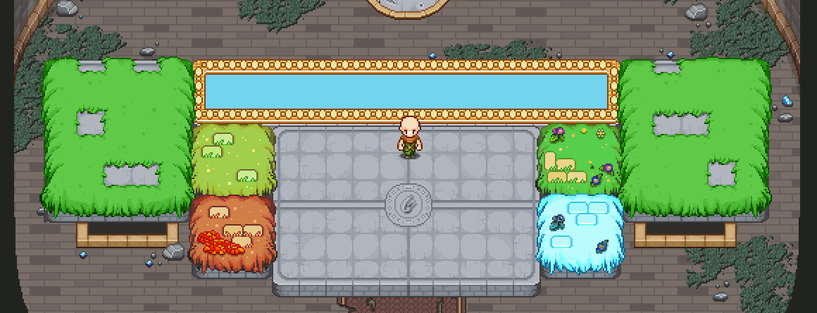
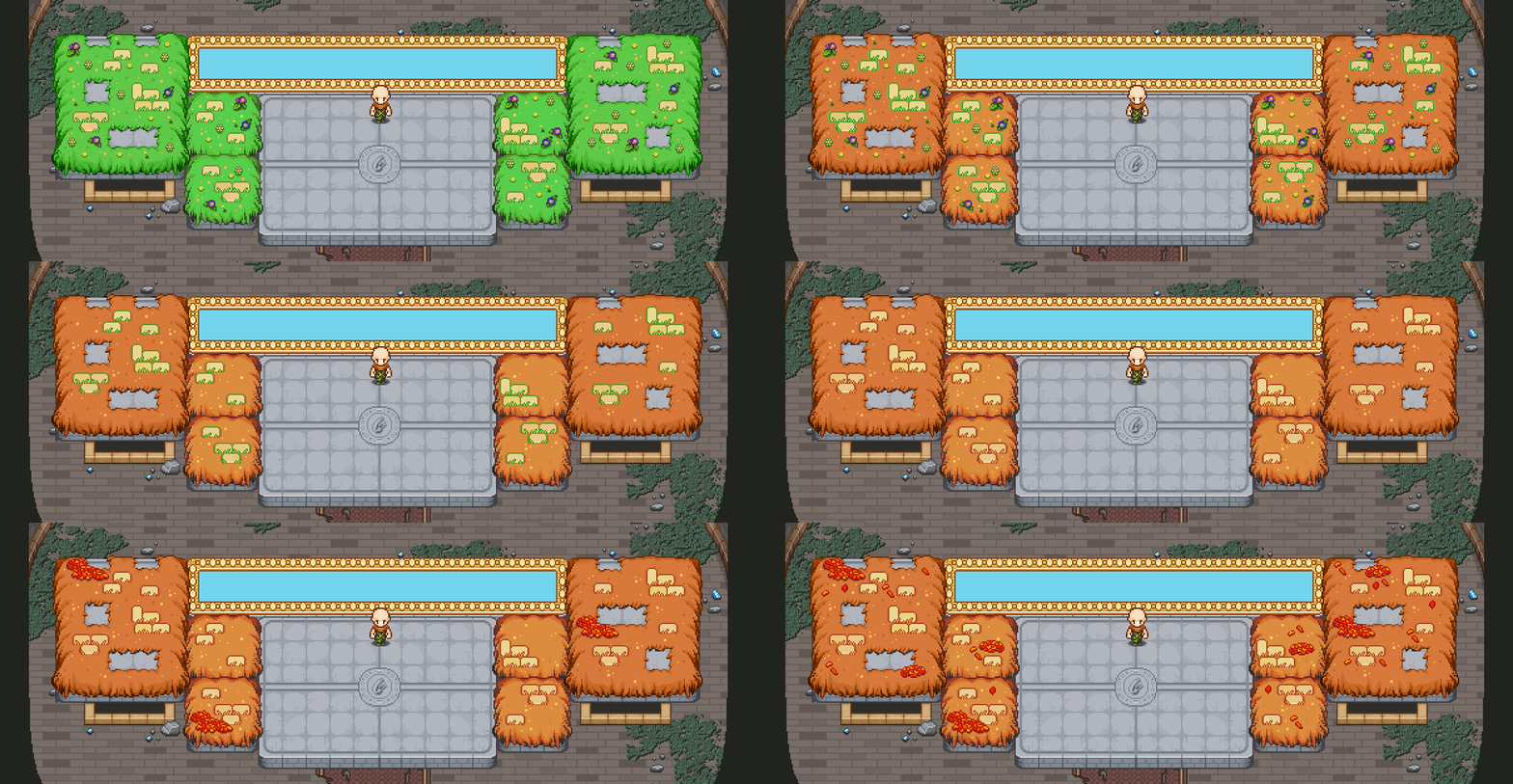
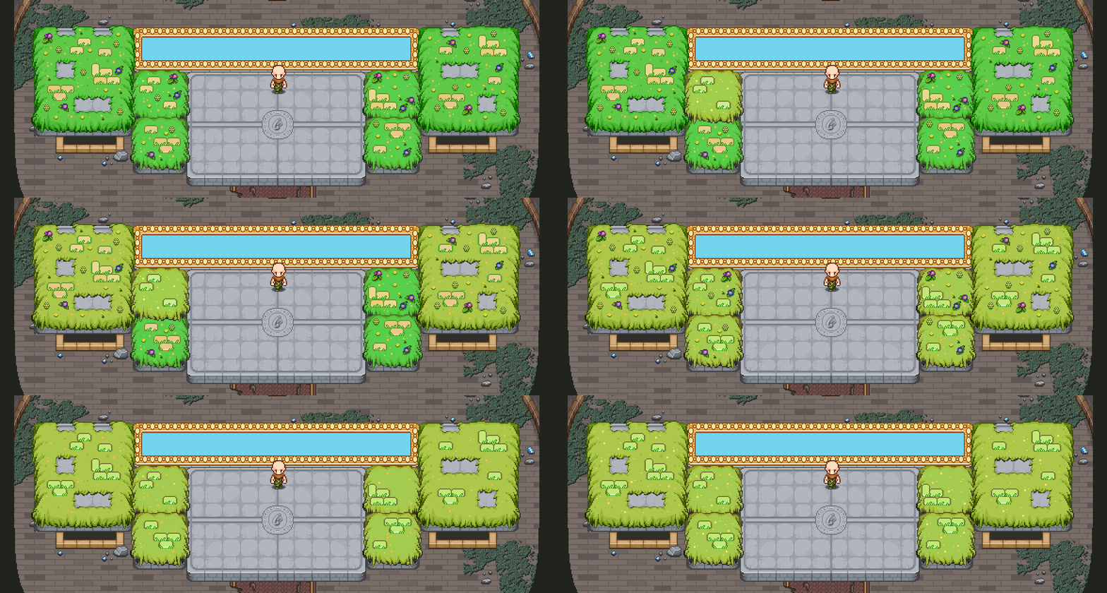
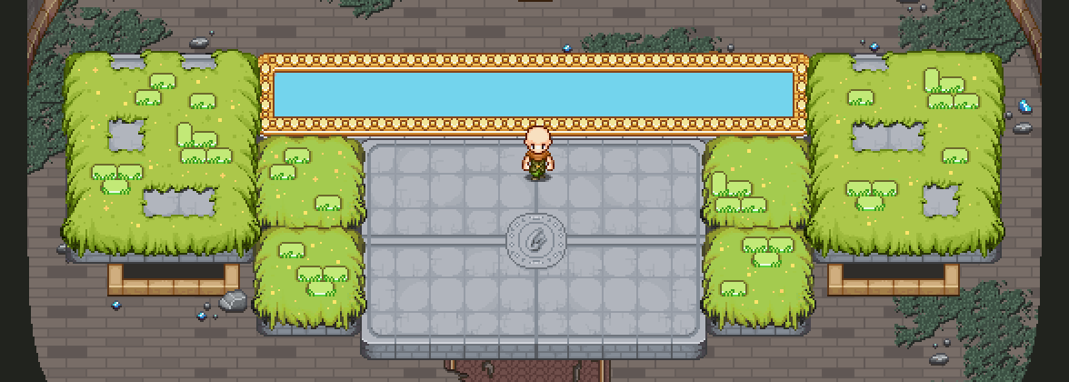
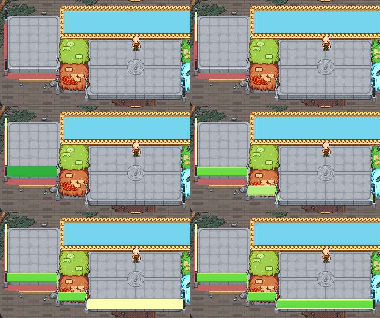
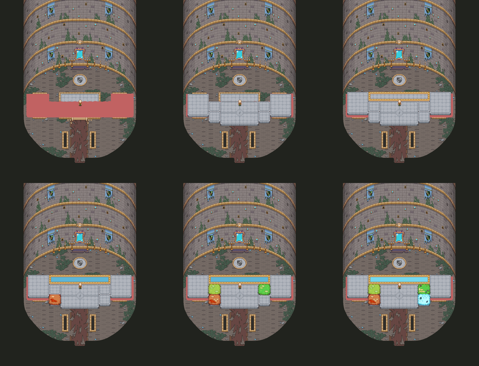
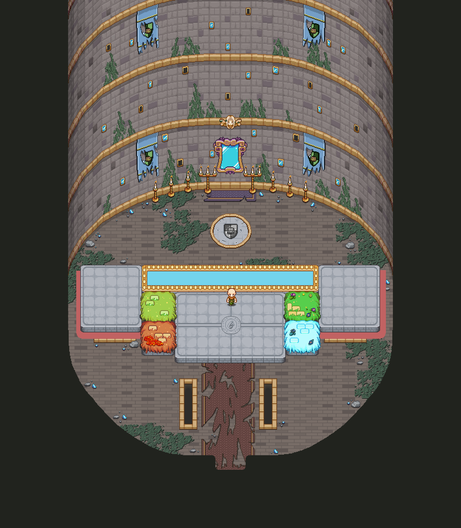
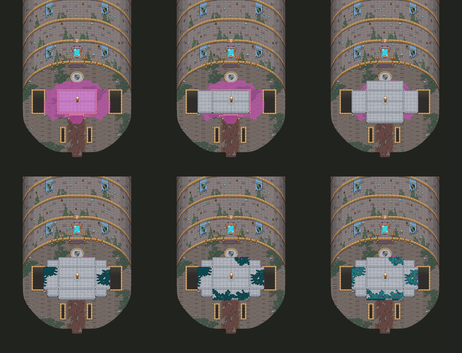
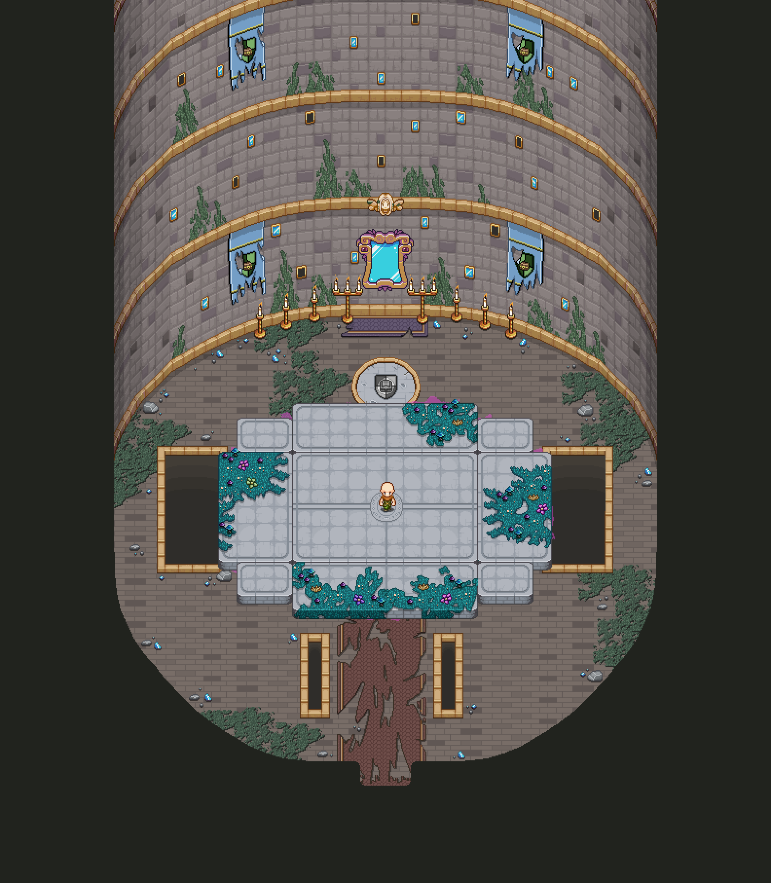
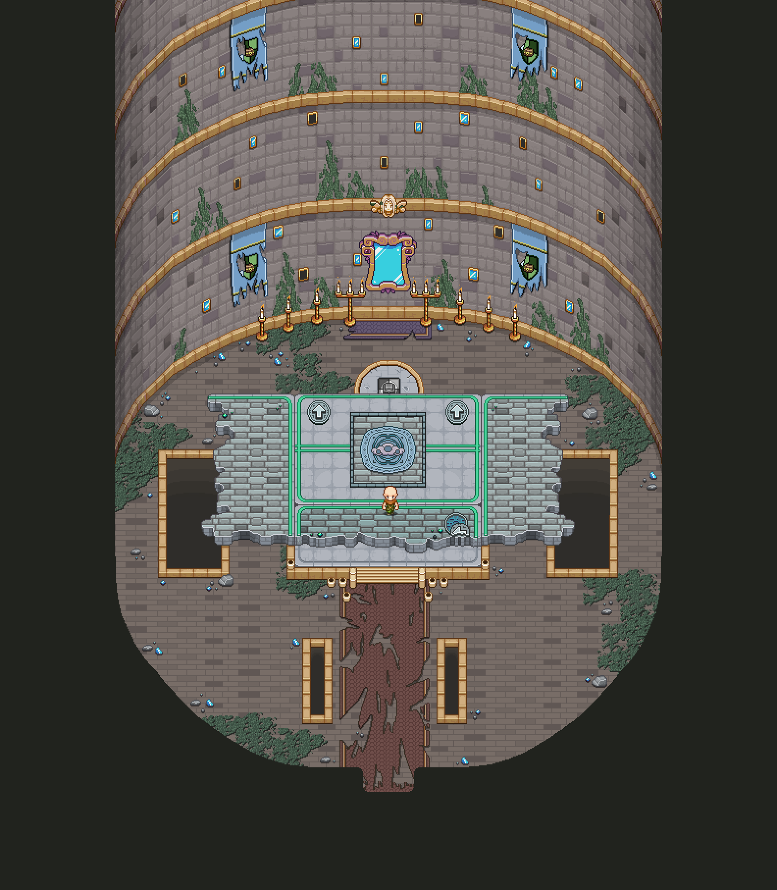
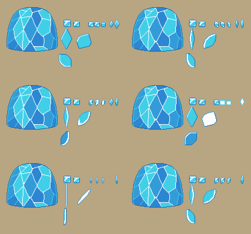
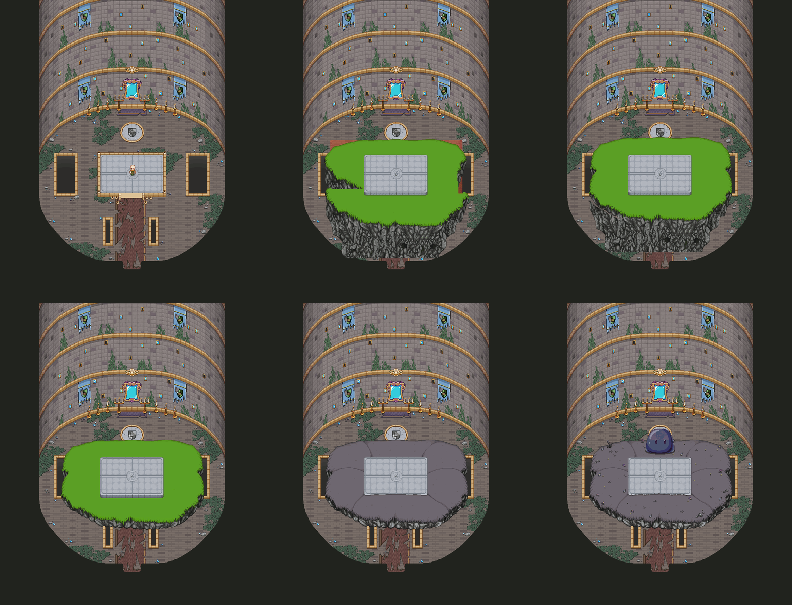
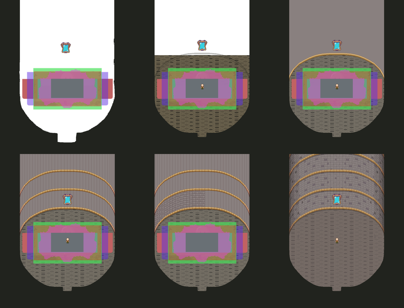
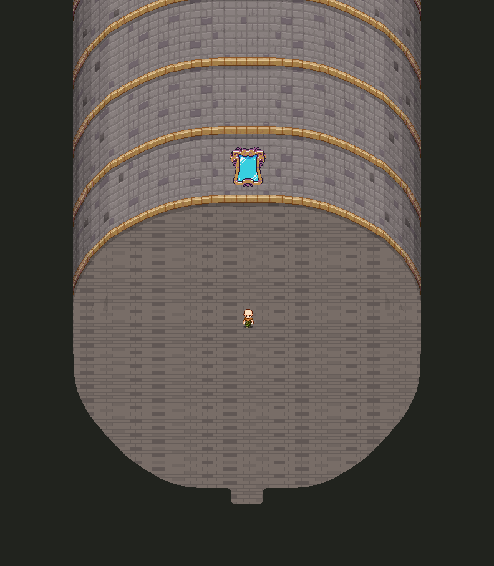
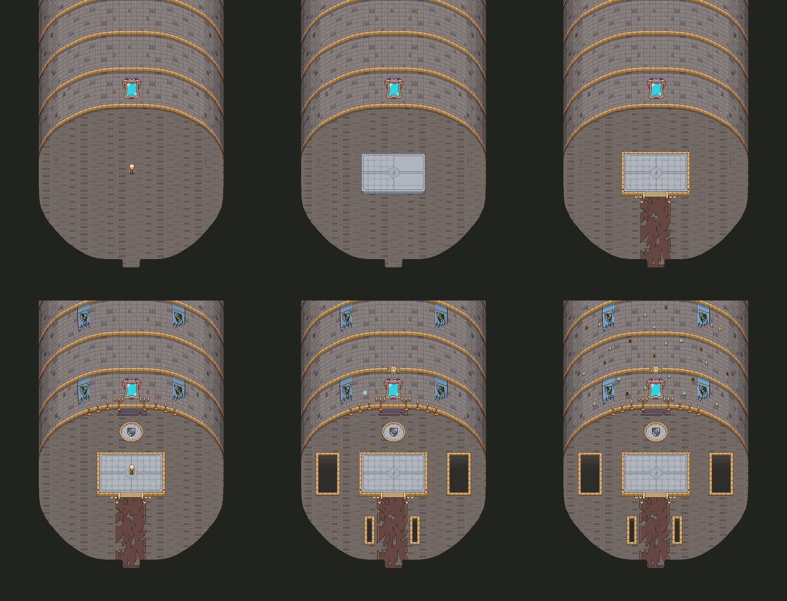
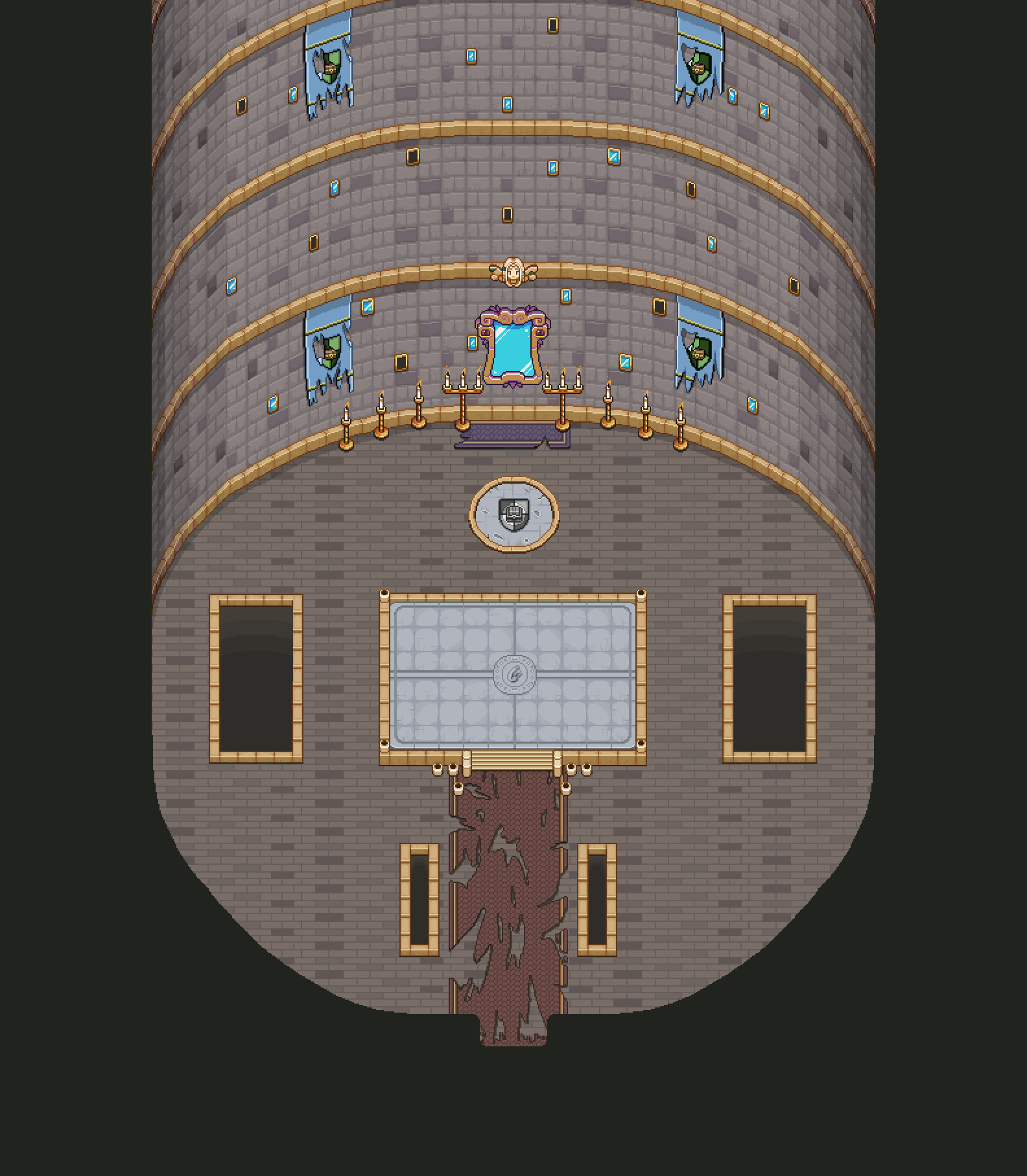
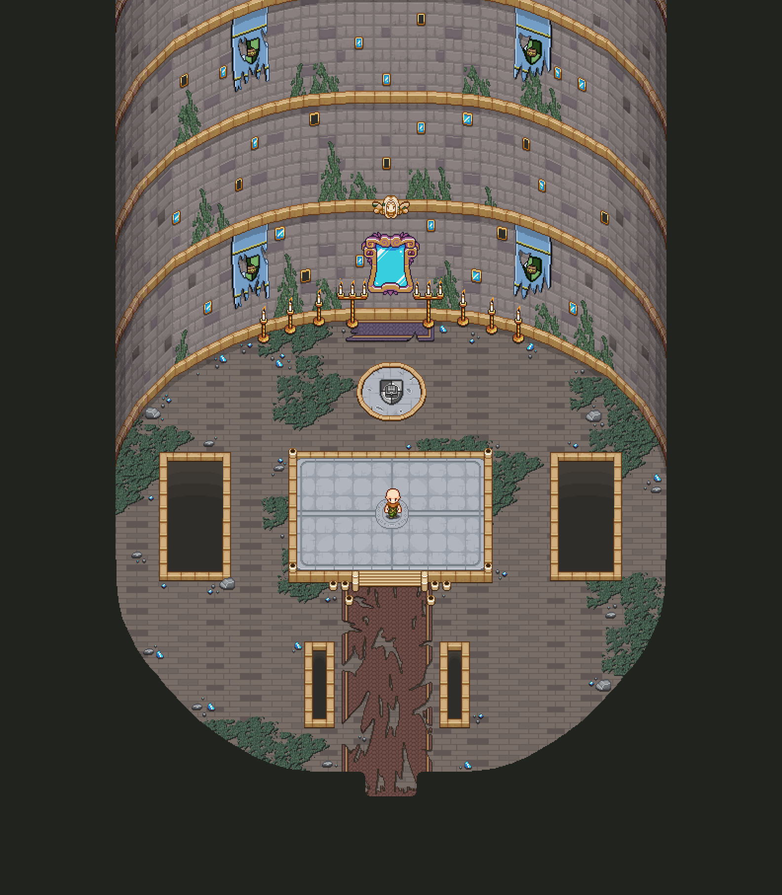
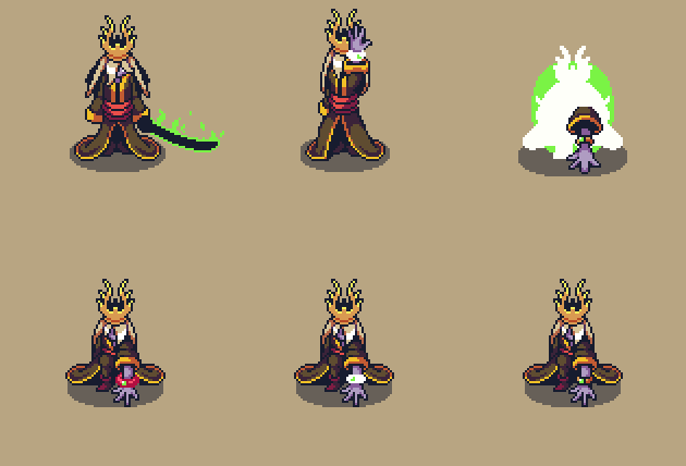
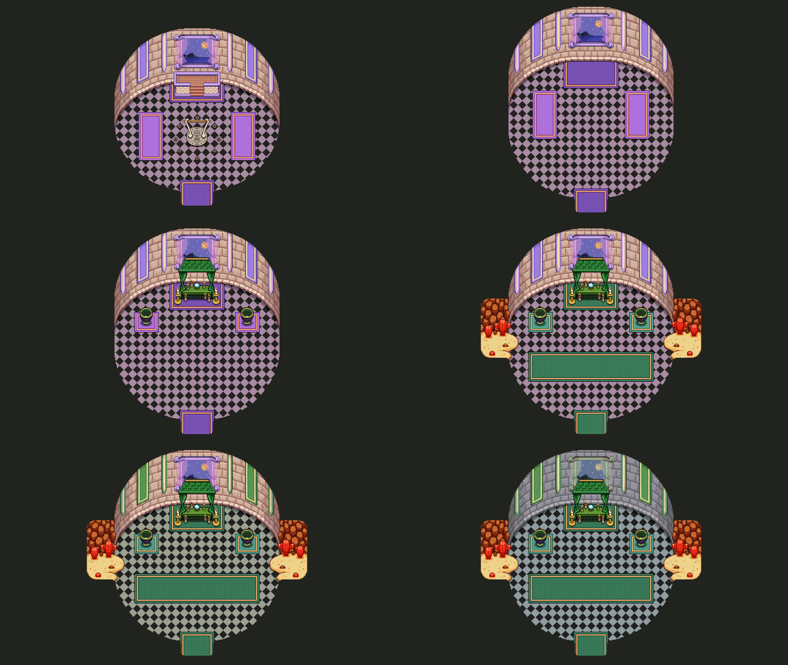
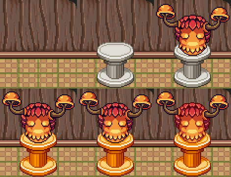
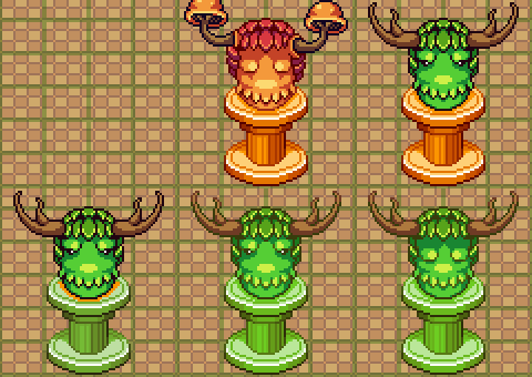
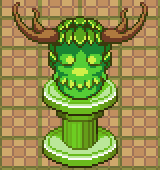
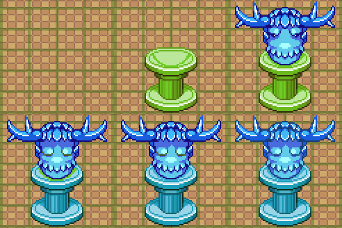
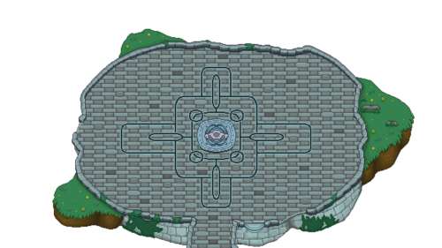
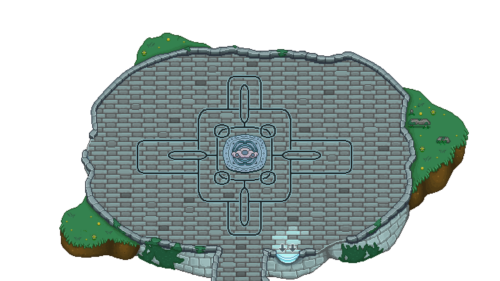
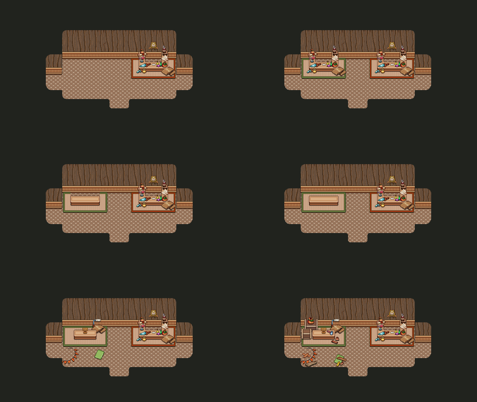
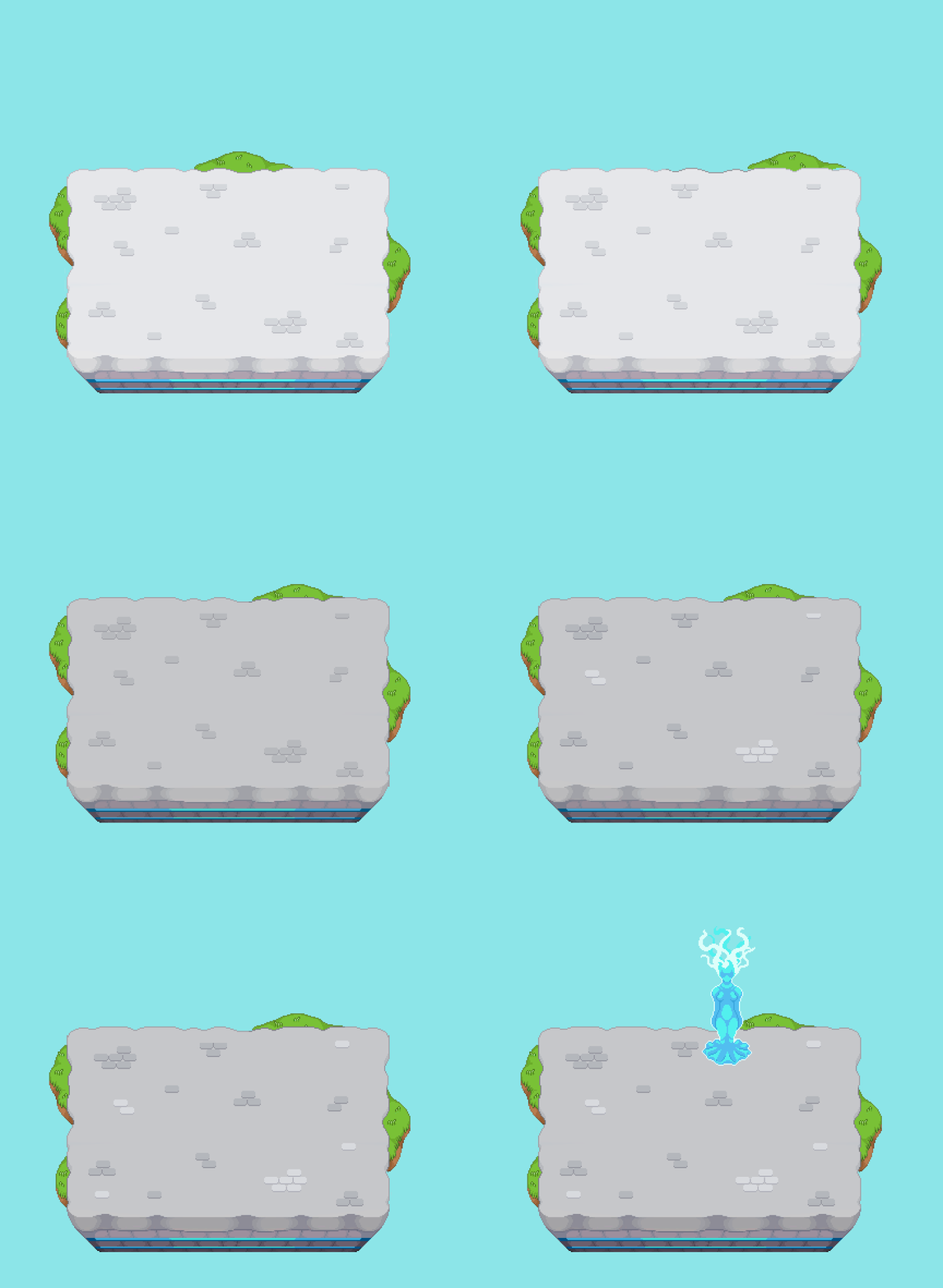
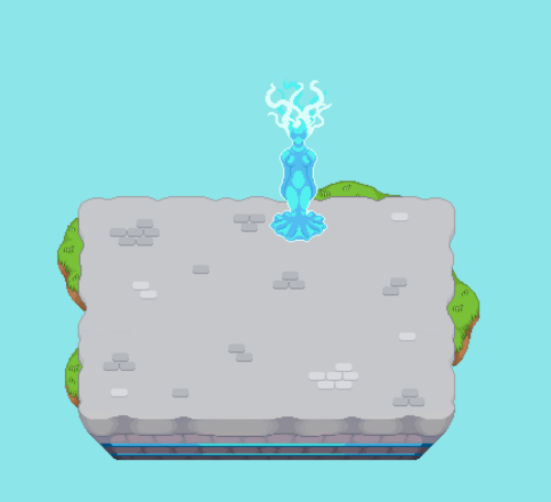
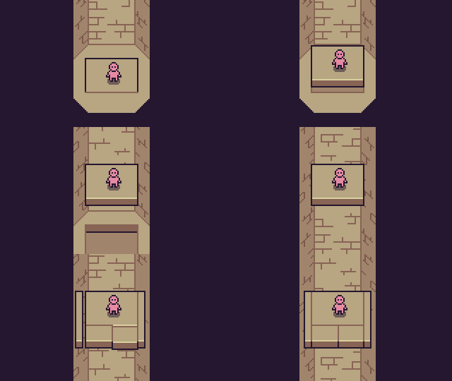
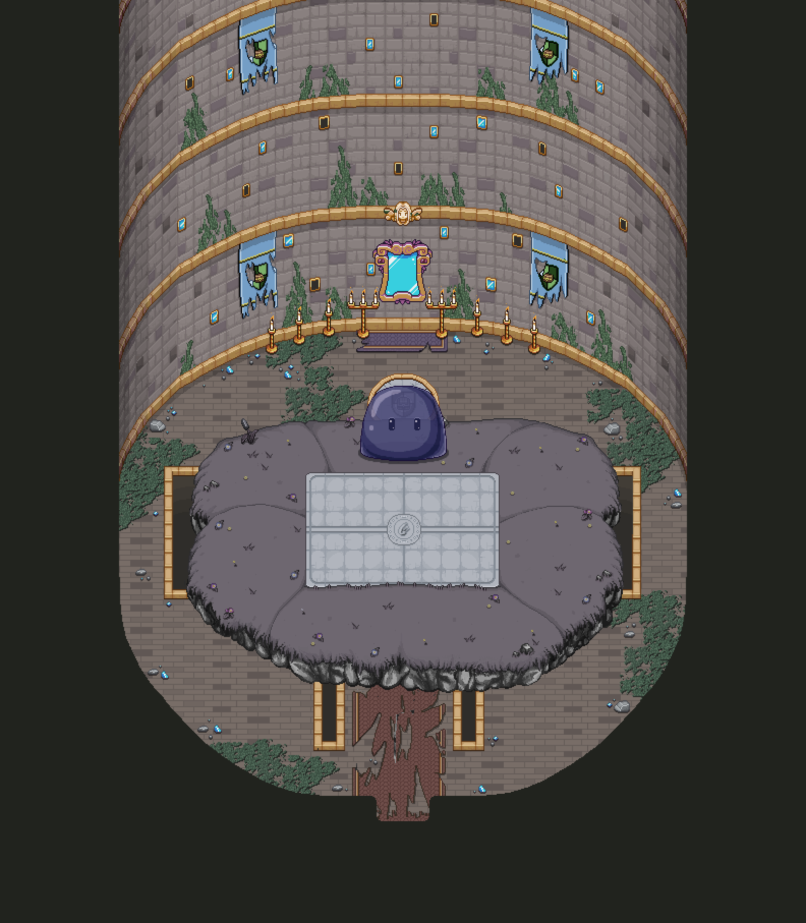
This week we’ll take a closer look at the next boss in the boss rush, the Season Hydra! As you may remember, I made a part of the background for it a while ago, but today it’s time to take a look at what the elevator will look like with each of the different seasons. First though, we decided to add grass to the remaining two platforms as well, so let’s have a peek at that first:

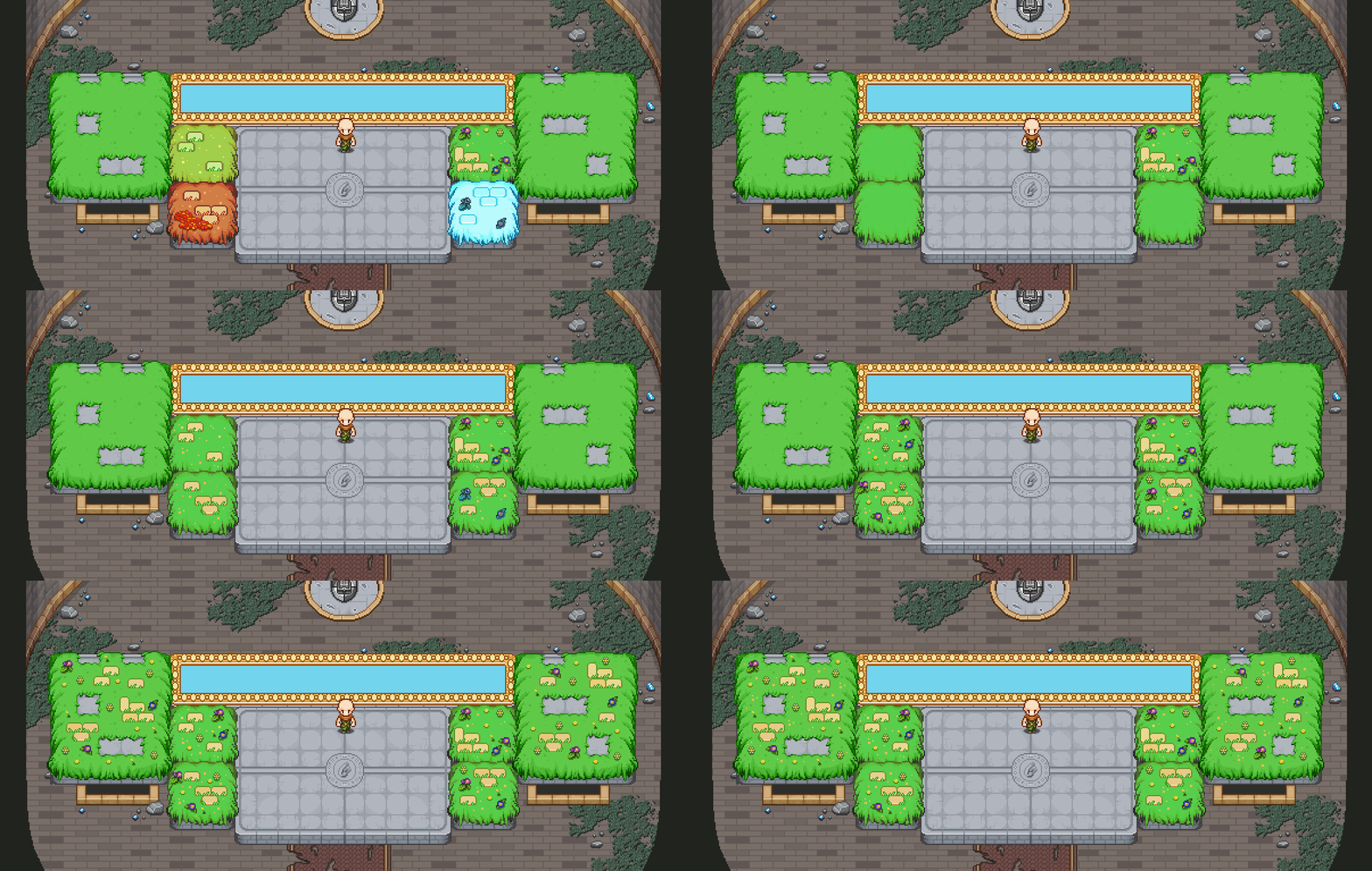
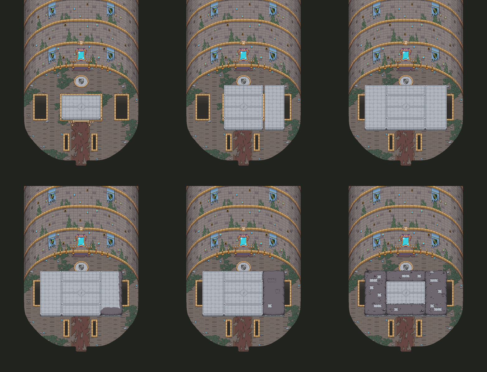
With that in order, let’s continue transforming this background into each of the four seasons! Starting with Summer:

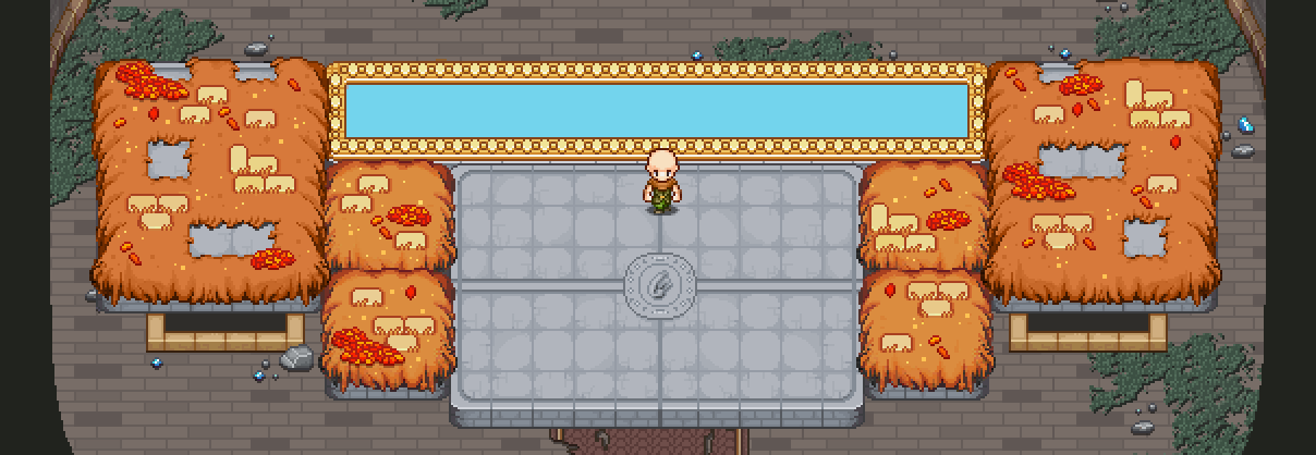
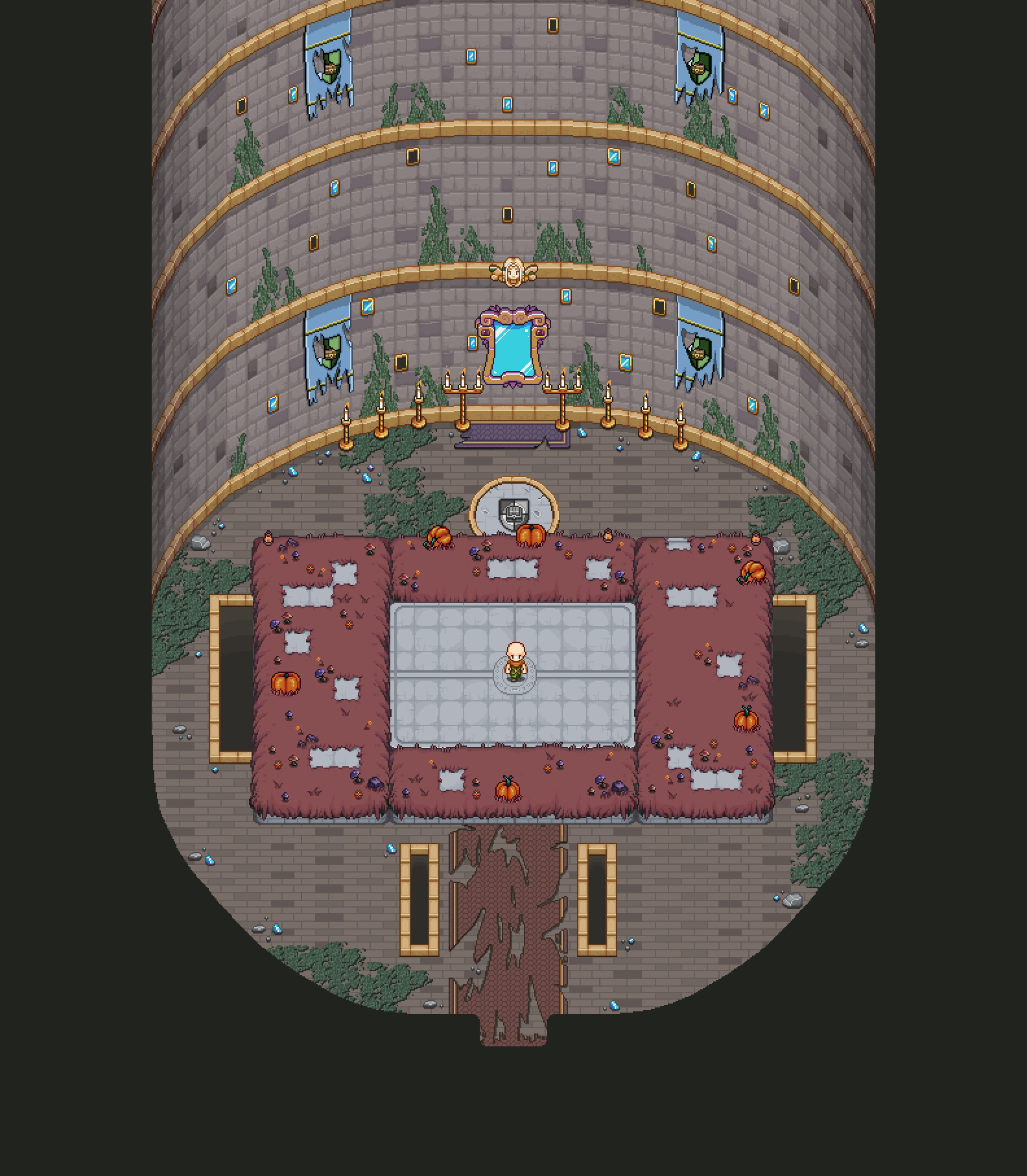
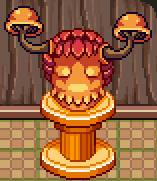
Next, Autumn:

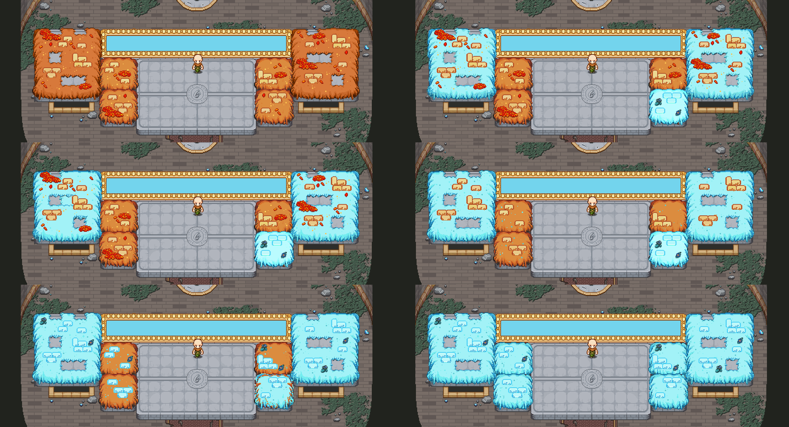
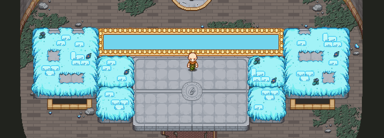
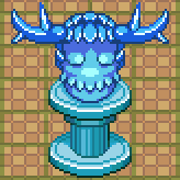
In the cold days of winter:

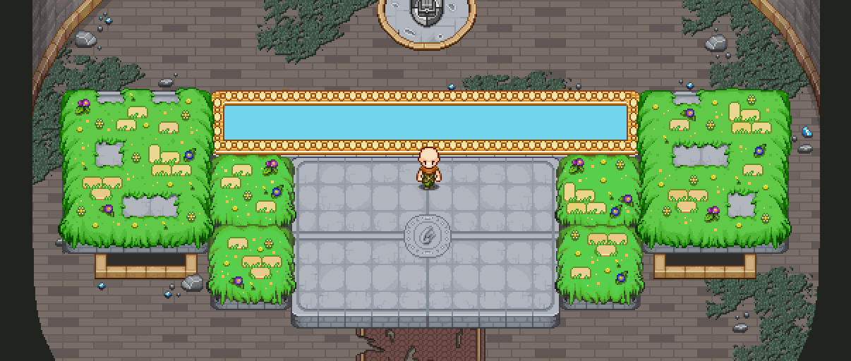
And finally, pleasant spring:

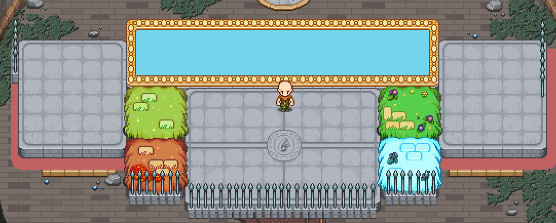
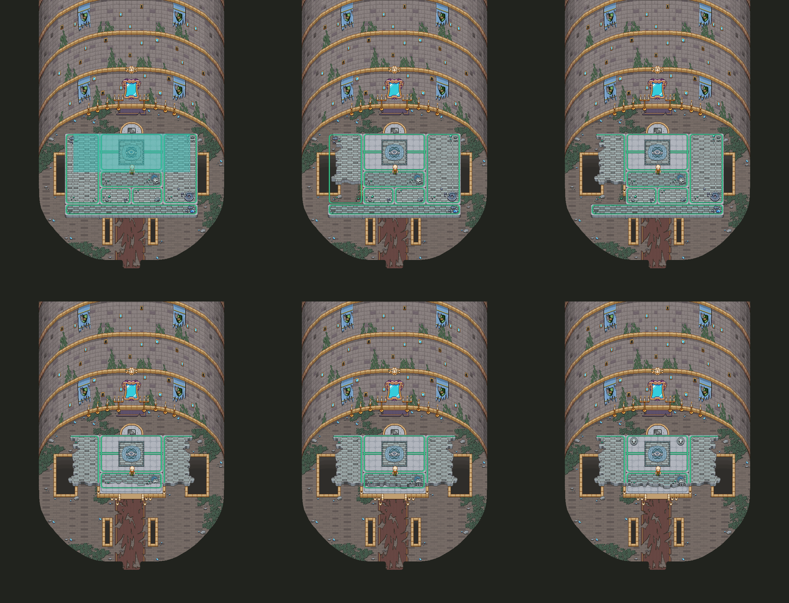
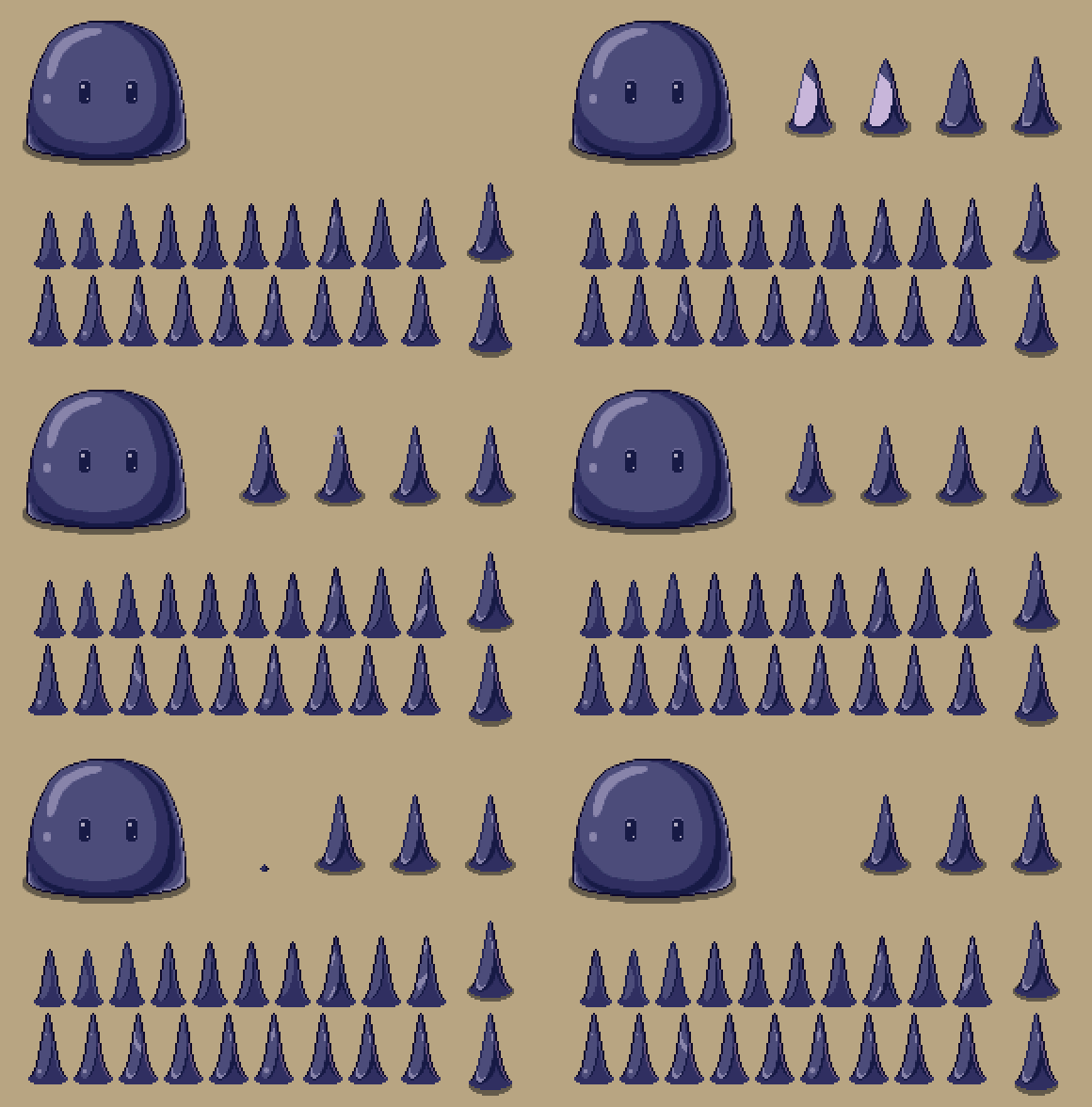
Of course, the Hydras will need some kind of wall for them to bang their heads into, otherwise how are you gonna be able to best them?! At first, we considered using the spears you’ve seen from across the game:

A basic WIP, of course, but we thought we might come up with something slightly cooler. Enter the force field:

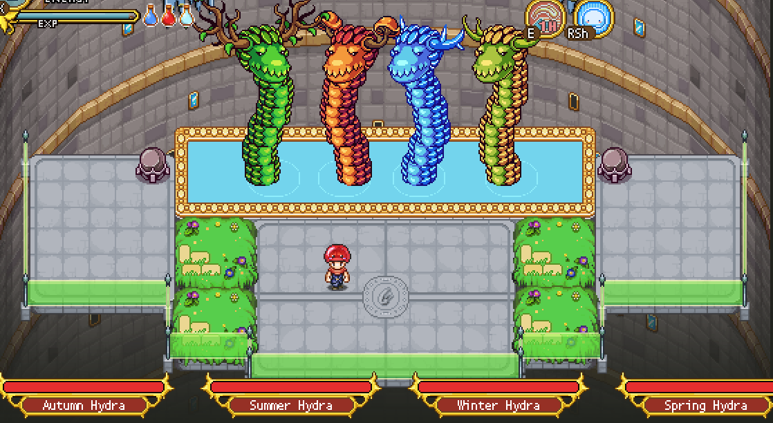
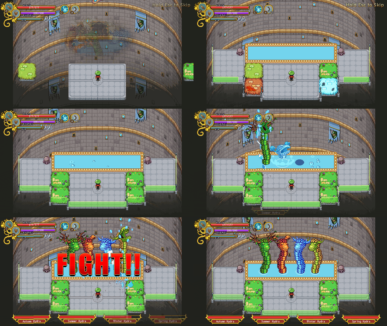
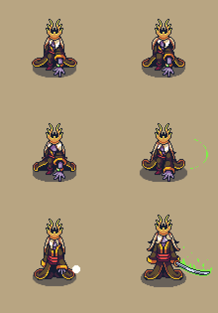
A little bit more hitech perhaps, but also a lot visually cooler. Especially with Fred’s startup animation of it! Let’s have a look:

And before we go, have a GIF of what the spawn sequence looks like right now (without the proper summer background added yet):

With the Hydra fight well under way, this dungeon is coming together more and more :) We hope you’ll enjoy it!

Have you all have a nice easter break (for those of you celebrating or taking time off during the holiday)? :) We’ve had a lovely time with family, but now it’s time to get back to work! This week we’ll start off by showing a couple more backgrounds for the boss rush:

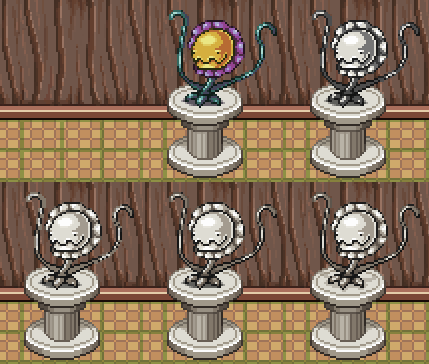
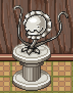
This first one is the floor for the Hydra boss, which I believe we’ve mentioned a little bit earlier. It will include a spring Hydra, so all four seasons are involved, hence the four different platform, each representing a season as well :)

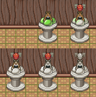
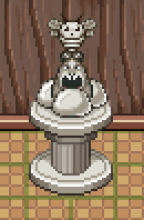
Next up we have a truly terror-filled floor featuring the Power Flower AND BEES! Don’t worry, if it turns out in prototyping that this was a terrible idea, we may still cut this part of the boss fight (or will we? mwahaha):

Teddy, meanwhile, has started playing around with transitions between floors, and here’s a little sneak peek of that:

And Fred continues on with the actual boss fight of the dungeon – Zhamla! Here’s another animation from his department:

This week we’ll start off with another Boss Rush floor, this time the GUN-D4M floor, which will pretty much be the Phasemen floor – but destroyed by the sheer force of the GUN-D4M starting the battle! Let’s have a look:

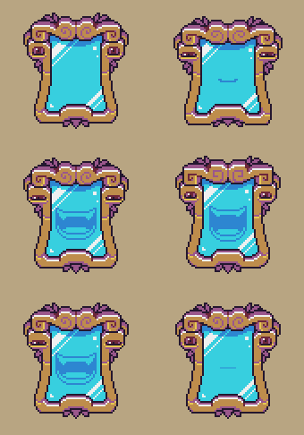
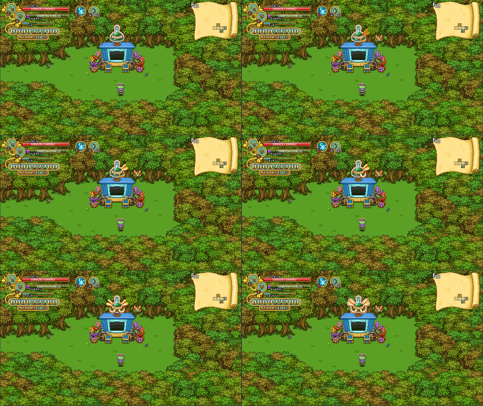
One of the other things we’ve spent a lot of time on lately is what it’s gonna look like actually summoning these bosses! Each boss will be summoned by the Mirror artefact who ‘governs’ the Tower, and so our idea has been that we want some kind of mirror or glass effect as they appear. The videos below will give a pretty good idea of how our iteration process works – starting off with something small and building on it and editing it here along with more details, until we have something we’re happy with.

So, first up, here’s a couple of our very early iterations:


Then, we added a glass/mirror-like colouring for the next couple iterations:


Here we begin to play around with a glass shattering effect, which in these early prototypes is still very crude, as you can see:


Here Fred has gotten his hands on the prototype and started making some graphics! The shattering effect is still pretty basic, though:

With more proper graphics it’s starting to look more and more like something that would actually appear in the game! Here the “summoning-shards” have better graphics, and we’re playing around with various sizes for the mirror shards as they shatter:


We’ve also been working on the elevator itself, adding some darkness to give a better sense of dept to the dungeon:

Pretty cool huh? It’s really exciting to see this all coming together :) Now, next week is easter here, and with the restrictions finally being out of the way for the most part, it’s time to spend some time with family!

Therefore, there won’t be an update next week, but the blog will be back as usual on Monday the 25th! See you then :)

Okay, time to make a bunch of more final dungeon floors!

Let’s start with the Terrorweed floor:

Size wise, it’s pretty similar to the previous floor, so we decided that the transition between these two floors would mainly be the mirror changing the colour of the grass and having new decorations pop up. In other words, the elevator sizes will remain the same for this one:

Now, the next floor, where you’ll face off against two Phasemen, will be a little bigger:

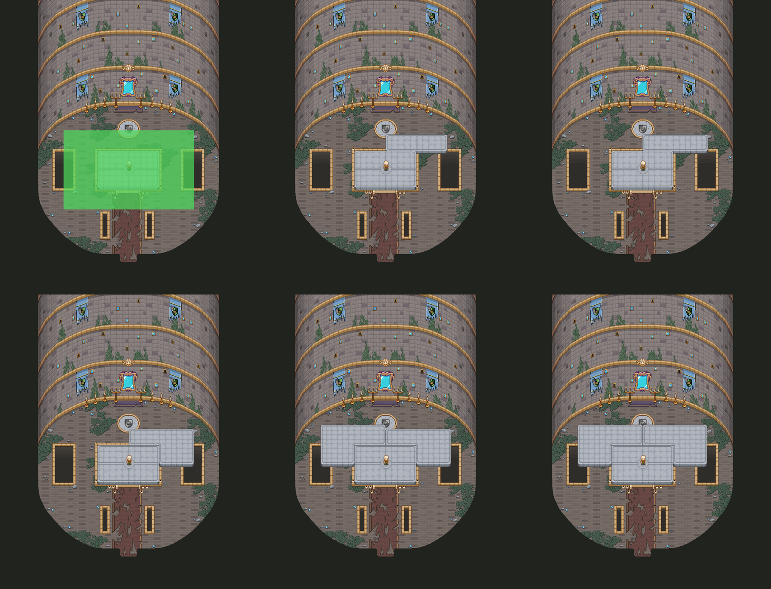
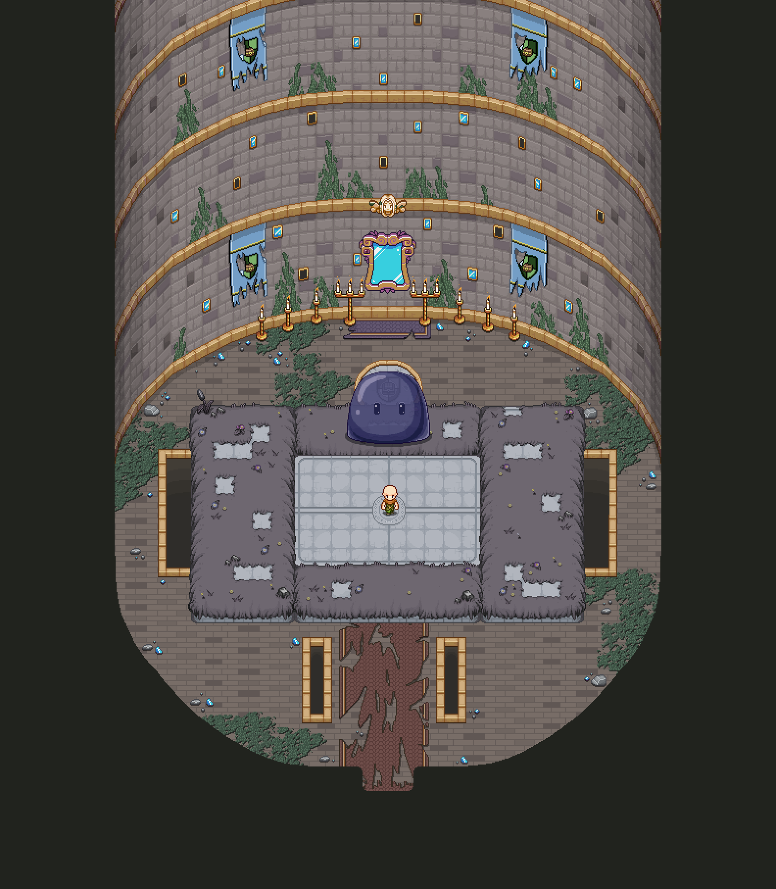
Here, I began by adding two elevator pieces “above” the original elevator, but then I realized a parts of this elevator will be destroyed by Gun-D4M that will appear mid-fight, and I knew we had mentioned keeping the elevator whole for the entire duration so we ended up having a long discussion about whether or not it should break – in some ways, it’d be pretty cool, but in the end we decided on our original idea of keepign the main elevator itself whole while the rest could get destroyed to fit the size change. As such, I had to remake this floor, keeping the elevator at the top to ensure it wouldn’t get destroyed once the floor starts falling apart:

And so, here’s the final version of the Phaseman floor:

In Teddy and Fred’s department, we’re starting work on the mirror summoning bosses for the boss rush! Here’s a little sneak peek of some of Fred’s animations:

More details to come next week :)

This week, aside from still doing a bunch of bug testing, we’ve been focusing on getting the “elevator floors” for where you’ll battle the bosses just right, starting off with the Shadow Slime floor!

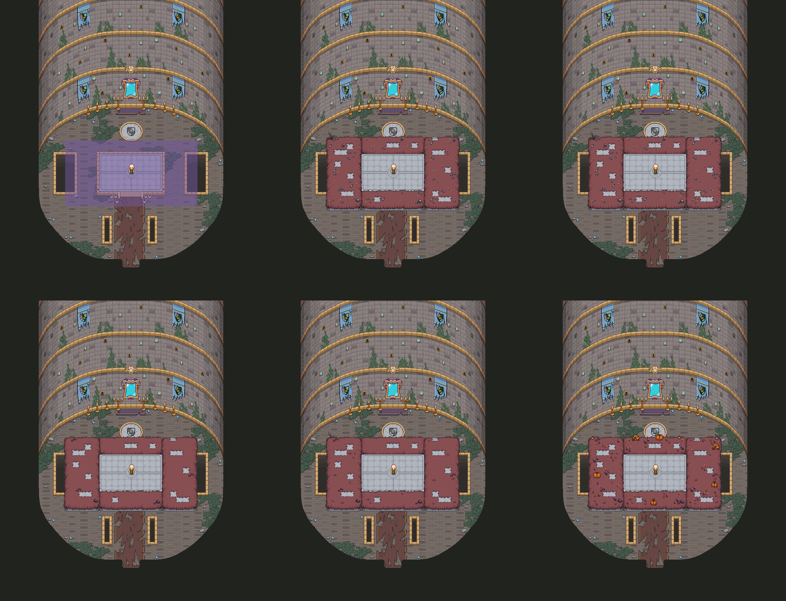
Our first test was with an organic floor, resembling whatever area you fought a similar boss, that would appear around the original elevator. Here’s the process for that:

Our second idea was that the floor would remain in the style of the elevator, with more elevator pieces appearing and connecting to the original elevator. These would then, through the magic of the mirror guarding the tower, be “dressed” in the various decorations that would have been where you first battled this type of boss. As such, here’s the second idea:

For now our favourite is this second version, so we’re gonna go ahead and make the rest of the boss floors in this style, which will be my main focus (in the graphics department anyway) the next upcoming weeks.

Speaking of the mirror artifact, Fred’s been working on some animations for him this week, and here’s one of them:

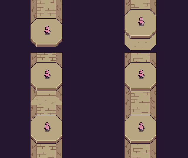
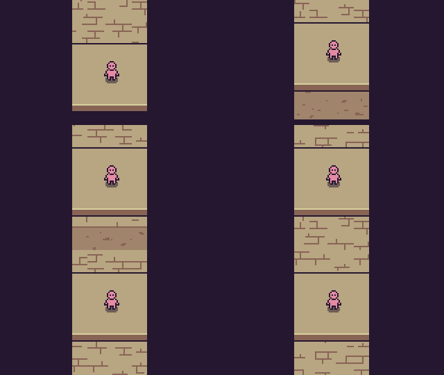
Now, the elevator will of course move upwards in some way, and Teddy has been experimenting with a variety of speeds and effects. Here’s a bunch of the various speeds:

And here we have the quick ones once more but with blur (and more blur):

Of course, the last thing we want is for anyone battling here to get dizzy from the moving background, so it’s quite a fine line here to make sure it looks cool while still being easy to read. Both the blur and the slower speed seems to be more easy on the eyes, but of course, one option is also for the elevator to stop during the fights. What do you guys think? Do you prefer a moving elevator or a static one? How fast is too fast? :)

Getting ever closer to the end! :D

It’s high time we return our attentions to Story Mode, and so let’s have a look at the interior of the tower this week! Here’s where that boss rush will take place, on an elevator taking you to the top. Here’s the process of the basic background:

The various colored squares in the beginning of the GIF above shows you the various sizes of the boss rooms in Story Mode, which will serve as a guide for when I start making the elevators for each boss. Next, it’s time to add some more details:

And finally, a bunch of moss and small rocks to add further detail to this first floor:

Feels great to have finally started working on this, but there’s a lot more to come in terms of elevators and the like, so stay tuned for more :)

Before ending this post though, here’s a look at some stuff Fred’s been working on as well:

Oh yes, he’s back!! Excited for the final battles to take place? We sure are! :)

Today we’ve been playing around with a bunch of different options for what the gate will look like when you reach the final Arcade Mode floor and it’s time to either go back to Arcadia or proceed on to the Bishop or Grindea battles. Starting off with the portal back to Arcadia:

The portal to Bishop meanwhile has a more sinister tint of purple and shows a dark sky:

The portal leading up to the Grindea battle will look a little different and more abstract, illustrating the fact that something rather strange is about to happen. Playing around with a couple of colour options here:

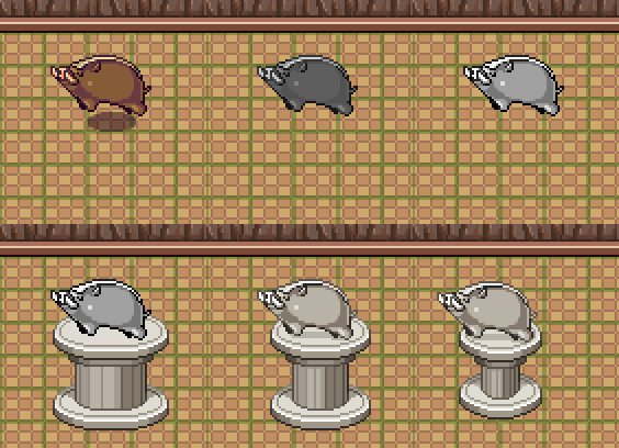
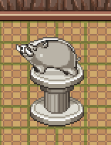
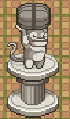
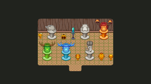
Now, as I mentioned before we’re gonna add a little statue shop with housing items, so I better start making a bunch of statues right? Let’s have a look at some of the ones that will be available:
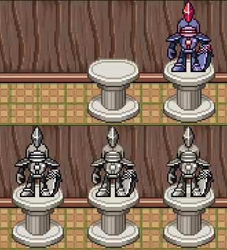
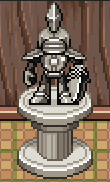
In Fred’s department, there’s more final dungeon stuff, including a spring version of the hydra and the summoning animation for that platinum level Frosty Friend:

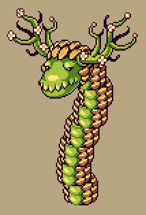
Finally, Teddy put together some words on our design decisions behind the final dungeon! Here goes:

So a while back we shared an intention of overhauling the final tower quite substantially, shifting from a large surrealistic “travel through the game again but weird”-type dungeon, to having it be a boss rush of sorts.

Nearly all feedback we received on this has been negative! We actually were expecting some feedback like that, but not of this magnitude. The main worries were:

* Shorter dungeon = less content

* Without a proper dungeon there won’t be storytelling

* It violates the game-design philosophy of a final dungeon being an exam on the rest of the game (think Wily’s Castle in Mega Man)

All these things are very reasonable, and because of this feedback we sat down and talked it all over again. But to even our own surprise, we’ve decided to stick to our guns! We’d like to share our reasoning, since it would be pretty weird to invite feedback, get it, and then ignore it silently.

First off we completely get that it “feels off” that there isn’t going to be a huge old-school dungeon at the end of the game. On paper, it is pretty much objectively weird, considering our primary sources of inspiration!

That said, after designing the dungeon two times now, we fear there is an uncomfortably high risk that it wouldn’t become a very good one, and we really don’t want to end on that note.

So why would we say that? Well, we feel the best “dungeons” of our game were those with the most engrossing context, and we weren’t satisfied with what we came up with for this dungeon.

A “go-to” strategy for us has been to load the dungeons up with story. But we neither want nor need to give any more exposition on the main plot until you reach the top of the tower, and having a side-plot at this stage felt off-beat.

So the first iteration was a plotless chimera-design where we just made random rooms based on old areas in the game, sometimes with combined themes (like season change + time travel in the same room). This was in spirit of the “exam”-philosophy, combined with a tribute to old mechanics. But when going through potential room designs, it felt hollow and without the charm that made our best dungeons good.

So as a “plot substitute” we decided to design a version that’s a surrealistic recap of the entire game. It ended up very similar to the “Curse of the Moon”, but much much longer. We felt this version had more character, but it had some glaring holes design-wise, and when we imagined playing through it we got very worried that it would feel a lot like treading water.

For us (including you guys) a recap might seem like a cool nostalgia trip, but looking at it from a new player’s perspective, it might just feel like weird filler. And while we’ve seldom cared about workload, we also saw that to make this version enjoyable would take a huge amount of work. If we had been in love with our design that wouldn’t have deterred us, but while we felt optimistic about some of it, a lot felt shaky.

So having recently played some very well-received games that actually had done away with giant dungeons before the end (a couple skipping them entirely), the blasphemous idea struck us: how would that feel in our game? Thinking back on playing those titles, our hope and belief is that in the context of an actual playthrough, the player will likely go along with what’s presented, too focused on playing to analyze and compare (though we don’t doubt some players will react).

Another thing that weighed in favor of the light-weight path is thinking about the Catalysts in the context of an average playthrough. Many of our Early Access players have undoubtedly gotten these already as part of full completion, but seen holistically, it’s probably quite a small percentage that will get all three catalysts before going into the tower.

For such a playthrough, getting the (remaining) Catalysts will in fact serve quite well as the Wily Stage of our game: one catalyst for combat, one for quest/puzzles, and one for grinding.

Now, about the boss rush: we’re planning remixes of some iconic battles, and we’ll make sure they all bring something new. One commenter came up with a pretty interesting idea that we’ll likely try out, namely having the elevator stop at some point, during which a short puzzle-section could play out as a change of pace.

We’re quite optimistic that we’ll be able to make this feel like a cool transition to the finale, that will keep the tension of the latest story-beat fresh.

That said, we totally understand some of you still would’ve preferred a classic big dungeon. We hope we’ll be able to win you over when it’s all said and done!

This week we’ll start by adding the background of another Arcade Mode room, the one where Astrid tells you which boss you’re about the face and helps you change that fate, should you wish to:

When it came to the boss preview effect of Astrid’s room, we had a couple different ideas. Our very first one was that she’d have a well of sorts, that would show which boss would appear:

Our other idea was to use a goblet and smoke effects to show it:

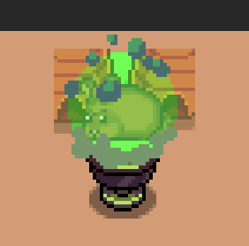
Fred then made a prototype for a cleaner effect than just the smoke:

And here we have the current version, some iterations later! In the video below, you can see what it looks like when you change boss as well:

After we asked about whether you preferred statues or trophies as reward for getting the ‘complete all challenges on a floor’ achievement, we thought a bit about it and found that we’d like to have the stonecutter have a little shop in town instead, where you can purchase whatever statues you’d like. As such, I’m going ahead to not only make more trophies, but more statues as well! Starting now with another batch of trophies:

The second batch has trophies from Flying Fortress, Tai Ming and the Temple of Seasons:

And here’s all the trophies, one for each floor:

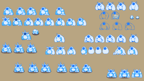
Meanwhile, Fred has been working on a cool platinum level Frosty Friend that will be summoned by someone really powerful in the upcoming final boss fight! First up we have a bunch of sketches, and at the bottom, the final version we picked:

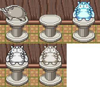
This week is all about Arcade Mode rewards, namely the rewards you’ll get for managing to finish every challenge on each floor! We’ve been playing around with a bunch of different ones, and here’s some of the ones we’ve come up with, starting with the Pillar Mountains, Evergrind Fields and Pumpkin Woods floors:

The idea with the Jumpkin one is that it’ll have a candle in its mouth which will have a living, animated flame :)

Next up we have the flying Fortress, Seasonne and Mount Bloom floors:

For the Temple of Seasons, here’s a suggestion featuring the Hydra, with three different skins:

And here’s the Tai Ming, Desert and Ghost Ship suggestions:

Finally, here’s all of them side by side:

Which ones do you like the most? Would you prefer that every reward was of the same type, so that all of them were some kind of statue or golden cup? We haven’t really decided if we prefer this version where it’s more mixed or if one specific type would be better. Let us know what you guys think!

Meanwhile, Fred’s been starting work on the first boss in the boss rush we were talking about: the shadow slime! Here’s some tests and an animation of one of its attacks:
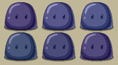
This week we’ll be adding a bunch of improvements, starting with making the jump down from the Phaseman and Crystal boss maps a bit clearer! First up, the original:
And next, a bunch of different suggestions for clearer versions:

For now, we’ll start by adding the last one, and if it still isn’t clear enough, we’ll blend it into one of the other two after you’ve defeated the boss, to make sure nobody’s confused about where to go after they’ve finished the boss :)

Another addition is that of a temporary space in the shop, for before anything but the shop is available! Looks a bit better than the space beside the shop being completely empty:
The travelling alchemist’s shop also needs slightly more proper graphics, to show off the fact that it’s not just ordinary potions but super potions that are for sale there:

One of the things you’ve told us in regards to the current update-in-progress is that you’d like to see a slightly darker version of the Grindea boss battle area, as she tends to blend in a bit much during the fight!

As such, here’s one such darker version, which we’ll try out and see how it works:

For Fred’s Friday, we have a little sneak peek of something curious… A couple sketches for an elevator! Whatever is this all about? Stay tuned to learn more next Monday! :)