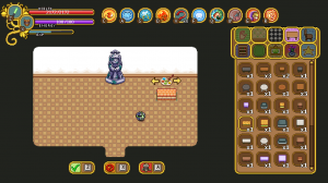
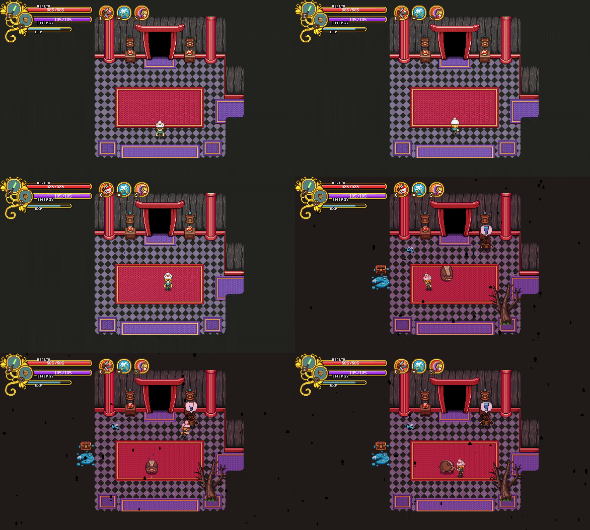
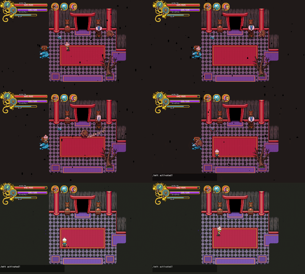
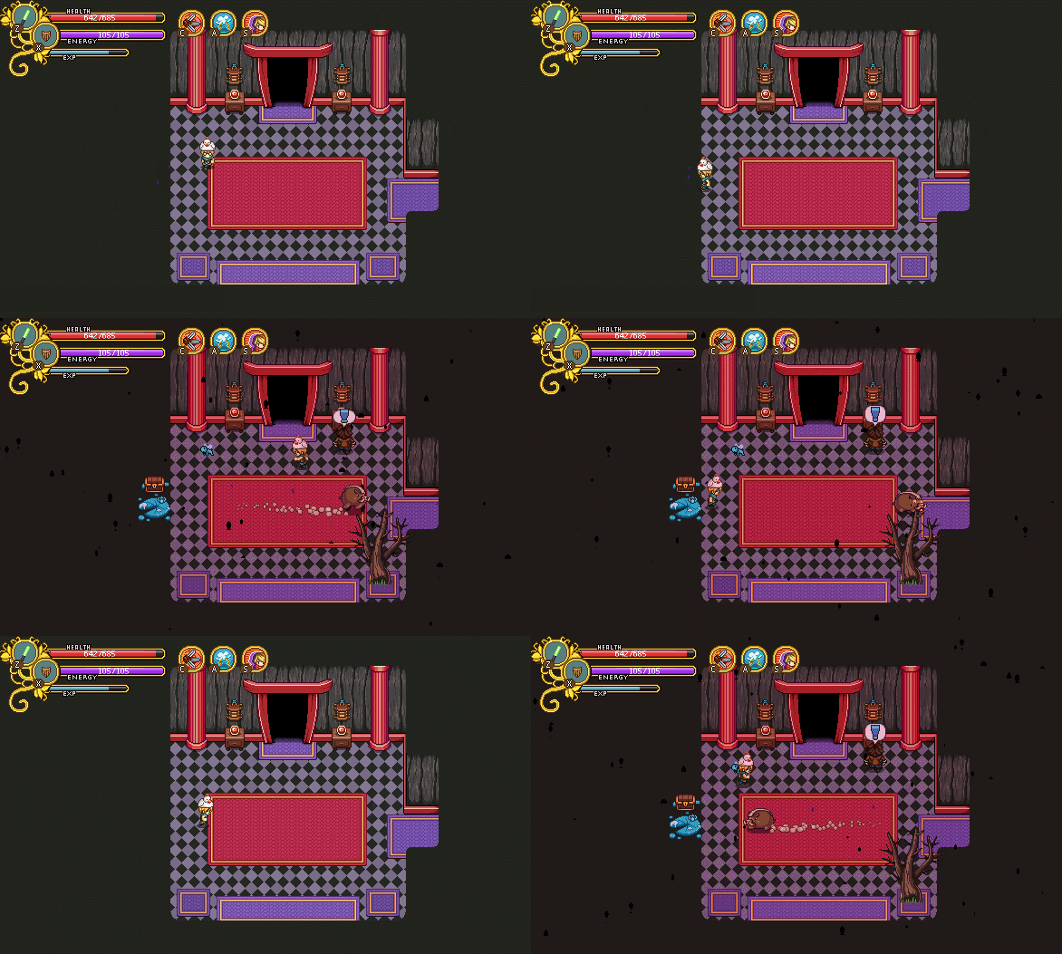
This week was a very special week, since the annual GGC was hosted (and also the week where we launched housing on frontline – go check it out)!

GGC is short for Gotland Game Conference, which is basically a game expo where the students at the game design education showcase their game and a bunch of people from the industry is invited as judges to give feedback and select which ones did the best. It all culminates in an award ceremony with an after-party where we all get a chance to hang out together and share experiences with other game developers. So basically, it’s great!

For those of you wanting a glimpse of all the game presented at the conference, check out this video:

One of the showfloor favorites, and clear winner of many of the awards at the award ceremony was this little gem called Pump the Frog, made by a bunch of first year students:

Totally charming and so well polished. It was hard to imagine they only had 8 weeks from start to finish, incredibly impressive work! It’s also nominated for several SGA (Swedish Game Awards) categories, so its success might continue on to other venues as well!

If you want to know more about the conference or would like to see some cool pictures from the showfloor and presentations, head over to the conference website!

———–

Now as I mentioned, this week we also launched the housing system, which is now playable on frontline! So, when we weren’t at GGC judging games and hanging out with fellow game developers, this week was all about some last minute housing polish, finishing up the remaining details and the graphics needed for them!

First up, we realized there were some more forgotten things we needed to take care of!

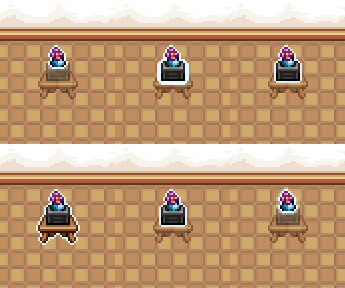
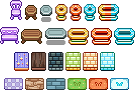
Some miniatures for the carpets from before, for example:
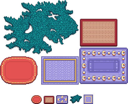
And then, a couple of items some of you have likely had in your inventory for quite some time! The red slime carpet and the green slime bad:
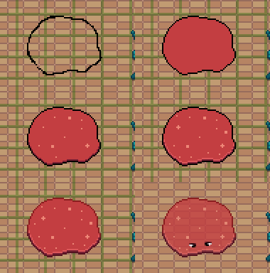
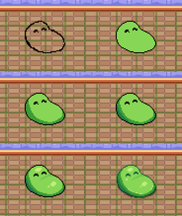
Hopefully that’s the last of our forgotten objects, and we can now focus on just adding new ones in the future :)

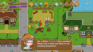
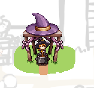
As for the housing system itself, the way you get the house, for now, is that once you’ve completed Flying Fortress, the scientist Kim will appear in Evergrind City next to your currently not-yet-built house, explaining one or two things about the science behind the houses in the game (and your own)!

She also wonders if you’d like to help test out some new systems, and upon agreeing to do so you’ll be able to purchase the house from the carpenter, who will build it for you. After this is done we plan to move Kim back to the lab in the HQ where she’ll continue doing other experiments (gotta keep busy, you know)!

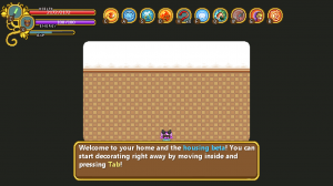
As for the house, once it’s been finished (this happens once you change screens once), you’ll get a very short and basic explanation of how to use it upon entering the building.

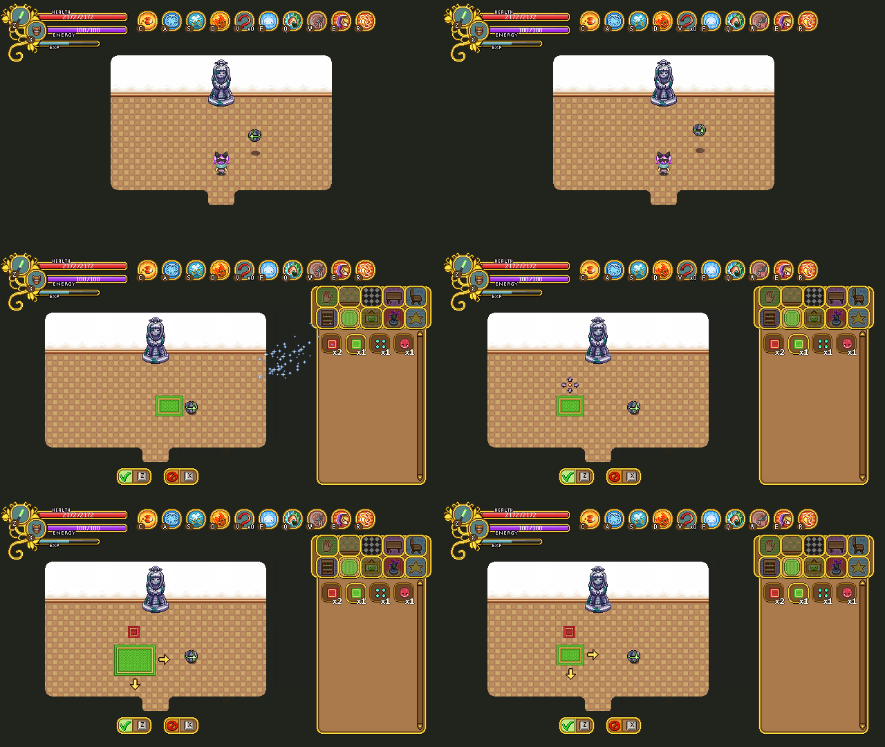
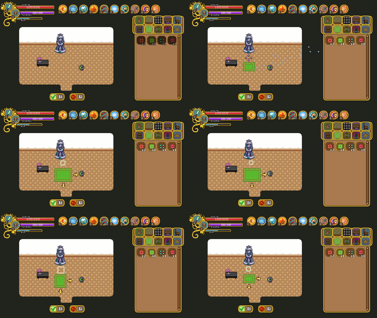
We’ve continued working on the icons that illustrate what tool you’re currently using, and here they are in action:

First up, the style icon (seen above). After some thinking we’ve decided the arrows for each of the icons need to be remade, and it’s also missing a proper outline and an animation at this point.

Next, the carpet tool’s “carpet version”:

For this one we’re actually considering using the old version (seen below) after all, to make it stand out a bit more from the carpets you’re editing.

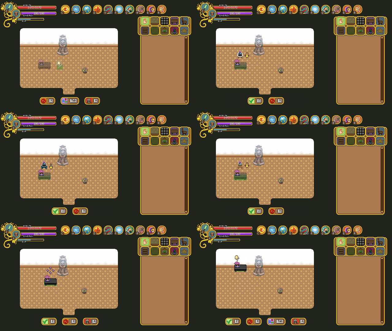
Finally, a GIF showcasing both the stack and the move tool:

The stack tool (as well as the carpet tool) don’t use the correct freeze frames in these GIFs which means the animation isn’t paced exactly right (it’s supposed to pause for longer on each stack), but it gives you an idea of what it’ll look like. The move tool is missing an animation in these GIFs as well, but it has since been added to the game. Finally, we added outlines to all the icons, which made them stand out a bit more against the background. This can also be viewed in the game.

We did have a discussion regarding whether or not to use a more simplistic style for each of these (like the old version of the carpet tool), but decided against it in the end. This way there will be a little more color, and hopefully each icon will stand out enough on their own once the outlines and proper animations have been added!

As for Fred, his main focus has been getting all those housing icon moving. Here are the finished icons he worked on:

We didn’t talk about the hand tool much in the previous post on housing, but the hand tool is a very basic tool accessible from the housing menu that allows you to move around your house and select any furniture piece you want (which in turn brings you into the other tools). The hand tool is also connected to your skin color in-game, and matches that of your character.

Here’s the new and improved move tool! We changed the arrows quite a bit, both in shape and color, plus it now moves and has an outline. It works a lot better than the old version, to say the least!

There’s also this new and improved version of the carpet tool icon (above), and the stack tool which you’ve already seen, below:

And here’s the style tool, a little bit interesting now that the brush is moving about:

Finally, Kim got a slight redesign to better resemble her portrait as well as an additional animation. In her regular one, she’s doing some chemistry stuff, mixing a liquid of some sort. While she’s outdoors telling you about the housing science, we thought we’d give her a different animation to better suit the theme (as well as one that doesn’t make sounds every few seconds):

We currently haven’t decided whether she’ll pick her chemistry set back up once she returns inside, or if she’ll continue using her newfound tablet instead!

Now, if you haven’t tried out the housing system yet, go ahead and let us know what you think! We’re eagerly awaiting your feedback :)

Hello guys and sorry for the late recap! Apparently, someone (me) forgot to hit ‘publish’ after finishing the post and nobody noticed until now… Ooops!

Oh well, ready for some new Housing info?

Our basic prototype is more or less done: the items that have been made so far have all been implemented, and most of the ones that will move in some way have their proper animations. Teddy is currently working on two things, the light settings (which are coming along rather nicely so far), and the rather complicated systems behind being able to add more rooms and change the layout of your house.

You see, previously we decided that you’d be able to select between a bunch of pre-designed layouts for your house, which could be unlocked at the proper salesman or through your housing menu (not fully decided). As our conversation went on, though, we started thinking it’d be really cool if you could design your house however you wanted, adding new rooms and change their sizes freely.

Before we fully commit to that can of worms, our current goal is to upload what we have to Frontline (any day now, possibly even tonight!) and let you guys try it out. We’re still a little torn between having pre-designed layouts or having you design the house more freely, as the latter definitely would add a ton more work and I’m sure most of you would like to see the game finished sooner rather than later.

So for now, we’ll upload what we have: a single layout, and the current housing items. The shop and house will be placeholder, with more finalized look for each of them coming later on, as we’ll use the Arcadia redesign versions as a base for the story mode versions after they’re finished.

With your feedback we hope to be able to gauge how much more work (and polish!) will be needed before the housing system can truly be complete, and as such will give us a better idea of which of our options to pick.

There’s also a third option here, where if people are satisfied with the basic version of the house, we might just stay off multiple layouts altogether as that would save a lot of time and would mean we could add the proper housing system much sooner. Anyway, your feedback will decide! Stay tuned for that :)
And now, time to make some walls for Tai Ming’s arcade mode!

“Walls?” you might ask. “Isn’t that quite straight forward?” Oh yes, my friend! Typically walls are the least of my worries when I make Arcade floors, as they’re just a very basic edge signifying the end of the battle area. In other floors, they’re a bunch of random generated trees, or a basic stone wall.

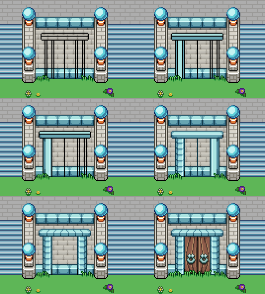
As mentioned in last week’s post, however, Tai Ming will be different. We’ll mix and match various ways to block off the battle area, ranging from streams of water, fences and even cave walls. And while creating each of those is a rather simple task in itself, they also need to be able to connect with each other and different types of walls – and they all need to work together!

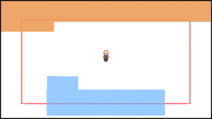
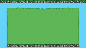
Above you can see the size of the battle area we decided to work with for these rooms. It’ll be slightly bigger or smaller depending on which walls are used in the room, but most will be of approximately the same size.

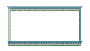
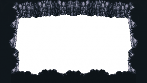
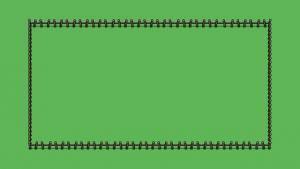
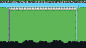
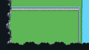
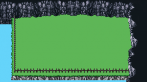
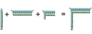
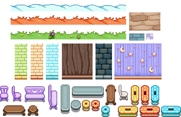
So, first of all, let’s take a look at what we have to work with. In order of appearance: wall, mountain, stream and fence:

In a coming post, we’ll also take a look at houses that will serve as walls, and maybe one or two variations of these that account for other town-like features. After all, we want to convey the feeling that this is town, in whatever ways we can while keeping the Arcade feel!

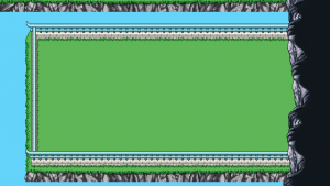
For now though, let’s look at how we can use these pieces together to create a variety of different room types:

…and so on! Of course, not all of the rooms will have streams or mountain walls, though I suspect many will and they do make for more interesting looking rooms so far (at least until we’ve added some houses)!

There’s still a way to go, but the basics are down and I think this will end up quite interesting once it’s all done.

And now, some housing icons to indicate which tool you’re currently using! …Cause there are quite a few tools, actually. First up, the carpet tool:

This tool is used to edit the size of the carpets. You’ll be able to change the size of many of our carpets freely, and this icon will help indicate what you’re currently doing. The upper version is Fred’s basic version, but we’ll also make one featuring the carpet design beneath to see which one we like the best.

Next up, the move tool, which is rather straight forward:

Select a piece of furniture with the hand tool, and move it around to wherever you wanna put it. We’ll probably add some kind of animation to the arrows, as most of the tool indicators will be animated in some basic way (much like the carpet tool)

Next, the stack tool:

This “tool” appears when you try to select a square that has multiple objects stacked on it, and helps you select which parts of it you want to edit or move. Do you only want to select the top object, the topmost two or the whole stack?

Below’s a test animation I did to make the indicator easier to understand, and beneath it is Fred’s finished version:

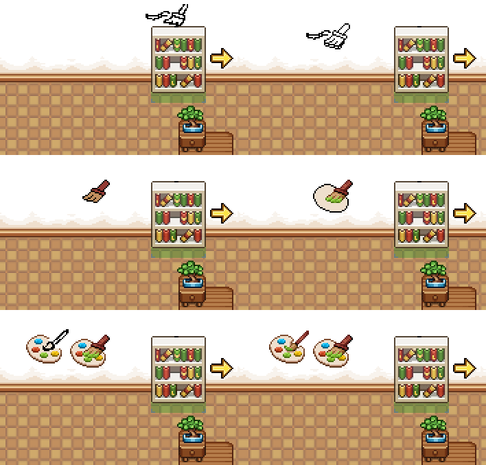
Finally, the style tool, which allows you to change the basic appearance of an object. This is indicated by a painter’s brush and palette. The first version had a rather crude version of the brush, so it was quickly changed:

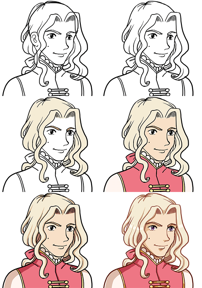
And now, another portrait!

Not much is known about this guy yet, I’m afraid! Other than the fact he’ll be staying in the desert, of course. I’ve been watching a couple of documentaries on Versailles in general and the era of Louis XIV in particular, which I guess shows through the design?

These portraits are a lot of fun to make, and I’m itching to remake the earlier ones to bring ’em all together style wise. That should probably wait, though :D

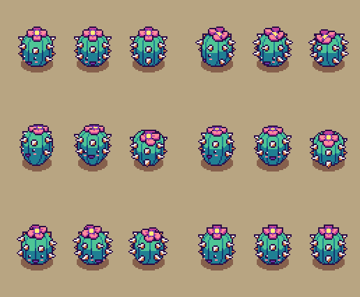
Finally, some animations! This week, Fred has been busy with the enemies, bringing the Cacute and Mrs. Bird to life~

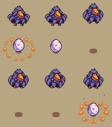
First up, we have Mrs. Bird’s idle animations, and her laying one of those annoying eggs that will either spawn a new bird or slow you down if you decide to break it:

The annoying and OMG-SO-CUTE egg in question:

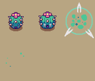
And next up, the Cacute! If you decide to be really evil, this is what it looks like when you kill it:

Though why you’d wanna do that when this is how cute it looks in its idle and movement animations, is beyond me:

Now that most of the Housing stuff has been animated, Fred will continue to work with the enemies to ensure that Teddy can just dive in and prototype them once he is done with his part of the housing. The less he has to wait on new animations, the more focused he can be when the prototyping phase starts!

For now though, both he and I will continue to be stuck for a while with housing and Arcadia stuff, as that’s our main missions before we can move on to the desert and rejoin Fred on that venture!

Sometimes, it’s easy to forget that being a gamedev involves more than simply making games and managing the community surrounding it. Today (when this gets posted, a while ago) we had our “annual meeting”, which is a formal thing we need to do to review the year and how the company has fared through it.

This year we also formalized and signed contracts surrounding Secrets of Grindea and its IP, protecting it and us in the unlikely case we no longer get along. While we trust each other 100% it’s so much easier making these contracts while there are no issues, rather than try to solve any such issues as they arise in a not-so-likely future. In fact, we should have done this years ago, before we even started selling the game.

If you’re an aspiring gamedev, I very strongly advise you look into getting a contract outlining exactly what each of you will be doing for the company and what happens in the case where one or several of you want out. You might think there will never be any problems ahead, but you never know, and it’s better to be protected than to wish you had been. Also, money can easily change people, and I’ve seen countless horror stories out there where devs no longer get along once they start selling their game as opposed to it being a dream.

——–

Now, some time has passed since we started the poll regarding which of the Tai Ming Arcade floor designs you’d prefer – backtrack through time or random time jumps. At the moment of writing this, it seems you guys are as divided as we are, so for the time being we’re leaning slightly towards the backtracking idea.

This means each of the rooms have to be made available in both a past and a present version. And speaking of the floor visuals, how would we even go about designing an Arcade floor of an area that’s more of a town than any of the previous areas you’ve progressed through?

To sort this out, I had a long meeting with Teddy where we sketched and discussed the various ways we could handle this.

In conclusion, we’ve decided to make the floors in a very different way compared to the others. For the other floors, each room background is either very designed by me, with variations to give the user an impression of there being more rooms than there actually is (Flying Fortress, Mount Bloom etc), or they are fully generated by the engine that puts a bunch of trees in a circle on top of a basic background (Evergrind Fields, Seasonne, etc). For Tai Ming, we’re going to do a mix of the two.

We decided that each outdoor room of Tai Ming will consist of a plain grass background, upon which we’ll put various things that will serve to block the screen so that you can’t move further than the square where you’ll be fighting. These things will include various fences, mountain walls, streams of water and houses, either ones you will enter or closed ones that will only serve to block your way forward.

Each of these items will be generated into the game by the engine, but they will have to be handmade by me to fit into each situation. For instance, there needs to be a way for a horizontal and vertical fence/stream/mountain wall to connect, and they need to be able to work with each other – a fence must be able to connect to the mountain wall, for instance.

To make these floors coherent we’ll frame them with the mountain, meaning the the bottom, far right/left and topmost floors will have a corresponding mountain wall – it will be in the upper parts of the topmost floors, signifying that you cannot go further north than this. We believe this will give the floors a sense of you progressing through Tai Ming much like it works in Story Mode, you’re passing through a town that’s inside the mountain. Because there’s a lot of water in Tai Ming’s second zone and we thought it would make the rooms a more interesting look, there will be streams here and there that you can pass over (in some rooms) by bridges, that will also be made by me but generated into the game by the engine as it creates each floor.

So basically, instead of painting whole rooms, I will spend a lot of time making and piecing together many, many small parts, that need to work both on their own and be able to connect with others as they get generated by the game!

As for the indoor rooms, they will (for now) be single room living areas in a bunch of variations, but with entrances and exits in the same place: if you enter a house from the south you’ll exit it in the north, and if you enter a house from the right you’ll exit it to the left. Since we’ve already dealing with quite complex backgrounds we thought we’d keep the indoor houses simple. This way we don’t have to make a ton of variations of the house sprites (the outodoor ones) that would have to look different if the house is L-shaped or longer than one room. Now we can focus on giving each of the exits variations through color and design rather than the shape, which would also end up affecting the other pieces made for the outdoor areas.

Creating these floors properly will definitely be a challenge, and more on the technical side than what we normally do, but we believe this will make these floors look the best they can. Our other options would be to make a ton of pre-rendered rooms (a bunch with the mountain wall to the bottom, a bunch with the wall to the left, etc) or lose the coherency of where the mountain floors and walls connect, and we all agree that just wouldn’t be as nice.

In other words, expect a post or two full with tiny parts and ways of connecting them! ;)

———————-

And now, for something else! Among these other things I’ve also started working on the proper Arcadia graphics now that the design is settled! Here’s a video featuring the first part, Candy’s Curses:

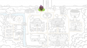
And here’s the whole map! I thought I’d post this after every new step, to show you the town slowly taking shape:

One I’ve made all the finished buildings, I’ll make the flat version with signposts where the buildings will be. The reason I’m starting with the finished buildings is so that each plot will be big enough: it’s a little hard to tell exactly how big a building will end up being before I’ve painted it and it’s surroundings, and I want to be able to adjust the paths and greenery to fit the built versions :)
————–

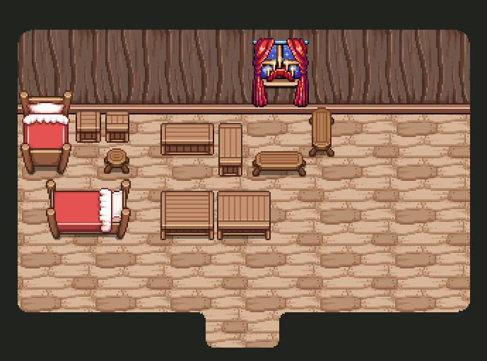
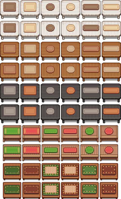
Back to housing! We’ve had multiple discussions regarding table cloths and how to apply them to various tables. Finally, we’ve come to a decision!

Basically, we had two options. Either we’d make a ton of basic table cloths that had to fit each of the tables, or we’d make unique styles for each table, with table cloths (and other decorations) specifically made for that object.

In the end, we decided to go with the second option, for multiple reasons. For one, the tables aren’t all exactly as big, which means it’ll be quite a challenge to make sure every table cloth fits each and every table. Second, it’s more fun for us to design table cloths to go with each table, rather than have to design around all tables with the limitation of size as mentioned. It also makes each table you buy a little more interesting, as it comes with its own unique styles.

And without further ado, here’s a bunch of the table cloths we’ve made so far:

…With more to come!

And while we’re on the subject of housing, have another bunch of Fred’s animated housing items:

…..aaand as of yesterday, the frontline patch is finally up!! This includes the third and final part of Tai Ming (albeit without the proper sound effects and with some placeholder stuff). Patch notes can be found here!

Naturally this weekend has been spent crunching a bunch of stuff we wanted to include in this patch, so we’re all quite spent and now eagerly await your feedback. For me, a playthrough took about 40 minutes – how long did it take you? What did you think of the twists and turns? How was the balance? Please feel free to share anything and everything here in the comment section of on any of our forums!

For now, here’s a bunch of sneak peek GIFs of what you’ll be facing in the third and final part of this dungeon:

01

02

03

04

05

Since you’ll be able to play through our progress this time, this blog post is kept rather short since I’m sure you all would much rather be playing! Please go ahead and do so, and let us know all of your feedback <3

Thanks! :D

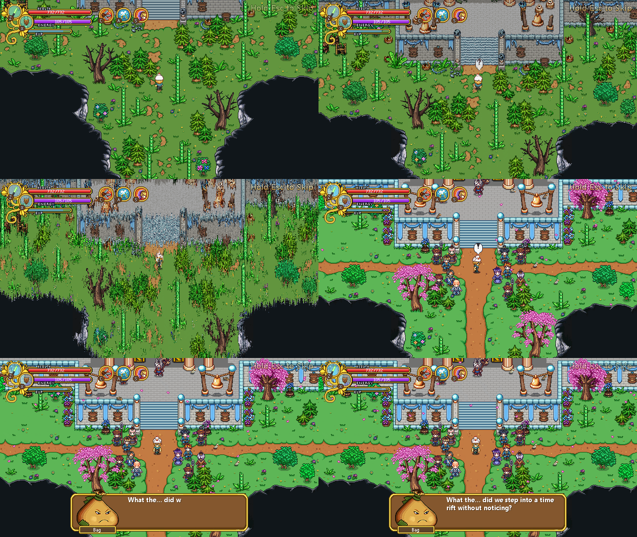
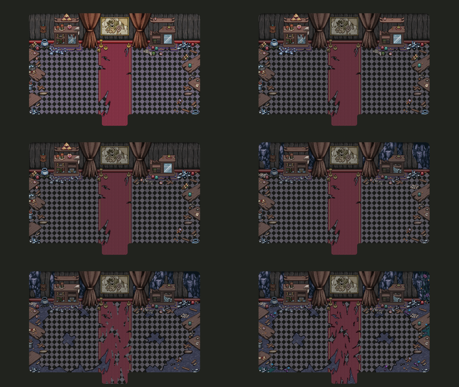
Another week has passed, which has been another week filled with preparing for the final Tai Ming boss. Finally, we’ve completed the third and last stage of the Mimic boss room… Time to bring in some Mt. Bloom!

01

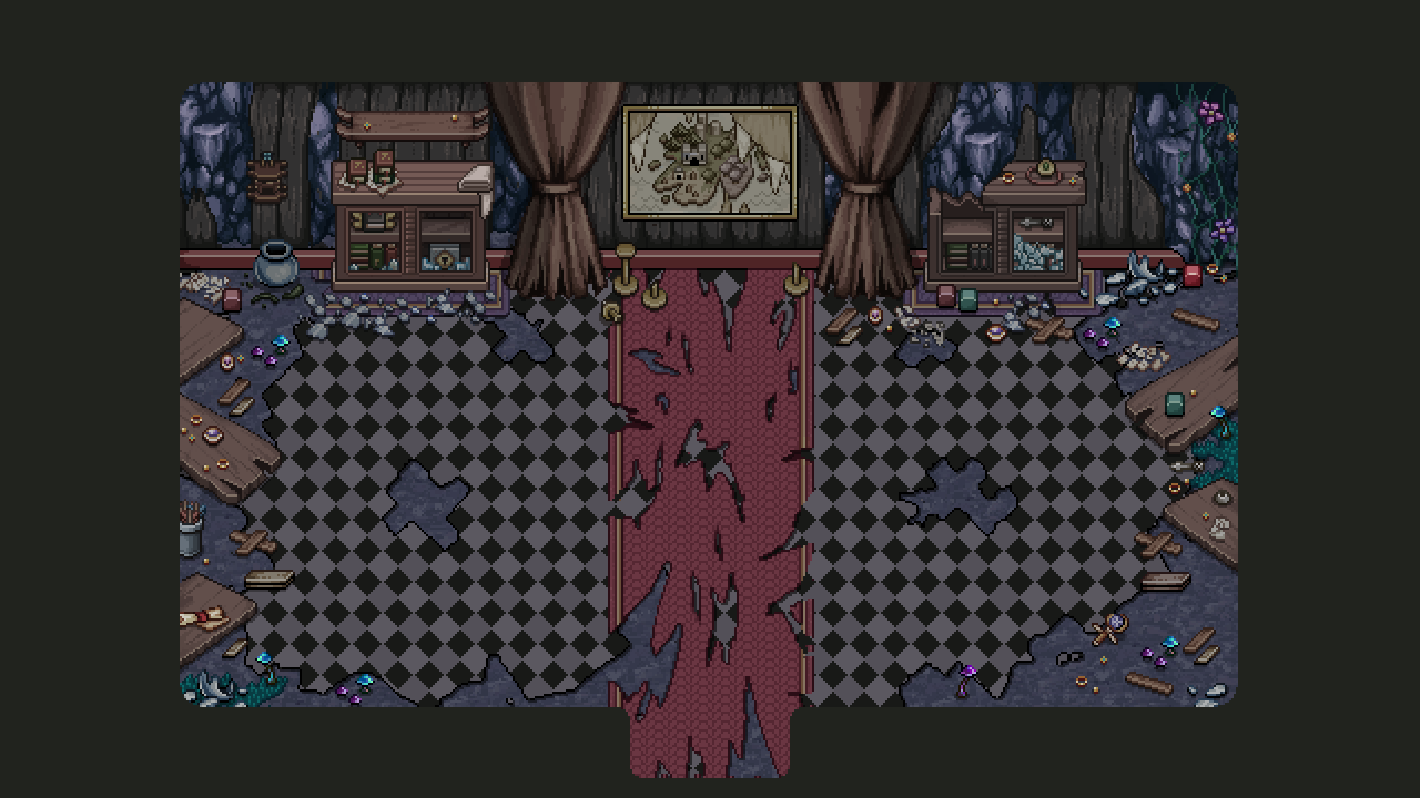
So basically in this third stage you’re back to your own time, but we wanted this room to be more ruined than the rest in order for some health crystals to have grown in the room after this time jump! The boss battle is very long, after all, and being so close to Mount Bloom we thought this was a nice solution for including some health without forcing random health orbs.

The health crystals aren’t pictured in the finished version below, but they’ll be growing in the parts where the cave floor is peeking through:

02

Another thing we’ve been focusing on lately is the cutscenes surrounding the Mimic fight. And with this one, we have a question for you guys!

03

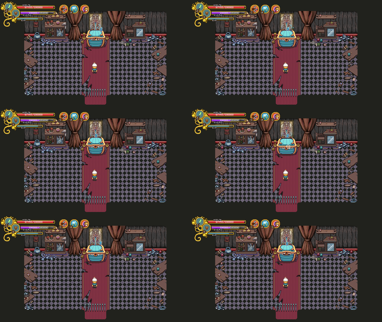
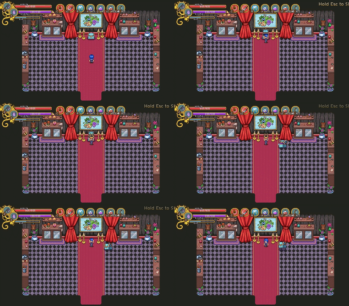
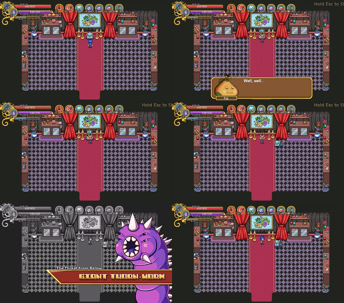
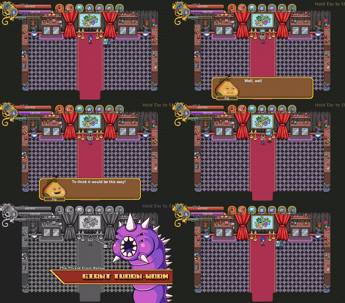
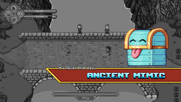
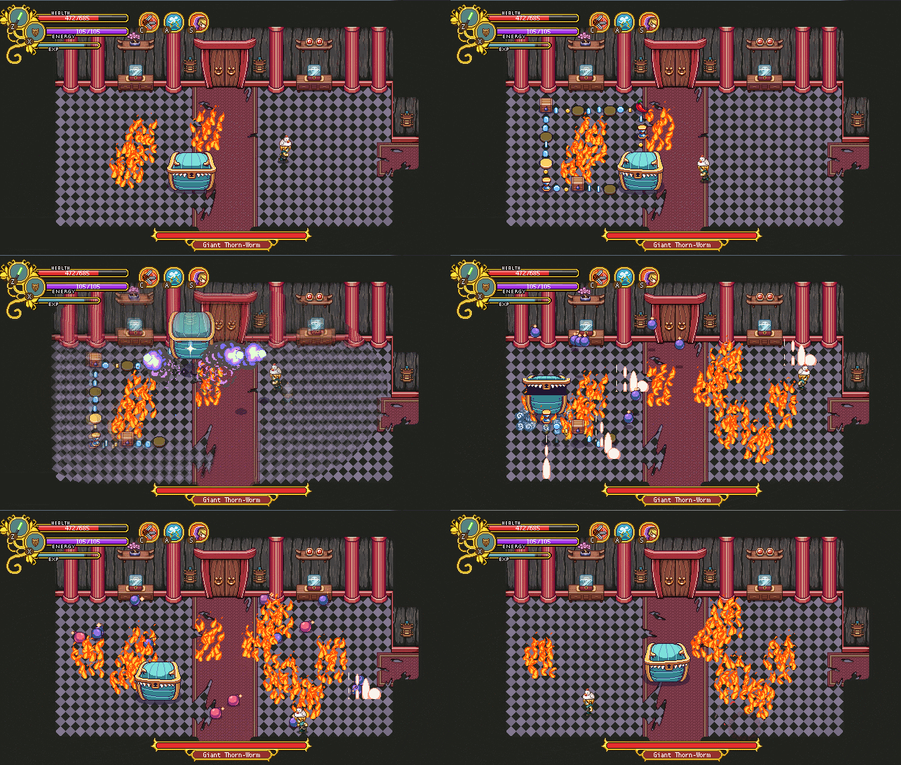
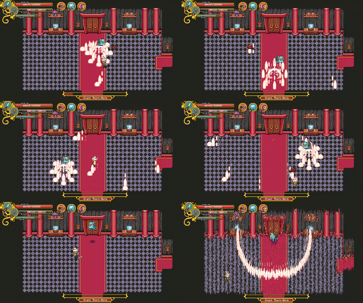
Above you can see one of the cutscenes we’ve been prototyping lately. Now the question is: when should the boss portrait appear? We have two suggestions:

04

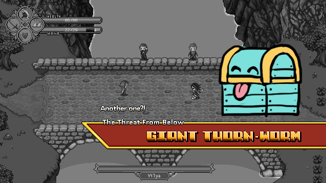
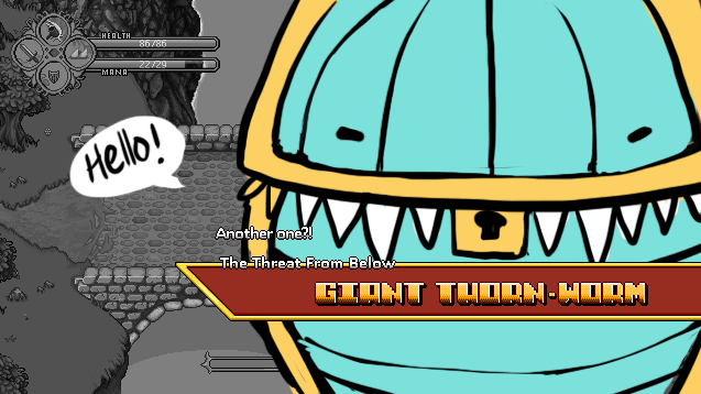
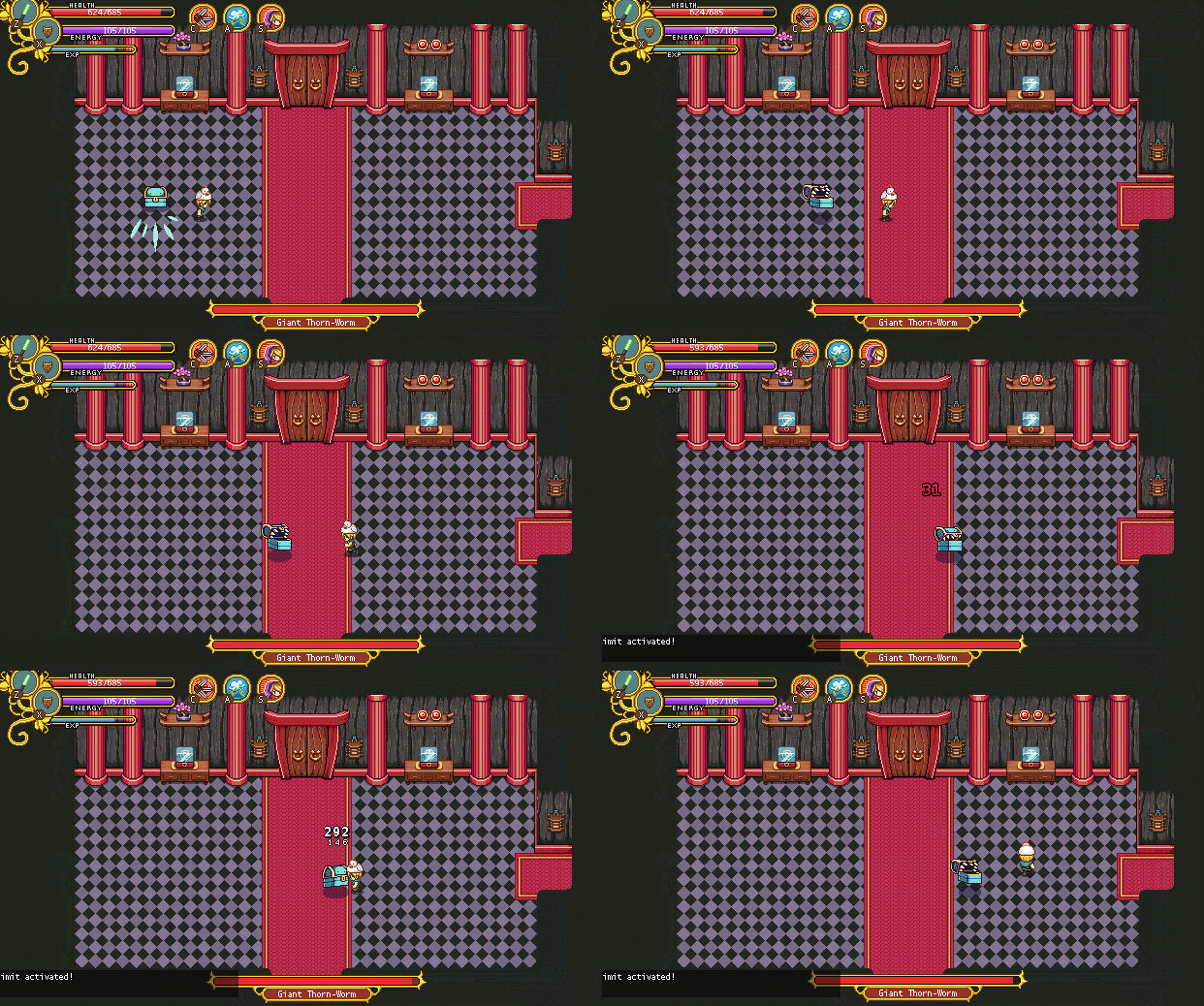
In this first alternative, the boss portrait (yes it’s a thorn-worm for now, since the real one hasn’t been made yet) appears as the Mimic sucks the crown into its chest.

05

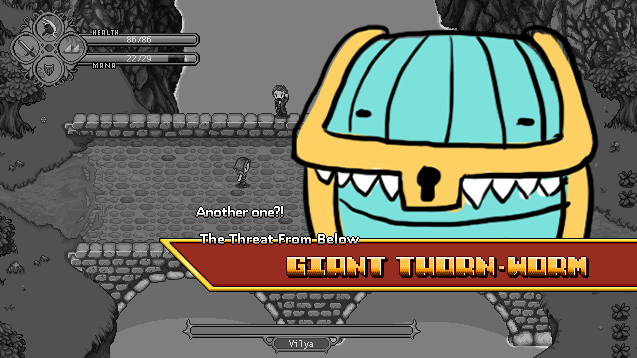
…And in this one it appears as its tongue is around the crown, pausing mid-animation.

What do you guys think? We’re currently torn, and while it might not seem like a huge decision, it’s always better to pick the version that the most people like better! When I asked this in my own work blog, the overwhelming result so far indicates the second one is better. Do you agree? Please comment with your preference! :D

Now, we can’t let the Mimic boss portrait remain a thorn-worm now, can we? Time to fix that!

We are actually not yet sure if this will be *the* boss portrait, or if we’ll have several, one for each state. So before making this one, I made some quick sketches to work out what size each of the iterations would have in their portrait versions, should we decide to add the other ones:

06

07

08

For now though, we are gonna start with just the small one, and play around with adding the other two in a prototype, to get a sense of what it’d feel like to have them appear after you complete each iteration:

09

What do you think? Would you like to have a new boss portrait appear every time you beat one version of the Mimic, or do you feel it would get too spammy, throwing you out of the mood of the battle? I guess it’s hard to imagine without actually trying out the fight, though.. Maybe we should include a way to try out the different versions in next frontline update, unless it would mean too much work for our poor overworked programmer!

And now, some mixed stuff!

10

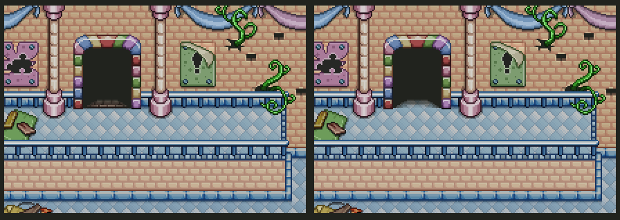
First up, fixing a graphical error shown above! Behind the door transparency the closed door peeked through, rather than the floor. It has now been fixed.

I also added a bunch of extra decorations for the second fighting room in zone 3. It just looked a bit empty, so I felt it needed a bit more polish:

11

12

I also adjusted the garland you’ll unlock in the Seasonne batch of housing items, making sure it’s properly stackable. Previously, you had to put them next to each other like in the left version below, but by editing the size they will now stack seamlessly when you put two next to eachother:

13

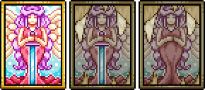
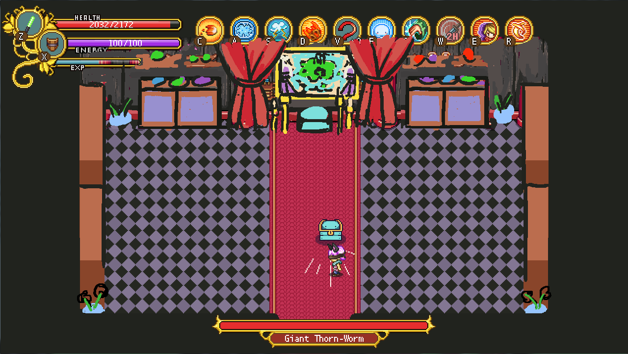
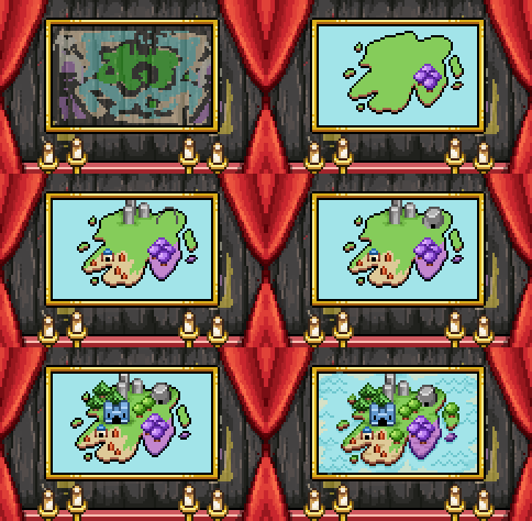
Finally, we’re swapping out the map painting in the Mimic boss room for a portrait of Grindea! Progress and finished versions below:

14

15

16

Now, a lot of you have asked when frontline will be updated with the third Tai Ming area. Here’s our estimate: HOPEFULLY this weekend! We’ll do our very best to make that happen, at least :)
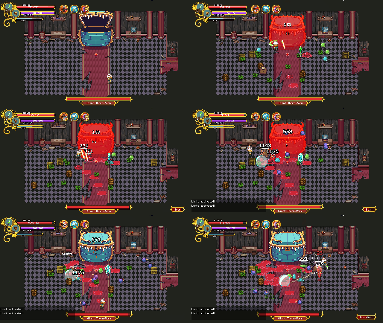
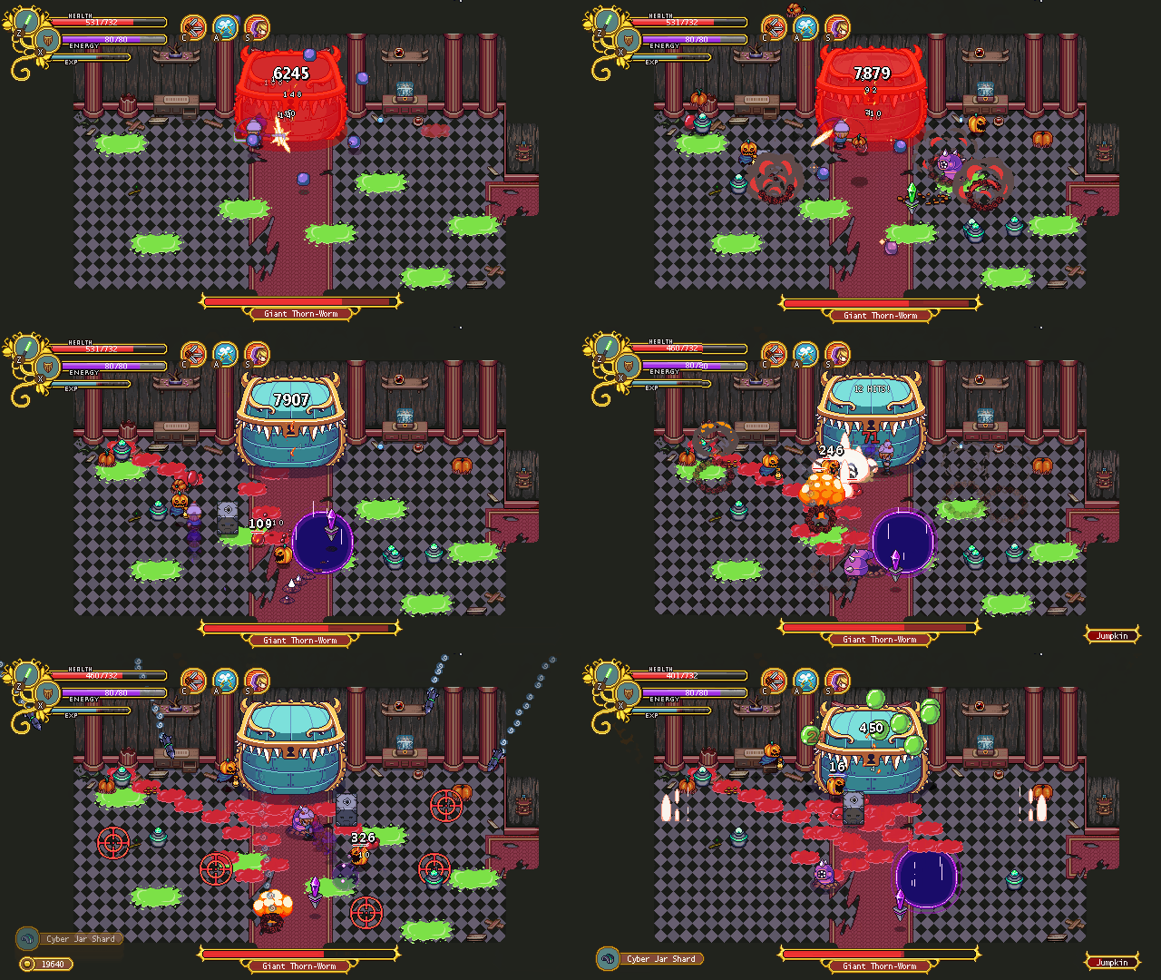
Remember the Mimic boss? Improvements have been made, and the prototyping goes on!

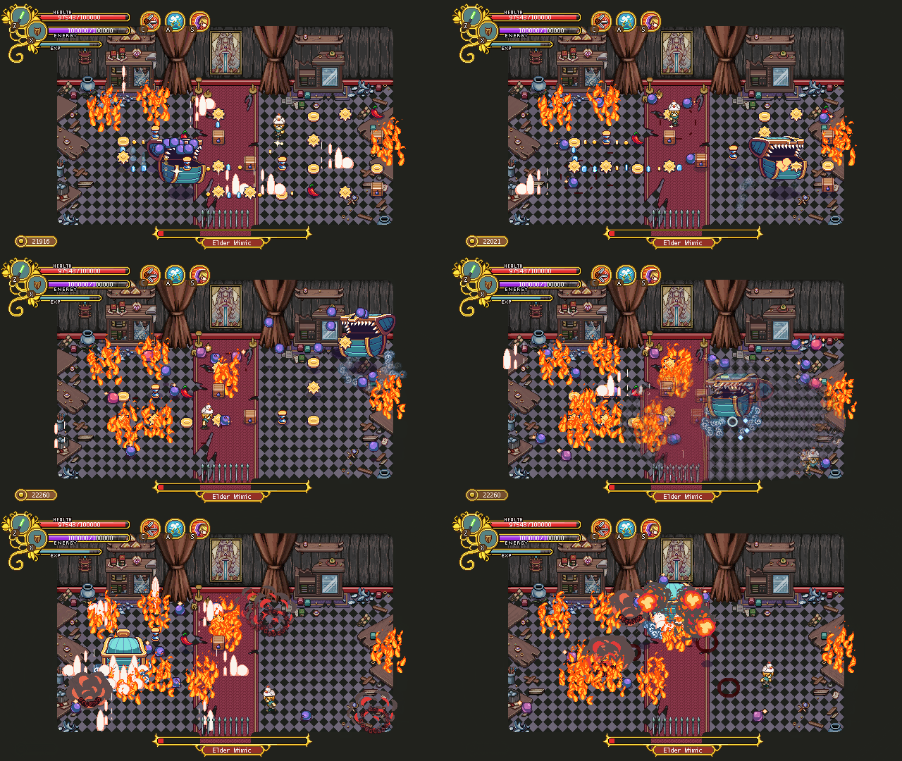
01

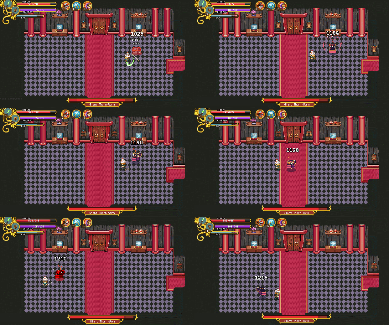
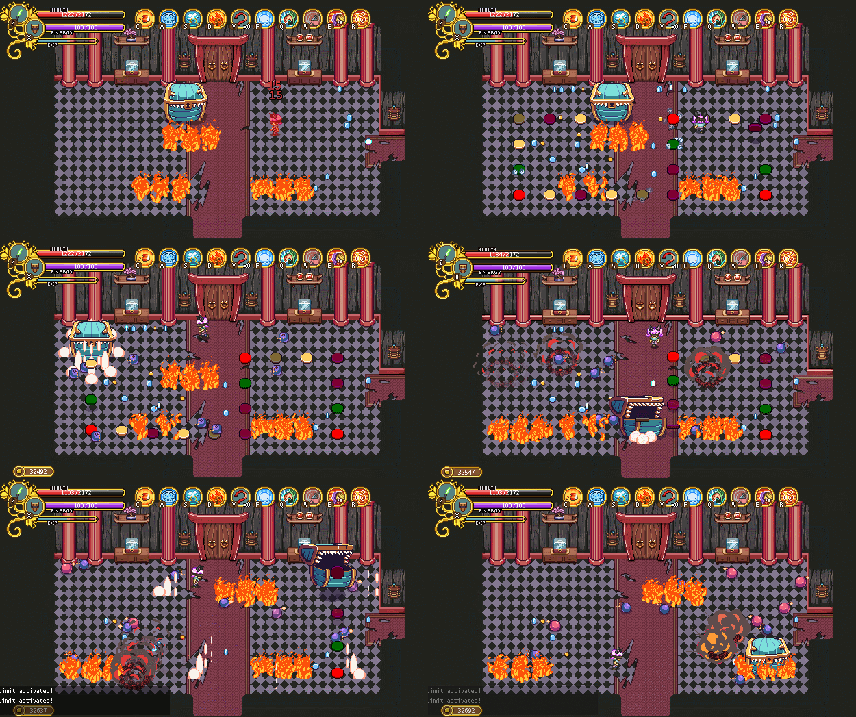
Since the last prototype we decided to keep the waves he spits out, but with mixed enemies, so there will be enemies from all around the world rather than from one area at a time. We also removed a couple of waves, since this fight likely is long enough as it is – this is stage 3 after all!

02

Occasionally while you battle the wave(s) he spits out, the Mimic will launch random disables or damage dealing stuff as well. These can be anything from bombs, slime, rockets, fire – you name it! These will be random, but certain disables/attacks don’t unlock until you’ve progressed far enough in the fight.

Yet another step closer to finishing the map! Now there’s mainly a ton of animations and polish, polish, polish remaining!! :D

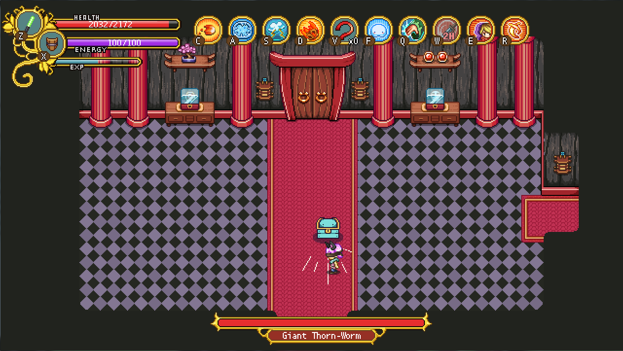
…And of course… The actual background for the fight!

Right now the prototype version of the boss room looks like below (which can also be seen in the GIFs above):

03

After doing some thinking & talking, I made a sketch preview of what the finish thing could look like, and had it approved by Teddy and Fred before I began work:

04

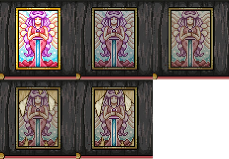
The most complicated thing in the room is probably the painting – which we, oh irony, have decided to swap out for another one yet to be made. For now, here’s this one, which will likely appear somewhere else in Tai Ming instead:

05

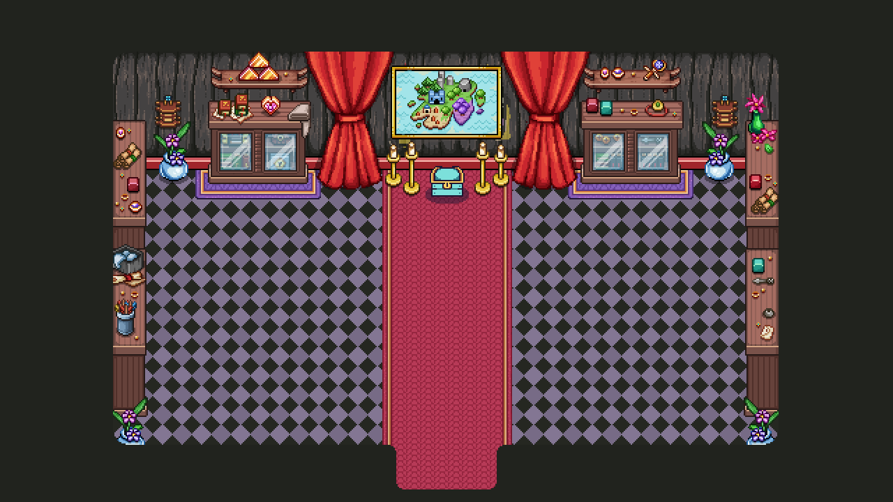
And here’s the finished room for the first stage:

06

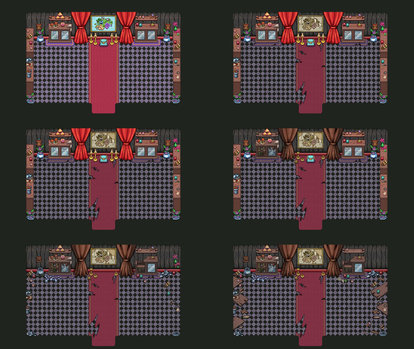
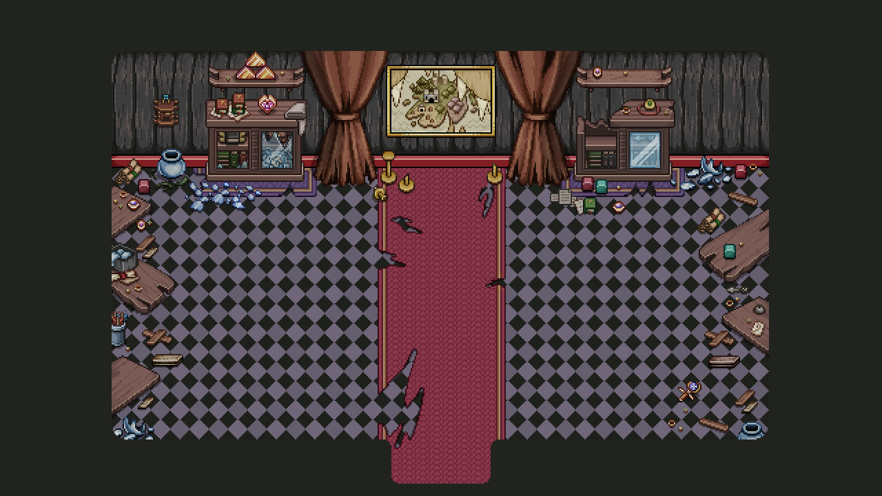
As the fight progresses, you will jump through time and the room will change. And so… On to stage two! For this one, some time has passed and it’s time to break and demolish the props inside:

07

As I made this I did not yet know the painting would get swapped out, and so it too got a ruined version, though I do not yet know if that will be in the game or not. Maybe this will be the only time you’ll ever be able to see it, so take a good look!! ;)

08

For the next stage, we jump back to our own time, and this particular room of Tai Ming has seen some serious ruin compared to the rest. But first…. some more housing miniatures!

With Tai Ming and Mount Bloom’s housing items finished, it’s time to create their miniatures and add them to the game, and this time I thought we’d mix it up with a video!

Only the basic items for each batch in this one – the video would be way to long otherwise! More to follow in another post. For now, here’s the result from this vid:

09

And the large versions for comparison:

10

That’s all for this week! Next week the work on the boss room continues, and we begin piecing together the cutscenes one by one. Stay tuned!

With Tai Ming nearing completion, and a revamp of Arcade Mode in general and Arcadia in particular, it’s no wonder a lot of our recent talks have been about exactly what new Arcadia will look like. This meeting we dove in and decided on some more things:

Buying Houses for Arcadia
Basically, Arcadia will start as an area of wilderness! The place where you start will be small, with most of the map being covered with wood and other obstacles. As time progresses you will be able to ask various people for help clearing the area, and in doing so revealing a bunch of signposts indicating what could be build at the spot.

Clicking the sign will trigger a preview of what the building or decoration will look like, and what it will bring to Arcadia. For instance, aside from shops and buildings with gameplay features of various kinds, there will be decorative things that may not give you a new feature per say, but will bring people with quests to town.

Essence & Gold
Essence will be used to buy perks, as well as transmute decorative hats and other gear that carry over to Story Mode. Essence might also become the currency used to buy housing items in the Arcade Mode version of the feature.

Gold, meanwhile, will be used to unlock new buildings and decorations, and pretty much everything else.

Candy & Muffin
Muffin’s house from Seasonne will be available from start, though there will be nobody at home in the beginning. Once you’ve either died a number of time or gotten to a certain highscore, Candy or Muffin will start inhabiting the house.

If you’ve died x times, Muffin will appear and allow you to make Arcade Mode easier by giving you a number of treats (3 maximum, much like perks). Treats might include things such as health orbs healing more or there being no elite enemies. The downside to this is that you will get a much reduced highscore for using these treats.

If you gain x highscore, Candy will appear and allow you to activate certain curses (again 3 maximum, much the same as perks). These curses serve to make the game harder in various ways, such as doubling the amount of elites or removing health orbs altogether. With curses activated you will gain a higher score than during regular runs.

While it might sound tempting to do so, you can’t combine treats and curses: you’ll have to use one or the other.

The Arena
There will be an arena where you can practice boss fights once you’ve reached them through one of your Arcade Mode runs. In the arena you’ll also be able to run the same PvP challenges that will eventually become available in Story Mode, as well. It’s likely you’ll have to pay some gold to practice boss fights, while PvP will be free.

The Aquarium
One of the decorative spots, a house where you’ll see a collection of all the fishes you’ve caught during your Arcade Mode runs (one of each). This place will also attract NPCs with quests!

The Inn
…Will work much like it does now, only with more NPCs and more quests!

—-

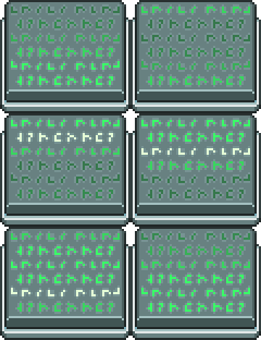
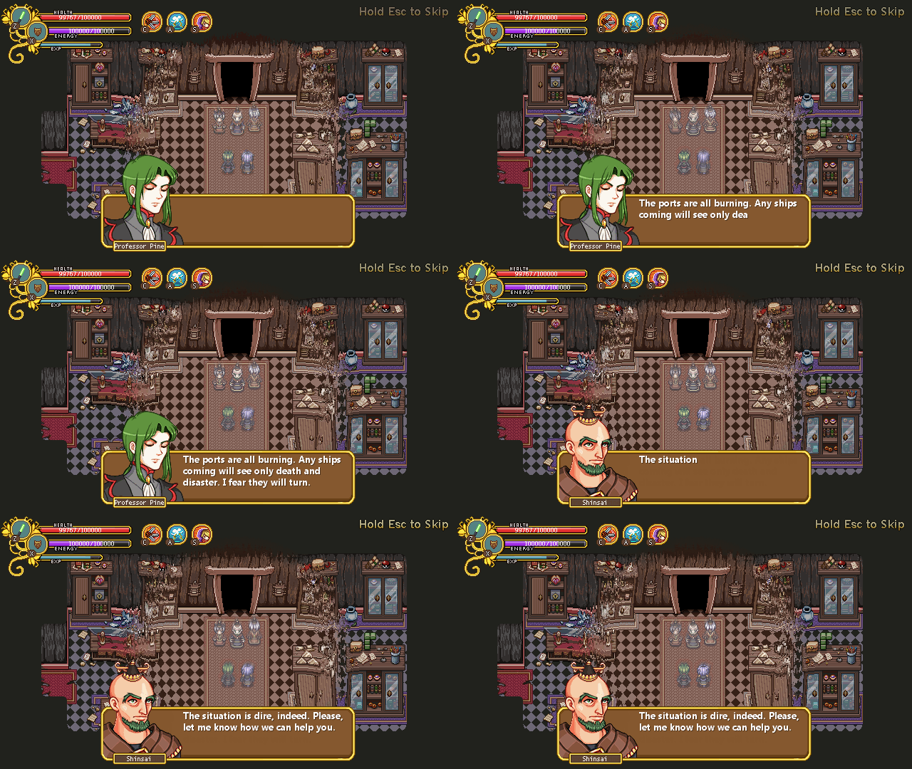
And by the time we reached this point of our discussion, the hamburger place we were at were closing so we had to go back home to do regular work. More planning next time, and instead, let’s have some more text previews:

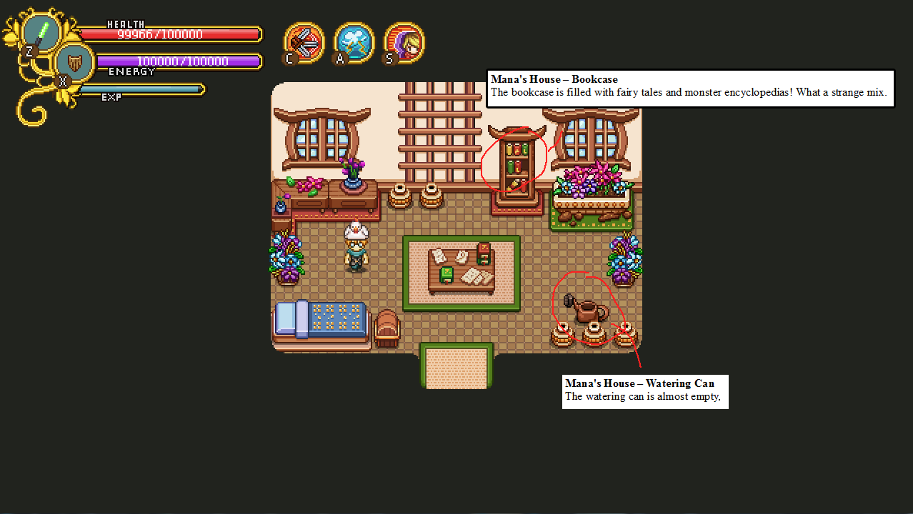
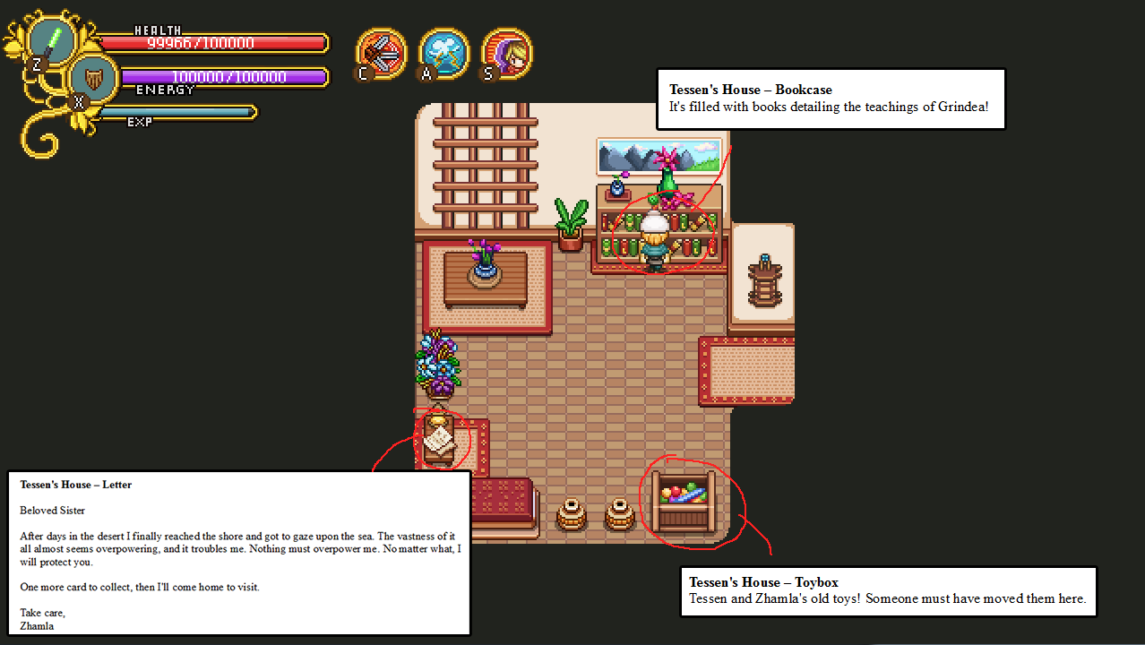
01

02

03

04

While making these it’s really easy to start coming up with things for previous areas as well, as you remember other bookcases or signs where you’d like to have some kind of text but haven’t added one yet. All in good time though, we want to avoid backtracking too much while we still have quite a long way to go before the main story is done.

All in all there will be 35 optional flavor texts available throughout Tai Ming! Can you find them all? I guess we’ll see… :)
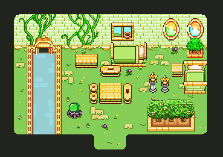
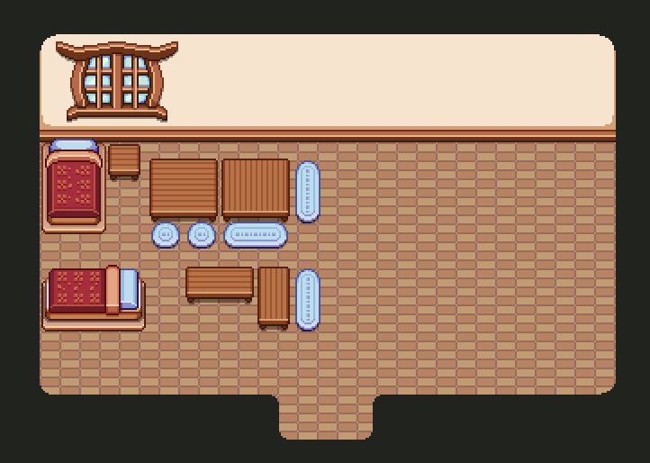
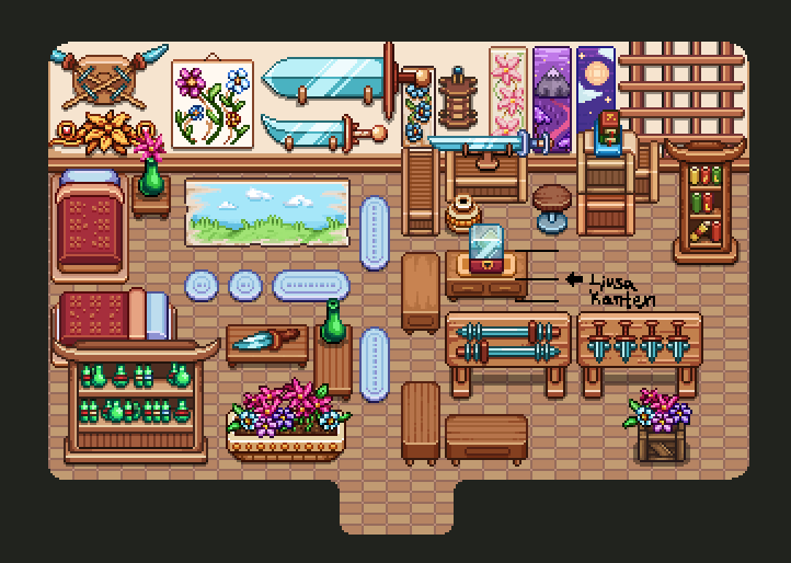
Now it’s time for the final batch of themed housing items for a while now! Tai Ming, bring it on~
You know, you’d think that with Tai Ming being a town and all, there would be plenty of ready made housing objects there, right? Not so. I’m not kidding, I had to remake almost every single item in some way!

Next time we make a town, I’ll make sure to follow the housing guidelines to begin with. Not that I could follow the guidelines before since we didn’t have any… But you know ;)
Anyway! The basic items, not much to say. A very basic batch, with things you’ve likely seen before (although remade in size or with additional versions for Housing):

01TaiMingBase

The surfaces here will have a different height than items in the rest of the housing batches, since people in Tai Ming prefer sitting on the floor rather than chairs!

Compared to the basic batch, the special item one is.. a bit overwhelming: so many items!! There were so many wall decorations I couldn’t even fit them all on one wall, but had to put one on the floor just to show you. There are also a bunch of variations for some of these objects (such as different versions of decorations on top of the crates in the upper right corner) that there was no room to show as well:

01TaiMingSpecial

I think it’s likely that not all of these will be unlocked as you enter Tai Ming: some of the more generic looking objects will likely become part of the first basic batch, and others will be granted as quest or chest rewards.

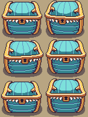
And now…. More Mimic boss stuff! This time of his third and giant phase~

01A

We’ve already gone through two prototypes for this version. Here is the first one, where the Mimic pretty much spits out random things all the time. We felt this version was a little too messy in the end, so it was scrapped.

01B

Cue prototype #2:

02A

This version has a more clear pattern: he begins by spitting out a bunch of Pillar Mountains and Evergrind Fields themed enemies, then spits out slime at random intervals while you either beat the enemies or him up. After you’ve damaged him enough he then moves on to Flying Fortress enemies, while spitting out rockets. After dealing even more damage on him, he’ll move on to Temple of Seasons enemies – and so on.

02B

We liked this version a bit more, but we didn’t particularly enjoy how much it felt like you were replaying the game, so we’ll probably do one more prototype where we mix the encounters up a bit more between areas but keep the intervals he spits them out at!

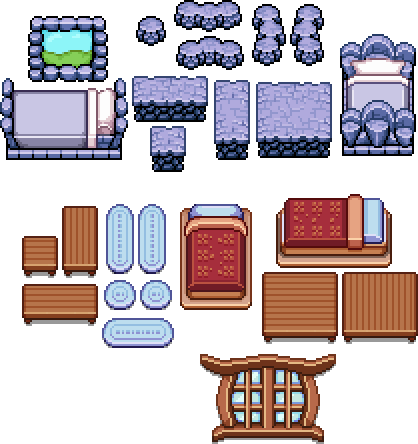
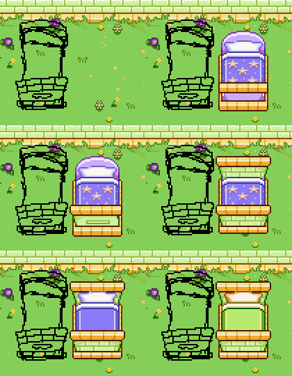
You’d think after finishing a bunch of sprites for housing, you’re all set, right? Nope! Time for step two in housing: making drop appearances/menu miniatures for everything!

01

Honestly, if there’s one thing I wish I knew how to streamline better it’s finding the right folder for stuff and saving a ton of items as PNG. Maybe there’s a way I haven’t found yet (I have not exactly done much looking).

Regardless, it takes a tooon of time saving items once you’ve finished making them. Not only do you have to check it for flaws (one of my great skills is accidentally leaving empty pixels in objects, trying to catch that before adding items to the folders now), and actually save it with all that entails, in the case of housing you also need to make menu versions since the big ones are much too large to show properly in the interface!

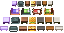
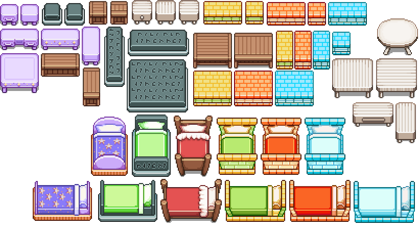
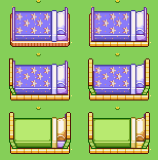
Above you can see a bunch of examples of miniatures, with the bigger versions below. After making this many, we had a talk about how to display Temple of Seasons stuff (since they will be three versions at once), and I had for some reason assumed that meant I should make three versions of everything. Because that would entail a whole lot of extra coding, we decided to either make one version that were all three at once, or simply stick with one of them and put a special icon next to it showing it gets transformed by the seasons.

After trying out the first idea (see above, upper right), we decided to simply stick with one version, in this case the summer!

02

And the madness continues! This time a bunch of surfaces and beds~

03

04

05

See that stray pixel between the red tablecloth and the left vines? Yeah, that’s exactly the kind of thing I’m trying to avoid. And clearly failed to do so before uploading this image! Oh well, at least it won’t be in the game :D

06

And now…. Time for some Mimic updates!

07

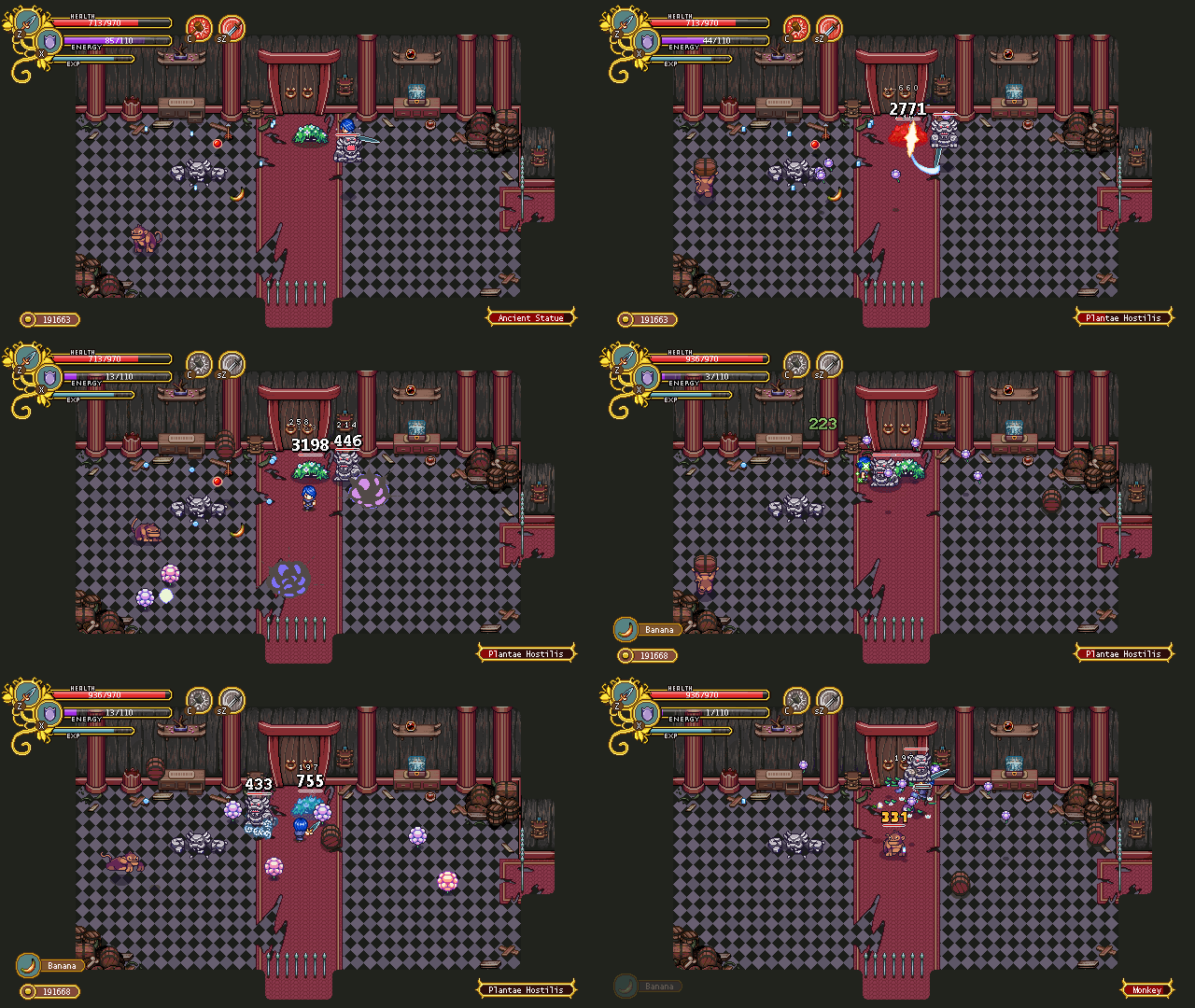
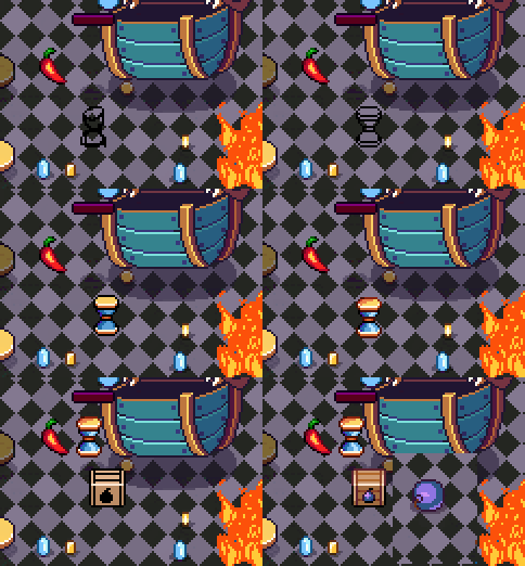
To make this guy’s eat-attack look a little more interesting we decided to swap out coins of various colors for a different set of items. The mimic will still eat huge coins (which won’t do anything), but the items that cause various effects will be as follow:

Emblem – Causes shockwaves (not pictured yet)
Chili Pepper – Fire
Hourglass – Slows player character(s)
Box of Bombs – The mimic spews out a bunch of bombs!

Since Fred has a very hectic schedule right now with a ton of animations needed for next update, I stepped in to make temporary objects for him to eat (wip above). These will be upgraded and animated by Fred once he has a few spare minutes:

08

Here’s a GIF showing how the mimic boss has improved since last time. AGAIN all GIFs in this post run slower than in the actual game. I’m looking for a different program to record GIFs in since FRAPS isn’t working anymore and cutting things in GIFcam is a bother. If anyone has any  suggestions they are very welcome! Anyway!! Instead of simply leaving fire on the ground, he now shoots out balls of flame that cause a fire to burn where they land. We also made an effect for the hourglass slow-down, to make it more clear when you get affected by it:

09

In the third phase, the mimic will grow even bigger and become static. In order to harm the player, he will spew out a ton of random items and enemies.

In this part of the battle we have two options, and we have not quite decided which one to go for yet – either he’ll send the player far back (the room would then be a bit larger vertically) with some kind of pushing attack, then fill up the room with obstacles and enemies the player needs to get past in order to hit the Mimic again. The second option is to have the Mimic invincible, until he gets exhausted (triggered by you clearing enough waves of enemies/items), at which point he’ll reveal his tongue which you can hit do deal damage.

We’ve also discussed a special attack where the Mimic starts sucking all the items he spewed out towards him, causing damage to the player if you get sucked too close (due to spikes or something similar poking out of the chest), but we haven’t finalized that part yet so I cannot say if it will actually appear in the game.

Finally, let’s end this week with a quick look at the skill you’ll unlock in the fourth dungeon~

10

So this skill has the codename “the ghost skill” because we haven’t come up with anything better yet. What it does is basically it shows you the spirit world, where things look a bit different.

11

There are a ton of possibilities for this skill, including having enemies that can damage you in the real world by using real weapons, but you cannot hurt them unless you go into the spirit world. There’s also obstacles you can only pass in the spirit world, or hidden treasures only seen while in it.

With this skill you’ll also be able to talk to ghosts, which might help you on your journey or give you quests?! Who knows, this is just a very early prototype after all.

12

What do you think? Too dark and scary? We’ll do our best to make sure nothing becomes too creepy, just the right amount!

It’s our 260th recap and this week I’ll be focusing on more housing content, while Teddy and Fred continue prototyping the Mimic boss!

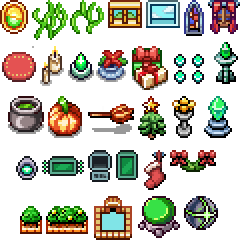
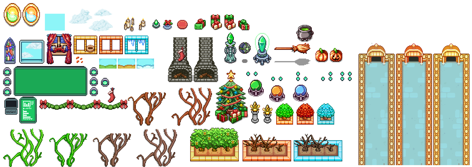
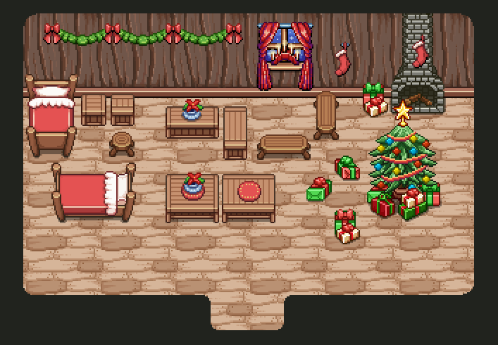
Last time when we looked at the Seasonne housing items, there were a bunch of the basic ones. This time, it’s time to add some random special items! A christmas tree, christmas stockings, garlands, presents, a christmas flower… Pretty much everything christmas inspired I could think of quickly:

WinterSpecial01

Do you feel like we missed another christmas themed item that would be cool to have in the house? Go ahead and comment! :)

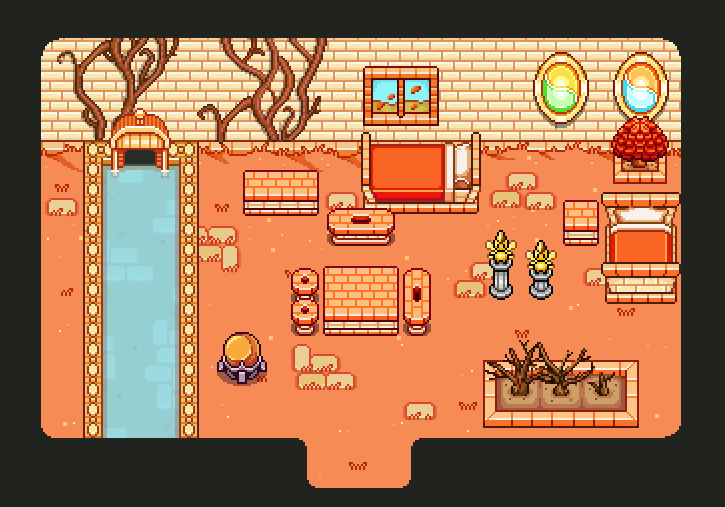
For the Temple of Seasons housing items, most items will have 3 versions that change depending on the season. You’ll be able to place an orb to change the season in the room, which will change your items (and if you won’t want to keep the orb after swapping season, you can simply remove it again).

Some progress GIFs of the bed:

SummerBase01Bed

SummerBase01Bed02

For the Temple of Seasons summer window, I’d like there to be a cute little bird in the nest or something. I just keep coming up with ideas hoping Fred and Teddy will cooperate in implementing them! But since it’s a great idea, I’m sure they will… Right?! ;)

The wall decorations to the right and the fairy statues will remain the same regardless of season, the rest will change as you hit the orb:

SummerSpecial01

And now, time to change those seasons!

First up, the autumn batch! The vines have dried up and the leaves have fallen off the bushes. Also everything has orange hues rather than yellow and green. For the window I imagine dried up leaves blowing past:

01 Autumn

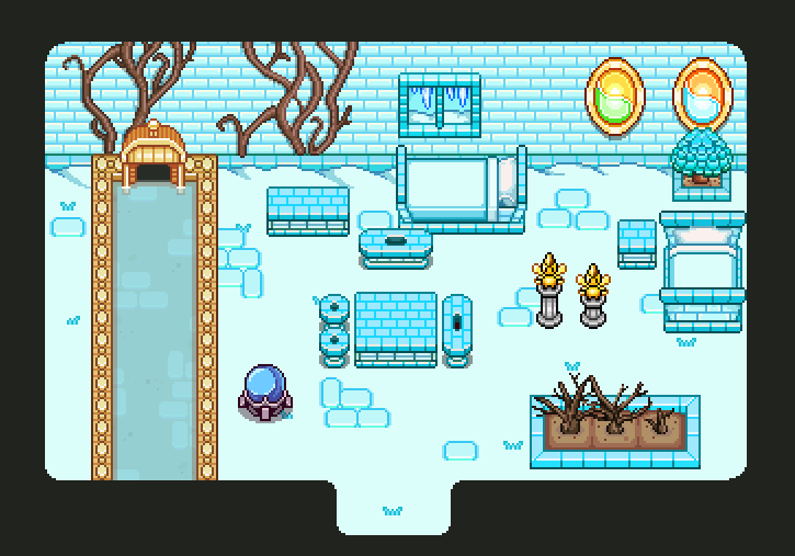
In the winter version, everything is blue and white, and the vegetation have become more colorless (aside from the magic bush in the corner which never dies). There’s hanging a bunch of icicles in the window:

02 Winter

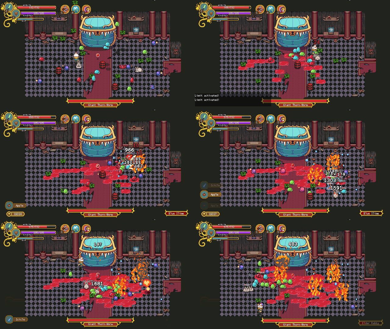
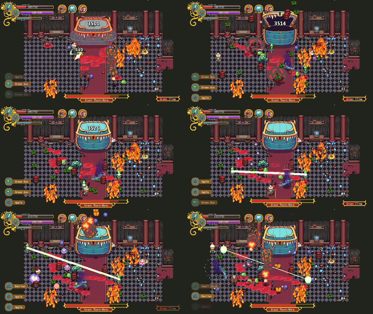
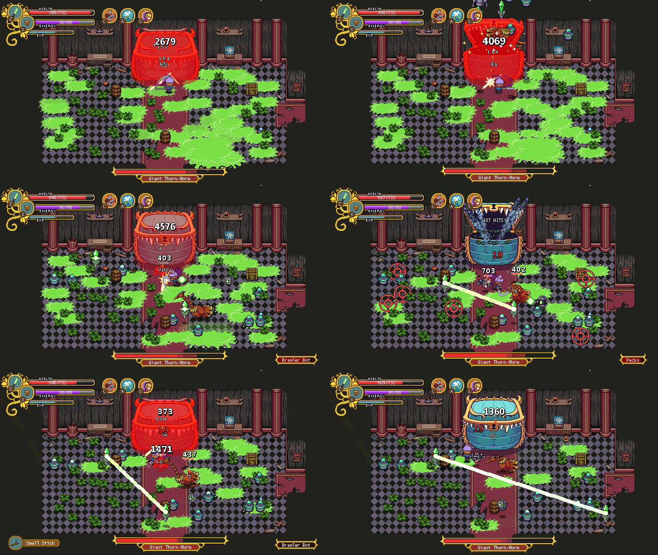
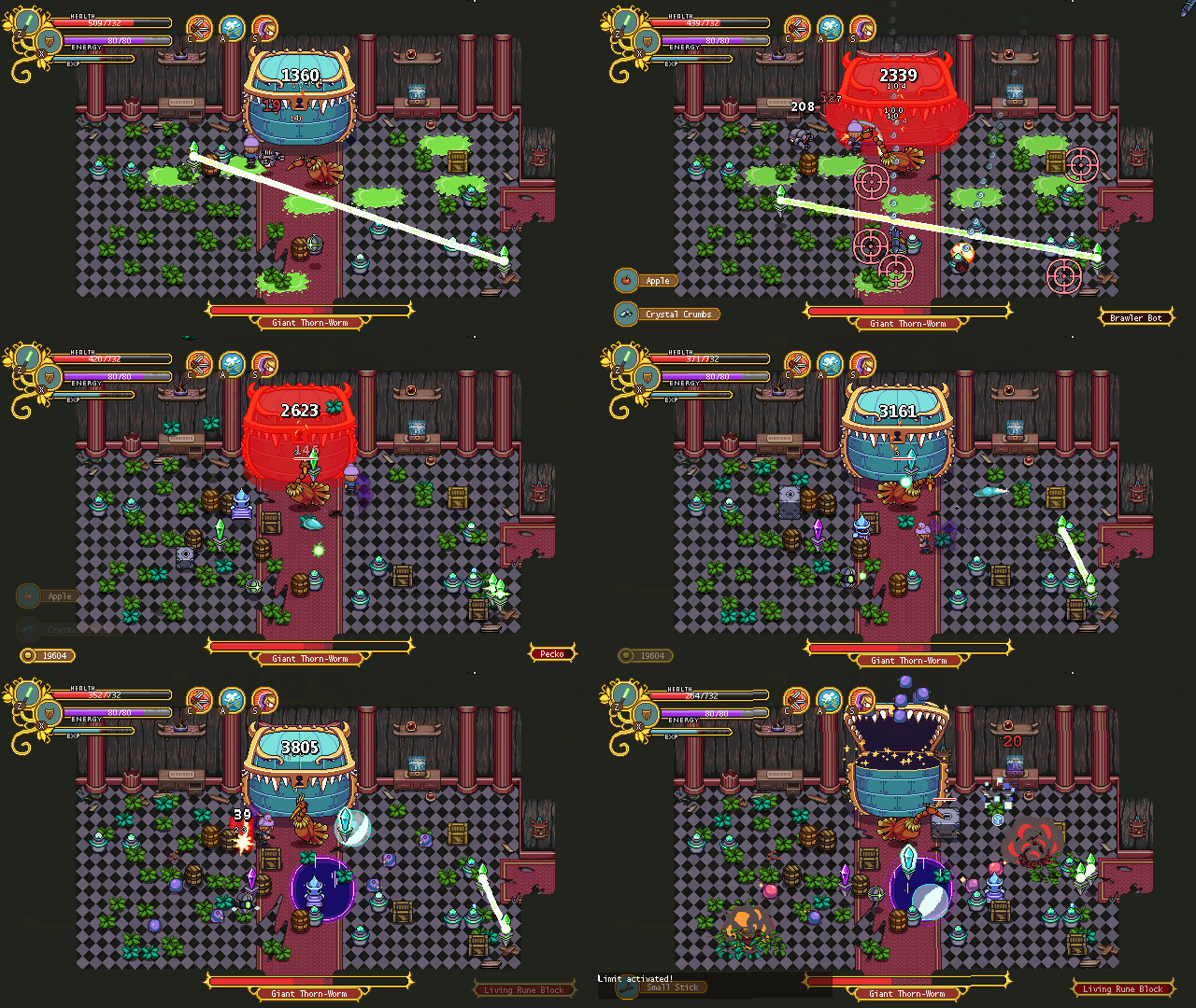
And now… finally…. A preview of the Mimic boss fight!! (These GIFs are for some reason a bit laggy/slower than what the actual game looks like, but you’ll get the idea anyway)

01

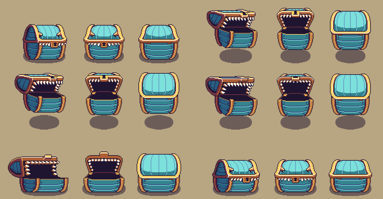
This is the first version of this little guy, which we’ve (not surprisingly) focused on first. In total he’ll have three stages, where he grows in size and gets more complicated attacks in each step.

02

The first version is very straight forward right now, and will probably remain so. He basically jumps after you Jumpkin-style, getting enraged after you deal enough damage. Once you’ve done enough, he’ll go into a super rage-mode, jumping around and causing shockwaves:

03

The next version is a bigger and meaner version of the first. When he’s not jumping around, this time in a more Giga Slime-fashion, except for the slime, he spits out a ton of random items (in this version we’re using placeholder coins), after which he’ll start eating the items up again:

Mimic2

Depending on what item he eats, various bad effects will happen. One will cause flames to appear on the ground, another will have him send out shockwaves, a third will slow down the player, and a fourth sends out a ton a bombs. Madness!

Another week has gone by, this one focused on finishing up the second to last Tai Ming map, more housing items, and a lot of prototyping action!

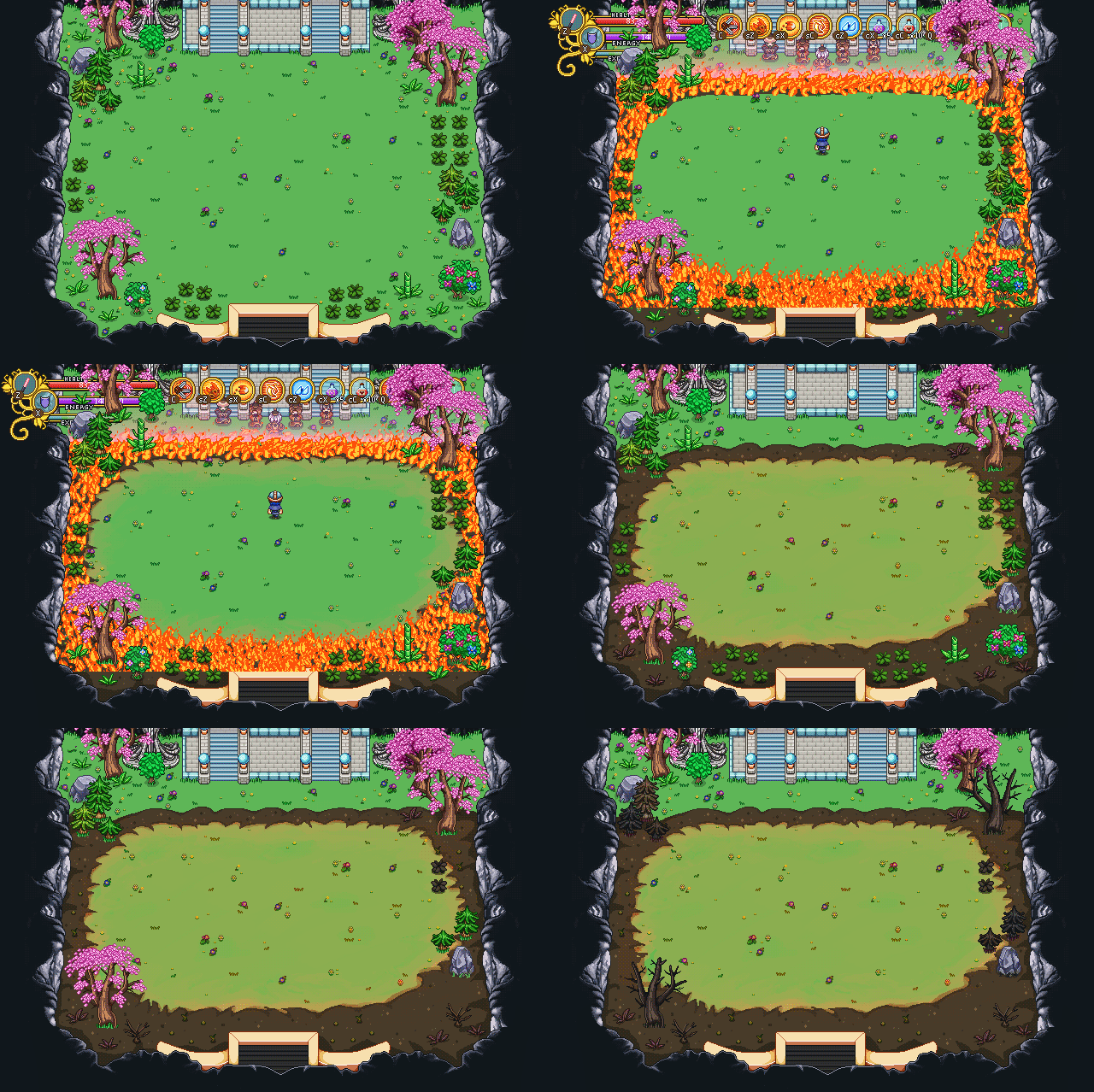
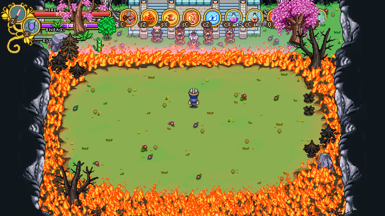
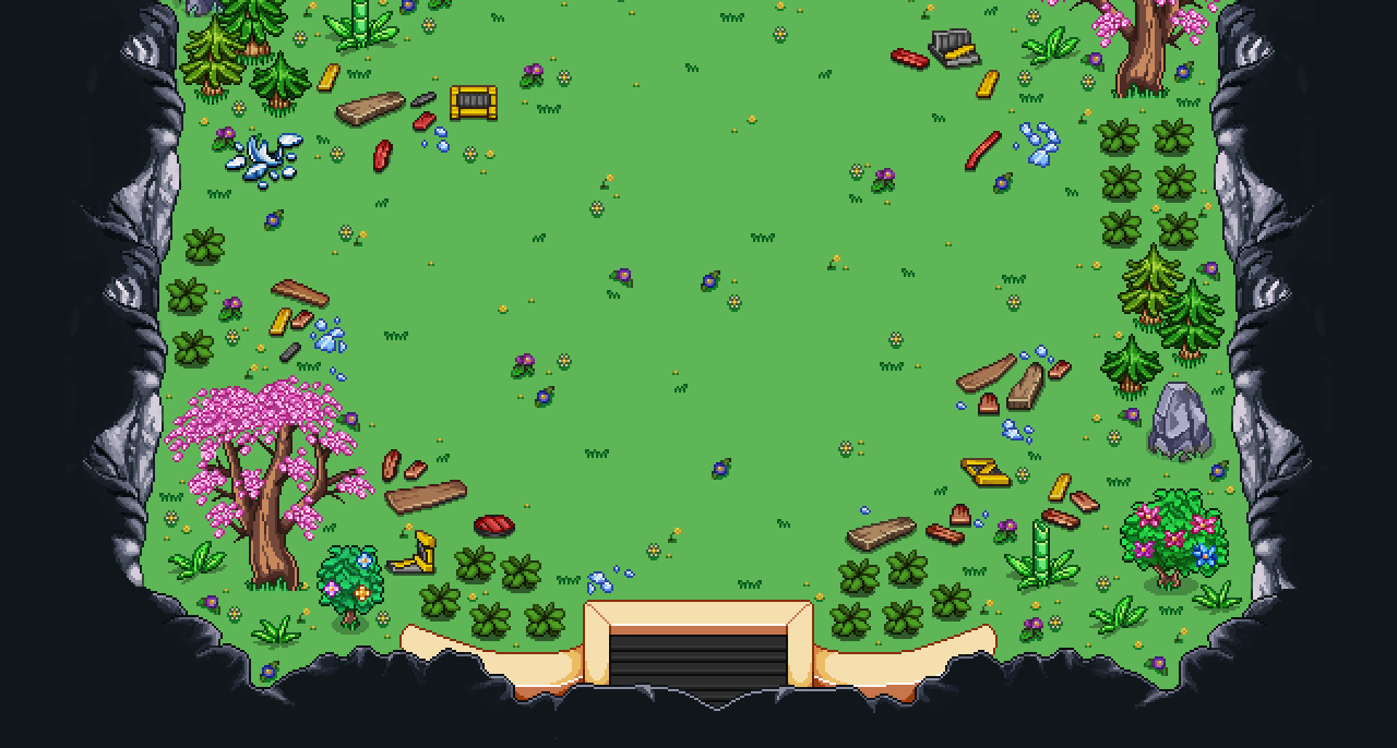
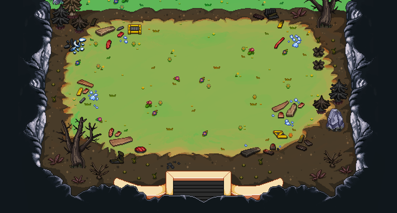
A lot of things will happen on the courtyard map we showed last week, so it needs a whole bunch of different states. First, I’ll add some dirt and burn effect to the ground where the fire is raging:

01

Basically I paint dirt wherever the fire is, and repaint any bushes, trees, etc to darker, burned crisp versions. Some props, like the whack-able bushes, get completely destroyed and only leave a stump behind. While it would probably be more realistic to just remove everything except for maybe the trees, we felt like keeping the props with a burn effect on would make the map look more interesting than if everything was simply removed.

I also changed the color of the grass in the circle to a slightly more yellow-reddish hue, which would go along better with the flames:

02

Of course, once the effect we showed last week is put on top of this, things will look slightly different. But there’s a basic preview, anyway!

Now, time for some polish!

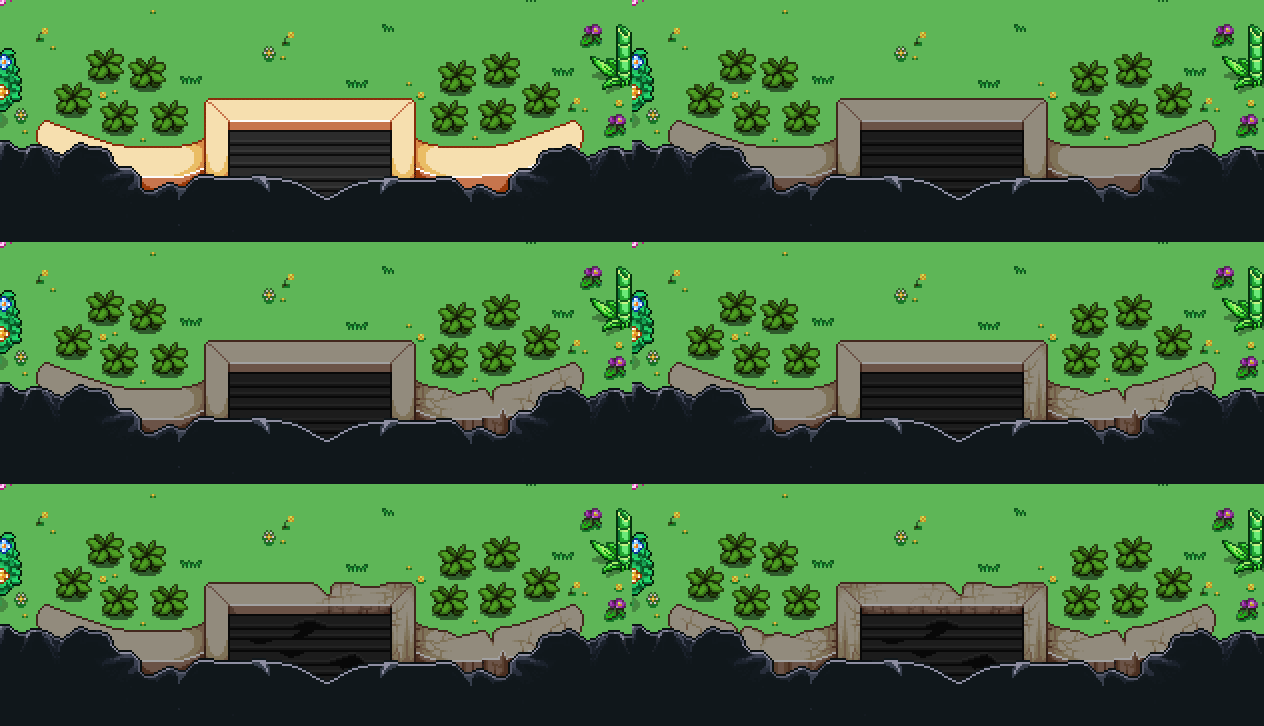
Previously I had not yet added the door in the back of the courtyard, so I went ahead and made that. There’s both an opened and closed version:

03

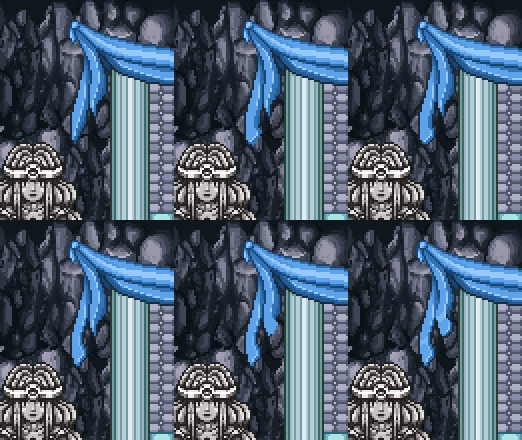
Since I wasn’t 100% satisfied with the way the cloth fall at the end of the ‘altar’, I decided to go back and edit the shape slightly:

04

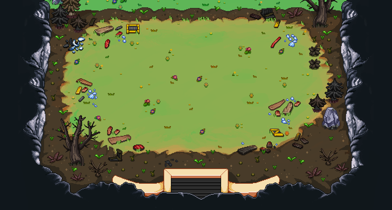
The courtyard still felt a bit empty, and not messy enough (some stuff is going down!), so I threw in a bunch of planks, some broken glass, and other stuff. In the burned version, I added a burn effect only on the parts of each object that’s within the fire:

05

06

Finally, due to another time jump, there was need of a version of this place after the fire, where some time has passed. In order to illustrate that we added some newly grown grass, but not too much, since not that much time has passed at this point:

07

And now, the final part of the courtyard project: the present version!

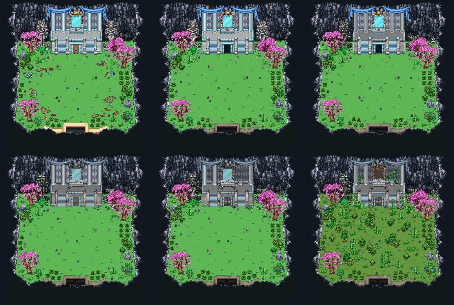
First up, a GIF of the demolishing progress of the entrance/exit:

08

And then, a GIF of the transformation of the whole area! As usual, it’s all about breaking down items and adding more greenery. This map too will have two versions, one with a closed door and one with it open:

09

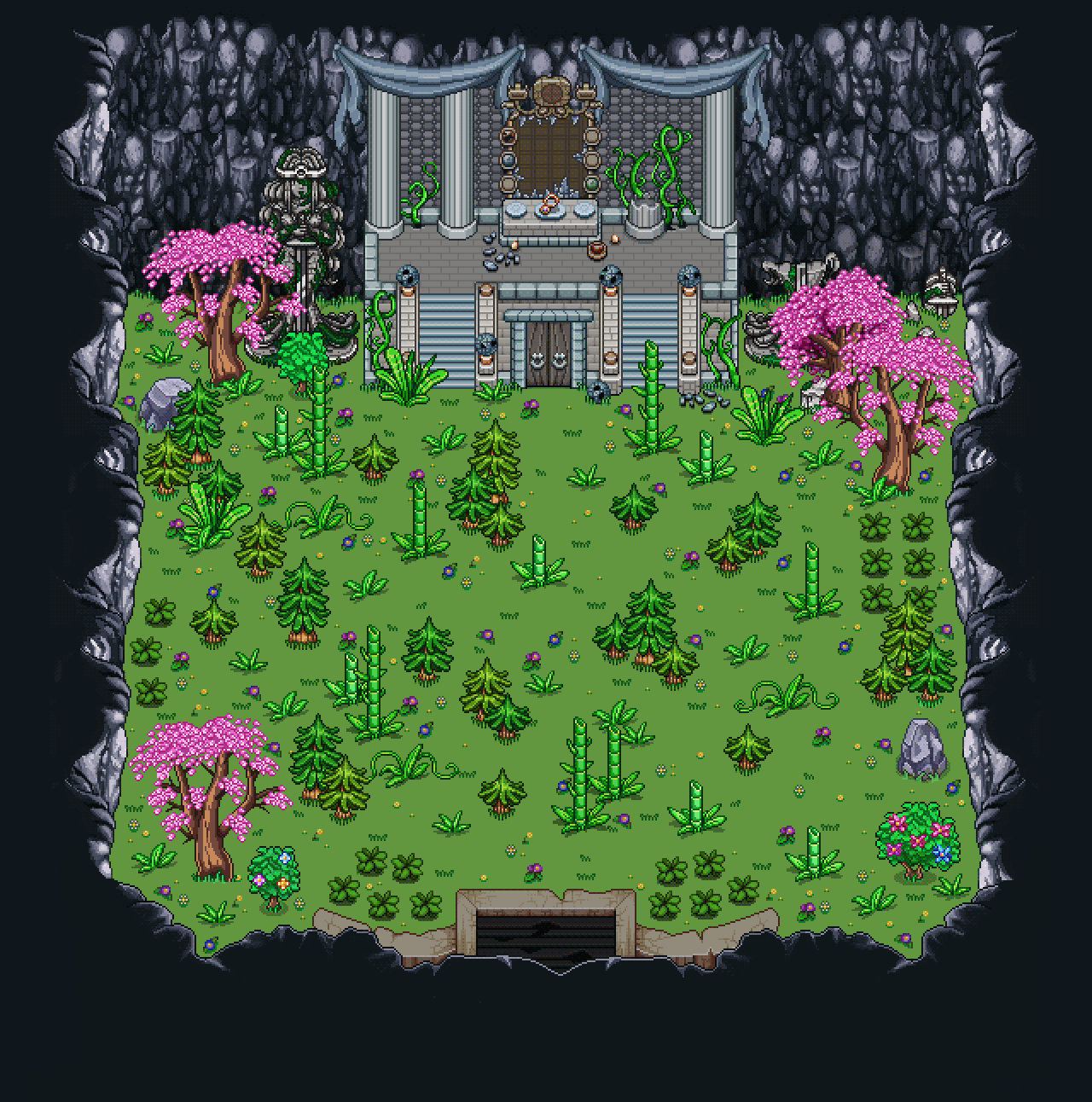
Final thing (some objects will be replaced automatically by the game engine):

10

In the housing department, it’s time to create the batch unlocked by entering Seasonne, and here are the basic items that will be available~

11

While there aren’t a ton of christmas-y items here yet, rest assured there will be a whole bunch of them before I’m done with this batch! Christmas trees, piles of presents, greenery hanging on the wall, christmas stockings…! Just you wait and see.

Also, feel free to suggest other christmas-inspired items (or any kind, really) here or on the forums :3

And now, some of Fred’s animations, featuring the second stage of the Mimic fight:

Idle

MunchLineup