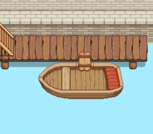
Time to make Grindeas first set of boats! Starting with a small and rather simple one, there will be several more before we’re done. This is actually the first time I’m drawing boats, so bear with me and expect several stages of improving and adding details to these as we continue on.

Without further ado, the first one:

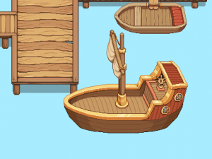
The second boat is actually more of a ship! There will be another similar one of these nearby, too. As you can see in the WIP video below, at first the sail was down, but as it was pointed out to me you don’t keep sails down while in port… I changed it (I know absolutely nothing of ships but it was a pretty dumb thing to not realize sooner! I’m sorry!)

WIP and finished thing:

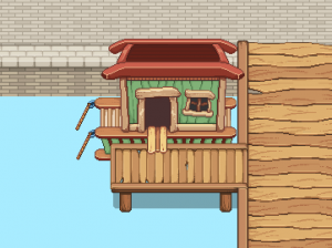
Time for the third “boat”, which also is no regular boat, but a houseboat! I’m not 100% this is the color scheme we’ll go for in the end, but for now it’s a green, red and brown quirky kind of deal:

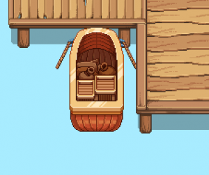
The final boat post this week and the final boat in the port: another smaller vessel this time, filled with cargo! Maybe it has come in from a bigger ship docked outside the harbor area?

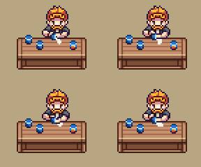
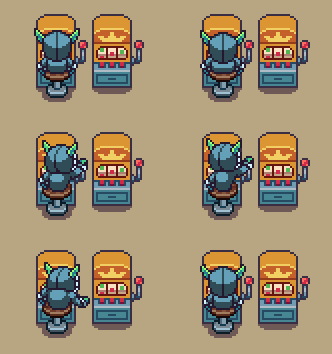
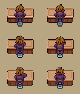
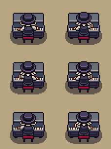
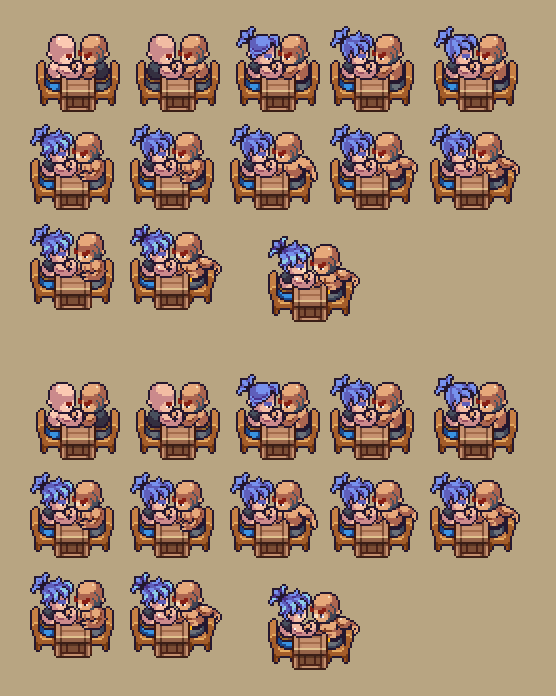
As for Fred, this week he continues to make NPCs for the Saloon! As mentioned last week, there will be a lot of different characters here, and not all are human… Below is another selection of people visiting or working at this place: a bartender cleaning a glass, a caveling using a slot machine, someone at the bar, and a pianist for entertainment!

…and yes, Teddy is still working on implementing all the new Arcadia systems! Keep in mind there’s a lot of new mechanics to add, so it’s taking a little while. He’s aaaalmost done and ready to let us inhouse test before handing it over to you guys though! Stay with us just a couple of more weeks~

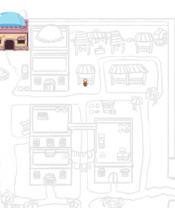
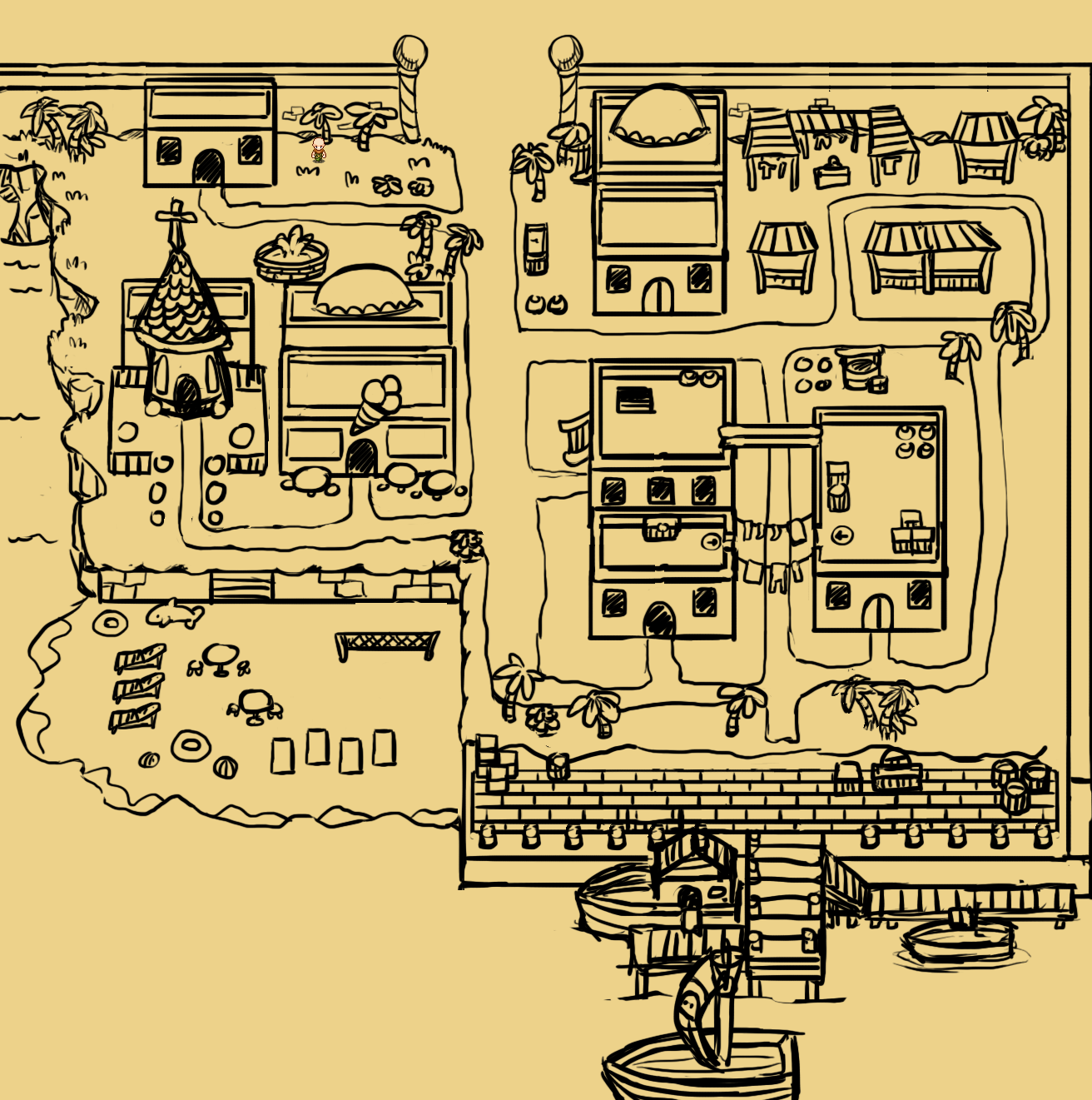
With the desert town progress underway, we decided to make a few changes on the right side of the map before I start rendering those houses. Here’s the original sketch (please excuse the house on the left side which I forgot to remove before saving this):

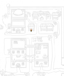
We decided to change the bottom left house in the picture below to one big two-story house instead, and add a large crate on the right house with a jump down, as well as another jump down on the lower level of the left house. This will make the houses stand out a bit more from the rest, and will look more interesting overall.

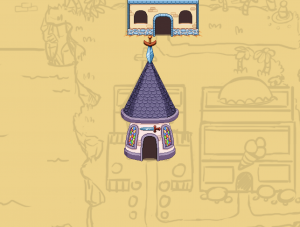
We also decided to add an entrance to the topmost house and move the marketplace a bit accordingly. We found that it having no entrance looked a bit empty, and the market place will probably only look better if it’s a little more pushed together:

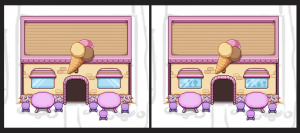
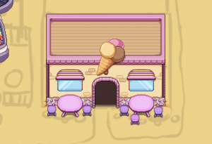
On to the Ice cream parlor, which as I mentioned had a problem with the mirrored windows. I fixed this and added some silhouettes showing through the glass:

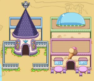
And now, since we have done a bit of work on the lower left side of the map, I decided to tie things together a bit by adding the remaining houses and some decorative stuff. I also replaced the church’s weaponry with Grindea-related imagery:

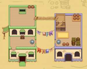
Now, the desert town creation continues with two new houses, a pair of buildings linked together by a rather thin pair of planks! The one on the left is supposed to be the living quarters of someone, while the one on the right is thought to be a warehouse of sorts. Not sure if both will be open or if we’ll close the doors on the warehouse until we can figure out a cool quest or something to happen in there.

For now, here’s the progress of the exterior:

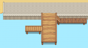
Next we have the harbor, a rather big undertaking that will have to be divided in multiple parts! First up, the core of it all, the bridges:

These bridges will lead to a number of boats of different sizes, which will be what I focus on next. There will be crates and NPCs unloading cargo and strange items here as well, which is why this part is quite big compared to the rest of the town. By the time everything is finished we hope it’ll be all bustling with activity!

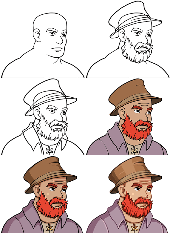
And now, time for another desert portrait! This time it’s the grandpa of the gardener family, the father of the mother who keeps pulling out poor baby carrots. His sprite, made by Fred, was posted a couple of weeks ago first:

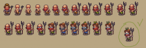
This week Fred has been working on a bunch of NPCs, these too for the desert area. First up is several iterations of the NPC responsible for the jumping vegetable enemies posted before! This guy is an old gardener who has become a little.. unhinged in later years… I will say no more than that! Here’s a bunch of iterations, with the final version inside the green circle:

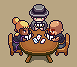
Next up, it’s time to fill the Saloon with people! While the interior of the Saloon hasn’t been made yet, there will be a ton of people there, so Fred has already begun working on a bunch of them!

First, there are two people in the midst of arm wrestling, and a trio playing cards:

There will be more like these coming, as we hope to create a feeling of the Saloon being bustling with activity, card games and entertainment :)

Another week and more desert progress! This week it’s time to begin making those houses that will appear in the desert town. First up is the church, where a certain follower of Grindea will appear:

In the beginning we thought it’d be fun to have a sword at the top of the building, kind of emulating the way churches here in the west have crosses up there, but we’ll probably replace this to something more associated with Grindea later on, such as a bigger version of Essence or something along those lines. For now though, here’s what it looks like:

Next building is the Ice Cream parlor! A place where you’ll be able to get a yummy snack. In the final image below, the window got mirrored so the light on it comes in opposite directions. I will fix this in the final version and possibly put silhouettes of ice creams through the glass as well.

Here’s the WIP:

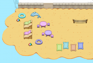
And the next part of town I’ll focus on is the beach! A place where people go to relax and enjoy the pleasant weather around this area. Maybe play some beach volleyball or take a swim in the water:

The water around the area looks a little lacking right now, but I plan on asking Fred to make some animations for waves coming onto the shoreline, ans well as the usual water decorations:

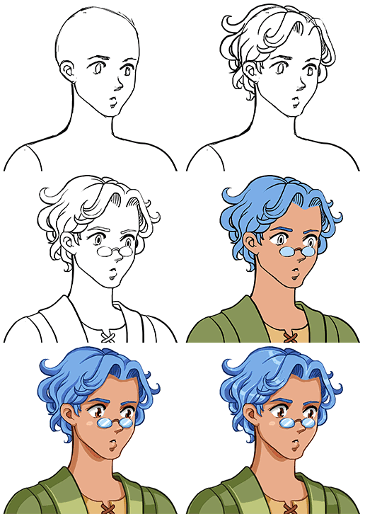
Now, another portrait! Continuing on with the family of gardeners, it’s time to make a portrait of the father, the guy with the pot of unknown liquid:

And here’s the WIP:

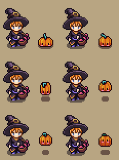
As the Arcadia rework is well on its way, Fred has moved on to make a couple of things needed for it, in this case a sprite of Candy that isn’t hidden behind her giant cauldron, and a cute little familiar we decided to add that tags along with her:

How cute! Wouldn’t you like to have one of those familiars of your own? ….Well, maybe you will. Maybe you will.

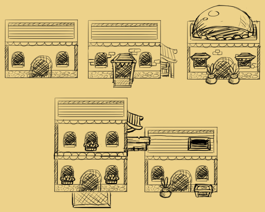
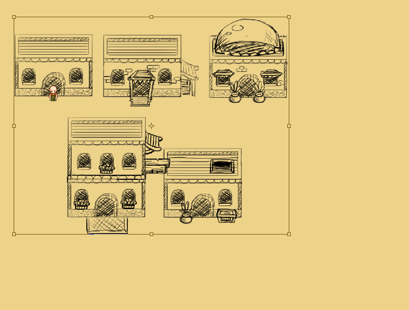
Another week, and work on the desert continues! Before I start sketching the town layout, I wanted to get a feeling of how the houses would look like, so I began to sketch a bunch of alternatives for random basic buildings. Like the house in one of the desert maps, these have a slightly different design compared to the rest of the houses in the game, much like the buildings in Tai Ming:

Once I was done with the sketches, I added a character sprite and quickly realized they were much bigger than they would be in game, so I resized them to fit better:

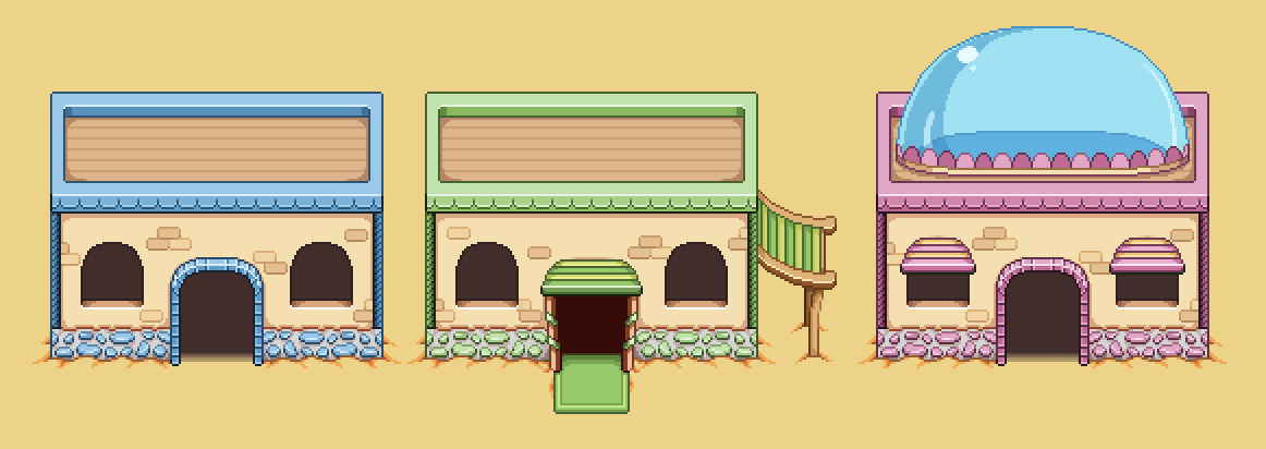
In order to truly grasp what they look like, I decided to make a few of them in the actual artstyle too. This will give a better feel for color and shape, and I’ll be able to use these houses in the game, or at least parts of them, depending on what the final town design ends up being.

Here’s the WIP:

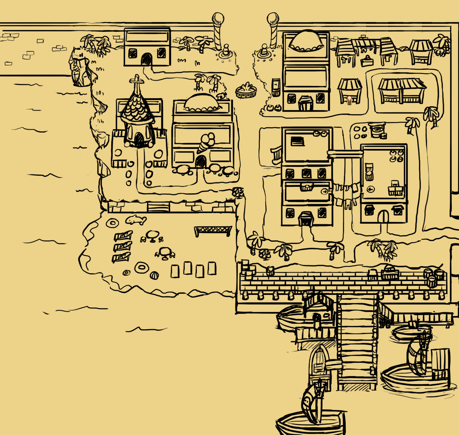
Alright, time to start looking at the desert town! …Neither the desert nor the desert town has been named yet, I guess we’ll have to fix that sooner or later… But anyway! As mentioned, we had already decided on a bunch of major things we wanted to include in the town, among those a church, an ice cream parlor, a marketplace, a beach and a harbor area with ships. With this in mind I began making a sketch of what I imagined the area to look like, with the list of features in mind:

As always with these sketches, we added it as a flat background to the game and ran around in it, imagining it the way it’d look when everything is done. It led us to a bunch of changes:

* Adding more water to the bottom and left, making sure the camera doesn’t stop scrolling when you near the edge of the land. This makes it more pleasant to the eye and helps give a feeling that the sea is more vast.

* The bridge near the harbor area would be increased in size, both in regards to width as well as length. We plan on adding a bunch of NPCs to make it seem bustling enough. We also added more ships, to increase the sense of it being a lively port.

* We reduced to overall size of the entire thing (but just slightly), with the exception of the beach which we found to be of adequate size.

* We made the north entrance a bit more fancy looking, having space for a couple of guards rather than palm trees being the very first thing you run into. We also moved the fountain near the northern entrance to a more central position.

Here’s the upgraded version, and what we’ll use as a base for the city:

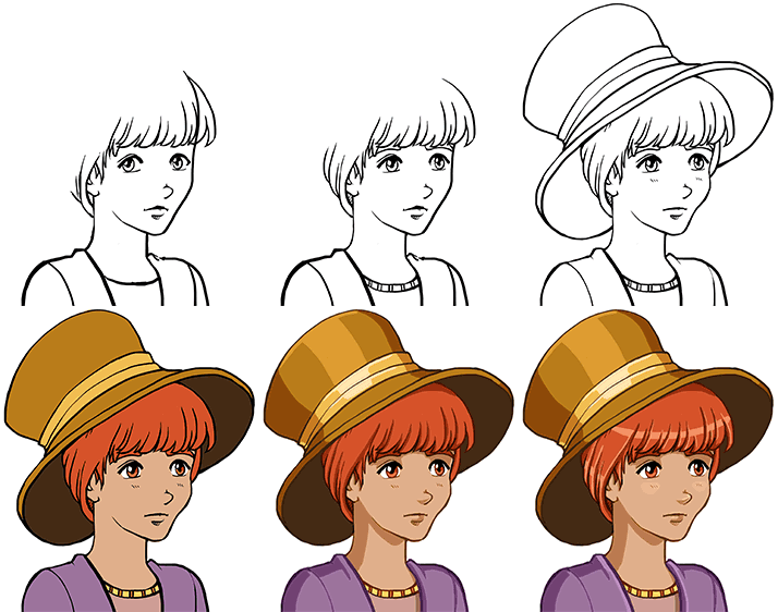
And as Fred keeps making NPCs, I get to make more portrait. This time it’s for the lady gardener, struggling to get the vegetables growing (maybe if she stopped pulling them up and let them grow it’d go better, but who am I to judge). Here’s the sprite, for those who forgot:

And here’ the WIP and final (for now) portrait:


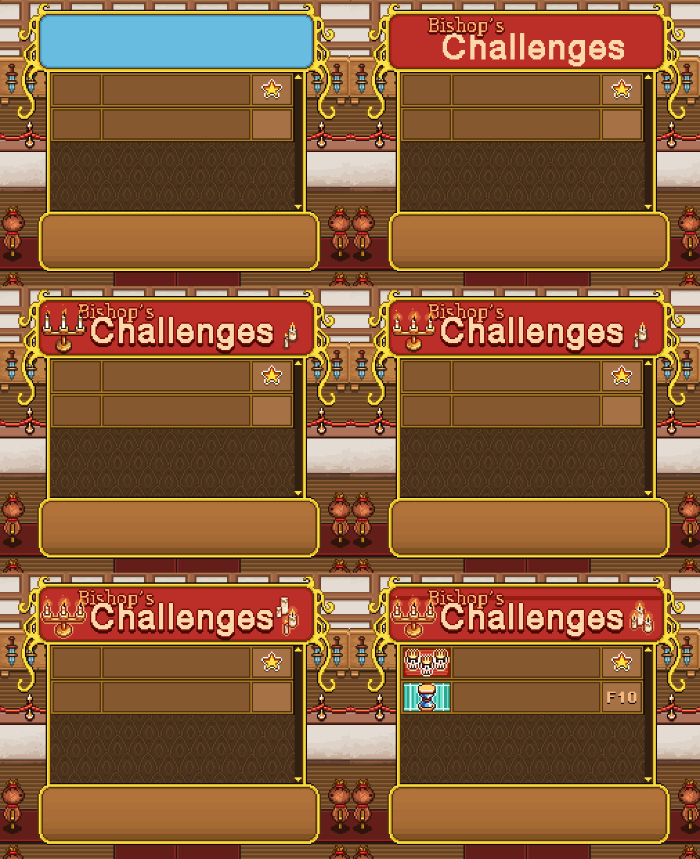
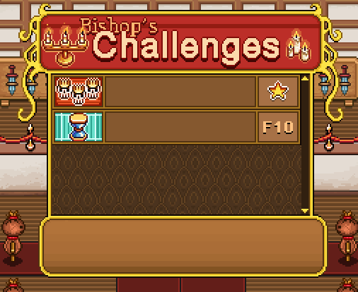
A quick break to fix some Arcadia things that popped up! To begin with, Bishop’s challenges of course needs a interface of its own:

The basic design is pretty much the same as Master Ji’s shield training, but instead of having either a star or nothing, this interface will show you what floor you reached on your best run during a challenge! Completing a whole run will give you a gold star, though to be honest we don’t expect a lot of people to manage that:

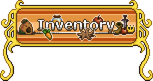
A slight adjustment has been made to the inventory title box in Arcadia as well… For as you can see, the original version includes bag:

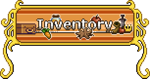
…and since bag is not included in Arcade Mode, we simply replaced him with trunk instead:

The health pot also won’t be available from Remedi’s potions in Arcadia. It’s possible we’ll include an Arcade-only potion, but until we come up with one or in case we don’t, we made a special icon showing that the health pot is unavailable in this mode:

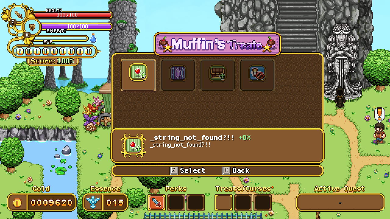
Teddy’s working on implementing each of the new buildings, and while working on Muffin’s Treats we realized we need to edit how the item frame(s) look:

As you can see the item frames are a bit too big for the treat icons, so I made a slightly edited version of the fancy one in the description box that will be used for these! As I took the opportunity to upgrade the overall look of it, we decided to update the regular item frames in the rest of the game to look more like it as well:

As for the selection frames, they will be using the treat/curse frames seen in the bottom UI instead, but at the time of the screenshot, they hadn’t been implemented just yet.

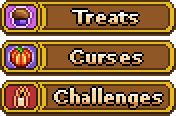
Next, we forgot that you of course need to browse to Treats, Curses and Challenges in a popup window (same as when you select buy or talk in shops), so they needed icons as well:

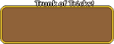
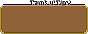
Finally, a minor edit: we decided to change name of Trunk of Tricks to Trunk of Tips:

This way it’ll feel slightly more different from Bag of Tricks :)

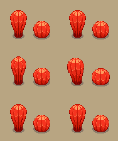
As for Fred, this time around he has animated the cacti I made a while ago! As mentioned, these won’t be destructible but will only wiggle a little when you hit ’em:

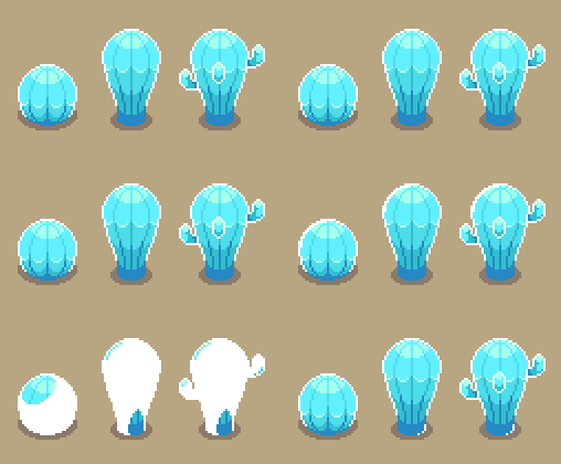
Some of them will be able to get frozen though, and those you’ll be able to destroy to make your way slightly quicker through the first desert area:

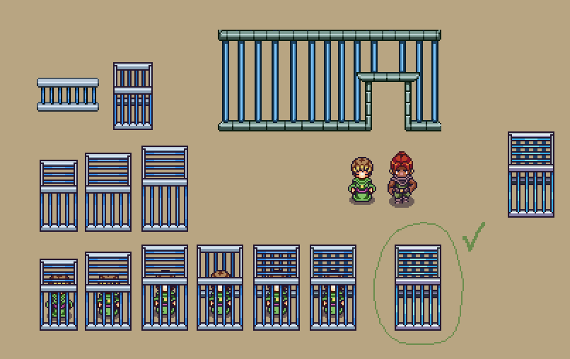
In Arcadia, a cage being built to house NPCs that you’ll be able to release during your runs after defeating a mini-boss!

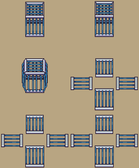
Of course, it also needs an animation for when you successfully save a captured NPC and let them go:

New week, new interfaces! This time it’s the last couple of interfaces for Arcade Mode, featuring how to build new houses and a notification window for when new NPCs are added to town:

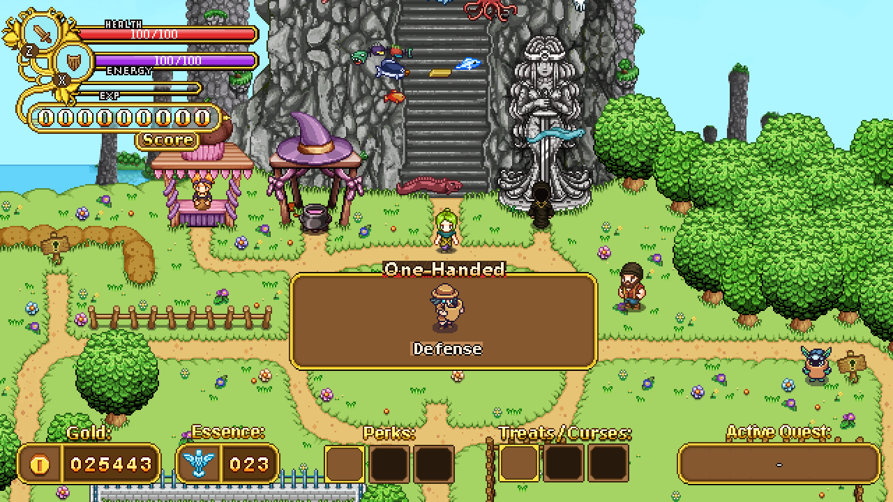
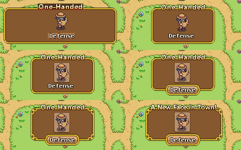
Above is the first quick sketch of the notification box mentioned. We wanted to notify players of when new characters appear in town so they know what/who to look for. Instead of One-Handed it will say “A New Face in Town”, and instead of Defense, it’ll say the character’s name. We used to placeholder text to get a feeling for how big the fonts are.

Here’s the progress of taking the box from the sketch version to the actual one we’ll use in the game:

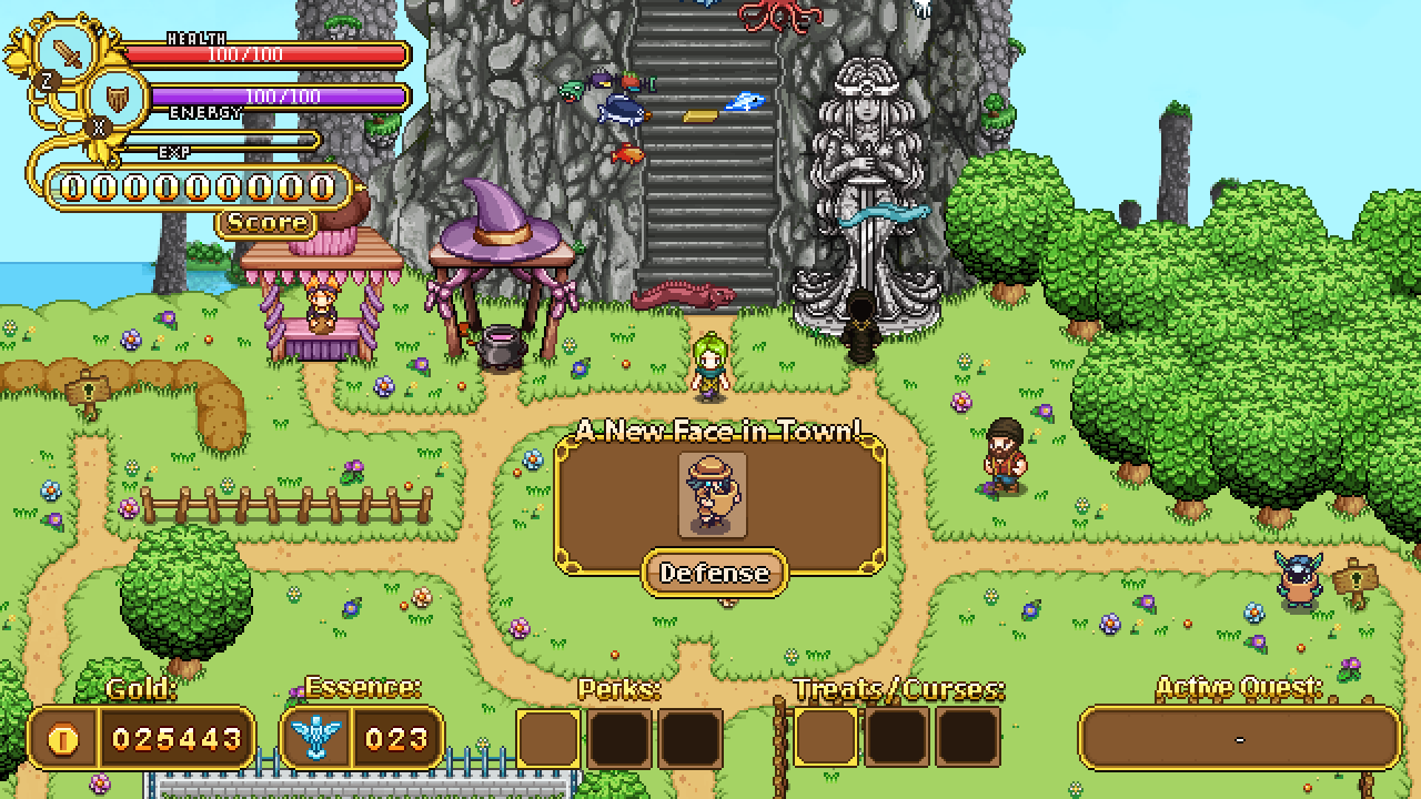
And the final window in its context:

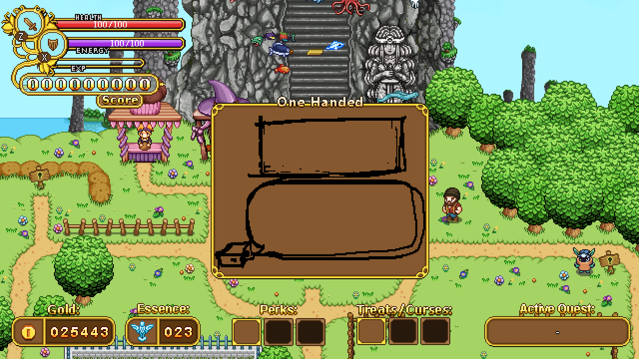
Next up, building houses. When you inspect a signpost you’ll be presented with a window where Trunk informs you of what will appear in that area and how much it’ll cost. Extremely(!) detailed sketch below:

Again, bringing it from sketch to final box:

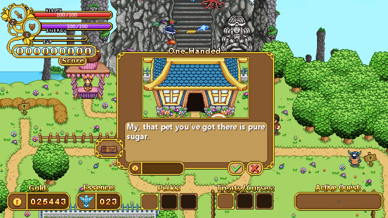
Once more we’ve used a placeholder text to get a feeling of how big text will appear inside the box. Instead of One-Handed it’ll say the name of the building, and instead of Candy’s line from Pumpkin Woods there will be a description of the house and what can be done there. The coin box to the bottom left of the window will tell you how much it costs to unlock this building, while the checkmark and x will confirm or cancel. The x will be selected by default to avoid accidentally building things you wouldn’t want.

Final version below:

Next up, a bunch of icons, featuring both curses and Bishop challenges:

This first batch are all Bishop challenges. The first one is the one where you race against time to complete each room in a specific time or get instakilled, the second represents the only elites challenge, the third is for the challenge where you’re blinded the whole time. The fourth is for the runs when you can’t level up, and the fifth and final icon is for the combined no leveling / only elites challenge:

Next up, the next bunch of curses:

The first one being where the floors turn to ice, the second where you’re surrounded by flames, the third being the curse which allows higher level enemies to spawn on lower level floors, the fourth is a curse that makes you take double damage.

The fifth is the curse which makes enemies leave something harmful behind when they die (poison clouds, acid, etc), and the last one is a slightly modified version of the bishop challenge above, for the curse which either blinds you temporarily at the start of each room, or has blinding mushrooms spread across the floor. If we go for the mushroom idea, we’ll likely change the icon, but for now this is the placeholder until we’ve tried the two modes out:

Now, in preparation to move from Arcadia to the desert, here’s some small Arcadia fixes to conclude my work there (for now):

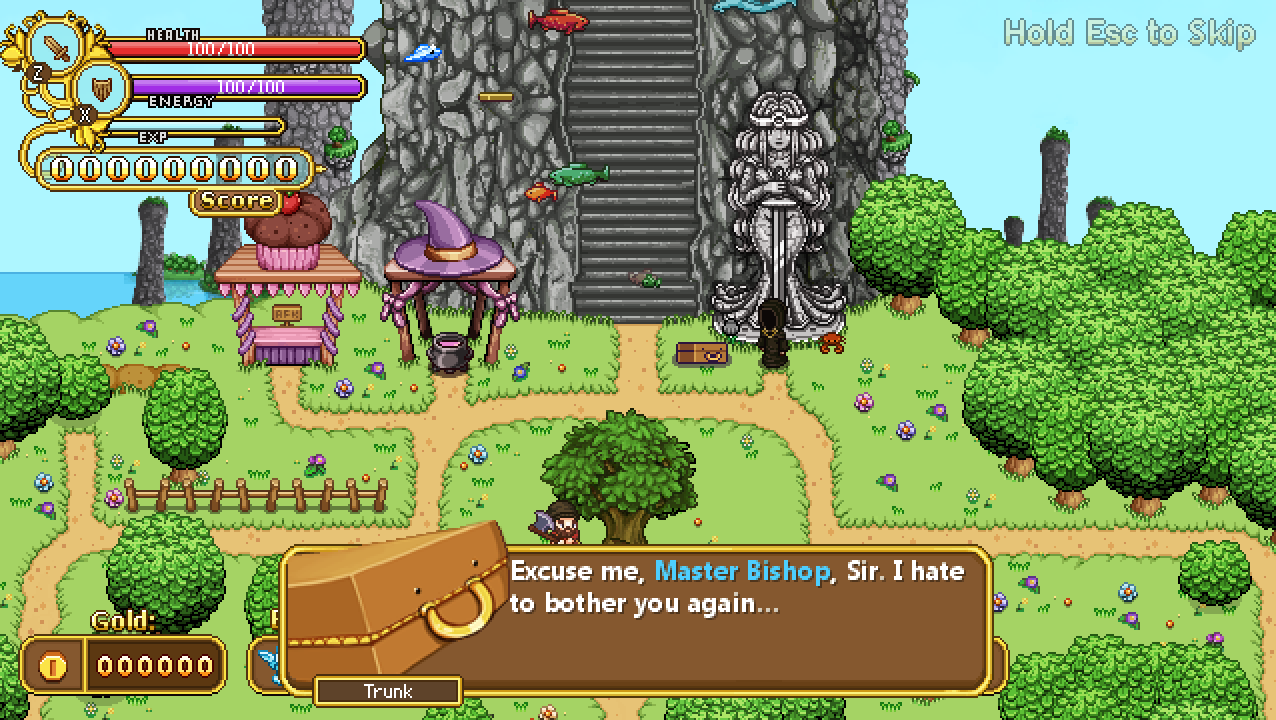
Above is a screen of Trunk talking to Bishop, during which we realized his portrait is a little too big and feels too close to the text. First mission: make it smaller!

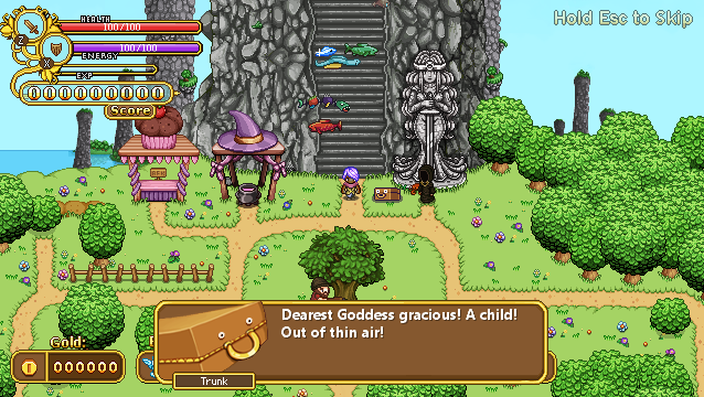
Second mission, giving him a proper expression for a special moment where he gets a little surprised to say the least:

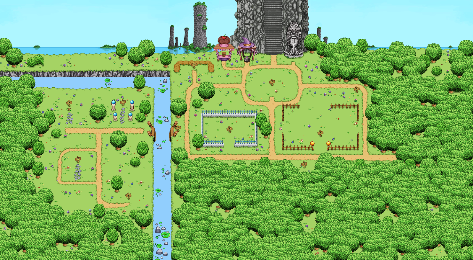
This is approximately what Arcadia will look like when you first arrive, but there’s a little something missing here:

What’s that? A ruined bridge, of course! We realized it’s kind of weird that some things have already been set up on the other side of the water without any indication of how people got over, and it looks a little more interesting to have it there:

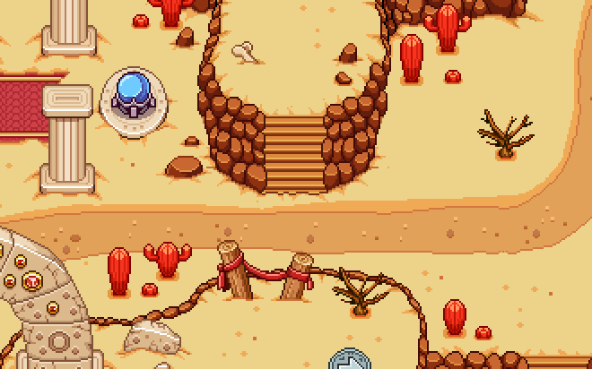
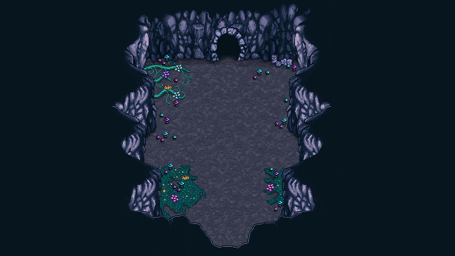
Okay, so time to move to the desert. Here we have a pathway that’s supposed to be blocked, so you have to move around the area before unlocking a way to pass through here:

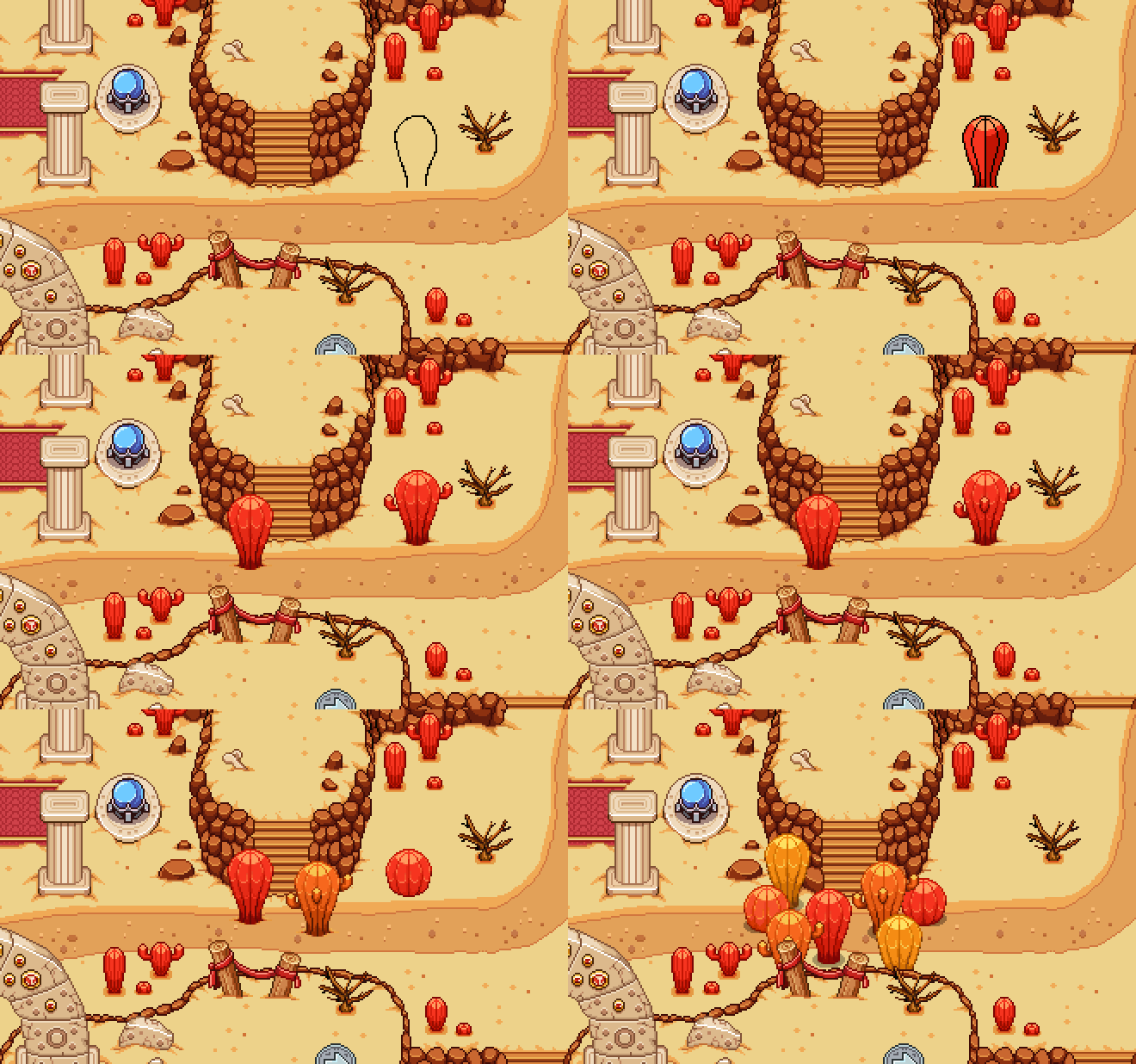
And what’s stopping you? More cacti! Bigger ones, this time. Time to make a bunch:

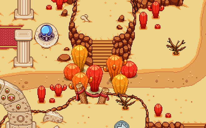
And here they are, in their rather huge glory! We’ll probably add a bunch of these here and there to keep you from being able to destroy everything (most other decorations – the smaller cacti – can be cut down by the player, while these cannot):

Next up, another place that will be blocked until you’re actually supposed to get here:

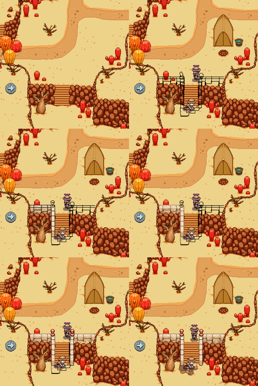
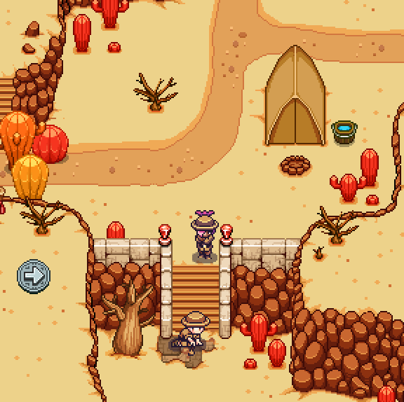
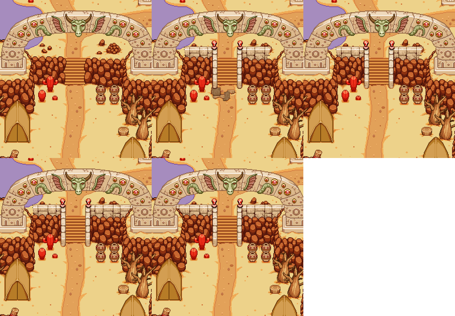
Here, we want the stairway to be blocked by a couple of archaeologists who have made interesting findings in the area. This serves both as an introduction to the fact that there will be archaeologists here, as well as a temporary way of blocking your progress until you’re ready for the desert storyline:


(Of course I couldn’t leave the stairs looking as empty as they did, or you wouldn’t really buy why the archaeologists are interested in it..)

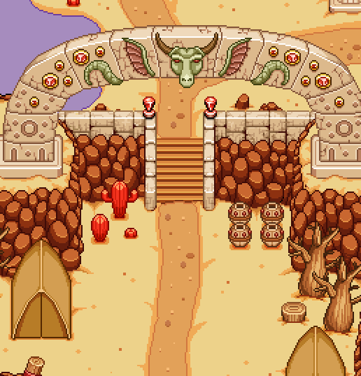
And with the new, more epic looking staircase, this one looks rather boring in comparison:

Time to fix the problem:

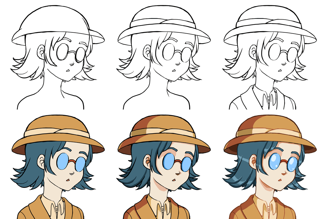
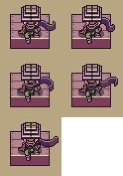
Next up, another portrait! As Fred keeps making new NPCs needed for the upcoming quests, I make the portraits to match. This time it’s another archaeologist, consulting a map. Sprite below:

And here’s the WIP:

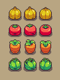
As for Fred, this week he has been working on finishing up the vegetable lineup from last week! Here they are, in all directions:

Needless to say, these fellow will of course be animated as well, bouncing around in a cute way:

And where’s there vegetables, there’s a garden, right? Here’s a gardener, pulling up some rather small and sad looking vegetables in comparison to the lively one above:

With the new year coming, it’s time to plan new things. For us that means it’s time to start thinking about the harbor town, a place which has been planned for a long time but never sketched and never discussed in greater detail. So that’s what we’ve done now!

Basically, we’ve had a huge brainstorming session where we just talked about what we’d like to see in the harbor town, what would be cool and a little how things would look. Here’s our list:

The Harbor – Obviously a harbor town needs a harbor or it’s not much of a harbor town, right? So we’ve planned a long dock, next to which there are a bunch of ships. Some will look like regular ships, others might have special themes: a viking ship perhaps, seeing as we’re Swedes and all?
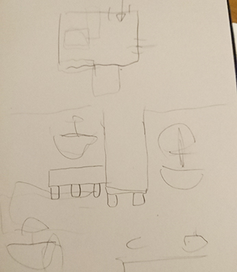
“Loading Area” – An area next to the dock with a lot of strange crates and sailor carrying stuff and loading stuff onto carts and such.

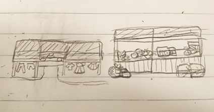
Market Place – A pretty big area with lots of market stands: some where you can buy the usual stuff and gear, some that carry exotic items or fruit for show, to give the area a bit of flavor.
The Beach – A small beach with touristy things such as sunbeds and blankets. Tourists walking around enjoying the sand, water and hot weather!

Ice Cream Parlor – Probably next to the beach? But who knows! Anyway, an ice cream parlor filled with tons of ice cream! Probably some tables outside where people can sit and enjoy their treat.

A Church – With Grindea’s statue inside and one of those creepy priests!

Houseboat(s) – One or a few, for a more interesting way of living.

Regular Houses – A few where NPCs live, one of which will be an author which you’ll help complete the final part of her best selling series! We’ll also add this author character earlier in the game, once the library is implemented. We’d like her to have a book signing there in the beginning of the game, up until the festival (or so), for added recognition once you get to the harbor town (where she’s forced to live away from all of her fans so she can finally complete the next book)!

Wells and Fountains – The town is in the desert so they better have water available for the heat!
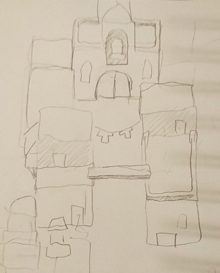
Now we (or well, I) just need to mix all of these things together and make a proper sketch of what the town could look like with all these ingredients included. First though, time for some icons and small interface fixes! All related to Arcadia, of course. First up, making a new version of Bag of Tricks, featuring Trunk instead of Bag:
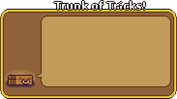
And speaking of Bag, that guy’s actually the inventory icon… not very fitting for Arcade Mode where he doesn’t even exist. Time to replace him with Trunk:

Next, true icon galore as it’s time to make icons for the Treats & Curses we’ve come up with so far. In order of appearance: More Elites Curse, No Heal Curse, No Elites Treat, More Healing Treat, More Treasure Rooms Treat, and Time Crystal Treat (they will probably get better names later):

Finally, not exactly an icon, but cleaning up the background a little! Since it’ll move around as you run across the map (parallax wohoo), I needed to clean up holes of stuff I thought would be permanently hidden behind buildings (oops):

We’ve also been sketching and talking about the details surrounding two big upcoming things: the final desert map, and the interface at the Cinema in Arcadia!

Starting with the desert map, this is the sketch we showed a little while ago:
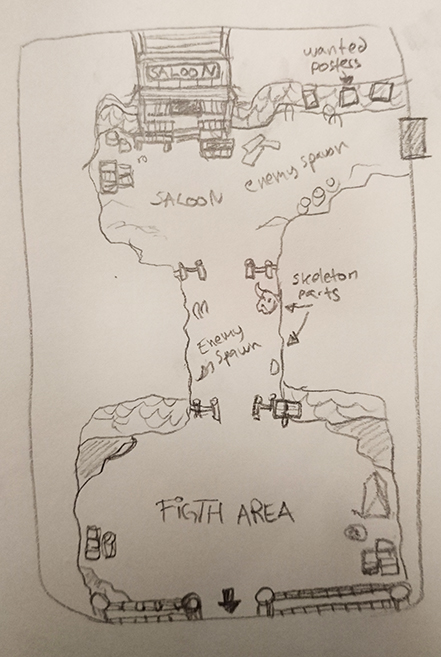
When I made this sketch I paid no heed to character sizes or what the distances between each section of the map would be in the game, as it was a sketch made on paper after all. Now that we need to translate the sketch into something we can actually use, we need to fix that.
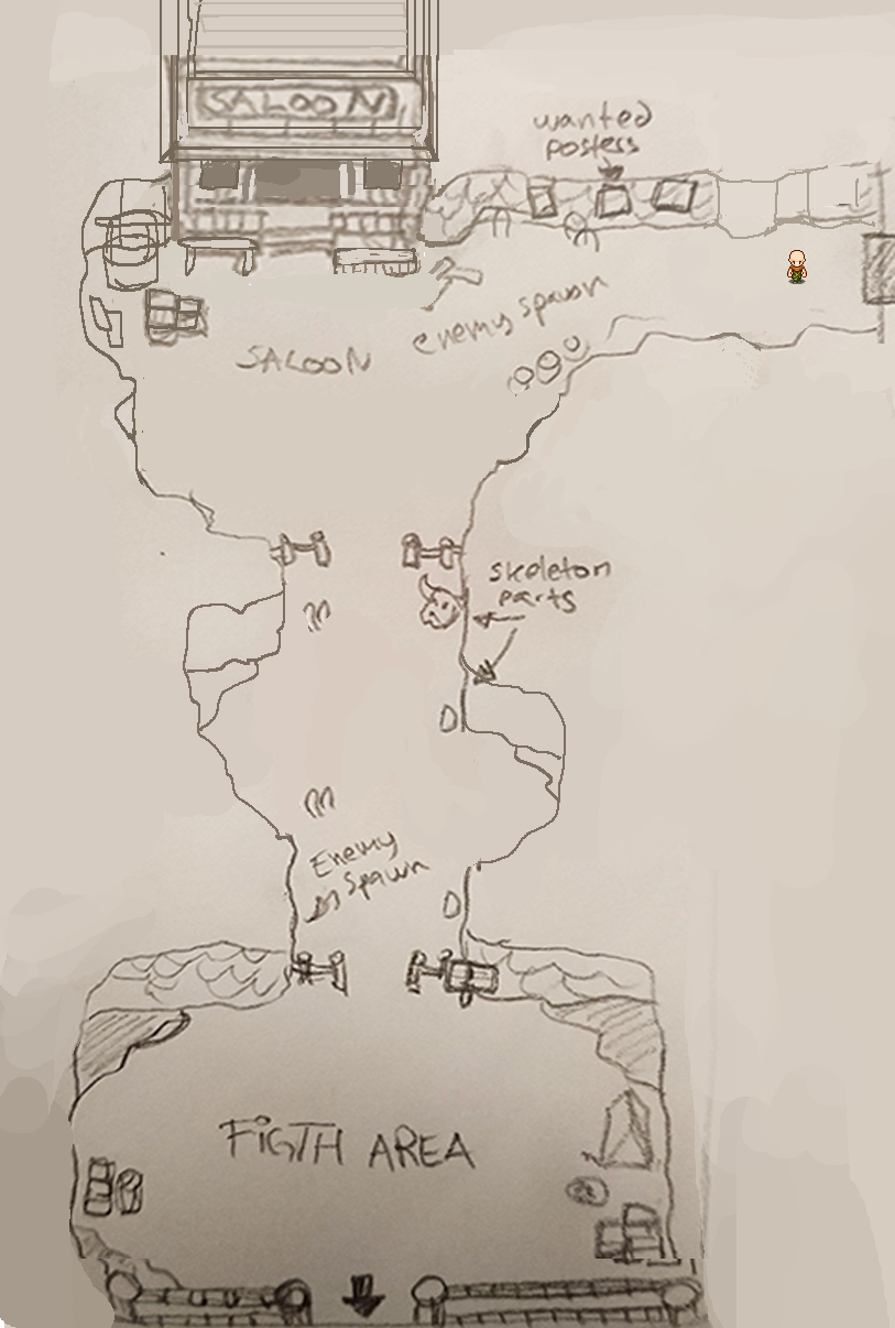
In the above version of the sketch I’ve brought the whole thing into Photoshop and copy pasted a player character into each section, using it to determine distances and how big each thing is. The result is that certain parts of the sketch have been enlarged to better fit the character(s) that will run through the area. For instance, the part above the misspelled fight area has been a bit enlarged on both sides, and there’s a longer corridor coming towards the Saloon from the top right.

Once this was done, we brought the map into the game to run through it and try it out for ourselves (it’s a much different thing actually playing through the map compared to looking at a static character in the midst of it):
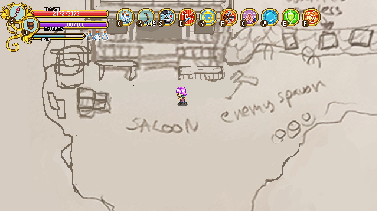
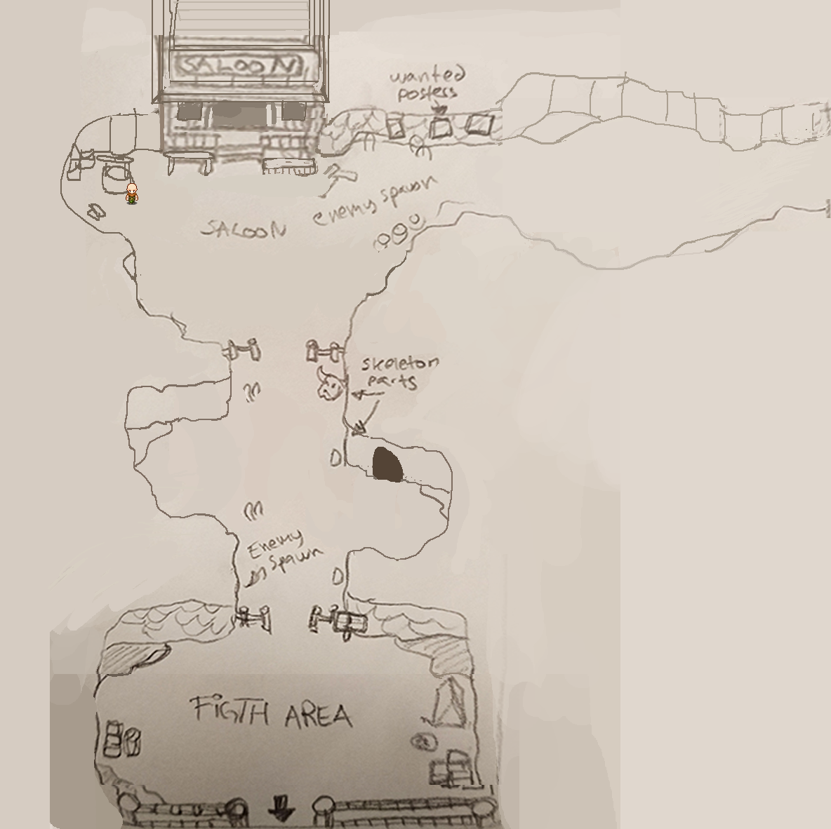
Again, we felt some areas were too small, so we made the corridor before the Saloon even larger and added a small space where you can more easily battle enemies there. The area before the (still misspelled) fight area was made larger as well, with the option to add a cave (can’t have too many caves and potential extra maps). Finally we actually made the Fight area slightly smaller to give the user interface in the top of the screen more room without it having to completely cut off the walls.
As mentioned, we also talked about the Cinema, how it would work, and how best to make an interface for it. We decided that when you open the cinema interface you’ll be presented with six options: Personal Best, Most Recent, Favorites, Friends, Public and Sharing.

In the “Personal Best” section, you’ll be presented with a list of your top best runs, automatically saved for your rewatching pleasure! Same thing with “Most Recent”, but with your most recent runs rather than the best. In “Favorites” any runs you’ve saved as a favorite will be available, both your own and those of your friends or strangers: which brings us to “Friends”, where your friends top runs will be available: each friend having one entry each. In Public, you’ll see the runs with the highest scores, and in Sharing you decide whether you want your runs to be shown only to yourself, you and your friends, or if you want them to be public to anyone (i.e if you end up on the high score).

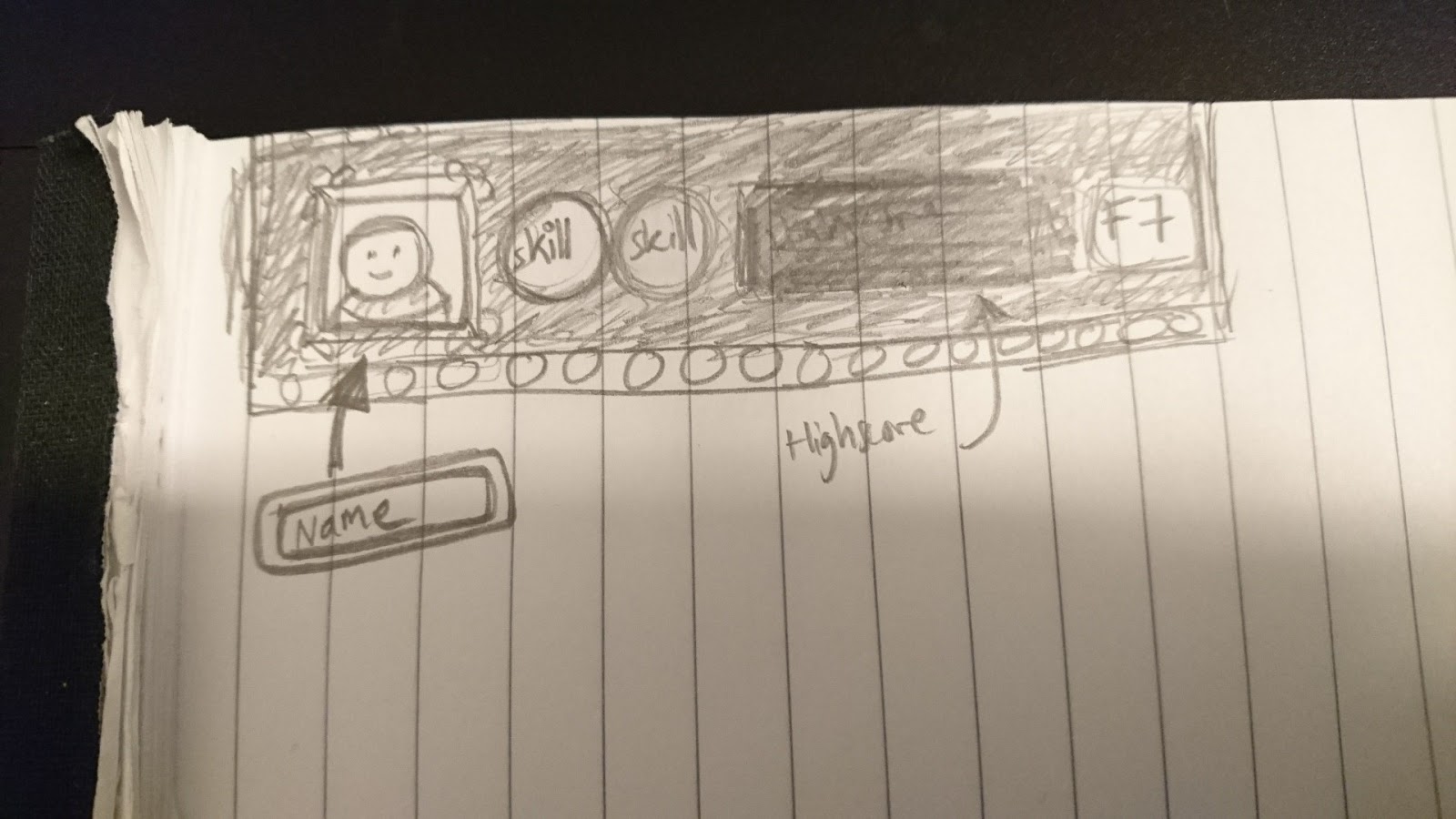
Here’s a very early sketch showing what the selection of a replay could look like, featuring your character’s face (+ parts of the poncho and hat), the top two skills you used, what score you got and which floor you reached:
Continuing on with the cinema interface, though, the first thing we need to design is the header:
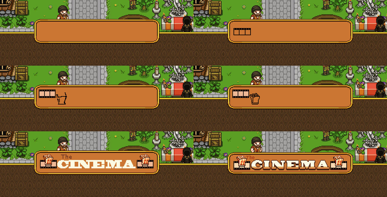
I went with a bag of popcorn and film strip to decorate the sides as this felt like two iconic references to the movies! Keeping with that spirit, I designed the movie info boxes to resemble film strips as well (as seen on the sketch earlier):
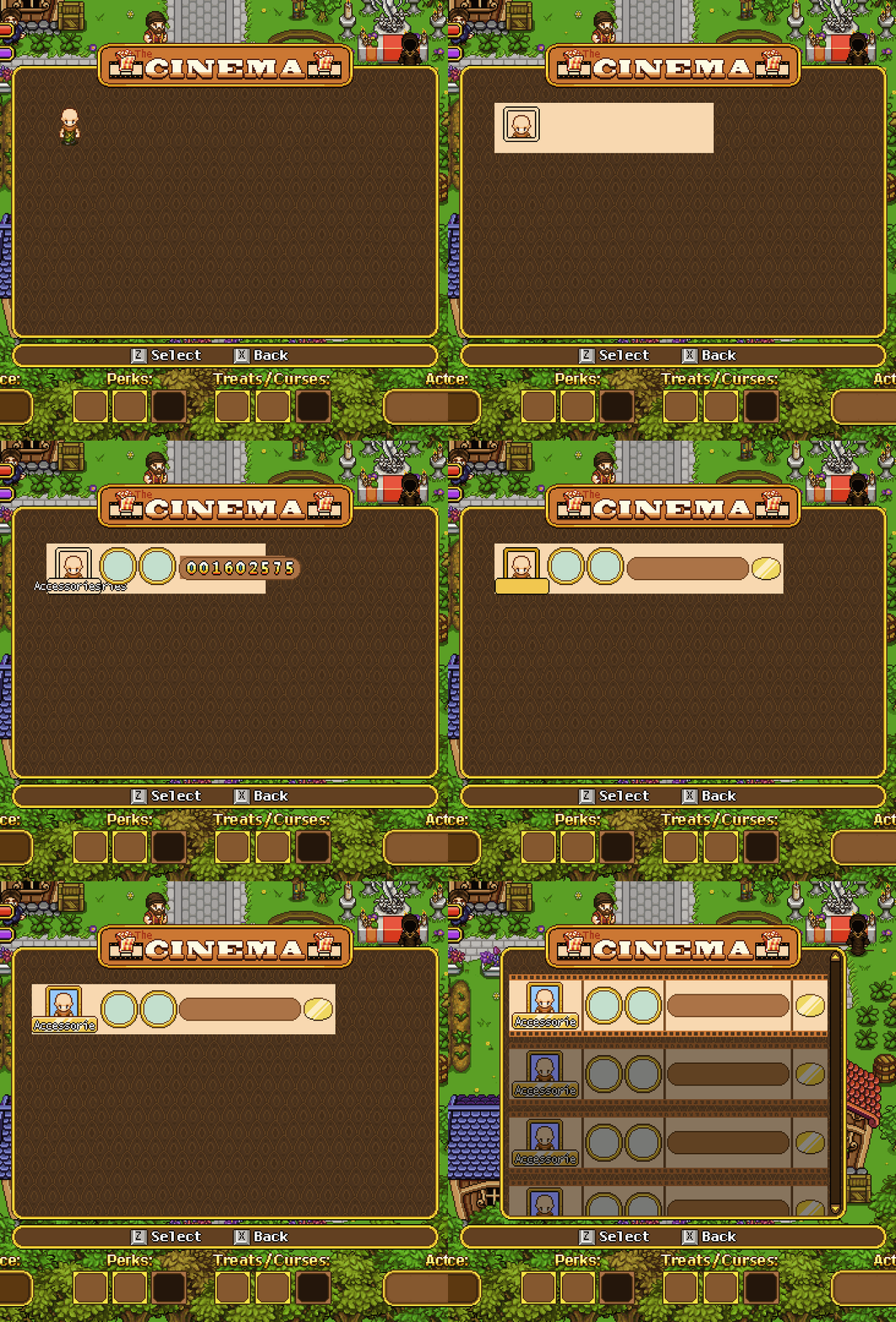
Also as mentioned earlier the info shown will be part of your character, it’s name (or the first 10 letters of it), the two highest leveled skills, the score (in the brown box), and the floor reached (golden shape at the end). In the final version below, I added a star to indicate someone having added that particular strip to favorites:
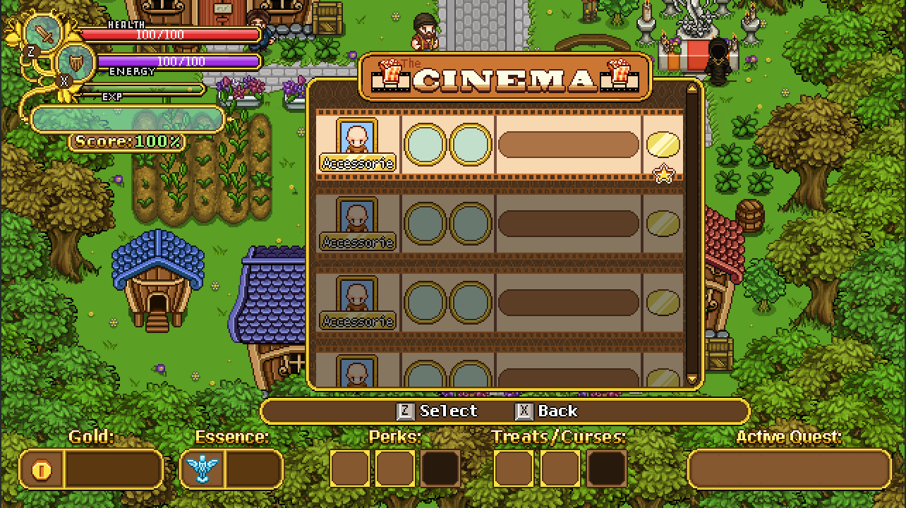
Speaking of which, this interface needs quite a few new buttons as well, in order to select everything! Without further ado:
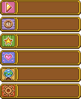
From top to bottom: Play Clip, Most Recent, Favorite(s), Friends, Public, and Settings. The last one will lead to this rather simple popup menu, where you can select who can view your replays by moving left or right (the options being only you, only friends, or public):

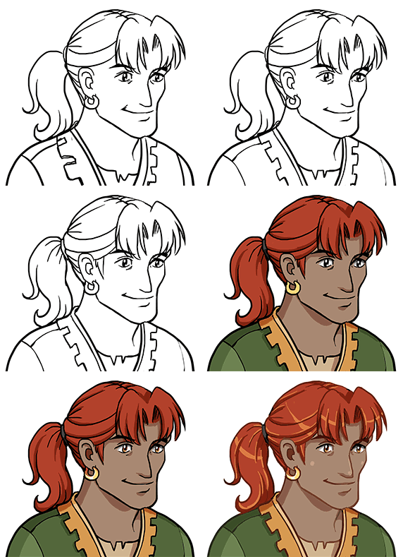
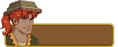
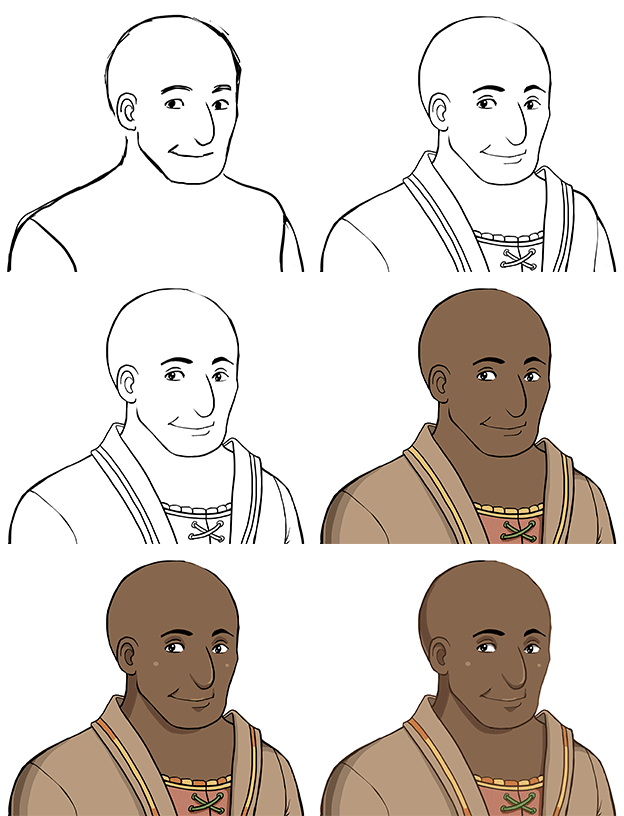
Finally, let’s take a look at another portrait. This guy is designed after one of the archaeologists Fred made a while ago:
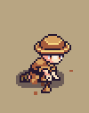
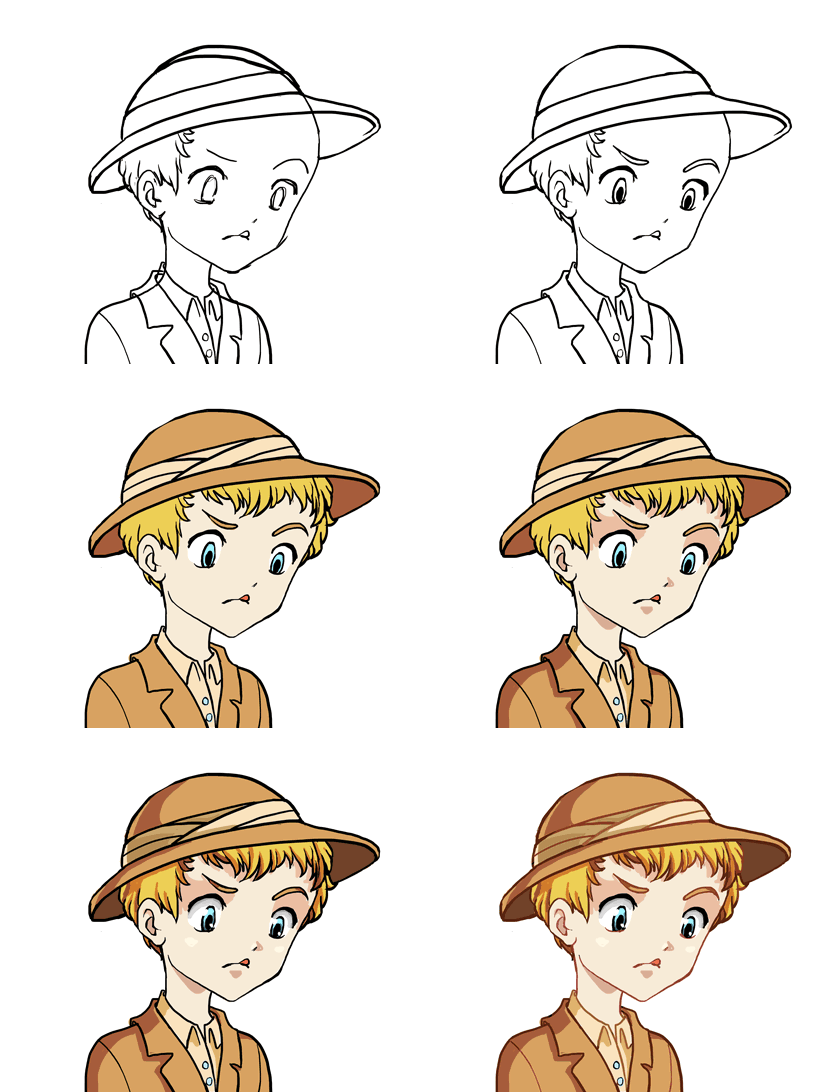
Like most NPCs made recently, you will run into this guy in the desert, where he’ll be busy excavating some new findings (and in doing so, unfortunately blocking your way for a while)!

Next week we’ll discuss and continue designing the final interfaces for the Arcadia Rework: the one for Master Ji’s shield challenges, and the UI that shows information about each building you can build. After that there’s mostly some smaller detail stuff for me to do before I believe I’m done with all Arcadia Rework things! Exciting times.

Alright, back to business (ALSO SORRY THIS POST IS SO LATE! Scheduling got messed up again (I will set an alarm to check that it actually works, I promise)! As mentioned before, we’re at the point where we need to design a lot of interface stuff and decide how things will work together and unlock in terms of the new Arcadia rework features.
These include new interface indicator for gold, treats and curses when you’re running around inside Arcadia itself. Here we decided to combine Treats and Curses. Previously we said you could pick either Treats or Curses, and have three of each, but since then we have changed our minds: now, you’ll be able to pick and choose between Treats and Curses, but you can only pick 3 in total. It’s good to keep in mind that 3 isn’t a 100% fixed number at this point, we’ll have to try things out and see what feels good. The final number could be anywhere between 2-5 (is my guess, anyway).
We haven’t actually decided on which specific Treats or Curses to include yet, so if you have any cool ideas, feel free to share them with us! As a reminder, Treats are features that will make an Arcade run easier, but lowers your score, while Curses make your runs harder and increases your score!

Selecting Treats/Curses at their respective NPC will need a menu of its own too, as will the Cinema’s replay feature (where you’ll be able to view past runs), the Bank exchange service (where you can convert Essence to Gold and the other way around), and Master Ji’s challenge selection (where you pick which of his shield-focused challenges you want to try). We also need to come up with the challenges the latter will have.

The Arena will mainly use the interface from Story Mode, but we will also need a menu where you can select your last three characters that reached any boss in the game and have a go at the boss again. Here, we’ve decided to keep the Multiplayer mini-games, while the single player ones will be replaced by the boss-rebattle feature. Our reasoning here is that it might be fun to be able to challenge your friends to mini-games in the Arena without having to start Story Mode (since we have the arena anyway, you know), while the single player portion of the Arena doesn’t make as much sense to keep and works better in Story Mode alone.

There’s also another matter we need to discuss, and finalize: whether the build time of unlocked buildings will count IRL time, the time you play Arcade runs, or both. Last time we talked about this we could not decide, so now’s possibly your last chance: what would you prefer? To wait a short while regardless of what you do, to have to play arcade runs for the buildings to finish, or to be able to shorten the waiting time by playing arcade mode?

Let us know what you think!

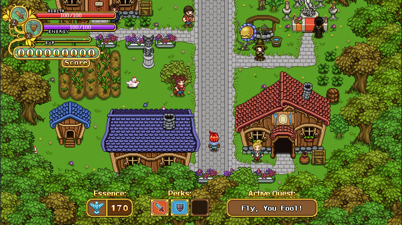
So, time to get those new interfaces going! First up, the main interface as you run around Arcadia. Here’s the old version of the interface:

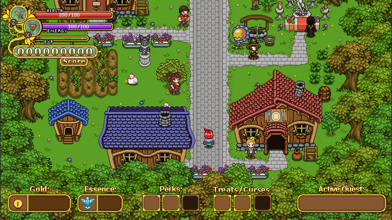
And here’s a basic suggestion with a new gold indicator and slots for Treats/Curses:

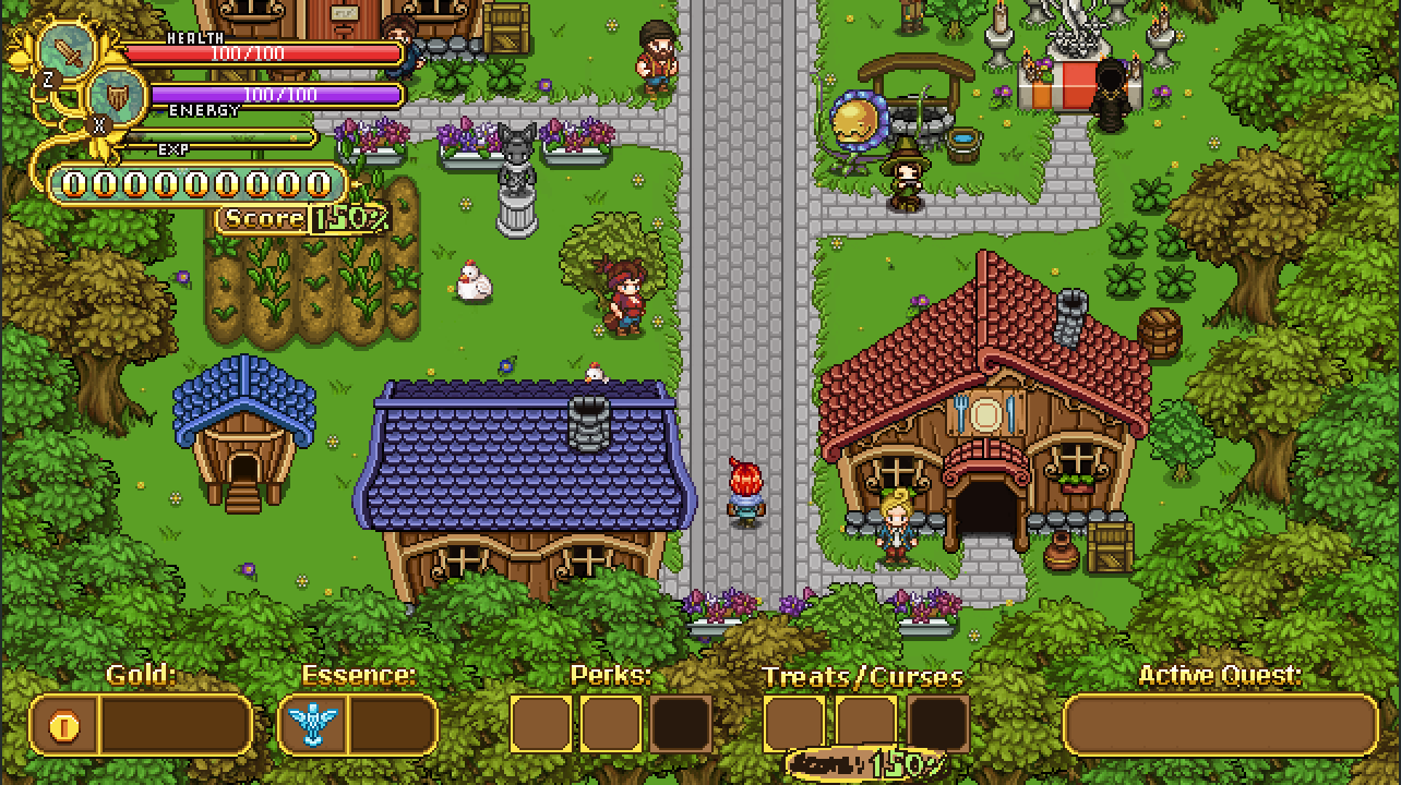
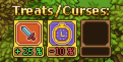
Now, the treats and curses will affect your score multiplier by a certain percentage each: either they’ll increase your score or they’ll reduce your score. More score equals more rewards (and a higher place on the high score list!), so we felt it was important to include this in the interface somehow. Here’s a quick sketch featuring the score multiplier increase both next to the score and next to the treats/curses:

While we liked the idea of having the percentage show next to the score counter (that way it can show all through your run as well), we weren’t sold on having an exact copy of it next to the treats/curses. Instead, we thought maybe we should separate them and show how much each of your curses or treats actually subtract or add to your score:

As of now, we still haven’t decided whether we want to include the above version or just keep the cleaned up score multiplier next to your score (as seen below). Do you think you’d prefer to see how much each score adds/subtracts, or is that unnecessary information that only clutters up the interface?

Next up, we’ll continue the interface business by taking a look at the interface of one of the more important new features: Treats and Curses!

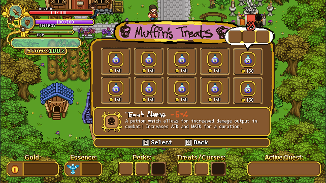
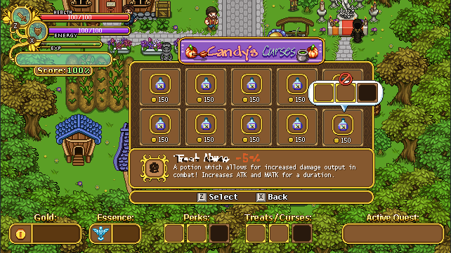
For this interface the important part is having enough room for a bunch of treats/curses, with a text box featuring a description of each treat/curse, a title bar (so you know which interface you’re in), as well as some way of letting the player know when treats/curses don’t work together – for example if you have on treat that disables all elite enemies along with a curse that makes them more likely to spawn.

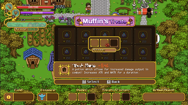
In the above sketch I used the potion interface as a base. There will be a few key differences though: for one, it won’t cost you money to change curses/treats, at least not the way it’s currently designed. If you’re currently hovering over a curse/treat that won’t work with the ones you have selected currently, a speech bubble popup will appear with a stop sign, showing you which ones are incompatible. Next to the curse/treat title in the text box will be how much score will be added or subtracted to your score, in percent.

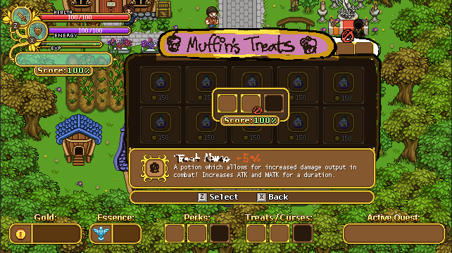
Once you select a curse, a new interface will pop up where you can select which slot you want to add the curse/treat to:

In this interface there will also be a total score counter showing how much your total score will be with your selected curses/treats. In the sketch above there’s another stop sign next to the incompatible curse/treat, however this will likely not be added to the game: instead, if you try to select a curse or treat when you have others selected that wouldn’t work with it, there will be a prompt asking if you’d like to remove the ones that are incompatible with the one you’re trying to select. If you answer yes, the above interface will pop up with the incompatible curses/treats removed: if you answer no, you’ll remain in the curse/treat selection screen.

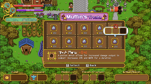
Now, time to freshen up the graphics a bit:

Here I’ve added some proper graphics to nearly everything: Muffin’s Treats has a title sprite, the pop-up speech bubble indicating which curses/treats are incompatible has been added, and the background is properly made as well. The text I haven’t touched though, as it will be added properly with the game engine.

Next, same thing but with Candy’s title sprite:

And finally, the screen where you select which slot to add your selected curse/treat to! Again, the stop sign will probably not be used the way we ended up designing things, but we hadn’t finalized that by the time I finished making the graphics:

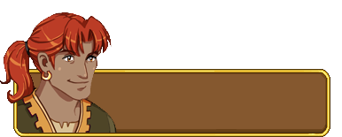
Next, a quick portrait, with and without hat:

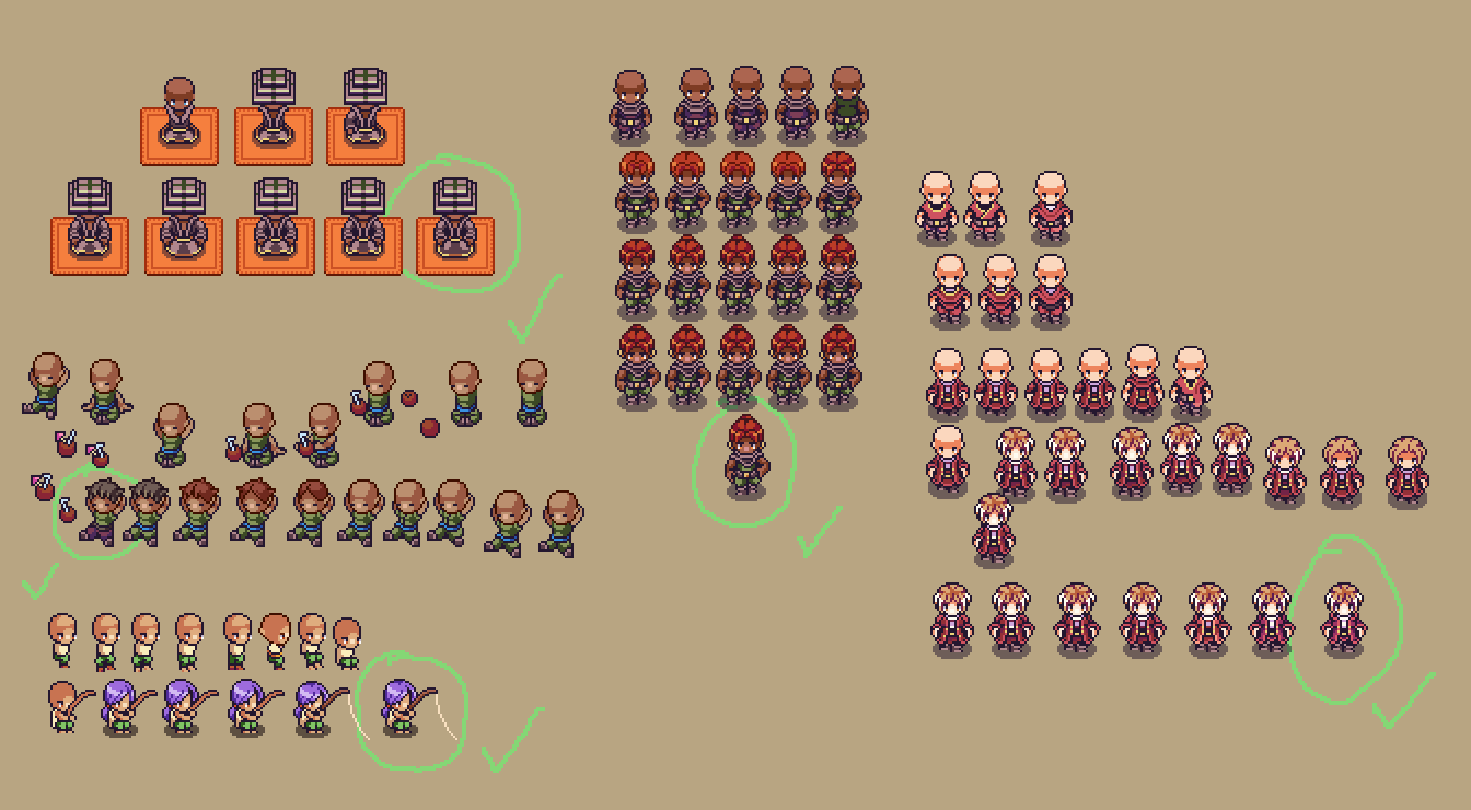
And Fred’s section of this post features a return to the desert and more of its inhabitants! Here’s a whole bunch of the iterations for four of the characters you’ll meet in the harbor town, with the final versions inside each green circle:

…And an animation for that poor winter fae, who has been lured into the desert by his friend! Poor thing is suffering from the less than ideal weather for a winter loving creature!

With only a few days left before Christmas, we’ll take a small break and will return on January 1st! No weekly recap next week, in other words, but we’ll make sure to post a happy holiday post to cheer you all on over the holidays :) In the meanwhile you can sneak a peek of what will be shown in the recap of Jan 1st over on my own workblog! Until then~

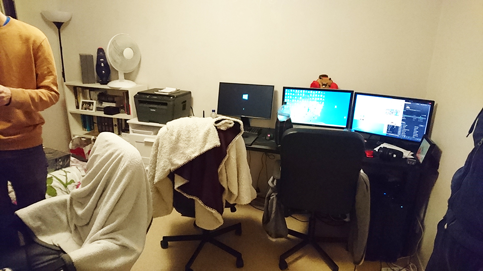
We’re in our new office!! Last Wednesday we finally made the move, but we had already started preparing the day before. Here’s the old office in our apartment’s guest room, as it used to be, and fully packed:

The saddest thing we’ll be leaving behind is the cats! It’s been so nice to be able to spend all day long with our lovely two cats, who will have to wait alone at home for us to return from the office every day now ;_;

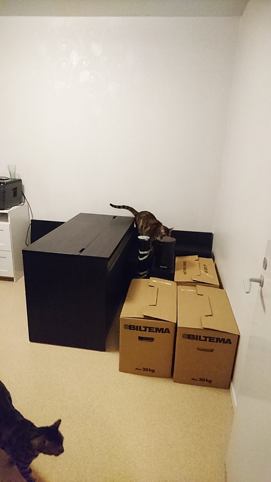
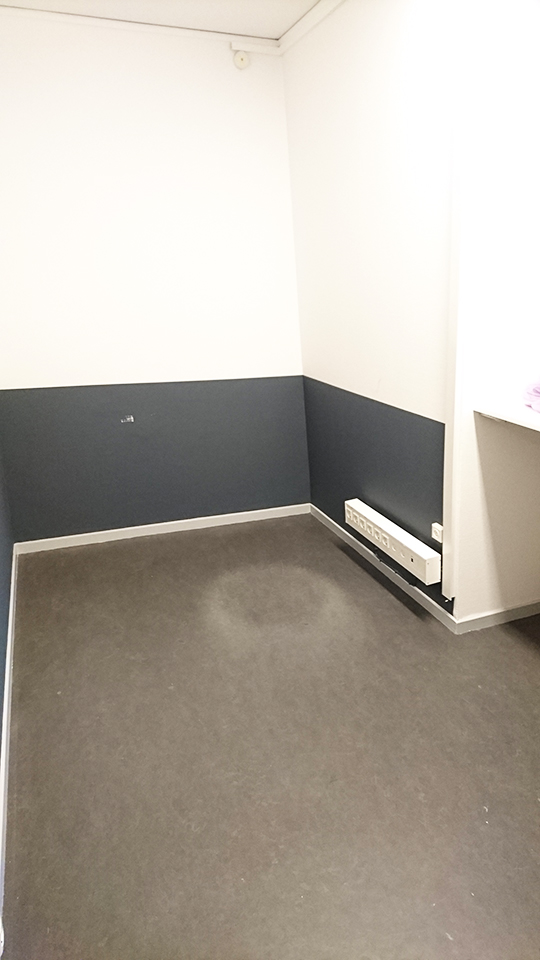
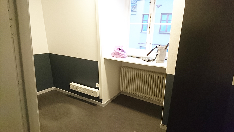
Yesterday, the moving company knocked on our door at 8 am, ready to move our stuff. The whole thing took about an hour, plus another 30 minutes of putting everything together at the new office, here pictured empty:

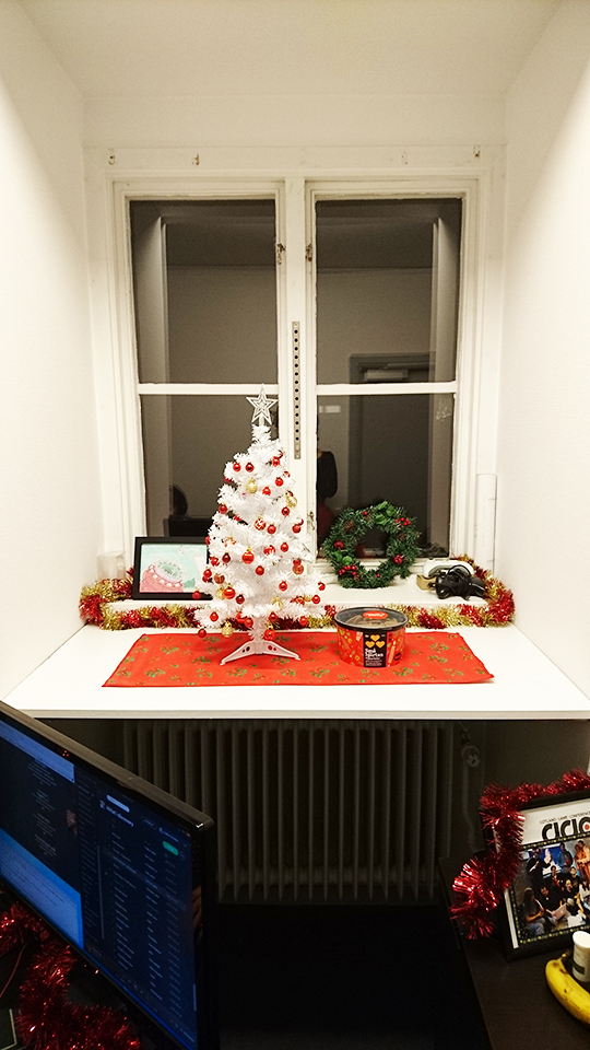
After we were done, we went to have lunch and went by a couple stores to buy a few things to make our office more cozy: a few plants (fake, so they won’t die if we have to leave the office for a few days), a clothes hanger where we can put our coats, and a few decorations for the window (including a cute little christmas tree):

The whole place feels very cozy now, and we’re very happy with the space. At first we thought it might be a little on the small side, but we’re really satisfied with the amount of room we have and how comfy we could make it.

The only sad part, as mentioned, is leaving behind the cats – but the walks and ability to separate work and free time should be worth it! Already work feels much more focused and distraction-free, so that’s great :)

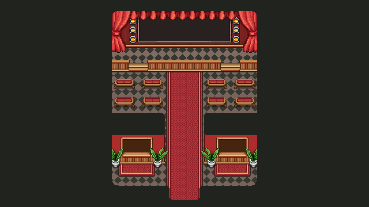
Now, let’s jump straight into continuing the interior spree of the Arcadia Rework! It’s time to take a look at the Cinema, another of those brand new buildings that don’t exist in Story Mode. Here, you’ll be able to watch replays of your previous Arcade runs, and even share them with your friends.

While most of this will take place in one of the ticket booths near the entrance, we couldn’t resist adding a bit of a cinema feel with a big screen and some seats for flavour. Perhaps some NPCs will be here, watching a short movie on screen? Maybe some of them will even offer a quest of two!

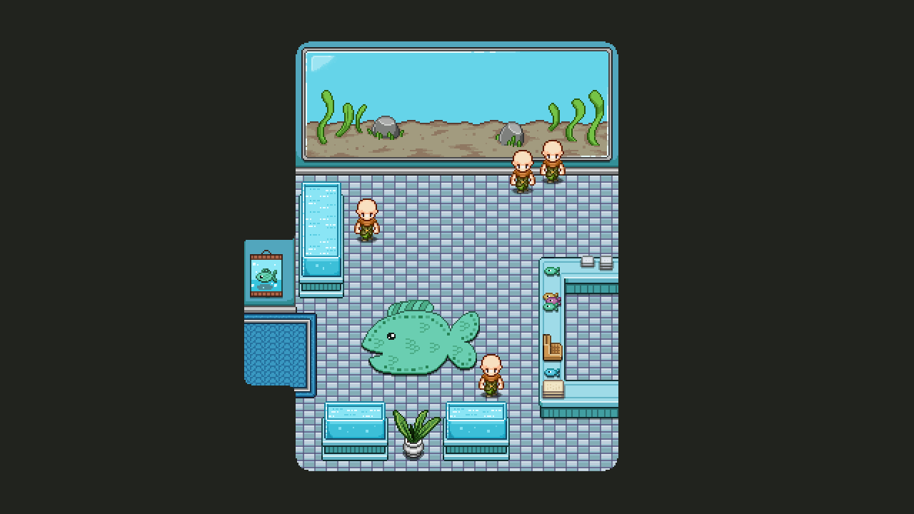
The second to last interior before all the interior designs of the new and improved Arcadia are completed, belongs to the Aquarium! This place will feature a set of fishes that you captured during your run, as well as the typical souvenirs:

In the sketch, I included a set of fish shaped balloons, but I think we’ll let Fred make those from start to finish since they will need to be animated to really have that proper balloon feel! For now, here’s what the Aquarium looks like, sans the proper fishes and mentioned balloons:

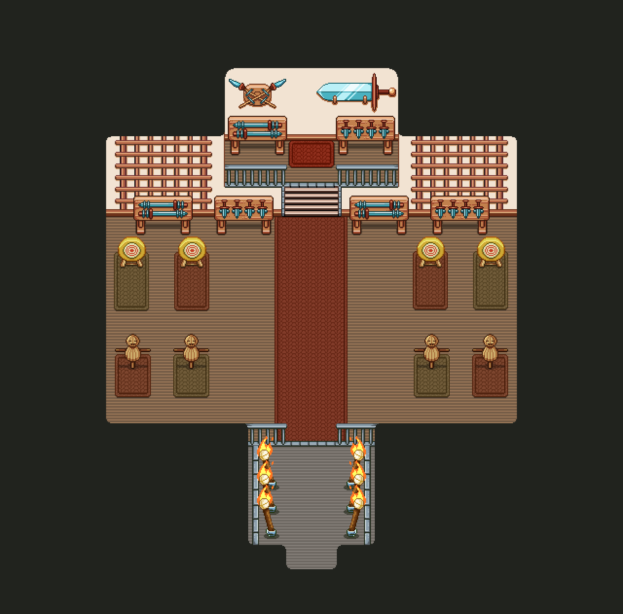
And now, the final part of the Arcadia rework (interior wise, anyway): the Dojo interior! This is another building that exists in Story Mode, and may have its old version replaced by this new Arcade version. It’s designed to have a big enough fighting area for you to prove yourself in a set of challenges, as well as a shield block training session we may include in the earlier parts of story mode: we’ll see!

Without further ado, the WIP video:

And the finished version! I thought it’d be cool to save some space at the bottom where Master Ji’s apprenticed can stand and watch/cheer for you as you do your challenges! In the section above, the master himself will spectate your progress:

As for Fred’s department…. It’s time to introduce a new character of quite some importance: the Trunk!

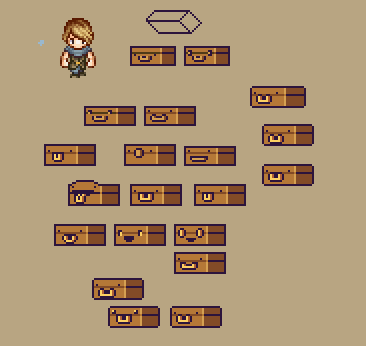
This little guys will be the equivalent of Bag, but for Arcade Mode. We didn’t have a character like this in Arcade Mode previously, but the more we thought about it, the more we felt it was lacking somehow. It kind of felt strange to have bag say random things when he isn’t even a character in this part of the game, and as we start to get to the point where we need to design how to unlock the new features, we felt a sidekick that can help you understand how to do that felt more interesting than random info boxes.

Aside from being your sidekick in the Arcade Mode portion of the game, bag and trunk have very little in common, though! This little fellow is cheerful and happy, excited to be a part of your adventures. (Well, maybe Bag is too, but he doesn’t show it half as well as this one!)

Stay tuned for more information about this new character and how you’ll interact in Arcade Mode!

Whew, after close to one week in bed sniffing away with the flu, I’m actually feeling alive again and more than ready to get back to work! Unfortunately I cursed Teddy with the flu as well, so he’s been down and out for a while too… Fred seems to have remained immune this time around!

Because 2/3rds of the company has been unable to do much work the past week, there aren’t much in terms of news! We are drawing ever closer to being able to move into our new office space though, so that’s super exciting and we’re all looking forward to it (and have already begun planning how we’ll move everything and changes we need to make to make it all work for us).

As I mentioned last week, the office is actually already available to us (since Dec 1st), but we’re waiting to move in until the 6th (this Wednesday) when we’ll get helped by a moving company. Since we don’t have too much stuff to move but the items we do have are quite cumbersome to transport in the tiny car that’s available to us – in fact we don’t think the larger of the two desks will fit in it even if we unscrew the whole thing- we decided for our peace of mind it’s probably better to hire a couple guys to move it for us. Less risk of us dropping and breaking stuff, and having to solve how to transport a much too large table.. Carry it to the office by foot, a healthy 50 minute walk…? Hmm.

Now, I’ll be getting back to work properly today, and have already started off by sketching what the final desert map will look like (ignore my amazing misspelling of fight…):

The are three important areas in this map. First, the entrance to the city, indicated by the arrow pointing downwards. Second, the battle area in front of it, where you’ll battle a mini-boss and possibly some random enemy spawns. Third, the Saloon in the top part of the map, home of the shady people of the country. I want to make wanted posters in the surrounding area, featuring the gangsters you’ll meet in there. Maybe you’ll even run into a set of suspicious ferrets again…

The rest of this week will, however, be focused on finishing up the new Arcade Floors (some minor things remaining), and after that I’ll do the last interiors for the Arcadia town rework – just a few left! Once those are done we’ll start designing the new interfaces needed to get all the new systems up and running, and then test, test, test before we’re finally ready to release it all to the public! We’re very excited about the rework and though it’s a little while left before it’s 100% ready we hope you are too :D

So, time to finish up those Arcade floors! There’s a couple of pretty important maps missing from both the Tai Ming and the Mount Bloom floors that need to be added before they are truly complete: the score counting screens!

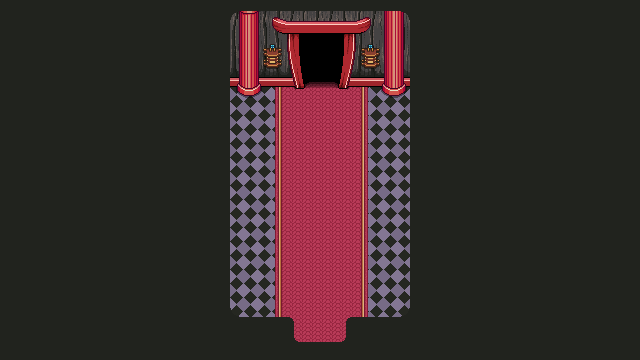
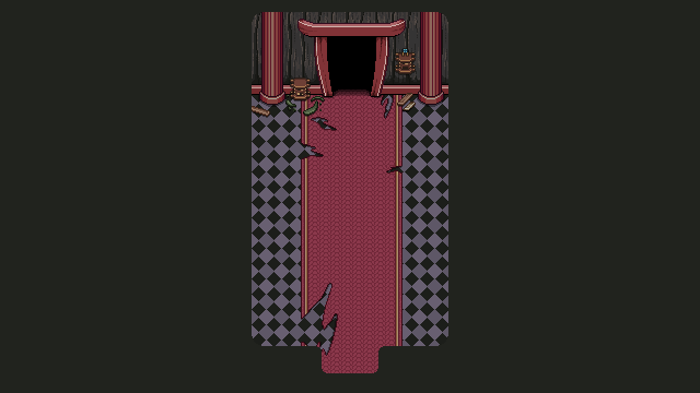
Whenever you finish a floor in Arcade Mode, you’ll run through a corridor of some sort while the game shows you your current score and how well you did in each room of the floor. These corridors are either connecting two floors of the same area, or serve to connect one type of floor with the next. The first corridor shown above is the corridor that will bridge the two Mount Bloom floors, while the second leads the way into the Tai Ming floors.

Below you have two types of the same corridor, one for past and one for present. Which one you’ll pass through depends on what boss you fought against. Meanwhile, when you transfer from Tai Ming to the desert maps, you’ll simply walk through a door from the Mimic room.

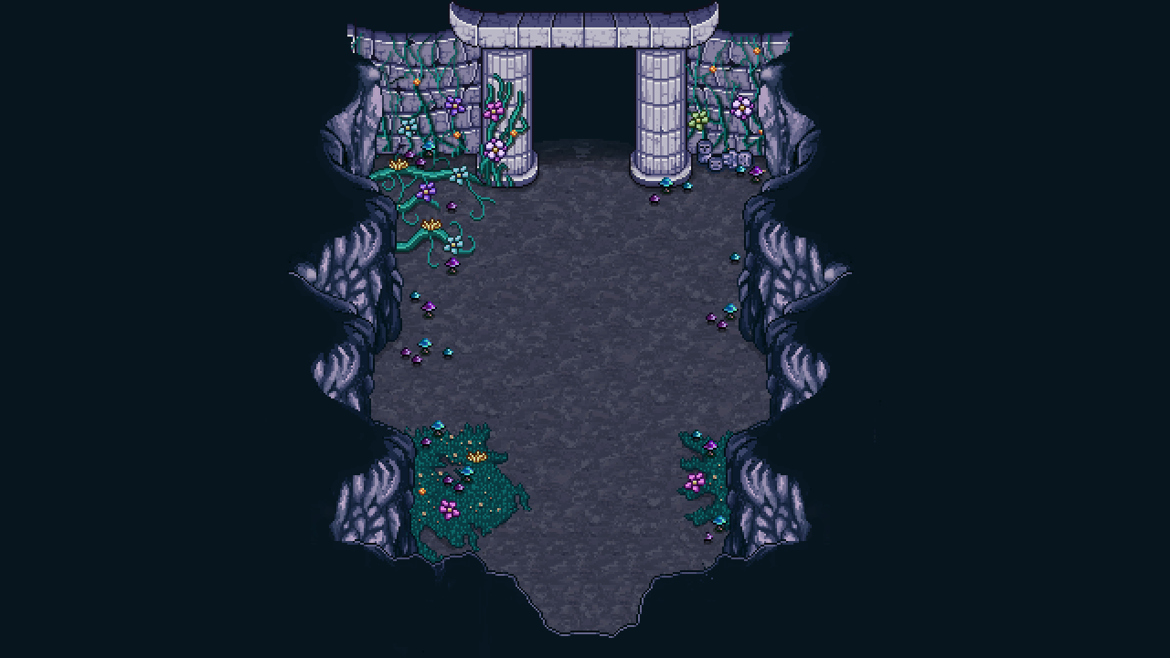
In order to have a proper exit from the above corridors, I had to extract and polish up the entrance/exit to the courtyard used in story mode and make a version of it in both timelines as well:

Finally, some minor changes to one of the boss rooms (the Arcade Mode version, that is):

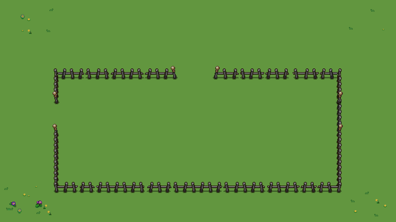
Instead of having to limit ourselves to having this boss appear after going through a mountain wall, we decided to remove the lower mountain part and adjust how things were placed slightly, so we can put a regular fence there instead (and as such be able to place the boss map anywhere on the map rather than along a mountain). In order to do this we also had to repaint the lower parts of the vertical mountain wall, as can be seen in the second picture.

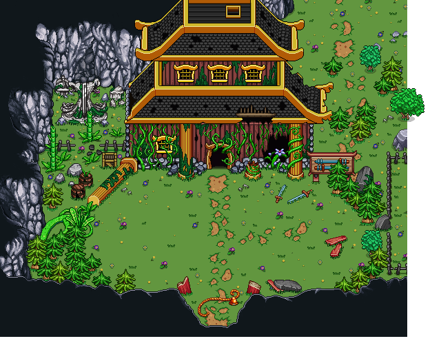
Now there’s just one more thing to do before these floors are fully complete (unless I’m forgetting something)!! And you guessed it, it’s turning all those polished and clean Past props into their present, ruined versions!!

Actually, since we decided each room will only be available in one of the timelines, I decided to not do exact replicas of some things, such as the buildings. With these I felt it’d be more interesting to bring in more designs to create more variations.

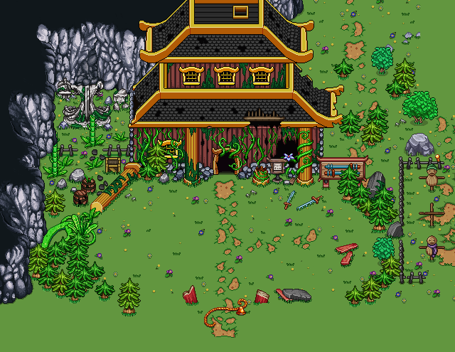
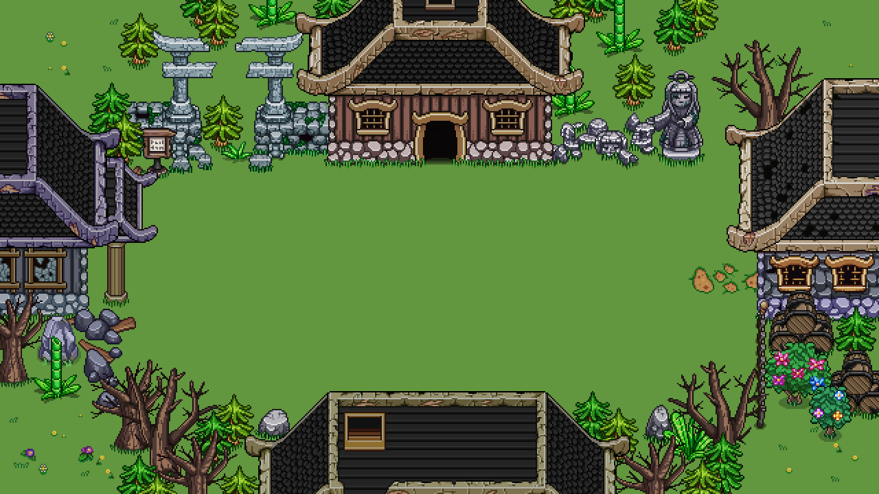
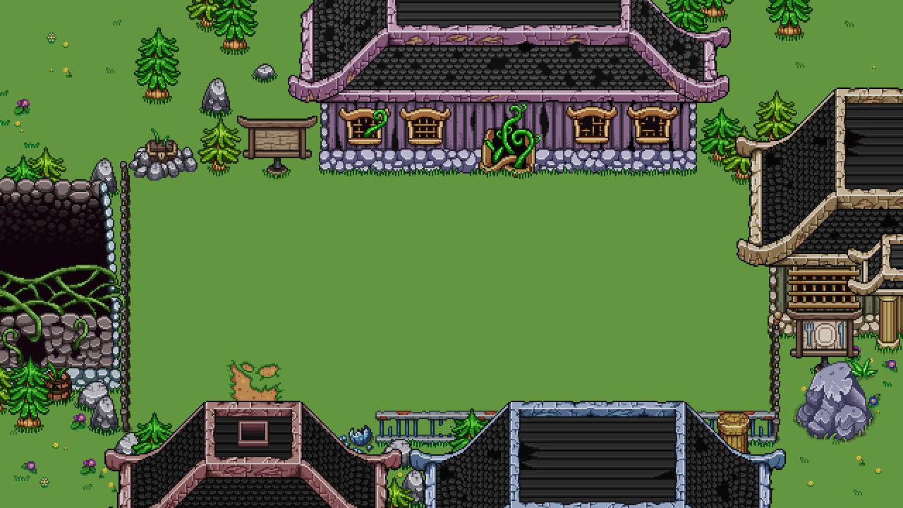
Here’s a few of the buildings that might appear on your run:

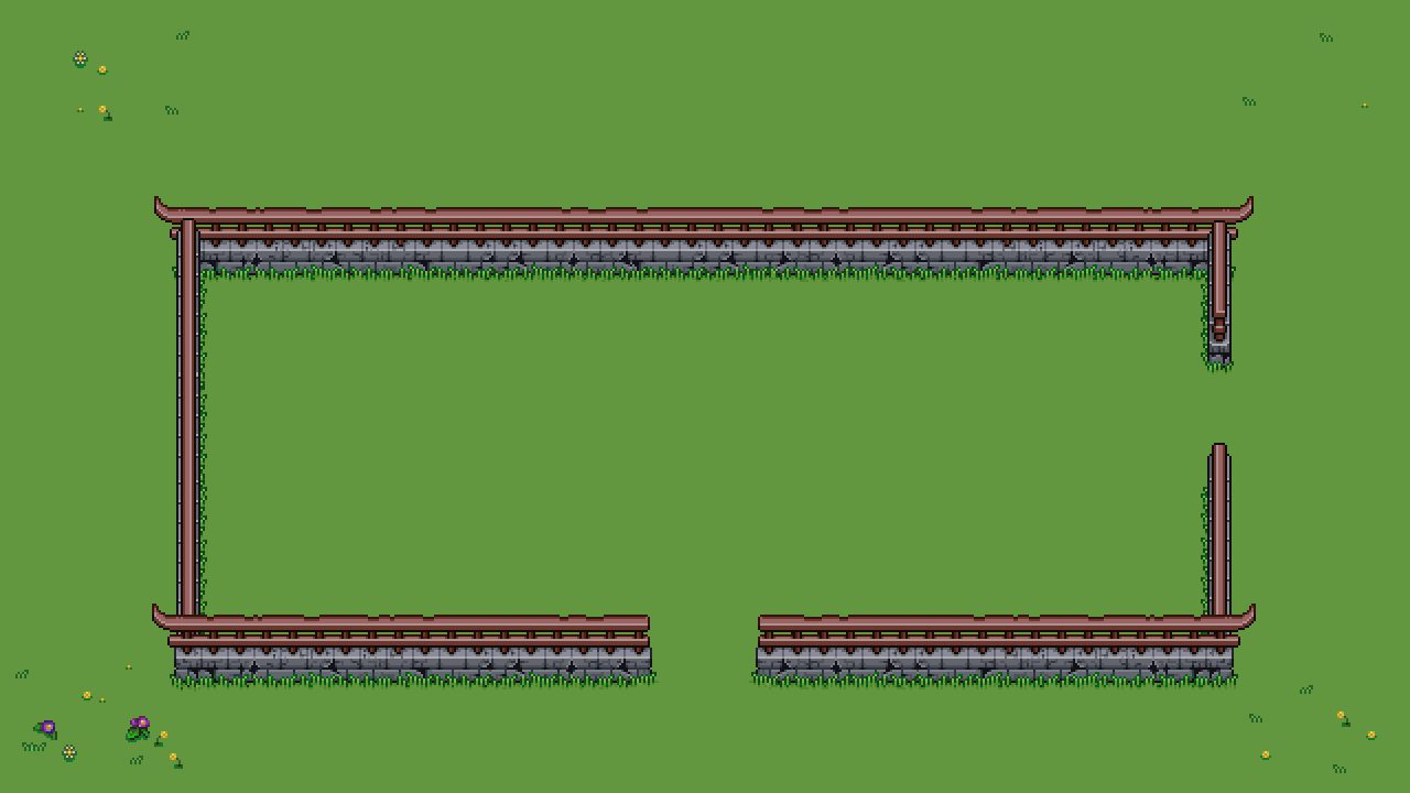
The fences were more straight forward, just make a ruined, old-looking version of each part:

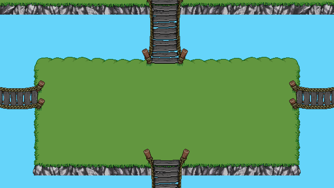
And finally, the new (very old looking!) bridges to connect islands or help you cross over streams:

Okay, now that the new bunch of floors are properly completed, let’s celebrate by taking a quick break from Arcade Mode and make another portrait featuring yet another sailor (can’t have too many of those in a harbor town, right?):

And the finished portrait:

Meanwhile, Fred has moved on from fishes and started making a ton of NPCs for the desert! Here are some of the ones you’ll meet during your adventure:

Guys! I am afraid this weekly recap will be incredibly empty, which is a shame seeing as this is our 300th week of blogging about the creation of Secrets of Grindea!! :( However, I’ve actually been destroyed by a nasty flu from hell that decided to take a turn for the worse over 2½ weeks in (hello fever), meaning I haven’t been able to work or blog any during this week. To make matters worse, I brought Teddy down with me, so the only one well enough to do anything aside from sleep and cough this week has been Fred (hopefully he manages to escape the nasty clutches of this evil flu)!

BUT, we do have some news about our company!

As you may or may not know, for these last four years or so, we’ve had our office in a spare room (the guest room) in our apartment. It’s been pretty nice having your workspace so close, but it has also had its own challenges, such as being easily distracted by the pile of dirty dishes in the kitchen when you should be working, or simply not knowing where work ends and where free time begins (hint: it never really ends when you technically live in the office).

Last time we went to a semi-regular After Work event for the game design industry here on the island, we heard there were office spaces available where some of the other companies work, and the more we thought about it, the more we realized we might actually benefit from having a small office outside of our home. This way we’d be able to keep work and free time more separate, hopefully making each more focused, while actually getting outside more (enforced 2×10 minute walks through a world heritage city filled with ruins and amazing architecture to get to the office and back, sounds good to me) compared to leaving the apartment twice per week for groceries.

So two weeks ago we went to check on one of the spaces, and we kind of fell in love! It’s on the third floor, rather small (making it cheap!) but not much smaller than the space we’re currently in. It honestly didn’t take much thought before we decided to go for it!

It’ll be available to us from the 1st of December, so expect some exciting posts as we move into our new office and make it ours. I don’t have any pictures of it right now, but I’ll make sure to take plenty once we’re actually moving in. Unfortunately, this is all I have for this week, but next should be a regular recap with lots of juicy stuff! Stay tuned and have a great week until then :)