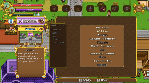
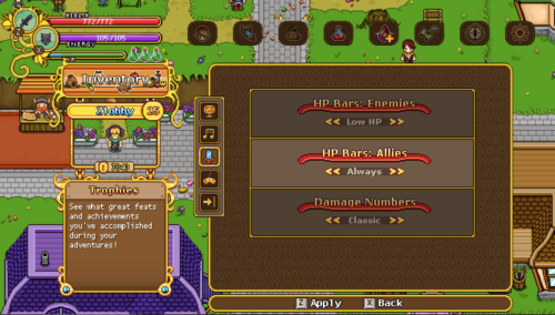
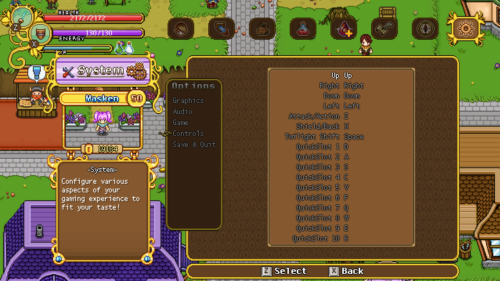
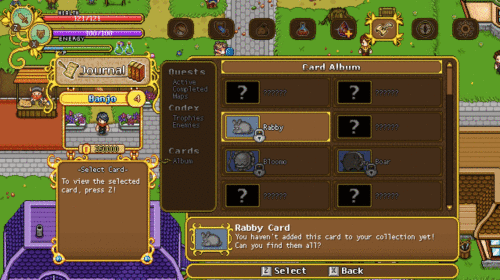
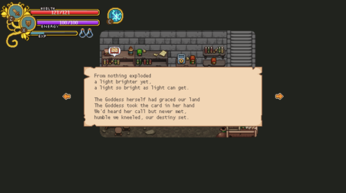
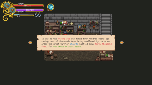
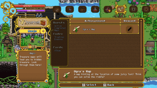
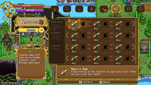
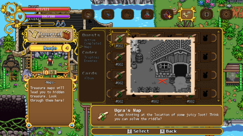
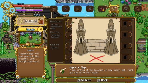
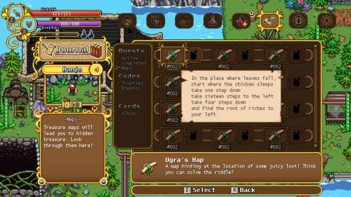
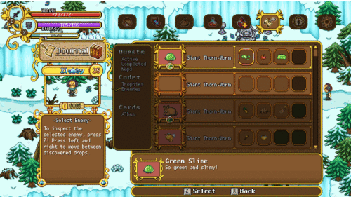
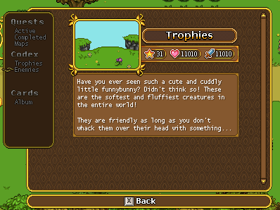
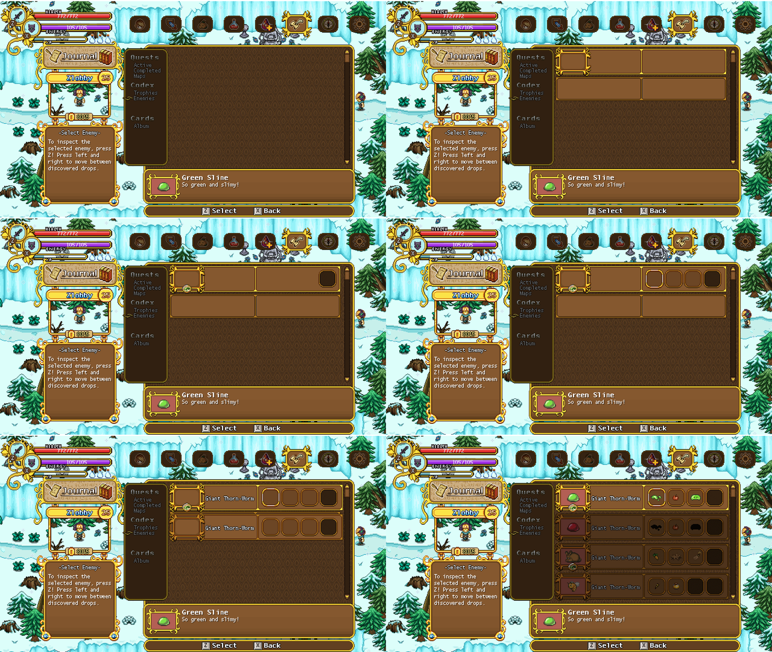
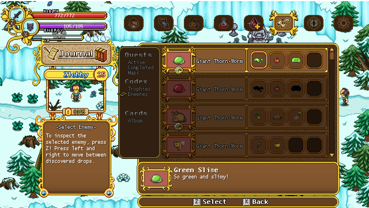
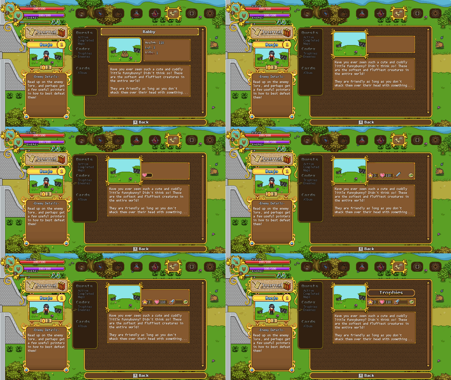
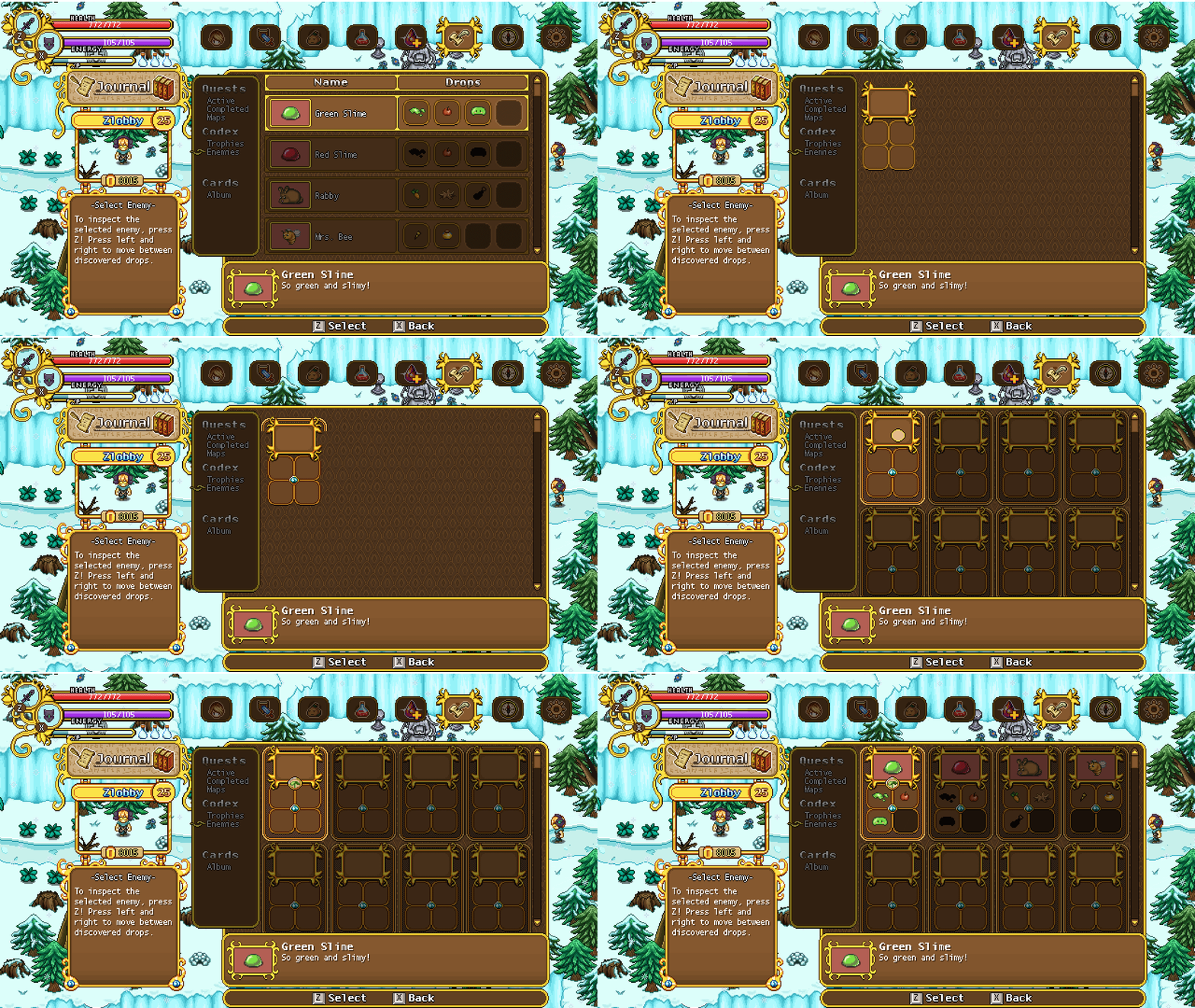
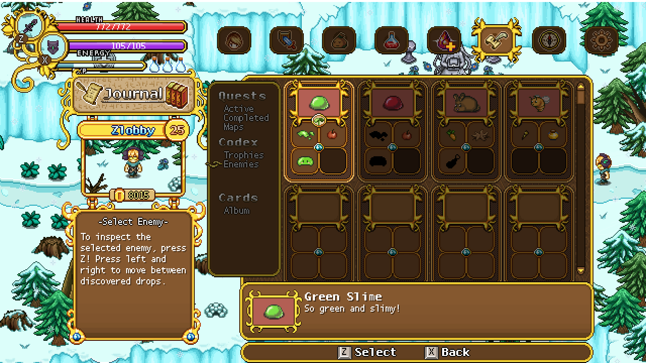
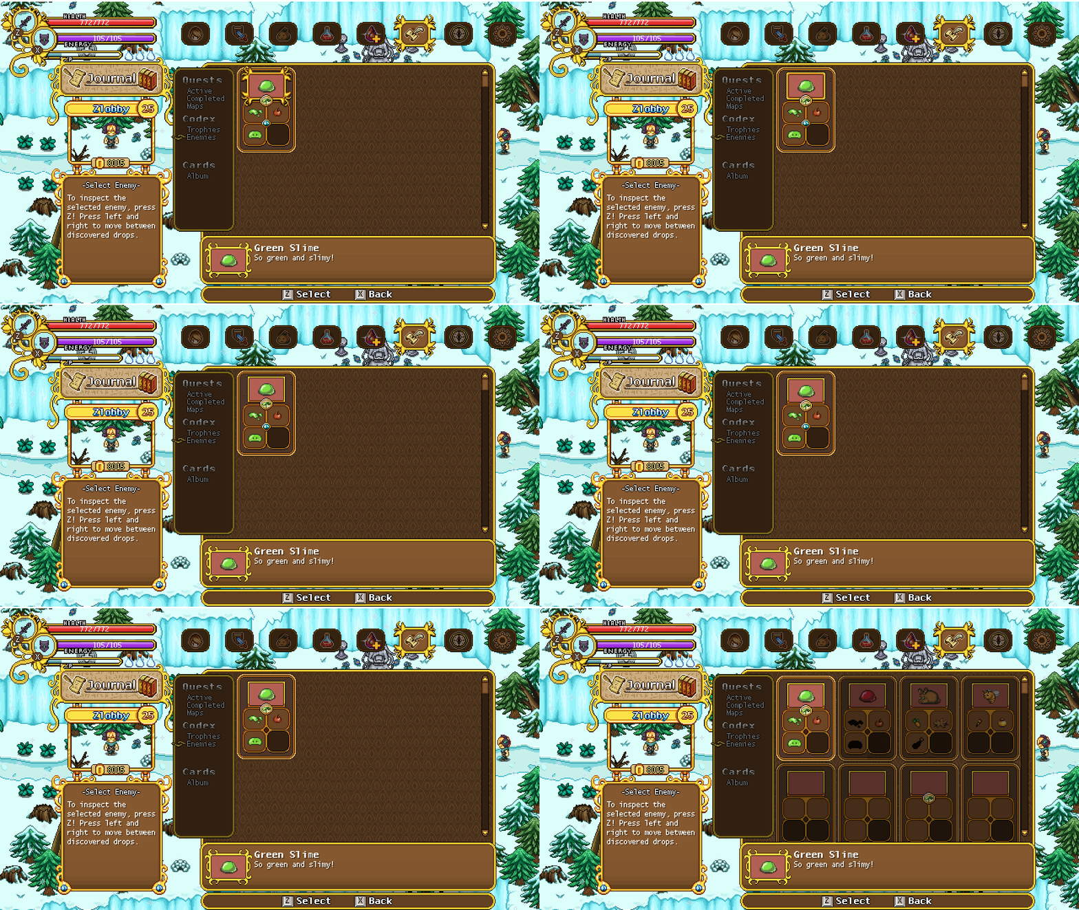
First up this week, editing that enemy info page a bit, allowing for larger numbers in each of the categories:

Another seed is on the way, through which you can grow a very strange plant indeed… Let’s take a look:

After some consideration of the previous version, we decided to swap it around:

And now, for the seed:

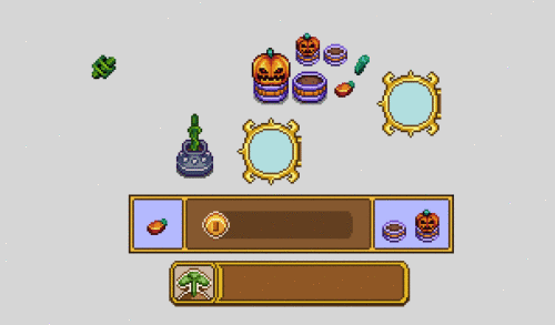
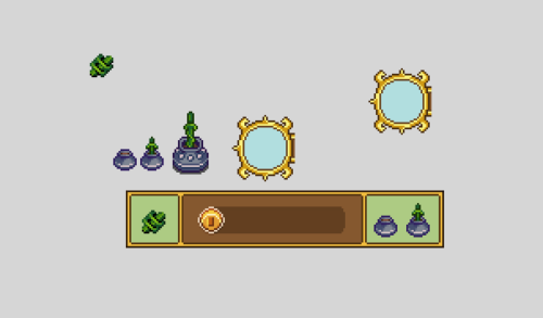
And all of the usual interface bits needed for you to grow this thing:

And now, something that’s been a long time coming: new haircuts! Remember the locked ones? Well they won’t be locked much longer, as we intend to fill up the remaining haircut slots – or at least add a bunch more of them. Here’s the first batch:

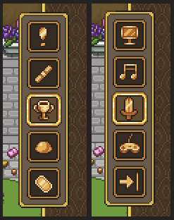
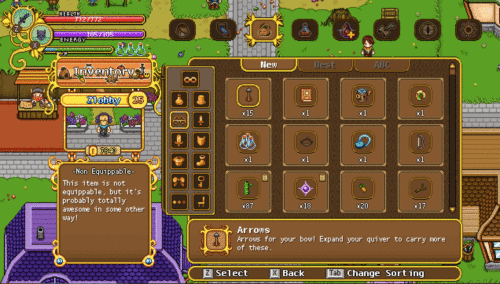
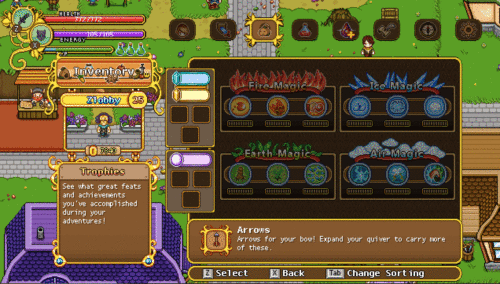
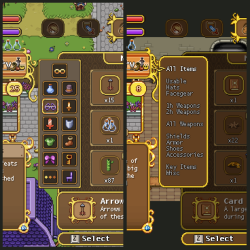
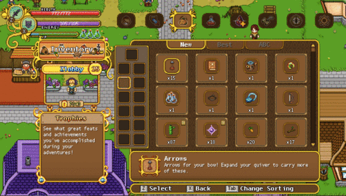
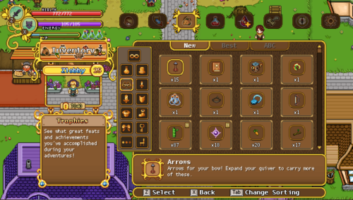
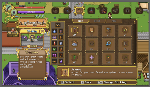
Remember how started improving the inventory menu a while back, preparing for the categories to be icons rather than text? Well, it’s finally time to start making those icons!

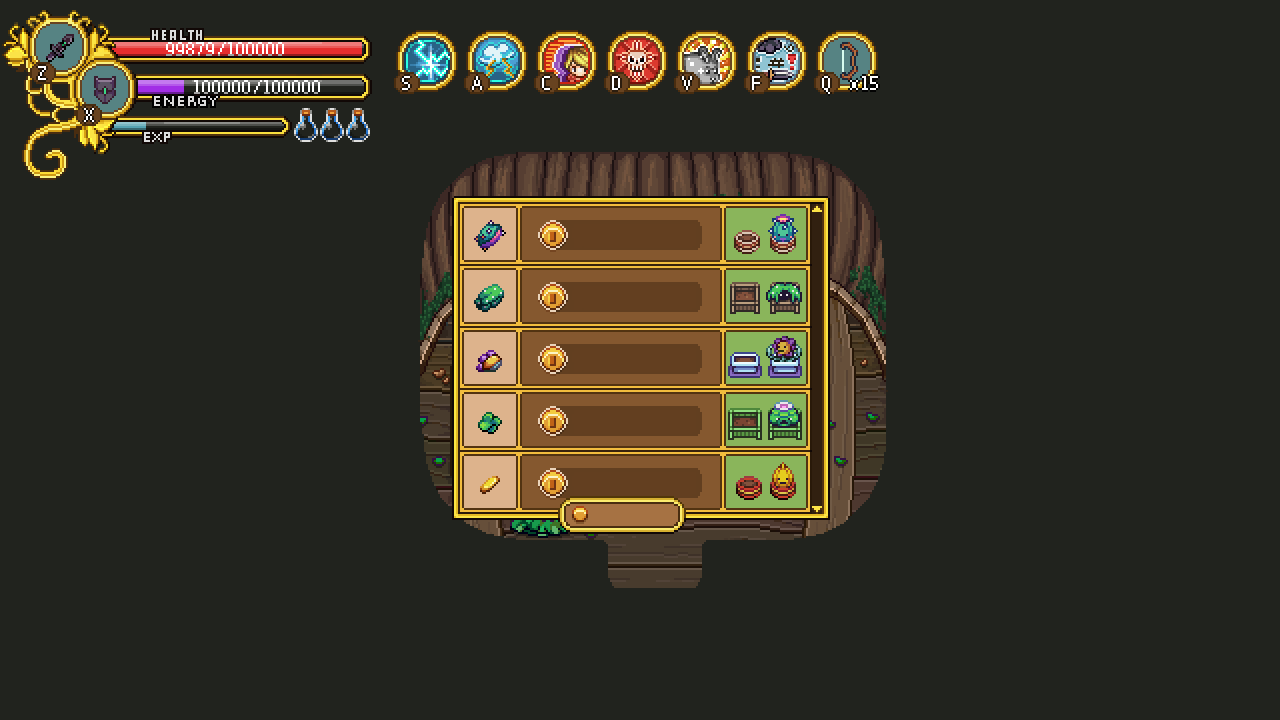
In this first test, I went for a monochrome look, but we’re not sure whether it’s the best way to go – perhaps it’s better to bring in a bit more colour to the menu, giving each icon a colour of its own. What do you guys think?

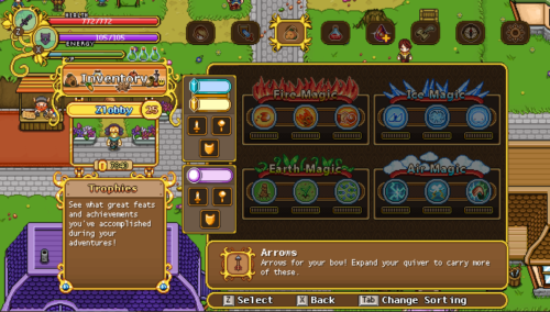
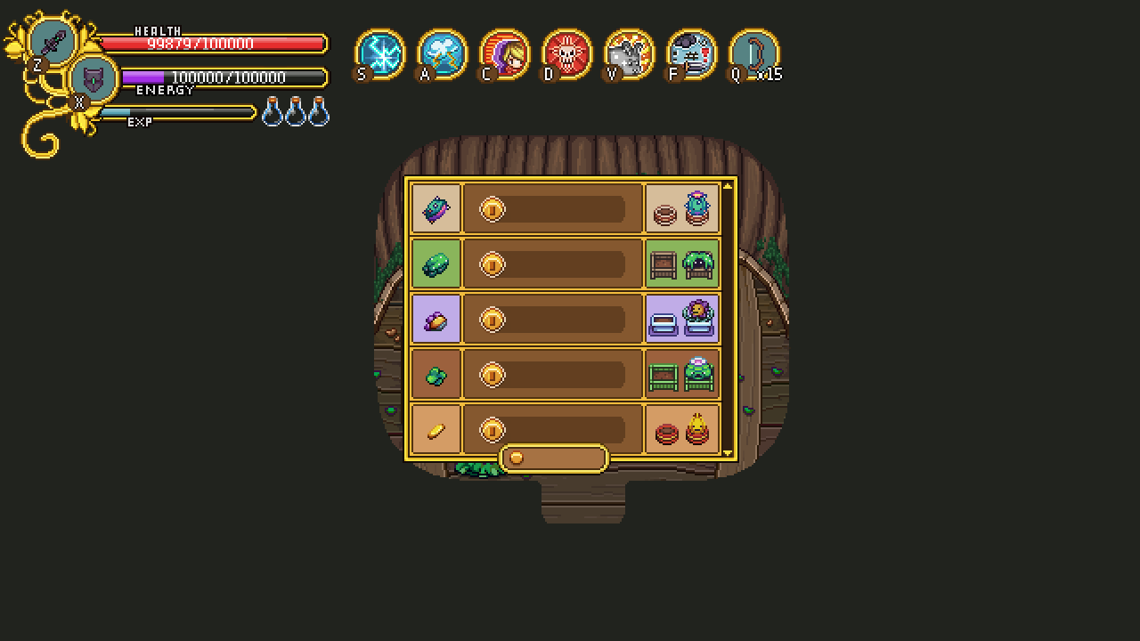
And here we have another option, the icons in colour! Which one do you prefer?

I personally feel a bit torn, since the monochrome one looks a bit less messy and more stylish, but it’s also nice to bring in more colour to the menu! It’s possible we’ll keep on iterating these options, or go for a mix of some sort, perhaps having the category you’re currently on show in colour. We’ll see!

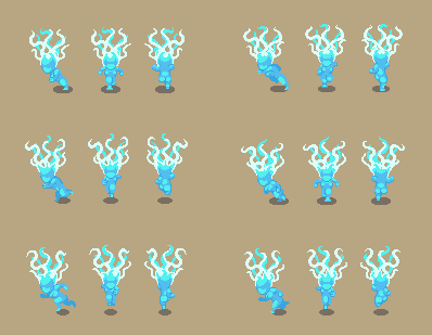
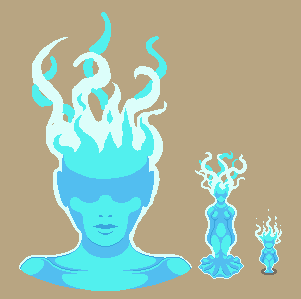
Meanwhile, Fred has been doing some more work on Grindea! Here’s some of his WIP sketches:

…And Teddy’s been adding my personal favourite feature in a long time! Lizards in your house!! How cute isn’t this?

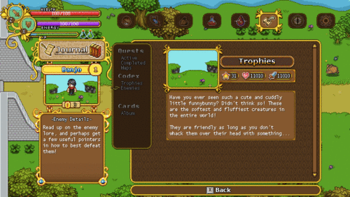
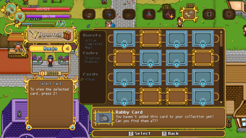
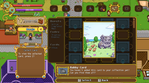
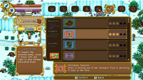
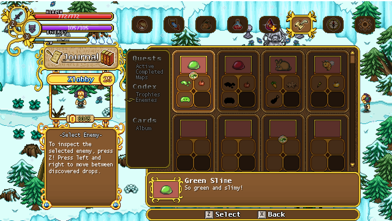
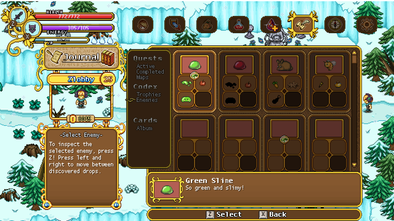
Moving on with the codex work, we’ve actually started second guessing that fancy new design, as it limits us in some ways. True, you could show more enemies on one page, but on the other hand there was no easy or obvious way to browse which items each enemy drops. As such, I’m making another iteration, this one based on the original, only with fancier graphics and cleaning it up a bit:

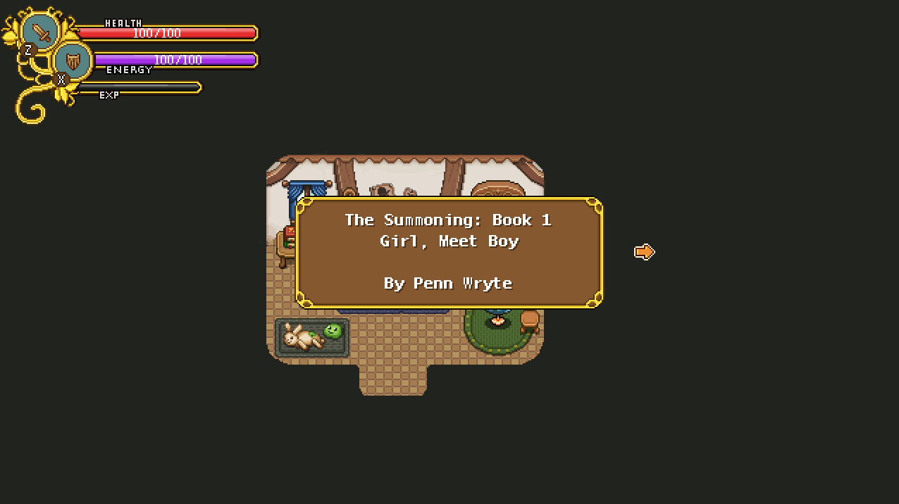
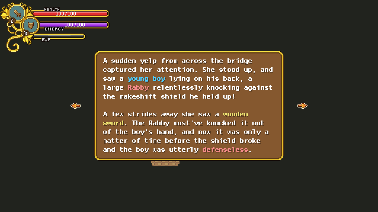
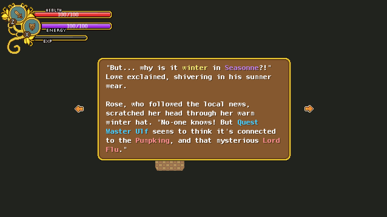
Work on a very different part on the game is progressing as well, namely that story written by Penn Wrythe!

The idea is that you’ll find parts of this story across the game, each one progressing the story slightly, until you meet Penn Wrythe herself and help her come up with the ending to her novel. The idea is that that Penn Wrythe will ask you what you value the most; power, love or fame (or some such), and depending on your answer the final part of the story will turn out in different ways.

There will be 5-8 parts of this story scattered across the game, so it’s quite the long tale.

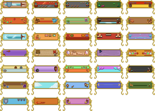
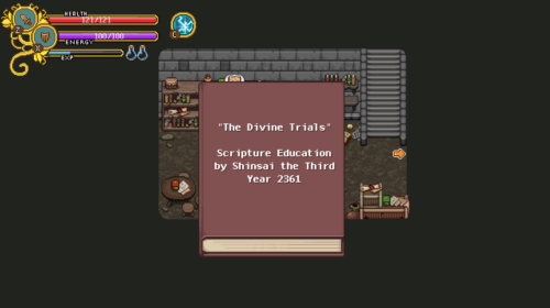
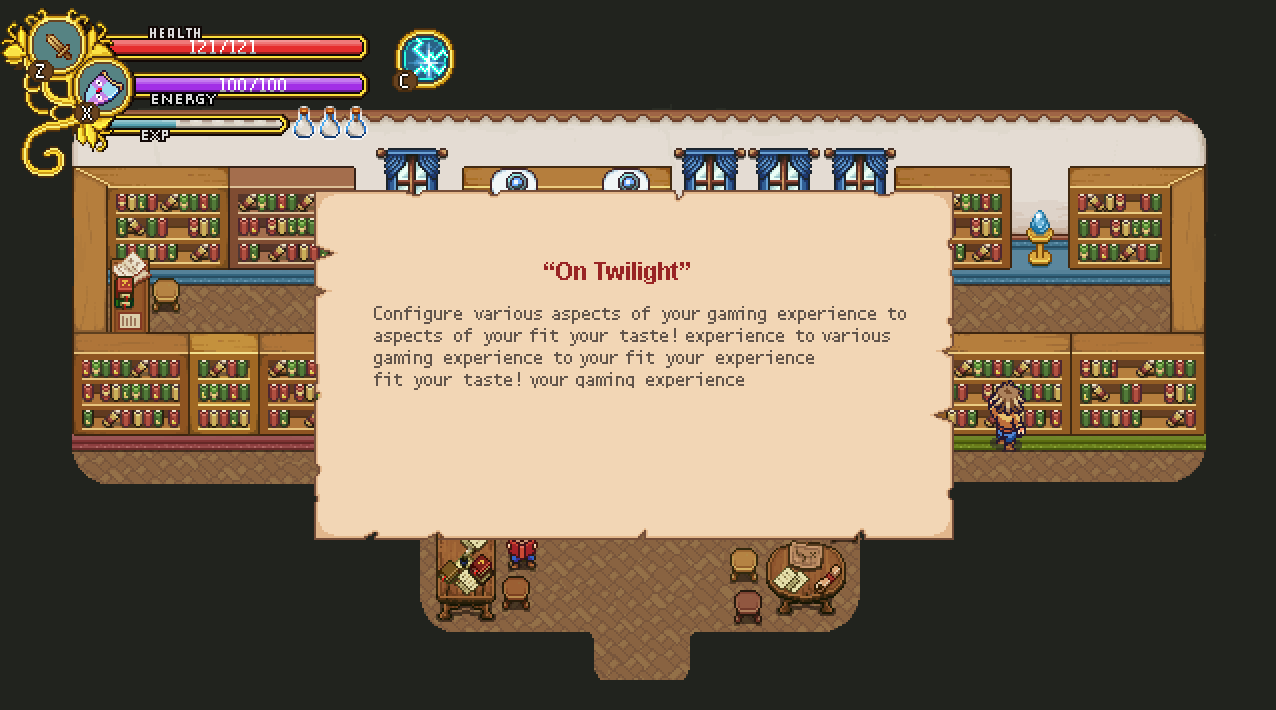
With the various books being added to the game, I thought it’s high time to make a better background than the typical classic brown one for such works. As you might remember, we designed a book interface ages ago, but due to limits in sizing and making it easier for us overall, we decided to scrap that some time back (for the time being, anyway). However, a more simple paper would still be feasible to add, so I threw something together:

Next up, a quick redesign of the enemy info pages! Just some slight graphic updates and the removal of some unnecessary text in favour of icons!

And here’s a quick little reminder of what it currently looks like in the game, which will be replaced with the above version:

Meanwhile in Fred’s department, work on Grindea is in full swing! Take a look at these sketches:

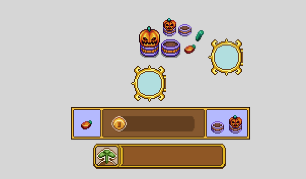
As you may have noticed in previous images of the seed system, the Jumpkin was missing from most of it! Therefore, let’s start off this week by making all of the Jumpkin stuff, including a new drop for the Jumpkin, replacing the pumpkin seeds it dropped previously (it’ll now drop a singular seed, which looks a bit different, which will let you plant it, but it’ll also drop a jumpkin stem)!

There’s also a menu button for the seed system store, which can be seen below as well:

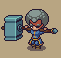
Time for the final veteran portrait, this one featuring the lady with the giant hammer! Let’s have a look:

Now it’s time to make a little redesign of the enemy codex! As mentioned, we’re going to redesign most of the menu, but the enemy codex is the one we’re aiming to actually get into this patch as opposed to a future one, as it will show information on which enemies drop seeds!

Here’s what it used to look like:

And here’s the process of the redesign:

As you can see, we can now fit twice as many enemies on every single page, giving a better overview of each enemy and what it drops:

We’re not 100% this is the iteration that will make it into the game yet, but at the very least, it’s a start! What do you guys think? Better or no?

Continuing with a couple more iterations of the codex, these ones have fewer details for more readability, and some bigger spacing:

Which one is your favourite this far?

Meanwhile, Fred’s been working on some fun stuff, including a little cloud that will water those growing plats for you, and Grindeas idle animation! How cool is that?

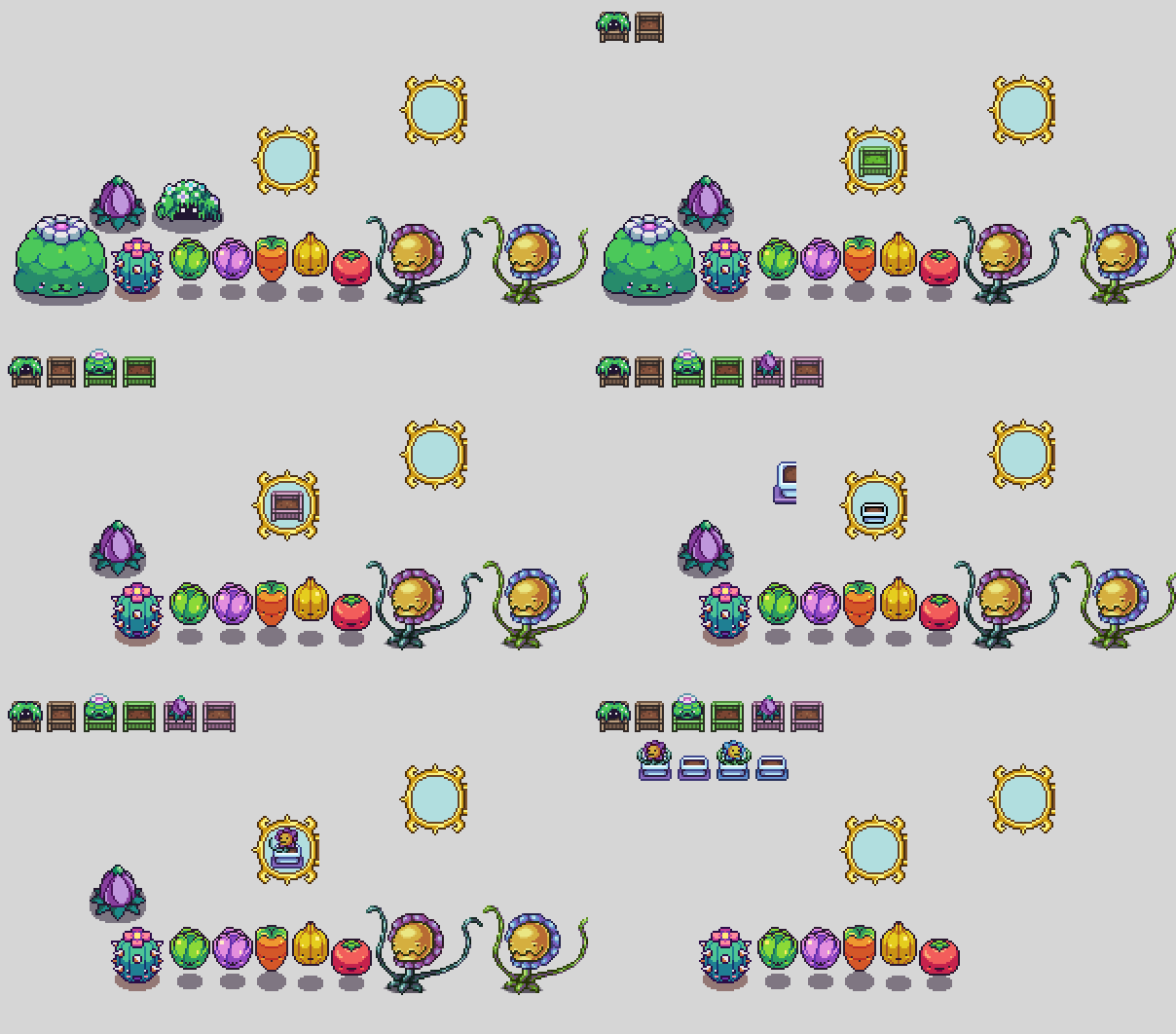
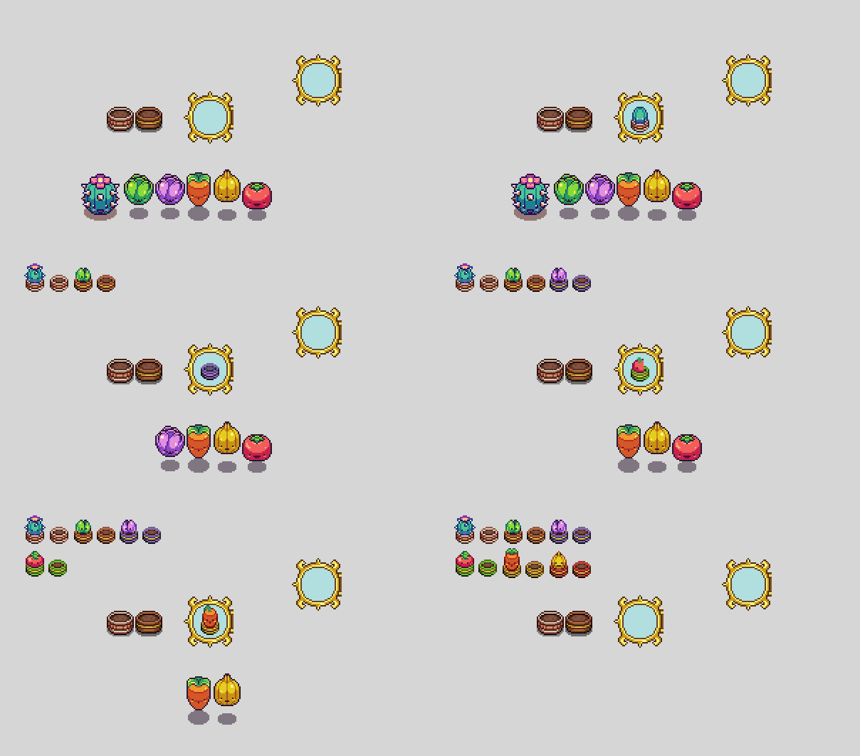
On to the next mission, making drop appearances for each of the potted plants! First batch here:


And here’s the second batch:


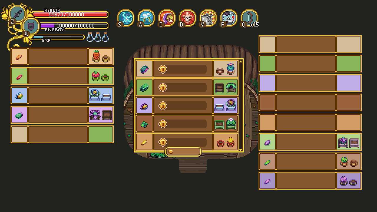
And now it’s time to take a look at the new interface where you’ll be able to choose which of your seeds to plant! Going for a pretty minimalistic and streamlined design here, this interface will only show the seed, how much it costs to pot it, what sort of pot and plant it’ll result in and how much money you have!

I made two versions of this interface, one with static colours which you can see above, and one where the colours are different for each seed, seen here below:

And here’s the rest of the colours, in case we decide to go for the second version:

Which one do you prefer?

Next we have another portrait, of another of the veteran collectors we’re adding:


As for Fred, he’s been busy potting a lot of plants! Here you can see a whole bunch of them in their housing forms, including a jumpkin for which I haven’t made a proper pot yet:

Now, time to get back to work and what better way to start off a new work week after a week’s holiday than to make the first pieces of a whole new system? These seeds (appropriately enough, since it’s spring time over here and I just spent pretty much the entire vacation outside managing the garden) will drop from all the greenery inspired enemies in the game, letting you plant them in your own home! Let’s take a look:
I’ve also made all the preparations for the first such plant, namely the Power Flower, whose seed you can already get after defeating it in Story Mode:
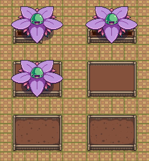
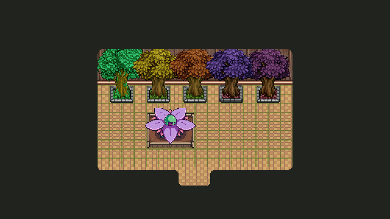
Of course, we also needed some drop appearance, both for the potted and the ..unpotted versions:

Next up, time to make some more potted plants! Without further ado:
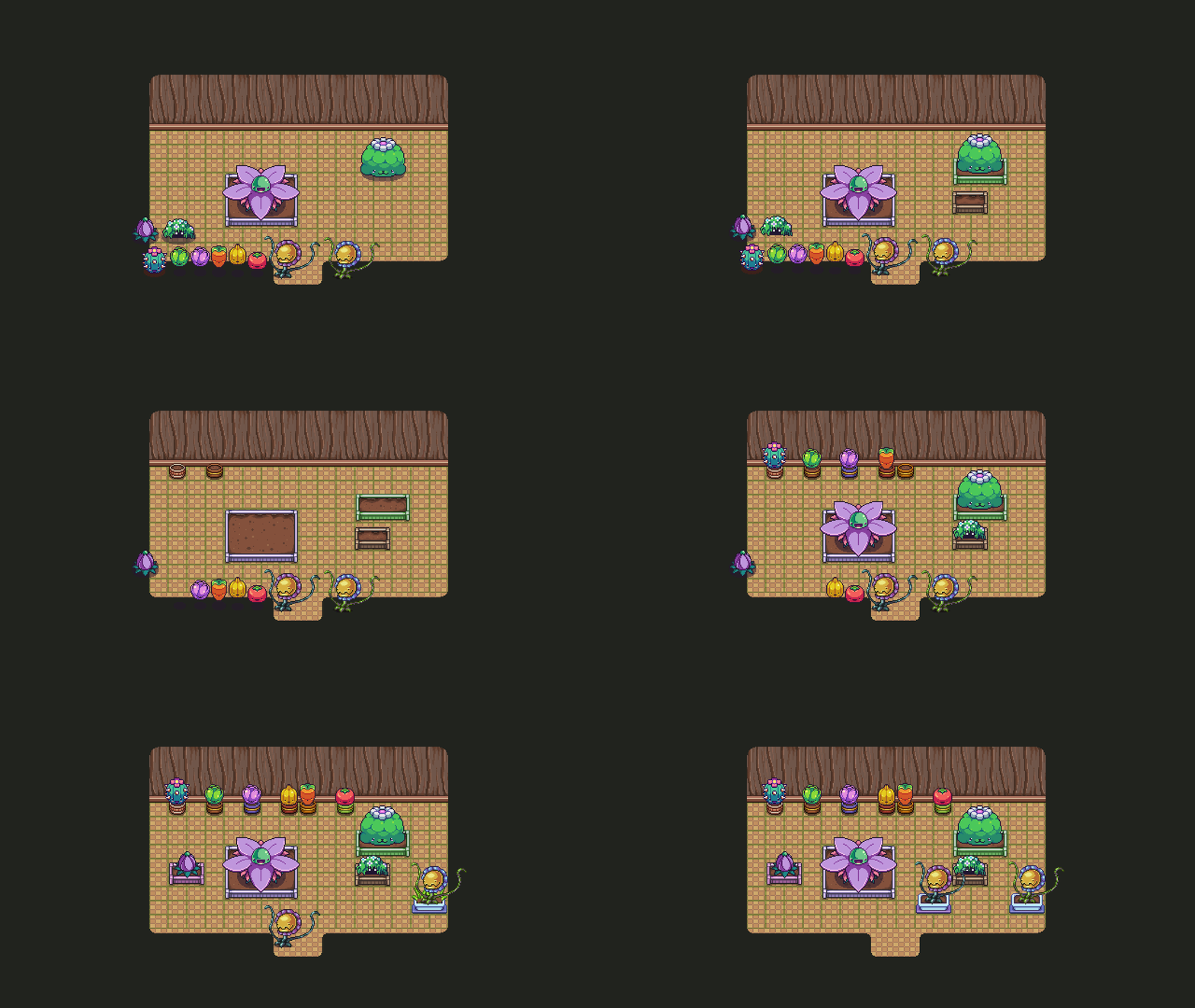
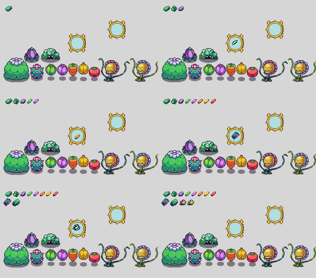
And here we have the full lineup, both with and without the actual plants:
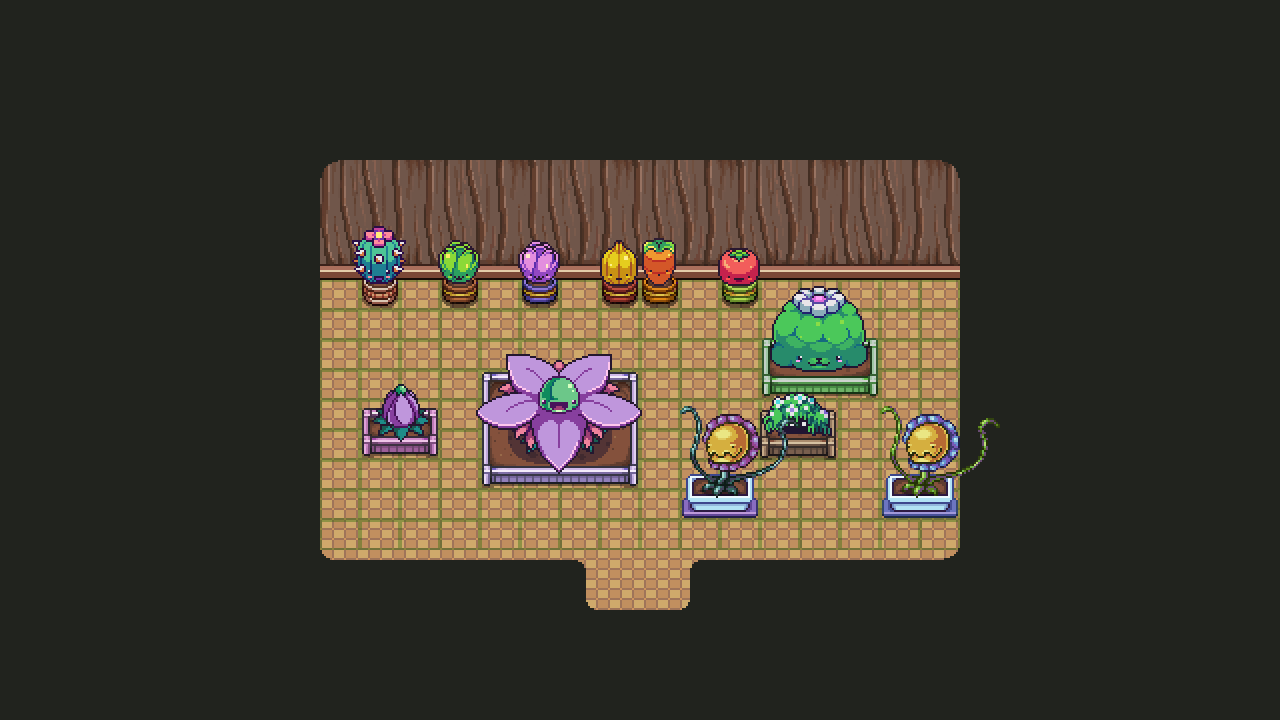
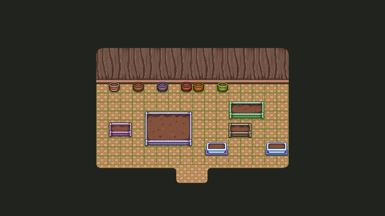
We’ll also add some kind of sprout to these for when you’ve planted a seed and it’s starting to grow, at which point examining it will give you an estimate of how far off it is from turning into an actual plant!

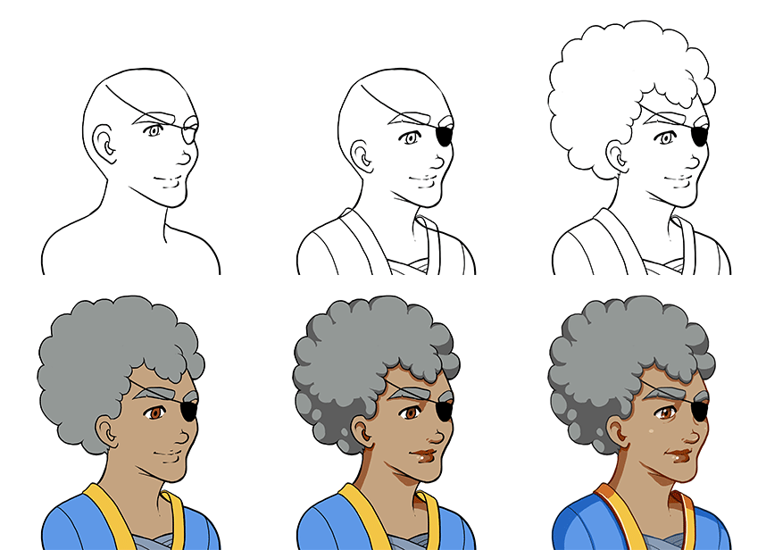
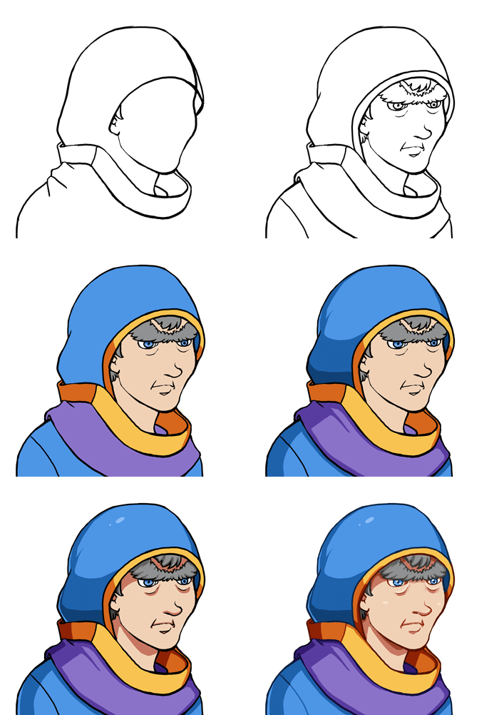
And now, back to doing something I haven’t done in a little while, which is a new portrait! This is for one of the new older generation collectors you’ll find in the HQ at some point:

Meanwhile in Fred’s department, we see a sneak peek of a couple new things for the stable update: a couple shields, a sprout, and an idle animation for one of the veteran collectors:

Now that we’ve been back a while and gotten back into the groove of working, we thought it was high time to have a meeting about what we’re gonna do the next bunch of weeks! As you know, the frontline patch has been released and we’re currently working on stuff for the stable version of the same. As such we went over what things will be added, and had a few unexpected ones added to the list as well!

First up, as mentioned before, we’ll add a book series by Penn Wrythe, that you’ll find parts of throughout the game. The final part will only be written after you’ve answered a couple questions asked by the writer herself, meaning you’ll determine the ending. We haven’t yet started working on this, but it’ll be done in one of the coming weeks.

We’re also finally adding the final bunch of haircuts, giving you a bunch of new selections! We’ll also make it possible to choose from the opposite gender’s haircut pool.

A redesign of the enemy codex is gonna happen – to be honest, we’ll probably redesign most of the menu, parts of which you’ve already seen, but for now the enemy codex redesign is the only one we’re certain will make it into the stable update. Our aim here is making it look a bit more pleasing visually as well as adding a few more things, such as the plant enemy seeds! We haven’t yet decided if the seeds are gonna function like a normal drop in the codex, or if there will be a plant icon somewhere indicating that this is an enemy type that drops seeds. Both these options come with their own pros and cons, and as of yet we haven’t really made any final decision on how to handle it – but it’ll get ironed out in a meeting at a later date.

Other than these things we still have the other things mentioned previously such as the seed system and the basement beneath the church in Port Monnaie, most of which has already been finished!

Now, on to more work, got a lot left to do this week :D

Now that the month has drawn to a close, it’s time to do a quick recap of what’s left for this patch, especially what we want to add to frontline (which is out already, by the way!!) and what we’ll save for stable – so it was high time for another meeting!

One of the things we’ve been talking about has been the boss drops. Right now only a few early bosses have boss drops, which aren’t even dropped 100% of the time, which is a bit weird even now that we’ve added boss rebattles in the arena. We had two options for this – either remove the boss drops altogether or let the boss drops be at 100% and add some more to other bosses across the game. In this case, we decided to go with the later, adding a bunch of new boss drops, including a seed allowing you to grow a Power Flower inside your house, an evil eye mask dropped from the evil eye in the ghost ship, a thorn worm cap allowing you to wear thorns on your head, and a cog shield dropped from the toy machine in Seasonne!

The Power Flower Seed brings us to the next topic, which is a plant system where you can plant seeds and have them grow in your home! How this will work is that you’ll find a seed, dropped from various plant enemies, and if you take the seed to the tree in Seasonne he’ll put it in a pot for you, which you can then place in your house. After some time, the seed will turn into a full grown potted version of the enemy you got the seed from. While this completed system won’t make it into this frontline update, we’ll start it up at the very least.

For the stable update, we’ll be adding Penn Wrythe’s novels, which will appear throughout the game in parts. After meeting her in Port Monnaie you’ll get to influence the way the final part of the story turns out, so think about your answers carefully! We’ll also be adding the cellar beneath the church in Port Monnaie, as well as a bunch of old books here and there across the game.

We discussed whether to add the player scaling feature yet or not, but we’ve decided to save that for another update – possibly the one after this one, where we go back to focusing more on Arcade Mode again.

Now, time for some last minute additions, starting with the final arena award, the arena hat:

Adding some backgrounds for Bishop in the journal, as well as a background for your character when they’re in Bishop’s own little realm:

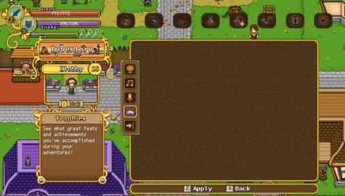
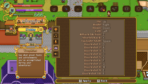
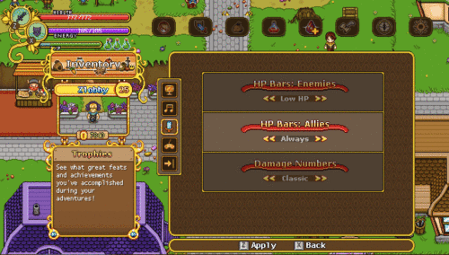
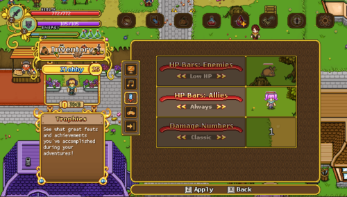
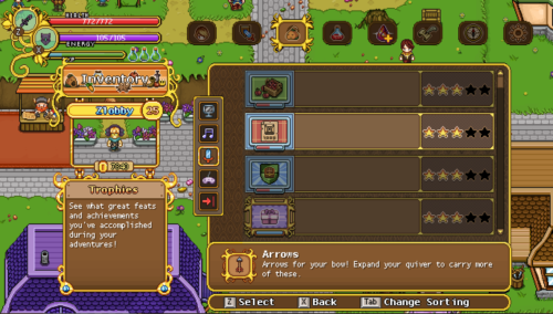
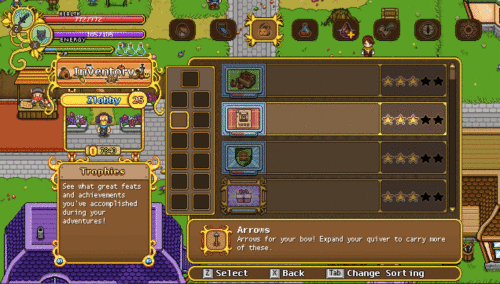
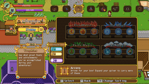
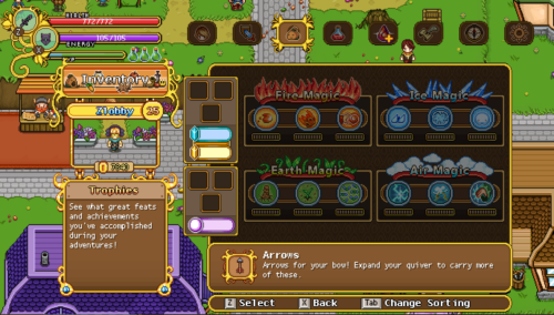
Here’s something that won’t appear in this next patch, but is important to start working on anyway, namely our continued rework of the menu! In this step you’ll see me making a new layout where we’re removing the text titles of each inventory category and replacing them with icons (although the actual icons haven’t been made yet):

And as an additional bonus, a sneak peek of what Maracus Skill-to-Talent transmute looks like, complete with the awesome song made by our amazing music creator Andrew Riley of Lucky Lion Studios! Look at the old man go :3

Since we decided to make a bunch of new boss drops as well, I better get to work making those! Here’s a Power Flower seed, an Evil Eye Mask, and a Thorn Worm cap:

I also went ahead and made the drop appearance of the power flower seed all grown up for its place in the housing system, although you won’t be able to use it just yet (next update, maybe!)

Finally I was a bit cheeky and made my own suggestion for what the Toy Factory’s shield drop could look like, although it’ll most likely be edited and adjusted a bit by Fred:

And finally, here’s a little early sneak peek of three new collectors that will appear in the collector’s HQ or around the world, featuring a few more veterans, since we felt like the collectors all seemed awfully young:

Now go forth dear friends and try out the new patch over on the frontline beta! Among the new stuff is:

* Three big but optional side “quests”/objectives has been added, you can find them in the lost ship, Pillar Mountains and Mt Bloom respectively

* You can now refight all bosses in the arena, which has been improved in terms of UI and has a few more challenges as well

* A new load screen and splash screen for everyone who has been working on the game; the game should also load more quickly

* More bosses have drops (if you’ve killed them already you have been awarded the drops retroactively as all boss drops are now at 100%)

* Talent orbs can now be transformed into silver skill points and the other way around in the HQ

You can read the full patch notes over at the forums! And as always, all feedback is appreciated, please continue to help us make this game the best it can be, we value each and every one of your comments <3

Now, with this patch out and about, we’ll be taking a little belated easter holiday, since we haven’t had any off time for a while! The blog will be back as usual on April 26th, after we’ve had a full week back at the office with new content to recap for you guys :)

Today we’ve had a meeting talking about various improvements for the game as a whole. One such thing we’ve been meaning to add for a while is a proper loading screen before the game starts up: on some computers the game can take a little bit to start (we’re working on making this quicker as well!) and so it’s really nice to be able to get confirmation that you actually pressed the button in the first place.

As such, we’ve decided to add a little splash screen followed by the customary Pixel Ferrets logo (as well as our sound design teams logos) before a (hopefully) short load screen will appear until the game has properly loaded. Adding the splash picture and the logos should give the game most of the time it needs to start up everything it needs, so adding those will likely come with the added benefit of the game feeling like it’s starting up a bit quicker than it actually does as well (haha..)

We’ve also made the decision to upgrade some more menus: you already saw our work on the Trophies menu redesign last week, and we’ll continue to work on giving most of the in-game menus an upgraded look that fits better with the game’s overall aesthetic as well as work better overall – some just haven’t been streamlined enough, or have issues with the game’s various translations. More on that later!

Another thing we’ve been discussing but won’t be added until later on, if at all, is lobby systems, where you can host your game in a public listing, allowing strangers to join you from the game menu itself. While this is a neat feature for players who don’t have friends playing the game and who do not want to join a community in finding players in a similar ping distance, we feel like people are managing just fine for now and that adding it would be better left to after release, if it’s even needed then. We’ll see!

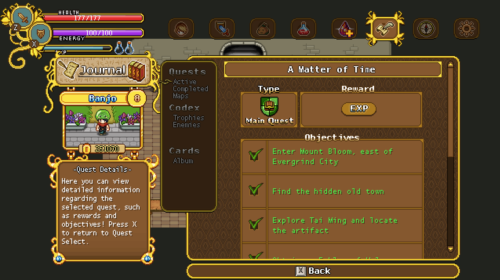
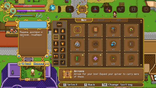
Now, let’s start work on some of the smaller menu improvements. In this post, I’ll mainly be looking at adding some flavour to the box on the left, where you can read a description of the part of the menu you’re currently in. With this new addition, you’ll get a more proper headline than the one in use right now, which is just more of the same boring white text.

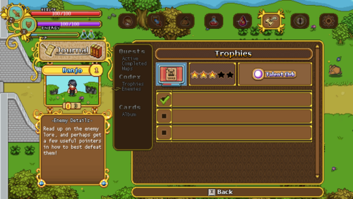
We’re also adding a reward box to the trophies menu on the info box to the right, where you can easily see what you’ll get for finishing up the achievement in question. While this wasn’t totally needed, we felt it’s nice for people to be able to know the reward, so they can decide if they wanna pursue a specific trophy over the rest.

In that same box, we’re also adding another proper headline – although we’re not entirely sure it’ll look in this exact way yet, since it takes up a lot of space and we might need all we can get in order to fit the lengthier descriptions.

As a bonus, while I’m in the world of interface, here’s a little GIF featuring a battle indicator used for Bishop’s boss battle:

Okay, so time for us to take a look at that loading screen I mentioned previously! First of all, here we have the splash art that will appear before anything else. This won’t have the ‘windowed’ look, but will simply appear for a short while before the actual game window pops up:

Once the game window starts, you’ll be greeted with the familiar Pixel Ferrets logo, as mentioned before:

Followed by the three teams that have helped us bring the world of Grindea together in terms of sound effects and music:

Once that is out of the way, you’ll be greeted with the actual load screen. It’ll start like this, completely covered in clouds, but once the game finishes loading, the clouds will part ways and the pre-game menu will be revealed. To the left in this load screen, we’ll also have a random backer’s names show up as thanks for helping us get this far:

A gif showing how it all plays out once the actual game window starts can be seen here (although my computer already properly loaded the game, so there’s not much of a load screen going on here haha):

Now, some of these things are a bit placeholder-y, one of them being the fonts and overall design of the texts used. For example, I’m not too fond of the readability in the sound design teams part of the load screen, with it being on two rows and a bit hard to read overall:

So I made a couple suggestions making it look a bit more streamlined and less in your face:

For the cloudy load screen part, there was a bit of a font issue as well. Here’s what it looked like before:

And here are some suggested improvements, with this first one being my personal favourite (although we haven’t made any final decisions regarding which one we’ll pick yet):

Finally, with this new load screen appearing, I felt like the old in-game load screen between areas look a bit lame (it was one of the very first things we added to the game, after all!) so I made a little mockup of what a new version could look like, tying back to the pre-game load screen we’re implementing right now:

The text on the left will be replaced by the usual gameplay tips, I just didn’t have them on hand so I picked a random rat fact for now! The idea is that the clouds will be floating slowly across the sky, with possibly the occasional bird flying across – although hopefully the game won’t load for so long between areas that you’ll have to spend any longer amounts of time looking at it haha!

Meanwhile, Fred is working on adding and animating some new NPCs, namely the priest and apprentice that will appear in the church in Port Monnaie, as well as giving Bokus the ability to read and turn the pages of his book:

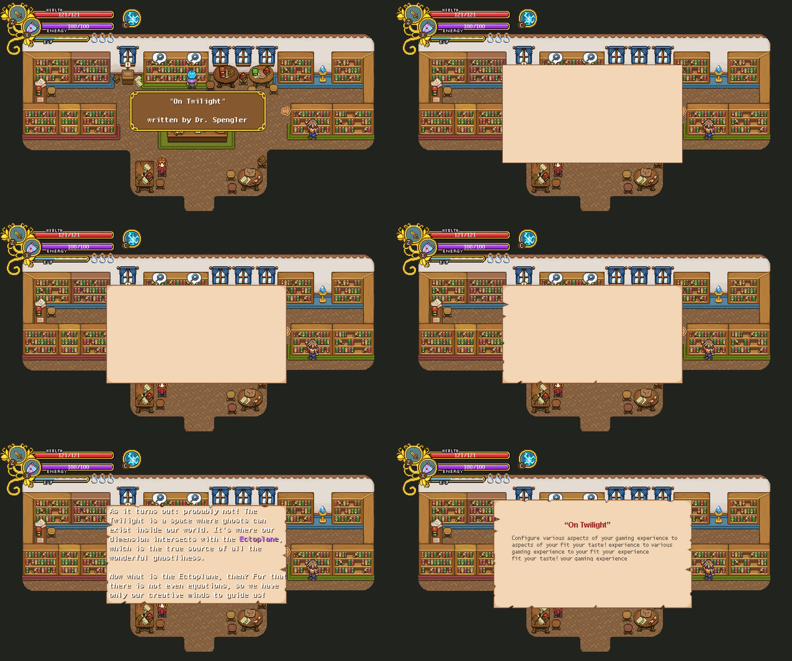
Now, as I mentioned last week we’re doing a bit of an archery challenge in Arcade Mode, and as such I was tasked with making a mobile version of the archery challenge!

For now, this style will appear on each of the floors, but I have a crazy idea of making a special background and use different bush cutouts for each floor, if I manage to find the spare time for it!

Next up, some additions and changes to the transmutation GUI! For starters, the mechanic needed a proper ‘shop title’ splash, and a button for activating the transmutation service to begin with, as seen below:

We also decided to make a few changes to the UI itself, adding a couple of maracas, removing the title bar (it seemed unnecessary), and changing the colours of the gems in the interface to better represent the rest of the UI colours here.

And now, some mixed stuff, starting with some improvements on the readability of the shop title splash I just showed:

An open door in the HQ leading into said transmutation room:

And some of our progress on a different part of the game, namely the Bishop’s battle! Here you can see some more of our iteration process, ranging from climbing the pillar itself to how the encounter with Bishop himself evolved from the placeholder version to what’s currently in the game! If you look closely, you’ll see that the background has changed slightly from the previous finished version I showed some time back: we’ve moved the bushes slightly out of the way to make sure they don’t distract from the battle:


Next, back to story mode, as we’ve been working on a redesign for the trophies menu! As mentioned before, we’re gonna change the trophies themselves around a bit as well, and in doing so we’ll upgrade the whole look of this part of the menu to better match the other newer menus, basically by adding more and better graphics:

Finally we’re looking at a bunch of effects he’s been working on for the card cave, shown here as videos!

The first video shows our very first iteration of how the cavities in the wall light up depending on how many cards you’ve collected. The second video show what happens once you’ve collected all of the cards, revealing a secret catalyst, and in the third video we have adjusted the colour of the flames and added some bonus effects to when the cards merge together into the catalyst:

We’ve long been talking about revamping the challenges a bit, removing the long and slow paced ones and adding more quick and quirky challenges that you complete quickly, all with the intention of making them feel a bit more action packed. Now that we’re nearing completion of the upcoming story mode patch, it’s time to take a look at Arcade Mode, including these new challenge types!

To start off with, there will be two types of challenge rooms now – one where you’ll just solve strange challenges without risking any damage, and one for all the more dangerous challenges where you might accidentally take a hit – such as the kill in order challenge already implemented. Other ideas for these types of challenges include mini boss battles, kill quickly challenges, or take no damage challenges. Of course, due to the more dangerous nature of these challenges, it’ll be properly marked on the map so you know you’re risking your health if you enter – and also the reward will obviously be greater than in the ordinary challenge rooms!

For the regular challenge rooms meanwhile, we’re probably removing the bigger chicken challenges as well as fishing (but don’t quote me on that just yet). Some new ideas we have include:

An archery challenge, where you’ll spawn into a “fake”/prop version of Robin’s archery challenge from story mode, and you’ll have to hit enough targets or get a minimum amount of points.

A music challenge where you’ll have to mimic the order in which the musical faes from story mode play a song on a set of bells of your own.

And an animal taming challenge, where you’ll have to successfully tame a pet to get the reward!

…and we’re currently in the process of designing more! Do you have any cool challenge ideas you’d like to see in Arcade Mode? Let us know in the comments :)

Now, back to story mode for a little bit, as I make a bunch of adjustments to the Card Room in Mount Bloom, moving things around a bit and making more subtle frames for each of the cards:

In the end, we opted for an even more subtle frame (but don’t worry, it should look fancy enough once you’ve found some cards):

Now, back to Arcade Mode and its floating isle final room! In this next part I make a proper stand for the chest you’ll get for reaching this far:

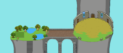
And finally, the other floating isles in the distance:

Meanwhile, Fred’s been hard at work finishing up all of the animation sketches for Bishop and a couple new ones (including the one below where he brushes off some dust after you’ve successfully defeated him):

He’s also been working on a bunch of light effects for the Mount Bloom card room which we hope to show you within the upcoming couple weeks! Stay tuned for that… :)

New week, new improvements! We wanted to make the Bishop boss portrait look a bit more creepy, so I did a bit of an paintover to adjust just that:

We’ve also made some additions around the card room, adding frames for each card to the wall, as well a a proper entrance (bye bye dragon floor and puzzle stuff):

With us finally deciding the visuals for the floating isle that will be the final Arcade Mode room, it was high time to add that and Arcadia itself to the world map (proper layout of the isles yet to be decided):

And speaking of the floating isle in question, I’ve started working on that as well! Here’s as far as I’ve gotten as of yet, more work to come:

Finally, Fred makes some progress with cleaning up the Bishop’s animations (have a little sneak peek), as well as adding some light effects to the cards in the card cave, which will illustrate how many cards you’ve collected thus far: