*kicks in door*

I’M HERE, I’m here! Totally didn’t forget I was in charge of the blog still, I would never! Since I’m so not late and so on time, let’s just dive into the juicy stuff straight away!

Last week I showed you guys that little elevator animation-thingie I was working on. Since then, Teddy has been busy hammering all that together into an actual ingame prototype! Here’s iteration nr. 1:

As always, Teddy has done a stellar job transferring my chaotic Photoshop document into something playable. I like this version a lot, it feels more or less one-to-one to my version. I dooo think the little pause/stop the platforms do before they actually connect feels a bit off tho. It felt really nice when I was working on it in a vacuum inside Photoshop, but seeing it ingame we all felt it would look better if the platforms just connected to each other instantly.

This looks much better to me, just the flow and impact of everything feel much smoother and juicier. I’m actually kinda stoked over how well this turned out, I was very prepared for having to re-iterate the whole idea or at the very least add a bunch more effects and polish to it. But I dunno, I think it looks really good! Throwing in one more video just because I can:

So, a problem this added coolness of the elevator has created iiis, some other aspects of the elevator sequence now feels a bit tame in comparison. Especially Mirrar himself feel a bit static and stiff which is completely unacceptable!

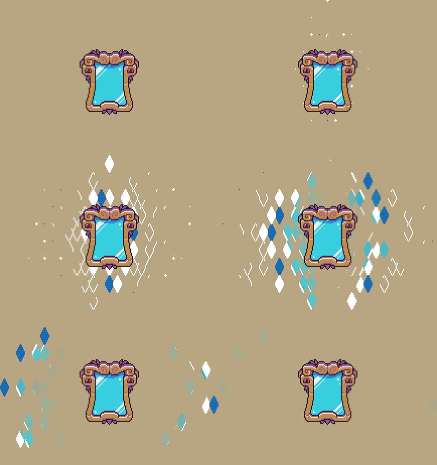
This has been kinda my main task this week, trying to add some extra layers of CHA-PLOW to our little reflective friend. Starting out, I wanted to revisit his “wake up”-animation. This is the sequence that plays when Mirrar wakes up for the first time after the elevator activation. Here is the original animation:

Simple. Boring. Not enough “oh shiiii- it’s time for the final part of the game”-energy exerted. So, this is the amped-up version:

I like this one much more. The added length and build-up to the wake up add a ton of anticipation for me, and the effect adds some much needed flair. One thing I do like from the original is the little “I just woke up”-blinks he does after the wake up, definitely stealing those for the upgraded version.
You could for sure push this even further, adding even more effects, but I want to see it in the actual game before I do anything else.

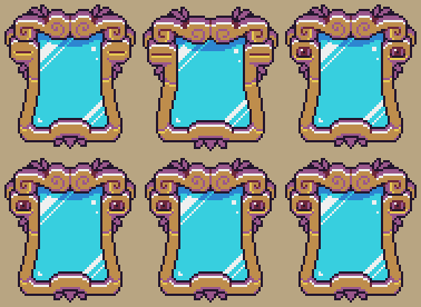
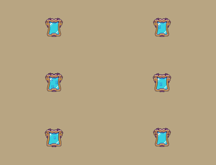
I’ve also tried to come up with some more abstract (yet mirror-y) effects that can be used to add even more oompf wherever we see fit:

I had a ton of fun tinkering with this, Photoshop on the other hand did not. Surprisingly, having 1000~ layers in a single document will make Photoshop have “performance issues”? Who knew!

Fred here again!

I was thinking… Since I’m still interning as Lead Blog Master, and have ultimate and all-mighty power over this thing, why not focus on what I do best? Let’s talk some animatiooooooonnn!

I figured I could try to do like a step-by-step of some animation-related stuff I’ve been experimenting with this week. Just share some general thoughts and maybe some tips and tricks. Makes it easier for me to write about, and hopefully, it’s a bit interesting for you guys as well ;D Anyway, lesss goo!

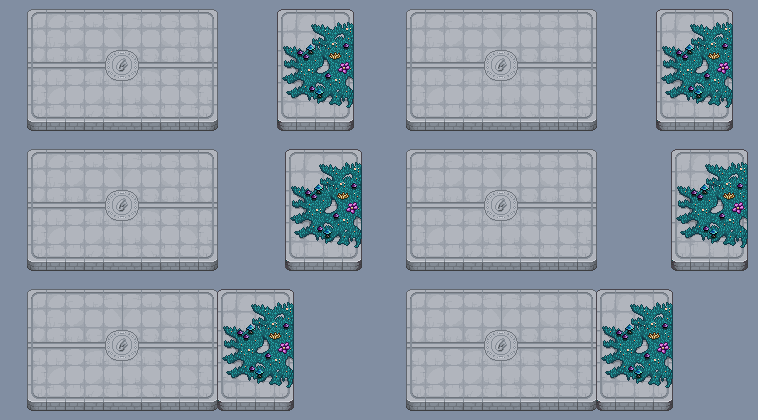
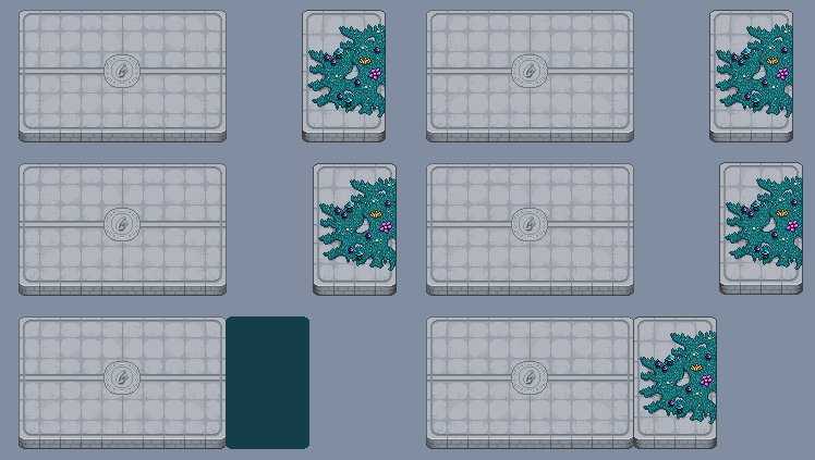
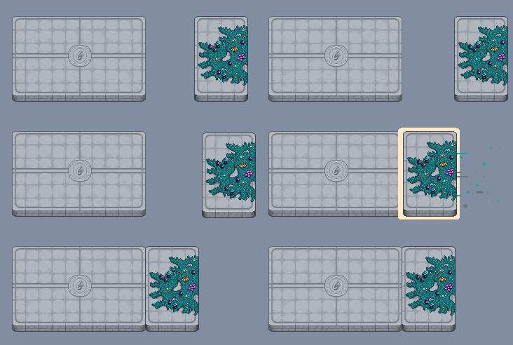
So, this week I wanted to add some more epic and juiciness to the platforms appearing in this sequence:

Even in this state it actually looks pretty good, but I’ve always felt there’s been potential for some extra level of pizzazz here. It is the lead-up to the conclusion of the entire game after all, I would rather it feel overboard than overwhelming. Hopefully, we’ll find a sweet middle ground, but we’ll see what happens!

What I start out with here is just adding some basic movement for the smaller platform piece. My main gripe with the original version is that the movement was a bit too smooth for me, so I try to counteract that here by adding different speeds to the animation and points where it comes to a complete standstill. This just helps a lot with adding impact and force.

It moves! Looks kinda cool, but a bit too stale for my liking. Here’s a super useful magic trick I use all the time to help add impact and feedback: add a few frames of wobble at the moment of impact. The wobble here is super simple, just moving the platform a few pixels over the course of 4 frames. Super simple, but super effective!

Now I want to add a bit more anticipation to the whole animation, just to make sure players have the time to adjust their focus. This is super important when animating in general, if you don’t give your spectators a tiny heads-up something cool is about to happen, they could end up missing that sweet animation you’ve spent tons of hours on. In games, it gets extra tricky because there are so many situations where a player has to focus on multiple things on the screen at once. I battle with this a lot myself, even if I’m slowly getting better at it. ANYWAY, less talk, more animation!

Some added “oh lawd, he cometh”-wobbling and we’re good to go!

So now we’ve got the player’s attention, time to take advantage of that and add some more KA-PLAOW!

Much better. Not too over the top, but still way juicier than before. I added a small trailing effect here as well, which I’ve tried to keep intentionally simple. It’s basically just a square lagging behind the platform for 2 frames. Since there is a ton of different platform pieces both in size and visuals, I want to keep as much of the animation as modular as I can. If I can create effects that Teddy can easily recreate using code, that’s the dream!

So, while the trail looks kinda sweet already, we can do better. Time for my favorite; particlesss!

Here I’ve basically just added 3 different particles I made and copied and pasted them a bunch. I could probably have added more, but doing so in Photoshop get’s so tedious and time-consuming, especially when you want to try out different timings and stuff like that. Since the particles are also something that Teddy will control via code, it’s just easier to fine-adjust them at that stage.

We’re missing the most essential thing of all:

Smoke, the salt of an animator’s kitchen!

At this point, I dunno, I feel kinda happy! Like I’ve said, a lot of stuff here can be adjusted and fine-tuned in the code later but this looks solid as a base! As always it’s going to be exciting to see Teddy translate this “prototype” animation into the game, he usually does an amazing job so :) I will update you guys when we have more to show on that front.

As a little wrap-up, here is the entire sequence, with more than just the one platform:

I’ve messed around a bit with another added effect for the main platform which I don’t think I nailed fully, but I still think there’s something there to keep exploring. Added a touch of wobble to the big papa platform as well!

Anyway, thanks for reading this week’s issue of “Fred’s animation blog”! Will I be back next week? We’ll see. Until next time, love you all. Baaaiiiiiii! <3

Fred here! With Vilya being very busy with moving houses still, I’m filling in to keep the blog posts rolling. I was actually supposed to fill in for her last week as well buuut, I kinda forgot. Learning on the job 8)

Diving right into it; Teddy has done a ton of work for the final cutscene this week. For starters, adding and timing all of the music our lovely musician Riley has been sending us for the past month. It’s 9 tracks in total for the entire sequence of scenes and, you guys, it’s going to be epic! The music adds so much, it’s always such a cool experience hearing a scene with music for the first time. Especially in this case when it’s such a massive cutscene that we have been tinkering with for such a long time. If I can figure it out, I could add a track or two for you people to listen to. Might save that technical venture for next week tho ;D

Besides music, a lot of time has been spent adding multiplayer versions of the cutscenes. This means making every player have their own unique reactions, timings and positions during multiplayer. We don’t want every player to just feel like they’re a copy of the player hosting the server. It adds a lot of monotonous and tiresome work, rewatching and debugging cutscenes in different multiplayer setups. In the end, it’s worth it tho, even if it feels like a minor detail at first glance.

Worth it!

Besides all of this “hard to show on the blog”-stuff, we’re still swinging away at good ol’ Zhamla. One move from his original encounter in Tai-Ming that we all really like is his Dash Slash! It looks cool, has a lot of agility and speed to it and it just fits Zhamla’s combat style very well.

The only problem with it is that it’s not too challenging at this stage of the game. It’s not totally useless, but compared to the rest of his arsenal, it leaves you wanting more. So we tried to figure out a way to spice it up a bit while keeping the spirit of the original:

Since we tinkered with some Shadow Clone-stuff the other week, we stayed on the theme. The clones add a decent amount of difficulty while keeping the feeling of the original attack. He still has access to the “vanilla” version of the attack during the final battle, and will mix it up as he sees fit!

At this point, we’ve reached a stage with Zhamla where, in terms of his moveset and attacks, we are feeling pretty satisfied actually! He’s got a wide variety of moves, he’s fun and very challenging to play against (at least for me ;D) so I dunno… This could potentially be the final prototype of a move we show here on the blog! This does not mean the battle is finished tho, there are still a ton of adjustments needed and graphics and polish that are missing. Knowing us we’ll probably end up squeezing in one extra move or two as well, but still! Feels exciting that it’s starting to come together :)

We’ve mostly shown you Zhamla’s attacks separately, so I’m finishing this post off with a short video of him chaining some of his moves together. Can’t wait for you people to get destroyed by him the way I have during testing <3

Picking up from last week; we are starting to feel very optimistic about our refining of Zhamla’s normal attacks. They are much more fun to deal with, they feel more varied and they’ve solved some of the clarity issues we had before. 

The only downside to all this positivity is that Fred has a bunch of new animations to tackle. Zhamla poses two normal attacks in all three directions (it’s technically four, but the left/right is just a mirrored version of each other) with the ability to finish his attack pattern with either of them. This means Fred needs to create 6 unique “Hey, I’m open for attack now!”-animations to indicate to the player when it’s time to fire back at Zhamla. It might seem a bit excessive but in the end, we feel it will be worth it. Zhamla deserves that extra bit of polish only reserved for the finalist of final bosses!

So, while Fred is busy with that, Teddy has put together some prototypes for some new potential attacks for the King of Collecting!

First up, we have another take on screen-wide fire move. As with most attacks like this one, its main purpose is to give the player a change of pace more than being overly difficult. Since the area of attack is so massive, we want to make sure players have ample time to react properly.

For the other attack, we went with another element: Lightning, with a touch of rain!

The first iteration of the attack both looked and felt a bit overwhelming during the testing, so Teddy did what he does best and cranked it up a notch:

Much better! Once again not the most difficult or threatening attack on its own, but it can easily be combined with other patterns and combos to add a bit more spice where we feel it’s needed.
Visually there’s still more to be desired, Fred has already been tinkering away with some suggestions:

The idea is to have a more pronounced lightning effect in the middle, surrounded by a bunch of smaller bolts. We’ll see how it turns out next week :)   

Back at it again with more Zhamla shenanigans! Last week I mentioned we were tinkering with adding one more sword-based attack to his arsenal and this is the result:

We based this attack on the elite version of Echo of Madness from Tai Ming. On one hand, because it felt like just the type of intimate and Perfect Guard-focused attack we were looking for gameplay-wise and on the other hand, it’s also a nice little visual connection between Zhamla and the Echo’s.

The graphics are still in the very early stages of polish, there’s still some clarity and size issues with all of Zhamla’s shadows bunched together, but nothing that a few coats of animation won’t fix!

Another focus this week has been to give the players more visual feedback for when Zhamla is open to be attacked. Since he is so hectic and agile in his playstyle, we feel it’s more important than usual to make sure players know when they can inflict damage and not get taken by surprise by Zhamla.

Fred whipped up this animation (the above one) as a test for when Zhamla leaves himself vulnerable after one of his normal attacks:

While still rough around the edges, it’s still more than enough to give the intended effect during testing. After some time spent in Teddy’s workshop, here it is in the game:

And another iteration with some more visual feedback added into the mix:

The added effects bring a bit more oomph to it, which I personally like. The flames were put there as a placeholder, but I dunno. It kinda works! We will keep experimenting and pushing it further, but just this simple test feels very promising so far :)

This past week Teddy and Fred have kept tinkering with new attacks and patterns for Zhamla. We are trying to find that sweet spot where Zhamla lives up to his name as King of Collecting, the most powerful collector of all time, while at the same time not trying to overwhelm the player with an endless moveset. It’s a fine line to walk and it’s always tempting to push it even further when you’re working on the final FINAL boss of the game, but we’ll try to not go too overboard. No promises tho 8)

So, one of the new attacks we’ve been working on is screen wide wind inferno-thingy! It’s main intention is to break up the pace a bit and give the player a small amount of breathing room before jumping back into the high intensity of dealing with Zhamla face-to-face.

First up is a video of an early iteration of the attack, trying out to concept and game feel:

And a later iteration with more polished graphics to get a better feel of the cinematic qualities of the attack:

There’s still a lot of tinkering and polish left, but so far, I think it looks pretty sweet!

The second attack we focused in on this week is a Blink Strike. At the moment we’re taking some extra time and care to make sure Zhamla feels fluid and varied when his utilizing his sword. The Blink Strike was an attempt to make him more agile and able to reposition without the need for too many fancy animations.

A video of it’s first iteration:

Aaand a second one with a bit more polish to the graphics:

So far during testing, it’s been doing just what we intended (which is not always the case, yay game design!) and while there are still adjustments to be made, so far so good! We’re still deliberating on and trying out at least one more sword-based attack for Zhamla to have access to. Hopefully, you guys will enjoy what we cook up!


In the last post I mentioned recording a bunch of videos showcasing some of the stuff we’ve done so far with the final battle. Without further ado:


First above, the sequence where Zhamla breaks the room to reveal the sky outside! In this prototype, we still use the red sky, but in the final version we might change it around so a night sky with stars will be revealed instead.

Next up, a little updated sequence with Zhamla’s summons! Here you can see the swap between the red sky and the night sky, as it happens when Frosty Fiend appears:


We’ve also made an updated heal for the sequence where you need to damage Braazlet. We’re still missing the proper HP-bar graphics (which I made last week) in the prototype below, but it should be added soon:


Finally, an assortment of new attacks and patterns:

   
Keep in mind that all of these are still in the prototyping phase and will get polished quite a bit more :)

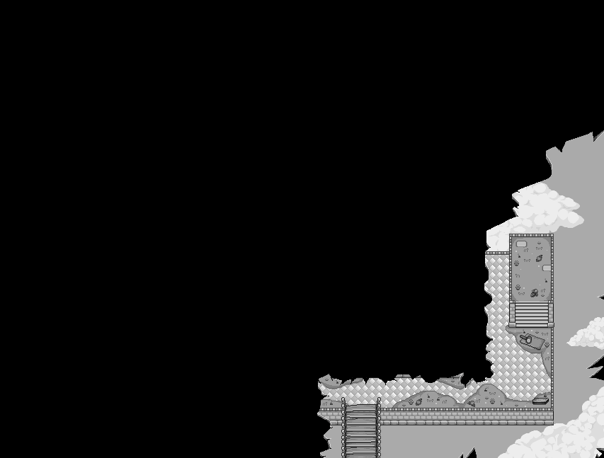
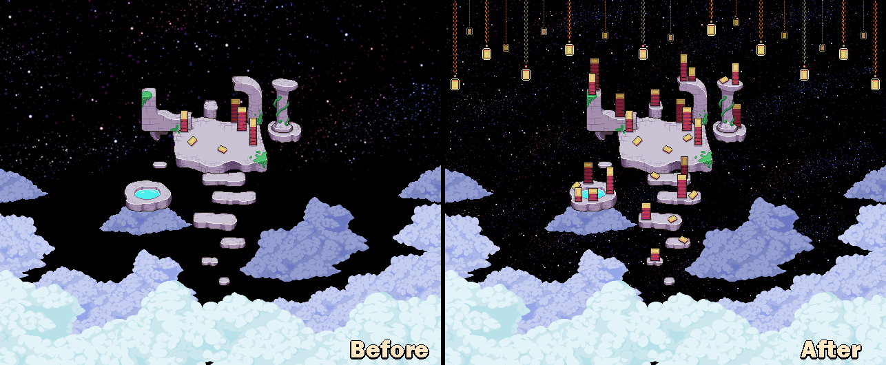
One of the very final scenes in the game will take place above the blue skies, in space, where Grindea herself has one of her dwellings. We thought a lot about how to do the transition between blue sky and starlit night, and after having tried out a bunch of gradient options, we decided to simply go for an easier (and prettier) solution: clouds!

Once you get high enough, there will be a thick blanket of clouds, and as you emerge above them, there will be different colour clouds and a starlit sky behind them.

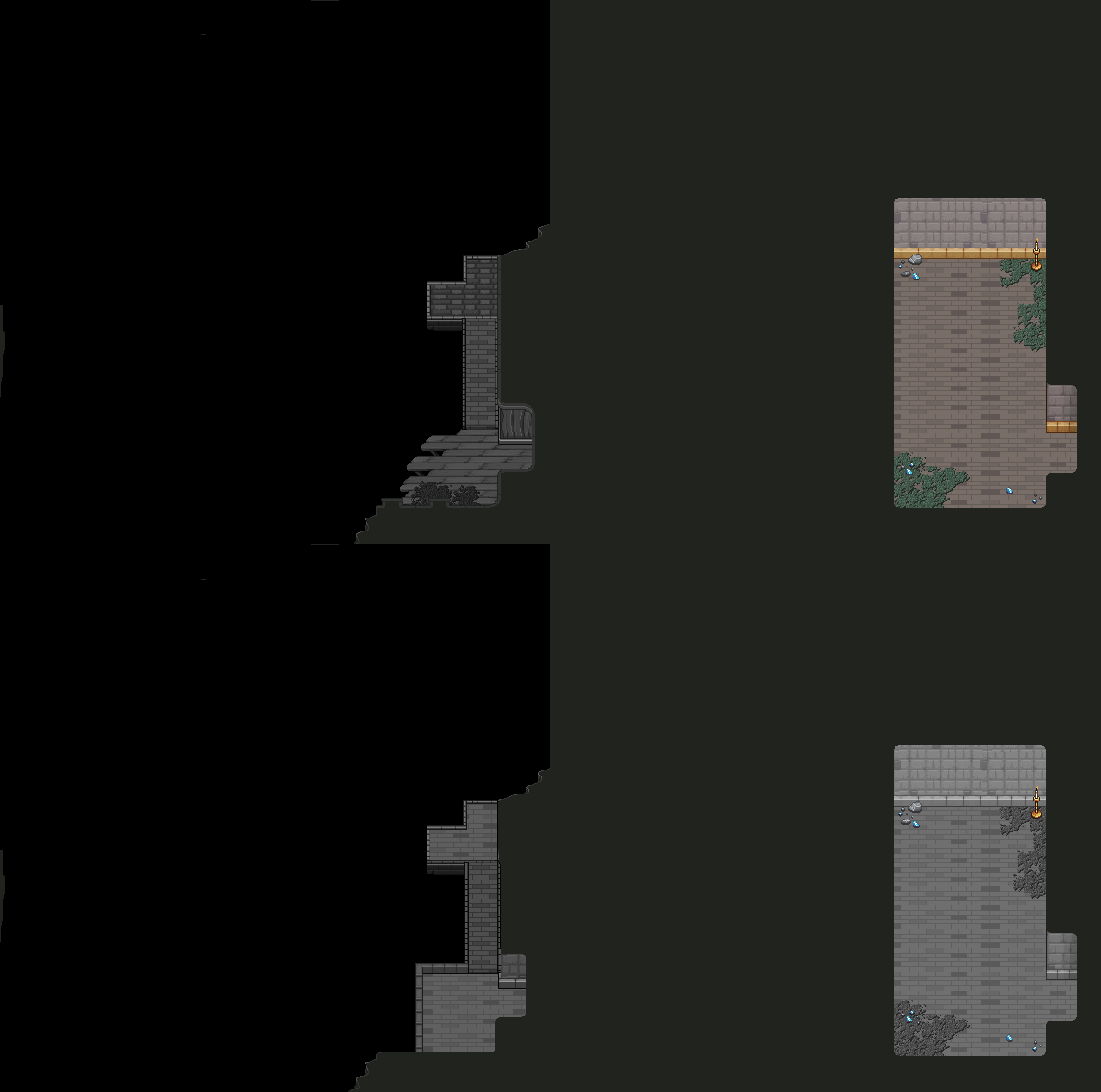
Here’s an early sketch, the the corresponding new clouds needed:

And now it’s time to render the background:

After painting a ton of floating stones, it’s now done! Well, at least my part of the work – time for Fred to animate some cards/stars :)

Hey guys! Sorry for this extremely late post, I’ve been in the midst of moving and with things still being pretty chaotic around here, I simply forgot to schedule the draft – oops!

Right now our full focus is on the very final boss battle, against Zhamla. While the prototype for the battle is nearing completion, we still feel like something is lacking. Nothing big, just a lil something extra. Our current focus is playing around with tweaking and/or adding bunch of new attacks, patterns and phases to see what feels good and what doesn’t. Overall though, I think it looks absolutely amazing, and can’t wait to show you guys!

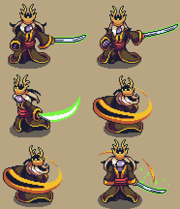
We’ll try to record a bunch of videos over the weekend so you can see some of the juicy stuff in action, but for now, here’s a bunch of Fred’s animations:

As for me, I’ve made a new kind of HP-bar as part of the boss battle against Zhamla! This bar is for Braazlet, who you’ll have to defeat before you’re able to do any real damage to Zhamla himself. In the videos we’ve shown before, we’re using placeholder graphics, so it was definitely time for me to add some proper graphics!

I

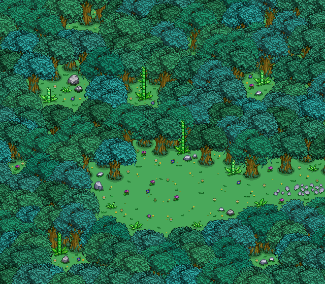
I’ve also made a proper background for the Frosty Fiend portion of Zhamla’s boss battle! As with Braazlet’s HP-bar, we previously used placeholder graphics for this, but now it has its very own proper background:

First up this week, let’s take a look at the healing phase of Zhamla’s boss battle!

Here, you need to defeat the bracelet first, so it can’t keep on healing Zhamla indefinitely. Bag and Braazlet will also have some lines mid-battle in speech bubble form, and in order to make this look its best I made some new graphics to go with the bubbles. I also took the opportunity to update the speech bubbles used by other artefacts earlier in the game (= Shiidu and Trunk).

Here’s the result, with a sample bubble and a prototype video showcasing them:


The summoning of Zhamla’s version of Frosty Friend (Frosty.. Foe? Fiend?) is also coming together more and more. Here’s a prototype of the summoning of this summon:


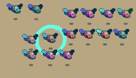
Fred has also been working on various sketches of another of Zhamla’s summons, a bigger and scarier version of Summon Plant! Let’s take a look at that:


Which one is your favourite? Ours is in the green circle with the checkbox!

This week Teddy and Fred made a plan about doing a May crunch, in which they aim to make the Zhamla battle fully playable except for some final polish.

Teddy has since prototyped the transition from Dad’s battle Arena to Zhamla’s (exploded!) battle arena, inserted a healing sequence where the player needs to defeat the bracelet before doing damage to Zhamla himself, and also developed prototypes for the summon phase start and summon phase end.

We’ve also received some of the very last songs that will be added to the game, which definitely feels bittersweet.

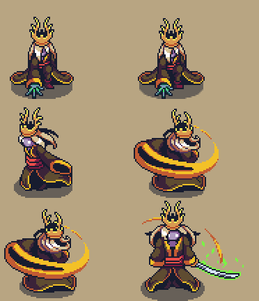
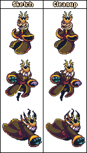
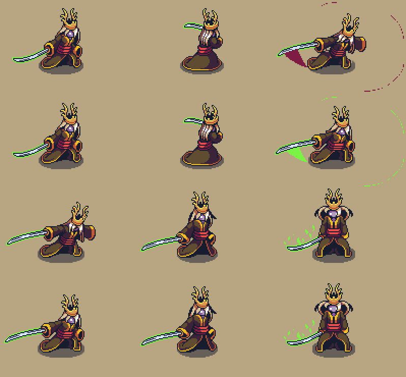
Here’s a little sneak peek on some more Zhamla boss animations courtesy of Fred this week: